Edit charts and tables
You can edit the appearance of charts and tables in Explore. When you search your data or edit an existing answer, Explore automatically creates the type of chart or table that it thinks makes the most sense for the data. Then, you can refine it to fit your needs.
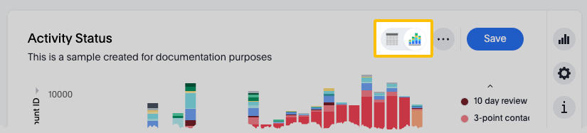
Important: Save your changes before closing the
editor. Select More  > Save at the top of the visualization.
Important: If you're viewing an existing answer, a
lock  next to the title means you only have View access.
You can still edit the search, but you can't save changes. Select the lock to
request edit access from the owner.
next to the title means you only have View access.
You can still edit the search, but you can't save changes. Select the lock to
request edit access from the owner.
General settings
- Title and description
- Select the title and description to edit them.
- Choose a chart or table
- Select View chart to display the data as a chart, or
select View table to display it as a table. When you
save your changes, other users see the view you chose. They do not see both
the chart and table unless they have permission to open and edit the
visualization.
Navigating the editor
There are a few places to look for settings:
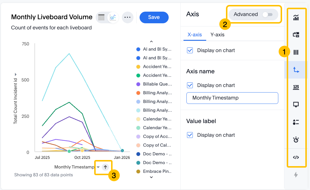
- 1. Editing menu
- There's a section for each component of a chart or table. The settings
in each section depend on the type of chart or table.
- Type
- Layout
- Column
- Axis
- Data label
- Tooltip
- Legend
- Display
- Query (View the query used to generate the chart. Not editable)
- 2. Advanced settings
- In some sections of the editing menu, select Advanced to reveal more settings.
- 3. Interact with the chart or table
- You can find some settings by selecting or right-clicking on specific elements of the chart or table. For example, select an axis name to reveal a settings menu.
Chart settings
These are some of the available chart settings:
- Chart type
- Select Type
 , then select from more than 20 chart types. To learn more about
each type, see the ThoughtSpot documentation: Chart types
, then select from more than 20 chart types. To learn more about
each type, see the ThoughtSpot documentation: Chart types - Change colors
- In multicolored charts, select any legend item color to edit it.
- Hide legend items
- Select any legend item to hide or show it in the chart. Double-click any legend item to show ONLY that item. Double-click it again to show all items.
- Switch axes
- Select Layout
 , then click and drag columns into different axes.
 - Edit axes properties
- Select either the x-axis or y-axis to edit the properties. For example, you can add conditional formatting and filter data.
- Set a maximum number of data points
- Select Display
 , then input a Max data points number.
 - Hide null values
- Select Column
 > Hide null values.
 - Edit tooltips
- Select Tooltip
 > Edit to choose which fields to include in the tooltip that appears
when you hover over a data point.
> Edit to choose which fields to include in the tooltip that appears
when you hover over a data point. - Show data labels
- Select Data label
 to display labels on the chart.
 - Show gridlines
- Select Axis
 , then under Axis lines, select
Display gridline on chart.
, then under Axis lines, select
Display gridline on chart.
Table settings
These are some of the available table settings:
- Edit column properties
- To edit column properties, hover over the column name and select the More ellipsis. For example, you can configure text wrapping, conditional formatting, and rename the column.
- Sort columns
- You can sort by a column in ascending or descending order. Hover over the column name and select the More ellipsis, then select Sort.
- Hide columns
- You can hide a column from a table, while keeping it in the search. Select
Layout
, then drag columns from Visible Columns to
Hidden Columns. You can still use a hidden column
to sort the data.
What to do next
Save your visualization to create an answer and share it with your organization.