Tag
Overview
A tag is used to label and categorize items with descriptive keywords. Items can have single tags or a tag collection.
Tags are useful for quick recognition, easy navigation, and filtering items.
Anatomy
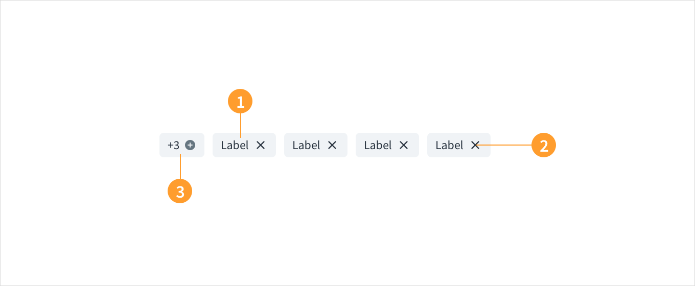
Tags consist of:
- Label: text that identifies the tag. Tags should always have labels. They can be search terms or keywords.
- Close icon: the icon that users can click to remove the tag.
- Tag collection: a group of more than one tags. When an item has more than one tag, it becomes a tag collection.
Best practices
- When content is mapped to multiple categories, use tags to differentiate between them.
- Labels should be short for easy scanning, preferably one word.
- Use tags to filter data and show items within a particular category.
Interactions
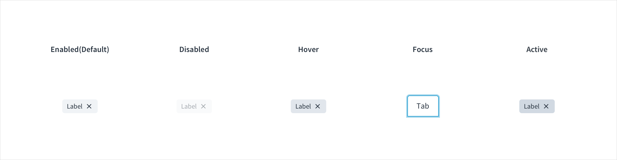
Tags have enabled, disabled, hover, focus, and active states:
- Enabled: Communicates to the user that the element is enabled for interaction (default). Enabled tags have a background color with HEX # F0F3F6.
- Disabled: Communicates to the user that the element is not interactive. Disabled tags have a background color with HEX # F9FAFB.
- Hover: Provides feedback indicating that the user has placed a cursor over the element. (desktop only). On hover, the background color of tags is HEX # E1E6EC.
- Focus: Provides feedback indicating that the user has highlighted the element, typically using an input method such as a keyboard or mouse. On focus, the background color of tags is HEX # F0F3F6, and the tag is surrounded by a stroke with HEX # A5D7EC.
- Active: Provides feedback indicating that the user is clicking or tapping the element. Active tabs have a background color with HEX # D1D9E2.
Accessibility
The Jutro Tag component is used to categorize and label web content, using descriptive keywords.
- Screen reader interaction: When active, the close ('X') button within each tag includes the WAI-ARIA attribute:
aria-label="close" - Keyboard interaction: The close button is activated by SPACEBAR and ENTER.
- Color: The contrast ratio of textual elements against their background is above 4.5:1, as per WCAG 2.0 AA requirements.
- Zoom: All content is visible and functional up to & including a zoom factor of 200%.
This component has been validated to meet the WCAG 2.0 AA accessibility guidelines. However, changes made by the content author can affect accessibility conformance. When using the tag component:
- Be sure the tag text is clear and concise.
- Do not use color alone to differentiate tag categories.
- When using custom colours ensure that the minimum contrast requirements are met.
Was this page helpful?