The TabSet and Tab components are available from the @jutro/components package. The Tab component can only be placed inside a TabSet component. Tab requires to have an id set.
You can make a tab visible or not using the visible prop. In this example, the third tab is not visible, but when you click on the first tab, the onTabChange prop calls the function handleTabChange and makes the third tab visible.
Additionally, the second tab is disabled using the disabled prop.
importReact,{ useState }from'react'; import{TabSet,Tab}from'@jutro/components/'; exportconstStatusTabs=()=>{ const[isTab3Visible, setIsTab3Visible]=useState(false); const[activeTab, setActiveTab]=useState('tab-4'); consthandleTabChange=(tabId)=>{ setActiveTab(tabId); setIsTab3Visible(tabId ==='tab-1'|| tabId ==='tab-3'); }; return( <TabSet defaultActiveTab="tab-4" activeTab={activeTab} onTabChange={handleTabChange} > <Tab heading="Tab heading 1" id="tab-1" > Tab 1 content </Tab> <Tab heading="Disabled tab" id="tab-2" disabled > Tab 2 content </Tab> <Tab heading="Hidden tab" id="tab-3" visible={isTab3Visible} > This tab is only visible after clicking on the fist tab. </Tab> <Tab heading="Tab heading 4" id="tab-4" > Click on the first tab to enable the hidden tab. </Tab> </TabSet> ); };
Tabs allow users to navigate similar content on the same page. For example, you might have a series of tabs labeled "Get a quote," "Account log in," and "Claims." They help organize content into multiple categories, reducing cognitive load for the user.
Use tabs to alternate views within the same context. Users should not have to navigate to different areas. Tabs allow them to alternate views while staying in place.
Logically chunk content so each user can easily predict what they will find within each tab.
Arrange tabs logically but don't use tabs for sequential content that needs to be read in a particular order.
By default, set the first tab in a set to be active.
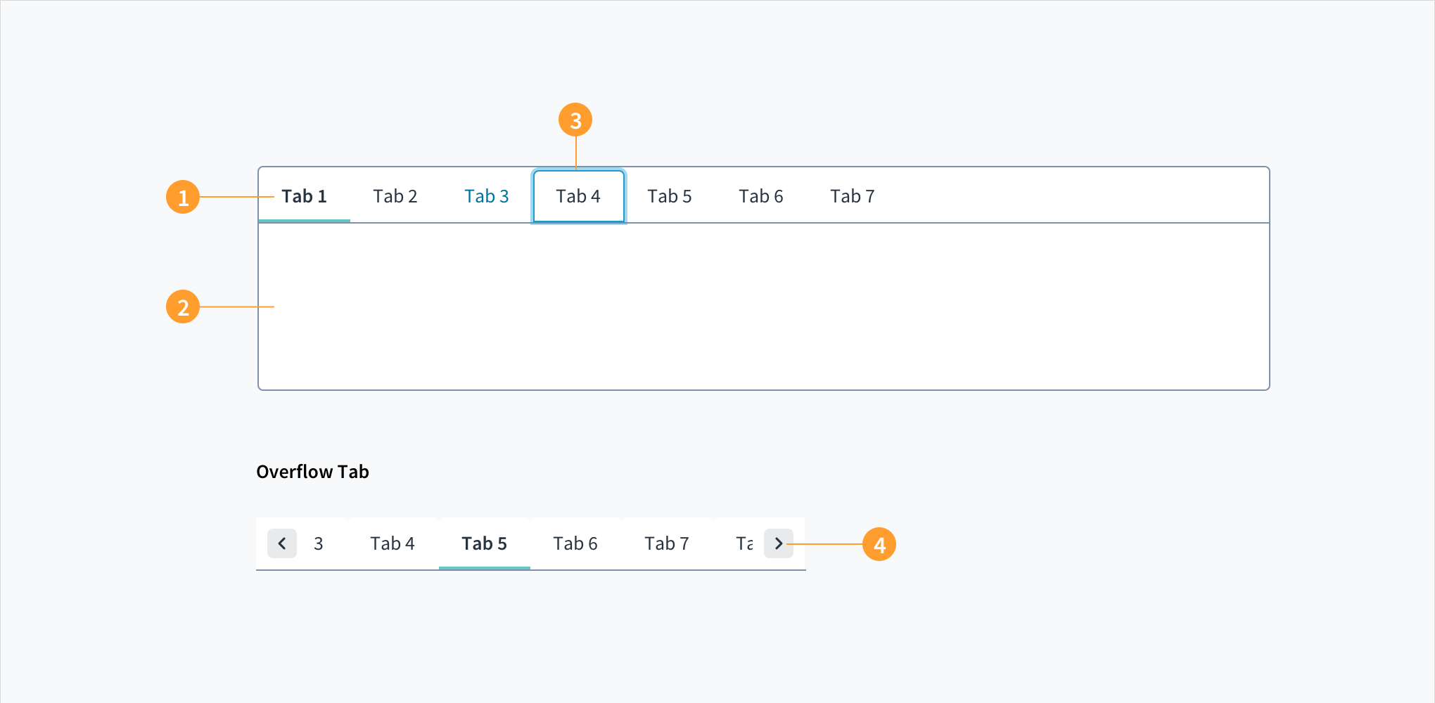
Avoid the temptation to use more than one row of tabs. We generally recommend no more than six tabs in a set.
Only use tabs when users do not need to compare content across multiple tabs.
Highlight the currently selected tab.
Ensure that unselected tabs are clearly visible and readable.
Display tabs on the top of the tab panel, rather than on the sides or bottom.
The Jutro Tabs component is a set of layered content, also known as tab panels. Only one tab panel is displayed at a time.
Screen reader interaction: WAI-ARIA roles of 'tablist', 'tab' and 'tabpanel' are included to provide meaning to assistive technologies. When a tab panel is active the aria-selected value is set to 'true' to provide contextual information.
Keyboard interaction: The TAB key moves focus to the first tab element in the sequence. Use the arrow keys to move between tab panels. If the tab panel contains focusable elements (such as a link or button) pressing the TAB key moves focus to the focusable element. If there are no focusable elements, the TAB key will move focus away from the tab panel to the next focusable element after the component.
Color: The contrast ratio of textual elements against their background is above 4.5:1, as per WCAG 2.0 AA requirements. The active tab label is indicated as such with bold text and a thick bottom border.
Zoom: All content is visible and functional up to & including a zoom factor of 200%.
This component has been validated to meet the WCAG 2.0 AA accessibility guidelines. However, changes made by the content author can affect accessibility conformance. Be sure to follow guidance in this section and also in the WAI-ARIA Authoring Practices for Tabs.
When using this component in your applications:
Provide meaningful and descriptive titles for each tab. This assists users to understand the content within each tab panel, and provides for efficient navigation.
Ensure that the content within each tab panel is accessible by, for example, using semantic heading components, paying attention to color contrasts, & applying alternative text to images.
Make sure to understand the Design System components API surface, and the implications and trade-offs. Learn more in our introduction to the component API.
The heading for the tab. This prop is not rendered by the Tab component directly, but rather is extracted out by the TabSet component and rendered by it instead. Can be either a simple string or a renderer function which should accept rendering props object as an argument