Introduction to Guidewire Canvas
- Weather events that gave rise to the claim.
- Other geospatial data that is meaningful to your company.
A separate license enables you to access Weather Discrepancy Alert API, which can drive a ClaimCenter workflow that depends on whether a recorded weather event corroborates a claimed loss cause, date, and location.
Canvas loads claims daily from Guidewire ClaimCenter™ and can load policies from Guidewire PolicyCenter™ or from another system of record.
Canvas is built on the Google Maps Platform and displays geocoded locations of claims and policies over a map or satellite layer, with a street view that provides a zoom-in capability. You also can view additional geovisual layers to provide details that enable your claims response. For example, a layer might show the path of an impending hurricane near your policy locations or might show the incidence of high-wind speeds as related to your property claims. You also can export policy and claims details for use in subsequent analyses.
Benefits
- Prior to a catastrophe, your company might review the projected path of an event; verify the number of policies and their total insured value; contact policy-holders to convey instructions; deploy response teams; and export policy details for use in other applications.
- After a catastrophe, your company might identify the effect on different areas on the basis of weather information and claims details; contact affected policyholders; triage claims; review aggregate claim information; identify auto-adjudication opportunities; and detect fraud by spotting anomalies, perhaps in part by comparing claims in different regions or by looking at a property's appearance before the catastrophe.
Guidewire can work with your company to integrate Canvas and ClaimCenter so that the latter displays a Weather Discrepancy alert when a weather pattern is found to be inconsistent with a claim's location, loss date, or loss cause. You then can configure ClaimCenter so that the alert causes a claim to be flagged for human review, whereas a lack of discrepancy causes the claim to be assigned a fast-track status.
A variety of other use cases are unrelated to weather. For example, your company might evaluate agent locations to determine if coverage is sufficient in different locales; evaluate the usefulness of a car-repair network given the nearness of vendors to recent accident claims; identify trends in the claim line-items assigned to specific types of vendors such as tow truck operators, car-service shops, medical clinics, and paralegal offices; and monitor the frequency and patterns of identity theft in a neighborhood.
Search types
- Polygon Search enables you to display only the policies and
claims that are in a geographic area and within a date range. The date range can refer
to any of three options: when the loss occurred, when the claim was created, or when the
claim was closed.
For details: Search by polygon.
- Individual Claim enables you to specify a claim number, at
which point the claim is placed on the map.
For details: Search for a specific claim.
- Named Catastrophe enables you to display the policies and
claims that the core system identified as being part of a specific catastrophe.
For details: Search for a named catastrophe.
- Point Location enables you to find a location by address or
geocode. Also, you can search for claims and policies within a radius that you define.
For details: Search for a specific location.
Search results
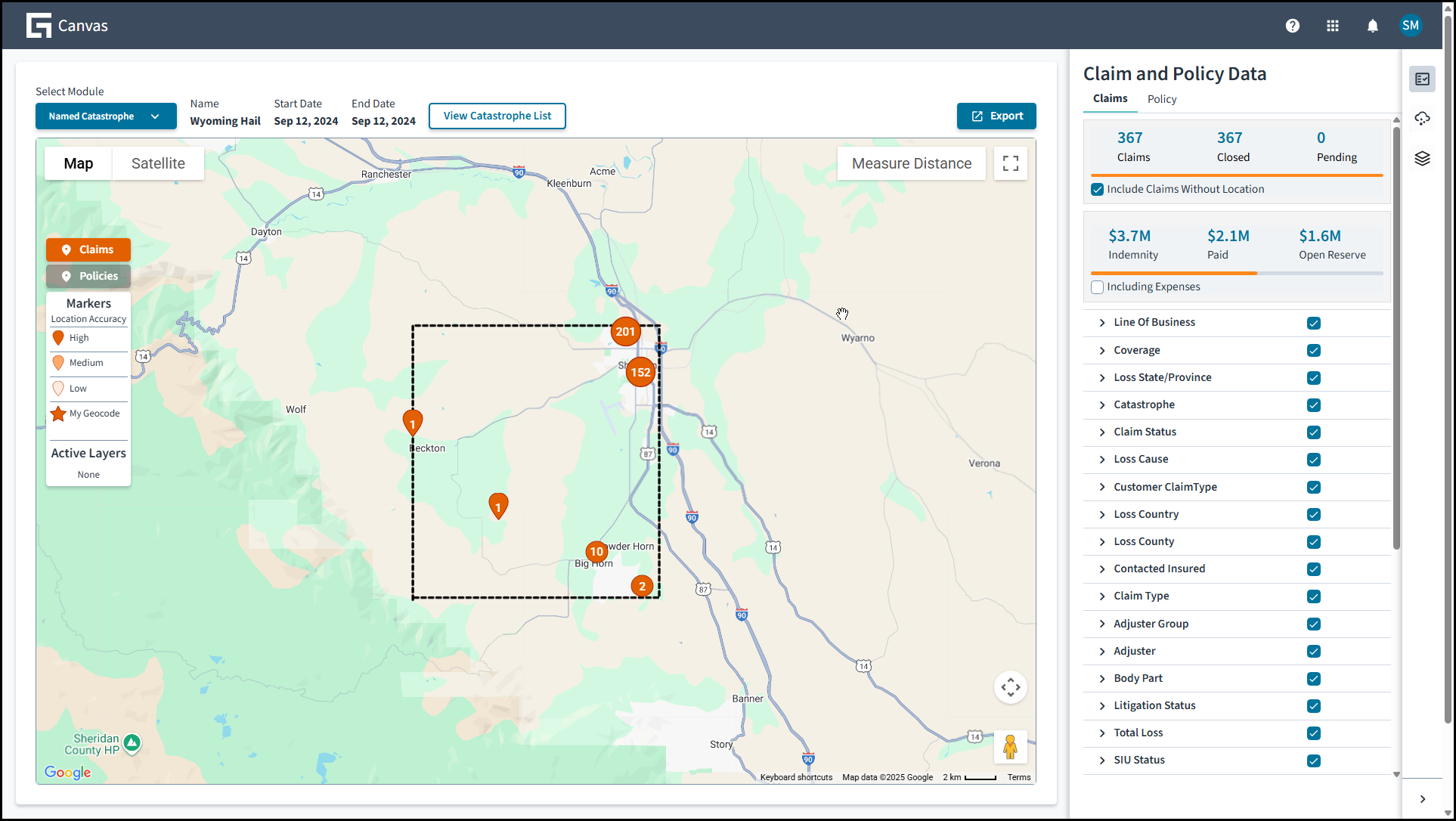
The screen just shown is displaying the location of a set of claims in a user-defined area and at a given time, along with a variety of metrics about that set of claims. Each red icon represents the claims in a location.
As you update the map's resolution, the meaning of a red icon might change from representing all the claims in a city to representing a single claim.
The number on the icon indicates the number of claims being represented at the current level of resolution. If the number is 1, the icon is displayed as a tear-drop icon or as a star, as explained later.
Instead of displaying details at a claims level, you can request that the main screen display details at a policy level, in which case you see a set of blue icons. Claims and policy data also might be presented together. In any case, selecting an icon gives you further details on the claims or policies represented by the icon.
- If a tear-drop icon on the map is in full color, the core product provided a complete address that matches an address on Google maps.
- If a tear-drop icon on the map is not in full color, the address detail is in some way problematic, and the certainty of the location is less.
- If a star is on the map, the core platform provided a latitude-longitude pair, and the certainty of the location is great.
At the top right, the Export button enables you to download a spreadsheet with data on the displayed claims and policies; and the Measure Distance button enables you to draw a line between two points and to learn the distance represented by the length.
- The topmost displays or hides summary data that's based on two inputs that you control: what claims and policies are being referenced and what subsets of the related data are included in the summary.
- The second displays or hides details on weather events for specific dates and for specific perils such as wind and wildfire.
- The third displays or hides visual layers of information and provides a way to include layers stored in the Keyhole Markup Language (KML) files that you reference from the Internet or from your organization's intranet.
Layers
- Community layers, which are curated by Guidewire from third-party providers for
the benefit of all customers.
Most community layers are dynamic, which means that the external provider updates them regularly to reflect current conditions such as advancing hurricanes or wildfires in progress. However, Guidewire can't guarantee the availability of community layers because these third-party providers might change their specifications without notice or might suffer downtime.
To request additional community layers, contact your Customer Success Manager.
- My Company layers, which are internal to your organization, are uploaded by your
organization's Canvas administrator, and are visible only to your organization's users.
Each of these layers represent additional geolocation data that's valuable to your
company; for example, data on historical events such as a flood boundary; demographic or
firmographic data on approved vendor locations; or internal data such as agent
locations.
The My Company layers must be in KML or the related zipped (KMZ) format, as provided by Google Earth, and are subject to size limitations that are enforced by Google: 10MB for KML and 3MB for KMZ.
Any end-user can invoke the Preview capability in Canvas to upload a My Company layer for the rest of the user's current session.
Weather data
- Hail:

This option provides the hail size, with the maximum of 0.75 inches or 2 centimeters.
- Lightning:

This option provides the timestamp of a lightning strike.
- Smoke:

This option provides measures of severity, both quantitative (mg/m2) and qualitative (
Low Smoke,Moderate Smoke,Extreme Smoke). - Tornado (Satellite):

In relation to a tornado spotted by satellite, this option provides the Enhanced Fujita scale value, the number of injuries, and the number of fatalities. The presence of a satellite tornado precedes a verified touchdown and can be present even when no touchdown occurs.
- Tornado (Verified):

In relation to a tornado for which a touchdown was verified, this option provides the Enhanced Fujita scale value, the number of injuries, and the number of fatalities.
- Wildfire:

This option provides the name, start date, size, and percentage contained.
- Wind:

This option provides the wind speed from 40 mph or 60 kph.
You'd click the icon to view the layer and click the layer itself to view the related metadata.
| Australia, New Zealand | Canada | Europe | USA | Other | |
|---|---|---|---|---|---|
| Hail | X | X | X | X | |
| Lightning | X | X | X | X | X |
| Smoke | X | X | |||
| Tornado (Satellite) | X | ||||
| Tornado (Verified) | X | ||||
| Wildfire | X | X | |||
| Wind | X | X | X | X |
Onboarding
To onboard Canvas, ask your organization's IT staff to access the Onboarding Process Overview.
Here is a template for the policy file needed in phase 4: Policy file template.