Responsive and adaptive design
Looking for code and technical details? See Responsive and adaptive development.
Today's business is often mobile. Cars are “on-the-go” offices. Jutro accounts for this by using a hybrid solution to building applications.
First, some definitions.
What does responsiveness mean for applications?
Responsive design layouts automatically adjust to fit the size of the screen or the browser window. The same user interface that shows on a laptop will also show on a tablet or mobile phone. This ensures consistent quality and information access across all devices.
What does adaptive design mean for applications?
Adaptive design provides layouts for different viewpoints. Specific design layouts are created for multiple devices such as laptops, tablets (both vertical and horizontal), and mobile phones. The system detects what form factor (breakpoint) is needed and renders a layout that matches. This optimizes the user experience. In some cases, the information may vary slightly on different form factors. For example, it may be less detailed on a mobile phone.
Unlike responsive designs, which use a single, flexible design that can stretch or shrink to fit the screen, adaptive designs have multiple designs that map to fixed, predefined layout sizes.
How are these two approaches used in Jutro?
Jutro uses both approaches to optimize the user experience. There are components built to be responsive and layouts built with defined breakpoints to help the designers and developers accelerate product execution.
Recommendations and floorplan selection
For P&C cloud applications, the trend continues to be mobile first. There is a nuance in that guidance. Productivity and IT applications are data and labor-intensive and hence most often used on laptop or desktop systems. These tend to be B2B applications. The floorplans that are optimized for these kinds of applications include the L-Shape, C-Shape, and r-Shape.
Applications that customers of P&C insurers use for submitting first-notice-of-loss, viewing claims status, as well as purchasing and reviewing policies are often viewed on mobile devices. Field agents for insurers also use mobile devices such as tablets. The I-Shape floorplan is optimized to work with tablets and mobile devices.
For more information, see our page about floorplan guidelines
Getting started
It's recommended that product managers start by assessing where the application will primarily be used by end users. What kind of information will be presented, and what tasks will the end user need to accomplish. This will help guide decisions of how to approach responsiveness and adaptiveness. The UX designer or consultant can help you identify the persona who will use the application and the context of their work.
How Jutro components are built
- Responsive: The component adjusts to the screen size automatically using media queries.
- Adaptive: The component doesn't adjust to the screen size. Instead, you must configure them using the breakpoint props. The component renders differently depending on the device.
- Fixed: The component or the page doesn't adjust to the screen size.
Example
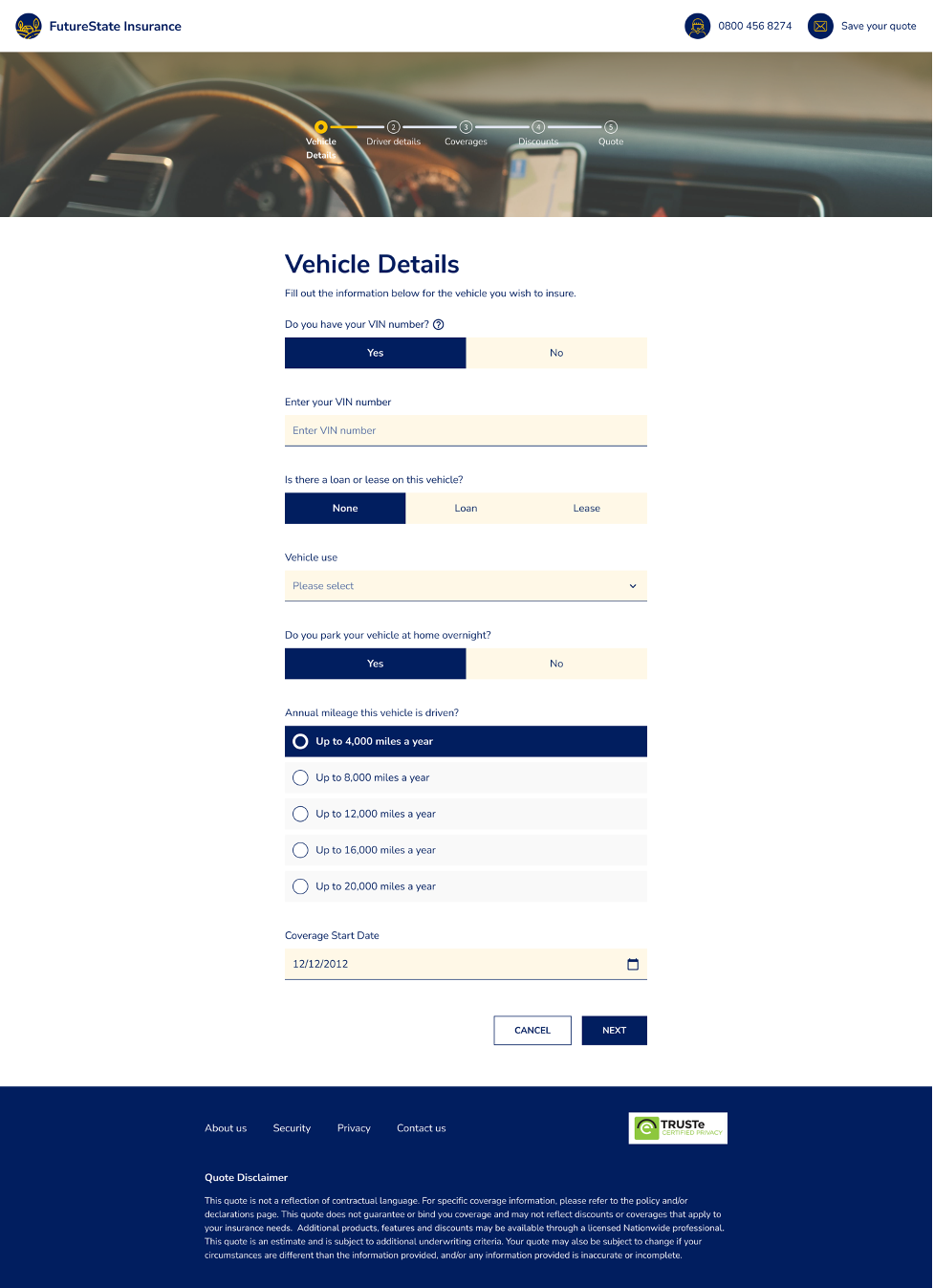
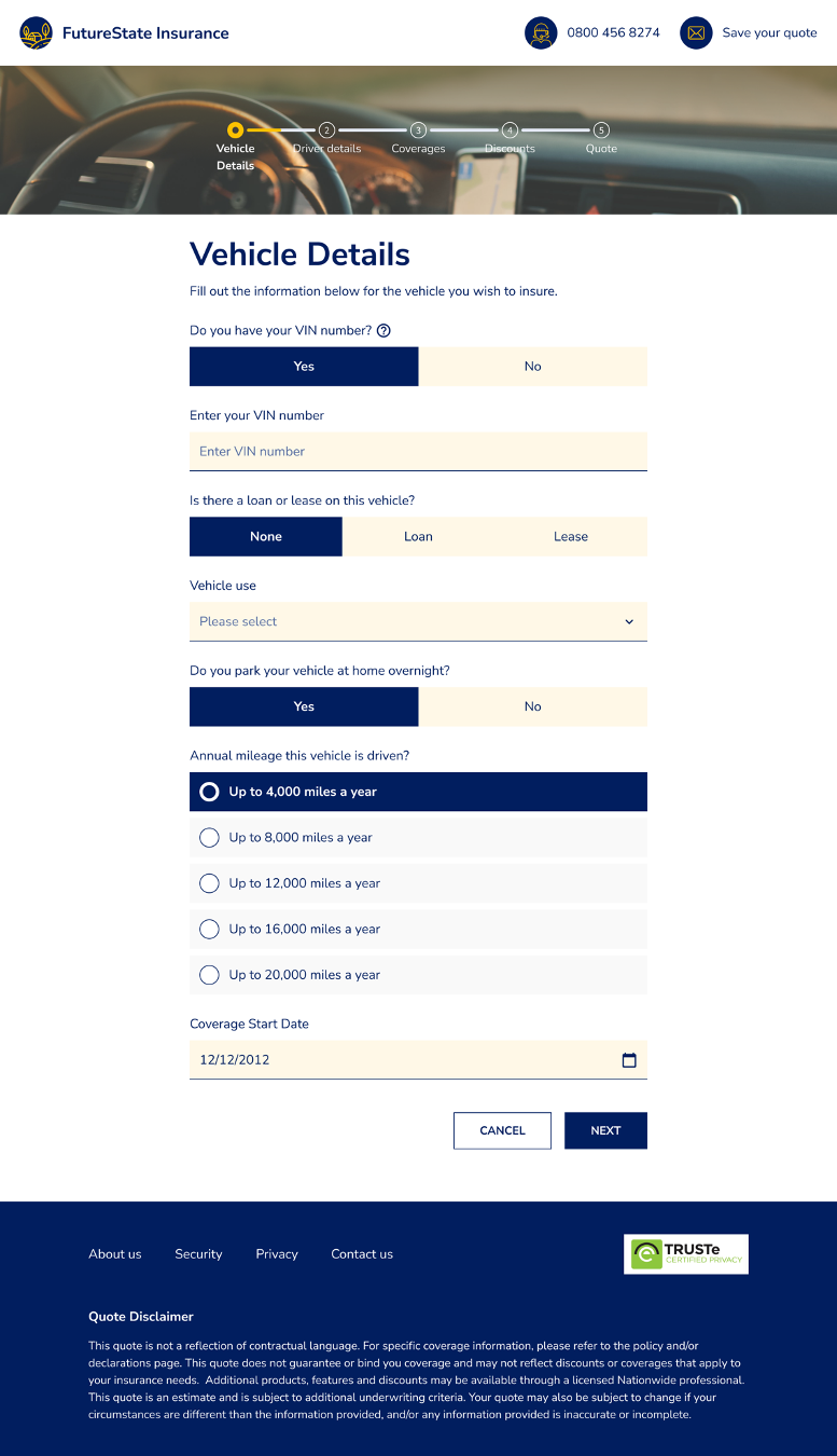
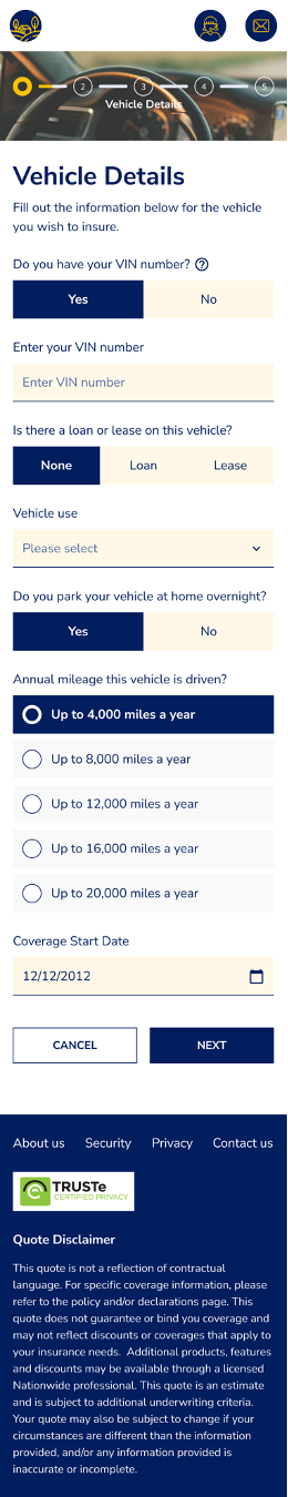
The following is an example of what the same application looks like across three different form factors.
We use our made-up company called “FutureState” for various workflows to see how to best optimize and test Jutro. This workflow is for usage-based insurance. You’ll see that all three form factors have the same information.
Workflow recommendations
- Select a floorplan based on the different screen sizes that will be used.
- Design on phone first, then design for larger screens. This is called “mobile-first” design.
- If you choose responsive components, place them in different form factors available in the Jutro Design System to see how they behave and how they look.
- Choose the different components that you need, describe how the user interacts with them.
- Consider different workflows on different devices. For example, a field that has a label to the left would become a field that has a label above it on mobile.
- Verify the feasibility of your design with development. Modify your design if needed until it meets the needs of the end users, is technically feasible, and cost-effective to develop.
- Review your design with the PM or product owner.