Shadows
Overview
Shadows provide visual depth to objects and enable users to identify important elements on the surface of pages. Shadows are important for communicating depth, direction of movement, and the edges of surfaces. They help users understand hierarchy and make your interface more intuitive.
Anatomy

1. Shadow container
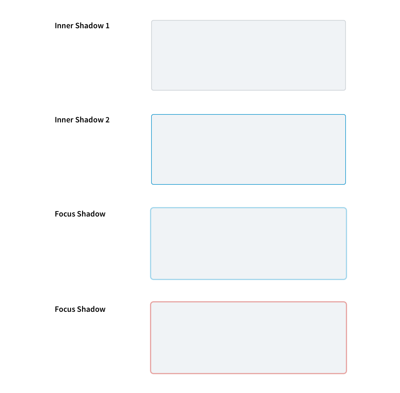
2. Inner shadow
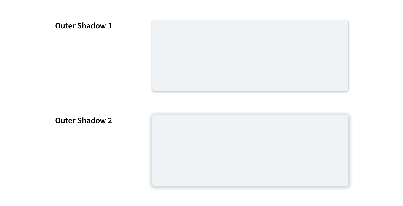
3. Outer shadow
Shadows sit behind various page shapes, which have a fill color (including white). They can be set as either outer or inner shadows.
Shadows consist of the following elements:
Shadow (contained)
- Shadow container: A container in the application.
- Inner shadow: Inner shadows are displayed inside a container.
- Outer shadow: Outer shadows are displayed on containers.
Best practices
- Use outer shadows to indicate interactive page elements, e.g., buttons.
- Use outer shadows to highlight important content elements for users' attention, e.g., object cards.
- Use inner shadows to indicate containers intended for users' input, e.g., a text field.
- Use shadows consistently throughout your design and ensure that the shadow values are also consistent.
- When elements are stacked on top of each other, use the same depth of the shadow.
- If an element is on the third layer with nothing below it, the shadow will need to be twice as deep and diffused.
- Shadows should contribute to the user experience in purposeful ways, such as drawing users' attention to important page items, e.g., a set of pricing options for a product subscription.
- When using outer and inner shadows combined, make sure pages don't look busy or confusing.