Iconography
Across all of Guidewire's enterprise and consumer applications, icons play a crucial role in providing context, information, actions, and feedback to the user.
While Jutro's icon library is comprehensive, we encourage utilizing icons only when it's necessary and enhances the overall user experience.
Design principles
System icons are designed to be simple, modern, friendly, and sometimes quirky. Each icon is reduced to its minimal form, expressing essential characteristics.
Icon shapes are bold and geometric. They have a symmetrical and consistent look, ensuring readability and clarity, even at small sizes.
Icons are within a 24x24-pixel bounding box and can be resized in increments of 4 pixels (e.g., 16px, 20px, 24px).
Dense layouts
On desktop, when the mouse and keyboard are the primary input methods, measurements may be scaled down to 20dp.
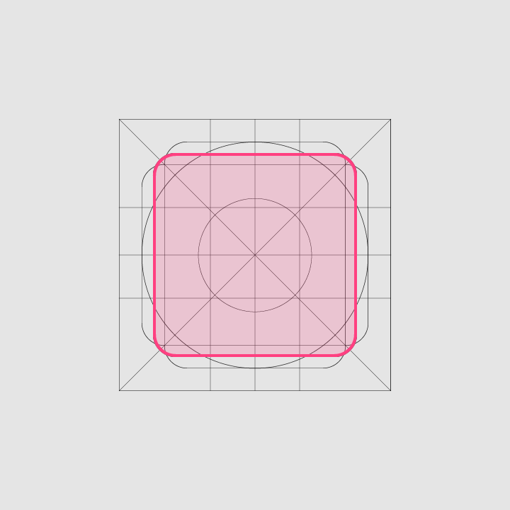
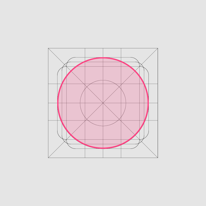
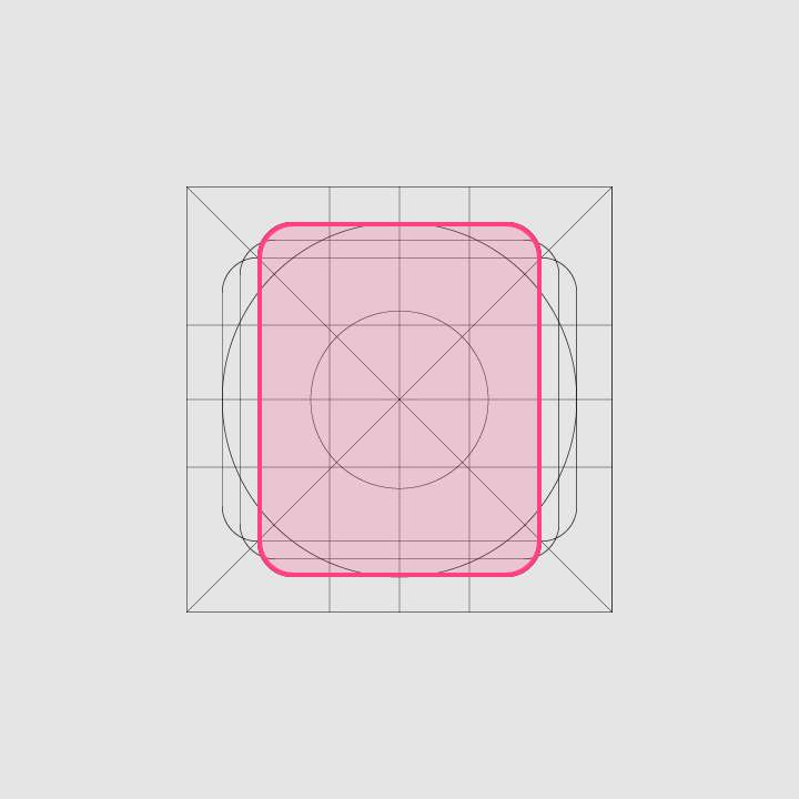
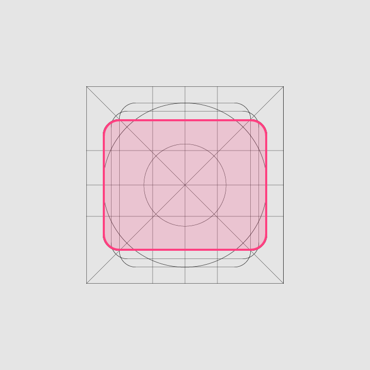
Keyline shapes
Keyline shapes are based on the grid. By using these core shapes as a baseline, you can maintain consistent visual proportions throughout your product icons.
Tooltips
When users hover over, focus on, or tap an icon, a tooltip will appear displaying informative text relating to the icon. Some icons appear without a label. In these cases, a tooltip provides the necessary information and context, eliminating any guesswork on the part of the user.


Insurance industry icons
P&C icons
Guidewire's P&C icons are unique and crucial in giving the user context and guidance as they navigate through the nuances P&C insurance while performing complex tasks. Also, these icons are crucial visual indicators in high data density user interfaces.
Here are some examples:


