Jutro app anatomy
This page provides an overview of the constituent elements that make up an application's user interface.
To see what a Jutro app looks like when fully assembled, check out the Jutro gallery.
Web application
Web applications refer to applications that are built on the Guidewire Cloud Platform using the Jutro Design System, and are aligned with Guidewire's recommended app anatomy. Web applications can be designed/run as standalone applications, or embedded as micro frontends in other applications. All applications can be constructed using metadata and/or JSX.
The anatomy of an application consists of:
- Floorplans
- Patterns
- Components

Floorplans and layouts
Floorplans provide the overall structure for your app and can be set globally or per page. When selecting a floorplan, you can also change the page layout.
Floorplans are comprised of:
- A header and footer
- A navigation panel
- A content area
You can find more information about floorplans here.

Patterns
Patterns are repeatable UI patterns, made up of Jutro components, that are frequently used in the property and casualty insurance industry.
Patterns can be generic, like an account update screen, or they can be tied to a LOB or a specific job-to-be-done like adding a vehicle or making a payment. You can find examples of Jutro patterns here.
Patterns attributes:
- Responsive, but with specific min/max values
- No floorplan layout
- Component metadata
- No grid system, default is flex
- Can be extended
Components
Components are the basic building blocks of the Jutro Design System. Each component is designed and implemented to address a specific interaction or UI need. You can assemble components like Lego blocks to create patterns and intuitive user experiences.
Component attributes include:
- Responsive, but with specific min/max values
- Can be built with JSX
- Can have predefined props
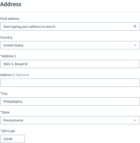
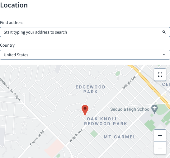
Buttons, notifications, and input text fields are all examples of components.

You will also encounter some larger components that combine multiple interface elements. The global header, for instance, consists of individual components like the avatar, notifications, and lookup.
