Floating button
This experimental component might not yet be fully accessible, fully documented, or fully covered by design tokens, and its API and behavior might change more frequently than stable components.
For more information, see Introduction to experimental components and properties.
September 2026 update: These experimental components will be discontinued starting in Jutro 10.16. We appreciate feedback from early adopters, and we encourage you to consider this notice when planning any long-term adoption of these components.
Usage
Overview
A floating button is an icon-only button that remains fixed on screen and provides a persistent, always-available point of interaction. You can use the aiMode property to configure it as the entry point for GenAI-powered experiences.
When to use
- As a persistent, always-available entry point across pages.
- As the primary trigger to open a dedicated AI interface.
When not to use
- Don't use the floating button to perform a specific action in context. Use a button for task-level actions inside cards, panels, or other components instead.
Formatting
Anatomy
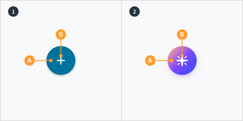
Floating buttons consist of the following elements:
- Basic floating button displays a container (A) around an icon (B).
- AI variant floating button displays a container (A) around an icon (B).
AI variant
The AI variant of the floating button uses the aiMode property to apply a gradient purple visual treatment, visually distinguishing it from the basic floating button and signaling that it launches a GenAI-powered feature. Use it as the primary, persistent trigger for opening a dedicated AI interface.
Accessibility
The floating button component is an icon-only button used to trigger a persistent action or toggle the visibility of a panel or interface.
This component is designed to meet WCAG 2.1 AA accessibility guidelines. Non-textual content that needs to convey meaning (the icon) and the keyboard focus indicator have a contrast ratio of at least 3:1 with their adjacent colors.
However, changes made by the content author or the specific implementation context can affect accessibility conformance.
Follow the guidance below and refer to the WAI-ARIA Authoring Practices Guide when using this component in your applications:
- Labels: Provide a descriptive label using the
labelprop, which the component renders as anaria-label. This ensures screen readers identify the button correctly immediately upon focus. - Zoom and layout: Ensure the floating button does not obscure essential content, interactive elements, or scrollbars, especially when the page is zoomed to 400%.