Data table
This experimental component might not yet be fully accessible, fully documented, or fully covered by design tokens, and its API and behavior might change more frequently than stable components.
For more information, see Introduction to experimental components and properties.
September 2026 update: These experimental components will be discontinued starting in Jutro 10.16. We appreciate feedback from early adopters, and we encourage you to consider this notice when planning any long-term adoption of these components.
Usage
Overview
The data table is a pre-composed experience that packages the most common table patterns into a single component. While the stable table is a composable system for designing custom layouts from low-level building blocks, the data table is designed for configuring a standardized experience with common patterns already built-in.
The component enables designers and developers to quickly implement complex data views, including pagination, sorting, search, and filtering, by configuring properties rather than building the table structure from scratch.
| Feature | Table (stable) | Data table (experimental) |
|---|---|---|
| Approach | Composable: Design custom layouts using low-level building blocks. | Pre-composed: Configure a standardized experience with built-in patterns. |
| Configuration | Manual: You must manually wire behaviors like filtering or search. | Built-in: Common behaviors are pre-wired and managed using component props. |
| Best for | Custom layouts or unique data behaviors. | Standardized data manipulation using proven Jutro patterns. |
When to use
- Use the data table for complex datasets that require comparing information or sorting data.
- Use it when you want standard features, like pagination, search, and filtering, available in the base configuration.
When not to use
Don't use the data table if you need a custom layout or unique data behaviors that deviate from the base configuration. Use the stable table component instead.
Formatting
Anatomy
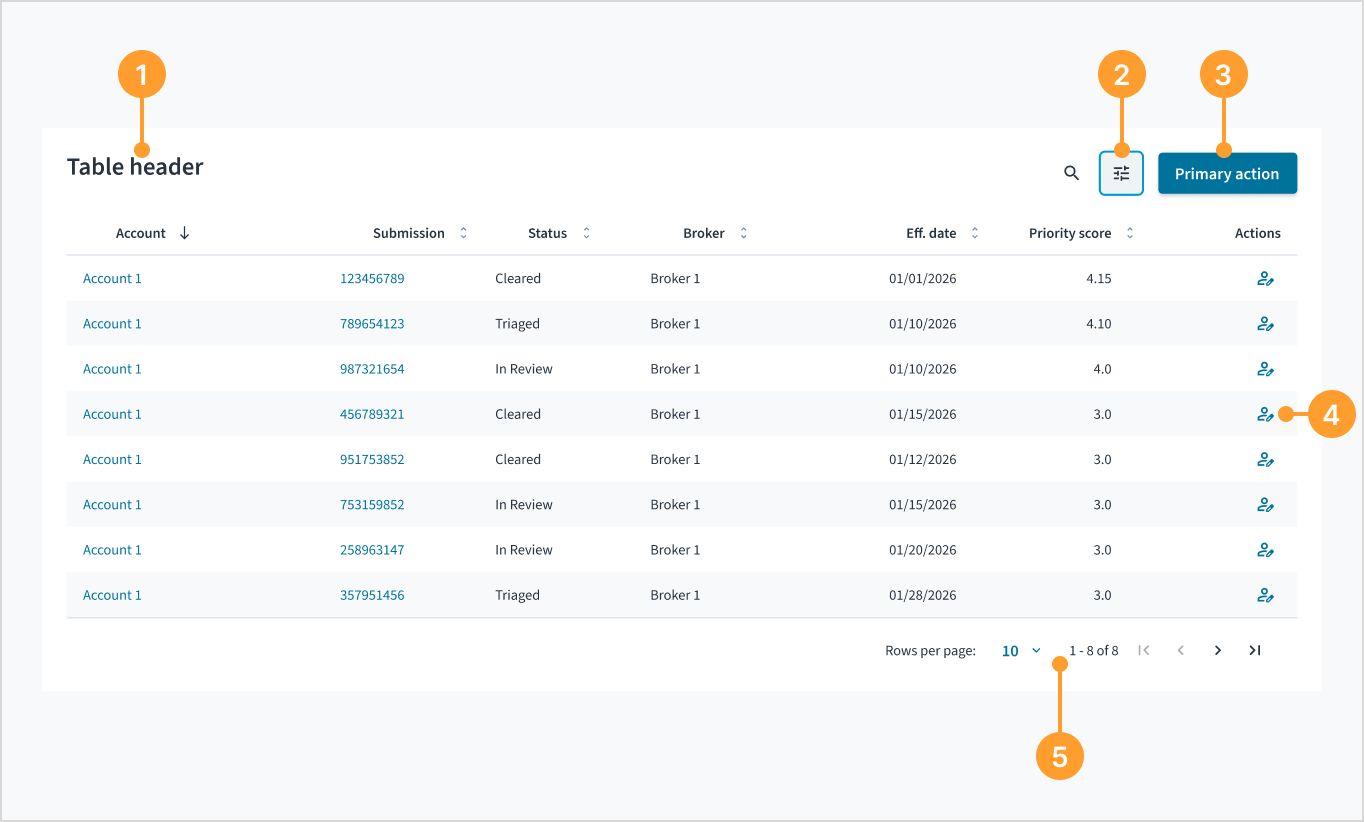
The data table component consists of the following elements:
- Title: A heading that describes the table content.
- Table controls: Interactive elements for manipulating data, such as search and filters.
- Table actions: Buttons that perform operations on the table's dataset, such as adding a record or exporting data.
- Row actions: A set of actions in the final column for managing an individual row.
- Pagination: Controls for navigating through pages of data and adjusting the number of rows displayed per page.
Header and actions
The table header contains the title and global actions for the dataset. When configuring these actions, especially those involving AI, follow these hierarchy and placement rules:
Button hierarchy
- Maintain a single primary action: Never place two primary buttons next to each other. Only one button in the header or row uses the primary styling.
- Prioritize standard actions: In most cases, a standard action is the main task a user needs to perform. Assign the primary style to the standard action and use the secondary style for AI-driven actions.
- Use visual separators: When standard and AI actions coexist, consider using a visual separator to distinguish between the two types of intent.
AI action guidelines
- Order of operations: Place standard actions before AI actions to reflect a logical workflow where manual tasks are the priority.
- Avoid redundant AI iconography: Don't use AI-specific icons for standard functions. For example, use the standard edit icon for a normal edit button rather than an AI-themed variation.
- Contextual relevance: Only use AI actions when they provide unique value, such as summarizing data, rather than for simple CRUD (Create, Read, Update, Delete) tasks.
Content
General writing guidelines
- Use sentence case for all aspects of designing Guidewire product interfaces. Don't use title case.
- Use present tense verbs and active voice in most situations.
- Use common contractions to lend your copy a more natural and informal tone.
- Use plain language. Avoid unnecessary jargon and complex language.
- Keep words and sentences short.
Table-specific guidelines
The data table follows the same content principles as the standard table component. For more details on writing column headers, formatting numbers, and empty states, see the table component documentation.
Text wrapping and trunctation
The data table automatically manages cell content based on the following base configuration:
- Text wrapping: Content wraps up to 2 lines within a cell.
- Truncation: Text that exceeds 2 lines is truncated with an ellipsis (...), and the full text is displayed in a tooltip on hover.
- Titles and subtitles: Table titles and subtitles also wrap up to 2 lines before truncating.
Accessibility
The data table is designed to meet WCAG 2.1 AA accessibility guidelines. The contrast ratio of textual elements against their background is above 4.5:1. Non-textual content that conveys meaning and keyboard focus indicators have a contrast ratio of at least 3:1 with their adjacent colors.
When using this component, ensure you follow these guidelines:
- Provide a descriptive title: Always include a title that describes the table's purpose to help users with screen readers understand the context before navigating the data.
- Use accessible names for actions: For icon-only buttons in the header or row actions, provide a descriptive
aria-label(for example,aria-label="Delete row"). - Write helpful empty states: When no data is available, provide a clear message that explains why the table is empty and what the user can do next.
Code
<DataTable
  columns={[
    {
      id: 'product',
      header: 'Product',
      type: 'text',
      path: 'product',
    },
    {
      id: 'insured',
      header: 'Insured',
      type: 'text',
      path: 'insured',
    },
    {
      id: 'premium',
      header: 'Premium',
      type: 'currency',
      currencyDisplay: 'code',
      path: 'premium',
    },
  ]}
  data={[
    {
      id: '73065',
      product: 'Go Commercial Auto',
      insured: 'Marshall Rogahn',
      premium: 1236.39,
    },
    {
      id: '80077',
      product: "Go Worker's Compensation",
      insured: 'April Kub',
      premium: 173.99,
    },
    {
      id: '64487',
      product: 'USA Personal Auto',
      insured: 'Abel Rippin',
      premium: 1228.69,
    },
    {
      id: '12345',
      product: 'Go Commercial Auto',
      insured: 'John Smith',
      premium: 892.45,
    },
  ]}
/>
Import statement
import { DataTable } from '@jutro/components';
Component contract
Make sure to understand the Design System components API surface, and the implications and trade-offs. Learn more in our introduction to the component API.
Properties
columnsrequired- Type
DataTableColumn<TRow>[]Shared properties
- Type
DataTableColumnCommonProps<TRow> & DataTableColumnWithHeader & DataTableColumnWithAccessors<TRow, TResult>idrequired- Type
stringDescriptionUnique identifier for the column.
typerequired- Type
'text' | 'number' | 'infoLabel' | 'datetime' | 'currency' | 'link' | 'actions'DescriptionThe type of column that determines how data is rendered. Each type has its own set of specific properties.
accessorFn- Type
(args: { row: TRow }) => TResultDescriptionFunction to extract data from each row object. Cannot be used in parallel with
pathorrenderCellproperties. align- Type
'left' | 'center' | 'right'DescriptionDetermines the text alignment for the column content.
getCellClassName- Type
(args: { row: TRow }) => stringDescriptionFunction to determine CSS class name for each cell in the column.
header- TypeDescription
The header text for the column. Cannot be used in parallel with
renderHeaderproperty. headerClassName- Type
stringDescriptionCSS class name to apply to the column header.
maxLines- Type
numberDescriptionDefines the maximum number of lines to display in a cell. Content exceeding this limit is truncated.
maxWidth- Type
numberDescriptionDefines the maximum width of the column in pixels. This property does not apply to the last column, which automatically expands to fill the remaining available space in the data table.
minWidth- Type
numberDescriptionDefines the minimum width of the column in pixels.
path- Type
stringDescriptionPath to the data property in each row object. Cannot be used in parallel with
accessorFnorrenderCellproperties. pin- Type
'left' | 'right' | undefinedDescriptionPins the column to the edge of the table. To maintain proper keyboard navigation, this can only be applied to the outermost columns.
renderCell- Type
(args: { row: TRow }) => ReactElementDescriptionCustom function to render cell content. Cannot be used in parallel with
pathoraccessorFnproperties. renderHeader- Type
() => ReactNodeDescriptionCustom function to render the column header. Cannot be used in parallel with
headerproperty. sortable- Type
booleanDescriptionDetermines whether the column can be sorted by clicking the header.
DescriptionProperties available for all column types.
Text column
- Type
DataTableTextColumn<TRow>getIcon- Type
(args: { row: TRow }) => { icon?: ReactElement, iconPosition?: "left" | "right" }DescriptionFunction to determine icon display for each cell.
DescriptionProperties available for columns with
typeproperty set totext. Number column
- TypeDescription
Properties available for columns with
typeproperty set tonumber. Info label column
- Type
DataTableInfoLabelColumn<TRow>getInfoLabelrequired- Type
(args: { row: TRow }) => { type: "success" | "error" | "warning" | "info" | "neutral", icon?: ReactElement, iconPosition?: "left" | "right" }DescriptionFunction to determine info label styling for each cell.
DescriptionProperties available for columns with
typeproperty set toinfoLabel. Date and time column
- Type
DataTableDatetimeColumn<TRow>dateFormat- Type
DateFormatsDescriptionControls the date display format. Available options are
'short'(for example, 1/15/2023),'medium'(for example, Jan 15, 2023),'long'(for example, January 15, 2023), and'full'(for example, Sunday, January 15, 2023). showTime- Type
booleanDescriptionWhether to display time along with the date.
timeZoneName- Type
'short' | 'long' | undefinedDescriptionControls how the timezone is displayed when timezone information is provided in the data. Use
'short'for abbreviated names (for example, EST),'long'for full names (for example, Eastern Standard Time), or leave undefined to hide timezone information.
DescriptionProperties available for columns with
typeproperty set todatetime. Currency column
- TypeDescription
Properties available for columns with
typeproperty set tocurrency. Link column
- Type
DataTableLinkColumn<TRow>getLinkrequired- Type
(args: { row: TRow }) => { onClick: () => void }DescriptionFunction to determine link behavior for each cell.
DescriptionProperties available for columns with
typeproperty set tolink. Actions column
- Type
DataTableActionColumn<TRow>actionsrequired- Type
(args: { row: TRow }) => DataTableActionsTypeDescriptionFunction to determine action buttons for each row.
DescriptionProperties available for columns with
typeproperty set toactions. There are 4 shared properties that you cannot use for this column type:sortable,align,pathandaccessorFn.
DescriptionArray of column definitions that specify how data is displayed in the table. Each column can be one of several types: text, number, infoLabel, datetime, currency, link, or actions.
title- Type
IntlMessageShapeDescriptionDefines the title of the data table shown in the table header.
subTitle- Type
IntlMessageShapeDescriptionDefines the subtitle of the data table shown in the table header.
headerActions- Type
DataTableActionsTypeaiMode- Type
booleanDescriptionIf set to
true, the action button displays a distinct visual style to indicate that it triggers a GenAI-powered process.
DescriptionAn array of action buttons displayed in the data table header. Each object inherits the full
Buttonproperty set. data- Type
TRow[]DescriptionArray of row data objects to display in the table. All row objects must have the same structure and properties, and each row must include an
idfield. initialState- Type
DataTableStateDescriptionInitial state for the table including pagination, sorting, search and filter values.
onStateChange- Type
(state: DataTableState) => voidDescriptionCallback function called when the table state changes (pagination, sorting, search, filters).
getSubRow- Type
(args: { row: TRow }) => ReactElement | nullDescriptionFunction to render sub-rows for each row in the table. Returns a ReactElement or null if the row has no sub-rows.
expandedRows- Type
string[]DescriptionArray of row IDs that are currently expanded. Use this property to control which rows display their sub-rows from the parent component. When users expand or collapse rows, the updated array is passed to the
onStateChangecallback. loading- Type
booleanDescriptionIf set to
true, displays a loading state instead of the table data. renderLoadingState- Type
() => ReactNodeDescriptionCustom function to render the loading state when loading prop is set to
true. emptyState- Type
TableEmptyStatePropsDescriptionConfiguration for the empty state displayed when there is no data.
renderEmptyState- Type
() => ReactNodeDescriptionCustom function to render the empty state when there is no data.
showSearch- Type
booleanDescriptionIf set to
true, displays a search input above the table. filters- Type
DataTableFilter[]Shared properties
- Type
DataTableFilterBaseidrequired- Type
stringDescriptionUnique identifier for the filter.
typerequired- Type
'text' | 'select' | 'multipleselect' | 'toggle' | 'range' | 'number' | 'month' | 'year' | 'time'DescriptionThe type of filter that determines how users can filter data. Each type has its own set of specific properties.
DescriptionProperties available for all filter types.
Select-based filters
- Type
DataTableSelectableFilteravailableValuesrequired- Type
Array<{ label: IntlMessageShape; id: string }>DescriptionArray of available options for the filter.
DescriptionProperties available for filters with
typeproperty set toselect,multipleselect, ortoggle. Text filter
- Type
DataTableFilterTextDescriptionProperties available for filters with
typeproperty set totext. Inherits all TextInput properties, excludingonChangeandvalue. Select filter
- Type
DataTableFilterSelectDescriptionProperties available for filters with
typeproperty set toselect. Inherits all properties from Select component exceptonChangeandvalue. Multiple select filter
- Type
DataTableFilterMultipleSelectDescriptionProperties available for filters with
typeproperty set tomultipleselect. Inherits all properties from MultipleSelect component exceptonChangeandvalue. Toggle filter
- Type
DataTableFilterToggleDescriptionProperties available for filters with
typeproperty set totoggle. Inherits all properties from ToggleButtonGroup component exceptonChangeandvalue. Range filter
- Type
DataTableFilterRangeDescriptionProperties available for filters with
typeproperty set torange. Inherits all properties from Slider component (range variant) exceptonChange,value, andrange. Number filter
- Type
DataTableFilterNumberDescriptionProperties available for filters with
typeproperty set tonumber. Inherits all properties from NumberInput component exceptonChangeandvalue. Month filter
- Type
DataTableFilterMonthDescriptionProperties available for filters with
typeproperty set tomonth. Inherits all properties from MonthPicker component exceptonChangeandvalue. Year filter
- Type
DataTableFilterYearDescriptionProperties available for filters with
typeproperty set toyear. Inherits all properties from YearPicker component exceptonChangeandvalue. Time filter
- Type
DataTableFilterTimeDescriptionProperties available for filters with
typeproperty set totime. Inherits all properties from TimePicker component exceptonChangeandvalue.
DescriptionArray of filter definitions that allow users to filter table data. Each filter can be one of several types:
text,select,multipleselect,toggle,range,number,month,year, ortime. initialFiltersExpanded- Type
booleanDescriptionIf set to true, the filters panel is expanded by default.
pagination- Type
{ pageIndex?: number, pageSize?: number, pageSizeOptions?: number[], totalRows?: number }pageIndex- Type
numberDescriptionCurrent page index (zero-based).
pageSize- Type
numberDescriptionNumber of rows to display per page.
pageSizeOptions- Type
number[]DescriptionArray of available page size options for the user to choose from.
totalRows- Type
numberDescriptionThe total number of rows across all pages. Required for proper pagination display when using server-side data.
DescriptionConfiguration for table pagination including page size options and total row count.
Hooks
No hooks are available for data table.
Translation keys
There are no translations for data table.
For information on how to manage translations, see our section about Internationalization.
Escape Hatches
For more information, see our documentation about escape hatches.
Examples
Check out the Usage section for details about how to design a data table properly, and the different configuration options we provide.
Basic example
To implement a basic data table, provide the columns and data props to the DataTable component. The path property in each column definition specifies the key in the data objects to display in that column, and each data object must contain a unique id property.
The type property in the column definition determines the set of possible properties for that column, such as currencyDisplay for currency type columns. See the Component contract section for more details on column types and their properties.
<DataTable
  columns={[
    {
      id: 'product',
      header: 'Product',
      type: 'text',
      path: 'product',
    },
    {
      id: 'insured',
      header: 'Insured',
      type: 'text',
      path: 'insured',
    },
    {
      id: 'premium',
      header: 'Premium',
      type: 'currency',
      currencyDisplay: 'code',
      path: 'premium',
    },
  ]}
  data={[
    {
      id: '73065',
      product: 'Go Commercial Auto',
      insured: 'Marshall Rogahn',
      premium: { amount: 1236.39, currency: 'USD' },
    },
    {
      id: '80077',
      product: "Go Worker's Compensation",
      insured: 'April Kub',
      premium: { amount: 173.99, currency: 'USD' },
    },
    {
      id: '64487',
      product: 'USA Personal Auto',
      insured: 'Abel Rippin',
      premium: { amount: 1228.69, currency: 'USD' },
    },
    {
      id: '12345',
      product: 'Go Commercial Auto',
      insured: 'John Smith',
      premium: { amount: 892.45, currency: 'USD' },
    },
  ]}
/>
Columns
The data table supports different column types through the columns property, which defines how data is displayed and formatted in each column. Each column definition requires an id, and type property, defined header (using the header property or renderHeader function), along with a way to access the data from your row objects.
You can access data from your row objects in three different ways:
path- A string that specifies the property path in the data object. Use this for direct property access when the data structure matches your display needs.accessorFn- A function that receives the row object and returns the value to display. Use this for computing or transforming data before display, such as combining multiple fields or performing calculations. See the example.renderCell- A function that receives the row object and returns a React element. Use this for complete custom rendering when the built-in column types don't meet your needs. See the example.
The data table supports the following column types:
text- Displays text content with optional icons.number- Shows numeric values with formatting options like decimal places and grouping.infoLabel- Renders status badges with icons for different states.datetime- Formats and displays date and time values.currency- Shows monetary values with proper currency formatting.link- Creates clickable links that trigger custom actions.actions- Provides action buttons for row-level operations.selection- Provides checkboxes for selecting rows.expansion- Provides expand/collapse icons for rows with sub-rows.
Each column type has specific properties that control its appearance and behavior. See the Component contract section for detailed information about each column type and their available properties.
import { DataTable } from '@jutro/components';
import {
  CheckCircleIcon,
  ErrorIcon,
  WarningIcon,
  EditIcon,
} from '@jutro/icons';
import React from 'react';

const sampleData = [
  {
    id: '1',
    insured: 'Marshall Rogahn',
    policyNumber: 3,
    status: 'Active',
    effectiveDate: '2023-01-15T10:30:00Z',
    premium: { amount: 126.39, currency: 'USD' },
    email: 'mrogahn@gw.com',
  },
  {
    id: '2',
    insured: 'April Kub',
    policyNumber: 1,
    status: 'Pending',
    effectiveDate: '2023-03-22T14:15:00Z',
    premium: { amount: 173.99, currency: 'USD' },
    email: 'akub@gw.com',
  },
  {
    id: '3',
    insured: 'Abel Rippin',
    policyNumber: 0,
    status: 'Inactive',
    effectiveDate: '2022-11-08T09:00:00Z',
    premium: { amount: 128.69, currency: 'USD' },
    email: 'arippin@gw.com',
  },
  {
    id: '4',
    insured: 'John Smith',
    policyNumber: 0,
    status: 'Inactive',
    effectiveDate: '2023-05-10T11:45:00Z',
    premium: { amount: 892.45, currency: 'USD' },
    email: 'jsmith@gw.com',
  },
];

export function DataTableColumns() {
  const handleEmailClick = (email: string) => {
    console.log(`Opening email client for: ${email}`);
  };

  const handleEditClick = (id: string) => {
    console.log(`Edit clicked for ID: ${id}`);
  };

  return (
    <DataTable
      title="Policy list"
      columns={[
        {
          id: 'insured',
          header: 'Insured',
          type: 'text',
          path: 'insured',
        },
        {
          id: 'policyNumber',
          header: 'Claims',
          type: 'number',
          path: 'policyNumber',
          align: 'right',
        },
        {
          id: 'status',
          header: 'Status',
          type: 'infoLabel',
          path: 'status',
          getInfoLabel: ({ row }) => {
            const status = row.status;
            switch (status) {
              case 'Active':
                return { type: 'success', icon: <CheckCircleIcon /> };
              case 'Pending':
                return { type: 'warning', icon: <WarningIcon /> };
              case 'Inactive':
                return { type: 'error', icon: <ErrorIcon /> };
            }
          },
        },
        {
          id: 'effectiveDate',
          header: 'Effective date',
          type: 'datetime',
          path: 'effectiveDate',
          dateFormat: 'short',
          showTime: false,
        },
        {
          id: 'premium',
          header: 'Premium',
          type: 'currency',
          path: 'premium',
          currencyDisplay: 'symbol',
          align: 'right',
        },
        {
          id: 'email',
          header: 'Contact',
          type: 'link',
          path: 'email',
          getLink: ({ row }) => ({
            onClick: () => handleEmailClick(row.email),
          }),
        },
        {
          id: 'actions',
          header: 'Actions',
          type: 'actions',
          actions: ({ row }) => [
            {
              icon: <EditIcon />,
              onClick: () => handleEditClick(row.id),
              label: 'Edit',
              hideLabel: true,
            },
          ],
        },
      ]}
      data={sampleData}
    />
  );
}
Defining headers
Each column requires a defined header to display in the column's header cell. You can define headers in two ways:
header- Use this for simple text headers or when you need consistent styling applied by the data table component. You provide a text string that is displayed as the column header.renderHeader- Use this when you need custom header rendering with complex JSX elements, conditional rendering, or styling that goes beyond the standard header appearance. TherenderHeaderfunction returns a React element.
Use the header property for most cases, as it provides a consistent styling with the rest of the data table component. Reserve renderHeader for special cases where you need full control over the header's appearance and behavior.
import { DataTable } from '@jutro/components';
import { InfoIcon } from '@jutro/icons';
import { Tooltip, Typography } from '@jutro/components';
import React from 'react';

export function DataTableHeaders() {
  return (
    <DataTable
      columns={[
        {
          id: 'product',
          header: 'Product',
          type: 'text',
          path: 'product',
        },
        {
          id: 'insured',
          renderHeader: () => (
            <div style={{ display: 'flex', alignItems: 'center', gap: '8px' }}>
              <Typography
                variant="heading-5"
                tag="span">
                Insured
              </Typography>
              <Tooltip content="The person or entity covered by this policy">
                <InfoIcon size="small" />
              </Tooltip>
            </div>
          ),
          type: 'text',
          path: 'insured',
        },
        {
          id: 'premium',
          header: 'Premium',
          type: 'currency',
          currencyDisplay: 'symbol',
          path: 'premium',
        },
      ]}
      data={[
        {
          id: '73065',
          product: 'Go Commercial Auto',
          insured: 'Marshall Rogahn',
          premium: { amount: 1236.39, currency: 'USD' },
        },
        {
          id: '80077',
          product: "Go Worker's Compensation",
          insured: 'April Kub',
          premium: { amount: 173.99, currency: 'USD' },
        },
        {
          id: '64487',
          product: 'USA Personal Auto',
          insured: 'Abel Rippin',
          premium: { amount: 1228.69, currency: 'USD' },
        },
      ]}
    />
  );
}
Date and time formatting
The date and time column supports two data formats for handling timezone information. The timeZoneName property controls how the timezone is displayed: 'short' shows abbreviated timezone names (for example, EST), 'long' shows full names (for example, Eastern Standard Time), and undefined hides timezone information even when provided in the data.
Simple string
Pass a simple date string value. The date and time is interpreted as UTC and displayed without timezone information.
{
    id: 'effectiveDate',
    header: 'Effective date',
    type: 'datetime',
    path: 'effectiveDate',
    dateFormat: 'short',
    showTime: true
}

// Data format:
{ id: '1', effectiveDate: '2023-01-15T10:30:00Z' }
// Output: 1/15/2023, 10:30 AM
Object with timezone
Pass an object containing both a date value and timezone information. The timezone is extracted and displayed alongside the formatted date and time.
{
    id: 'eventTime',
    header: 'Event time',
    type: 'datetime',
    path: 'eventTime',
    dateFormat: 'short',
    showTime: true,
    timeZoneName: 'short'
}

// Data format:
{ id: '1', eventTime: { value: '2023-01-15T10:30:00Z', timezone: 'America/New_York' } }
// Output: 1/15/2023, 10:30 AM EST
Accessor function
When you need to transform or compute data values before they are displayed using the column's built-in formatting, use the accessorFn property. The accessorFn function receives the row object and returns a value that matches the column type, allowing the column type's formatting rules to be applied to the transformed data.
Use accessorFn when you need to:
- Transform or normalize data values before display (for example, uppercase text, trim whitespace).
- Compute new values from row data (for example, sum multiple fields, calculate percentages).
- Extract nested data from complex row objects.
- Apply simple calculations without creating custom React elements.
- Reuse column type formatting while modifying the input value.
import { DataTable } from '@jutro/components';
import React from 'react';

export function DataTableAccessorFn() {
  return (
    <DataTable
      columns={[
        {
          id: 'product',
          header: 'Product',
          type: 'text',
          path: 'product',
        },
        {
          id: 'insured',
          header: 'Insured',
          type: 'text',
          // accessorFn transforms the data value before the column type's formatting is applied
          // In this case, we uppercase the insured name
          accessorFn: ({ row }) => {
            const insured = row.insured as string;
            return insured.toUpperCase();
          },
        },
        {
          id: 'premium',
          header: 'Premium',
          type: 'currency',
          currencyDisplay: 'symbol',
          // accessorFn computes a new value and returns it in a format matching the column type
          // The currency column then applies its built-in formatting to the computed value
          // Here we apply a 10% discount to the premium amount
          accessorFn: ({ row }) => {
            const premium = row.premium as { amount: number; currency: string };
            return {
              amount: premium.amount * 0.9,
              currency: premium.currency,
            };
          },
        },
      ]}
      data={[
        {
          id: '73065',
          product: 'Go Commercial Auto',
          insured: 'Marshall Rogahn',
          premium: { amount: 1236.39, currency: 'USD' },
        },
        {
          id: '80077',
          product: "Go Worker's Compensation",
          insured: 'April Kub',
          premium: { amount: 173.99, currency: 'USD' },
        },
        {
          id: '64487',
          product: 'USA Personal Auto',
          insured: 'Abel Rippin',
          premium: { amount: 1228.69, currency: 'USD' },
        },
        {
          id: '12345',
          product: 'Go Commercial Auto',
          insured: 'John Smith',
          premium: { amount: 892.45, currency: 'USD' },
        },
      ]}
    />
  );
}
Render cells
When you need custom rendering logic for cells that goes beyond the built-in column types, you can use the renderCell function in your column definition. The renderCell function receives the row object and returns a React element, allowing you to implement completely custom cell content.
Use renderCell when you need to:
- Create complex JSX elements with custom styling or nested components.
- Apply conditional rendering that displays different content based on row properties.
- Implement custom formatting that doesn't match any built-in column type.
For simple transformations or calculations that don't require custom JSX, consider using accessorFn instead, which lets the column type apply its formatting to the transformed value.
import { DataTable } from '@jutro/components';
import React from 'react';

export function DataTableRenderCell() {
  return (
    <DataTable
      columns={[
        {
          id: 'product',
          header: 'Product',
          type: 'text',
          renderCell: ({ row }) => <>{row.product as string}</>,
        },
        {
          id: 'insured',
          header: 'Insured',
          type: 'text',
          // renderCell receives the row object and returns a React element instead of relying on column type formatting
          renderCell: ({ row }) => <>{row.insured as string}</>,
        },
        {
          id: 'premium',
          header: 'Premium',
          type: 'currency',
          currencyDisplay: 'symbol',
          // In this example, a custom JSX with specific decimal places and currency display is created
          renderCell: ({ row }) => {
            const premium = row.premium as { amount: number; currency: string };
            return (
              <>
                ${premium.amount.toFixed(1)} {premium.currency}
              </>
            );
          },
        },
      ]}
      data={[
        {
          id: '73065',
          product: 'Go Commercial Auto',
          insured: 'Marshall Rogahn',
          premium: { amount: 1236.39, currency: 'USD' },
        },
        {
          id: '80077',
          product: "Go Worker's Compensation",
          insured: 'April Kub',
          premium: { amount: 173.99, currency: 'USD' },
        },
        {
          id: '64487',
          product: 'USA Personal Auto',
          insured: 'Abel Rippin',
          premium: { amount: 1228.69, currency: 'USD' },
        },
        {
          id: '12345',
          product: 'Go Commercial Auto',
          insured: 'John Smith',
          premium: { amount: 892.45, currency: 'USD' },
        },
      ]}
    />
  );
}
Filters
The data table supports filtering through a filter panel UI by providing the filters property to the DataTable component. The filters property is an array of filter definitions that specify the available filter options and criteria.
If any filter is passed through the filters property, the header includes an icon button that expands or collapses the filtering panel, with a tooltip that indicates the result of clicking the button. The filter panel provides UI controls for users to select filter values. To expand the filtering panel at first render, set the initialFiltersExpanded property to true.
The filter icon displays a badge indicating the count of active filters when filtering is applied.
The filtering panel includes the filters defined in the filters property and Apply and Clear buttons, which behave as follows:
- Apply button is enabled when a filter value changes. When clicked, it triggers the
onStateChangecallback with the selected filter values. - Clear button is enabled when any filter is applied. When clicked, it clears all filter values and triggers the
onStateChangecallback with an empty filters state.
You can use the following types of filters:
text- A text input filter for string-based filteringselect- A single-select dropdown filtermultipleselect- A multi-select dropdown filtertoggle- A toggle button group filterrange- A range slider filter for numeric rangesnumber- A number input filtermonth- A month picker filteryear- A year picker filtertime- A time picker filter
Some of the filter types require additional properties. See the Component contract section for more details on filter types and their properties.
The data table is designed to work with server-side filtering, where the UI state is managed by the component and your application handles the filtering implementation. When users interact with filters, the onStateChange callback receives the selected filter values. Your application is responsible for using these filter values to fetch the appropriate filtered data (typically through a server API) and pass it back to the component via the data prop.
import { DataTable } from '@jutro/components';
import React, { useState, useEffect } from 'react';

import {
  DataTableFiltersMockAPI,
  stateToQueryParams,
} from './DataTableFiltersMockAPI';

const productOptions = [
  { id: 'Go Commercial Auto', label: 'Go Commercial Auto' },
  { id: "Go Worker's Compensation", label: "Go Worker's Compensation" },
  { id: 'USA Personal Auto', label: 'USA Personal Auto' },
];
export function DataTableFilters() {
  const mockAPI = new DataTableFiltersMockAPI();

  // Initialize with empty filters
  const [criteria, setCriteria] = useState<string>(stateToQueryParams({}));
  const [data, setData] = useState(null);
  const [loading, setLoading] = useState(false);

  // Fetch data whenever filter criteria changes
  useEffect(() => {
    setLoading(true);
    mockAPI
      .fetchData(criteria)
      .then(setData)
      .finally(() => setLoading(false));
  }, [criteria]);

  // Extract filtered results from API response
  const { entries = [] } = data || {};
  return (
    <DataTable
      title="Policy list"
      subTitle="Detailed record of individual policies"
      columns={[
        {
          id: 'product',
          header: 'Product',
          type: 'text',
          path: 'product',
        },
        {
          id: 'insured',
          header: 'Insured',
          type: 'text',
          path: 'insured',
        },
        {
          id: 'premium',
          header: 'Premium',
          type: 'currency',
          currencyDisplay: 'symbol',
          path: 'premium',
        },
      ]}
      data={entries}
      loading={loading}
      // onStateChange runs when user applies filters
      // Filter values are converted to query parameters for API filtering
      onStateChange={(state) => setCriteria(stateToQueryParams(state))}
      // Expand filter panel on initial render
      initialFiltersExpanded={true}
      // Define available filters for users to apply
      filters={[
        {
          type: 'text',
          id: 'insured',
          label: 'Insured',
        },
        {
          type: 'select',
          id: 'product',
          label: 'Product',
          availableValues: productOptions,
        },
        {
          type: 'range',
          id: 'premium',
          label: 'Premium',
          min: 25,
          max: 1500,
          step: 25,
        },
      ]}
    />
  );
}
/**
 * Mock API for DataTable filters example
 * Simulates server-side filtering without pagination
 */

import type { DataTableState } from '@jutro/components';

export interface TableMockData {
  id: string;
  product: string;
  insured: string;
  premium: {
    amount: number;
    currency: string;
  };
}

export interface FilterResult {
  entries: TableMockData[];
}

const sampleData: TableMockData[] = [
  {
    id: '73065',
    product: 'Go Commercial Auto',
    insured: 'Marshall Rogahn',
    premium: { amount: 1236.39, currency: 'USD' },
  },
  {
    id: '80077',
    product: "Go Worker's Compensation",
    insured: 'April Kub',
    premium: { amount: 173.99, currency: 'USD' },
  },
  {
    id: '64487',
    product: 'USA Personal Auto',
    insured: 'Abel Rippin',
    premium: { amount: 1228.69, currency: 'USD' },
  },
  {
    id: '12345',
    product: 'Go Commercial Auto',
    insured: 'John Smith',
    premium: { amount: 892.45, currency: 'USD' },
  },
  {
    id: '54321',
    product: 'USA Personal Auto',
    insured: 'Sarah Johnson',
    premium: { amount: 1150.75, currency: 'USD' },
  },
  {
    id: '98765',
    product: "Go Worker's Compensation",
    insured: 'Michael Brown',
    premium: { amount: 457.3, currency: 'USD' },
  },
  {
    id: '24680',
    product: 'Go Commercial Auto',
    insured: 'Emily Davis',
    premium: { amount: 1454.88, currency: 'USD' },
  },
  {
    id: '13579',
    product: 'USA Personal Auto',
    insured: 'Robert Wilson',
    premium: { amount: 945.2, currency: 'USD' },
  },
];

function parseQueryParams(
  queryString: string
): Record<string, string | number> {
  const params: Record<string, string | number> = {};
  const searchParams = new URLSearchParams(queryString);

  searchParams.forEach((value, key) => {
    params[key] = isNaN(Number(value)) ? value : Number(value);
  });

  return params;
}

export class DataTableFiltersMockAPI {
  /**
   * Simulate async API call with filtering
   * In a real application, this would be an actual HTTP request to a backend API
   */
  async fetchData(queryString: string): Promise<FilterResult> {
    // Simulate network delay
    await new Promise((resolve) => setTimeout(resolve, 300));

    const params = parseQueryParams(queryString);

    let filteredData = [...sampleData];

    // Apply text filter for insured name
    if (params['filters.insured']) {
      const searchTerm = (params['filters.insured'] as string).toLowerCase();
      filteredData = filteredData.filter((item) =>
        item.insured.toLowerCase().includes(searchTerm)
      );
    }

    // Apply select filter for product
    if (params['filters.product']) {
      filteredData = filteredData.filter(
        (item) => item.product === params['filters.product']
      );
    }

    // Apply range filter for premium
    if (params['filters.premium']) {
      const [min, max] = (params['filters.premium'] as string)
        .split(',')
        .map(Number);
      filteredData = filteredData.filter(
        (item) => item.premium.amount >= min && item.premium.amount <= max
      );
    }

    return {
      entries: filteredData,
    };
  }
}

/**
 * Converts DataTable state to URL query parameters string
 * Encodes filters into query string format
 */
export function stateToQueryParams(state: Partial<DataTableState>): string {
  const params = new URLSearchParams();

  if (state.filters && Object.keys(state.filters).length > 0) {
    Object.entries(state.filters).forEach(([key, value]) => {
      if (Array.isArray(value)) {
        // Handle range filter (array of [min, max])
        params.append(`filters.${key}`, value.join(','));
      } else if (value && typeof value === 'object' && 'id' in value) {
        // Handle select filter (object with id property)
        params.append(`filters.${key}`, value.id as string);
      } else if (value) {
        // Handle text filter and other simple values
        params.append(`filters.${key}`, String(value));
      }
    });
  }

  return params.toString();
}
Search
The data table supports searching functionality by setting the showSearch property to true. When enabled, the header includes a search icon button that, when clicked, expands into a search input field, allowing users to search through the table data.
The submitted search query is passed through the onStateChange event, which can be used to filter the table data based on the search input. The search query is available in the searchQuery property of the DataTableState object passed to the onStateChange callback.
The data table component is designed to work with server-side search implementations, where the search query is sent to an API that returns the filtered data. In this example, a mock API is used to simulate server-side searching. It is available for you to copy below the search example, but in your implementation, you would replace it with your actual API calls.
import { DataTable } from '@jutro/components';
import React, { useState, useEffect } from 'react';

import {
  DataTableSearchMockAPI,
  stateToQueryParams,
} from './DataTableSearchMockAPI';

export function DataTableSearch() {
  const mockAPI = new DataTableSearchMockAPI();

  const [criteria, setCriteria] = useState<string>(
    stateToQueryParams({
      pageIndex: 0,
      pageSize: 10,
    })
  );
  const [data, setData] = useState(null);
  const [loading, setLoading] = useState(false);

  // Fetch data whenever search query or pagination changes
  useEffect(() => {
    setLoading(true);
    mockAPI
      .fetchData(criteria)
      .then(setData)
      .finally(() => setLoading(false));
  }, [criteria]);

  // Extract search results and pagination state from API response
  const {
    entries = [],
    pageIndex = 0,
    pageSize = 10,
    totalRows = 0,
  } = data || {};

  return (
    <DataTable
      columns={[
        {
          id: 'product',
          header: 'Product',
          type: 'text',
          path: 'product',
        },
        {
          id: 'insured',
          header: 'Insured',
          type: 'text',
          path: 'insured',
        },
        {
          id: 'premium',
          header: 'Premium',
          type: 'currency',
          currencyDisplay: 'symbol',
          path: 'premium',
        },
      ]}
      data={entries}
      loading={loading}
      // onStateChange runs when user searches or interacts with pagination
      // Both search query and pagination state are converted to query parameters
      onStateChange={(state) => setCriteria(stateToQueryParams(state))}
      // Enable search functionality in the table header
      showSearch
      pagination={{
        pageIndex,
        pageSize,
        totalRows,
        pageSizeOptions: [5, 10, 20],
      }}
    />
  );
}
/**
 * Mock API for simulating async data fetching with search capability
 * This simulates communication with an external database
 */

import type { DataTableState } from '@jutro/components';

export interface TableMockData {
  id: string;
  product: string;
  insured: string;
  premium: {
    amount: number;
    currency: string;
  };
}

export interface SearchResult {
  entries: Array<{
    id: string;
    product: string;
    insured: string;
    premium: {
      amount: number;
      currency: string;
    };
  }>;
  pageIndex: number;
  pageSize: number;
  totalRows: number;
}

// Sample data that would normally come from a database
const sampleData = [
  {
    id: '73065',
    product: 'Go Commercial Auto',
    insured: 'Marshall Rogahn',
    premium: { amount: 1236.39, currency: 'USD' },
  },
  {
    id: '80077',
    product: "Go Worker's Compensation",
    insured: 'April Kub',
    premium: { amount: 173.99, currency: 'USD' },
  },
  {
    id: '64487',
    product: 'USA Personal Auto',
    insured: 'Abel Rippin',
    premium: { amount: 1228.69, currency: 'USD' },
  },
  {
    id: '12345',
    product: 'Go Commercial Auto',
    insured: 'John Smith',
    premium: { amount: 892.45, currency: 'USD' },
  },
  {
    id: '54321',
    product: 'Go Commercial Auto',
    insured: 'Jane Doe',
    premium: { amount: 654.32, currency: 'USD' },
  },
  {
    id: '99999',
    product: 'USA Personal Auto',
    insured: 'Robert Johnson',
    premium: { amount: 456.78, currency: 'USD' },
  },
];

/**
 * Parses query string parameters into an object
 */
function parseQueryParams(
  queryString: string
): Record<string, string | number> {
  const params: Record<string, string | number> = {};
  const searchParams = new URLSearchParams(queryString);

  searchParams.forEach((value, key) => {
    params[key] = isNaN(Number(value)) ? value : Number(value);
  });

  return params;
}

export class DataTableSearchMockAPI {
  /**
   * Simulate async API call with search, filtering, and pagination
   * In a real application, this would be an actual HTTP request to a backend API
   *
   * @param queryString - URL query string (e.g., "searchQuery=auto&pageIndex=0&pageSize=10")
   */
  async fetchData(queryString: string): Promise<SearchResult> {
    // Simulate network delay
    await new Promise((resolve) => setTimeout(resolve, 300));

    const params = parseQueryParams(queryString);
    const searchQuery = (params.searchQuery as string) || '';
    const pageIndex = (params.pageIndex as number) || 0;
    const pageSize = (params.pageSize as number) || 10;

    // Filter data based on search query (simulating server-side search)
    let filteredData = sampleData;
    if (searchQuery.trim()) {
      const query = searchQuery.toLowerCase();
      filteredData = sampleData.filter(
        (item) =>
          item.product.toLowerCase().includes(query) ||
          item.insured.toLowerCase().includes(query)
      );
    }

    const totalRows = filteredData.length;
    const startIndex = pageIndex * pageSize;
    const endIndex = startIndex + pageSize;

    // Simulate pagination
    const entries = filteredData.slice(startIndex, endIndex);

    return {
      entries,
      pageIndex,
      pageSize,
      totalRows,
    };
  }
}

/**
 * Converts DataTable state to URL query parameters string
 * This helper is used to pass state to the API in a URL-friendly format
 */
export function stateToQueryParams(state: Partial<DataTableState>): string {
  const params = new URLSearchParams();

  if (state.searchQuery) {
    params.append('searchQuery', state.searchQuery);
  }

  if (state.pageIndex !== undefined) {
    params.append('pageIndex', String(state.pageIndex));
  }

  if (state.pageSize !== undefined) {
    params.append('pageSize', String(state.pageSize));
  }

  return params.toString();
}
Sub-rows
The data table supports expanding rows to display additional content by using the getSubRow property. Sub-rows are useful for showing detailed information, nested data, or additional context related to a row without cluttering the main table view.
To use sub-rows, you need to:
- Add an
expansioncolumn type to your columns array. This column displays the expand/collapse icon for rows that have sub-rows. - Provide the
getSubRowfunction that returns a React element for rows with sub-rows, ornullfor rows without sub-rows.
The getSubRow function receives an object with the current row data and should return either a React element containing the sub-row content, or null if the row has no sub-rows. Users can expand and collapse individual rows by clicking the expand icon in the expansion column.
The expanding state is managed through the expandedRows property. You can control which rows are expanded and listen to expansion changes through the onStateChange callback. The expandedRows property contains an array of row IDs that are currently expanded. See the Component contract section for more details on the properties.
State management for expanded rows
In the following example, the row with ID '73065' is initially expanded. When users click the expand or collapse icon, the onStateChange callback captures the updated list of expanded row IDs and updates the component state:
<DataTable
  columns={columns}
  data={sampleData}
  expandedRows={['73065']}
  onStateChange={(state) => {
    if (state.expandedRows) {
      setExpandedRows(state.expandedRows);
    }
  }}
  getSubRow={({ row }) => <SubRow row={row} />}
/>
Sub-row implementation
import { DataTable } from '@jutro/components';
import { Typography } from '@jutro/components';
import React from 'react';

import type { DataTableColumn } from '@jutro/components';

type PolicyData = {
  id: string;
  product: string;
  insured: string;
  premium: { amount: number; currency: string };
  effectiveDate?: string;
  expirationDate?: string;
  coverageType?: string;
};

const subRowStyles: React.CSSProperties = {
  display: 'grid',
  gridTemplateColumns: 'repeat(3, 1fr)',
  gridTemplateRows: 'repeat(2, 1fr)',
  gap: '0.5rem 1rem',
  padding: '1rem 0',
};

const SubRow: React.FC<{ row: PolicyData }> = ({ row }) => (
  <div style={subRowStyles}>
    <Typography variant="body-medium">Effective Date</Typography>
    <Typography variant="body-medium">Expiration Date</Typography>
    <Typography variant="body-medium">Coverage Type</Typography>
    <Typography variant="body-medium">
      <strong>{row.effectiveDate}</strong>
    </Typography>
    <Typography variant="body-medium">
      <strong>{row.expirationDate}</strong>
    </Typography>
    <Typography variant="body-medium">
      <strong>{row.coverageType}</strong>
    </Typography>
  </div>
);

const sampleData: PolicyData[] = [
  {
    id: '73065',
    product: 'Go Commercial Auto',
    insured: 'Marshall Rogahn',
    premium: { amount: 1236.39, currency: 'USD' },
    effectiveDate: '2024-01-15',
    expirationDate: '2025-01-15',
    coverageType: 'Comprehensive & Collision',
  },
  {
    id: '80077',
    product: "Go Worker's Compensation",
    insured: 'April Kub',
    premium: { amount: 173.99, currency: 'USD' },
  },
  {
    id: '64487',
    product: 'USA Personal Auto',
    insured: 'Abel Rippin',
    premium: { amount: 1228.69, currency: 'USD' },
    effectiveDate: '2024-03-20',
    expirationDate: '2025-03-20',
    coverageType: 'Standard Coverage',
  },
  {
    id: '12345',
    product: 'Go Commercial Auto',
    insured: 'John Smith',
    premium: { amount: 892.45, currency: 'USD' },
  },
];

const columns: DataTableColumn<PolicyData>[] = [
  {
    id: 'expansion',
    type: 'expansion',
  },
  {
    id: 'product',
    header: 'Product',
    type: 'text',
    path: 'product',
  },
  {
    id: 'insured',
    header: 'Insured',
    type: 'text',
    path: 'insured',
  },
  {
    id: 'premium',
    header: 'Premium',
    type: 'currency',
    currencyDisplay: 'symbol',
    path: 'premium',
  },
];

export function DataTableSubRows() {
  return (
    <DataTable<PolicyData>
      columns={columns}
      data={sampleData}
      getSubRow={({ row }) => {
        // Only show sub-rows for rows that have additional details
        if (row.effectiveDate && row.expirationDate && row.coverageType) {
          return <SubRow row={row} />;
        }
        return null;
      }}
    />
  );
}
Selection
The data table supports row selection through the selection column type. Add a column with type: 'selection' to enable row selection with checkboxes. The selected row IDs are managed through the component's state by the onStateChange callback.
When users select or deselect rows, the onStateChange callback receives the selected row IDs as an array. You can use it to:
- Show or enable action buttons only when rows are selected.
- Delete, export, update, or process all selected rows.
- Send selected row IDs to an API for batch operations.
import { DataTable } from '@jutro/components';
import React, { useState } from 'react';

import type { DataTableState } from '@jutro/components';

const sampleData = [
  {
    id: '73065',
    product: 'Go Commercial Auto',
    insured: 'Marshall Rogahn',
    premium: { amount: 1236.39, currency: 'USD' },
  },
  {
    id: '80077',
    product: "Go Worker's Compensation",
    insured: 'April Kub',
    premium: { amount: 173.99, currency: 'USD' },
  },
  {
    id: '64487',
    product: 'USA Personal Auto',
    insured: 'Abel Rippin',
    premium: { amount: 1228.69, currency: 'USD' },
  },
  {
    id: '12345',
    product: 'Go Commercial Auto',
    insured: 'John Smith',
    premium: { amount: 892.45, currency: 'USD' },
  },
];

export function DataTableSelection() {
  const [state, setState] = useState<DataTableState>({});

  return (
    <DataTable
      columns={[
        {
          id: 'selection',
          type: 'selection',
        },
        {
          id: 'product',
          header: 'Product',
          type: 'text',
          path: 'product',
        },
        {
          id: 'insured',
          header: 'Insured',
          type: 'text',
          path: 'insured',
        },
        {
          id: 'premium',
          header: 'Premium',
          type: 'currency',
          currencyDisplay: 'symbol',
          path: 'premium',
        },
      ]}
      data={sampleData}
      initialState={state}
      onStateChange={setState}
    />
  );
}
Header actions
The data table supports custom actions in the header area by providing the headerActions property to the DataTable component. The headerActions property accepts an array of the button configurations that are displayed as action buttons in the table header.
You can use regular buttons or AI-powered buttons by setting the aiMode property to true on an action object. Each action requires a label, and you can use the onClick event handler to control the action. Each object inherits the full property set of its base component type (Button).
The header actions appear in the top-right area of the table header, alongside other table controls like search and filters. If more than two actions are provided, all actions after the second one are available through a drop-down menu opened by an icon button.
<DataTable
  title="Policy list"
  headerActions={[
    {
      label: 'Add new policy',
      icon: <AddCircleOutlineIcon />,
      onClick: () => console.log('Add new policy clicked'),
    },
    {
      aiMode: true,
      label: 'Summarize',
      variant: 'secondary',
      icon: <AiGeneratedSparkleIcon />,
      onClick: () => console.log('Summarize clicked'),
    },
    {
      label: 'Action 1',
      icon: <DeleteIcon />,
      onClick: () => console.log('Action 1 taken'),
    },
    {
      label: 'Action 2',
      icon: <RevertedIcon />,
      onClick: () => console.log('Action 2 taken'),
    },
  ]}
  columns={[
    {
      id: 'product',
      header: 'Product',
      type: 'text',
      path: 'product',
    },
    {
      id: 'insured',
      header: 'Insured',
      type: 'text',
      path: 'insured',
    },
    {
      id: 'premium',
      header: 'Premium',
      type: 'currency',
      currencyDisplay: 'symbol',
      path: 'premium',
    },
  ]}
  data={[
    {
      id: '73065',
      product: 'Go Commercial Auto',
      insured: 'Marshall Rogahn',
      premium: { amount: 1236.39, currency: 'USD' },
    },
    {
      id: '80077',
      product: "Go Worker's Compensation",
      insured: 'April Kub',
      premium: { amount: 173.99, currency: 'USD' },
    },
    {
      id: '64487',
      product: 'USA Personal Auto',
      insured: 'Abel Rippin',
      premium: { amount: 1228.69, currency: 'USD' },
    },
    {
      id: '12345',
      product: 'Go Commercial Auto',
      insured: 'John Smith',
      premium: { amount: 892.45, currency: 'USD' },
    },
  ]}
/>
Pagination
The data table supports pagination functionality by providing the pagination property to the DataTable component. When enabled, pagination controls appear at the bottom of the table, allowing users to navigate through large datasets by dividing the data into manageable pages.
The pagination controls include page navigation buttons, current page information, and an optional page size selector that allows users to change how many rows are displayed for each page.
The pagination object supports the following properties:
pageIndex- The current page index (zero-based, defaults to 0)pageSize- The number of rows for each page (defaults to 15)pageSizeOptions- Array of available page sizes for the user to choose from (defaults to [15, 30, 50])totalRows- The total number of rows in the complete dataset (required for proper pagination display)
Pagination state changes are communicated through the onStateChange event, which receives pageIndex and pageSize properties when users interact with the pagination controls. The page index automatically resets to 0 when the page size changes or when features like search and filters are applied. This ensures users view the results from the beginning of the new dataset.
The pagination controls are automatically disabled when the table is in a loading state. For accessibility, the pagination component automatically receives an aria-label that includes the table's title, helping screen readers understand the context of the pagination controls.
The data table component is designed to work with server-side pagination implementations, where the pagination state is sent to an API that returns the corresponding page of data. In this example, a mock API is used to simulate server-side pagination. It is available for you to copy below the pagination example, but in your implementation, you would replace it with your actual API calls.
import { DataTable } from '@jutro/components';
import React, { useState, useEffect } from 'react';

import {
  DataTablePaginationMockAPI,
  stateToQueryParams,
} from './DataTablePaginationMockAPI';

export function DataTablePagination() {
  const mockAPI = new DataTablePaginationMockAPI();

  // Initialize pagination state with default values
  const [criteria, setCriteria] = useState<string>(
    stateToQueryParams({
      pageIndex: 0,
      pageSize: 5,
    })
  );
  const [data, setData] = useState(null);
  const [loading, setLoading] = useState(false);

  // Fetch data whenever pagination criteria changes (page number or page size)
  // This automatically triggers when user navigates pages or changes rows per page
  useEffect(() => {
    setLoading(true);
    mockAPI
      .fetchData(criteria)
      .then(setData)
      .finally(() => setLoading(false));
  }, [criteria]);

  // Extract current pagination state and results from API response
  // totalRows is needed to calculate total number of pages in pagination controls
  const {
    entries = [],
    pageIndex = 0,
    pageSize = 5,
    totalRows = 0,
  } = data || {};

  return (
    <DataTable
      title="Policy list"
      columns={[
        {
          id: 'product',
          header: 'Product',
          type: 'text',
          path: 'product.name',
        },
        {
          id: 'insured',
          header: 'Insured',
          type: 'text',
          path: 'insured',
        },
        {
          id: 'premium',
          header: 'Premium',
          type: 'currency',
          currencyDisplay: 'symbol',
          path: 'premium',
        },
      ]}
      data={entries}
      loading={loading}
      // onStateChange runs when user interacts with pagination controls
      // The new pagination state is converted to query parameters for API fetch
      onStateChange={(state) => setCriteria(stateToQueryParams(state))}
      pagination={{
        pageIndex,
        pageSize,
        pageSizeOptions: [5, 10, 15],
        totalRows,
      }}
    />
  );
}
/**
 * Mock API for DataTable pagination example
 * Simulates server-side pagination without filtering
 */

import type { DataTableState } from '@jutro/components';
import type { CurrencyInputProps } from '@jutro/components';

export type TableMockDataProduct = {
  name: string;
};

export type TableMockDataCurrency = NonNullable<CurrencyInputProps['value']>;

export type TableMockData = {
  id: string;
  product: TableMockDataProduct;
  insured: string;
  premium: TableMockDataCurrency;
};

export interface PaginationResult {
  entries: TableMockData[];
  pageIndex: number;
  pageSize: number;
  totalRows: number;
}

const tableMockData: Array<TableMockData> = [
  {
    id: '73065',
    product: {
      name: 'Go Commercial Auto',
    },
    insured: 'Marshall Rogahn',
    premium: { currency: 'USD', amount: 1236.39 },
  },
  {
    id: '80077',
    product: {
      name: "Go Worker's Compensation",
    },
    insured: 'April Kub',
    premium: { currency: 'USD', amount: 173.99 },
  },
  {
    id: '64487',
    product: {
      name: 'USA Personal Auto',
    },
    insured: 'Abel Rippin',
    premium: { currency: 'USD', amount: 1228.69 },
  },
  {
    id: '12345',
    product: {
      name: 'Go Commercial Auto',
    },
    insured: 'John Smith',
    premium: { currency: 'USD', amount: 892.45 },
  },
  {
    id: '23456',
    product: {
      name: "Go Worker's Compensation",
    },
    insured: 'Sarah Johnson',
    premium: { currency: 'USD', amount: 567.23 },
  },
  {
    id: '34567',
    product: {
      name: 'USA Personal Auto',
    },
    insured: 'Michael Brown',
    premium: { currency: 'USD', amount: 445.67 },
  },
  {
    id: '45678',
    product: {
      name: 'Go Commercial Auto',
    },
    insured: 'Emily Davis',
    premium: { currency: 'USD', amount: 2134.89 },
  },
  {
    id: '56788',
    product: {
      name: "Go Worker's Compensation",
    },
    insured: 'David Wilson',
    premium: { currency: 'USD', amount: 823.45 },
  },
  {
    id: '67890',
    product: {
      name: 'USA Personal Auto',
    },
    insured: 'Jessica Miller',
    premium: { currency: 'USD', amount: 298.76 },
  },
  {
    id: '78901',
    product: {
      name: 'Go Commercial Auto',
    },
    insured: 'Christopher Taylor',
    premium: { currency: 'USD', amount: 3456.78 },
  },
  {
    id: '37586',
    product: {
      name: 'Go Commercial Auto',
    },
    insured: 'Pamela Heller',
    premium: { currency: 'USD', amount: 1947.5 },
  },
  {
    id: '32975',
    product: {
      name: 'USA Personal Auto',
    },
    insured: 'Mr. Mike Stehr',
    premium: { currency: 'USD', amount: 340.39 },
  },
  {
    id: '56789',
    product: {
      name: "Go Worker's Compensation",
    },
    insured: 'Katie Ankunding',
    premium: { currency: 'USD', amount: 430.25 },
  },
  {
    id: '44320',
    product: {
      name: 'Go Commercial Auto',
    },
    insured: 'Dawn Hermiston',
    premium: { currency: 'USD', amount: 794.35 },
  },
  {
    id: '05401',
    product: {
      name: "Go Worker's Compensation",
    },
    insured: 'Erika Turner',
    premium: { currency: 'USD', amount: 156.69 },
  },
  {
    id: '53420',
    product: {
      name: 'USA Personal Auto',
    },
    insured: 'Harold Leannon',
    premium: { currency: 'USD', amount: 255.29 },
  },
  {
    id: '05681',
    product: {
      name: "Go Worker's Compensation",
    },
    insured: 'Jeffery Mills',
    premium: { currency: 'USD', amount: 502.69 },
  },
  {
    id: '97696',
    product: {
      name: 'USA Personal Auto',
    },
    insured: 'Theresa Bernier',
    premium: { currency: 'USD', amount: 1580.49 },
  },
  {
    id: '70782',
    product: {
      name: 'Go Commercial Auto',
    },
    insured: 'Ms. Danielle Kuhic',
    premium: { currency: 'USD', amount: 1821.85 },
  },
  {
    id: '35800',
    product: {
      name: "Go Worker's Compensation",
    },
    insured: 'Sidney Raynor',
    premium: { currency: 'USD', amount: 447.8 },
  },
];

function parseQueryParams(
  queryString: string
): Record<string, string | number> {
  const params: Record<string, string | number> = {};
  const searchParams = new URLSearchParams(queryString);

  searchParams.forEach((value, key) => {
    params[key] = isNaN(Number(value)) ? value : Number(value);
  });

  return params;
}

export class DataTablePaginationMockAPI {
  /**
   * Simulate async API call with pagination
   * In a real application, this would be an actual HTTP request to a backend API
   */
  async fetchData(queryString: string): Promise<PaginationResult> {
    // Simulate network delay
    await new Promise((resolve) => setTimeout(resolve, 300));

    const params = parseQueryParams(queryString);
    const pageIndex = (params.pageIndex as number) || 0;
    const pageSize = (params.pageSize as number) || 5;

    const totalRows = tableMockData.length;
    const startIndex = pageIndex * pageSize;
    const endIndex = startIndex + pageSize;

    // Simulate pagination
    const entries = tableMockData.slice(startIndex, endIndex);

    return {
      entries,
      pageIndex,
      pageSize,
      totalRows,
    };
  }
}

/**
 * Converts DataTable state to URL query parameters string
 * Encodes pagination parameters into query string format
 */
export function stateToQueryParams(state: Partial<DataTableState>): string {
  const params = new URLSearchParams();

  if (state.pageIndex !== undefined) {
    params.append('pageIndex', String(state.pageIndex));
  }

  if (state.pageSize !== undefined) {
    params.append('pageSize', String(state.pageSize));
  }

  return params.toString();
}