Button
Usage
Overview
The button is a component that enable users to perform actions and make choices, with a single click. Think of the button as facilitating a conversation between the user and the experience. Most of the time when users encounter text—for example, in an empty state, confirmation, or error—the experience is speaking to the user. Buttons are among the most important components that users interact with. They let users make their purpose known.
Buttons can optionally use the experimental aiMode property to visually flag actions that trigger GenAI-powered features.
The AI variant of the button follows the same usage and content guidelines as standard buttons, with a few exceptions noted throughout this page.
When to use
- To trigger an action. For example, Submit, Upload, Add, Delete, Save, or Apply.
- To trigger a GenAI-related action, use the experimental
aiModeproperty:- Within cards, sections, or other components, to trigger a specific AI task. Examples: "Check coverage," "Analyze documents," "Request report."
- As the primary trigger to open a dedicated AI interface, such as a panel, menu, or modal containing GenAI features.
- To get explicit user confirmation on an AI-generated response or action. Examples: "Approve and insert," "Accept suggestion," "Confirm and send."
When not to use
- For navigating to new page. Use the link component instead.
- For uploading files. Use the file uploader pattern instead.
- Don't use
aiModefor general system functions or actions that don't involve Generative AI, such as accessing settings, closing a modal, or a standard file upload.
Formatting
Anatomy
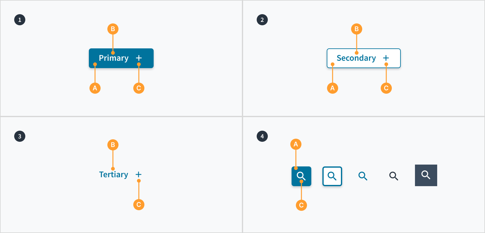
Buttons consist of the following elements:
- Primary buttons display containers (A) around a text label (B) with an optional icon (C). Primary buttons have a solid background color.
- Secondary buttons display containers (A) around a text label (B) with an optional icon (C). Secondary buttons have a visible stroke and no background color.
- Tertiary buttons display a text label (B) with an optional icon (C).
- Icon buttons display containers (A) around a mandatory icon (C).
The AI variant of the button shares this same structure.
Alignment and placement
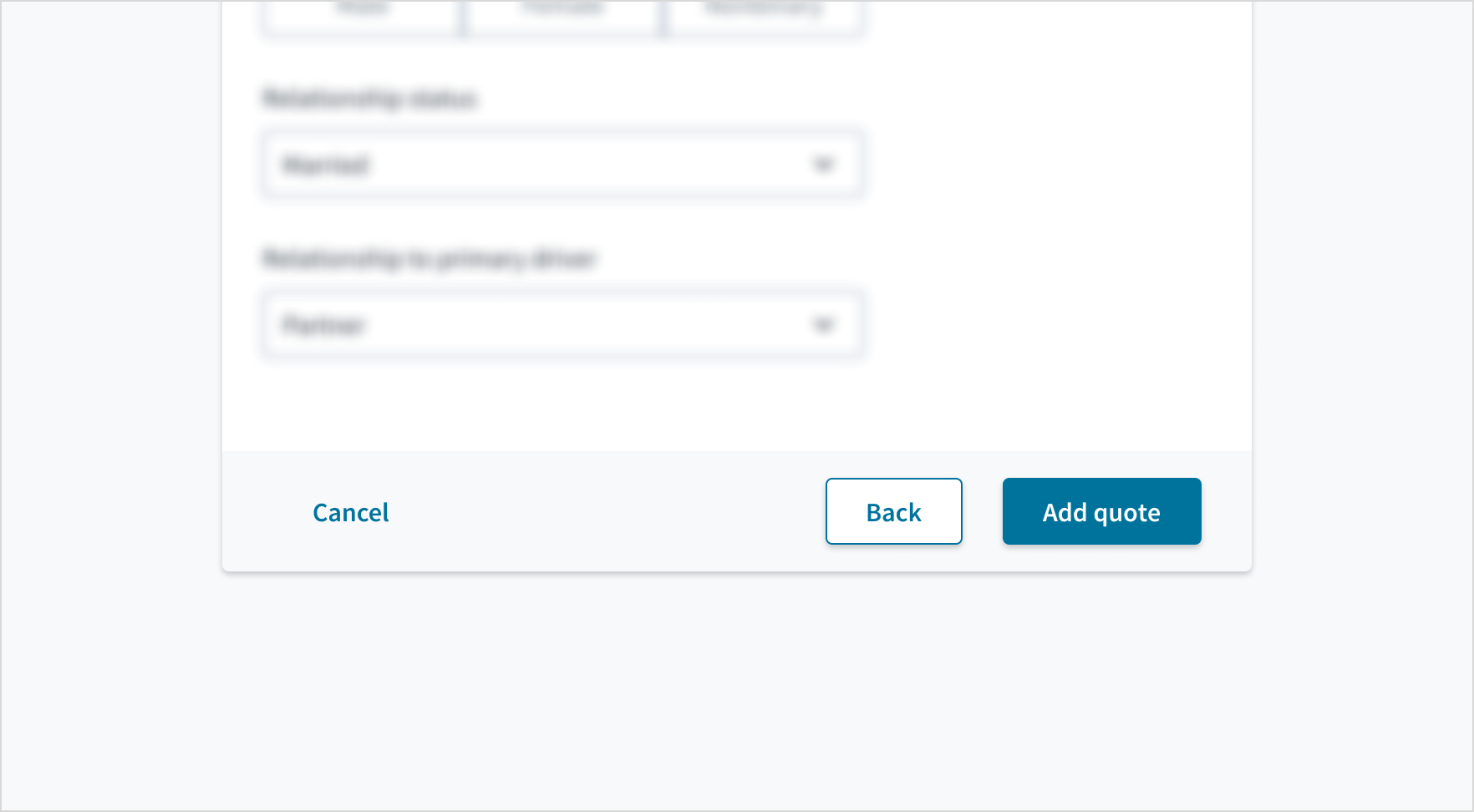
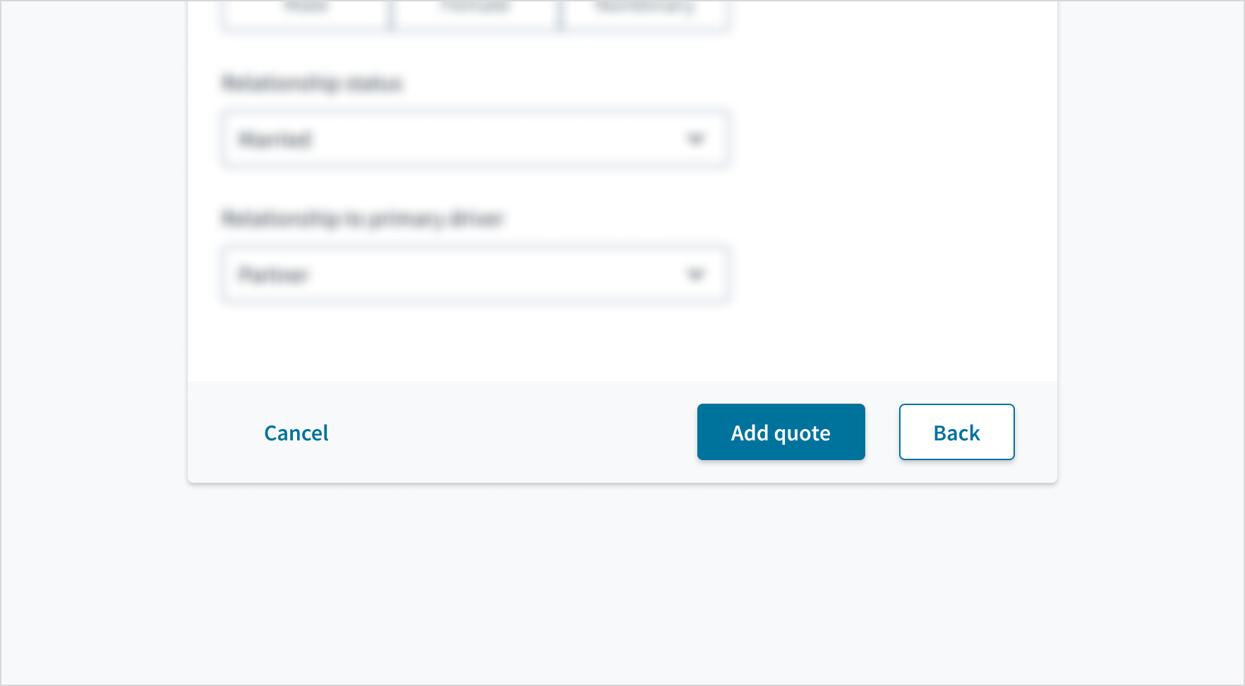
When a button group appears as part of a process, such as in a wizard or in a modal, we recommend placing them in the bottom right corner of the page to align with the natural flow of pages. Inside that button group, primary buttons go on the far right.
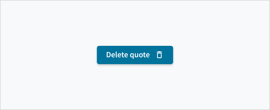
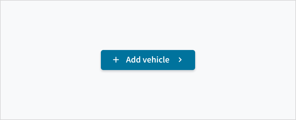
For customer configuration, you can set the icon to the left of the button label or the right, but not both at the same time.
For internal Guidewire applications, always position the icon on the right so that the user reads the label first, then sees the icon.
Button types
Buttons are rectangular with radiused corners, drop shadows (except for tertiary), simple color treatments, and text labels that use sentence case.
| Type | Purpose |
|---|---|
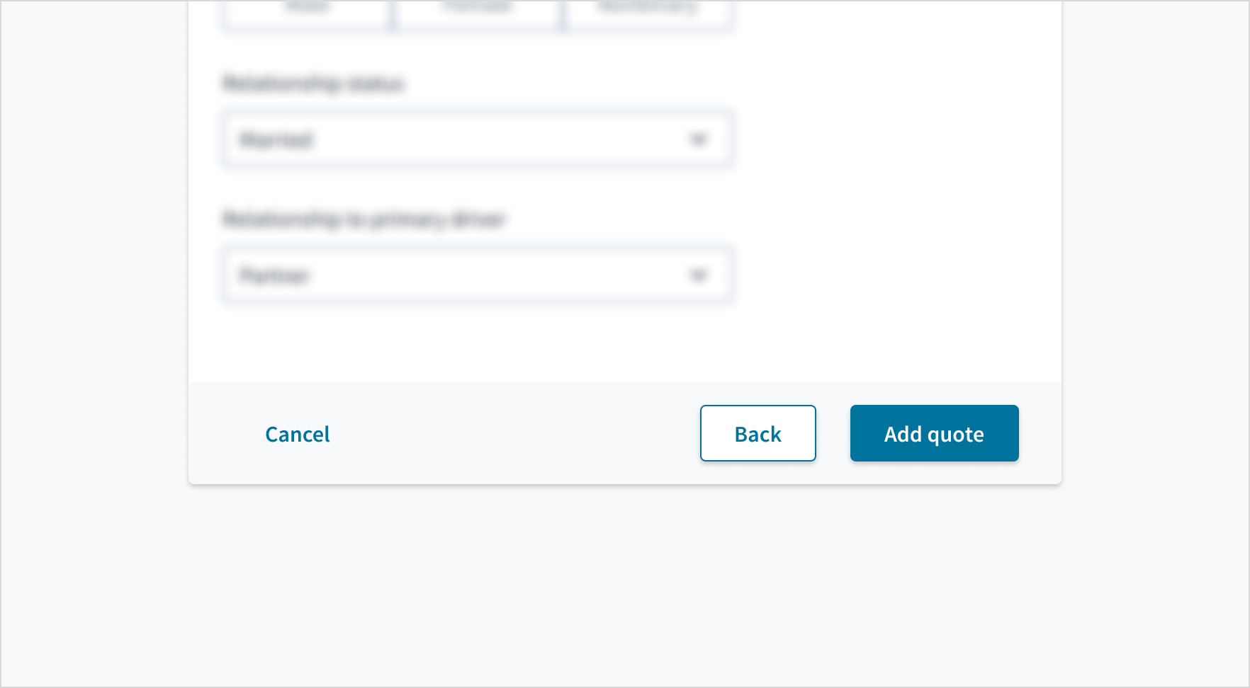
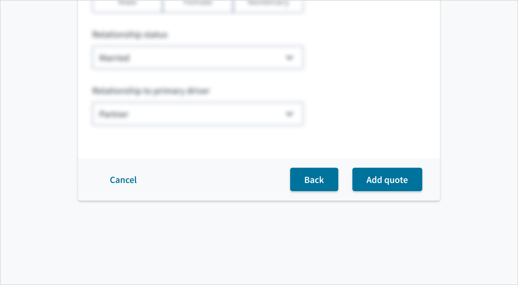
| Primary button | Primary buttons are high emphasis. Use them for the most important action. Each page must have only one primary button to trigger the action (not including modal or quick view). |
| Secondary button | Secondary buttons are medium emphasis. Use secondary buttons in conjunction with a primary button. As part of a pair, the secondary button's function is to perform the dismissive action of the set. They offer a way for the user to back out and take no action. For example, Cancel versus the primary action Send. Don't use a secondary button in isolation and don't use a secondary button for the main action. |
| Tertiary button | Tertiary buttons are low emphasis. Use them for less pronounced, and sometimes independent, actions. You can use tertiary buttons in isolation or pair them with a primary button when there are multiple calls to action. When a primary button for the main action is present, you can also use tertiary buttons for sub-tasks on a page. |
| Icon button | Icon buttons are intended for widely recognized actions and must appear in conjunction with a tooltip. |
Each page must have only one primary trigger action:
Button groups
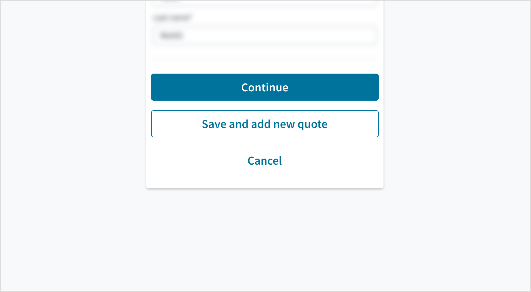
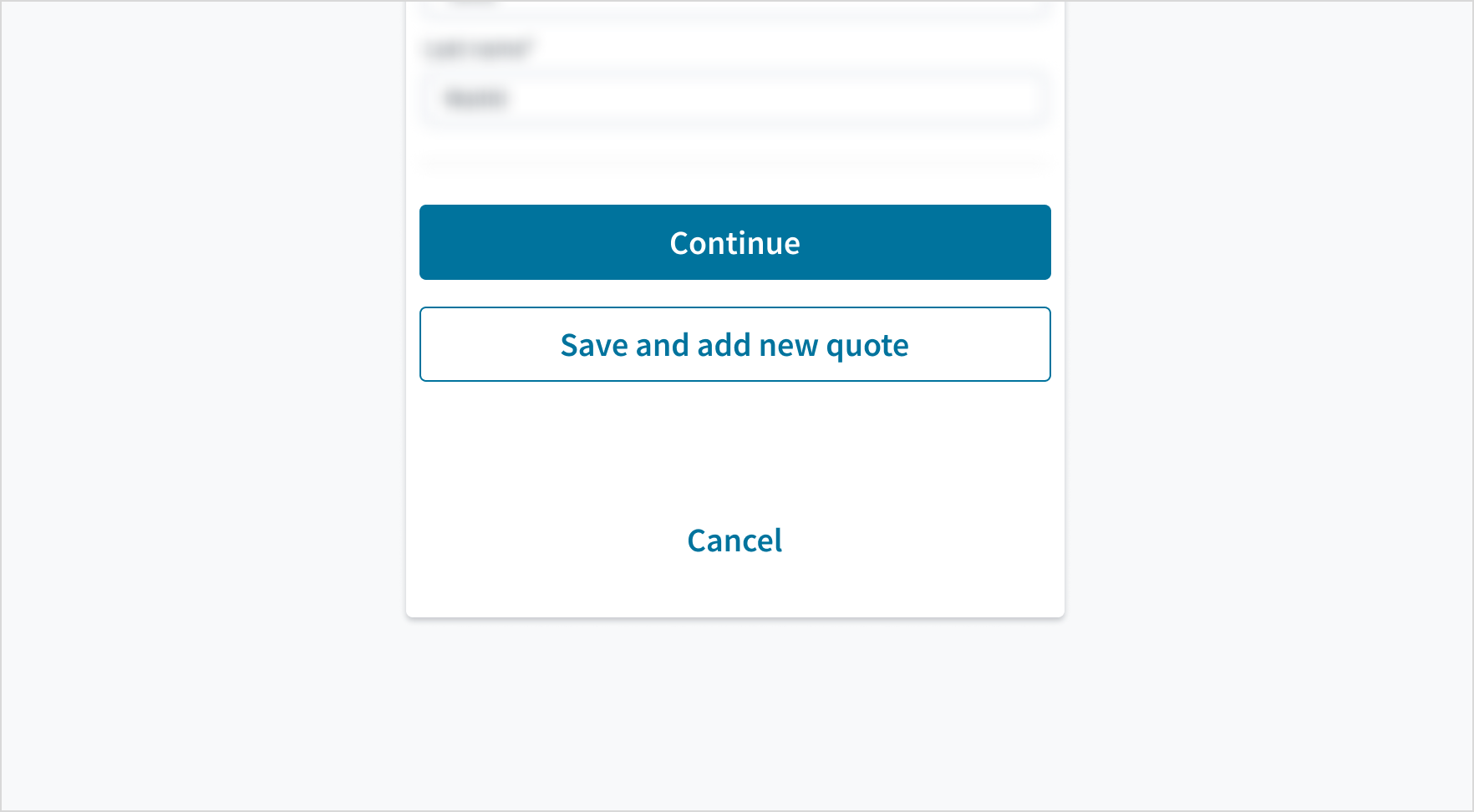
Buttons can be grouped to show the relationship between them. We recommend using a 16px gap between buttons (both vertically and horizontally).
Experimental AI variant
This experimental property might not yet be fully accessible, fully documented, or fully covered by design tokens, and its API and behavior might change more frequently than stable components.
For more information, see Introduction to experimental components and properties.
September 2026 update: The experimental aiMode property will be discontinued starting in Jutro 10.16. We appreciate feedback from early adopters, and we encourage you to consider this notice when planning any long-term adoption of this property.
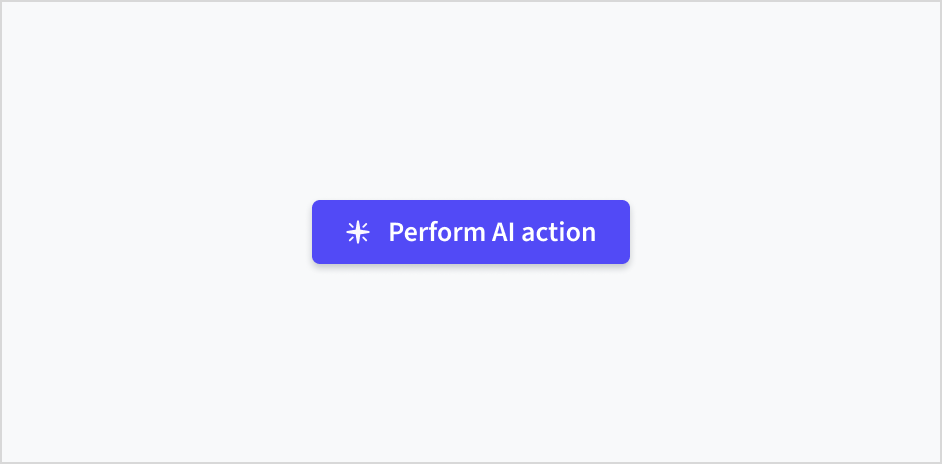
The AI variant of the button uses royal purple (#524AF6) as its primary color to visually identify it as an AI-related action. Within the AI variant, the sparkle icon signals more specifically that a button will initiate a new, independent AI task.
AI variant types
| Type | Purpose |
|---|---|
| AI variant with sparkle icon | Use to initiate AI actions. |
| AI variant without icon | Use for standard actions within AI workflows, and for follow-up actions such as human acceptance. |
| Icon-only AI variant | For limited use only. Use for established concepts, such as Submit prompt. Don't use to open the chat assistant; use the AI variant of the floating button instead. |
Sparkle icon usage
Use the sparkle icon to signify that a button will initiate a new, independent AI task, such as generating content, starting an analysis, or performing a complex action.
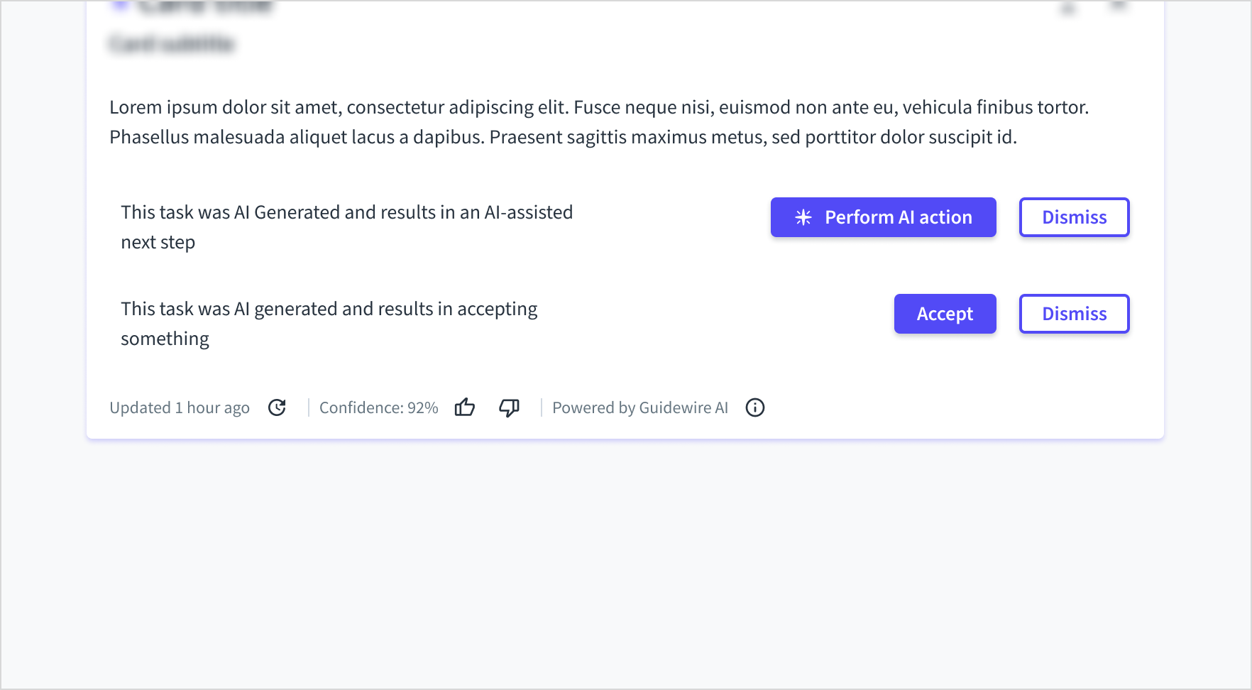
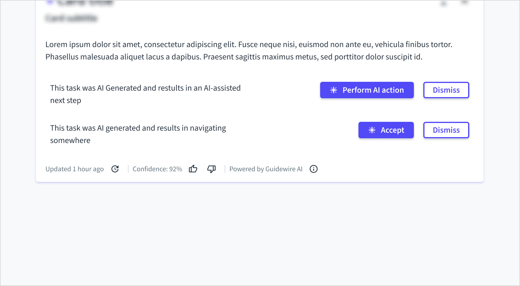
Don't use the sparkle icon for simple, responsive actions like Accept or Dismiss, even if they're part of an AI workflow. Overusing the icon dilutes its meaning and creates visual clutter, making it harder for users to spot primary generative actions.
Icon placement
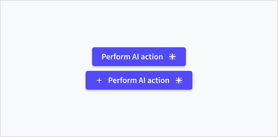
Unlike standard buttons, where the icon is placed on the right, always place the sparkle icon on the left side of the AI variant's button label. Don't place the sparkle icon on the right side of the label, and don't combine it with additional icons.
Content
General writing guidelines
- Use sentence case for all aspects of designing Guidewire product interfaces. Don't use title case.
- Use present tense verbs and active voice in most situations.
- Use common contractions to lend your copy a more natural and informal tone.
- Use plain language. Avoid unnecessary jargon and complex language.
- Keep words and sentences short.
Be concise
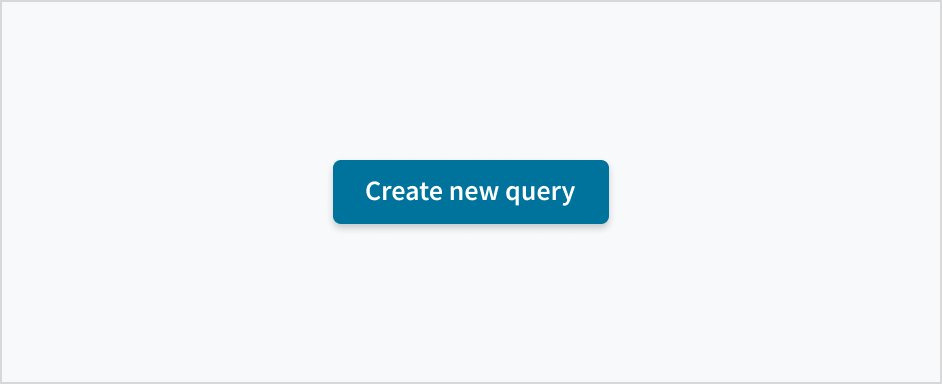
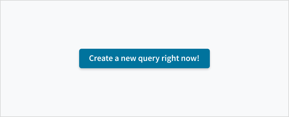
- Keep button labels short and simple: 1 or 2 words, no longer than 4 words.
- Remove articles (“a”, “an”, and “the”) to support scannability, comprehension, and task completion.
Reference: Nielsen Norman
Clearly state the action
- For commands that initiate an action or submit information, start button labels with a verb. If the resulting action is not clear from the verb alone, use a noun after the verb to disambiguate the context. For example, Add vehicle instead of Add, or Create schedule instead of Create.
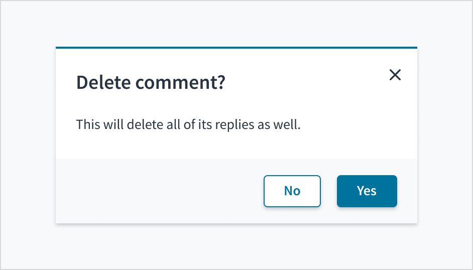
- Don't use Yes and No for button labels. Name the action that happens when the user clicks.
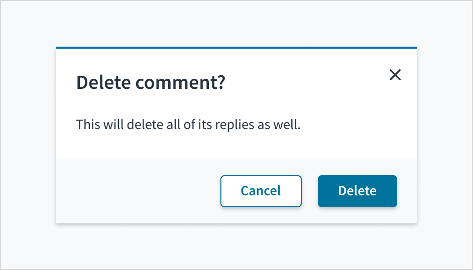
- Choose words that logically align with the preceding content: If your headline asks Delete ## object type? then your button text must also say Delete.
- Take care when using a primary button for a destructive action, especially when it can be triggered by keyboard return. In these instances, be very explicit so there's no ambiguity.
For consistency, see Jutro's content guidelines for a list of recommended action labels.
Use sentence case
Button text must always be in sentence case. Never use all caps to emphasize a specific button, and don't write in title case.
Refer to the UI text style guide for more information on how to implement sentence case.


Be mindful of tone
- Button labels should tap into users' existing vocabulary. Ask yourself, “Is this a word that a person would actually say in a conversation?”
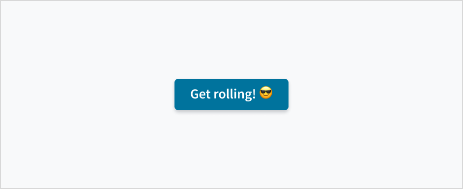
- Don't use emojis, exclamation points, or other forms of punctuation in button labels.

Behaviors
States
Buttons have states for enabled, hover, focus, active, disabled, and loading.
| State | Description | |
|---|---|---|
 | Enabled | Communicates to the user that the element is enabled for interaction (default). |
 | Hover | Indicates that the user has placed a cursor over the element (desktop only). The Hover state can be used with the Enabled and Loading states. |
 | Focus | Indicates that the user has highlighted the element, typically using an input method such as keyboard or voice. The Focus state can be used with all other states (including Disabled). |
 | Active | Indicates that the user is clicking or tapping the element. The Active state can be used with the Enabled and Hover states. |
 | Disabled | Communicates to the user that the element is not interactive. Every button is Accessible Disabled by default. That means the disabled button can be focused. |
 | Loading | Communicates to the user that the action is in progress. Use the Loading state when an action is supposed to take more than 1 second. When a button is in the Loading state, the following must happen:
|
Interactions
Mouse
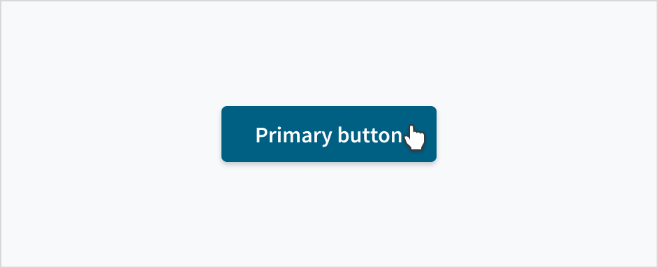
The button can be triggered by clicking anywhere inside the button container.
Keyboard
When the button has focus, both Space and Enter will activate it.
Screen reader
The button component uses the implicitly semantic HTML5 <button> tag. Text within the tags acts as the accessible name.
Responsiveness and adaptiveness
Jutro buttons come in 2 different sizes to accommodate the needs of both enterprise and consumer applications. Enterprise applications require greater data density, and as a result, benefit from smaller buttons and more screen real estate. Like most components, buttons can be distributed, sized, and arranged by our Grid and Flex components as part of Jutro's commitment to responsive design.
| Small button | Medium button |
|---|---|
 |  |
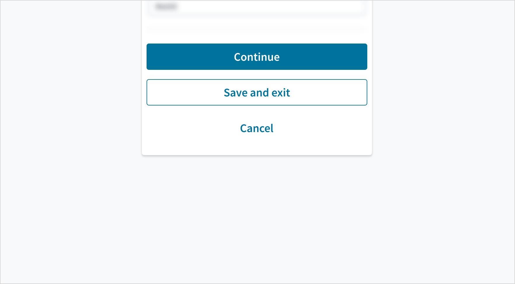
In mobile experiences, we recommend filling the container width with buttons (the text and icon inside of the button must be centered).
Accessibility
The Jutro button element represents an HTML button that is used to submit information. Text between the opening and closing tags appears as the text of the button.
This component has been validated to meet the WCAG 2.2 AA accessibility guidelines in its default, base configuration. This includes ensuring:
- The contrast ratio of textual elements against their background is above 4.5:1.
- Non-textual content that needs to convey meaning (like icons and focus indicators) has a contrast ratio of at least 3:1 with its adjacent colors.
- The item is operable using a keyboard, as well as using a mouse.
- Content is accessible using screen readers, such as JAWS and VoiceOver.
Accessibility conformance ultimately depends on how this component is implemented and customized. Changes made by the content author can affect accessibility. For details on our shared responsibility model, please review our full Jutro accessibility statement.
Follow the guidance below and refer to the WAI-ARIA Authoring Practices for Buttons when using this component in your applications:
- The button text must clearly describe the action of the button.
- If applying custom color themes, check that the contrast ratio of text against its background meets the required threshold.
Accessibly disabled component
The Button component remains accessibility compliant, even when disabled, as of Jutro version 8.4.0. This functionality is enabled by default for every new app that is created using version 8.4.0 of Jutro or later. Older apps can employ this functionality by adding the accessibleDisabled object to their config.json file and passing props, as shown below.
Accessible disabled Button components have the following characteristics:
- The
disabledHTML attribute is removed. - An additional property called
aria-disabledis defined. - All callback functions, such as
onClickandonBlur, are muted and unable to be called. - The HTML type attribute value of
Buttonchanges tobutton. - If the button has an
hrefattribute, its role changes tolinkand itstabIndexchanges to 0.
Styling for accessible disabled and standard disabled buttons remains the same.