Table states
Usage
Feedback states are an important part of the table component's user experience. They provide clear visual feedback when the table can't display rows of data, transforming a potentially confusing empty space into a helpful and informative message. These states communicate the current status of the data, such as loading, empty, or an error, and guide the user on how to proceed. This documentation covers the primary states of the table component.
Formatting
Anatomy
While the specific content varies, all states within the table share a common set of elements, presented in the table body in place of the data rows.
- Image or icon: A visual cue that helps users quickly understand the nature of the state.
- Title: A concise heading that communicates the primary message of the state.
- Description: Body text that provides additional context, explains why the state is being shown, and guides the user on next steps.
- Action: A button or link that provides a direct pathway for the user to take action.
Not all of these elements are required for every state; the specific combination depends on the context. See the section on State variations for detailed guidelines on each state.
Content
General writing guidelines
- Use sentence case for all aspects of designing Guidewire product interfaces. Don't use title case.
- Use present tense verbs and active voice in most situations.
- Use common contractions to lend your copy a more natural and informal tone.
- Use plain language. Avoid unnecessary jargon and complex language.
- Keep words and sentences short.
State variations
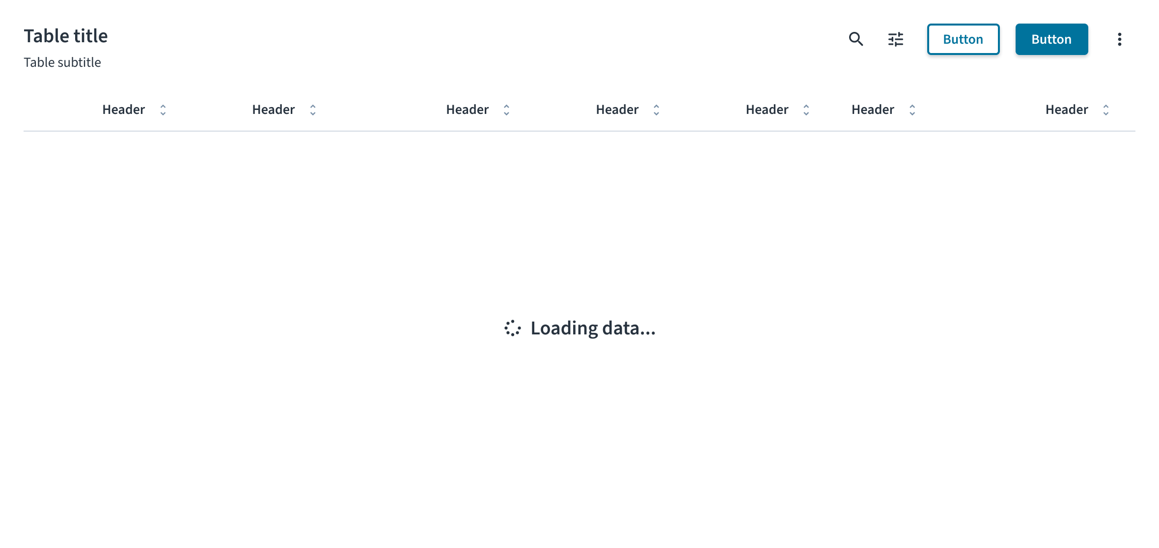
Loading state
The loading state informs the user that data is being fetched. It consists of a spinner icon and a text label. The message must be simple and direct. Use the standard "Loading data..." text to clearly inform the user that the system is working. This is a temporary state and does not include any user-interactive elements like buttons or links.
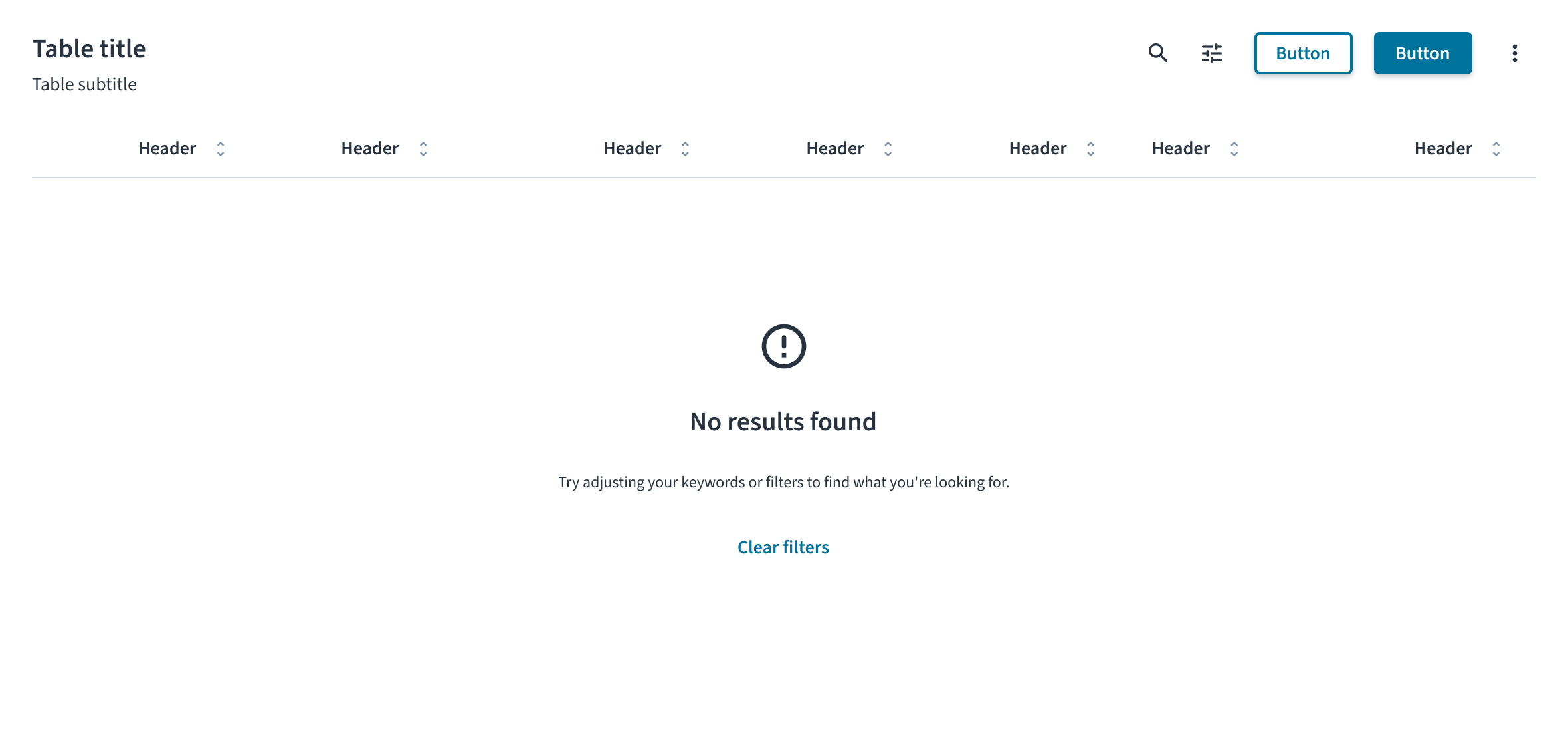
Empty state
The empty state informs the user why there is no data to display. The content and actions must be tailored to the specific scenario. For more comprehensive guidance, see the Empty state pattern.
- Initial use: This state appears when a user first encounters a feature and has not yet added any data. In the message, explain the value of the feature and use the primary action to guide the user toward adding their first item (for example, with an Add claim button).
- No search results: This state appears after a user's search or filtering returns no matching results. The message must inform the user that the search is complete but found nothing. An action button is strongly recommended to provide a clear path forward for the user. A good example of a logic-based action is to display a Clear filters button, but only when the empty state is a result of active filters.
- After deletion or completion: This state appears after a user successfully completes a task, such as clearing all notifications. It serves as a confirmation and often does not require an action button.
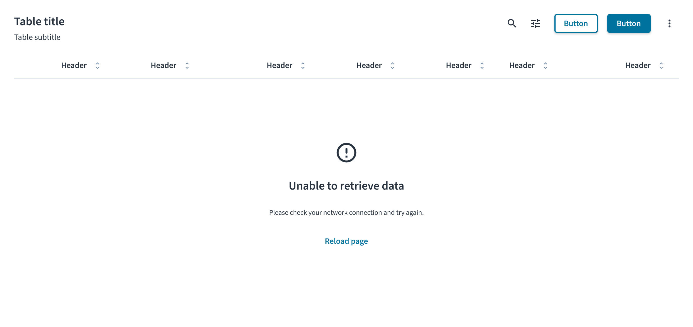
Error state
The error state informs the user that data could not be displayed due to a problem. The message must clearly explain the issue in plain language and provide a direct path to resolution. For example, for a system or network failure, the state includes a warning icon, the title “Unable to retrieve data,” a description explaining the issue, and a Reload page button as a recovery action.
Accessibility
The contrast ratio of textual elements against their background is above 4.5:1 as per WCAG 2.1 AA requirements. Non-textual content that needs to convey meaning (such as icons and keyboard focus visibility) has a contrast ratio of at least 3:1 with its adjacent colors. All content is visible and functional up to and including 400% without requiring scrolling in two dimensions.
This component has been validated to meet the WCAG 2.1 AA accessibility guidelines. However, changes made by the content author can affect accessibility conformance.
When using this component within your application, observe these best practices:
- Announce state changes. When a state appears, its content must be announced by screen readers. This typically requires the use of ARIA live regions to ensure users of assistive technologies are aware of the change.
- Define the role of illustrations. If a state includes supportive text that explains the situation, the illustration or icon must be treated as decorative and hidden from screen readers. If the illustration is the only means of conveying the state's meaning, it must have descriptive alt text.