Breadcrumb
Usage
Overview
The breadcrumb is a secondary navigational component that helps users identify their current location and enables them to move to a parent level or a previous step. Comprised of text links, each link in a breadcrumb represents a page, one level up, that users can quickly access.
Breadcrumbs are an important navigational element that support wayfinding — making users aware of their current location within the hierarchical structure of an application.
When to use
- Products and experiences with hierarchies that are more than two levels deep.
- You want to inform the user of where they are in the application's information hierarchy.
- The user is most likely to have landed on the page from an external source.
When not to use
- As the primary way to navigate an app or site.
- For products that have single-level navigation.
- To help users keep track of their progress during a multi-step process. Use one of the progress indicator components instead.
Formatting
Anatomy
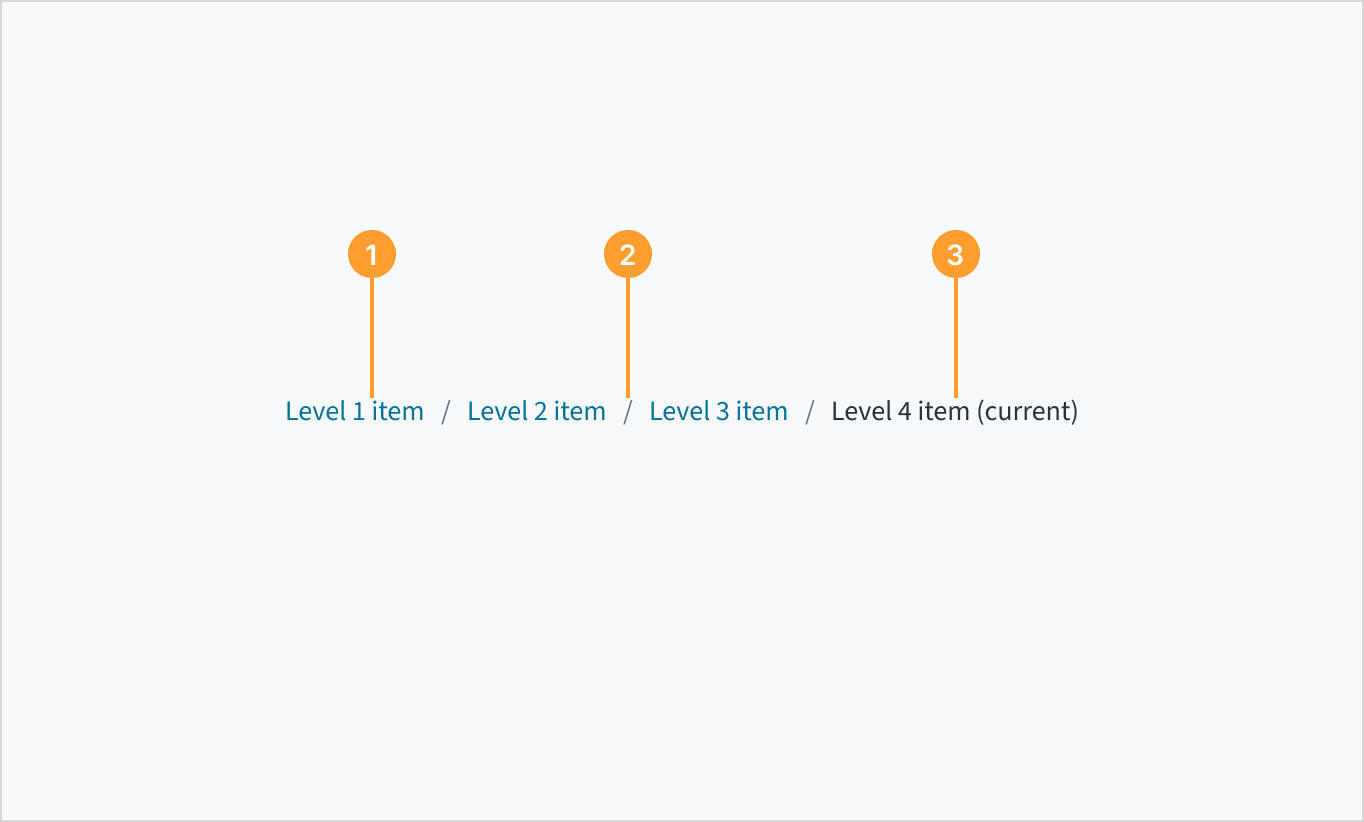
The breadcrumb component consists of the following elements:
- Text link: Breadcrumbs appear as a live text link with a blue fill, like hyperlinks. They direct users to the parent-level page.
- Text link separator: The separator provides a visual indication of separation between pages. It uses the same font as the text link. Separators aren't interactive.
- Current item: The breadcrumb item for the page the user is currently viewing. Appears as plain text.
Placement
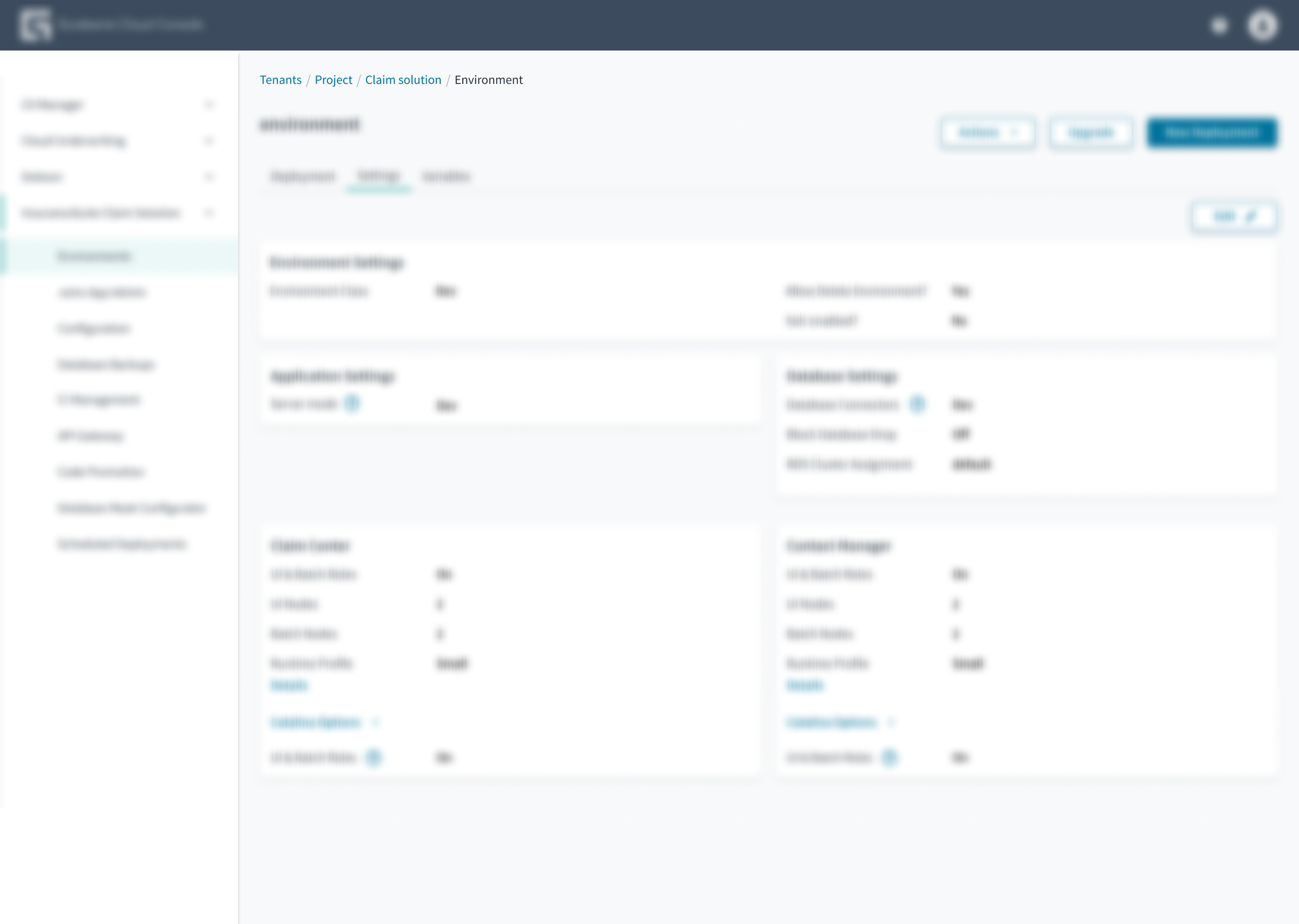 Place breadcrumbs at the top left portion of the page.
Best practices
- All items in the breadcrumb trail (except the current page) must represent a place the user can go to. If there's a logical category that doesn't have an associated page, don't include it in the breadcrumb trail.
- Breadcrumb trails typically start with the homepage. However, if the global navigation includes a link to the homepage, don't include the Home link in the breadcrumb trail.
- Breadcrumbs are intended to show the hierarchical structure of the site, not the history of pages traversed.
- Ensure that all items in the breadcrumb trail, except the current page, are active links.
- On mobile devices, don't wrap breadcrumbs to multiple lines. Consider shortening the breadcrumb trail to include only the last levels.
Source: Nielsen Norman Group
Content
General writing guidelines
- Use sentence case for all aspects of designing Guidewire product interfaces. Don't use title case.
- Use present tense verbs and active voice in most situations.
- Use common contractions to lend your copy a more natural and informal tone.
- Use plain language. Avoid unnecessary jargon and complex language.
- Keep words and sentences short.
Page links
- The word or words in the breadcrumb text link should be accurate, specific, and explicit — not vague.
- Users should never be surprised by what happens after they click or tap on a text link.
- Breadcrumb labels ideally use sentence case, if the linked pages use that case.


Behaviors
- If there's only one item to display, the breadcrumbs don't render. This means that the user is at the top level of a navigation structure.
- If there are only two items to display, the component renders a Back button.
- If there are more than two items to display, the component renders the usual breadcrumbs.
States
Breadcrumbs have the same interactive states as the link component.
Interactions
Keyboard
Navigate to the links using the TAB key. Activate the link using the ENTER key.
Screen reader
The aria role of 'navigation' and the aria-label='breadcrumb' are included to provide more context to screen reader users. Similarly, when the 'lastItemClickable' checkbox is enabled, the final link in the breadcrumb trail adopts the value aria-current="page" to identify the current page.
Accessibility
The contrast ratio of textual elements against their background is above 4.5:1 as per WCAG 2.1 AA requirements. Non-textual content that needs to convey meaning (such as icons and keyboard focus visibility) has a contrast ratio of at least 3:1 with its adjacent colors. All content is visible and functional up to and including 400% without requiring scrolling in two dimensions.
This component has been validated to meet the WCAG 2.1 AA accessibility guidelines. However, changes made by the content author can affect accessibility conformance.
Refer to the guidance below and also to the WAI-ARIA Authoring Practices for Breadcrumbs. Considerations include the following:
- The breadcrumb trail must remain in the same location on each page.
- Link text must be clear and understandable.