Table
Examples
The table component provides a flexible structure for displaying data, that can be combined with different data management layers to implement various features. You can optionally leverage external libraries such as TanStack Table to handle parts of data management logic.
For features like row actions, search, sorting, and selection, you can review the following code examples that demonstrate implementation using only Jutro components and examples that incorporate TanStack Table for part of the data management logic. The examples have all files needed for you to review them in your environment, such as hooks and mock data. Each example has a different set of files.
Check out the Usage section for details about how to design a table properly, and the different configuration options we provide.
Basic example
To create a basic implementation of a Table component, you must use the following components:
Tableto set a structureTableHeaderto define the header sectionTableBodyto define the body sectionHeaderRowto define a row in the headerBodyRowto define a row in the bodyHeaderCellto define a cell in the headerBodyCellto define a cell in the body
When using these components, you must follow the rules defined in the Code and Usage sections. This includes proper component nesting and adding appropriate accessibility labels, such as aria-label used in this example.
export default function BasicTableExample() {
  const data = [
    {
      id: '73065',
      product: 'Go Commercial Auto',
      insured: 'Marshall Rogahn',
      premium: 1236.39,
    },
    {
      id: '80077',
      product: 'Go Worker\'s Compensation',
      insured: 'April Kub',
      premium: 173.99,
    },
    {
      id: '64487',
      product: 'USA Personal Auto',
      insured: 'Abel Rippin',
      premium: 1228.69,
    },
    {
      id: '12345',
      product: 'Go Commercial Auto',
      insured: 'John Smith',
      premium: 892.45,
    },
  ];

  return (
    <Table aria-label="Policy list">
      <TableHeader>
        <HeaderRow>
          <HeaderCell columnIndex={0}>Product</HeaderCell>
          <HeaderCell columnIndex={1}>Insured</HeaderCell>
          <HeaderCell columnIndex={2}>Premium</HeaderCell>
        </HeaderRow>
      </TableHeader>
      <TableBody>
        {data.map((row, rowIndex) => (
          <BodyRow key={row.id}>
            <BodyCell rowIndex={rowIndex} columnIndex={0}>
              {row.product}
            </BodyCell>
            <BodyCell rowIndex={rowIndex} columnIndex={1}>
              {row.insured}
            </BodyCell>
            <BodyCell rowIndex={rowIndex} columnIndex={2}>
              ${row.premium.toLocaleString()}
            </BodyCell>
          </BodyRow>
        ))}
      </TableBody>
    </Table>
  );
}
Table with a title
The Table component does not include any built-in titles or subtitles. It is recommended that you add a descriptive title in your implementation, and a subtitle if necessary. You can easily add them using the Jutro Typography component.
Add appropriate accessibility labels, such as aria-labelledby and aria-describedby, to the Table component to reference the title and subtitle, respectively.
export function TableWithTitleExample() {
  const data = [
    {
      id: '73065',
      product: 'Go Commercial Auto',
      insured: 'Marshall Rogahn',
      premium: 1236.39,
    },
    {
      id: '80077',
      product: 'Go Worker\'s Compensation',
      insured: 'April Kub',
      premium: 173.99,
    },
    {
      id: '64487',
      product: 'USA Personal Auto',
      insured: 'Abel Rippin',
      premium: 1228.69,
    },
    {
      id: '12345',
      product: 'Go Commercial Auto',
      insured: 'John Smith',
      premium: 892.45,
    },
  ];

  return (
    <div style={{ display: 'block', width: '100%' }}>
      <div
        style={{
          display: 'block',
          width: '100%',
          marginBottom: '1rem',
          clear: 'both',
          float: 'none',
        }}>
        <Typography variant="heading-2" id="policy-list-table">
          Policy list
        </Typography>
        <Typography role="doc-subtitle" id="policy-list-subtitle">
          Detailed record of individual policies
        </Typography>
      </div>
      <div style={{ display: 'block', width: '100%', clear: 'both' }}>
        <Table
          aria-labelledby="policy-list-table"
          aria-describedby="policy-list-subtitle">
          <TableHeader>
            <HeaderRow>
              <HeaderCell columnIndex={0}>Product</HeaderCell>
              <HeaderCell columnIndex={1}>Insured</HeaderCell>
              <HeaderCell columnIndex={2}>Premium</HeaderCell>
            </HeaderRow>
          </TableHeader>
          <TableBody>
            {data.map((row, rowIndex) => (
              <BodyRow key={row.id}>
                <BodyCell rowIndex={rowIndex} columnIndex={0}>
                  {row.product}
                </BodyCell>
                <BodyCell rowIndex={rowIndex} columnIndex={1}>
                  {row.insured}
                </BodyCell>
                <BodyCell rowIndex={rowIndex} columnIndex={2}>
                  ${row.premium.toLocaleString()}
                </BodyCell>
              </BodyRow>
            ))}
          </TableBody>
        </Table>
      </div>
    </div>
  );
}
Row actions
To implement row actions in the Table component, combine the structure components with a data management layer that handles individual row operations and an action column that contains interactive elements for each row.
The row actions implementation requires managing action callbacks and providing them to action components placed in table cells. Create action buttons or menus in a dedicated column that perform operations on individual rows, such as edit, delete, or view details. This dedicated column is typically the last column in the table. The action components receive row data and action callbacks as parameters, and can trigger operations that modify the dataset or change the application state.
Use a data management layer (such as the useTableRowActions custom hook) to handle row operations like adding, updating, or deleting individual rows from your dataset. The action logic must provide methods for performing these operations and updating the internal state accordingly. For more complex scenarios like inline editing, combine row actions with an editing state management layer (such as the useEditableRow custom hook) that tracks which rows are in edit mode and manages temporary edit data.
Connect the action callbacks by passing functions like deleteRow and saveRow to your action column components. These callbacks are executed when users interact with action buttons and modify the dataset or trigger state changes. For inline editing scenarios, implement conditional rendering in your cells that switches between display components and input components based on the row's editing state, using functions like isRowEditing and renderCell to manage the display logic.
Alternatively, you can use TanStack Table as a data management layer, which provides flexibility for implementing custom row actions through column definitions with custom cell renderers. With TanStack Table, row actions are implemented through column configurations that define the action components and their behaviors.
Component implementation
import React, { useCallback, useEffect, useId, useMemo, useState } from 'react';
import type { ReactNode } from 'react';

import {
  BodyCell,
  BodyRow,
  Button,
  HeaderCell,
  HeaderRow,
  Table,
  TableBody,
  TableHeader,
  Typography,
} from '@jutro/components';
import type { TableProps } from '@jutro/components';
import { DeleteIcon, EditIcon } from '@jutro/icons';

import { EditableActions } from './Editable';
import { EditableProduct, EditableInsured, EditablePremium } from './Editable';
import { useEditableRow } from './RowActionsHooks';
import { useTableRowActions } from './RowActionsHooks';
import { TableMockData, tableMockData } from './table.mockdata';

type RowActions<T> = {
  deleteRow?: (id: string) => void;
  saveRow?: (id: string, rowData: Partial<T>) => void;
};

/** Column type definition that specifies the structure for table columns with row actions capabilities. */
/** Each column has an id, header renderer, cell renderer, and optional alignment. */
export type Column<T> = {
  id: string;
  header: () => ReactNode;
  cell: (row: T, actions?: RowActions<T>) => ReactNode;
  align?: 'left' | 'right' | 'center';
};

export type ColumnDefinition<T extends object> = Array<Column<T>>;

/** Column configuration for the table with Product, Insured, and Premium columns. */
export const genericColumns: ColumnDefinition<TableMockData> = [
  {
    id: 'product',
    header: () => (
      <Typography
        variant="heading-5"
        tag="span"
      >
        Product
      </Typography>
    ),
    cell: (row) => <Typography>{row.product.name}</Typography>,
  },
  {
    id: 'insured',
    header: () => (
      <Typography
        variant="heading-5"
        tag="span"
      >
        Insured
      </Typography>
    ),
    cell: (row) => <Typography>{row.insured}</Typography>,
  },
  {
    id: 'premium',
    header: () => (
      <Typography
        variant="heading-5"
        tag="span"
      >
        Premium
      </Typography>
    ),
    cell: (row) => (
      <Typography>
        {`${row.premium.currency} ${row.premium.amount?.toFixed(2)}`}
      </Typography>
    ),
    align: 'right',
  },
];

export const TableTitleString = 'Policy list';

/** Component that renders a table title section with heading and subtitle. */
export const TableTitle: React.FC<{ tableId: string }> = ({ tableId }) => (
  <div>
    <div>
      <Typography
        variant="heading-2"
        id={tableId}
      >
        {TableTitleString}
      </Typography>
      <Typography role="doc-subtitle">
        Detailed record of individual policies
      </Typography>
    </div>
  </div>
);

export function RowActionsStory(args: TableProps): React.ReactElement {
  const tableId = useId();

  const {
    rowData,
    setAtomicRowData,
    onRowSave,
    isRowEditing,
    startEditing,
    abortEditing,
  } = useEditableRow<TableMockData>();

  const [onFocusFirstField, setOnFocusFirstField] = useState(false);

  const handleStartEditing = useCallback(
    (rowId: string, row: TableMockData) => {
      startEditing(rowId, row);
      setOnFocusFirstField(true);
    },
    [startEditing]
  );

  // Reset focus trigger after it's been used
  useEffect(() => {
    if (onFocusFirstField) {
      const timer = setTimeout(() => {
        setOnFocusFirstField(false);
      }, 100);
      return () => clearTimeout(timer);
    }
  }, [onFocusFirstField]);

  const columns = useMemo<ColumnDefinition<TableMockData>>(
    () => [
      ...genericColumns,
      {
        id: 'actions',
        align: 'right',
        header: () => (
          <Typography
            tag="span"
            variant="heading-5"
          >
            Actions
          </Typography>
        ),
        cell: (row, { deleteRow } = {}) => (
          <div>
            <Button
              label={`Delete ${row.id}`}
              icon={<DeleteIcon />}
              variant="tertiary"
              onClick={() => deleteRow?.(row.id)}
              hideLabel
            />
            <Button
              label={`Edit ${row.id}`}
              icon={<EditIcon />}
              variant="tertiary"
              onClick={() => handleStartEditing(row.id, row)}
              hideLabel
            />
          </div>
        ),
      },
    ],
    [handleStartEditing]
  );

  const { data, deleteRow, saveRow } = useTableRowActions<TableMockData>({
    data: tableMockData,
  });


  const editableCells = useMemo<Record<string, ReactNode>>(
    () => ({
      product: (
        <EditableProduct
          id="product"
          value={rowData?.product}
          onChange={setAtomicRowData}
          onFocus={onFocusFirstField}
        />
      ),
      insured: (
        <EditableInsured
          id="insured"
          value={rowData?.insured}
          onChange={setAtomicRowData}
        />
      ),
      premium: (
        <EditablePremium
          id="premium"
          value={rowData?.premium}
          onChange={setAtomicRowData}
        />
      ),
      actions: (
        <EditableActions
          onSave={() => onRowSave(saveRow)}
          onAbort={abortEditing}
        />
      ),
    }),
    [
      rowData,
      setAtomicRowData,
      onRowSave,
      abortEditing,
      saveRow,
      onFocusFirstField,
    ]
  );

  const renderCell = (
    rowId: string,
    columnId: string,
    cellCallback: () => ReactNode
  ) => {
    if (isRowEditing(rowId)) {
      return editableCells[columnId];
    }

    return cellCallback();
  };

  return (
    <div>
      <TableTitle tableId={tableId} />
      <Table
        className={args.className}
        noStripedRows={args.noStripedRows}
        aria-labelledby={tableId}
      >
        <TableHeader>
          <HeaderRow>
            {columns.map(({ id, header, align }, columnIndex) => (
              <HeaderCell
                key={`${id}_${columnIndex}`}
                columnIndex={columnIndex}
                align={align}
              >
                {header()}
              </HeaderCell>
            ))}
          </HeaderRow>
        </TableHeader>
        <TableBody>
          {data.map((row, rowIndex) => (
            <BodyRow key={row.id}>
              {columns.map(({ cell, id: columnId, align }, columnIndex) => (
                <BodyCell
                  key={`${columnId}_${row.id}`}
                  columnIndex={columnIndex}
                  rowIndex={rowIndex}
                  align={align}
                >
                  {renderCell(row.id, columnId, () =>
                    cell(row, { deleteRow, saveRow })
                  )}
                </BodyCell>
              ))}
            </BodyRow>
          ))}
        </TableBody>
      </Table>
    </div>
  );
}
Data management
import { useState, useCallback } from 'react';

/** Arguments for the useTableRowActions hook. */
export type UseTableRowActionsArgs<T extends { id: string }> = {
  data: T[];
  initialState?: {
    selectedRows?: string[];
  };
};

/** Return type for the useTableRowActions hook. */
export type UseTableRowActionsResult<T extends { id: string }> = {
  data: T[];
  selectedRows: string[];
  hasAllRowsSelected: () => boolean;
  hasSomeRowsSelected: () => boolean;
  toggleRowsSelection: () => void;
  isRowSelected: (rowId: string) => boolean;
  toggleRowSelection: (rowId: string) => void;
  deleteRow: (rowId: string) => void;
  saveRow: (rowId: string, rowData: Partial<T>) => void;
};

/**
 * Custom React hook for managing table row actions and selection.
 * Provides functionality for selecting rows and performing actions on them.
 */
export function useTableRowActions<T extends { id: string }>({
  data: initialData,
  initialState: { selectedRows: initialSelectedRows = [] } = {},
}: UseTableRowActionsArgs<T>): UseTableRowActionsResult<T> {
  const [data, setData] = useState(initialData);
  const [selectedRows, setSelectedRows] = useState(
    initialSelectedRows
  );

  const hasAllRowsSelected = () =>
    selectedRows.length !== 0 && selectedRows.length === data.length;

  const hasSomeRowsSelected = () => selectedRows.length > 0;

  const toggleRowsSelection = () => {
    setSelectedRows((alreadySelected) => {
      if (alreadySelected.length > 0) {
        return [];
      }

      return [...data.map((row) => row.id)];
    });
  };

  const isRowSelected = (rowId: string) =>
    selectedRows.includes(rowId);

  const toggleRowSelection = (rowId: string) => {
    setSelectedRows((alreadySelected) => {
      if (alreadySelected.includes(rowId)) {
        return alreadySelected.filter((id) => id !== rowId);
      }

      return [rowId, ...alreadySelected];
    });
  };

  const deleteRow = (rowId: string) => {
    setData((current) => current.filter((row) => row.id !== rowId));
    setSelectedRows((current) =>
      current.filter((id) => id !== rowId)
    );
  };

  const saveRow = (rowId: string, rowData: Partial<T>) => {
    setData((current) =>
      current.map((row) => {
        if (row.id !== rowId) {
          return row;
        }

        return { ...row, ...rowData };
      })
    );
  };

  return {
    data,
    selectedRows,
    hasAllRowsSelected,
    hasSomeRowsSelected,
    toggleRowsSelection,
    isRowSelected,
    toggleRowSelection,
    deleteRow,
    saveRow,
  };
}


/** Callback function type for saving row data. */
type SaveCallback<T> = (id: string, rowData: Partial<T>) => void;

/** Return type for the useEditableRow hook. */
type UseEditableRowResult<T> = {
    rowData?: Partial<T>;
    setAtomicRowData: (key: string, value: unknown) => void;
    onRowSave: (callback?: SaveCallback<T>) => void;
    isRowEditing: (id?: string) => boolean;
    startEditing: (id: string, row: T) => void;
    abortEditing: () => void;
};

/**
 * Custom React hook for managing editable table rows.
 * Provides functionality for editing individual rows in a table.
 */
export function useEditableRow<T>(): UseEditableRowResult<T> {
    const [editingId, setEditingId] = useState<string | undefined>(undefined);
    const [rowData, setRowData] = useState<Partial<T> | undefined>(undefined);

    const setAtomicRowData = useCallback(
        (key: string, value: unknown) => {
            setRowData(data => ({ ...data, [key]: value }));
        },
        [setRowData]
    );

    const onRowSave = useCallback(
        (callback?: SaveCallback<T>) => {
            if (!editingId || !rowData) {
                setEditingId(undefined);
                setRowData(undefined);

                return;
            }

            callback?.(editingId, rowData);

            setEditingId(undefined);
            setRowData(undefined);
        },
        [editingId, rowData]
    );

    const isRowEditing = useCallback(
        (id?: string) => editingId === id,
        [editingId]
    );

    const startEditing = useCallback(
        (id: string, row: T) => {
            setEditingId(id);
            setRowData(row);
        },
        [setEditingId, setRowData]
    );

    const abortEditing = useCallback(() => {
        setEditingId(undefined);
        setRowData(undefined);
    }, [setEditingId, setRowData]);

    return {
        rowData,
        setAtomicRowData,
        onRowSave,
        isRowEditing,
        startEditing,
        abortEditing,
    };
}
import React, { useEffect, useRef } from 'react';

import { Button } from '@jutro/components';
import { CheckIcon, CloseIcon } from '@jutro/icons';

import {
  Combobox,
  ComboboxOption,
  CurrencyInput,
  TextInput,
} from '@jutro/components';
import type { CurrencyInputProps } from '@jutro/components';

import { tableMockData } from './table.mockdata';
import type {
  TableMockDataProduct,
  TableMockDataCurrency,
} from './table.mockdata';

export const EditableActions: React.FC<{
  onSave: () => void;
  onAbort: () => void;
}> = ({ onSave, onAbort }) => (
  <div>
    <Button
      label="Save"
      icon={<CheckIcon />}
      variant="tertiary"
      onClick={onSave}
      hideLabel
    />
    <Button
      label="Abort"
      icon={<CloseIcon />}
      variant="tertiary"
      onClick={onAbort}
      hideLabel
    />
  </div>
);

type CurrencyValue = CurrencyInputProps['value'];

// Get unique product names from the mock data
const availableProducts = Array.from(
  new Set(tableMockData.map((item) => item.product.name))
).map((name) => ({ name }));

export const EditableProduct: React.FC<{
  id: string;
  value: TableMockDataProduct | undefined;
  onChange: (id: string, value: TableMockDataProduct) => void;
  onFocus?: boolean;
}> = ({ id, value, onChange, onFocus }) => {
  const comboboxRef = useRef<HTMLDivElement>(null);

  useEffect(() => {
    if (onFocus && comboboxRef.current) {
      // Find the input element within the combobox and focus it
      const input = comboboxRef.current.querySelector('input');
      if (input) {
        input.focus();
      }
    }
  }, [onFocus]);

  return (
    <div ref={comboboxRef}>
      <Combobox
        label="Edit product"
        value={{
          id: String(value?.name),
          label: String(value?.name),
        }}
        onChange={(_, newValue) => {
          onChange(id, {
            name: String(newValue?.label),
          });
        }}
        hideLabel
      >
        {availableProducts.map(({ name }) => (
          <ComboboxOption
            key={name}
            value={{ id: name, label: name }}
          />
        ))}
      </Combobox>
    </div>
  );
};

export const EditableInsured: React.FC<{
  id: string;
  value: string | undefined;
  onChange: (id: string, value: string) => void;
}> = ({ id, value, onChange }) => (
  <TextInput
    label="Edit insured"
    value={value}
    onChange={(event) => {
      onChange(id, event.target.value);
    }}
    hideLabel
  />
);

export const EditablePremium: React.FC<{
  id: string;
  value: TableMockDataCurrency | undefined;
  onChange: (id: string, value: TableMockDataCurrency) => void;
}> = ({ id, value, onChange }) => (
  <CurrencyInput
    label="Edit premium"
    availableCurrencies={['USD']}
    value={value}
    onChange={(_, newValue) => onChange(id, newValue)}
    hideLabel
  />
);
import type { CurrencyInputProps } from '@jutro/components';

export type TableMockDataProduct = {
    name: string;
};

export type TableMockDataCurrency = NonNullable<CurrencyInputProps['value']>;

export type TableMockData = {
    id: string;
    product: TableMockDataProduct;
    insured: string;
    premium: TableMockDataCurrency;
};

export const tableMockData: Array<TableMockData> = [
    {
        id: '73065',
        product: {
            name: 'Go Commercial Auto',
        },
        insured: 'Marshall Rogahn',
        premium: { currency: 'USD', amount: 1236.39 },
    },
    {
        id: '80077',
        product: {
            name: 'Go Worker\'s Compensation',
        },
        insured: 'April Kub',
        premium: { currency: 'USD', amount: 173.99 },
    },
    {
        id: '64487',
        product: {
            name: 'USA Personal Auto',
        },
        insured: 'Abel Rippin',
        premium: { currency: 'USD', amount: 1228.69 },
    },
    {
        id: '12345',
        product: {
            name: 'Go Commercial Auto',
        },
        insured: 'John Smith',
        premium: { currency: 'USD', amount: 892.45 },
    },
    {
        id: '23456',
        product: {
            name: 'Go Worker\'s Compensation',
        },
        insured: 'Sarah Johnson',
        premium: { currency: 'USD', amount: 567.23 },
    },
    {
        id: '34567',
        product: {
            name: 'USA Personal Auto',
        },
        insured: 'Michael Brown',
        premium: { currency: 'USD', amount: 445.67 },
    },
    {
        id: '45678',
        product: {
            name: 'Go Commercial Auto',
        },
        insured: 'Emily Davis',
        premium: { currency: 'USD', amount: 2134.89 },
    },
    {
        id: '56789',
        product: {
            name: 'Go Worker\'s Compensation',
        },
        insured: 'David Wilson',
        premium: { currency: 'USD', amount: 823.45 },
    },
    {
        id: '67890',
        product: {
            name: 'USA Personal Auto',
        },
        insured: 'Jessica Miller',
        premium: { currency: 'USD', amount: 298.76 },
    },
    {
        id: '78901',
        product: {
            name: 'Go Commercial Auto',
        },
        insured: 'Christopher Taylor',
        premium: { currency: 'USD', amount: 3456.78 },
    },
];
Component implementation
import React, { useCallback, useId, useMemo, useState } from 'react';
import type { ReactNode } from 'react';
import type { ColumnDef, RowData } from '@tanstack/react-table';
import {
  flexRender,
  getCoreRowModel,
  useReactTable,
} from '@tanstack/react-table';

import {
  BodyCell,
  BodyRow,
  Button,
  HeaderCell,
  HeaderRow,
  Table,
  TableBody,
  TableHeader,
  Typography,
} from '@jutro/components';
import type { TableProps } from '@jutro/components';
import { DeleteIcon, EditIcon } from '@jutro/icons';

import {
  EditableActions,
  EditableProduct,
  EditableInsured,
  EditablePremium,
} from './Editable';
import { useEditableRow } from './useEditableRow';
import { tableMockData } from './table.mockdata';
import type { TableMockData } from './table.mockdata';

const initialData = tableMockData.slice(0, 10);

/** Tanstack Table module augmentation to extend ColumnMeta interface with alignment and aria-label properties. */
declare module '@tanstack/react-table' {
  interface TableMeta<TData extends RowData> {
    deleteRows: (rowIds: string[]) => void;
  }
  interface ColumnMeta<TData extends RowData, TValue> {
    align?: 'left' | 'right' | 'center';
    ariaLabel?: string;
  }
}

/** Column configuration for the table with Product, Insured, and Premium columns. */
export const genericColumns: ColumnDef<TableMockData, any>[] = [
  {
    id: 'product',
    header: () => (
      <Typography
        variant="heading-5"
        tag="span"
      >
        Product
      </Typography>
    ),
    cell: (props) => <Typography>{props.getValue()}</Typography>,
    accessorFn: (row) => row.product.name,
    meta: {
      ariaLabel: 'Product',
    },
  },
  {
    id: 'insured',
    header: () => (
      <Typography
        variant="heading-5"
        tag="span"
      >
        Insured
      </Typography>
    ),
    cell: (props) => <Typography>{props.getValue()}</Typography>,
    accessorKey: 'insured',
    meta: {
      ariaLabel: 'Insured',
    },
  },
  {
    id: 'premium',
    header: () => (
      <Typography
        variant="heading-5"
        tag="span"
      >
        Premium
      </Typography>
    ),
    cell: (props) => <Typography>{props.getValue()}</Typography>,
    accessorFn: (row) =>
      `${row.premium.currency} ${row.premium.amount?.toFixed(2)}`,
    meta: {
      align: 'right',
      ariaLabel: 'Premium',
    },
  },
];

export const TableTitleString = 'Policy list';

/** Component that renders a table title section with heading and subtitle. */
export const TableTitle: React.FC<{ tableId: string }> = ({ tableId }) => (
  <div>
    <div>
      <Typography
        variant="heading-2"
        id={tableId}
      >
        {TableTitleString}
      </Typography>
      <Typography role="doc-subtitle">
        Detailed record of individual policies
      </Typography>
    </div>
  </div>
);

export function RowActionsTanstackStory(args: TableProps): React.ReactElement {
  const tableId = useId();

  const [data, setData] = useState(initialData);

  const deleteRow = useCallback((rowId: string) => {
    setData((current) => current.filter((row) => row.id !== rowId));
  }, []);

  const saveRow = useCallback(
    (rowId: string, rowData: Partial<TableMockData>) => {
      setData((current) =>
        current.map((row) => {
          if (row.id !== rowId) {
            return row;
          }

          return { ...row, ...rowData };
        })
      );
    },
    []
  );

  const {
    rowData,
    setAtomicRowData,
    onRowSave,
    isRowEditing,
    startEditing,
    abortEditing,
  } = useEditableRow<TableMockData>();

  // In accordance with the Tanstack Table documentation
  // eslint-disable-next-line @typescript-eslint/no-explicit-any
  const columns = useMemo<ColumnDef<TableMockData, any>[]>(
    () => [
      ...genericColumns,
      {
        id: 'actions',
        accessorFn: () => null,
        meta: { align: 'right' },
        header: () => (
          <Typography
            tag="span"
            variant="heading-5"
          >
            Actions
          </Typography>
        ),
        cell: ({ row: { original } }) => (
          <div>
            <Button
              label={`Delete ${original.id}`}
              icon={<DeleteIcon />}
              variant="tertiary"
              onClick={() => deleteRow(original.id)}
              hideLabel
            />
            <Button
              label={`Edit ${original.id}`}
              icon={<EditIcon />}
              variant="tertiary"
              onClick={() => startEditing(original.id, original)}
              hideLabel
            />
          </div>
        ),
      },
    ],
    [deleteRow, startEditing]
  );

  const table = useReactTable({
    getCoreRowModel: getCoreRowModel(),
    data,
    columns,
  });

  const editableCells = useMemo<Record<string, ReactNode>>(
    () => ({
      product: (
        <EditableProduct
          id="product"
          value={rowData?.product}
          onChange={setAtomicRowData}
        />
      ),
      insured: (
        <EditableInsured
          id="insured"
          value={rowData?.insured}
          onChange={setAtomicRowData}
        />
      ),
      premium: (
        <EditablePremium
          id="premium"
          value={rowData?.premium}
          onChange={setAtomicRowData}
        />
      ),
      actions: (
        <EditableActions
          onSave={() => onRowSave(saveRow)}
          onAbort={abortEditing}
        />
      ),
    }),
    [rowData, setAtomicRowData, abortEditing, onRowSave, saveRow]
  );

  const renderCell = (
    rowId: string,
    columnId: string,
    cellCallback: () => ReactNode
  ) => {
    if (isRowEditing(rowId)) {
      return editableCells[columnId];
    }

    return cellCallback();
  };

  return (
    <div>
      <TableTitle tableId={tableId} />
      <Table
        className={args.className}
        noStripedRows={args.noStripedRows}
        aria-labelledby={tableId}
      >
        <TableHeader>
          {table.getHeaderGroups().map((headerGroup) => (
            <HeaderRow key={headerGroup.id}>
              {headerGroup.headers.map((header, columnIndex) => (
                <HeaderCell
                  key={header.id}
                  columnIndex={columnIndex}
                  align={header.column.columnDef.meta?.align}
                >
                  {flexRender(
                    header.column.columnDef.header,
                    header.getContext()
                  )}
                </HeaderCell>
              ))}
            </HeaderRow>
          ))}
        </TableHeader>
        <TableBody>
          {table.getRowModel().rows.map((row, rowIndex) => (
            <BodyRow key={row.id}>
              {row.getVisibleCells().map((cell, columnIndex) => (
                <BodyCell
                  key={cell.id}
                  rowIndex={rowIndex}
                  columnIndex={columnIndex}
                  align={cell.column.columnDef.meta?.align}
                >
                  {renderCell(row.original.id, cell.column.id, () =>
                    flexRender(cell.column.columnDef.cell, cell.getContext())
                  )}
                </BodyCell>
              ))}
            </BodyRow>
          ))}
        </TableBody>
      </Table>
    </div>
  );
}
Data management
import { useState, useCallback } from 'react';

/** Callback function type for saving row data. */
type SaveCallback<T> = (id: string, rowData: Partial<T>) => void;

/** Return type for the useEditableRow hook. */
type UseEditableRowResult<T> = {
  rowData?: Partial<T>;
  setAtomicRowData: (key: string, value: unknown) => void;
  onRowSave: (callback?: SaveCallback<T>) => void;
  isRowEditing: (id?: string) => boolean;
  startEditing: (id: string, row: T) => void;
  abortEditing: () => void;
};

/**
 * Custom React hook for managing editable table rows.
 * Provides functionality for editing individual rows in a table.
 */
export function useEditableRow<T>(): UseEditableRowResult<T> {
  const [editingId, setEditingId] = useState<string | undefined>(
    undefined
  );
  const [rowData, setRowData] = useState<Partial<T> | undefined>(
    undefined
  );

  const setAtomicRowData = useCallback(
    (key: string, value: unknown) => {
      setRowData((data) => ({ ...data, [key]: value }));
    },
    [setRowData]
  );

  const onRowSave = useCallback(
    (callback?: SaveCallback<T>) => {
      if (!editingId || !rowData) {
        setEditingId(undefined);
        setRowData(undefined);

        return;
      }

      callback?.(editingId, rowData);

      setEditingId(undefined);
      setRowData(undefined);
    },
    [editingId, rowData]
  );

  const isRowEditing = useCallback(
    (id?: string) => editingId === id,
    [editingId]
  );

  const startEditing = useCallback(
    (id: string, row: T) => {
      setEditingId(id);
      setRowData(row);
    },
    [setEditingId, setRowData]
  );

  const abortEditing = useCallback(() => {
    setEditingId(undefined);
    setRowData(undefined);
  }, [setEditingId, setRowData]);

  return {
    rowData,
    setAtomicRowData,
    onRowSave,
    isRowEditing,
    startEditing,
    abortEditing,
  };
}
import React, { useEffect, useRef } from 'react';

import { Button } from '@jutro/components';
import { CheckIcon, CloseIcon } from '@jutro/icons';

import {
  Combobox,
  ComboboxOption,
  CurrencyInput,
  TextInput,
} from '@jutro/components';
import type { CurrencyInputProps } from '@jutro/components';

import { tableMockData } from './table.mockdata';
import type {
  TableMockDataProduct,
  TableMockDataCurrency,
} from './table.mockdata';

export const EditableActions: React.FC<{
  onSave: () => void;
  onAbort: () => void;
}> = ({ onSave, onAbort }) => (
  <div>
    <Button
      label="Save"
      icon={<CheckIcon />}
      variant="tertiary"
      onClick={onSave}
      hideLabel
    />
    <Button
      label="Abort"
      icon={<CloseIcon />}
      variant="tertiary"
      onClick={onAbort}
      hideLabel
    />
  </div>
);

type CurrencyValue = CurrencyInputProps['value'];

// Get unique product names from the mock data
const availableProducts = Array.from(
  new Set(tableMockData.map((item) => item.product.name))
).map((name) => ({ name }));

export const EditableProduct: React.FC<{
  id: string;
  value: TableMockDataProduct | undefined;
  onChange: (id: string, value: TableMockDataProduct) => void;
  onFocus?: boolean;
}> = ({ id, value, onChange, onFocus }) => {
  const comboboxRef = useRef<HTMLDivElement>(null);

  useEffect(() => {
    if (onFocus && comboboxRef.current) {
      // Find the input element within the combobox and focus it
      const input = comboboxRef.current.querySelector('input');
      if (input) {
        input.focus();
      }
    }
  }, [onFocus]);

  return (
    <div ref={comboboxRef}>
      <Combobox
        label="Edit product"
        value={{
          id: String(value?.name),
          label: String(value?.name),
        }}
        onChange={(_, newValue) => {
          onChange(id, {
            name: String(newValue?.label),
          });
        }}
        hideLabel
      >
        {availableProducts.map(({ name }) => (
          <ComboboxOption
            key={name}
            value={{ id: name, label: name }}
          />
        ))}
      </Combobox>
    </div>
  );
};

export const EditableInsured: React.FC<{
  id: string;
  value: string | undefined;
  onChange: (id: string, value: string) => void;
}> = ({ id, value, onChange }) => (
  <TextInput
    label="Edit insured"
    value={value}
    onChange={(event) => {
      onChange(id, event.target.value);
    }}
    hideLabel
  />
);

export const EditablePremium: React.FC<{
  id: string;
  value: TableMockDataCurrency | undefined;
  onChange: (id: string, value: TableMockDataCurrency) => void;
}> = ({ id, value, onChange }) => (
  <CurrencyInput
    label="Edit premium"
    availableCurrencies={['USD']}
    value={value}
    onChange={(_, newValue) => onChange(id, newValue)}
    hideLabel
  />
);
import type { CurrencyInputProps } from '@jutro/components';

export type TableMockDataProduct = {
    name: string;
};

export type TableMockDataCurrency = NonNullable<CurrencyInputProps['value']>;

export type TableMockData = {
    id: string;
    product: TableMockDataProduct;
    insured: string;
    premium: TableMockDataCurrency;
};

export const tableMockData: Array<TableMockData> = [
    {
        id: '73065',
        product: {
            name: 'Go Commercial Auto',
        },
        insured: 'Marshall Rogahn',
        premium: { currency: 'USD', amount: 1236.39 },
    },
    {
        id: '80077',
        product: {
            name: 'Go Worker\'s Compensation',
        },
        insured: 'April Kub',
        premium: { currency: 'USD', amount: 173.99 },
    },
    {
        id: '64487',
        product: {
            name: 'USA Personal Auto',
        },
        insured: 'Abel Rippin',
        premium: { currency: 'USD', amount: 1228.69 },
    },
    {
        id: '12345',
        product: {
            name: 'Go Commercial Auto',
        },
        insured: 'John Smith',
        premium: { currency: 'USD', amount: 892.45 },
    },
    {
        id: '23456',
        product: {
            name: 'Go Worker\'s Compensation',
        },
        insured: 'Sarah Johnson',
        premium: { currency: 'USD', amount: 567.23 },
    },
    {
        id: '34567',
        product: {
            name: 'USA Personal Auto',
        },
        insured: 'Michael Brown',
        premium: { currency: 'USD', amount: 445.67 },
    },
    {
        id: '45678',
        product: {
            name: 'Go Commercial Auto',
        },
        insured: 'Emily Davis',
        premium: { currency: 'USD', amount: 2134.89 },
    },
    {
        id: '56789',
        product: {
            name: 'Go Worker\'s Compensation',
        },
        insured: 'David Wilson',
        premium: { currency: 'USD', amount: 823.45 },
    },
    {
        id: '67890',
        product: {
            name: 'USA Personal Auto',
        },
        insured: 'Jessica Miller',
        premium: { currency: 'USD', amount: 298.76 },
    },
    {
        id: '78901',
        product: {
            name: 'Go Commercial Auto',
        },
        insured: 'Christopher Taylor',
        premium: { currency: 'USD', amount: 3456.78 },
    },
];
Search
To implement search in the Table component, combine the structure components with a data management layer and a search input component that filters table data in real-time.
The search implementation requires managing search query state and providing search callbacks to a search input component. Create a search input component like SearchBar that allows users to enter search queries, and connect it to your table through a search handler function. The search functionality filters your dataset based on the search query by comparing it against searchable column values using accessor functions.
Use a data management layer (such as the useTableDataSearch custom hook) to handle search query state, debounce user input for performance, and filter your dataset based on the current search query. Debouncing is essential to prevent excessive filtering operations as users type, which can cause performance issues with large datasets. You can implement debouncing using techniques like setTimeout or libraries such as Lodash's debounce function to delay the search execution until the user has stopped typing.
The search logic must compare the query against specific column values using accessorFn properties defined in your column configuration. Each column that should be searchable needs an accessor function that returns the searchable text for that column. Connect the search callbacks by passing functions like onSearchQueryChange to the onChange property of your search input component.
Alternatively, you can use TanStack Table as a data management layer, which provides built-in global filtering capabilities. With TanStack Table, search functionality is handled automatically through its useReactTable hook with getFilteredRowModel function and global filter configuration.
Component implementation
import React, {
  useEffect,
  useRef,
  useState,
  useId,
  type ReactNode,
} from 'react';
import { flushSync } from 'react-dom';

import {
  BodyCell,
  BodyRow,
  Button,
  HeaderCell,
  HeaderRow,
  Table,
  TableBody,
  TableEmptyState,
  TableHeader,
  TextInput,
  Typography,
} from '@jutro/components';
import type { TableProps } from '@jutro/components';
import { SearchIcon } from '@jutro/icons';
import type { IntlMessageShape } from '@jutro/prop-types';

import { useTableDataSearch } from './useTableDataSearch';
import { TableMockData, tableMockData } from './table.mockdata';

type SearchBarProps = {
  /**
   * Label for the search input, supports internationalized messages.
   */
  label?: IntlMessageShape;
  /**
   * Callback function triggered when the search input value changes.
   */
  onChange: (value: string) => void;
  /**
   * Placeholder text for the search input, supports internationalized messages.
   */
  placeholder?: IntlMessageShape;
  /**
   * The current value of the search input.
   */
  value?: string;
} & Omit<React.HTMLAttributes<HTMLDivElement>, 'onChange'>;

/** SearchBar component that provides a collapsible search input with icon toggle functionality. */
export const SearchBar: React.FC<SearchBarProps> = ({
  onChange,
  value: externalValue,
  label = 'Search table - enter text to update the table data below',
  placeholder = 'Search table',
  ...htmlProps
}) => {
  const searchInput = useRef<HTMLInputElement>(null);

  const [active, setActive] = useState(Boolean(externalValue));
  const [value, setValue] = useState(externalValue);

  useEffect(() => {
    setValue(externalValue);
  }, [externalValue]);

  const onSearchChange = (event: React.ChangeEvent<HTMLInputElement>) => {
    setValue(event.target.value);

    onChange(event.target.value);
  };

  const onIconClick = () => {
    flushSync(() => {
      setActive(true);
    });

    searchInput.current?.focus();
  };

  const onInputBlur = () => {
    if (value) {
      return;
    }

    setActive(false);
  };

  return (
    <div {...htmlProps}>
      {active && (
        <TextInput
          ref={searchInput}
          label={label}
          hideLabel
          placeholder={placeholder}
          value={value}
          onChange={onSearchChange}
          onBlur={onInputBlur}
        />
      )}
      {!active && (
        <Button
          label={label}
          variant="neutral"
          icon={<SearchIcon />}
          hideLabel
          onClick={onIconClick}
        />
      )}
    </div>
  );
};

SearchBar.displayName = 'SearchBar';

/** Column type definition that specifies the structure for table columns with search capabilities. */
/** Each column has an id, header renderer, cell renderer, optional alignment, and accessor for search functionality. */
export type Column<T> = {
  id: string;
  header: () => ReactNode;
  cell: (row: T) => ReactNode;
  align?: 'left' | 'right' | 'center';
  accessorFn?: (row: T) => string;
};

export type ColumnDefinition<T extends object> = Array<Column<T>>;

/** Column configuration for the table with Product, Insured, and Premium columns for search functionality. */
export const columns: ColumnDefinition<TableMockData> = [
  {
    id: 'product',
    header: () => (
      <Typography
        variant="heading-5"
        tag="span"
      >
        Product
      </Typography>
    ),
    cell: (row) => <Typography>{row.product.name}</Typography>,
    accessorFn: (row) => row.product.name,
  },
  {
    id: 'insured',
    header: () => (
      <Typography
        variant="heading-5"
        tag="span"
      >
        Insured
      </Typography>
    ),
    cell: (row) => <Typography>{row.insured}</Typography>,
    accessorFn: (row) => row.insured,
  },
  {
    id: 'premium',
    header: () => (
      <Typography
        variant="heading-5"
        tag="span"
      >
        Premium
      </Typography>
    ),
    cell: (row) => (
      <Typography>
        {`${row.premium.currency} ${row.premium.amount?.toFixed(2)}`}
      </Typography>
    ),
    align: 'right',
    accessorFn: (row) =>
      `${row.premium.currency} ${row.premium.amount?.toFixed(2)}`,
  },
];

export const TableTitleString = 'Policy list';

/** Component that renders a table title section with heading and subtitle. */
export const TableTitle: React.FC<{
  tableId: string;
  children?: ReactNode;
}> = ({ tableId, children }) => (
  <div>
    <div>
      <Typography
        variant="heading-2"
        id={tableId}
      >
        {TableTitleString}
      </Typography>
      <Typography role="doc-subtitle">
        Detailed record of individual policies
      </Typography>
    </div>
    {children}
  </div>
);

export function SearchStory(args: TableProps): React.ReactElement {
  const tableId = useId();

  const { data, searchQuery, onSearchQueryChange } =
    useTableDataSearch<TableMockData>({
      columns,
      data: tableMockData,
    });

  const renderTableBody = () => {
    if (!data.length) {
      return (
        <TableEmptyState detailedMessageContent="Your search returned no matching policies. Try a different query." />
      );
    }

    return data.map((row, rowIndex) => (
      <BodyRow key={row.id}>
        {columns.map(({ cell, align }, columnIndex) => (
          <BodyCell
            key={`${columnIndex}_${row.id}`}
            rowIndex={rowIndex}
            columnIndex={columnIndex}
            align={align}
          >
            {cell(row)}
          </BodyCell>
        ))}
      </BodyRow>
    ));
  };

  return (
    <div>
      <TableTitle tableId={tableId}>
        <div>
          <SearchBar
            value={searchQuery}
            onChange={onSearchQueryChange}
          />
        </div>
      </TableTitle>
      <Table
        aria-labelledby={tableId}
        className={args.className}
        noStripedRows={args.noStripedRows}
      >
        <TableHeader>
          <HeaderRow>
            {columns.map(({ header, align }, columnIndex) => (
              <HeaderCell
                key={columnIndex}
                columnIndex={columnIndex}
                align={align}
              >
                {header()}
              </HeaderCell>
            ))}
          </HeaderRow>
        </TableHeader>
        <TableBody>{renderTableBody()}</TableBody>
      </Table>
    </div>
  );
}
Data management
import { useMemo, useEffect, useState } from 'react';

import type { ColumnDefinition } from './Search';

/** Custom hook to debounce a value over a specified delay period. */
export function useDebounce<T>(value: T, delay: number): T {
  const [debouncedValue, setDebouncedValue] = useState(value);

  useEffect(() => {
    const handler = setTimeout(() => setDebouncedValue(value), delay);

    return () => clearTimeout(handler);
  }, [value, delay]);

  return debouncedValue;
}

/** Arguments for the useTableDataSearch hook. */
export type UseTableDataSearchArgs<T extends object> = {
  columns: ColumnDefinition<T>;
  data: T[];
  initialState?: {
    searchQuery?: string;
  };
};

/** Return type for the useTableDataSearch hook. */
export type UseTableDataSearchResult<T extends object> = {
  data: T[];
  searchQuery?: string;
  onSearchQueryChange: (newSearchQuery?: string) => void;
};

const DEFAULT_DEBOUNCE_TIMEOUT = 300;

/**
 * Utility class for handling table data search operations.
 * Provides methods for filtering data based on search queries.
 */
class TableData<T extends object> {
  private data: T[];
  readonly columns: ColumnDefinition<T>;

  constructor(data: T[], columns: ColumnDefinition<T>) {
    this.data = data;
    this.columns = columns;
  }

  search(searchQuery?: string) {
    if (!searchQuery) {
      return this;
    }

    const query = searchQuery.trim().toLowerCase();

    this.data = this.data.filter((row) =>
      this.columns.some(({ accessorFn }) =>
        accessorFn?.(row)?.toLowerCase().includes(query)
      )
    );

    return this;
  }

  getData() {
    return this.data;
  }
}

/**
 * Custom React hook for managing table data with search functionality.
 * Handles search state and provides filtered data along with control functions.
 */
export function useTableDataSearch<T extends object>({
  columns,
  data: initialData,
  initialState: { searchQuery: initialSearchQuery } = {},
}: UseTableDataSearchArgs<T>): UseTableDataSearchResult<T> {
  const [searchQuery, setSearchQuery] = useState(initialSearchQuery);

  const debouncedSearchQuery = useDebounce(
    searchQuery,
    DEFAULT_DEBOUNCE_TIMEOUT
  );

  const tableData = useMemo(() => {
    const tableDataFactory = new TableData<T>(initialData, columns);

    return tableDataFactory.search(debouncedSearchQuery).getData();
  }, [columns, initialData, debouncedSearchQuery]);

  const onSearchQueryChange = (newSearchQuery?: string) => {
    setSearchQuery(newSearchQuery);
  };

  return {
    data: tableData,
    searchQuery: debouncedSearchQuery,
    onSearchQueryChange,
  };
}
import type { CurrencyInputProps } from '@jutro/components';

export type TableMockDataProduct = {
    name: string;
};

export type TableMockDataCurrency = NonNullable<CurrencyInputProps['value']>;

export type TableMockData = {
    id: string;
    product: TableMockDataProduct;
    insured: string;
    premium: TableMockDataCurrency;
};

export const tableMockData: Array<TableMockData> = [
    {
        id: '73065',
        product: {
            name: 'Go Commercial Auto',
        },
        insured: 'Marshall Rogahn',
        premium: { currency: 'USD', amount: 1236.39 },
    },
    {
        id: '80077',
        product: {
            name: 'Go Worker\'s Compensation',
        },
        insured: 'April Kub',
        premium: { currency: 'USD', amount: 173.99 },
    },
    {
        id: '64487',
        product: {
            name: 'USA Personal Auto',
        },
        insured: 'Abel Rippin',
        premium: { currency: 'USD', amount: 1228.69 },
    },
    {
        id: '12345',
        product: {
            name: 'Go Commercial Auto',
        },
        insured: 'John Smith',
        premium: { currency: 'USD', amount: 892.45 },
    },
    {
        id: '23456',
        product: {
            name: 'Go Worker\'s Compensation',
        },
        insured: 'Sarah Johnson',
        premium: { currency: 'USD', amount: 567.23 },
    },
    {
        id: '34567',
        product: {
            name: 'USA Personal Auto',
        },
        insured: 'Michael Brown',
        premium: { currency: 'USD', amount: 445.67 },
    },
    {
        id: '45678',
        product: {
            name: 'Go Commercial Auto',
        },
        insured: 'Emily Davis',
        premium: { currency: 'USD', amount: 2134.89 },
    },
    {
        id: '56789',
        product: {
            name: 'Go Worker\'s Compensation',
        },
        insured: 'David Wilson',
        premium: { currency: 'USD', amount: 823.45 },
    },
    {
        id: '67890',
        product: {
            name: 'USA Personal Auto',
        },
        insured: 'Jessica Miller',
        premium: { currency: 'USD', amount: 298.76 },
    },
    {
        id: '78901',
        product: {
            name: 'Go Commercial Auto',
        },
        insured: 'Christopher Taylor',
        premium: { currency: 'USD', amount: 3456.78 },
    },
];
Component implementation
import React, {
  useId,
  useState,
  useEffect,
  useRef,
  type ReactNode,
} from 'react';
import {
  flexRender,
  getCoreRowModel,
  getFilteredRowModel,
  useReactTable,
} from '@tanstack/react-table';
import { flushSync } from 'react-dom';

import {
  BodyCell,
  BodyRow,
  Button,
  HeaderCell,
  HeaderRow,
  Table,
  TableBody,
  TableEmptyState,
  TableHeader,
  TextInput,
  Typography,
} from '@jutro/components';
import type { TableProps } from '@jutro/components';
import { SearchIcon } from '@jutro/icons';
import type { IntlMessageShape } from '@jutro/prop-types';
import type { ColumnDef, RowData } from '@tanstack/react-table';
import { tableMockData, TableMockData } from './table.mockdata';

/** Tanstack Table module augmentation to extend ColumnMeta interface with alignment and aria-label properties. */
declare module '@tanstack/react-table' {
  interface ColumnMeta<TData extends RowData, TValue> {
    align?: 'left' | 'right' | 'center';
    ariaLabel?: string;
  }
}

/** Column configuration for the table with Product, Insured, and Premium columns. */
export const columns: ColumnDef<TableMockData, any>[] = [
  {
    id: 'product',
    header: () => (
      <Typography
        variant="heading-5"
        tag="span"
      >
        Product
      </Typography>
    ),
    cell: (props) => <Typography>{props.getValue()}</Typography>,
    accessorFn: (row) => row.product.name,
    meta: {
      ariaLabel: 'Product',
    },
  },
  {
    id: 'insured',
    header: () => (
      <Typography
        variant="heading-5"
        tag="span"
      >
        Insured
      </Typography>
    ),
    cell: (props) => <Typography>{props.getValue()}</Typography>,
    accessorKey: 'insured',
    meta: {
      ariaLabel: 'Insured',
    },
  },
  {
    id: 'premium',
    header: () => (
      <Typography
        variant="heading-5"
        tag="span"
      >
        Premium
      </Typography>
    ),
    cell: (props) => <Typography>{props.getValue()}</Typography>,
    accessorFn: (row) =>
      `${row.premium.currency} ${row.premium.amount?.toFixed(2)}`,
    meta: {
      align: 'right',
      ariaLabel: 'Premium',
    },
  },
];

/** Custom hook to debounce a value over a specified delay period. */
export function useDebounce<T>(value: T, delay: number): T {
  const [debouncedValue, setDebouncedValue] = useState(value);

  useEffect(() => {
    const handler = setTimeout(() => setDebouncedValue(value), delay);

    return () => clearTimeout(handler);
  }, [value, delay]);

  return debouncedValue;
}

{
}
type SearchBarProps = {
  /**
   * Label for the search input, supports internationalized messages.
   */
  label?: IntlMessageShape;
  /**
   * Callback function triggered when the search input value changes.
   */
  onChange: (value: string) => void;
  /**
   * Placeholder text for the search input, supports internationalized messages.
   */
  placeholder?: IntlMessageShape;
  /**
   * The current value of the search input.
   */
  value?: string;
} & Omit<React.HTMLAttributes<HTMLDivElement>, 'onChange'>;

/** SearchBar component that provides a collapsible search input with icon toggle functionality. */
export const SearchBar: React.FC<SearchBarProps> = ({
  onChange,
  value: externalValue,
  label = 'Search table - enter text to update the table data below',
  placeholder = 'Search table',
  ...htmlProps
}) => {
  const searchInput = useRef<HTMLInputElement>(null);

  const [active, setActive] = useState(Boolean(externalValue));
  const [value, setValue] = useState(externalValue);

  useEffect(() => {
    setValue(externalValue);
  }, [externalValue]);

  const onSearchChange = (event: React.ChangeEvent<HTMLInputElement>) => {
    setValue(event.target.value);

    onChange(event.target.value);
  };

  const onIconClick = () => {
    flushSync(() => {
      setActive(true);
    });

    searchInput.current?.focus();
  };

  const onInputBlur = () => {
    if (value) {
      return;
    }

    setActive(false);
  };

  return (
    <div {...htmlProps}>
      {active && (
        <TextInput
          ref={searchInput}
          label={label}
          hideLabel
          placeholder={placeholder}
          value={value}
          onChange={onSearchChange}
          onBlur={onInputBlur}
        />
      )}
      {!active && (
        <Button
          label={label}
          variant="neutral"
          icon={<SearchIcon />}
          hideLabel
          onClick={onIconClick}
        />
      )}
    </div>
  );
};

SearchBar.displayName = 'SearchBar';
{
}

export const TableTitleString = 'Policy list';

/** Component that renders a table title section with heading and subtitle. */
export const TableTitle: React.FC<{
  tableId: string;
  children?: ReactNode;
}> = ({ tableId, children }) => (
  <div>
    <div>
      <Typography
        variant="heading-2"
        id={tableId}
      >
        {TableTitleString}
      </Typography>
      <Typography role="doc-subtitle">
        Detailed record of individual policies
      </Typography>
    </div>
    {children}
  </div>
);

export function SearchTanstackStory(args: TableProps): React.ReactElement {
  const tableId = useId();

  const [searchQuery, setSearchQuery] = useState('');

  {
  }
  const debouncedSearch = useDebounce(searchQuery, 300);

  const table = useReactTable({
    getCoreRowModel: getCoreRowModel(),
    getFilteredRowModel: getFilteredRowModel(),
    onGlobalFilterChange: setSearchQuery,
    data: tableMockData,
    columns,
    state: {
      globalFilter: debouncedSearch,
    },
    globalFilterFn: 'includesString',
  });
  {
  }

  const renderTableBody = () => {
    if (!table.getRowModel().rows.length) {
      return (
        <TableEmptyState detailedMessageContent="Your search returned no matching policies. Try a different query." />
      );
    }

    return table.getRowModel().rows.map((row, rowIndex) => (
      <BodyRow key={row.id}>
        {row.getVisibleCells().map((cell, columnIndex) => (
          <BodyCell
            key={cell.id}
            rowIndex={rowIndex}
            columnIndex={columnIndex}
            align={cell.column.columnDef.meta?.align}
          >
            {flexRender(cell.column.columnDef.cell, cell.getContext())}
          </BodyCell>
        ))}
      </BodyRow>
    ));
  };

  return (
    <div>
      <TableTitle tableId={tableId}>
        <div>
          <SearchBar
            value={searchQuery}
            onChange={setSearchQuery}
          />
        </div>
      </TableTitle>
      <Table
        aria-labelledby={tableId}
        className={args.className}
        noStripedRows={args.noStripedRows}
      >
        <TableHeader>
          {table.getHeaderGroups().map((headerGroup) => (
            <HeaderRow key={headerGroup.id}>
              {headerGroup.headers.map((header, columnIndex) => (
                <HeaderCell
                  key={header.id}
                  columnIndex={columnIndex}
                  align={header.column.columnDef.meta?.align}
                >
                  {flexRender(
                    header.column.columnDef.header,
                    header.getContext()
                  )}
                </HeaderCell>
              ))}
            </HeaderRow>
          ))}
        </TableHeader>
        <TableBody>{renderTableBody()}</TableBody>
      </Table>
    </div>
  );
}
Data management
import type { CurrencyInputProps } from '@jutro/components';

export type TableMockDataProduct = {
    name: string;
};

export type TableMockDataCurrency = NonNullable<CurrencyInputProps['value']>;

export type TableMockData = {
    id: string;
    product: TableMockDataProduct;
    insured: string;
    premium: TableMockDataCurrency;
};

export const tableMockData: Array<TableMockData> = [
    {
        id: '73065',
        product: {
            name: 'Go Commercial Auto',
        },
        insured: 'Marshall Rogahn',
        premium: { currency: 'USD', amount: 1236.39 },
    },
    {
        id: '80077',
        product: {
            name: 'Go Worker\'s Compensation',
        },
        insured: 'April Kub',
        premium: { currency: 'USD', amount: 173.99 },
    },
    {
        id: '64487',
        product: {
            name: 'USA Personal Auto',
        },
        insured: 'Abel Rippin',
        premium: { currency: 'USD', amount: 1228.69 },
    },
    {
        id: '12345',
        product: {
            name: 'Go Commercial Auto',
        },
        insured: 'John Smith',
        premium: { currency: 'USD', amount: 892.45 },
    },
    {
        id: '23456',
        product: {
            name: 'Go Worker\'s Compensation',
        },
        insured: 'Sarah Johnson',
        premium: { currency: 'USD', amount: 567.23 },
    },
    {
        id: '34567',
        product: {
            name: 'USA Personal Auto',
        },
        insured: 'Michael Brown',
        premium: { currency: 'USD', amount: 445.67 },
    },
    {
        id: '45678',
        product: {
            name: 'Go Commercial Auto',
        },
        insured: 'Emily Davis',
        premium: { currency: 'USD', amount: 2134.89 },
    },
    {
        id: '56789',
        product: {
            name: 'Go Worker\'s Compensation',
        },
        insured: 'David Wilson',
        premium: { currency: 'USD', amount: 823.45 },
    },
    {
        id: '67890',
        product: {
            name: 'USA Personal Auto',
        },
        insured: 'Jessica Miller',
        premium: { currency: 'USD', amount: 298.76 },
    },
    {
        id: '78901',
        product: {
            name: 'Go Commercial Auto',
        },
        insured: 'Christopher Taylor',
        premium: { currency: 'USD', amount: 3456.78 },
    },
];
Selection
To implement selection in the Table component, combine the structure components with a data management layer that manages selection state for individual rows and bulk operations.
The selection implementation requires managing selection state of individual rows and providing selection callbacks to your table cells. Use the selected property in BodyRow component to indicate whether a row is selected. This Boolean value can be used by child components to determine row state.
Handle selection interactions through Checkbox components placed in BodyCell and HeaderCell components. You can handle selection changes by updating the selection state and maintaining a list of selected row identifiers. Place individual row checkboxes in the first column of each row, and add a header checkbox in the corresponding HeaderCell for bulk selection operations like "select all" or "clear all".
Use a data management layer (such as the useTableDataSelection custom hook) to track which rows are selected, handle individual row selection, and manage bulk selection operations like "select all" or "clear all". The selection logic must handle adding and removing items from the selection set and provide methods for checking selection status. Connect the selection callbacks to Checkbox components by passing functions like toggleRowSelection and toggleRowsSelection to the onChange properties of the respective checkboxes. These callbacks update the internal selection state when users interact with the checkboxes.
Alternatively, you can use TanStack Table as a data management layer, which provides built-in row selection state management. With TanStack Table, selection is handled automatically through its useReactTable hook with row selection configuration.
Component implementation
import React, { useId, useMemo, type ReactNode } from 'react';

import {
  BodyCell,
  BodyRow,
  Button,
  Checkbox,
  HeaderCell,
  HeaderRow,
  Table,
  TableBody,
  TableHeader,
  Typography,
} from '@jutro/components';
import { CheckIcon, RemoveIcon } from '@jutro/icons';

import type { TableProps } from '@jutro/components';

import { useTableDataSelection } from './useTableDataSelection';
import { TableMockData, tableMockData } from './table.mockdata';

type HeaderActions = {
  hasAllRowsSelected?: () => boolean;
  hasSomeRowsSelected?: () => boolean;
  toggleRowsSelection?: () => void;
};

type RowActions = {
  isRowSelected?: (id: string) => boolean;
  toggleRowSelection?: (id: string) => void;
};

/** Column type definition that specifies the structure for table columns with selection capabilities. */
export type Column<T> = {
  id: string;
  header: (actions?: HeaderActions) => ReactNode;
  cell: (row: T, actions?: RowActions) => ReactNode;
  align?: 'left' | 'right' | 'center';
};

export type ColumnDefinition<T extends object> = Array<Column<T>>;

/** Column configuration for the table with Product, Insured, and Premium columns. */
export const basicColumns: ColumnDefinition<TableMockData> = [
  {
    id: 'product',
    header: () => (
      <Typography
        variant="heading-5"
        tag="span"
      >
        Product
      </Typography>
    ),
    cell: (row) => <Typography>{row.product.name}</Typography>,
  },
  {
    id: 'insured',
    header: () => (
      <Typography
        variant="heading-5"
        tag="span"
      >
        Insured
      </Typography>
    ),
    cell: (row) => <Typography>{row.insured}</Typography>,
  },
  {
    id: 'premium',
    header: () => (
      <Typography
        variant="heading-5"
        tag="span"
      >
        Premium
      </Typography>
    ),
    cell: (row) => (
      <Typography>
        {`${row.premium.currency} ${row.premium.amount?.toFixed(2)}`}
      </Typography>
    ),
    align: 'right',
  },
];

/** Component that displays the count of selected rows and provides a button to clear the selection. */

type SelectedRowsCounterProps = {
  count: number;
  onClear: () => void;
};

export const SelectedRowsCounter: React.FC<SelectedRowsCounterProps> = ({
  count,
  onClear,
}) => {
  if (!count) {
    return null;
  }

  const noun = count === 1 ? 'row' : 'rows';

  return (
    <div>
      <Typography tag="span">
        {count} {noun} selected
      </Typography>
      <Button
        label="Clear selection"
        variant="tertiary"
        size="small"
        onClick={onClear}
      />
    </div>
  );
};

export const TableTitleString = 'Policy list';

/** Component that renders a table title section with heading and subtitle. */
export const TableTitle: React.FC<{
  tableId: string;
  children?: ReactNode;
}> = ({ tableId, children }) => (
  <div>
    <div>
      <Typography
        variant="heading-2"
        id={tableId}
      >
        {TableTitleString}
      </Typography>
      <Typography role="doc-subtitle">
        Detailed record of individual policies
      </Typography>
    </div>
    {children}
  </div>
);

export function SelectionStory(args: TableProps): React.ReactElement {
  const tableId = useId();

  const columns = useMemo<ColumnDefinition<TableMockData>>(
    () => [
      {
        id: 'selection',
        header: ({
          hasAllRowsSelected,
          hasSomeRowsSelected,
          toggleRowsSelection,
        } = {}) => {
          const allSelected = hasAllRowsSelected?.();
          const someSelected = hasSomeRowsSelected?.();

          const icon = allSelected ? <CheckIcon /> : <RemoveIcon />;

          return (
            <Checkbox
              label=""
              aria-label={someSelected ? 'Deselect all' : 'Select all'}
              checked={allSelected || someSelected}
              onChange={() => toggleRowsSelection?.()}
              icon={icon}
            />
          );
        },
        cell: (row, { isRowSelected, toggleRowSelection } = {}) => (
          <Checkbox
            label=""
            aria-label={
              isRowSelected?.(row.id)
                ? `Deselect ${row.id}`
                : `Select ${row.id}`
            }
            checked={isRowSelected?.(row.id)}
            onChange={() => toggleRowSelection?.(row.id)}
          />
        ),
      },
      ...basicColumns,
    ],
    []
  );

  const {
    data,
    selectedRows,
    hasAllRowsSelected,
    hasSomeRowsSelected,
    toggleRowsSelection,
    isRowSelected,
    toggleRowSelection,
    deleteRow,
  } = useTableDataSelection<TableMockData>({
    data: tableMockData,
  });

  const onRowsDelete = () => {
    selectedRows.forEach(deleteRow);
  };

  return (
    <div>
      <TableTitle tableId={tableId}>
        {hasSomeRowsSelected() && (
          <div>
            <Button
              label="Delete selected rows"
              onClick={onRowsDelete}
            />
          </div>
        )}
      </TableTitle>
      <SelectedRowsCounter
        count={selectedRows.length}
        onClear={() => toggleRowsSelection?.()}
      />
      <Table
        aria-labelledby={tableId}
        className={args.className}
        noStripedRows={args.noStripedRows}
      >
        <TableHeader>
          <HeaderRow>
            {columns.map(({ id, header, align }, columnIndex) => (
              <HeaderCell
                key={id}
                columnIndex={columnIndex}
                align={align}
              >
                {header({
                  hasAllRowsSelected,
                  hasSomeRowsSelected,
                  toggleRowsSelection,
                })}
              </HeaderCell>
            ))}
          </HeaderRow>
        </TableHeader>
        <TableBody>
          {data.map((row, rowIndex) => (
            <BodyRow
              key={row.id}
              selected={isRowSelected(row.id)}
            >
              {columns.map(({ id, cell, align }, columnIndex) => (
                <BodyCell
                  key={`${id}_${row.id}`}
                  rowIndex={rowIndex}
                  columnIndex={columnIndex}
                  align={align}
                >
                  {cell(row, {
                    isRowSelected,
                    toggleRowSelection,
                  })}
                </BodyCell>
              ))}
            </BodyRow>
          ))}
        </TableBody>
      </Table>
    </div>
  );
}
Data management
import { useState } from 'react';

/** Arguments for the useTableDataSelection hook. */
export type UseTableDataSelectionArgs<T extends { id: string }> = {
  data: T[];
  initialState?: {
    selectedRows?: string[];
  };
};

/** Return type for the useTableDataSelection hook. */
export type UseTableDataSelectionResult<T extends { id: string }> = {
  data: T[];
  selectedRows: string[];
  hasAllRowsSelected: () => boolean;
  hasSomeRowsSelected: () => boolean;
  toggleRowsSelection: () => void;
  isRowSelected: (rowId: string) => boolean;
  toggleRowSelection: (rowId: string) => void;
  deleteRow: (rowId: string) => void;
  saveRow: (rowId: string, rowData: Partial<T>) => void;
};

/**
 * Custom React hook for managing table data with selection functionality.
 * Handles row selection state and provides selection control functions along with basic data manipulation.
 */
export function useTableDataSelection<T extends { id: string }>({
  data: initialData,
  initialState: { selectedRows: initialSelectedRows = [] } = {},
}: UseTableDataSelectionArgs<T>): UseTableDataSelectionResult<T> {
  const [data, setData] = useState(initialData);
  const [selectedRows, setSelectedRows] = useState(
    initialSelectedRows
  );

  const hasAllRowsSelected = () =>
    selectedRows.length !== 0 && selectedRows.length === data.length;

  const hasSomeRowsSelected = () => selectedRows.length > 0;

  const toggleRowsSelection = () => {
    setSelectedRows((alreadySelected) => {
      if (alreadySelected.length > 0) {
        return [];
      }

      return [...data.map((row) => row.id)];
    });
  };

  const isRowSelected = (rowId: string) =>
    selectedRows.includes(rowId);

  const toggleRowSelection = (rowId: string) => {
    setSelectedRows((alreadySelected) => {
      if (alreadySelected.includes(rowId)) {
        return alreadySelected.filter((id) => id !== rowId);
      }

      return [rowId, ...alreadySelected];
    });
  };

  const deleteRow = (rowId: string) => {
    setData((current) => current.filter((row) => row.id !== rowId));
    setSelectedRows((current) =>
      current.filter((id) => id !== rowId)
    );
  };

  const saveRow = (rowId: string, rowData: Partial<T>) => {
    setData((current) =>
      current.map((row) => {
        if (row.id !== rowId) {
          return row;
        }

        return { ...row, ...rowData };
      })
    );
  };

  return {
    data,
    selectedRows,
    hasAllRowsSelected,
    hasSomeRowsSelected,
    toggleRowsSelection,
    isRowSelected,
    toggleRowSelection,
    deleteRow,
    saveRow,
  };
}
import type { CurrencyInputProps } from '@jutro/components';

export type TableMockDataProduct = {
    name: string;
};

export type TableMockDataCurrency = NonNullable<CurrencyInputProps['value']>;

export type TableMockData = {
    id: string;
    product: TableMockDataProduct;
    insured: string;
    premium: TableMockDataCurrency;
};

export const tableMockData: Array<TableMockData> = [
    {
        id: '73065',
        product: {
            name: 'Go Commercial Auto',
        },
        insured: 'Marshall Rogahn',
        premium: { currency: 'USD', amount: 1236.39 },
    },
    {
        id: '80077',
        product: {
            name: 'Go Worker\'s Compensation',
        },
        insured: 'April Kub',
        premium: { currency: 'USD', amount: 173.99 },
    },
    {
        id: '64487',
        product: {
            name: 'USA Personal Auto',
        },
        insured: 'Abel Rippin',
        premium: { currency: 'USD', amount: 1228.69 },
    },
    {
        id: '12345',
        product: {
            name: 'Go Commercial Auto',
        },
        insured: 'John Smith',
        premium: { currency: 'USD', amount: 892.45 },
    },
    {
        id: '23456',
        product: {
            name: 'Go Worker\'s Compensation',
        },
        insured: 'Sarah Johnson',
        premium: { currency: 'USD', amount: 567.23 },
    },
    {
        id: '34567',
        product: {
            name: 'USA Personal Auto',
        },
        insured: 'Michael Brown',
        premium: { currency: 'USD', amount: 445.67 },
    },
    {
        id: '45678',
        product: {
            name: 'Go Commercial Auto',
        },
        insured: 'Emily Davis',
        premium: { currency: 'USD', amount: 2134.89 },
    },
    {
        id: '56789',
        product: {
            name: 'Go Worker\'s Compensation',
        },
        insured: 'David Wilson',
        premium: { currency: 'USD', amount: 823.45 },
    },
    {
        id: '67890',
        product: {
            name: 'USA Personal Auto',
        },
        insured: 'Jessica Miller',
        premium: { currency: 'USD', amount: 298.76 },
    },
    {
        id: '78901',
        product: {
            name: 'Go Commercial Auto',
        },
        insured: 'Christopher Taylor',
        premium: { currency: 'USD', amount: 3456.78 },
    },
];
Component implementation
import React, { useId, useMemo, useState, type ReactNode } from 'react';
import type { ColumnDef, RowData } from '@tanstack/react-table';
import {
  flexRender,
  getCoreRowModel,
  useReactTable,
} from '@tanstack/react-table';

import {
  BodyCell,
  BodyRow,
  Button,
  Checkbox,
  HeaderCell,
  HeaderRow,
  Table,
  TableBody,
  TableHeader,
  Typography,
} from '@jutro/components';
import { CheckIcon, RemoveIcon } from '@jutro/icons';

import type { TableProps } from '@jutro/components';

import { TableMockData, tableMockData } from './table.mockdata';

/** Tanstack Table module augmentation to extend ColumnMeta interface with alignment and aria-label properties. */
declare module '@tanstack/react-table' {
  interface TableMeta<TData extends RowData> {
    deleteRows: (rowIds: string[]) => void;
  }
  interface ColumnMeta<TData extends RowData, TValue> {
    align?: 'left' | 'right' | 'center';
    ariaLabel?: string;
  }
}

/** Column configuration for the table with Product, Insured, and Premium columns. */
export const basicColumns: ColumnDef<TableMockData, any>[] = [
  {
    id: 'product',
    header: () => (
      <Typography
        variant="heading-5"
        tag="span"
      >
        Product
      </Typography>
    ),
    cell: (props) => <Typography>{props.getValue()}</Typography>,
    accessorFn: (row) => row.product.name,
    meta: {
      ariaLabel: 'Product',
    },
  },
  {
    id: 'insured',
    header: () => (
      <Typography
        variant="heading-5"
        tag="span"
      >
        Insured
      </Typography>
    ),
    cell: (props) => <Typography>{props.getValue()}</Typography>,
    accessorKey: 'insured',
    meta: {
      ariaLabel: 'Insured',
    },
  },
  {
    id: 'premium',
    header: () => (
      <Typography
        variant="heading-5"
        tag="span"
      >
        Premium
      </Typography>
    ),
    cell: (props) => <Typography>{props.getValue()}</Typography>,
    accessorFn: (row) =>
      `${row.premium.currency} ${row.premium.amount?.toFixed(2)}`,
    meta: {
      align: 'right',
      ariaLabel: 'Premium',
    },
  },
];

/** Component that displays the count of selected rows and provides a button to clear the selection. */

type SelectedRowsCounterProps = {
  count: number;
  onClear: () => void;
};

export const SelectedRowsCounter: React.FC<SelectedRowsCounterProps> = ({
  count,
  onClear,
}) => {
  if (!count) {
    return null;
  }

  const noun = count === 1 ? 'row' : 'rows';

  return (
    <div>
      <Typography tag="span">
        {count} {noun} selected
      </Typography>
      <Button
        label="Clear selection"
        variant="tertiary"
        size="small"
        onClick={onClear}
      />
    </div>
  );
};

export const TableTitleString = 'Policy list';

/** Component that renders a table title section with heading and subtitle. */
export const TableTitle: React.FC<{
  tableId: string;
  children?: ReactNode;
}> = ({ tableId, children }) => (
  <div>
    <div>
      <Typography
        variant="heading-2"
        id={tableId}
      >
        {TableTitleString}
      </Typography>
      <Typography role="doc-subtitle">
        Detailed record of individual policies
      </Typography>
    </div>
    {children}
  </div>
);

export function SelectionTanstackStory(args: TableProps): React.ReactElement {
  const [data, setData] = useState(tableMockData);

  const tableId = useId();

  const columns = useMemo<ColumnDef<TableMockData, any>[]>(
    () => [
      {
        id: 'selection',
        accessorFn: () => null,
        header: ({ table }) => {
          const allSelected = table.getIsAllRowsSelected();
          const someSelected = table.getIsSomeRowsSelected();

          const icon = allSelected ? <CheckIcon /> : <RemoveIcon />;

          return (
            <Checkbox
              label=""
              aria-label={
                allSelected || someSelected ? 'Deselect all' : 'Select all'
              }
              checked={allSelected || someSelected}
              onChange={table.getToggleAllRowsSelectedHandler()}
              icon={icon}
            />
          );
        },
        cell: ({ row }) => (
          <Checkbox
            label=""
            aria-label={
              row.getIsSelected()
                ? `Deselect ${row.original.id}`
                : `Select ${row.original.id}`
            }
            checked={row.getIsSelected()}
            onChange={row.getToggleSelectedHandler()}
          />
        ),
      },
      ...basicColumns,
    ],
    []
  );

  const table = useReactTable({
    getCoreRowModel: getCoreRowModel(),
    data,
    columns,
    enableRowSelection: true,
    getRowId: (row) => row.id,
    meta: {
      deleteRows: (rowIds: string[]) => {
        setData((oldRows) => oldRows.filter(({ id }) => !rowIds.includes(id)));
      },
    },
  });

  const selectedRows = Object.keys(table.getState().rowSelection);

  const onDeleteRows = () => {
    table.options.meta?.deleteRows(selectedRows);
    table.resetRowSelection();
  };

  const isAnyRowSelected =
    table.getIsSomeRowsSelected() || table.getIsAllRowsSelected();

  return (
    <div>
      <TableTitle tableId={tableId}>
        {isAnyRowSelected && (
          <div>
            <Button
              label="Delete selected rows"
              onClick={onDeleteRows}
            />
          </div>
        )}
      </TableTitle>
      <SelectedRowsCounter
        count={selectedRows.length}
        onClear={() => table.toggleAllRowsSelected(false)}
      />
      <Table
        aria-labelledby={tableId}
        className={args.className}
        noStripedRows={args.noStripedRows}
      >
        <TableHeader>
          {table.getHeaderGroups().map((headerGroup) => (
            <HeaderRow key={headerGroup.id}>
              {headerGroup.headers.map((header, columnIndex) => (
                <HeaderCell
                  key={header.id}
                  columnIndex={columnIndex}
                  align={header.column.columnDef.meta?.align}
                >
                  {flexRender(
                    header.column.columnDef.header,
                    header.getContext()
                  )}
                </HeaderCell>
              ))}
            </HeaderRow>
          ))}
        </TableHeader>
        <TableBody>
          {table.getRowModel().rows.map((row, rowIndex) => (
            <BodyRow
              key={row.id}
              selected={row.getIsSelected()}
            >
              {row.getVisibleCells().map((cell, columnIndex) => (
                <BodyCell
                  key={cell.id}
                  rowIndex={rowIndex}
                  columnIndex={columnIndex}
                  align={cell.column.columnDef.meta?.align}
                >
                  {flexRender(cell.column.columnDef.cell, cell.getContext())}
                </BodyCell>
              ))}
            </BodyRow>
          ))}
        </TableBody>
      </Table>
    </div>
  );
}
Data management
import type { CurrencyInputProps } from '@jutro/components';

export type TableMockDataProduct = {
    name: string;
};

export type TableMockDataCurrency = NonNullable<CurrencyInputProps['value']>;

export type TableMockData = {
    id: string;
    product: TableMockDataProduct;
    insured: string;
    premium: TableMockDataCurrency;
};

export const tableMockData: Array<TableMockData> = [
    {
        id: '73065',
        product: {
            name: 'Go Commercial Auto',
        },
        insured: 'Marshall Rogahn',
        premium: { currency: 'USD', amount: 1236.39 },
    },
    {
        id: '80077',
        product: {
            name: 'Go Worker\'s Compensation',
        },
        insured: 'April Kub',
        premium: { currency: 'USD', amount: 173.99 },
    },
    {
        id: '64487',
        product: {
            name: 'USA Personal Auto',
        },
        insured: 'Abel Rippin',
        premium: { currency: 'USD', amount: 1228.69 },
    },
    {
        id: '12345',
        product: {
            name: 'Go Commercial Auto',
        },
        insured: 'John Smith',
        premium: { currency: 'USD', amount: 892.45 },
    },
    {
        id: '23456',
        product: {
            name: 'Go Worker\'s Compensation',
        },
        insured: 'Sarah Johnson',
        premium: { currency: 'USD', amount: 567.23 },
    },
    {
        id: '34567',
        product: {
            name: 'USA Personal Auto',
        },
        insured: 'Michael Brown',
        premium: { currency: 'USD', amount: 445.67 },
    },
    {
        id: '45678',
        product: {
            name: 'Go Commercial Auto',
        },
        insured: 'Emily Davis',
        premium: { currency: 'USD', amount: 2134.89 },
    },
    {
        id: '56789',
        product: {
            name: 'Go Worker\'s Compensation',
        },
        insured: 'David Wilson',
        premium: { currency: 'USD', amount: 823.45 },
    },
    {
        id: '67890',
        product: {
            name: 'USA Personal Auto',
        },
        insured: 'Jessica Miller',
        premium: { currency: 'USD', amount: 298.76 },
    },
    {
        id: '78901',
        product: {
            name: 'Go Commercial Auto',
        },
        insured: 'Christopher Taylor',
        premium: { currency: 'USD', amount: 3456.78 },
    },
];
Sorting
To implement sorting in the Table component, combine the structure components with a data management layer such as a custom hook that manages sorting state.
The sorting implementation requires managing sort state of current sorted column and direction, and providing sort callbacks to header cells. Use HeaderCell properties, such as isSortable, isSorted, and onSort to display the correct sorting indicators and handle user interactions. You can handle sort changes by updating the data state and applying the appropriate sorting logic to your dataset.
Use a data management layer (such as the useTableDataSorting custom hook) to sort your dataset based on the current column and direction, then pass the sorted data to your table rows. The sorting logic must handle different data types (strings, numbers, dates) and provide consistent ascending and descending order behavior.
Alternatively, you can use TanStack Table as a data management layer, which provides built-in sorting state management and handles column sorting automatically through its useReactTable hook with sorting configuration.
Accessibility
The HeaderCell component automatically handles all necessary accessibility attributes for sorting functionality. When you provide the isSortable and isSorted properties, the component automatically generates appropriate aria-sort attributes (none, ascending, or descending) and descriptive aria-label values that communicate the sorting state to screen readers. You don't need to manually set these accessibility attributes.
However, you can manually override these accessibility labels by passing them as HTML props. Note that manually passed aria-label attributes are treated as native HTML properties and are not automatically translated. If you need internationalization for custom accessibility labels, you must use a translator function yourself:
<HeaderCell aria-label={translator(consumerCustomMessage)} .../>
The component only supports aria-sort values of none, ascending, and descending. If you have a use case for other aria-sort values (such as other for custom sorting that is neither ascending nor descending), you need to pass them manually as the component does not handle these values automatically.
Component implementation
import React, { useId, type ReactNode } from 'react';

import {
  BodyCell,
  BodyRow,
  HeaderCell,
  HeaderRow,
  Table,
  TableBody,
  TableHeader,
} from '@jutro/components';
import type { HeaderCellProps, TableProps } from '@jutro/components';
import { Typography } from '@jutro/components';
import { useTableDataSorting } from './useTableDataSorting';
import { TableMockData, tableMockData } from './table.mockdata';

type SortingFn<T> = (row: T) => unknown;

/** Column type definition that specifies the structure for table columns with sorting capabilities. */
/** Each column has an id, header renderer, cell renderer, optional alignment, and sorting configuration. */
export type Column<T> = {
  id: string;
  header: () => ReactNode;
  cell: (row: T) => ReactNode;
  align?: 'left' | 'right' | 'center';
  accessorFn?: (row: T) => string;
  sortingFn?: Array<SortingFn<T>> | SortingFn<T>;
  isSortable?: boolean;
};

export type ColumnDefinition<T extends object> = Array<Column<T>>;

/** Column configuration for the table with Product, Insured, and Premium columns with sorting. */
export const columns: ColumnDefinition<TableMockData> = [
  {
    id: 'product',
    header: () => (
      <Typography
        variant="heading-5"
        tag="span"
      >
        Product
      </Typography>
    ),
    cell: (row) => <Typography>{row.product.name}</Typography>,
    accessorFn: (row) => row.product.name,
    sortingFn: ({ product: { name } }) => name,
  },
  {
    id: 'insured',
    header: () => (
      <Typography
        variant="heading-5"
        tag="span"
      >
        Insured
      </Typography>
    ),
    cell: (row) => <Typography>{row.insured}</Typography>,
    accessorFn: (row) => row.insured,
    sortingFn: ({ insured }) => insured,
  },
  {
    id: 'premium',
    header: () => (
      <Typography
        variant="heading-5"
        tag="span"
      >
        Premium
      </Typography>
    ),
    cell: (row) => (
      <Typography>
        {`${row.premium.currency} ${row.premium.amount?.toFixed(2)}`}
      </Typography>
    ),
    align: 'right',
    accessorFn: (row) =>
      `${row.premium.currency} ${row.premium.amount?.toFixed(2)}`,
    sortingFn: ({ premium: { amount } }) => amount,
  },
];

export const TableTitleString = 'Policy list';

/** Component that renders a table title section with heading and subtitle. */
export const TableTitle: React.FC<{ tableId: string }> = ({ tableId }) => (
  <div>
    <div>
      <Typography
        variant="heading-2"
        id={tableId}
      >
        {TableTitleString}
      </Typography>
      <Typography role="doc-subtitle">
        Detailed record of individual policies
      </Typography>
    </div>
  </div>
);

export function SortingStory(
  args: TableProps & HeaderCellProps
): React.ReactElement {
  const tableId = useId();
  const { data, isColumnSorted, onSortChange } =
    useTableDataSorting<TableMockData>({
      columns,
      data: tableMockData,
    });

  return (
    <div>
      <TableTitle tableId={tableId} />
      <Table
        noStripedRows={args.noStripedRows}
        sortingIcons={args.sortingIcons}
        className={args.className}
        aria-labelledby={tableId}
      >
        <TableHeader>
          <HeaderRow>
            {columns.map(({ id, header, align, isSortable = true }, index) => (
              <HeaderCell
                key={index}
                columnIndex={index}
                align={align}
                isSortable={isSortable}
                isSorted={isColumnSorted(id)}
                onSort={() => onSortChange(id)}
              >
                {header()}
              </HeaderCell>
            ))}
          </HeaderRow>
        </TableHeader>
        <TableBody>
          {data.map((row, rowIndex) => (
            <BodyRow key={row.id}>
              {columns.map(({ id, cell, align }, columnIndex) => (
                <BodyCell
                  key={`${id}_${row.id}`}
                  rowIndex={rowIndex}
                  columnIndex={columnIndex}
                  align={align}
                >
                  {cell(row)}
                </BodyCell>
              ))}
            </BodyRow>
          ))}
        </TableBody>
      </Table>
    </div>
  );
}
Data management
import { useMemo, useState } from 'react';
import { orderBy } from 'lodash';

import type { ColumnDefinition } from './Sorting';

type SortingDirections = 'asc' | 'desc';

type SortedColumn = {
    columnId: string;
    direction: SortingDirections;
};

/** Arguments for the useTableDataSorting hook. */
export type UseTableDataSortingArgs<T extends object> = {
    columns: ColumnDefinition<T>;
    data: T[];
    initialState?: {
        sortedColumn?: SortedColumn;
    };
};

/** Return type for the useTableDataSorting hook. */
export type UseTableDataSortingResult<T extends object> = {
    data: T[];
    isColumnSorted: (columnId?: string) => false | 'asc' | 'desc';
    onSortChange: (columnId?: string) => void;
};

/**
 * Utility class for handling table data sorting operations.
 * Provides methods for sorting data based on column configurations.
 */
class TableData<T extends object> {
    private data: T[];
    readonly columns: ColumnDefinition<T>;

    constructor(data: T[], columns: ColumnDefinition<T>) {
        this.data = data;
        this.columns = columns;
    }

    sort(sortedColumn?: SortedColumn) {
        if (!sortedColumn) {
            return this;
        }

        const { columnId, direction } = sortedColumn;

        const [column] = this.columns.filter(({ id }) => id === columnId);

        if (!column) {
            return this;
        }

        const getSortingCallbacks = () => {
            const { sortingFn, accessorFn } = column;

            if (!sortingFn) {
                return [(row: T) => accessorFn?.(row)];
            }

            if (!Array.isArray(sortingFn)) {
                return [(row: T) => sortingFn(row)];
            }

            return sortingFn;
        };

        const sortingCallbacks = getSortingCallbacks();

        const sortingDirections = Array(sortingCallbacks.length).fill(
            direction
        );

        this.data = orderBy(this.data, sortingCallbacks, sortingDirections);

        return this;
    }

    getData() {
        return this.data;
    }
}

/**
 * Custom React hook for managing table data with sorting functionality.
 * Handles sorting state and provides sorted data along with control functions.
 */
export function useTableDataSorting<T extends object>({
    columns: columnsConfig,
    data: initialData,
    initialState: {
        sortedColumn: initialSortedColumn,
    } = {},
}: UseTableDataSortingArgs<T>): UseTableDataSortingResult<T> {
    const [sortedColumn, setSortedColumn] = useState(initialSortedColumn);

    const tableData = useMemo(() => {
        const tableDataFactory = new TableData<T>(initialData, columnsConfig);

        return tableDataFactory.sort(sortedColumn).getData();
    }, [columnsConfig, initialData, sortedColumn]);

    const isColumnSorted = (columnId?: string): SortingDirections | false => {
        if (!sortedColumn) {
            return false;
        }

        const { columnId: sortedId, direction } = sortedColumn;

        return sortedId === columnId ? direction : false;
    };

    const onSortChange = (columnId?: string) => {
        if (!columnId) {
            setSortedColumn(undefined);
            return;
        }

        setSortedColumn(current => {
            if (!current || current.columnId !== columnId) {
                return { columnId, direction: 'desc' };
            }

            const { direction } = current;

            return {
                ...current,
                direction: direction === 'asc' ? 'desc' : 'asc',
            };
        });
    };

    return {
        data: tableData,
        isColumnSorted,
        onSortChange,
    };
}
import type { CurrencyInputProps } from '@jutro/components';

export type TableMockDataProduct = {
    name: string;
};

export type TableMockDataCurrency = NonNullable<CurrencyInputProps['value']>;

export type TableMockData = {
    id: string;
    product: TableMockDataProduct;
    insured: string;
    premium: TableMockDataCurrency;
};

export const tableMockData: Array<TableMockData> = [
    {
        id: '73065',
        product: {
            name: 'Go Commercial Auto',
        },
        insured: 'Marshall Rogahn',
        premium: { currency: 'USD', amount: 1236.39 },
    },
    {
        id: '80077',
        product: {
            name: 'Go Worker\'s Compensation',
        },
        insured: 'April Kub',
        premium: { currency: 'USD', amount: 173.99 },
    },
    {
        id: '64487',
        product: {
            name: 'USA Personal Auto',
        },
        insured: 'Abel Rippin',
        premium: { currency: 'USD', amount: 1228.69 },
    },
    {
        id: '12345',
        product: {
            name: 'Go Commercial Auto',
        },
        insured: 'John Smith',
        premium: { currency: 'USD', amount: 892.45 },
    },
    {
        id: '23456',
        product: {
            name: 'Go Worker\'s Compensation',
        },
        insured: 'Sarah Johnson',
        premium: { currency: 'USD', amount: 567.23 },
    },
    {
        id: '34567',
        product: {
            name: 'USA Personal Auto',
        },
        insured: 'Michael Brown',
        premium: { currency: 'USD', amount: 445.67 },
    },
    {
        id: '45678',
        product: {
            name: 'Go Commercial Auto',
        },
        insured: 'Emily Davis',
        premium: { currency: 'USD', amount: 2134.89 },
    },
    {
        id: '56789',
        product: {
            name: 'Go Worker\'s Compensation',
        },
        insured: 'David Wilson',
        premium: { currency: 'USD', amount: 823.45 },
    },
    {
        id: '67890',
        product: {
            name: 'USA Personal Auto',
        },
        insured: 'Jessica Miller',
        premium: { currency: 'USD', amount: 298.76 },
    },
    {
        id: '78901',
        product: {
            name: 'Go Commercial Auto',
        },
        insured: 'Christopher Taylor',
        premium: { currency: 'USD', amount: 3456.78 },
    },
];
Component implementation
import React, { useId } from 'react';
import {
  flexRender,
  getCoreRowModel,
  getSortedRowModel,
  useReactTable,
} from '@tanstack/react-table';

import {
  BodyCell,
  BodyRow,
  HeaderCell,
  HeaderRow,
  Table,
  TableBody,
  TableHeader,
} from '@jutro/components';
import { Typography } from '@jutro/components';
import type { HeaderCellProps, TableProps } from '@jutro/components';
import type { ColumnDef, RowData } from '@tanstack/react-table';
import { TableMockData, tableMockData } from './table.mockdata';

/** Tanstack Table module augmentation to extend ColumnMeta interface with alignment and aria-label properties. */
declare module '@tanstack/react-table' {
  interface ColumnMeta<TData extends RowData, TValue> {
    align?: 'left' | 'right' | 'center';
    ariaLabel?: string;
  }
}

/** Column configuration for the table with Product, Insured, and Premium columns. */
export const columns: ColumnDef<TableMockData, any>[] = [
  {
    id: 'product',
    header: () => (
      <Typography
        variant="heading-5"
        tag="span"
      >
        Product
      </Typography>
    ),
    cell: (props) => <Typography>{props.getValue()}</Typography>,
    accessorFn: (row) => row.product.name,
    meta: {
      ariaLabel: 'Product',
    },
  },
  {
    id: 'insured',
    header: () => (
      <Typography
        variant="heading-5"
        tag="span"
      >
        Insured
      </Typography>
    ),
    cell: (props) => <Typography>{props.getValue()}</Typography>,
    accessorKey: 'insured',
    meta: {
      ariaLabel: 'Insured',
    },
  },
  {
    id: 'premium',
    header: () => (
      <Typography
        variant="heading-5"
        tag="span"
      >
        Premium
      </Typography>
    ),
    cell: (props) => <Typography>{props.getValue()}</Typography>,
    accessorFn: (row) =>
      `${row.premium.currency} ${row.premium.amount?.toFixed(2)}`,
    meta: {
      align: 'right',
      ariaLabel: 'Premium',
    },
  },
];

export const TableTitleString = 'Policy list';

/** Component that renders a table title section with heading and subtitle. */
export const TableTitle: React.FC<{ tableId: string }> = ({ tableId }) => (
  <div>
    <div>
      <Typography
        variant="heading-2"
        id={tableId}
      >
        {TableTitleString}
      </Typography>
      <Typography role="doc-subtitle">
        Detailed record of individual policies
      </Typography>
    </div>
  </div>
);

export function SortingTanstackStory(
  args: TableProps & HeaderCellProps
): React.ReactElement {
  const tableId = useId();

  const table = useReactTable({
    getCoreRowModel: getCoreRowModel(),
    data: tableMockData,
    columns,
    getSortedRowModel: getSortedRowModel(),
    enableSortingRemoval: false,
    sortDescFirst: true,
  });

  return (
    <div>
      <TableTitle tableId={tableId} />
      <Table
        noStripedRows={args.noStripedRows}
        className={args.className}
      >
        <TableHeader>
          {table.getHeaderGroups().map((headerGroup) => (
            <HeaderRow key={headerGroup.id}>
              {headerGroup.headers.map((header, index) => (
                <HeaderCell
                  key={header.id}
                  columnIndex={index}
                  onSort={header.column.getToggleSortingHandler()}
                  isSortable={header.column.getCanSort()}
                  isSorted={header.column.getIsSorted()}
                  align={header.column.columnDef.meta?.align}
                  aria-label={header.column.columnDef.meta?.ariaLabel}
                >
                  {flexRender(
                    header.column.columnDef.header,
                    header.getContext()
                  )}
                </HeaderCell>
              ))}
            </HeaderRow>
          ))}
        </TableHeader>
        <TableBody>
          {table.getRowModel().rows.map((row, rowIndex) => (
            <BodyRow key={row.id}>
              {row.getVisibleCells().map((cell, columnIndex) => (
                <BodyCell
                  key={cell.id}
                  rowIndex={rowIndex}
                  columnIndex={columnIndex}
                  align={cell.column.columnDef.meta?.align}
                >
                  {flexRender(cell.column.columnDef.cell, cell.getContext())}
                </BodyCell>
              ))}
            </BodyRow>
          ))}
        </TableBody>
      </Table>
    </div>
  );
}
Data management
import type { CurrencyInputProps } from '@jutro/components';

export type TableMockDataProduct = {
    name: string;
};

export type TableMockDataCurrency = NonNullable<CurrencyInputProps['value']>;

export type TableMockData = {
    id: string;
    product: TableMockDataProduct;
    insured: string;
    premium: TableMockDataCurrency;
};

export const tableMockData: Array<TableMockData> = [
    {
        id: '73065',
        product: {
            name: 'Go Commercial Auto',
        },
        insured: 'Marshall Rogahn',
        premium: { currency: 'USD', amount: 1236.39 },
    },
    {
        id: '80077',
        product: {
            name: 'Go Worker\'s Compensation',
        },
        insured: 'April Kub',
        premium: { currency: 'USD', amount: 173.99 },
    },
    {
        id: '64487',
        product: {
            name: 'USA Personal Auto',
        },
        insured: 'Abel Rippin',
        premium: { currency: 'USD', amount: 1228.69 },
    },
    {
        id: '12345',
        product: {
            name: 'Go Commercial Auto',
        },
        insured: 'John Smith',
        premium: { currency: 'USD', amount: 892.45 },
    },
    {
        id: '23456',
        product: {
            name: 'Go Worker\'s Compensation',
        },
        insured: 'Sarah Johnson',
        premium: { currency: 'USD', amount: 567.23 },
    },
    {
        id: '34567',
        product: {
            name: 'USA Personal Auto',
        },
        insured: 'Michael Brown',
        premium: { currency: 'USD', amount: 445.67 },
    },
    {
        id: '45678',
        product: {
            name: 'Go Commercial Auto',
        },
        insured: 'Emily Davis',
        premium: { currency: 'USD', amount: 2134.89 },
    },
    {
        id: '56789',
        product: {
            name: 'Go Worker\'s Compensation',
        },
        insured: 'David Wilson',
        premium: { currency: 'USD', amount: 823.45 },
    },
    {
        id: '67890',
        product: {
            name: 'USA Personal Auto',
        },
        insured: 'Jessica Miller',
        premium: { currency: 'USD', amount: 298.76 },
    },
    {
        id: '78901',
        product: {
            name: 'Go Commercial Auto',
        },
        insured: 'Christopher Taylor',
        premium: { currency: 'USD', amount: 3456.78 },
    },
];
Usage
Overview
The table is a component used to display and manipulate large, complex datasets in a scannable, easy-to-read format. Tables organize information into rows and columns, enabling users to compare data, identify patterns, and take action.
When to use
- To present complex data that requires clear organization and structure.
- When the order in which data is presented is significant, and users need to control sorting.
- When users need to compare data of the same type across different items.
When not to use
- When the presentation order of data is not as significant as the data itself. Instead, use card views or list views.
- When the use case doesn't require direct comparison of data. Instead, use card views or list views.
- When working with small quantities of data that would result in excessive white space. Instead, consider using a card view or list view.
Formatting
Anatomy
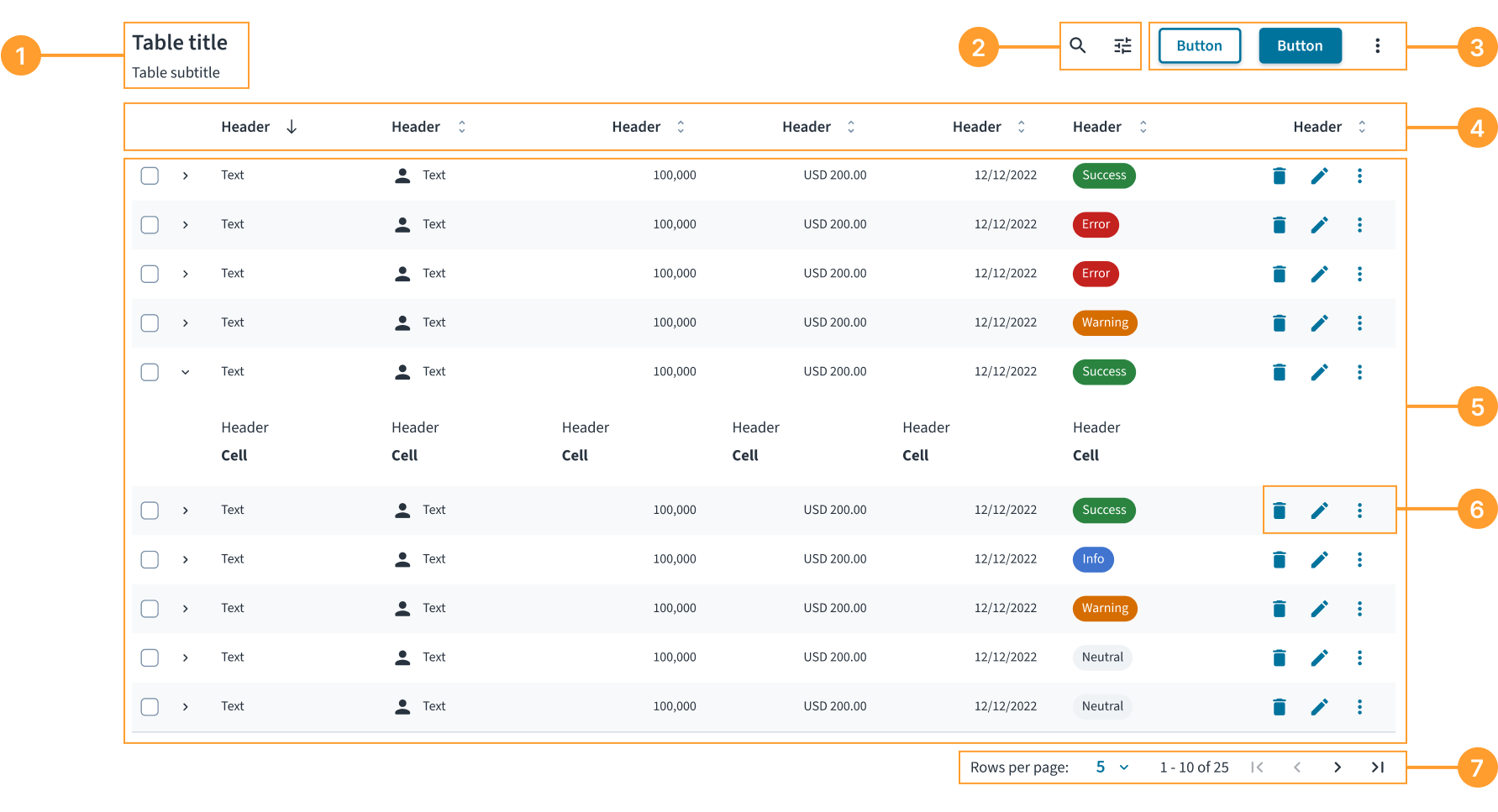
The table component consists of the following elements:
- Title and subtitle: A heading that describes the content of the table.
- Table controls: A set of controls for manipulating how data is displayed, such as search and filters.
- Table actions: A set of buttons that perform an operation on the table's dataset, such as adding a new record or exporting data.
- Column headers: Labels for each column that identify the type of data. Headers can also include sorting and other actions.
- Data rows: A complete set of cells representing a single item or record. Rows can include selection controls (checkboxes) and expand icons.
- Row actions: A set of actions in the last column that a user can take on an individual row.
- Pagination: Controls that allow users to navigate through pages of data and adjust the number of rows displayed per page.
Alignment and placement
By default, columns shrink to fit their content, except for the last column, which expands to fill the remaining available space. This preserves the scannability of the information.
If a table includes row actions, they must be placed in this last column.
Content
General writing guidelines��
- Use sentence case for all aspects of designing Guidewire product interfaces. Don't use title case.
- Use present tense verbs and active voice in most situations.
- Use common contractions to lend your copy a more natural and informal tone.
- Use plain language. Avoid unnecessary jargon and complex language.
- Keep words and sentences short.
Keep cell content concise
Try to have no more than 50 characters for content within a table cell to ensure readability. For longer content, the component handles overflow with the following specific rules:
- Text between 81 and 159 characters wraps onto multiple lines.
- Text 160 characters or longer is truncated with an ellipsis (...) and the full text will be revealed in a tooltip upon hover.
- Numerical data must always be fully visible and does not wrap or truncate.
- Other data formats wrap if necessary.
Write clear column headers
Headers must be short, descriptive, and written in sentence case.
- Keep headers to one or two words. This improves scannability and ensures readability of table data.
- Start headers with a noun when possible. Headers are labels for the data in the column, so using a noun (for example, Name, Status, Creation date) is the clearest way to describe that data.
Format numbers consistently
When writing in our source language (American English), format numbers with a comma as the thousands separator in any number with four or more digits. Do not use commas in years (unless five or more digits), page numbers, addresses, or decimals.
For other locales, follow the established localization guidelines for number formatting.
Be clear in empty states
Write direct, helpful messages that explain why the table is empty and, if possible, what the user can do next.
Behaviors
States
A table can have several states to communicate the status of the data.
- Loading: When data is being fetched, the table body displays a loading indicator with the text "Loading data...".
- Empty: When a table contains no data, it displays an empty state. The message must be helpful, and an action button is strongly recommended to guide the user. For example, when designing for a "No search results" state, display a Clear filters button if filters are active. The button type (primary, secondary, and tertiary) can be configured to suit the specific use case.
- Error: If data fails to load due to a system error (like a lost internet connection), the empty state must communicate the problem and provide a recovery action, such as a Refresh button.
- Row states: Rows can be in a default, selected (highlighted), or expanded state.
Interactions
- Sorting: Users can click a column header to sort the table data by that column. A directional icon in the header indicates the current sort order.
- Selecting: Users can select one or more rows using checkboxes in the first column. A checkbox in the header allows users to select or deselect all visible rows. When rows are selected, a contextual selection bar may appear at the top of the table.
- Expanding rows: If a row is expandable, users can click the chevron icon to reveal additional, related information directly below the row.
- Row actions: Users perform actions on a single row using the controls in the last column. Display up to two primary icon actions; place all additional actions in an ellipsis (...) menu.
- Pagination: Users can navigate between pages of data using the pagination controls at the bottom of the table.
Responsiveness and adaptiveness
The table component is fully responsive. For mobile-first use cases, however, a card view often provides a better user experience than a traditional multi-column table.
Accessibility
The contrast ratio of textual elements against their background is above 4.5:1 as per WCAG 2.1 AA requirements. Non-textual content that needs to convey meaning (such as icons and keyboard focus visibility) has a contrast ratio of at least 3:1 with its adjacent colors. All content is visible and functional up to and including 400% without requiring scrolling in two dimensions.
This component has been validated to meet the WCAG 2.1 AA accessibility guidelines. However, changes made by the content author can affect accessibility conformance.
When using this component within your application, ensure that:
- A descriptive title is provided. A title, ideally using the
<caption>element, helps users with screen readers understand the table's purpose before they begin navigating the data. - Column headers are correctly defined. Headers must be properly structured (using
<th>with ascope="col"attribute) so that screen readers can announce the correct header for each data cell as a user navigates. - All interactive elements are accessible. Any controls inside the table, such as buttons or links, must have a clear, accessible name. For icon-only buttons, this requires providing a descriptive
aria-label(for example,aria-label="Delete item"). - The current sorting status is announced. When a column is sorted, its header must communicate the direction (ascending or descending) to screen readers, typically using the
aria-sortattribute. - Indicate when content is loading. Set the
aria-busy="true"attribute on the table when its content is actively being loaded or updated.
Keyboard navigation
The table provides comprehensive keyboard navigation following the grid pattern.
Navigation keys
-
Arrow keys - Navigate between adjacent cells.
←(Left Arrow) - Move to the previous cell in the current row.→(Right Arrow) - Move to the next cell in the current row.↑(Up Arrow) - Move to the cell above in the same column.↓(Down Arrow) - Move to the cell below in the same column.
-
Tab navigation - Sequential navigation through the table.
Tab- Move to the next focusable element.Shift + Tab- Move to the previous focusable element.
-
Page navigation - Quick navigation for large tables.
Page Up- Move to the first row in the current column.Page Down- Move to the last row in the current column.
-
Boundary navigation - Jump to table boundaries.
Home- Move to the first cell in the current row.Ctrl + Home- Move to the first cell in the table (top-left).End- Move to the last cell in the current row.Ctrl + End- Move to the last cell in the table (bottom-right).
Interactive content support
The keyboard navigation system intelligently handles cells containing interactive elements:
- Buttons and links - Interactive elements, such as sorting buttons or row actions, within cells remain accessible through both standard tab navigation and arrow keys navigation. When using arrow key navigation, if a cell contains an interactive element, such as an input field, button, or link, with a
tabindexgreater than-1, focus goes to that element instead of the cell. If there are multiple interactive elements in the cell, focus goes to the first one. - Custom focusable content - Any element with a
tabindexattribute is properly integrated into the navigation flow. - Form inputs - When a cell contains input fields,
textareaelements, or other editableformelements, the navigation respects their editing mode, which means that when focus is on such an element, arrow keys function as expected for navigation within the element. To move away from the element, useTaborShift + Tab.
Focus management
The table uses advanced focus management techniques:
- Roving tabindex pattern - Only one cell in the table is focusable at a time, reducing tab stops and improving navigation efficiency.
- Boundary awareness - Navigation keys respect table boundaries and won't move focus outside the table grid.
- Visual focus indicators - Clear visual feedback shows which cell currently has focus.
In order for the focus management to work correctly, ensure that rowIndex and columnIndex properties are properly set for BodyCell component, and the columnIndex property is properly set for HeaderCell component. See component contracts for more details.
Code
export default function BasicTableExample() {
  const data = [
    {
      id: '73065',
      product: 'Go Commercial Auto',
      insured: 'Marshall Rogahn',
      premium: 1236.39,
    },
    {
      id: '80077',
      product: 'Go Worker\'s Compensation',
      insured: 'April Kub',
      premium: 173.99,
    },
    {
      id: '64487',
      product: 'USA Personal Auto',
      insured: 'Abel Rippin',
      premium: 1228.69,
    },
    {
      id: '12345',
      product: 'Go Commercial Auto',
      insured: 'John Smith',
      premium: 892.45,
    },
  ];

  return (
    <Table aria-label="Policy list">
      <TableHeader>
        <HeaderRow>
          <HeaderCell columnIndex={0}>Product</HeaderCell>
          <HeaderCell columnIndex={1}>Insured</HeaderCell>
          <HeaderCell columnIndex={2}>Premium</HeaderCell>
        </HeaderRow>
      </TableHeader>
      <TableBody>
        {data.map((row, rowIndex) => (
          <BodyRow key={row.id}>
            <BodyCell rowIndex={rowIndex} columnIndex={0}>
              {row.product}
            </BodyCell>
            <BodyCell rowIndex={rowIndex} columnIndex={1}>
              {row.insured}
            </BodyCell>
            <BodyCell rowIndex={rowIndex} columnIndex={2}>
              ${row.premium.toLocaleString()}
            </BodyCell>
          </BodyRow>
        ))}
      </TableBody>
    </Table>
  );
}
Import statement
import {
  Table,
  TableHeader,
  TableBody,
  HeaderRow,
  HeaderCell,
  BodyRow,
  BodyCell,
} from '@jutro/components';
Component contract
Make sure to understand the Design System components API surface, and the implications and trade-offs. Learn more in our introduction to the component API.
Table
The Table component defines the structure of the table.
It accepts TableHeader and TableBody as its children. For more information, refer to the nesting section.
Properties
In addition to the Table component custom properties, you can pass standard HTML attributes to it.
noStripedRows- Type
booleanDescriptionDetermines whether the table displays alternating striped rows for better visual distinction.
Default valuefalse sortingIcons- Type
{ ascendingIcon: element, descendingIcon: element, unsortedIcon: element }DescriptionDefines custom icons for column sorting buttons, including ascending, descending, and unsorted states.
TableHeader
The TableHeader component defines the header section of the table.
It must be used as a child of the Table component and only accepts HeaderRow as its child. For more information, refer to the nesting section.
Properties
The TableHeader component does not have custom properties, but you can pass standard HTML attributes to it.
TableBody
The TableBody component defines the body section of the table.
It must be used as a child of the Table component and only accepts BodyRow as its child. For more information, refer to the nesting section.
Properties
The TableBody component does not have custom properties, but you can pass standard HTML attributes to it.
HeaderRow
The HeaderRow component defines a row in the header section of the table.
It must be used as a child of the TableHeader component and only accepts HeaderCell as its child. For more information, refer to the nesting section.
Properties
The HeaderRow component does not have custom properties, but you can pass standard HTML attributes to it.
BodyRow
The BodyRow component defines a row in the body section of the table.
It must be used as a child of the TableBody component and only accepts BodyCell as its child. For more information, refer to the nesting section.
Properties
In addition to the BodyRow component custom properties, you can pass standard HTML attributes to it.
selected- Type
booleanDescriptionIndicates whether the row is selected. Used in the row selection feature implementation.
HeaderCell
The HeaderCell component defines a cell in the header section of the table. Populate it with the column headers.
It must be used as a child of the HeaderRow component. For more information, refer to the nesting section.
Properties
In addition to the HeaderCell component custom properties, you can pass standard HTML attributes to it.
columnIndexrequired- Type
numberDescriptionSets the column index. Must be explicitly set to ensure accurate accessibility semantics when rendering multiple cells. The column index must start from 0.
align- Type
'left' | 'center' | 'right'DescriptionSets the alignment of the header cell content.
Default value'left' isSortable- Type
booleanDescriptionIndicates whether the column is sortable or not. Used in the sorting feature implementation.
Default valuefalse isSorted- Type
false | 'asc' | 'desc'DescriptionIndicates the sorting state of the column. Used in the sorting feature implementation.
onSort- Type
(event: unknown) => voidDescriptionCallback function triggered when a user clicks or activates the sortable column header. Use it to handle sorting logic, such as toggling between ascending, descending, and unsorted states, and updating the table data accordingly.
BodyCell
The BodyCell component defines a cell in the body section of the table. Populate it with the data for each individual cell in every row.
It must be used as a child of the BodyRow component. For more information, refer to the nesting section.
Properties
In addition to the BodyCell component custom properties, you can pass standard HTML attributes to it.
columnIndexrequired- Type
numberDescriptionSets the column index. Must be explicitly set to ensure accurate accessibility semantics when rendering multiple cells. The column index must start from 0.
rowIndexrequired- Type
numberDescriptionSets the row index. Must be explicitly set to ensure accurate accessibility semantics when rendering multiple cells. The row index must start from 0.
align- Type
'left' | 'center' | 'right'DescriptionSets the horizontal alignment of the body cell content.
Default value'left'
Custom behaviors
Nesting
The Table component defines the structure of the table through the children properties of ReactNode type. You must use the table structure components in the following way:
Tablecomponent acceptsTableHeaderandTableBodyas children.TableHeadercomponent acceptsHeaderRowas children and must only be used in the context ofTable.TableBodycomponent acceptsBodyRowas children and must only be used in the context ofTable.HeaderRowcomponent acceptsHeaderCellas children and must only be used in the context ofTableHeader.BodyRowcomponent acceptsBodyCellas children and must only be used in the context ofTableBody.HeaderCellcomponent must only be used in the context ofHeaderRow.BodyCellcomponent must only be used in the context ofBodyRow.
Although these components might be able to display or handle other types or HTML elements, that is not a supported feature.
Striped rows
By default, the table displays alternating row background colors (striped rows) to improve readability and help users track data across columns. You can disable this behavior by setting the noStripedRows property to true in the Table component. Consider doing it when working with tables that have very few rows, or when implementing custom row styling that conflicts with the default striping.
Example with the noStripedRows property set to true:
Hooks
No hooks are available for Table.
Translation keys
There are no translations for Table.
For information on how to manage translations, see our section about Internationalization.
Escape hatches
For more information, see our documentation about escape hatches.
Passing HTML attributes to components
You can pass standard HTML attributes, such as id, className, and style from corresponding HTML elements to all of the table components. These attributes are applied to the root element of the respective component.
Root elements of table components
| Table component | HTML element |
|---|---|
Table | <table> |
TableHeader | <thead> |
TableBody | <tbody> |
HeaderRow | <tr> |
BodyRow | <tr> |
HeaderCell | <th> |
BodyCell | <td> |
Example
In this example, the aria-labelledby attribute is passed to the Table component. It references the id of the Typography component that serves as the table title and reads the text content of that component as the table's accessible name.
export function TableHTMLPropExample() {
  const data = [
    {
      id: '73065',
      product: 'Go Commercial Auto',
      insured: 'Marshall Rogahn',
      premium: 1236.39,
    },
    {
      id: '80077',
      product: 'Go Worker\'s Compensation',
      insured: 'April Kub',
      premium: 173.99,
    },
    {
      id: '64487',
      product: 'USA Personal Auto',
      insured: 'Abel Rippin',
      premium: 1228.69,
    },
    {
      id: '12345',
      product: 'Go Commercial Auto',
      insured: 'John Smith',
      premium: 892.45,
    },
  ];

  return (
    <div>
      <Typography variant="heading-3" id="policy-list-title">
        Policy list
      </Typography>
      <Table aria-labelledby="policy-list-title">
        <TableHeader>
          <HeaderRow>
            <HeaderCell columnIndex={0}>Product</HeaderCell>
            <HeaderCell columnIndex={1}>Insured</HeaderCell>
            <HeaderCell columnIndex={2}>Premium</HeaderCell>
          </HeaderRow>
        </TableHeader>
        <TableBody>
          {data.map((row, rowIndex) => (
            <BodyRow key={row.id}>
              <BodyCell rowIndex={rowIndex} columnIndex={0}>
                {row.product}
              </BodyCell>
              <BodyCell rowIndex={rowIndex} columnIndex={1}>
                {row.insured}
              </BodyCell>
              <BodyCell rowIndex={rowIndex} columnIndex={2}>
                ${row.premium.toLocaleString()}
              </BodyCell>
            </BodyRow>
          ))}
        </TableBody>
      </Table>
    </div>
  );
}