Table pagination
Usage
Overview
Pagination enables users to navigate large datasets by dividing content into manageable pages. It provides controls to browse through pages and adjust the number of items displayed at one time, which is essential for maintaining performance and readability in data-heavy applications.
When to use
- To manage large datasets: Use when a table has hundreds or thousands of rows, and rendering them all at once impacts performance or page loading times.
- To improve scannability: Use when too much data on one page overwhelms users, making it harder to find or compare values.
- To enhance accessibility: Use when large tables create navigation issues for screen readers or keyboard users (for example, a table with hundreds of rows is impractical to explore).
- For filtered views: Use when users typically view a subset of data, like search results or filtered views. Pagination keeps them oriented and helps with manageable chunks.
When not to use
- For small datasets: Avoid if all rows can be displayed without performance issues or overwhelming the user (for example, 20-50 rows).
- For broad comparison tasks: Avoid when users need to compare many rows at once; consider virtual scrolling or filtered views instead.
- For single-view tasks: Don't use if the dataset represents a complete set that cannot be split across pages, like a settings table.
Formatting
Anatomy
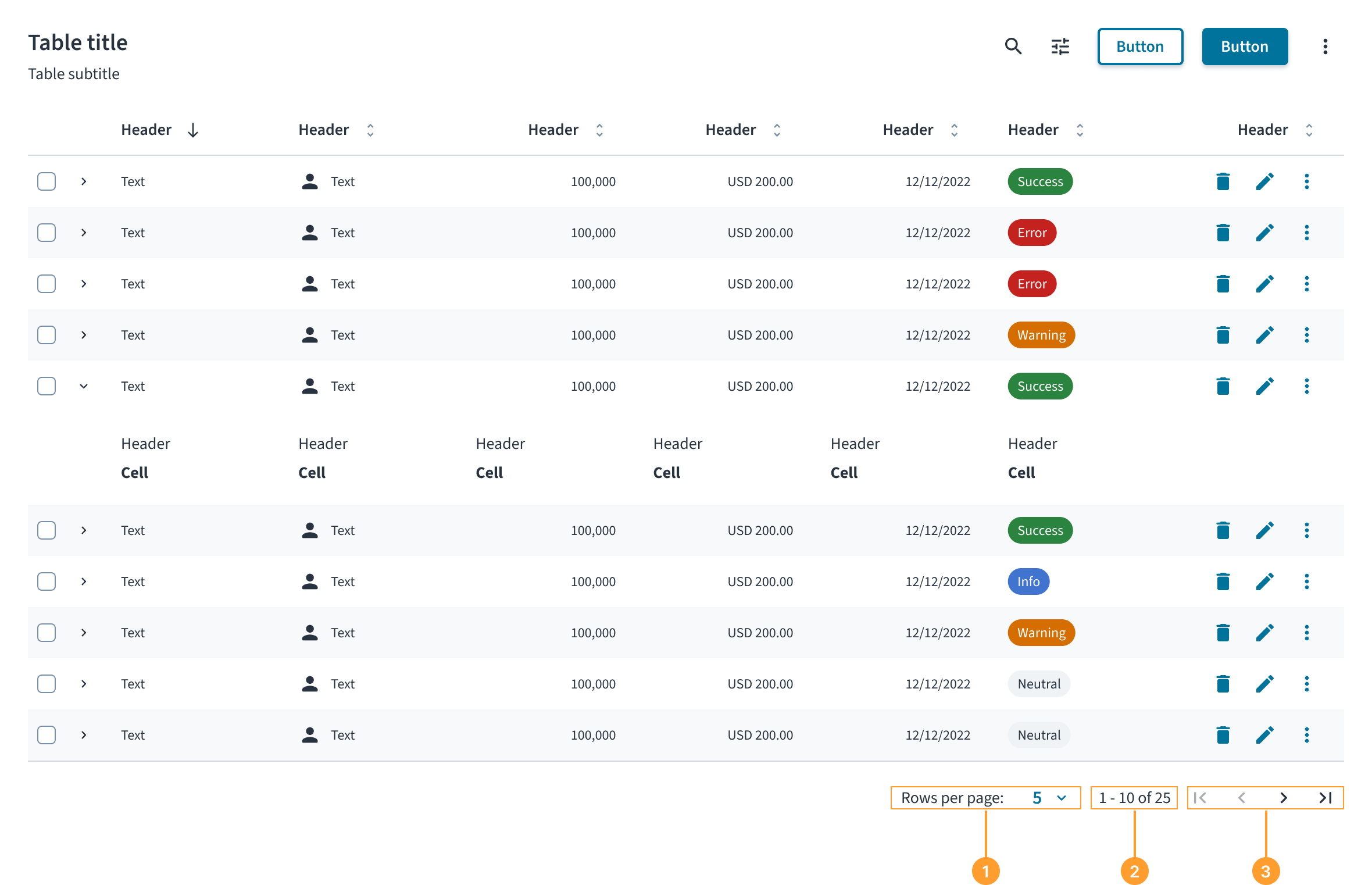
The pagination component appears at the bottom of the content it controls and consists of the following elements:
- Rows per page select: A dropdown that allows users to change the number of items displayed on each page.
- Item range display: A text label that communicates which items are currently being viewed in the context of the total number of items (for example, "1 - 10 of 25").
- Navigation controls: Icon buttons that enable users to move to the previous or next page of data, as well as navigate to the first and last page.
Content
General writing guidelines
- Use sentence case for all aspects of designing Guidewire product interfaces. Don't use title case.
- Use present tense verbs and active voice in most situations.
- Use common contractions to lend your copy a more natural and informal tone.
- Use plain language. Avoid unnecessary jargon and complex language.
- Keep words and sentences short.
Behaviors
States
The primary states of the pagination component relate to its navigation controls.
- The Previous page button must be disabled when the user is on the first page of data.
- The Next page button must be disabled when the user is on the last page of data.
Interactions
- Selecting a new value from the Rows per page dropdown reloads the associated component to display the chosen number of items.
- Clicking the Next page or Previous page buttons navigates the user through the dataset one page at a time.
Pagination usage approaches
- Default usage: Use the component in a standard, synchronous context. Customers provide the values directly to the component.
- Async table usage: When used with tables that fetch data asynchronously from a server, pagination reflects the table's current state. The component itself remains synchronous; the table manages async logic. This approach is applicable to both the default usage and when using TanStack Table.
- TanStack table usage: When using a table managed by TanStack Table, the consumer passes the table's pagination state to the pagination component. This allows the pagination UI to reflect the current table state, including any async or server-driven updates managed by the table.
Accessibility
The contrast ratio of textual elements against their background is above 4.5:1 as per WCAG 2.1 AA requirements. Non-textual content that needs to convey meaning (such as icons and keyboard focus visibility) has a contrast ratio of at least 3:1 with its adjacent colors. All content is visible and functional up to and including 400% without requiring scrolling in two dimensions.
This component has been validated to meet the WCAG 2.1 AA accessibility guidelines. However, changes made by the content author can affect accessibility conformance.
When using this component within your application, observe these best practices:
- Keyboard interaction: All controls within the pagination component must be keyboard focusable and operable. Users must be able to navigate between the dropdown and the navigation buttons using the
Tabkey and activate them using theEnterorSpacekeys. - Screen reader: The pagination component must be wrapped in a
<nav>element with anaria-labelof "Pagination" to identify it as a landmark region. All controls must have clear, accessible names. For the navigation buttons, usearia-labelattributes like "Go to previous page" and "Go to next page". The item range display (for example, "1 - 10 of 25") must be programmatically associated with the controls so it can be announced to screen reader users, providing essential context for navigation.
Code
<Table>
    {/* Table component content */}
</Table>
<Pagination
    currentPageIndex={pageIndex}
    pageSize={pageSize}
    totalRows={totalRows}
    pageSizeOptions={args.pageSizeOptions}
    onPageIndexChange={newPageIndex => {
        argsOnPageIndexChange(newPageIndex);
        onPageIndexChange(newPageIndex);
    }}
    onPageSizeChange={newPageSize => {
        argsOnPageSizeChange(newPageSize);
        onPageSizeChange(newPageSize);
    }}
    className={styles.tablePagination}
    aria-label={`${TableTitleString} pagination`}
    disabled={args.disabled}
/>
Check out the Examples section for complete code samples demonstrating various pagination implementations.
Import statement
import { Pagination } from '@jutro/components';
Component contract
Make sure to understand the Design System components API surface, and the implications and trade-offs. Learn more in our introduction to the component API.
Properties
currentPageIndexrequired- Type
numberDescriptionDefines the current page index, using zero-based indexing method. Defaults to 0 if set to a number less than 0.
Default value0 onPageIndexChangerequired- Type
(newPageIndex: number) => voidDescriptionCallback function that is invoked when the page index changes.
onPageSizeChangerequired- Type
(newPageSize: number) => voidDescriptionCallback function that is invoked when the page size changes.
totalRowsrequired- Type
numberDescriptionDefines the total number of rows currently available in the dataset. It takes into account any applied filters.
disabled- Type
booleanDescriptionDetermines whether the pagination component is disabled. It is used to disable the pagination controls during loading state.
Default valuefalse pageSize- Type
numberDescriptionDefines the number of rows shown per page. Defaults to 10 if less than or equal to 0.
Default value10 pageSizeOptions- Type
number[]DescriptionDefines the available page size options. Values less than or equal to 0 are ignored.
Default value[10, 25, 50]
Hooks
No hooks are available for Pagination.
Translation keys
There are no translations for Pagination.
For information on how to manage translations, see our section about Internationalization.
Escape hatches
For more information, see our documentation about escape hatches.
Examples
The table component provides complete pagination functionality using only Jutro components. For advanced use cases or existing integrations, you can optionally leverage external libraries such as Tanstack Table to handle parts of data management logic.
You can review two types of code examples for table pagination that demonstrate using only Jutro components and using TanStack Table for part of data management logic. The examples have all files needed for you to run them in your environment, such as hooks and mock data. Each example has a different set of files.
Check out the Usage section for details about how to design a table properly, and the different configuration options we provide.
Basic pagination implementation
To implement pagination with the table component, combine the Table and Pagination components with a data management layer such as a custom hook that manages pagination state.
The pagination component requires currentPageIndex and totalRows properties to display the correct state, along with onPageIndexChange and onPageSizeChange callbacks to handle user interactions. You can handle page changes by updating the data state and resetting to the first page when the page size changes to ensure users don't end up on empty pages.
Use a data management layer (such as the useTableData custom hook) to slice your dataset based on the current page and page size, then pass the paginated data to your table rows.
Alternatively, you can use TanStack Table as data management layer, which provides built-in pagination state management and handles page calculations automatically through its useReactTable hook.
Accessibility
The pagination component must be placed below the table with an appropriate aria-label that references the table title for accessibility. Pass the translated string from the table title component with a "pagination" suffix to the aria-label property of the Paginationcomponent.
Component implementation
import React, { useId, type ReactNode } from 'react';

import {
    BodyCell,
    BodyRow,
    HeaderCell,
    HeaderRow,
    Pagination,
    Table,
    TableBody,
    TableHeader,
} from '@jutro/components';
import type { PaginationProps, TableProps } from '@jutro/components';
import { Typography } from '@jutro/components';

import { TableMockData, tableMockData } from './table.mockdata';

import { useTableData } from './useTableDataPagination';

/** Column type definition that specifies the structure for table columns. */
/** Each column has an id, header renderer, cell renderer, and optional alignment. */
export type Column<T> = {
    id: string;
    header: () => ReactNode;
    cell: (row: T) => ReactNode;
    align?: 'left' | 'right' | 'center';
};

export type ColumnDefinition<T extends object> = Array<Column<T>>;

/** Column configuration for the table with Product, Insured, and Premium columns. */
export const columns: ColumnDefinition<TableMockData> = [
    {
        id: 'product',
        header: () => (
            <Typography variant="heading-5" tag="span">
                Product
            </Typography>
        ),
        cell: row => (
            <Typography>{row.product.name}</Typography>
        ),
    },
    {
        id: 'insured',
        header: () => (
            <Typography variant="heading-5" tag="span">
                Insured
            </Typography>
        ),
        cell: row => <Typography>{row.insured}</Typography>,
    },
    {
        id: 'premium',
        header: () => (
            <Typography variant="heading-5" tag="span">
                Premium
            </Typography>
        ),
        cell: row => (
            <Typography>
                {`${row.premium.currency} ${row.premium.amount?.toFixed(2)}`}
            </Typography>
        ),
        align: 'right',
    },
];

export const TableTitleString = 'Policy list';

/** Component that renders a table title section with heading and subtitle. */
export const TableTitle: React.FC<{ tableId: string }> = ({ tableId }) => (
    <div>
        <div>
            <Typography variant="heading-2" id={tableId}>
                {TableTitleString}
            </Typography>
            <Typography role="doc-subtitle">
                Detailed record of individual policies
            </Typography>
        </div>
    </div>
);

export function PaginationStory(
    args: TableProps & PaginationProps
): React.ReactElement {
    const tableId = useId();

    /** Provide default values for callback props. */
    const {
        onPageIndexChange: argsOnPageIndexChange = () => {},
        onPageSizeChange: argsOnPageSizeChange = () => {},
        ...restArgs
    } = args;

    const {
        data,
        pageSize,
        pageIndex,
        totalRows,
        onPageIndexChange,
        onPageSizeChange,
    } = useTableData<TableMockData>({
        data: tableMockData,
    });

    return (
        <div>
            <TableTitle tableId={tableId} />
            <Table
                noStripedRows={args.noStripedRows}
                className={args.className}
                aria-labelledby={tableId}
            >
                <TableHeader>
                    <HeaderRow>
                        {columns.map(({ id, header, align }, columnIndex) => (
                            <HeaderCell
                                key={id}
                                columnIndex={columnIndex}
                                align={align}
                            >
                                {header()}
                            </HeaderCell>
                        ))}
                    </HeaderRow>
                </TableHeader>
                <TableBody>
                    {data.map((row, rowIndex) => (
                        <BodyRow key={row.id}>
                            {columns.map(({ id, cell, align }, columnIndex) => (
                                <BodyCell
                                    key={`${id}_${row.id}`}
                                    rowIndex={rowIndex}
                                    columnIndex={columnIndex}
                                    align={align}
                                >
                                    {cell(row)}
                                </BodyCell>
                            ))}
                        </BodyRow>
                    ))}
                </TableBody>
            </Table>
            <Pagination
                currentPageIndex={pageIndex}
                pageSize={pageSize}
                totalRows={totalRows}
                pageSizeOptions={args.pageSizeOptions}
                onPageIndexChange={newPageIndex => {
                    argsOnPageIndexChange(newPageIndex);
                    onPageIndexChange(newPageIndex);
                }}
                onPageSizeChange={newPageSize => {
                    argsOnPageSizeChange(newPageSize);
                    onPageSizeChange(newPageSize);
                }}
                aria-label={`${TableTitleString} pagination`}
                disabled={args.disabled}
            />
        </div>
    );
}
Data management
import { useMemo, useState } from 'react';

/** Arguments for the useTableData hook. */
export type UseTableDataArgs<T extends object> = {
    data: T[];
    initialState?: {
        pageSize?: number;
        pageIndex?: number;
    };
};

/** Return type for the useTableData hook. */
export type UseTableDataResult<T extends object> = {
    data: T[];
    pageSize: number | undefined;
    pageIndex: number;
    totalRows: number;
    onPageIndexChange: (index: number) => void;
    onPageSizeChange: (size: number) => void;
};

const DEFAULT_PAGE_INDEX = 0;
const DEFAULT_PAGE_SIZE = 10;

/**
 * Utility class for handling table data operations.
 * Provides methods for pagination and data manipulation.
 */
class TableData<T extends object> {
    private data: T[];
    private length: number;

    constructor(data: T[]) {
        this.data = data;
        this.length = this.data.length;
    }

    paginate(pageIndex: number, pageSize: number) {
        const sliceStart = pageIndex * pageSize;
        const sliceEnd = (pageIndex + 1) * pageSize;

        this.data = this.data.slice(sliceStart, sliceEnd);

        return this;
    }

    getLength() {
        return this.length;
    }

    getData() {
        return this.data;
    }
}

/**
 * Custom React hook for managing table data with pagination.
 * Handles pagination state and provides paginated data along with control functions.
 */
export function useTableData<T extends object>({
    data: initialData,
    initialState: {
        pageIndex: initialPageIndex = DEFAULT_PAGE_INDEX,
        pageSize: initialPageSize = DEFAULT_PAGE_SIZE,
    } = {},
}: UseTableDataArgs<T>): UseTableDataResult<T> {
    const [pageSize, setPageSize] = useState(initialPageSize);
    const [pageIndex, setPageIndex] = useState(initialPageIndex);

    const { tableData, totalRows } = useMemo(() => {
        const tableDataFactory = new TableData<T>(initialData);

        return {
            tableData: tableDataFactory
                .paginate(pageIndex, pageSize)
                .getData(),
            totalRows: initialData.length,
        };
    }, [
        initialData,
        pageIndex,
        pageSize,
    ]);

    const onPageIndexChange = (newPageIndex: number) => {
        setPageIndex(newPageIndex);
    };

    const onPageSizeChange = (newPageSize: number) => {
        const newPageIndex = Math.floor((pageIndex * pageSize) / newPageSize);

        setPageSize(newPageSize);
        setPageIndex(newPageIndex);
    };

    return {
        data: tableData,
        pageSize,
        pageIndex,
        totalRows,
        onPageIndexChange,
        onPageSizeChange,
    };
}
import type { CurrencyInputProps } from '@jutro/components';
export type TableMockDataProduct = {
name: string;
};
export type TableMockDataCurrency = NonNullable<CurrencyInputProps['value']>;
export type TableMockData = {
id: string;
product: TableMockDataProduct;
insured: string;
premium: TableMockDataCurrency;
};
export const tableMockData: Array<TableMockData> = [
{
id: '73065',
product: {
name: 'Go Commercial Auto',
},
insured: 'Marshall Rogahn',
premium: { currency: 'USD', amount: 1236.39 },
},
{
id: '80077',
product: {
name: 'Go Worker\'s Compensation',
},
insured: 'April Kub',
premium: { currency: 'USD', amount: 173.99 },
},
{
id: '64487',
product: {
name: 'USA Personal Auto',
},
insured: 'Abel Rippin',
premium: { currency: 'USD', amount: 1228.69 },
},
{
id: '12345',
product: {
name: 'Go Commercial Auto',
},
insured: 'John Smith',
premium: { currency: 'USD', amount: 892.45 },
},
{
id: '23456',
product: {
name: 'Go Worker\'s Compensation',
},
insured: 'Sarah Johnson',
premium: { currency: 'USD', amount: 567.23 },
},
{
id: '34567',
product: {
name: 'USA Personal Auto',
},
insured: 'Michael Brown',
premium: { currency: 'USD', amount: 445.67 },
},
{
id: '45678',
product: {
name: 'Go Commercial Auto',
},
insured: 'Emily Davis',
premium: { currency: 'USD', amount: 2134.89 },
},
{
id: '56789',
product: {
name: 'Go Worker\'s Compensation',
},
insured: 'David Wilson',
premium: { currency: 'USD', amount: 823.45 },
},
{
id: '67890',
product: {
name: 'USA Personal Auto',
},
insured: 'Jessica Miller',
premium: { currency: 'USD', amount: 298.76 },
},
{
id: '78901',
product: {
name: 'Go Commercial Auto',
},
insured: 'Christopher Taylor',
premium: { currency: 'USD', amount: 3456.78 },
},
{
id: '37586',
product: {
name: 'Go Commercial Auto',
},
insured: 'Pamela Heller',
premium: { currency: 'USD', amount: 1947.5 },
},
{
id: '32975',
product: {
name: 'USA Personal Auto',
},
insured: 'Mr. Mike Stehr',
premium: { currency: 'USD', amount: 340.39 },
},
{
id: '56789',
product: {
name: 'Go Worker\'s Compensation',
},
insured: 'Katie Ankunding',
premium: { currency: 'USD', amount: 430.25 },
},
{
id: '44320',
product: {
name: 'Go Commercial Auto',
},
insured: 'Dawn Hermiston',
premium: { currency: 'USD', amount: 794.35 },
},
{
id: '05401',
product: {
name: 'Go Worker\'s Compensation',
},
insured: 'Erika Turner',
premium: { currency: 'USD', amount: 156.69 },
},
{
id: '53420',
product: {
name: 'USA Personal Auto',
},
insured: 'Harold Leannon',
premium: { currency: 'USD', amount: 255.29 },
},
{
id: '05681',
product: {
name: 'Go Worker\'s Compensation',
},
insured: 'Jeffery Mills',
premium: { currency: 'USD', amount: 502.69 },
},
{
id: '97696',
product: {
name: 'USA Personal Auto',
},
insured: 'Theresa Bernier',
premium: { currency: 'USD', amount: 1580.49 },
},
{
id: '70782',
product: {
name: 'Go Commercial Auto',
},
insured: 'Ms. Danielle Kuhic',
premium: { currency: 'USD', amount: 1821.85 },
},
{
id: '35800',
product: {
name: 'Go Worker\'s Compensation',
},
insured: 'Sidney Raynor',
premium: { currency: 'USD', amount: 447.8 },
},
{
id: '93190',
product: {
name: 'USA Personal Auto',
},
insured: 'Marcella Heaney',
premium: { currency: 'USD', amount: 524.29 },
},
{
id: '71208',
product: {
name: 'Go Commercial Auto',
},
insured: 'Bernard Torp',
premium: { currency: 'USD', amount: 130.89 },
},
{
id: '35905',
product: {
name: 'Go Worker\'s Compensation',
},
insured: 'Ebony Thompson',
premium: { currency: 'USD', amount: 1960.29 },
},
{
id: '52899',
product: {
name: 'USA Personal Auto',
},
insured: 'Jackie Lehner',
premium: { currency: 'USD', amount: 1971.19 },
},
{
id: '34985',
product: {
name: 'Go Commercial Auto',
},
insured: 'Oliver Lynch',
premium: { currency: 'USD', amount: 244.45 },
},
{
id: '23141',
product: {
name: 'Go Worker\'s Compensation',
},
insured: 'Darnell Roob-Connelly',
premium: { currency: 'USD', amount: 1203.59 },
},
{
id: '80844',
product: {
name: 'USA Personal Auto',
},
insured: 'Belinda Hintz',
premium: { currency: 'USD', amount: 1436.89 },
},
{
id: '93284',
product: {
name: 'Go Commercial Auto',
},
insured: 'Miss Shelley Gibson',
premium: { currency: 'USD', amount: 1241.85 },
},
{
id: '25834',
product: {
name: 'Go Worker\'s Compensation',
},
insured: 'Suzanne Schuster',
premium: { currency: 'USD', amount: 528.29 },
},
{
id: '31574',
product: {
name: 'USA Personal Auto',
},
insured: 'Jason DuBuque Jr.',
premium: { currency: 'USD', amount: 1749.69 },
},
{
id: '20234',
product: {
name: 'Go Commercial Auto',
},
insured: 'Bonnie Carter',
premium: { currency: 'USD', amount: 989.79 },
},
{
id: '62358',
product: {
name: 'Go Worker\'s Compensation',
},
insured: 'Ismael Carter-Weber',
premium: { currency: 'USD', amount: 1344.29 },
},
{
id: '79336',
product: {
name: 'USA Personal Auto',
},
insured: 'Myra Jast',
premium: { currency: 'USD', amount: 959.55 },
},
{
id: '26031',
product: {
name: 'Go Commercial Auto',
},
insured: 'Ms. Estelle Kunde',
premium: { currency: 'USD', amount: 262.79 },
},
{
id: '98761',
product: {
name: 'Go Worker\'s Compensation',
},
insured: 'Juana Green III',
premium: { currency: 'USD', amount: 1324.5 },
},
{
id: '65487',
product: {
name: 'USA Personal Auto',
},
insured: 'Melissa Bahringer',
premium: { currency: 'USD', amount: 1974.29 },
},
{
id: '11811',
product: {
name: 'Go Commercial Auto',
},
insured: 'Doyle Aufderhar',
premium: { currency: 'USD', amount: 838.29 },
},
{
id: '77339',
product: {
name: 'Go Worker\'s Compensation',
},
insured: 'Tonya Gibson',
premium: { currency: 'USD', amount: 1644 },
},
{
id: '21024',
product: {
name: 'USA Personal Auto',
},
insured: 'Edmond Osinski',
premium: { currency: 'USD', amount: 170.09 },
},
{
id: '94991',
product: {
name: 'Go Commercial Auto',
},
insured: 'Debbie Tillman MD',
premium: { currency: 'USD', amount: 1072.89 },
},
{
id: '37297',
product: {
name: 'Go Worker\'s Compensation',
},
insured: 'Mr. Raymond Abshire-Runolfsdottir',
premium: { currency: 'USD', amount: 417.78 },
},
{
id: '13979',
product: {
name: 'USA Personal Auto',
},
insured: 'Ella Adams',
premium: { currency: 'USD', amount: 537.79 },
},
{
id: '17343',
product: {
name: 'Go Commercial Auto',
},
insured: 'Ernesto Murphy',
premium: { currency: 'USD', amount: 1444.25 },
},
{
id: '42516',
product: {
name: 'Go Worker\'s Compensation',
},
insured: 'Ms. Josefina Heaney',
premium: { currency: 'USD', amount: 144.95 },
},
{
id: '75897',
product: {
name: 'USA Personal Auto',
},
insured: 'Andrew Yost',
premium: { currency: 'USD', amount: 712.79 },
},
{
id: '75048',
product: {
name: 'Go Commercial Auto',
},
insured: 'Dallas Leffler',
premium: { currency: 'USD', amount: 287.24 },
},
{
id: '40348',
product: {
name: 'Go Worker\'s Compensation',
},
insured: 'Melody Kohler',
premium: { currency: 'USD', amount: 1117.49 },
},
{
id: '92776',
product: {
name: 'USA Personal Auto',
},
insured: 'Angelica Okuneva',
premium: { currency: 'USD', amount: 1611.99 },
},
{
id: '93152',
product: {
name: 'Go Commercial Auto',
},
insured: 'Terence Wilkinson',
premium: { currency: 'USD', amount: 328.19 },
},
{
id: '44352',
product: {
name: 'Go Worker\'s Compensation',
},
insured: 'Jeannette Murazik Jr.',
premium: { currency: 'USD', amount: 1126.29 },
},
{
id: '41856',
product: {
name: 'USA Personal Auto',
},
insured: 'Joseph Pouros',
premium: { currency: 'USD', amount: 878.49 },
},
{
id: '11633',
product: {
name: 'Go Commercial Auto',
},
insured: 'Rachael Weimann',
premium: { currency: 'USD', amount: 159.07 },
},
{
id: '16770',
product: {
name: 'Go Worker\'s Compensation',
},
insured: 'Mrs. Marta Jacobi',
premium: { currency: 'USD', amount: 1779.49 },
},
{
id: '53601',
product: {
name: 'USA Personal Auto',
},
insured: 'Alicia Larkin',
premium: { currency: 'USD', amount: 934.49 },
},
{
id: '46741',
product: {
name: 'Go Commercial Auto',
},
insured: 'Mr. Jose Wisoky',
premium: { currency: 'USD', amount: 1938.25 },
},
{
id: '30067',
product: {
name: 'Go Worker\'s Compensation',
},
insured: 'Dr. Brent Zboncak DVM',
premium: { currency: 'USD', amount: 1680.27 },
},
{
id: '87136',
product: {
name: 'USA Personal Auto',
},
insured: 'Kayla Bode Sr.',
premium: { currency: 'USD', amount: 1923.29 },
},
{
id: '92090',
product: {
name: 'Go Commercial Auto',
},
insured: 'Sammy Bradtke',
premium: { currency: 'USD', amount: 1478.15 },
},
{
id: '62922',
product: {
name: 'Go Worker\'s Compensation',
},
insured: 'Roberto Lindgren',
premium: { currency: 'USD', amount: 836.69 },
},
{
id: '64971',
product: {
name: 'USA Personal Auto',
},
insured: 'Iris Cronin',
premium: { currency: 'USD', amount: 850.33 },
},
{
id: '72384',
product: {
name: 'Go Commercial Auto',
},
insured: 'Cathy Morar',
premium: { currency: 'USD', amount: 1072.09 },
},
{
id: '28848',
product: {
name: 'Go Worker\'s Compensation',
},
insured: 'Dana Quigley',
premium: { currency: 'USD', amount: 294.57 },
},
{
id: '82642',
product: {
name: 'USA Personal Auto',
},
insured: 'Simon Deckow',
premium: { currency: 'USD', amount: 497.66 },
},
{
id: '01350',
product: {
name: 'Go Commercial Auto',
},
insured: 'Lynda Kuhic I',
premium: { currency: 'USD', amount: 256.09 },
},
{
id: '48722',
product: {
name: 'Go Worker\'s Compensation',
},
insured: 'Alexander Ryan',
premium: { currency: 'USD', amount: 1755.99 },
},
{
id: '86848',
product: {
name: 'USA Personal Auto',
},
insured: 'Tommy Ratke',
premium: { currency: 'USD', amount: 1802.35 },
},
{
id: '29232',
product: {
name: 'Go Commercial Auto',
},
insured: 'Ann Baumbach',
premium: { currency: 'USD', amount: 1049.55 },
},
{
id: '05452',
product: {
name: 'Go Worker\'s Compensation',
},
insured: 'Conrad Bernhard',
premium: { currency: 'USD', amount: 1159.59 },
},
{
id: '11648',
product: {
name: 'USA Personal Auto',
},
insured: 'Ralph Weber',
premium: { currency: 'USD', amount: 779.45 },
},
{
id: '77546',
product: {
name: 'Go Commercial Auto',
},
insured: 'Guadalupe Wiza IV',
premium: { currency: 'USD', amount: 1754.39 },
},
{
id: '71382',
product: {
name: 'Go Worker\'s Compensation',
},
insured: 'Candice Fahey',
premium: { currency: 'USD', amount: 812.79 },
},
{
id: '08393',
product: {
name: 'USA Personal Auto',
},
insured: 'Laura Leannon DVM',
premium: { currency: 'USD', amount: 1364.65 },
},
{
id: '92539',
product: {
name: 'Go Commercial Auto',
},
insured: 'Kari Davis Jr.',
premium: { currency: 'USD', amount: 1697.29 },
},
{
id: '15371',
product: {
name: 'Go Worker\'s Compensation',
},
insured: 'Wilma Frami',
premium: { currency: 'USD', amount: 177.35 },
},
{
id: '88128',
product: {
name: 'USA Personal Auto',
},
insured: 'Yvonne Turcotte',
premium: { currency: 'USD', amount: 1976.19 },
},
{
id: '60171',
product: {
name: 'Go Commercial Auto',
},
insured: 'Marilyn Durgan',
premium: { currency: 'USD', amount: 854.29 },
},
{
id: '12899',
product: {
name: 'Go Worker\'s Compensation',
},
insured: 'Audrey Lemke',
premium: { currency: 'USD', amount: 842.78 },
},
{
id: '60012',
product: {
name: 'USA Personal Auto',
},
insured: 'Rufus Klein',
premium: { currency: 'USD', amount: 1573.35 },
},
{
id: '88293',
product: {
name: 'Go Commercial Auto',
},
insured: 'Manuel Berge PhD',
premium: { currency: 'USD', amount: 1443.15 },
},
{
id: '80959',
product: {
name: 'Go Worker\'s Compensation',
},
insured: 'Marta Witting',
premium: { currency: 'USD', amount: 1872.65 },
},
{
id: '73252',
product: {
name: 'USA Personal Auto',
},
insured: 'Santos Spinka',
premium: { currency: 'USD', amount: 578.85 },
},
{
id: '45442',
product: {
name: 'Go Commercial Auto',
},
insured: 'Julius Douglas',
premium: { currency: 'USD', amount: 145.99 },
},
{
id: '53022',
product: {
name: 'Go Worker\'s Compensation',
},
insured: 'Clay Brakus-Konopelski',
premium: { currency: 'USD', amount: 1392.3 },
},
{
id: '75387',
product: {
name: 'USA Personal Auto',
},
insured: 'Levi Predovic',
premium: { currency: 'USD', amount: 874 },
},
{
id: '70048',
product: {
name: 'Go Commercial Auto',
},
insured: 'Elias King',
premium: { currency: 'USD', amount: 1727.9 },
},
{
id: '93273',
product: {
name: 'Go Worker\'s Compensation',
},
insured: 'Jeff Parisian',
premium: { currency: 'USD', amount: 1426.99 },
},
{
id: '97759',
product: {
name: 'USA Personal Auto',
},
insured: 'Tyrone Trantow',
premium: { currency: 'USD', amount: 1276.29 },
},
{
id: '12809',
product: {
name: 'Go Commercial Auto',
},
insured: 'Kristina Huels',
premium: { currency: 'USD', amount: 502.49 },
},
{
id: '17134',
product: {
name: 'Go Worker\'s Compensation',
},
insured: 'Ms. Pam Schamberger',
premium: { currency: 'USD', amount: 1350.29 },
},
{
id: '47589',
product: {
name: 'USA Personal Auto',
},
insured: 'Ms. Hannah Stoltenberg',
premium: { currency: 'USD', amount: 1069.29 },
},
{
id: '36187',
product: {
name: 'Go Commercial Auto',
},
insured: 'Douglas Pollich',
premium: { currency: 'USD', amount: 1763.7 },
},
{
id: '19671',
product: {
name: 'Go Worker\'s Compensation',
},
insured: 'Mrs. Clara Ward DVM',
premium: { currency: 'USD', amount: 1826.7 },
},
{
id: '10161',
product: {
name: 'USA Personal Auto',
},
insured: 'Troy Jacobs',
premium: { currency: 'USD', amount: 772.75 },
},
{
id: '27633',
product: {
name: 'Go Commercial Auto',
},
insured: 'Kristin Casper',
premium: { currency: 'USD', amount: 1280.99 },
},
{
id: '01165',
product: {
name: 'Go Worker\'s Compensation',
},
insured: 'Jeanne Heaney',
premium: { currency: 'USD', amount: 576.99 },
},
{
id: '95399',
product: {
name: 'USA Personal Auto',
},
insured: 'Geoffrey Armstrong',
premium: { currency: 'USD', amount: 1895.25 },
},
{
id: '57716',
product: {
name: 'Go Commercial Auto',
},
insured: 'Mark Spencer',
premium: { currency: 'USD', amount: 1343.45 },
},
{
id: '09176',
product: {
name: 'Go Worker\'s Compensation',
},
insured: 'Jackie Schmeler',
premium: { currency: 'USD', amount: 1122.89 },
},
{
id: '09265',
product: {
name: 'USA Personal Auto',
},
insured: 'Charlotte Abbott-Greenholt',
premium: { currency: 'USD', amount: 1364.18 },
},
{
id: '66756',
product: {
name: 'Go Commercial Auto',
},
insured: 'Harriet Frami',
premium: { currency: 'USD', amount: 767.05 },
},
{
id: '71227',
product: {
name: 'Go Worker\'s Compensation',
},
insured: 'Daisy Prohaska',
premium: { currency: 'USD', amount: 899.09 },
},
{
id: '86466',
product: {
name: 'USA Personal Auto',
},
insured: 'Terry Wyman',
premium: { currency: 'USD', amount: 1627.79 },
},
{
id: '66603',
product: {
name: 'Go Commercial Auto',
},
insured: 'Julio Gibson',
premium: { currency: 'USD', amount: 989.65 },
},
{
id: '32235',
product: {
name: 'Go Worker\'s Compensation',
},
insured: 'Terrell Robel IV',
premium: { currency: 'USD', amount: 1614.59 },
},
{
id: '17839',
product: {
name: 'USA Personal Auto',
},
insured: 'Daniel Ernser',
premium: { currency: 'USD', amount: 1440.69 },
},
{
id: '49849',
product: {
name: 'Go Commercial Auto',
},
insured: 'Sheila Becker III',
premium: { currency: 'USD', amount: 1564.15 },
},
{
id: '54624',
product: {
name: 'Go Worker\'s Compensation',
},
insured: 'Ashley Hermiston',
premium: { currency: 'USD', amount: 1607.19 },
},
{
id: '86135',
product: {
name: 'USA Personal Auto',
},
insured: 'Phillip Will',
premium: { currency: 'USD', amount: 469.65 },
},
{
id: '47434',
product: {
name: 'Go Commercial Auto',
},
insured: 'Sylvia Daugherty',
premium: { currency: 'USD', amount: 750.45 },
},
{
id: '81809',
product: {
name: 'Go Worker\'s Compensation',
},
insured: 'Marshall Weber',
premium: { currency: 'USD', amount: 623.89 },
},
{
id: '45949',
product: {
name: 'USA Personal Auto',
},
insured: 'Mr. Roberto Paucek',
premium: { currency: 'USD', amount: 1282.29 },
},
{
id: '12930',
product: {
name: 'Go Commercial Auto',
},
insured: 'Stacy Bartoletti',
premium: { currency: 'USD', amount: 1736.69 },
},
{
id: '46127',
product: {
name: 'Go Worker\'s Compensation',
},
insured: 'Barry Thompson',
premium: { currency: 'USD', amount: 429.89 },
},
{
id: '60328',
product: {
name: 'USA Personal Auto',
},
insured: 'Lucas Leannon',
premium: { currency: 'USD', amount: 196.55 },
},
{
id: '97955',
product: {
name: 'Go Commercial Auto',
},
insured: 'Dr. Bryant Franey V',
premium: { currency: 'USD', amount: 409.99 },
},
{
id: '36518',
product: {
name: 'Go Worker\'s Compensation',
},
insured: 'Miriam Wyman',
premium: { currency: 'USD', amount: 435.55 },
},
{
id: '50622',
product: {
name: 'USA Personal Auto',
},
insured: 'Tanya Gutkowski-Dibbert',
premium: { currency: 'USD', amount: 1400.85 },
},
{
id: '16533',
product: {
name: 'Go Commercial Auto',
},
insured: 'Betsy Ortiz',
premium: { currency: 'USD', amount: 1756.25 },
},
{
id: '78088',
product: {
name: 'Go Worker\'s Compensation',
},
insured: 'Orlando Reilly-Wilderman I',
premium: { currency: 'USD', amount: 477.71 },
},
{
id: '49901',
product: {
name: 'USA Personal Auto',
},
insured: 'Vicky Feil',
premium: { currency: 'USD', amount: 1978.45 },
},
{
id: '83313',
product: {
name: 'Go Commercial Auto',
},
insured: 'Dr. Dorothy Schamberger',
premium: { currency: 'USD', amount: 1922.1 },
},
{
id: '86698',
product: {
name: 'Go Worker\'s Compensation',
},
insured: 'Carroll Tillman',
premium: { currency: 'USD', amount: 1738.49 },
},
{
id: '26873',
product: {
name: 'USA Personal Auto',
},
insured: 'Fred Harber',
premium: { currency: 'USD', amount: 686.29 },
},
{
id: '59745',
product: {
name: 'Go Commercial Auto',
},
insured: 'Elena Christiansen',
premium: { currency: 'USD', amount: 1991.15 },
},
{
id: '73463',
product: {
name: 'Go Worker\'s Compensation',
},
insured: 'Diana Kunze',
premium: { currency: 'USD', amount: 305.59 },
},
{
id: '86417',
product: {
name: 'USA Personal Auto',
},
insured: 'Deanna Zemlak DVM',
premium: { currency: 'USD', amount: 1814.99 },
},
{
id: '30873',
product: {
name: 'Go Commercial Auto',
},
insured: 'Tonya Hermann',
premium: { currency: 'USD', amount: 1836.05 },
},
{
id: '45237',
product: {
name: 'Go Worker\'s Compensation',
},
insured: 'Bernadette Strosin',
premium: { currency: 'USD', amount: 1669.55 },
},
{
id: '14011',
product: {
name: 'USA Personal Auto',
},
insured: 'Bernadette Corwin',
premium: { currency: 'USD', amount: 214.75 },
},
{
id: '28450',
product: {
name: 'Go Commercial Auto',
},
insured: 'Mrs. Yvette Cummerata MD',
premium: { currency: 'USD', amount: 1352.15 },
},
{
id: '52767',
product: {
name: 'Go Worker\'s Compensation',
},
insured: 'Darrin Smith',
premium: { currency: 'USD', amount: 1029.55 },
},
{
id: '35993',
product: {
name: 'USA Personal Auto',
},
insured: 'Micheal Hackett',
premium: { currency: 'USD', amount: 1433.69 },
},
{
id: '26705',
product: {
name: 'Go Commercial Auto',
},
insured: 'Kim Pfeffer',
premium: { currency: 'USD', amount: 1035.59 },
},
{
id: '24670',
product: {
name: 'Go Worker\'s Compensation',
},
insured: 'Cindy Botsford',
premium: { currency: 'USD', amount: 1759.75 },
},
{
id: '49540',
product: {
name: 'USA Personal Auto',
},
insured: 'Melanie Altenwerth',
premium: { currency: 'USD', amount: 438.99 },
},
{
id: '46220',
product: {
name: 'Go Commercial Auto',
},
insured: 'Edwin Shields-Rice DDS',
premium: { currency: 'USD', amount: 595.39 },
},
{
id: '63936',
product: {
name: 'Go Worker\'s Compensation',
},
insured: 'Rene Jaskolski',
premium: { currency: 'USD', amount: 1445.09 },
},
{
id: '00820',
product: {
name: 'USA Personal Auto',
},
insured: 'Stacy Sporer Sr.',
premium: { currency: 'USD', amount: 1461.15 },
},
{
id: '08657',
product: {
name: 'Go Commercial Auto',
},
insured: 'Eileen Turcotte',
premium: { currency: 'USD', amount: 1132.79 },
},
{
id: '87687',
product: {
name: 'Go Worker\'s Compensation',
},
insured: 'Jordan Strosin',
premium: { currency: 'USD', amount: 1946.7 },
},
{
id: '36269',
product: {
name: 'USA Personal Auto',
},
insured: 'Tracey Weissnat',
premium: { currency: 'USD', amount: 1255.23 },
},
{
id: '86888',
product: {
name: 'Go Commercial Auto',
},
insured: 'Pam Feil',
premium: { currency: 'USD', amount: 435.57 },
},
{
id: '78613',
product: {
name: 'Go Worker\'s Compensation',
},
insured: 'Alton Dibbert',
premium: { currency: 'USD', amount: 1242.79 },
},
{
id: '96941',
product: {
name: 'USA Personal Auto',
},
insured: 'Mrs. Melinda Roberts',
premium: { currency: 'USD', amount: 1374.9 },
},
{
id: '57810',
product: {
name: 'Go Commercial Auto',
},
insured: 'Lynn Shanahan',
premium: { currency: 'USD', amount: 1965.29 },
},
{
id: '70850',
product: {
name: 'Go Worker\'s Compensation',
},
insured: 'Yvette Bergnaum Jr.',
premium: { currency: 'USD', amount: 1234.35 },
},
{
id: '95470',
product: {
name: 'USA Personal Auto',
},
insured: 'Priscilla Oberbrunner',
premium: { currency: 'USD', amount: 515.7 },
},
{
id: '48161',
product: {
name: 'Go Commercial Auto',
},
insured: 'Glen Aufderhar',
premium: { currency: 'USD', amount: 529.25 },
},
{
id: '73098',
product: {
name: 'Go Worker\'s Compensation',
},
insured: 'Salvador Krajcik',
premium: { currency: 'USD', amount: 226.25 },
},
{
id: '48041',
product: {
name: 'USA Personal Auto',
},
insured: 'Mr. Dean Ritchie',
premium: { currency: 'USD', amount: 707.39 },
},
{
id: '32564',
product: {
name: 'Go Commercial Auto',
},
insured: 'Irving Kuhn',
premium: { currency: 'USD', amount: 1327.29 },
},
{
id: '10361',
product: {
name: 'Go Worker\'s Compensation',
},
insured: 'Lauren Cruickshank',
premium: { currency: 'USD', amount: 467.25 },
},
{
id: '33124',
product: {
name: 'USA Personal Auto',
},
insured: 'Angel Huels-Senger',
premium: { currency: 'USD', amount: 681.45 },
}
];
Component implementation
import React, { useId } from 'react';
import {
    flexRender,
    getCoreRowModel,
    getPaginationRowModel,
    useReactTable,
} from '@tanstack/react-table';

import {
    BodyCell,
    BodyRow,
    HeaderCell,
    HeaderRow,
    Pagination,
    Table,
    TableBody,
    TableHeader,
} from '@jutro/components';

import type { PaginationProps, TableProps } from '@jutro/components';

type TableStoryProps = TableProps & {
    onActionClick: (actionName: string, param?: unknown) => void;
};

import { TableMockData, tableMockData } from './table.mockdata';
import type { ColumnDef, RowData } from '@tanstack/react-table';
import { Typography } from '@jutro/components';

/** Tanstack Table module augmentation to extend ColumnMeta interface with alignment and aria-label properties. */
declare module '@tanstack/react-table' {
    interface ColumnMeta<TData extends RowData, TValue> {
        align?: 'left' | 'right' | 'center';
        ariaLabel?: string;
    }
}

/** Column configuration for the table with Product, Insured, and Premium columns. */
export const columns: ColumnDef<TableMockData, any>[] = [
    {
        id: 'product',
        header: () => (
            <Typography variant="heading-5" tag="span">
                Product
            </Typography>
        ),
        cell: props => <Typography>{props.getValue()}</Typography>,
        accessorFn: row => row.product.name,
        meta: {
            ariaLabel: 'Product',
        },
    },
    {
        id: 'insured',
        header: () => (
            <Typography variant="heading-5" tag="span">
                Insured
            </Typography>
        ),
        cell: props => <Typography>{props.getValue()}</Typography>,
        accessorKey: 'insured',
        meta: {
            ariaLabel: 'Insured',
        },
    },
    {
        id: 'premium',
        header: () => (
            <Typography variant="heading-5" tag="span">
                Premium
            </Typography>
        ),
        cell: props => <Typography>{props.getValue()}</Typography>,
        accessorFn: row =>
            `${row.premium.currency} ${row.premium.amount?.toFixed(2)}`,
        meta: {
            align: 'right',
            ariaLabel: 'Premium',
        },
    },
];

export const TableTitleString = 'Policy list';

/** Component that renders a table title section with heading and subtitle. */
export const TableTitle: React.FC<{ tableId: string }> = ({ tableId }) => (
    <div>
        <div>
            <Typography variant="heading-2" id={tableId}>
                {TableTitleString}
            </Typography>
            <Typography role="doc-subtitle">
                Detailed record of individual policies
            </Typography>
        </div>
    </div>
);

const TABLE_PAGE_SIZE_DEFAULT = 10;

export function PaginationTanstackStory(
    args: TableStoryProps & PaginationProps
): React.ReactElement {

    const tableId = useId();

    // Provide default values for callback props
    const {
        onPageIndexChange: argsOnPageIndexChange = () => {},
        onPageSizeChange: argsOnPageSizeChange = () => {},
        ...restArgs
    } = args;

    const table = useReactTable({
        data: tableMockData,
        columns,
        initialState: {
            pagination: {
                pageIndex: 0,
                pageSize: TABLE_PAGE_SIZE_DEFAULT,
            },
        },
        getCoreRowModel: getCoreRowModel(),
        getPaginationRowModel: getPaginationRowModel(),
    });

    return (
        <div>
            <TableTitle tableId={tableId} />
            <Table
                noStripedRows={args.noStripedRows}
                className={args.className}
                aria-labelledby={tableId}
            >
                <TableHeader>
                    {table.getHeaderGroups().map(headerGroup => (
                        <HeaderRow key={headerGroup.id}>
                            {headerGroup.headers.map((header, columnIndex) => (
                                <HeaderCell
                                    key={header.id}
                                    columnIndex={columnIndex}
                                    align={header.column.columnDef.meta?.align}
                                >
                                    {flexRender(
                                        header.column.columnDef.header,
                                        header.getContext()
                                    )}
                                </HeaderCell>
                            ))}
                        </HeaderRow>
                    ))}
                </TableHeader>
                <TableBody>
                    {table.getRowModel().rows.map((row, rowIndex) => (
                        <BodyRow key={row.id}>
                            {row.getVisibleCells().map((cell, columnIndex) => (
                                <BodyCell
                                    key={cell.id}
                                    rowIndex={rowIndex}
                                    columnIndex={columnIndex}
                                    align={cell.column.columnDef.meta?.align}
                                >
                                    {flexRender(
                                        cell.column.columnDef.cell,
                                        cell.getContext()
                                    )}
                                </BodyCell>
                            ))}
                        </BodyRow>
                    ))}
                </TableBody>
            </Table>
            <Pagination
                currentPageIndex={table.getState().pagination.pageIndex}
                pageSize={table.getState().pagination.pageSize}
                totalRows={table.getPrePaginationRowModel().rows.length}
                pageSizeOptions={args.pageSizeOptions}
                onPageIndexChange={newPageIndex => {
                    argsOnPageIndexChange(newPageIndex);
                    table.setPageIndex(newPageIndex);
                }}
                onPageSizeChange={newPageSize => {
                    argsOnPageSizeChange(newPageSize);
                    table.setPageSize(newPageSize);
                }}
                aria-label={`${TableTitleString} pagination`}
                disabled={args.disabled}
            />
        </div>
    );
}
Data management
import type { CurrencyInputProps } from '@jutro/components';
export type TableMockDataProduct = {
name: string;
};
export type TableMockDataCurrency = NonNullable<CurrencyInputProps['value']>;
export type TableMockData = {
id: string;
product: TableMockDataProduct;
insured: string;
premium: TableMockDataCurrency;
};
export const tableMockData: Array<TableMockData> = [
{
id: '73065',
product: {
name: 'Go Commercial Auto',
},
insured: 'Marshall Rogahn',
premium: { currency: 'USD', amount: 1236.39 },
},
{
id: '80077',
product: {
name: 'Go Worker\'s Compensation',
},
insured: 'April Kub',
premium: { currency: 'USD', amount: 173.99 },
},
{
id: '64487',
product: {
name: 'USA Personal Auto',
},
insured: 'Abel Rippin',
premium: { currency: 'USD', amount: 1228.69 },
},
{
id: '12345',
product: {
name: 'Go Commercial Auto',
},
insured: 'John Smith',
premium: { currency: 'USD', amount: 892.45 },
},
{
id: '23456',
product: {
name: 'Go Worker\'s Compensation',
},
insured: 'Sarah Johnson',
premium: { currency: 'USD', amount: 567.23 },
},
{
id: '34567',
product: {
name: 'USA Personal Auto',
},
insured: 'Michael Brown',
premium: { currency: 'USD', amount: 445.67 },
},
{
id: '45678',
product: {
name: 'Go Commercial Auto',
},
insured: 'Emily Davis',
premium: { currency: 'USD', amount: 2134.89 },
},
{
id: '56789',
product: {
name: 'Go Worker\'s Compensation',
},
insured: 'David Wilson',
premium: { currency: 'USD', amount: 823.45 },
},
{
id: '67890',
product: {
name: 'USA Personal Auto',
},
insured: 'Jessica Miller',
premium: { currency: 'USD', amount: 298.76 },
},
{
id: '78901',
product: {
name: 'Go Commercial Auto',
},
insured: 'Christopher Taylor',
premium: { currency: 'USD', amount: 3456.78 },
},
{
id: '37586',
product: {
name: 'Go Commercial Auto',
},
insured: 'Pamela Heller',
premium: { currency: 'USD', amount: 1947.5 },
},
{
id: '32975',
product: {
name: 'USA Personal Auto',
},
insured: 'Mr. Mike Stehr',
premium: { currency: 'USD', amount: 340.39 },
},
{
id: '56789',
product: {
name: 'Go Worker\'s Compensation',
},
insured: 'Katie Ankunding',
premium: { currency: 'USD', amount: 430.25 },
},
{
id: '44320',
product: {
name: 'Go Commercial Auto',
},
insured: 'Dawn Hermiston',
premium: { currency: 'USD', amount: 794.35 },
},
{
id: '05401',
product: {
name: 'Go Worker\'s Compensation',
},
insured: 'Erika Turner',
premium: { currency: 'USD', amount: 156.69 },
},
{
id: '53420',
product: {
name: 'USA Personal Auto',
},
insured: 'Harold Leannon',
premium: { currency: 'USD', amount: 255.29 },
},
{
id: '05681',
product: {
name: 'Go Worker\'s Compensation',
},
insured: 'Jeffery Mills',
premium: { currency: 'USD', amount: 502.69 },
},
{
id: '97696',
product: {
name: 'USA Personal Auto',
},
insured: 'Theresa Bernier',
premium: { currency: 'USD', amount: 1580.49 },
},
{
id: '70782',
product: {
name: 'Go Commercial Auto',
},
insured: 'Ms. Danielle Kuhic',
premium: { currency: 'USD', amount: 1821.85 },
},
{
id: '35800',
product: {
name: 'Go Worker\'s Compensation',
},
insured: 'Sidney Raynor',
premium: { currency: 'USD', amount: 447.8 },
},
{
id: '93190',
product: {
name: 'USA Personal Auto',
},
insured: 'Marcella Heaney',
premium: { currency: 'USD', amount: 524.29 },
},
{
id: '71208',
product: {
name: 'Go Commercial Auto',
},
insured: 'Bernard Torp',
premium: { currency: 'USD', amount: 130.89 },
},
{
id: '35905',
product: {
name: 'Go Worker\'s Compensation',
},
insured: 'Ebony Thompson',
premium: { currency: 'USD', amount: 1960.29 },
},
{
id: '52899',
product: {
name: 'USA Personal Auto',
},
insured: 'Jackie Lehner',
premium: { currency: 'USD', amount: 1971.19 },
},
{
id: '34985',
product: {
name: 'Go Commercial Auto',
},
insured: 'Oliver Lynch',
premium: { currency: 'USD', amount: 244.45 },
},
{
id: '23141',
product: {
name: 'Go Worker\'s Compensation',
},
insured: 'Darnell Roob-Connelly',
premium: { currency: 'USD', amount: 1203.59 },
},
{
id: '80844',
product: {
name: 'USA Personal Auto',
},
insured: 'Belinda Hintz',
premium: { currency: 'USD', amount: 1436.89 },
},
{
id: '93284',
product: {
name: 'Go Commercial Auto',
},
insured: 'Miss Shelley Gibson',
premium: { currency: 'USD', amount: 1241.85 },
},
{
id: '25834',
product: {
name: 'Go Worker\'s Compensation',
},
insured: 'Suzanne Schuster',
premium: { currency: 'USD', amount: 528.29 },
},
{
id: '31574',
product: {
name: 'USA Personal Auto',
},
insured: 'Jason DuBuque Jr.',
premium: { currency: 'USD', amount: 1749.69 },
},
{
id: '20234',
product: {
name: 'Go Commercial Auto',
},
insured: 'Bonnie Carter',
premium: { currency: 'USD', amount: 989.79 },
},
{
id: '62358',
product: {
name: 'Go Worker\'s Compensation',
},
insured: 'Ismael Carter-Weber',
premium: { currency: 'USD', amount: 1344.29 },
},
{
id: '79336',
product: {
name: 'USA Personal Auto',
},
insured: 'Myra Jast',
premium: { currency: 'USD', amount: 959.55 },
},
{
id: '26031',
product: {
name: 'Go Commercial Auto',
},
insured: 'Ms. Estelle Kunde',
premium: { currency: 'USD', amount: 262.79 },
},
{
id: '98761',
product: {
name: 'Go Worker\'s Compensation',
},
insured: 'Juana Green III',
premium: { currency: 'USD', amount: 1324.5 },
},
{
id: '65487',
product: {
name: 'USA Personal Auto',
},
insured: 'Melissa Bahringer',
premium: { currency: 'USD', amount: 1974.29 },
},
{
id: '11811',
product: {
name: 'Go Commercial Auto',
},
insured: 'Doyle Aufderhar',
premium: { currency: 'USD', amount: 838.29 },
},
{
id: '77339',
product: {
name: 'Go Worker\'s Compensation',
},
insured: 'Tonya Gibson',
premium: { currency: 'USD', amount: 1644 },
},
{
id: '21024',
product: {
name: 'USA Personal Auto',
},
insured: 'Edmond Osinski',
premium: { currency: 'USD', amount: 170.09 },
},
{
id: '94991',
product: {
name: 'Go Commercial Auto',
},
insured: 'Debbie Tillman MD',
premium: { currency: 'USD', amount: 1072.89 },
},
{
id: '37297',
product: {
name: 'Go Worker\'s Compensation',
},
insured: 'Mr. Raymond Abshire-Runolfsdottir',
premium: { currency: 'USD', amount: 417.78 },
},
{
id: '13979',
product: {
name: 'USA Personal Auto',
},
insured: 'Ella Adams',
premium: { currency: 'USD', amount: 537.79 },
},
{
id: '17343',
product: {
name: 'Go Commercial Auto',
},
insured: 'Ernesto Murphy',
premium: { currency: 'USD', amount: 1444.25 },
},
{
id: '42516',
product: {
name: 'Go Worker\'s Compensation',
},
insured: 'Ms. Josefina Heaney',
premium: { currency: 'USD', amount: 144.95 },
},
{
id: '75897',
product: {
name: 'USA Personal Auto',
},
insured: 'Andrew Yost',
premium: { currency: 'USD', amount: 712.79 },
},
{
id: '75048',
product: {
name: 'Go Commercial Auto',
},
insured: 'Dallas Leffler',
premium: { currency: 'USD', amount: 287.24 },
},
{
id: '40348',
product: {
name: 'Go Worker\'s Compensation',
},
insured: 'Melody Kohler',
premium: { currency: 'USD', amount: 1117.49 },
},
{
id: '92776',
product: {
name: 'USA Personal Auto',
},
insured: 'Angelica Okuneva',
premium: { currency: 'USD', amount: 1611.99 },
},
{
id: '93152',
product: {
name: 'Go Commercial Auto',
},
insured: 'Terence Wilkinson',
premium: { currency: 'USD', amount: 328.19 },
},
{
id: '44352',
product: {
name: 'Go Worker\'s Compensation',
},
insured: 'Jeannette Murazik Jr.',
premium: { currency: 'USD', amount: 1126.29 },
},
{
id: '41856',
product: {
name: 'USA Personal Auto',
},
insured: 'Joseph Pouros',
premium: { currency: 'USD', amount: 878.49 },
},
{
id: '11633',
product: {
name: 'Go Commercial Auto',
},
insured: 'Rachael Weimann',
premium: { currency: 'USD', amount: 159.07 },
},
{
id: '16770',
product: {
name: 'Go Worker\'s Compensation',
},
insured: 'Mrs. Marta Jacobi',
premium: { currency: 'USD', amount: 1779.49 },
},
{
id: '53601',
product: {
name: 'USA Personal Auto',
},
insured: 'Alicia Larkin',
premium: { currency: 'USD', amount: 934.49 },
},
{
id: '46741',
product: {
name: 'Go Commercial Auto',
},
insured: 'Mr. Jose Wisoky',
premium: { currency: 'USD', amount: 1938.25 },
},
{
id: '30067',
product: {
name: 'Go Worker\'s Compensation',
},
insured: 'Dr. Brent Zboncak DVM',
premium: { currency: 'USD', amount: 1680.27 },
},
{
id: '87136',
product: {
name: 'USA Personal Auto',
},
insured: 'Kayla Bode Sr.',
premium: { currency: 'USD', amount: 1923.29 },
},
{
id: '92090',
product: {
name: 'Go Commercial Auto',
},
insured: 'Sammy Bradtke',
premium: { currency: 'USD', amount: 1478.15 },
},
{
id: '62922',
product: {
name: 'Go Worker\'s Compensation',
},
insured: 'Roberto Lindgren',
premium: { currency: 'USD', amount: 836.69 },
},
{
id: '64971',
product: {
name: 'USA Personal Auto',
},
insured: 'Iris Cronin',
premium: { currency: 'USD', amount: 850.33 },
},
{
id: '72384',
product: {
name: 'Go Commercial Auto',
},
insured: 'Cathy Morar',
premium: { currency: 'USD', amount: 1072.09 },
},
{
id: '28848',
product: {
name: 'Go Worker\'s Compensation',
},
insured: 'Dana Quigley',
premium: { currency: 'USD', amount: 294.57 },
},
{
id: '82642',
product: {
name: 'USA Personal Auto',
},
insured: 'Simon Deckow',
premium: { currency: 'USD', amount: 497.66 },
},
{
id: '01350',
product: {
name: 'Go Commercial Auto',
},
insured: 'Lynda Kuhic I',
premium: { currency: 'USD', amount: 256.09 },
},
{
id: '48722',
product: {
name: 'Go Worker\'s Compensation',
},
insured: 'Alexander Ryan',
premium: { currency: 'USD', amount: 1755.99 },
},
{
id: '86848',
product: {
name: 'USA Personal Auto',
},
insured: 'Tommy Ratke',
premium: { currency: 'USD', amount: 1802.35 },
},
{
id: '29232',
product: {
name: 'Go Commercial Auto',
},
insured: 'Ann Baumbach',
premium: { currency: 'USD', amount: 1049.55 },
},
{
id: '05452',
product: {
name: 'Go Worker\'s Compensation',
},
insured: 'Conrad Bernhard',
premium: { currency: 'USD', amount: 1159.59 },
},
{
id: '11648',
product: {
name: 'USA Personal Auto',
},
insured: 'Ralph Weber',
premium: { currency: 'USD', amount: 779.45 },
},
{
id: '77546',
product: {
name: 'Go Commercial Auto',
},
insured: 'Guadalupe Wiza IV',
premium: { currency: 'USD', amount: 1754.39 },
},
{
id: '71382',
product: {
name: 'Go Worker\'s Compensation',
},
insured: 'Candice Fahey',
premium: { currency: 'USD', amount: 812.79 },
},
{
id: '08393',
product: {
name: 'USA Personal Auto',
},
insured: 'Laura Leannon DVM',
premium: { currency: 'USD', amount: 1364.65 },
},
{
id: '92539',
product: {
name: 'Go Commercial Auto',
},
insured: 'Kari Davis Jr.',
premium: { currency: 'USD', amount: 1697.29 },
},
{
id: '15371',
product: {
name: 'Go Worker\'s Compensation',
},
insured: 'Wilma Frami',
premium: { currency: 'USD', amount: 177.35 },
},
{
id: '88128',
product: {
name: 'USA Personal Auto',
},
insured: 'Yvonne Turcotte',
premium: { currency: 'USD', amount: 1976.19 },
},
{
id: '60171',
product: {
name: 'Go Commercial Auto',
},
insured: 'Marilyn Durgan',
premium: { currency: 'USD', amount: 854.29 },
},
{
id: '12899',
product: {
name: 'Go Worker\'s Compensation',
},
insured: 'Audrey Lemke',
premium: { currency: 'USD', amount: 842.78 },
},
{
id: '60012',
product: {
name: 'USA Personal Auto',
},
insured: 'Rufus Klein',
premium: { currency: 'USD', amount: 1573.35 },
},
{
id: '88293',
product: {
name: 'Go Commercial Auto',
},
insured: 'Manuel Berge PhD',
premium: { currency: 'USD', amount: 1443.15 },
},
{
id: '80959',
product: {
name: 'Go Worker\'s Compensation',
},
insured: 'Marta Witting',
premium: { currency: 'USD', amount: 1872.65 },
},
{
id: '73252',
product: {
name: 'USA Personal Auto',
},
insured: 'Santos Spinka',
premium: { currency: 'USD', amount: 578.85 },
},
{
id: '45442',
product: {
name: 'Go Commercial Auto',
},
insured: 'Julius Douglas',
premium: { currency: 'USD', amount: 145.99 },
},
{
id: '53022',
product: {
name: 'Go Worker\'s Compensation',
},
insured: 'Clay Brakus-Konopelski',
premium: { currency: 'USD', amount: 1392.3 },
},
{
id: '75387',
product: {
name: 'USA Personal Auto',
},
insured: 'Levi Predovic',
premium: { currency: 'USD', amount: 874 },
},
{
id: '70048',
product: {
name: 'Go Commercial Auto',
},
insured: 'Elias King',
premium: { currency: 'USD', amount: 1727.9 },
},
{
id: '93273',
product: {
name: 'Go Worker\'s Compensation',
},
insured: 'Jeff Parisian',
premium: { currency: 'USD', amount: 1426.99 },
},
{
id: '97759',
product: {
name: 'USA Personal Auto',
},
insured: 'Tyrone Trantow',
premium: { currency: 'USD', amount: 1276.29 },
},
{
id: '12809',
product: {
name: 'Go Commercial Auto',
},
insured: 'Kristina Huels',
premium: { currency: 'USD', amount: 502.49 },
},
{
id: '17134',
product: {
name: 'Go Worker\'s Compensation',
},
insured: 'Ms. Pam Schamberger',
premium: { currency: 'USD', amount: 1350.29 },
},
{
id: '47589',
product: {
name: 'USA Personal Auto',
},
insured: 'Ms. Hannah Stoltenberg',
premium: { currency: 'USD', amount: 1069.29 },
},
{
id: '36187',
product: {
name: 'Go Commercial Auto',
},
insured: 'Douglas Pollich',
premium: { currency: 'USD', amount: 1763.7 },
},
{
id: '19671',
product: {
name: 'Go Worker\'s Compensation',
},
insured: 'Mrs. Clara Ward DVM',
premium: { currency: 'USD', amount: 1826.7 },
},
{
id: '10161',
product: {
name: 'USA Personal Auto',
},
insured: 'Troy Jacobs',
premium: { currency: 'USD', amount: 772.75 },
},
{
id: '27633',
product: {
name: 'Go Commercial Auto',
},
insured: 'Kristin Casper',
premium: { currency: 'USD', amount: 1280.99 },
},
{
id: '01165',
product: {
name: 'Go Worker\'s Compensation',
},
insured: 'Jeanne Heaney',
premium: { currency: 'USD', amount: 576.99 },
},
{
id: '95399',
product: {
name: 'USA Personal Auto',
},
insured: 'Geoffrey Armstrong',
premium: { currency: 'USD', amount: 1895.25 },
},
{
id: '57716',
product: {
name: 'Go Commercial Auto',
},
insured: 'Mark Spencer',
premium: { currency: 'USD', amount: 1343.45 },
},
{
id: '09176',
product: {
name: 'Go Worker\'s Compensation',
},
insured: 'Jackie Schmeler',
premium: { currency: 'USD', amount: 1122.89 },
},
{
id: '09265',
product: {
name: 'USA Personal Auto',
},
insured: 'Charlotte Abbott-Greenholt',
premium: { currency: 'USD', amount: 1364.18 },
},
{
id: '66756',
product: {
name: 'Go Commercial Auto',
},
insured: 'Harriet Frami',
premium: { currency: 'USD', amount: 767.05 },
},
{
id: '71227',
product: {
name: 'Go Worker\'s Compensation',
},
insured: 'Daisy Prohaska',
premium: { currency: 'USD', amount: 899.09 },
},
{
id: '86466',
product: {
name: 'USA Personal Auto',
},
insured: 'Terry Wyman',
premium: { currency: 'USD', amount: 1627.79 },
},
{
id: '66603',
product: {
name: 'Go Commercial Auto',
},
insured: 'Julio Gibson',
premium: { currency: 'USD', amount: 989.65 },
},
{
id: '32235',
product: {
name: 'Go Worker\'s Compensation',
},
insured: 'Terrell Robel IV',
premium: { currency: 'USD', amount: 1614.59 },
},
{
id: '17839',
product: {
name: 'USA Personal Auto',
},
insured: 'Daniel Ernser',
premium: { currency: 'USD', amount: 1440.69 },
},
{
id: '49849',
product: {
name: 'Go Commercial Auto',
},
insured: 'Sheila Becker III',
premium: { currency: 'USD', amount: 1564.15 },
},
{
id: '54624',
product: {
name: 'Go Worker\'s Compensation',
},
insured: 'Ashley Hermiston',
premium: { currency: 'USD', amount: 1607.19 },
},
{
id: '86135',
product: {
name: 'USA Personal Auto',
},
insured: 'Phillip Will',
premium: { currency: 'USD', amount: 469.65 },
},
{
id: '47434',
product: {
name: 'Go Commercial Auto',
},
insured: 'Sylvia Daugherty',
premium: { currency: 'USD', amount: 750.45 },
},
{
id: '81809',
product: {
name: 'Go Worker\'s Compensation',
},
insured: 'Marshall Weber',
premium: { currency: 'USD', amount: 623.89 },
},
{
id: '45949',
product: {
name: 'USA Personal Auto',
},
insured: 'Mr. Roberto Paucek',
premium: { currency: 'USD', amount: 1282.29 },
},
{
id: '12930',
product: {
name: 'Go Commercial Auto',
},
insured: 'Stacy Bartoletti',
premium: { currency: 'USD', amount: 1736.69 },
},
{
id: '46127',
product: {
name: 'Go Worker\'s Compensation',
},
insured: 'Barry Thompson',
premium: { currency: 'USD', amount: 429.89 },
},
{
id: '60328',
product: {
name: 'USA Personal Auto',
},
insured: 'Lucas Leannon',
premium: { currency: 'USD', amount: 196.55 },
},
{
id: '97955',
product: {
name: 'Go Commercial Auto',
},
insured: 'Dr. Bryant Franey V',
premium: { currency: 'USD', amount: 409.99 },
},
{
id: '36518',
product: {
name: 'Go Worker\'s Compensation',
},
insured: 'Miriam Wyman',
premium: { currency: 'USD', amount: 435.55 },
},
{
id: '50622',
product: {
name: 'USA Personal Auto',
},
insured: 'Tanya Gutkowski-Dibbert',
premium: { currency: 'USD', amount: 1400.85 },
},
{
id: '16533',
product: {
name: 'Go Commercial Auto',
},
insured: 'Betsy Ortiz',
premium: { currency: 'USD', amount: 1756.25 },
},
{
id: '78088',
product: {
name: 'Go Worker\'s Compensation',
},
insured: 'Orlando Reilly-Wilderman I',
premium: { currency: 'USD', amount: 477.71 },
},
{
id: '49901',
product: {
name: 'USA Personal Auto',
},
insured: 'Vicky Feil',
premium: { currency: 'USD', amount: 1978.45 },
},
{
id: '83313',
product: {
name: 'Go Commercial Auto',
},
insured: 'Dr. Dorothy Schamberger',
premium: { currency: 'USD', amount: 1922.1 },
},
{
id: '86698',
product: {
name: 'Go Worker\'s Compensation',
},
insured: 'Carroll Tillman',
premium: { currency: 'USD', amount: 1738.49 },
},
{
id: '26873',
product: {
name: 'USA Personal Auto',
},
insured: 'Fred Harber',
premium: { currency: 'USD', amount: 686.29 },
},
{
id: '59745',
product: {
name: 'Go Commercial Auto',
},
insured: 'Elena Christiansen',
premium: { currency: 'USD', amount: 1991.15 },
},
{
id: '73463',
product: {
name: 'Go Worker\'s Compensation',
},
insured: 'Diana Kunze',
premium: { currency: 'USD', amount: 305.59 },
},
{
id: '86417',
product: {
name: 'USA Personal Auto',
},
insured: 'Deanna Zemlak DVM',
premium: { currency: 'USD', amount: 1814.99 },
},
{
id: '30873',
product: {
name: 'Go Commercial Auto',
},
insured: 'Tonya Hermann',
premium: { currency: 'USD', amount: 1836.05 },
},
{
id: '45237',
product: {
name: 'Go Worker\'s Compensation',
},
insured: 'Bernadette Strosin',
premium: { currency: 'USD', amount: 1669.55 },
},
{
id: '14011',
product: {
name: 'USA Personal Auto',
},
insured: 'Bernadette Corwin',
premium: { currency: 'USD', amount: 214.75 },
},
{
id: '28450',
product: {
name: 'Go Commercial Auto',
},
insured: 'Mrs. Yvette Cummerata MD',
premium: { currency: 'USD', amount: 1352.15 },
},
{
id: '52767',
product: {
name: 'Go Worker\'s Compensation',
},
insured: 'Darrin Smith',
premium: { currency: 'USD', amount: 1029.55 },
},
{
id: '35993',
product: {
name: 'USA Personal Auto',
},
insured: 'Micheal Hackett',
premium: { currency: 'USD', amount: 1433.69 },
},
{
id: '26705',
product: {
name: 'Go Commercial Auto',
},
insured: 'Kim Pfeffer',
premium: { currency: 'USD', amount: 1035.59 },
},
{
id: '24670',
product: {
name: 'Go Worker\'s Compensation',
},
insured: 'Cindy Botsford',
premium: { currency: 'USD', amount: 1759.75 },
},
{
id: '49540',
product: {
name: 'USA Personal Auto',
},
insured: 'Melanie Altenwerth',
premium: { currency: 'USD', amount: 438.99 },
},
{
id: '46220',
product: {
name: 'Go Commercial Auto',
},
insured: 'Edwin Shields-Rice DDS',
premium: { currency: 'USD', amount: 595.39 },
},
{
id: '63936',
product: {
name: 'Go Worker\'s Compensation',
},
insured: 'Rene Jaskolski',
premium: { currency: 'USD', amount: 1445.09 },
},
{
id: '00820',
product: {
name: 'USA Personal Auto',
},
insured: 'Stacy Sporer Sr.',
premium: { currency: 'USD', amount: 1461.15 },
},
{
id: '08657',
product: {
name: 'Go Commercial Auto',
},
insured: 'Eileen Turcotte',
premium: { currency: 'USD', amount: 1132.79 },
},
{
id: '87687',
product: {
name: 'Go Worker\'s Compensation',
},
insured: 'Jordan Strosin',
premium: { currency: 'USD', amount: 1946.7 },
},
{
id: '36269',
product: {
name: 'USA Personal Auto',
},
insured: 'Tracey Weissnat',
premium: { currency: 'USD', amount: 1255.23 },
},
{
id: '86888',
product: {
name: 'Go Commercial Auto',
},
insured: 'Pam Feil',
premium: { currency: 'USD', amount: 435.57 },
},
{
id: '78613',
product: {
name: 'Go Worker\'s Compensation',
},
insured: 'Alton Dibbert',
premium: { currency: 'USD', amount: 1242.79 },
},
{
id: '96941',
product: {
name: 'USA Personal Auto',
},
insured: 'Mrs. Melinda Roberts',
premium: { currency: 'USD', amount: 1374.9 },
},
{
id: '57810',
product: {
name: 'Go Commercial Auto',
},
insured: 'Lynn Shanahan',
premium: { currency: 'USD', amount: 1965.29 },
},
{
id: '70850',
product: {
name: 'Go Worker\'s Compensation',
},
insured: 'Yvette Bergnaum Jr.',
premium: { currency: 'USD', amount: 1234.35 },
},
{
id: '95470',
product: {
name: 'USA Personal Auto',
},
insured: 'Priscilla Oberbrunner',
premium: { currency: 'USD', amount: 515.7 },
},
{
id: '48161',
product: {
name: 'Go Commercial Auto',
},
insured: 'Glen Aufderhar',
premium: { currency: 'USD', amount: 529.25 },
},
{
id: '73098',
product: {
name: 'Go Worker\'s Compensation',
},
insured: 'Salvador Krajcik',
premium: { currency: 'USD', amount: 226.25 },
},
{
id: '48041',
product: {
name: 'USA Personal Auto',
},
insured: 'Mr. Dean Ritchie',
premium: { currency: 'USD', amount: 707.39 },
},
{
id: '32564',
product: {
name: 'Go Commercial Auto',
},
insured: 'Irving Kuhn',
premium: { currency: 'USD', amount: 1327.29 },
},
{
id: '10361',
product: {
name: 'Go Worker\'s Compensation',
},
insured: 'Lauren Cruickshank',
premium: { currency: 'USD', amount: 467.25 },
},
{
id: '33124',
product: {
name: 'USA Personal Auto',
},
insured: 'Angel Huels-Senger',
premium: { currency: 'USD', amount: 681.45 },
}
];
Asynchronous pagination implementation
This example demonstrates pagination with simulated asynchronous operations, such as when data needs to be fetched from a server. Unlike the basic pagination example which handles data synchronously, this implementation adds a loading state and simulates delays for pagination interactions to show how you might handle real-world scenarios where page changes trigger API calls.
Key implementation patterns
When implementing asynchronous pagination in your applications, consider these essential patterns:
Loading state management
- Set loading state to
trueimmediately when pagination actions are triggered. - Use debouncing to prevent rapid successive API calls during user interactions.
- Show visual loading indicators using
TableLoadercomponent while data is being fetched. - Disable pagination controls during loading to prevent conflicting requests.
Accessibility
- Set
aria-busy="true"on the table during loading states. - Use
aria-live="polite"on the table to announce pagination changes to screen readers. - Use the
disabledproperty on the pagination to prevent user interaction during asynchronous operations while preserving keyboard focus position.
Component implementation
import React, { useId, type ReactNode } from 'react';

import {
    BodyCell,
    BodyRow,
    HeaderCell,
    HeaderRow,
    Pagination,
    Table,
    TableBody,
    TableHeader,
    TableLoader,
} from '@jutro/components';
import type { PaginationProps, TableProps } from '@jutro/components';
import { Typography } from '@jutro/components';

import { useAsyncTableData } from './useTableDataPaginationAsync';
import { TableMockData, tableMockData } from './table.mockdata';

/** Column type definition that specifies the structure for table columns. */
/** Each column has an id, header renderer, cell renderer, and optional alignment. */
export type Column<T> = {
    id: string;
    header: () => ReactNode;
    cell: (row: T) => ReactNode;
    align?: 'left' | 'right' | 'center';
};

export type ColumnDefinition<T extends object> = Array<Column<T>>;

/** Column configuration for the table with Product, Insured, and Premium columns. */
export const columns: ColumnDefinition<TableMockData> = [
    {
        id: 'product',
        header: () => (
            <Typography variant="heading-5" tag="span">
                Product
            </Typography>
        ),
        cell: row => (
            <Typography>{row.product.name}</Typography>
        ),
    },
    {
        id: 'insured',
        header: () => (
            <Typography variant="heading-5" tag="span">
                Insured
            </Typography>
        ),
        cell: row => <Typography>{row.insured}</Typography>,
    },
    {
        id: 'premium',
        header: () => (
            <Typography variant="heading-5" tag="span">
                Premium
            </Typography>
        ),
        cell: row => (
            <Typography>
                {`${row.premium.currency} ${row.premium.amount?.toFixed(2)}`}
            </Typography>
        ),
        align: 'right',
    },
];

/** Props interface for the TableTitle component. */
type TableTitleProps = React.PropsWithChildren<{
    tableId: string;
    tableTitle?: string;
}>;

export const TableTitleString = 'Policy list';

/** Component that renders a table title section with heading and subtitle. */
export const TableTitle: React.FC<TableTitleProps> = ({
    tableId,
    tableTitle = TableTitleString,
}) => {
    return (
        <div>
            <div>
                <Typography variant="heading-2" id={tableId}>
                    {tableTitle}
                </Typography>
                <Typography role="doc-subtitle">
                    Detailed record of individual policies
                </Typography>
            </div>
        </div>
    );
};

export function PaginationAsyncStory(
    args: TableProps & PaginationProps
): React.ReactElement {
    const tableId = useId();

    // Provide default values for callback props
    const {
        onPageIndexChange: argsOnPageIndexChange = () => {},
        onPageSizeChange: argsOnPageSizeChange = () => {},
        ...restArgs
    } = args;

    const {
        data,
        loading,
        pageSize,
        pageIndex,
        totalRows,
        onPageIndexChange,
        onPageSizeChange,
    } = useAsyncTableData<TableMockData>({
        data: tableMockData,
    });

    return (
        <div>
            <TableTitle tableId={tableId} />
            <Table
                noStripedRows={args.noStripedRows}
                className={args.className}
                aria-labelledby={tableId}
                aria-busy={loading ? 'true' : 'false'}
                aria-live="polite"
            >
                <TableHeader>
                    <HeaderRow>
                        {columns.map(({ id, header, align }, columnIndex) => (
                            <HeaderCell
                                key={id}
                                columnIndex={columnIndex}
                                align={align}
                            >
                                {header()}
                            </HeaderCell>
                        ))}
                    </HeaderRow>
                </TableHeader>
                <TableBody>
                    {loading ? (
                        <TableLoader />
                    ) : (
                        data.map((row, rowIndex) => (
                            <BodyRow key={row.id}>
                                {columns.map(
                                    ({ id, cell, align }, columnIndex) => (
                                        <BodyCell
                                            key={`${id}_${row.id}`}
                                            rowIndex={rowIndex}
                                            columnIndex={columnIndex}
                                            align={align}
                                        >
                                            {cell(row)}
                                        </BodyCell>
                                    )
                                )}
                            </BodyRow>
                        ))
                    )}
                </TableBody>
            </Table>
            <Pagination
                currentPageIndex={pageIndex}
                pageSize={pageSize}
                totalRows={totalRows}
                pageSizeOptions={args.pageSizeOptions}
                onPageIndexChange={(newPageIndex: number) => {
                    argsOnPageIndexChange(newPageIndex);
                    onPageIndexChange(newPageIndex);
                }}
                onPageSizeChange={(newPageSize: number) => {
                    argsOnPageSizeChange(newPageSize);
                    onPageSizeChange(newPageSize);
                }}
                aria-label={`${TableTitleString} pagination`}
                disabled={args.disabled || loading}
            />
        </div>
    );
}
Data management
import { useMemo, useState } from 'react';
import { debounce } from 'lodash';


/** Arguments for the useTableData hook. */
export type UseTableDataArgs<T extends object> = {
    data: T[];
    initialState?: {
        pageSize?: number;
        pageIndex?: number;
    };
};

/** Return type for the useTableData hook. */
export type UseTableDataResult<T extends object> = {
    data: T[];
    pageSize: number | undefined;
    pageIndex: number;
    totalRows: number;
    onPageIndexChange: (index: number) => void;
    onPageSizeChange: (size: number) => void;
};

const DEFAULT_PAGE_INDEX = 0;
const DEFAULT_PAGE_SIZE = 10;

/**
 * Utility class for handling table data operations.
 * Provides methods for pagination and data manipulation.
 */
class TableData<T extends object> {
    private data: T[];
    private length: number;

    constructor(data: T[]) {
        this.data = data;
        this.length = this.data.length;
    }

    paginate(pageIndex: number, pageSize: number) {
        const sliceStart = pageIndex * pageSize;
        const sliceEnd = (pageIndex + 1) * pageSize;

        this.data = this.data.slice(sliceStart, sliceEnd);

        return this;
    }

    getLength() {
        return this.length;
    }

    getData() {
        return this.data;
    }
}

/**
 * Custom React hook for managing table data with pagination.
 * Handles pagination state and provides paginated data along with control functions.
 */

export function useTableData<T extends object>({
    data: initialData,
    initialState: {
        pageIndex: initialPageIndex = DEFAULT_PAGE_INDEX,
        pageSize: initialPageSize = DEFAULT_PAGE_SIZE,
    } = {},
}: UseTableDataArgs<T>): UseTableDataResult<T> {
    const [pageSize, setPageSize] = useState(initialPageSize);
    const [pageIndex, setPageIndex] = useState(initialPageIndex);

    const { tableData, totalRows } = useMemo(() => {
        const tableDataFactory = new TableData<T>(initialData);

        return {
            tableData: tableDataFactory
                .paginate(pageIndex, pageSize)
                .getData(),
            totalRows: initialData.length,
        };
    }, [
        initialData,
        pageIndex,
        pageSize,
    ]);

    const onPageIndexChange = (newPageIndex: number) => {
        setPageIndex(newPageIndex);
    };

    const onPageSizeChange = (newPageSize: number) => {
        const newPageIndex = Math.floor((pageIndex * pageSize) / newPageSize);

        setPageSize(newPageSize);
        setPageIndex(newPageIndex);
    };

    return {
        data: tableData,
        pageSize,
        pageIndex,
        totalRows,
        onPageIndexChange,
        onPageSizeChange,
    };
}

type UseAsyncTableDataArgs<T extends { id: string }> = UseTableDataArgs<T>;

type UseAsyncTableDataResult<T extends { id: string }> =
    UseTableDataResult<T> & {
        loading: boolean;
    };

const WAIT_TIME = 1000;

/**
 * Hook that wraps useTableData with simulated async loading states for pagination operations.
 */
export function useAsyncTableData<T extends { id: string }>(
    params: UseAsyncTableDataArgs<T>
): UseAsyncTableDataResult<T> {
    const [loading, setLoading] = useState(false);
    const tableDataResult = useTableData<T>(params);

    const setLoaded = useMemo(
        () =>
            debounce(() => {
                setLoading(false);
            }, WAIT_TIME),
        []
    );

    function simulateAsync<S>(callback: (...args: S[]) => void) {
        return (...args: S[]) => {
            setLoading(true);

            callback(...args);

            setLoaded();
        };
    }

    return {
        ...tableDataResult,
        loading,
        onPageIndexChange: simulateAsync(tableDataResult.onPageIndexChange),
        onPageSizeChange: simulateAsync(tableDataResult.onPageSizeChange),
    };
}
import type { CurrencyInputProps } from '@jutro/components';
export type TableMockDataProduct = {
name: string;
};
export type TableMockDataCurrency = NonNullable<CurrencyInputProps['value']>;
export type TableMockData = {
id: string;
product: TableMockDataProduct;
insured: string;
premium: TableMockDataCurrency;
};
export const tableMockData: Array<TableMockData> = [
{
id: '73065',
product: {
name: 'Go Commercial Auto',
},
insured: 'Marshall Rogahn',
premium: { currency: 'USD', amount: 1236.39 },
},
{
id: '80077',
product: {
name: 'Go Worker\'s Compensation',
},
insured: 'April Kub',
premium: { currency: 'USD', amount: 173.99 },
},
{
id: '64487',
product: {
name: 'USA Personal Auto',
},
insured: 'Abel Rippin',
premium: { currency: 'USD', amount: 1228.69 },
},
{
id: '12345',
product: {
name: 'Go Commercial Auto',
},
insured: 'John Smith',
premium: { currency: 'USD', amount: 892.45 },
},
{
id: '23456',
product: {
name: 'Go Worker\'s Compensation',
},
insured: 'Sarah Johnson',
premium: { currency: 'USD', amount: 567.23 },
},
{
id: '34567',
product: {
name: 'USA Personal Auto',
},
insured: 'Michael Brown',
premium: { currency: 'USD', amount: 445.67 },
},
{
id: '45678',
product: {
name: 'Go Commercial Auto',
},
insured: 'Emily Davis',
premium: { currency: 'USD', amount: 2134.89 },
},
{
id: '56789',
product: {
name: 'Go Worker\'s Compensation',
},
insured: 'David Wilson',
premium: { currency: 'USD', amount: 823.45 },
},
{
id: '67890',
product: {
name: 'USA Personal Auto',
},
insured: 'Jessica Miller',
premium: { currency: 'USD', amount: 298.76 },
},
{
id: '78901',
product: {
name: 'Go Commercial Auto',
},
insured: 'Christopher Taylor',
premium: { currency: 'USD', amount: 3456.78 },
},
{
id: '37586',
product: {
name: 'Go Commercial Auto',
},
insured: 'Pamela Heller',
premium: { currency: 'USD', amount: 1947.5 },
},
{
id: '32975',
product: {
name: 'USA Personal Auto',
},
insured: 'Mr. Mike Stehr',
premium: { currency: 'USD', amount: 340.39 },
},
{
id: '56789',
product: {
name: 'Go Worker\'s Compensation',
},
insured: 'Katie Ankunding',
premium: { currency: 'USD', amount: 430.25 },
},
{
id: '44320',
product: {
name: 'Go Commercial Auto',
},
insured: 'Dawn Hermiston',
premium: { currency: 'USD', amount: 794.35 },
},
{
id: '05401',
product: {
name: 'Go Worker\'s Compensation',
},
insured: 'Erika Turner',
premium: { currency: 'USD', amount: 156.69 },
},
{
id: '53420',
product: {
name: 'USA Personal Auto',
},
insured: 'Harold Leannon',
premium: { currency: 'USD', amount: 255.29 },
},
{
id: '05681',
product: {
name: 'Go Worker\'s Compensation',
},
insured: 'Jeffery Mills',
premium: { currency: 'USD', amount: 502.69 },
},
{
id: '97696',
product: {
name: 'USA Personal Auto',
},
insured: 'Theresa Bernier',
premium: { currency: 'USD', amount: 1580.49 },
},
{
id: '70782',
product: {
name: 'Go Commercial Auto',
},
insured: 'Ms. Danielle Kuhic',
premium: { currency: 'USD', amount: 1821.85 },
},
{
id: '35800',
product: {
name: 'Go Worker\'s Compensation',
},
insured: 'Sidney Raynor',
premium: { currency: 'USD', amount: 447.8 },
},
{
id: '93190',
product: {
name: 'USA Personal Auto',
},
insured: 'Marcella Heaney',
premium: { currency: 'USD', amount: 524.29 },
},
{
id: '71208',
product: {
name: 'Go Commercial Auto',
},
insured: 'Bernard Torp',
premium: { currency: 'USD', amount: 130.89 },
},
{
id: '35905',
product: {
name: 'Go Worker\'s Compensation',
},
insured: 'Ebony Thompson',
premium: { currency: 'USD', amount: 1960.29 },
},
{
id: '52899',
product: {
name: 'USA Personal Auto',
},
insured: 'Jackie Lehner',
premium: { currency: 'USD', amount: 1971.19 },
},
{
id: '34985',
product: {
name: 'Go Commercial Auto',
},
insured: 'Oliver Lynch',
premium: { currency: 'USD', amount: 244.45 },
},
{
id: '23141',
product: {
name: 'Go Worker\'s Compensation',
},
insured: 'Darnell Roob-Connelly',
premium: { currency: 'USD', amount: 1203.59 },
},
{
id: '80844',
product: {
name: 'USA Personal Auto',
},
insured: 'Belinda Hintz',
premium: { currency: 'USD', amount: 1436.89 },
},
{
id: '93284',
product: {
name: 'Go Commercial Auto',
},
insured: 'Miss Shelley Gibson',
premium: { currency: 'USD', amount: 1241.85 },
},
{
id: '25834',
product: {
name: 'Go Worker\'s Compensation',
},
insured: 'Suzanne Schuster',
premium: { currency: 'USD', amount: 528.29 },
},
{
id: '31574',
product: {
name: 'USA Personal Auto',
},
insured: 'Jason DuBuque Jr.',
premium: { currency: 'USD', amount: 1749.69 },
},
{
id: '20234',
product: {
name: 'Go Commercial Auto',
},
insured: 'Bonnie Carter',
premium: { currency: 'USD', amount: 989.79 },
},
{
id: '62358',
product: {
name: 'Go Worker\'s Compensation',
},
insured: 'Ismael Carter-Weber',
premium: { currency: 'USD', amount: 1344.29 },
},
{
id: '79336',
product: {
name: 'USA Personal Auto',
},
insured: 'Myra Jast',
premium: { currency: 'USD', amount: 959.55 },
},
{
id: '26031',
product: {
name: 'Go Commercial Auto',
},
insured: 'Ms. Estelle Kunde',
premium: { currency: 'USD', amount: 262.79 },
},
{
id: '98761',
product: {
name: 'Go Worker\'s Compensation',
},
insured: 'Juana Green III',
premium: { currency: 'USD', amount: 1324.5 },
},
{
id: '65487',
product: {
name: 'USA Personal Auto',
},
insured: 'Melissa Bahringer',
premium: { currency: 'USD', amount: 1974.29 },
},
{
id: '11811',
product: {
name: 'Go Commercial Auto',
},
insured: 'Doyle Aufderhar',
premium: { currency: 'USD', amount: 838.29 },
},
{
id: '77339',
product: {
name: 'Go Worker\'s Compensation',
},
insured: 'Tonya Gibson',
premium: { currency: 'USD', amount: 1644 },
},
{
id: '21024',
product: {
name: 'USA Personal Auto',
},
insured: 'Edmond Osinski',
premium: { currency: 'USD', amount: 170.09 },
},
{
id: '94991',
product: {
name: 'Go Commercial Auto',
},
insured: 'Debbie Tillman MD',
premium: { currency: 'USD', amount: 1072.89 },
},
{
id: '37297',
product: {
name: 'Go Worker\'s Compensation',
},
insured: 'Mr. Raymond Abshire-Runolfsdottir',
premium: { currency: 'USD', amount: 417.78 },
},
{
id: '13979',
product: {
name: 'USA Personal Auto',
},
insured: 'Ella Adams',
premium: { currency: 'USD', amount: 537.79 },
},
{
id: '17343',
product: {
name: 'Go Commercial Auto',
},
insured: 'Ernesto Murphy',
premium: { currency: 'USD', amount: 1444.25 },
},
{
id: '42516',
product: {
name: 'Go Worker\'s Compensation',
},
insured: 'Ms. Josefina Heaney',
premium: { currency: 'USD', amount: 144.95 },
},
{
id: '75897',
product: {
name: 'USA Personal Auto',
},
insured: 'Andrew Yost',
premium: { currency: 'USD', amount: 712.79 },
},
{
id: '75048',
product: {
name: 'Go Commercial Auto',
},
insured: 'Dallas Leffler',
premium: { currency: 'USD', amount: 287.24 },
},
{
id: '40348',
product: {
name: 'Go Worker\'s Compensation',
},
insured: 'Melody Kohler',
premium: { currency: 'USD', amount: 1117.49 },
},
{
id: '92776',
product: {
name: 'USA Personal Auto',
},
insured: 'Angelica Okuneva',
premium: { currency: 'USD', amount: 1611.99 },
},
{
id: '93152',
product: {
name: 'Go Commercial Auto',
},
insured: 'Terence Wilkinson',
premium: { currency: 'USD', amount: 328.19 },
},
{
id: '44352',
product: {
name: 'Go Worker\'s Compensation',
},
insured: 'Jeannette Murazik Jr.',
premium: { currency: 'USD', amount: 1126.29 },
},
{
id: '41856',
product: {
name: 'USA Personal Auto',
},
insured: 'Joseph Pouros',
premium: { currency: 'USD', amount: 878.49 },
},
{
id: '11633',
product: {
name: 'Go Commercial Auto',
},
insured: 'Rachael Weimann',
premium: { currency: 'USD', amount: 159.07 },
},
{
id: '16770',
product: {
name: 'Go Worker\'s Compensation',
},
insured: 'Mrs. Marta Jacobi',
premium: { currency: 'USD', amount: 1779.49 },
},
{
id: '53601',
product: {
name: 'USA Personal Auto',
},
insured: 'Alicia Larkin',
premium: { currency: 'USD', amount: 934.49 },
},
{
id: '46741',
product: {
name: 'Go Commercial Auto',
},
insured: 'Mr. Jose Wisoky',
premium: { currency: 'USD', amount: 1938.25 },
},
{
id: '30067',
product: {
name: 'Go Worker\'s Compensation',
},
insured: 'Dr. Brent Zboncak DVM',
premium: { currency: 'USD', amount: 1680.27 },
},
{
id: '87136',
product: {
name: 'USA Personal Auto',
},
insured: 'Kayla Bode Sr.',
premium: { currency: 'USD', amount: 1923.29 },
},
{
id: '92090',
product: {
name: 'Go Commercial Auto',
},
insured: 'Sammy Bradtke',
premium: { currency: 'USD', amount: 1478.15 },
},
{
id: '62922',
product: {
name: 'Go Worker\'s Compensation',
},
insured: 'Roberto Lindgren',
premium: { currency: 'USD', amount: 836.69 },
},
{
id: '64971',
product: {
name: 'USA Personal Auto',
},
insured: 'Iris Cronin',
premium: { currency: 'USD', amount: 850.33 },
},
{
id: '72384',
product: {
name: 'Go Commercial Auto',
},
insured: 'Cathy Morar',
premium: { currency: 'USD', amount: 1072.09 },
},
{
id: '28848',
product: {
name: 'Go Worker\'s Compensation',
},
insured: 'Dana Quigley',
premium: { currency: 'USD', amount: 294.57 },
},
{
id: '82642',
product: {
name: 'USA Personal Auto',
},
insured: 'Simon Deckow',
premium: { currency: 'USD', amount: 497.66 },
},
{
id: '01350',
product: {
name: 'Go Commercial Auto',
},
insured: 'Lynda Kuhic I',
premium: { currency: 'USD', amount: 256.09 },
},
{
id: '48722',
product: {
name: 'Go Worker\'s Compensation',
},
insured: 'Alexander Ryan',
premium: { currency: 'USD', amount: 1755.99 },
},
{
id: '86848',
product: {
name: 'USA Personal Auto',
},
insured: 'Tommy Ratke',
premium: { currency: 'USD', amount: 1802.35 },
},
{
id: '29232',
product: {
name: 'Go Commercial Auto',
},
insured: 'Ann Baumbach',
premium: { currency: 'USD', amount: 1049.55 },
},
{
id: '05452',
product: {
name: 'Go Worker\'s Compensation',
},
insured: 'Conrad Bernhard',
premium: { currency: 'USD', amount: 1159.59 },
},
{
id: '11648',
product: {
name: 'USA Personal Auto',
},
insured: 'Ralph Weber',
premium: { currency: 'USD', amount: 779.45 },
},
{
id: '77546',
product: {
name: 'Go Commercial Auto',
},
insured: 'Guadalupe Wiza IV',
premium: { currency: 'USD', amount: 1754.39 },
},
{
id: '71382',
product: {
name: 'Go Worker\'s Compensation',
},
insured: 'Candice Fahey',
premium: { currency: 'USD', amount: 812.79 },
},
{
id: '08393',
product: {
name: 'USA Personal Auto',
},
insured: 'Laura Leannon DVM',
premium: { currency: 'USD', amount: 1364.65 },
},
{
id: '92539',
product: {
name: 'Go Commercial Auto',
},
insured: 'Kari Davis Jr.',
premium: { currency: 'USD', amount: 1697.29 },
},
{
id: '15371',
product: {
name: 'Go Worker\'s Compensation',
},
insured: 'Wilma Frami',
premium: { currency: 'USD', amount: 177.35 },
},
{
id: '88128',
product: {
name: 'USA Personal Auto',
},
insured: 'Yvonne Turcotte',
premium: { currency: 'USD', amount: 1976.19 },
},
{
id: '60171',
product: {
name: 'Go Commercial Auto',
},
insured: 'Marilyn Durgan',
premium: { currency: 'USD', amount: 854.29 },
},
{
id: '12899',
product: {
name: 'Go Worker\'s Compensation',
},
insured: 'Audrey Lemke',
premium: { currency: 'USD', amount: 842.78 },
},
{
id: '60012',
product: {
name: 'USA Personal Auto',
},
insured: 'Rufus Klein',
premium: { currency: 'USD', amount: 1573.35 },
},
{
id: '88293',
product: {
name: 'Go Commercial Auto',
},
insured: 'Manuel Berge PhD',
premium: { currency: 'USD', amount: 1443.15 },
},
{
id: '80959',
product: {
name: 'Go Worker\'s Compensation',
},
insured: 'Marta Witting',
premium: { currency: 'USD', amount: 1872.65 },
},
{
id: '73252',
product: {
name: 'USA Personal Auto',
},
insured: 'Santos Spinka',
premium: { currency: 'USD', amount: 578.85 },
},
{
id: '45442',
product: {
name: 'Go Commercial Auto',
},
insured: 'Julius Douglas',
premium: { currency: 'USD', amount: 145.99 },
},
{
id: '53022',
product: {
name: 'Go Worker\'s Compensation',
},
insured: 'Clay Brakus-Konopelski',
premium: { currency: 'USD', amount: 1392.3 },
},
{
id: '75387',
product: {
name: 'USA Personal Auto',
},
insured: 'Levi Predovic',
premium: { currency: 'USD', amount: 874 },
},
{
id: '70048',
product: {
name: 'Go Commercial Auto',
},
insured: 'Elias King',
premium: { currency: 'USD', amount: 1727.9 },
},
{
id: '93273',
product: {
name: 'Go Worker\'s Compensation',
},
insured: 'Jeff Parisian',
premium: { currency: 'USD', amount: 1426.99 },
},
{
id: '97759',
product: {
name: 'USA Personal Auto',
},
insured: 'Tyrone Trantow',
premium: { currency: 'USD', amount: 1276.29 },
},
{
id: '12809',
product: {
name: 'Go Commercial Auto',
},
insured: 'Kristina Huels',
premium: { currency: 'USD', amount: 502.49 },
},
{
id: '17134',
product: {
name: 'Go Worker\'s Compensation',
},
insured: 'Ms. Pam Schamberger',
premium: { currency: 'USD', amount: 1350.29 },
},
{
id: '47589',
product: {
name: 'USA Personal Auto',
},
insured: 'Ms. Hannah Stoltenberg',
premium: { currency: 'USD', amount: 1069.29 },
},
{
id: '36187',
product: {
name: 'Go Commercial Auto',
},
insured: 'Douglas Pollich',
premium: { currency: 'USD', amount: 1763.7 },
},
{
id: '19671',
product: {
name: 'Go Worker\'s Compensation',
},
insured: 'Mrs. Clara Ward DVM',
premium: { currency: 'USD', amount: 1826.7 },
},
{
id: '10161',
product: {
name: 'USA Personal Auto',
},
insured: 'Troy Jacobs',
premium: { currency: 'USD', amount: 772.75 },
},
{
id: '27633',
product: {
name: 'Go Commercial Auto',
},
insured: 'Kristin Casper',
premium: { currency: 'USD', amount: 1280.99 },
},
{
id: '01165',
product: {
name: 'Go Worker\'s Compensation',
},
insured: 'Jeanne Heaney',
premium: { currency: 'USD', amount: 576.99 },
},
{
id: '95399',
product: {
name: 'USA Personal Auto',
},
insured: 'Geoffrey Armstrong',
premium: { currency: 'USD', amount: 1895.25 },
},
{
id: '57716',
product: {
name: 'Go Commercial Auto',
},
insured: 'Mark Spencer',
premium: { currency: 'USD', amount: 1343.45 },
},
{
id: '09176',
product: {
name: 'Go Worker\'s Compensation',
},
insured: 'Jackie Schmeler',
premium: { currency: 'USD', amount: 1122.89 },
},
{
id: '09265',
product: {
name: 'USA Personal Auto',
},
insured: 'Charlotte Abbott-Greenholt',
premium: { currency: 'USD', amount: 1364.18 },
},
{
id: '66756',
product: {
name: 'Go Commercial Auto',
},
insured: 'Harriet Frami',
premium: { currency: 'USD', amount: 767.05 },
},
{
id: '71227',
product: {
name: 'Go Worker\'s Compensation',
},
insured: 'Daisy Prohaska',
premium: { currency: 'USD', amount: 899.09 },
},
{
id: '86466',
product: {
name: 'USA Personal Auto',
},
insured: 'Terry Wyman',
premium: { currency: 'USD', amount: 1627.79 },
},
{
id: '66603',
product: {
name: 'Go Commercial Auto',
},
insured: 'Julio Gibson',
premium: { currency: 'USD', amount: 989.65 },
},
{
id: '32235',
product: {
name: 'Go Worker\'s Compensation',
},
insured: 'Terrell Robel IV',
premium: { currency: 'USD', amount: 1614.59 },
},
{
id: '17839',
product: {
name: 'USA Personal Auto',
},
insured: 'Daniel Ernser',
premium: { currency: 'USD', amount: 1440.69 },
},
{
id: '49849',
product: {
name: 'Go Commercial Auto',
},
insured: 'Sheila Becker III',
premium: { currency: 'USD', amount: 1564.15 },
},
{
id: '54624',
product: {
name: 'Go Worker\'s Compensation',
},
insured: 'Ashley Hermiston',
premium: { currency: 'USD', amount: 1607.19 },
},
{
id: '86135',
product: {
name: 'USA Personal Auto',
},
insured: 'Phillip Will',
premium: { currency: 'USD', amount: 469.65 },
},
{
id: '47434',
product: {
name: 'Go Commercial Auto',
},
insured: 'Sylvia Daugherty',
premium: { currency: 'USD', amount: 750.45 },
},
{
id: '81809',
product: {
name: 'Go Worker\'s Compensation',
},
insured: 'Marshall Weber',
premium: { currency: 'USD', amount: 623.89 },
},
{
id: '45949',
product: {
name: 'USA Personal Auto',
},
insured: 'Mr. Roberto Paucek',
premium: { currency: 'USD', amount: 1282.29 },
},
{
id: '12930',
product: {
name: 'Go Commercial Auto',
},
insured: 'Stacy Bartoletti',
premium: { currency: 'USD', amount: 1736.69 },
},
{
id: '46127',
product: {
name: 'Go Worker\'s Compensation',
},
insured: 'Barry Thompson',
premium: { currency: 'USD', amount: 429.89 },
},
{
id: '60328',
product: {
name: 'USA Personal Auto',
},
insured: 'Lucas Leannon',
premium: { currency: 'USD', amount: 196.55 },
},
{
id: '97955',
product: {
name: 'Go Commercial Auto',
},
insured: 'Dr. Bryant Franey V',
premium: { currency: 'USD', amount: 409.99 },
},
{
id: '36518',
product: {
name: 'Go Worker\'s Compensation',
},
insured: 'Miriam Wyman',
premium: { currency: 'USD', amount: 435.55 },
},
{
id: '50622',
product: {
name: 'USA Personal Auto',
},
insured: 'Tanya Gutkowski-Dibbert',
premium: { currency: 'USD', amount: 1400.85 },
},
{
id: '16533',
product: {
name: 'Go Commercial Auto',
},
insured: 'Betsy Ortiz',
premium: { currency: 'USD', amount: 1756.25 },
},
{
id: '78088',
product: {
name: 'Go Worker\'s Compensation',
},
insured: 'Orlando Reilly-Wilderman I',
premium: { currency: 'USD', amount: 477.71 },
},
{
id: '49901',
product: {
name: 'USA Personal Auto',
},
insured: 'Vicky Feil',
premium: { currency: 'USD', amount: 1978.45 },
},
{
id: '83313',
product: {
name: 'Go Commercial Auto',
},
insured: 'Dr. Dorothy Schamberger',
premium: { currency: 'USD', amount: 1922.1 },
},
{
id: '86698',
product: {
name: 'Go Worker\'s Compensation',
},
insured: 'Carroll Tillman',
premium: { currency: 'USD', amount: 1738.49 },
},
{
id: '26873',
product: {
name: 'USA Personal Auto',
},
insured: 'Fred Harber',
premium: { currency: 'USD', amount: 686.29 },
},
{
id: '59745',
product: {
name: 'Go Commercial Auto',
},
insured: 'Elena Christiansen',
premium: { currency: 'USD', amount: 1991.15 },
},
{
id: '73463',
product: {
name: 'Go Worker\'s Compensation',
},
insured: 'Diana Kunze',
premium: { currency: 'USD', amount: 305.59 },
},
{
id: '86417',
product: {
name: 'USA Personal Auto',
},
insured: 'Deanna Zemlak DVM',
premium: { currency: 'USD', amount: 1814.99 },
},
{
id: '30873',
product: {
name: 'Go Commercial Auto',
},
insured: 'Tonya Hermann',
premium: { currency: 'USD', amount: 1836.05 },
},
{
id: '45237',
product: {
name: 'Go Worker\'s Compensation',
},
insured: 'Bernadette Strosin',
premium: { currency: 'USD', amount: 1669.55 },
},
{
id: '14011',
product: {
name: 'USA Personal Auto',
},
insured: 'Bernadette Corwin',
premium: { currency: 'USD', amount: 214.75 },
},
{
id: '28450',
product: {
name: 'Go Commercial Auto',
},
insured: 'Mrs. Yvette Cummerata MD',
premium: { currency: 'USD', amount: 1352.15 },
},
{
id: '52767',
product: {
name: 'Go Worker\'s Compensation',
},
insured: 'Darrin Smith',
premium: { currency: 'USD', amount: 1029.55 },
},
{
id: '35993',
product: {
name: 'USA Personal Auto',
},
insured: 'Micheal Hackett',
premium: { currency: 'USD', amount: 1433.69 },
},
{
id: '26705',
product: {
name: 'Go Commercial Auto',
},
insured: 'Kim Pfeffer',
premium: { currency: 'USD', amount: 1035.59 },
},
{
id: '24670',
product: {
name: 'Go Worker\'s Compensation',
},
insured: 'Cindy Botsford',
premium: { currency: 'USD', amount: 1759.75 },
},
{
id: '49540',
product: {
name: 'USA Personal Auto',
},
insured: 'Melanie Altenwerth',
premium: { currency: 'USD', amount: 438.99 },
},
{
id: '46220',
product: {
name: 'Go Commercial Auto',
},
insured: 'Edwin Shields-Rice DDS',
premium: { currency: 'USD', amount: 595.39 },
},
{
id: '63936',
product: {
name: 'Go Worker\'s Compensation',
},
insured: 'Rene Jaskolski',
premium: { currency: 'USD', amount: 1445.09 },
},
{
id: '00820',
product: {
name: 'USA Personal Auto',
},
insured: 'Stacy Sporer Sr.',
premium: { currency: 'USD', amount: 1461.15 },
},
{
id: '08657',
product: {
name: 'Go Commercial Auto',
},
insured: 'Eileen Turcotte',
premium: { currency: 'USD', amount: 1132.79 },
},
{
id: '87687',
product: {
name: 'Go Worker\'s Compensation',
},
insured: 'Jordan Strosin',
premium: { currency: 'USD', amount: 1946.7 },
},
{
id: '36269',
product: {
name: 'USA Personal Auto',
},
insured: 'Tracey Weissnat',
premium: { currency: 'USD', amount: 1255.23 },
},
{
id: '86888',
product: {
name: 'Go Commercial Auto',
},
insured: 'Pam Feil',
premium: { currency: 'USD', amount: 435.57 },
},
{
id: '78613',
product: {
name: 'Go Worker\'s Compensation',
},
insured: 'Alton Dibbert',
premium: { currency: 'USD', amount: 1242.79 },
},
{
id: '96941',
product: {
name: 'USA Personal Auto',
},
insured: 'Mrs. Melinda Roberts',
premium: { currency: 'USD', amount: 1374.9 },
},
{
id: '57810',
product: {
name: 'Go Commercial Auto',
},
insured: 'Lynn Shanahan',
premium: { currency: 'USD', amount: 1965.29 },
},
{
id: '70850',
product: {
name: 'Go Worker\'s Compensation',
},
insured: 'Yvette Bergnaum Jr.',
premium: { currency: 'USD', amount: 1234.35 },
},
{
id: '95470',
product: {
name: 'USA Personal Auto',
},
insured: 'Priscilla Oberbrunner',
premium: { currency: 'USD', amount: 515.7 },
},
{
id: '48161',
product: {
name: 'Go Commercial Auto',
},
insured: 'Glen Aufderhar',
premium: { currency: 'USD', amount: 529.25 },
},
{
id: '73098',
product: {
name: 'Go Worker\'s Compensation',
},
insured: 'Salvador Krajcik',
premium: { currency: 'USD', amount: 226.25 },
},
{
id: '48041',
product: {
name: 'USA Personal Auto',
},
insured: 'Mr. Dean Ritchie',
premium: { currency: 'USD', amount: 707.39 },
},
{
id: '32564',
product: {
name: 'Go Commercial Auto',
},
insured: 'Irving Kuhn',
premium: { currency: 'USD', amount: 1327.29 },
},
{
id: '10361',
product: {
name: 'Go Worker\'s Compensation',
},
insured: 'Lauren Cruickshank',
premium: { currency: 'USD', amount: 467.25 },
},
{
id: '33124',
product: {
name: 'USA Personal Auto',
},
insured: 'Angel Huels-Senger',
premium: { currency: 'USD', amount: 681.45 },
}
];
Component implementation
import React, { useId, useState } from 'react';
import {
    flexRender,
    getCoreRowModel,
    getPaginationRowModel,
    useReactTable,
} from '@tanstack/react-table';

import {
    BodyCell,
    BodyRow,
    HeaderCell,
    HeaderRow,
    Pagination,
    Table,
    TableBody,
    TableHeader,
    TableLoader,
    Typography,
} from '@jutro/components';
import type { PaginationProps, TableProps } from '@jutro/components';
import type { ColumnDef, RowData } from '@tanstack/react-table';
import { TableMockData, tableMockData } from './table.mockdata';
import { simulateAsyncFetch } from './simulateAsyncFetch';

type TableStoryProps = TableProps & {
    onActionClick: (actionName: string, param?: unknown) => void;
};

/** Tanstack Table module augmentation to extend ColumnMeta interface with alignment and aria-label properties. */
declare module '@tanstack/react-table' {
    interface ColumnMeta<TData extends RowData, TValue> {
        align?: 'left' | 'right' | 'center';
        ariaLabel?: string;
    }
}

/** Column configuration for the table with Product, Insured, and Premium columns. */
export const columns: ColumnDef<TableMockData, any>[] = [
    {
        id: 'product',
        header: () => (
            <Typography variant="heading-5" tag="span">
                Product
            </Typography>
        ),
        cell: props => <Typography>{props.getValue()}</Typography>,
        accessorFn: row => row.product.name,
        meta: {
            ariaLabel: 'Product',
        },
    },
    {
        id: 'insured',
        header: () => (
            <Typography variant="heading-5" tag="span">
                Insured
            </Typography>
        ),
        cell: props => <Typography>{props.getValue()}</Typography>,
        accessorKey: 'insured',
        meta: {
            ariaLabel: 'Insured',
        },
    },
    {
        id: 'premium',
        header: () => (
            <Typography variant="heading-5" tag="span">
                Premium
            </Typography>
        ),
        cell: props => <Typography>{props.getValue()}</Typography>,
        accessorFn: row =>
            `${row.premium.currency} ${row.premium.amount?.toFixed(2)}`,
        meta: {
            align: 'right',
            ariaLabel: 'Premium',
        },
    },
];

export const TableTitleString = 'Policy list';

/** Component that renders a table title section with heading and subtitle. */
export const TableTitle: React.FC<{ tableId: string }> = ({ tableId }) => (
    <div>
        <div>
            <Typography variant="heading-2" id={tableId}>
                {TableTitleString}
            </Typography>
            <Typography role="doc-subtitle">
                Detailed record of individual policies
            </Typography>
        </div>
    </div>
);

const TABLE_PAGE_SIZE_DEFAULT = 10;

export function PaginationAsyncTanstackStory(
    args: TableStoryProps & PaginationProps
): React.ReactElement {

    const tableId = useId();

    // Provide default values for callback props
    const {
        onPageIndexChange: argsOnPageIndexChange = () => {},
        onPageSizeChange: argsOnPageSizeChange = () => {},
    } = args;

    const [loading, setLoading] = useState(false);

    const table = useReactTable({
        data: tableMockData,
        columns,
        initialState: {
            pagination: {
                pageIndex: 0,
                pageSize: TABLE_PAGE_SIZE_DEFAULT,
            },
        },
        getCoreRowModel: getCoreRowModel(),
        getPaginationRowModel: getPaginationRowModel(),
    });

    const handlePageIndexChange = (newPageIndex: number) => {
        argsOnPageIndexChange(newPageIndex);
        table.setPageIndex(newPageIndex);
    };

    const handlePageSizeChange = (newPageSize: number) => {
        argsOnPageSizeChange(newPageSize);
        table.setPageSize(newPageSize);
        table.setPageIndex(0);
    };

    return (
        <div>
            <TableTitle tableId={tableId} />
            <Table
                noStripedRows={args.noStripedRows}
                className={args.className}
                aria-labelledby={tableId}
                aria-busy={loading ? 'true' : 'false'}
                aria-live="polite"
            >
                <TableHeader>
                    {table.getHeaderGroups().map(headerGroup => (
                        <HeaderRow key={headerGroup.id}>
                            {headerGroup.headers.map((header, columnIndex) => (
                                <HeaderCell
                                    key={header.id}
                                    columnIndex={columnIndex}
                                    align={header.column.columnDef.meta?.align}
                                >
                                    {flexRender(
                                        header.column.columnDef.header,
                                        header.getContext()
                                    )}
                                </HeaderCell>
                            ))}
                        </HeaderRow>
                    ))}
                </TableHeader>
                <TableBody>
                    {loading ? (
                        <TableLoader />
                    ) : (
                        table.getRowModel().rows.map((row, rowIndex) => (
                            <BodyRow key={row.id}>
                                {row
                                    .getVisibleCells()
                                    .map((cell, columnIndex) => (
                                        <BodyCell
                                            key={cell.id}
                                            rowIndex={rowIndex}
                                            columnIndex={columnIndex}
                                            align={
                                                cell.column.columnDef.meta
                                                    ?.align
                                            }
                                        >
                                            {flexRender(
                                                cell.column.columnDef.cell,
                                                cell.getContext()
                                            )}
                                        </BodyCell>
                                    ))}
                            </BodyRow>
                        ))
                    )}
                </TableBody>
            </Table>
            <Pagination
                currentPageIndex={table.getState().pagination.pageIndex}
                pageSize={table.getState().pagination.pageSize}
                totalRows={table.getPrePaginationRowModel().rows.length}
                pageSizeOptions={args.pageSizeOptions}
                onPageIndexChange={simulateAsyncFetch(handlePageIndexChange, {
                    setLoading,
                })}
                onPageSizeChange={simulateAsyncFetch(handlePageSizeChange, {
                    setLoading,
                })}
                aria-label={`${TableTitleString} pagination`}
                disabled={args.disabled || loading}
            />
        </div>
    );
}
Data management
const WAIT_TIME = 400;

type SimulateAsyncFetchOptions = {
    setLoading?: (value: boolean) => void;
    delay?: number;
};

export function simulateAsyncFetch<T extends unknown[], R>(
    callback: (...args: T) => R | Promise<R>,
    options?: SimulateAsyncFetchOptions
): (...args: T) => Promise<R> {
    let timer: number | null = null;

    return async (...args: T): Promise<R> => {
        options?.setLoading?.(true);

        try {
            return await callback(...args);
        } finally {
            if (timer) {
                clearTimeout(timer);
            }

            timer = window.setTimeout(
                () => options?.setLoading?.(false),
                options?.delay || WAIT_TIME
            );
        }
    };
}
import type { CurrencyInputProps } from '@jutro/components';
export type TableMockDataProduct = {
name: string;
};
export type TableMockDataCurrency = NonNullable<CurrencyInputProps['value']>;
export type TableMockData = {
id: string;
product: TableMockDataProduct;
insured: string;
premium: TableMockDataCurrency;
};
export const tableMockData: Array<TableMockData> = [
{
id: '73065',
product: {
name: 'Go Commercial Auto',
},
insured: 'Marshall Rogahn',
premium: { currency: 'USD', amount: 1236.39 },
},
{
id: '80077',
product: {
name: 'Go Worker\'s Compensation',
},
insured: 'April Kub',
premium: { currency: 'USD', amount: 173.99 },
},
{
id: '64487',
product: {
name: 'USA Personal Auto',
},
insured: 'Abel Rippin',
premium: { currency: 'USD', amount: 1228.69 },
},
{
id: '12345',
product: {
name: 'Go Commercial Auto',
},
insured: 'John Smith',
premium: { currency: 'USD', amount: 892.45 },
},
{
id: '23456',
product: {
name: 'Go Worker\'s Compensation',
},
insured: 'Sarah Johnson',
premium: { currency: 'USD', amount: 567.23 },
},
{
id: '34567',
product: {
name: 'USA Personal Auto',
},
insured: 'Michael Brown',
premium: { currency: 'USD', amount: 445.67 },
},
{
id: '45678',
product: {
name: 'Go Commercial Auto',
},
insured: 'Emily Davis',
premium: { currency: 'USD', amount: 2134.89 },
},
{
id: '56789',
product: {
name: 'Go Worker\'s Compensation',
},
insured: 'David Wilson',
premium: { currency: 'USD', amount: 823.45 },
},
{
id: '67890',
product: {
name: 'USA Personal Auto',
},
insured: 'Jessica Miller',
premium: { currency: 'USD', amount: 298.76 },
},
{
id: '78901',
product: {
name: 'Go Commercial Auto',
},
insured: 'Christopher Taylor',
premium: { currency: 'USD', amount: 3456.78 },
},
{
id: '37586',
product: {
name: 'Go Commercial Auto',
},
insured: 'Pamela Heller',
premium: { currency: 'USD', amount: 1947.5 },
},
{
id: '32975',
product: {
name: 'USA Personal Auto',
},
insured: 'Mr. Mike Stehr',
premium: { currency: 'USD', amount: 340.39 },
},
{
id: '56789',
product: {
name: 'Go Worker\'s Compensation',
},
insured: 'Katie Ankunding',
premium: { currency: 'USD', amount: 430.25 },
},
{
id: '44320',
product: {
name: 'Go Commercial Auto',
},
insured: 'Dawn Hermiston',
premium: { currency: 'USD', amount: 794.35 },
},
{
id: '05401',
product: {
name: 'Go Worker\'s Compensation',
},
insured: 'Erika Turner',
premium: { currency: 'USD', amount: 156.69 },
},
{
id: '53420',
product: {
name: 'USA Personal Auto',
},
insured: 'Harold Leannon',
premium: { currency: 'USD', amount: 255.29 },
},
{
id: '05681',
product: {
name: 'Go Worker\'s Compensation',
},
insured: 'Jeffery Mills',
premium: { currency: 'USD', amount: 502.69 },
},
{
id: '97696',
product: {
name: 'USA Personal Auto',
},
insured: 'Theresa Bernier',
premium: { currency: 'USD', amount: 1580.49 },
},
{
id: '70782',
product: {
name: 'Go Commercial Auto',
},
insured: 'Ms. Danielle Kuhic',
premium: { currency: 'USD', amount: 1821.85 },
},
{
id: '35800',
product: {
name: 'Go Worker\'s Compensation',
},
insured: 'Sidney Raynor',
premium: { currency: 'USD', amount: 447.8 },
},
{
id: '93190',
product: {
name: 'USA Personal Auto',
},
insured: 'Marcella Heaney',
premium: { currency: 'USD', amount: 524.29 },
},
{
id: '71208',
product: {
name: 'Go Commercial Auto',
},
insured: 'Bernard Torp',
premium: { currency: 'USD', amount: 130.89 },
},
{
id: '35905',
product: {
name: 'Go Worker\'s Compensation',
},
insured: 'Ebony Thompson',
premium: { currency: 'USD', amount: 1960.29 },
},
{
id: '52899',
product: {
name: 'USA Personal Auto',
},
insured: 'Jackie Lehner',
premium: { currency: 'USD', amount: 1971.19 },
},
{
id: '34985',
product: {
name: 'Go Commercial Auto',
},
insured: 'Oliver Lynch',
premium: { currency: 'USD', amount: 244.45 },
},
{
id: '23141',
product: {
name: 'Go Worker\'s Compensation',
},
insured: 'Darnell Roob-Connelly',
premium: { currency: 'USD', amount: 1203.59 },
},
{
id: '80844',
product: {
name: 'USA Personal Auto',
},
insured: 'Belinda Hintz',
premium: { currency: 'USD', amount: 1436.89 },
},
{
id: '93284',
product: {
name: 'Go Commercial Auto',
},
insured: 'Miss Shelley Gibson',
premium: { currency: 'USD', amount: 1241.85 },
},
{
id: '25834',
product: {
name: 'Go Worker\'s Compensation',
},
insured: 'Suzanne Schuster',
premium: { currency: 'USD', amount: 528.29 },
},
{
id: '31574',
product: {
name: 'USA Personal Auto',
},
insured: 'Jason DuBuque Jr.',
premium: { currency: 'USD', amount: 1749.69 },
},
{
id: '20234',
product: {
name: 'Go Commercial Auto',
},
insured: 'Bonnie Carter',
premium: { currency: 'USD', amount: 989.79 },
},
{
id: '62358',
product: {
name: 'Go Worker\'s Compensation',
},
insured: 'Ismael Carter-Weber',
premium: { currency: 'USD', amount: 1344.29 },
},
{
id: '79336',
product: {
name: 'USA Personal Auto',
},
insured: 'Myra Jast',
premium: { currency: 'USD', amount: 959.55 },
},
{
id: '26031',
product: {
name: 'Go Commercial Auto',
},
insured: 'Ms. Estelle Kunde',
premium: { currency: 'USD', amount: 262.79 },
},
{
id: '98761',
product: {
name: 'Go Worker\'s Compensation',
},
insured: 'Juana Green III',
premium: { currency: 'USD', amount: 1324.5 },
},
{
id: '65487',
product: {
name: 'USA Personal Auto',
},
insured: 'Melissa Bahringer',
premium: { currency: 'USD', amount: 1974.29 },
},
{
id: '11811',
product: {
name: 'Go Commercial Auto',
},
insured: 'Doyle Aufderhar',
premium: { currency: 'USD', amount: 838.29 },
},
{
id: '77339',
product: {
name: 'Go Worker\'s Compensation',
},
insured: 'Tonya Gibson',
premium: { currency: 'USD', amount: 1644 },
},
{
id: '21024',
product: {
name: 'USA Personal Auto',
},
insured: 'Edmond Osinski',
premium: { currency: 'USD', amount: 170.09 },
},
{
id: '94991',
product: {
name: 'Go Commercial Auto',
},
insured: 'Debbie Tillman MD',
premium: { currency: 'USD', amount: 1072.89 },
},
{
id: '37297',
product: {
name: 'Go Worker\'s Compensation',
},
insured: 'Mr. Raymond Abshire-Runolfsdottir',
premium: { currency: 'USD', amount: 417.78 },
},
{
id: '13979',
product: {
name: 'USA Personal Auto',
},
insured: 'Ella Adams',
premium: { currency: 'USD', amount: 537.79 },
},
{
id: '17343',
product: {
name: 'Go Commercial Auto',
},
insured: 'Ernesto Murphy',
premium: { currency: 'USD', amount: 1444.25 },
},
{
id: '42516',
product: {
name: 'Go Worker\'s Compensation',
},
insured: 'Ms. Josefina Heaney',
premium: { currency: 'USD', amount: 144.95 },
},
{
id: '75897',
product: {
name: 'USA Personal Auto',
},
insured: 'Andrew Yost',
premium: { currency: 'USD', amount: 712.79 },
},
{
id: '75048',
product: {
name: 'Go Commercial Auto',
},
insured: 'Dallas Leffler',
premium: { currency: 'USD', amount: 287.24 },
},
{
id: '40348',
product: {
name: 'Go Worker\'s Compensation',
},
insured: 'Melody Kohler',
premium: { currency: 'USD', amount: 1117.49 },
},
{
id: '92776',
product: {
name: 'USA Personal Auto',
},
insured: 'Angelica Okuneva',
premium: { currency: 'USD', amount: 1611.99 },
},
{
id: '93152',
product: {
name: 'Go Commercial Auto',
},
insured: 'Terence Wilkinson',
premium: { currency: 'USD', amount: 328.19 },
},
{
id: '44352',
product: {
name: 'Go Worker\'s Compensation',
},
insured: 'Jeannette Murazik Jr.',
premium: { currency: 'USD', amount: 1126.29 },
},
{
id: '41856',
product: {
name: 'USA Personal Auto',
},
insured: 'Joseph Pouros',
premium: { currency: 'USD', amount: 878.49 },
},
{
id: '11633',
product: {
name: 'Go Commercial Auto',
},
insured: 'Rachael Weimann',
premium: { currency: 'USD', amount: 159.07 },
},
{
id: '16770',
product: {
name: 'Go Worker\'s Compensation',
},
insured: 'Mrs. Marta Jacobi',
premium: { currency: 'USD', amount: 1779.49 },
},
{
id: '53601',
product: {
name: 'USA Personal Auto',
},
insured: 'Alicia Larkin',
premium: { currency: 'USD', amount: 934.49 },
},
{
id: '46741',
product: {
name: 'Go Commercial Auto',
},
insured: 'Mr. Jose Wisoky',
premium: { currency: 'USD', amount: 1938.25 },
},
{
id: '30067',
product: {
name: 'Go Worker\'s Compensation',
},
insured: 'Dr. Brent Zboncak DVM',
premium: { currency: 'USD', amount: 1680.27 },
},
{
id: '87136',
product: {
name: 'USA Personal Auto',
},
insured: 'Kayla Bode Sr.',
premium: { currency: 'USD', amount: 1923.29 },
},
{
id: '92090',
product: {
name: 'Go Commercial Auto',
},
insured: 'Sammy Bradtke',
premium: { currency: 'USD', amount: 1478.15 },
},
{
id: '62922',
product: {
name: 'Go Worker\'s Compensation',
},
insured: 'Roberto Lindgren',
premium: { currency: 'USD', amount: 836.69 },
},
{
id: '64971',
product: {
name: 'USA Personal Auto',
},
insured: 'Iris Cronin',
premium: { currency: 'USD', amount: 850.33 },
},
{
id: '72384',
product: {
name: 'Go Commercial Auto',
},
insured: 'Cathy Morar',
premium: { currency: 'USD', amount: 1072.09 },
},
{
id: '28848',
product: {
name: 'Go Worker\'s Compensation',
},
insured: 'Dana Quigley',
premium: { currency: 'USD', amount: 294.57 },
},
{
id: '82642',
product: {
name: 'USA Personal Auto',
},
insured: 'Simon Deckow',
premium: { currency: 'USD', amount: 497.66 },
},
{
id: '01350',
product: {
name: 'Go Commercial Auto',
},
insured: 'Lynda Kuhic I',
premium: { currency: 'USD', amount: 256.09 },
},
{
id: '48722',
product: {
name: 'Go Worker\'s Compensation',
},
insured: 'Alexander Ryan',
premium: { currency: 'USD', amount: 1755.99 },
},
{
id: '86848',
product: {
name: 'USA Personal Auto',
},
insured: 'Tommy Ratke',
premium: { currency: 'USD', amount: 1802.35 },
},
{
id: '29232',
product: {
name: 'Go Commercial Auto',
},
insured: 'Ann Baumbach',
premium: { currency: 'USD', amount: 1049.55 },
},
{
id: '05452',
product: {
name: 'Go Worker\'s Compensation',
},
insured: 'Conrad Bernhard',
premium: { currency: 'USD', amount: 1159.59 },
},
{
id: '11648',
product: {
name: 'USA Personal Auto',
},
insured: 'Ralph Weber',
premium: { currency: 'USD', amount: 779.45 },
},
{
id: '77546',
product: {
name: 'Go Commercial Auto',
},
insured: 'Guadalupe Wiza IV',
premium: { currency: 'USD', amount: 1754.39 },
},
{
id: '71382',
product: {
name: 'Go Worker\'s Compensation',
},
insured: 'Candice Fahey',
premium: { currency: 'USD', amount: 812.79 },
},
{
id: '08393',
product: {
name: 'USA Personal Auto',
},
insured: 'Laura Leannon DVM',
premium: { currency: 'USD', amount: 1364.65 },
},
{
id: '92539',
product: {
name: 'Go Commercial Auto',
},
insured: 'Kari Davis Jr.',
premium: { currency: 'USD', amount: 1697.29 },
},
{
id: '15371',
product: {
name: 'Go Worker\'s Compensation',
},
insured: 'Wilma Frami',
premium: { currency: 'USD', amount: 177.35 },
},
{
id: '88128',
product: {
name: 'USA Personal Auto',
},
insured: 'Yvonne Turcotte',
premium: { currency: 'USD', amount: 1976.19 },
},
{
id: '60171',
product: {
name: 'Go Commercial Auto',
},
insured: 'Marilyn Durgan',
premium: { currency: 'USD', amount: 854.29 },
},
{
id: '12899',
product: {
name: 'Go Worker\'s Compensation',
},
insured: 'Audrey Lemke',
premium: { currency: 'USD', amount: 842.78 },
},
{
id: '60012',
product: {
name: 'USA Personal Auto',
},
insured: 'Rufus Klein',
premium: { currency: 'USD', amount: 1573.35 },
},
{
id: '88293',
product: {
name: 'Go Commercial Auto',
},
insured: 'Manuel Berge PhD',
premium: { currency: 'USD', amount: 1443.15 },
},
{
id: '80959',
product: {
name: 'Go Worker\'s Compensation',
},
insured: 'Marta Witting',
premium: { currency: 'USD', amount: 1872.65 },
},
{
id: '73252',
product: {
name: 'USA Personal Auto',
},
insured: 'Santos Spinka',
premium: { currency: 'USD', amount: 578.85 },
},
{
id: '45442',
product: {
name: 'Go Commercial Auto',
},
insured: 'Julius Douglas',
premium: { currency: 'USD', amount: 145.99 },
},
{
id: '53022',
product: {
name: 'Go Worker\'s Compensation',
},
insured: 'Clay Brakus-Konopelski',
premium: { currency: 'USD', amount: 1392.3 },
},
{
id: '75387',
product: {
name: 'USA Personal Auto',
},
insured: 'Levi Predovic',
premium: { currency: 'USD', amount: 874 },
},
{
id: '70048',
product: {
name: 'Go Commercial Auto',
},
insured: 'Elias King',
premium: { currency: 'USD', amount: 1727.9 },
},
{
id: '93273',
product: {
name: 'Go Worker\'s Compensation',
},
insured: 'Jeff Parisian',
premium: { currency: 'USD', amount: 1426.99 },
},
{
id: '97759',
product: {
name: 'USA Personal Auto',
},
insured: 'Tyrone Trantow',
premium: { currency: 'USD', amount: 1276.29 },
},
{
id: '12809',
product: {
name: 'Go Commercial Auto',
},
insured: 'Kristina Huels',
premium: { currency: 'USD', amount: 502.49 },
},
{
id: '17134',
product: {
name: 'Go Worker\'s Compensation',
},
insured: 'Ms. Pam Schamberger',
premium: { currency: 'USD', amount: 1350.29 },
},
{
id: '47589',
product: {
name: 'USA Personal Auto',
},
insured: 'Ms. Hannah Stoltenberg',
premium: { currency: 'USD', amount: 1069.29 },
},
{
id: '36187',
product: {
name: 'Go Commercial Auto',
},
insured: 'Douglas Pollich',
premium: { currency: 'USD', amount: 1763.7 },
},
{
id: '19671',
product: {
name: 'Go Worker\'s Compensation',
},
insured: 'Mrs. Clara Ward DVM',
premium: { currency: 'USD', amount: 1826.7 },
},
{
id: '10161',
product: {
name: 'USA Personal Auto',
},
insured: 'Troy Jacobs',
premium: { currency: 'USD', amount: 772.75 },
},
{
id: '27633',
product: {
name: 'Go Commercial Auto',
},
insured: 'Kristin Casper',
premium: { currency: 'USD', amount: 1280.99 },
},
{
id: '01165',
product: {
name: 'Go Worker\'s Compensation',
},
insured: 'Jeanne Heaney',
premium: { currency: 'USD', amount: 576.99 },
},
{
id: '95399',
product: {
name: 'USA Personal Auto',
},
insured: 'Geoffrey Armstrong',
premium: { currency: 'USD', amount: 1895.25 },
},
{
id: '57716',
product: {
name: 'Go Commercial Auto',
},
insured: 'Mark Spencer',
premium: { currency: 'USD', amount: 1343.45 },
},
{
id: '09176',
product: {
name: 'Go Worker\'s Compensation',
},
insured: 'Jackie Schmeler',
premium: { currency: 'USD', amount: 1122.89 },
},
{
id: '09265',
product: {
name: 'USA Personal Auto',
},
insured: 'Charlotte Abbott-Greenholt',
premium: { currency: 'USD', amount: 1364.18 },
},
{
id: '66756',
product: {
name: 'Go Commercial Auto',
},
insured: 'Harriet Frami',
premium: { currency: 'USD', amount: 767.05 },
},
{
id: '71227',
product: {
name: 'Go Worker\'s Compensation',
},
insured: 'Daisy Prohaska',
premium: { currency: 'USD', amount: 899.09 },
},
{
id: '86466',
product: {
name: 'USA Personal Auto',
},
insured: 'Terry Wyman',
premium: { currency: 'USD', amount: 1627.79 },
},
{
id: '66603',
product: {
name: 'Go Commercial Auto',
},
insured: 'Julio Gibson',
premium: { currency: 'USD', amount: 989.65 },
},
{
id: '32235',
product: {
name: 'Go Worker\'s Compensation',
},
insured: 'Terrell Robel IV',
premium: { currency: 'USD', amount: 1614.59 },
},
{
id: '17839',
product: {
name: 'USA Personal Auto',
},
insured: 'Daniel Ernser',
premium: { currency: 'USD', amount: 1440.69 },
},
{
id: '49849',
product: {
name: 'Go Commercial Auto',
},
insured: 'Sheila Becker III',
premium: { currency: 'USD', amount: 1564.15 },
},
{
id: '54624',
product: {
name: 'Go Worker\'s Compensation',
},
insured: 'Ashley Hermiston',
premium: { currency: 'USD', amount: 1607.19 },
},
{
id: '86135',
product: {
name: 'USA Personal Auto',
},
insured: 'Phillip Will',
premium: { currency: 'USD', amount: 469.65 },
},
{
id: '47434',
product: {
name: 'Go Commercial Auto',
},
insured: 'Sylvia Daugherty',
premium: { currency: 'USD', amount: 750.45 },
},
{
id: '81809',
product: {
name: 'Go Worker\'s Compensation',
},
insured: 'Marshall Weber',
premium: { currency: 'USD', amount: 623.89 },
},
{
id: '45949',
product: {
name: 'USA Personal Auto',
},
insured: 'Mr. Roberto Paucek',
premium: { currency: 'USD', amount: 1282.29 },
},
{
id: '12930',
product: {
name: 'Go Commercial Auto',
},
insured: 'Stacy Bartoletti',
premium: { currency: 'USD', amount: 1736.69 },
},
{
id: '46127',
product: {
name: 'Go Worker\'s Compensation',
},
insured: 'Barry Thompson',
premium: { currency: 'USD', amount: 429.89 },
},
{
id: '60328',
product: {
name: 'USA Personal Auto',
},
insured: 'Lucas Leannon',
premium: { currency: 'USD', amount: 196.55 },
},
{
id: '97955',
product: {
name: 'Go Commercial Auto',
},
insured: 'Dr. Bryant Franey V',
premium: { currency: 'USD', amount: 409.99 },
},
{
id: '36518',
product: {
name: 'Go Worker\'s Compensation',
},
insured: 'Miriam Wyman',
premium: { currency: 'USD', amount: 435.55 },
},
{
id: '50622',
product: {
name: 'USA Personal Auto',
},
insured: 'Tanya Gutkowski-Dibbert',
premium: { currency: 'USD', amount: 1400.85 },
},
{
id: '16533',
product: {
name: 'Go Commercial Auto',
},
insured: 'Betsy Ortiz',
premium: { currency: 'USD', amount: 1756.25 },
},
{
id: '78088',
product: {
name: 'Go Worker\'s Compensation',
},
insured: 'Orlando Reilly-Wilderman I',
premium: { currency: 'USD', amount: 477.71 },
},
{
id: '49901',
product: {
name: 'USA Personal Auto',
},
insured: 'Vicky Feil',
premium: { currency: 'USD', amount: 1978.45 },
},
{
id: '83313',
product: {
name: 'Go Commercial Auto',
},
insured: 'Dr. Dorothy Schamberger',
premium: { currency: 'USD', amount: 1922.1 },
},
{
id: '86698',
product: {
name: 'Go Worker\'s Compensation',
},
insured: 'Carroll Tillman',
premium: { currency: 'USD', amount: 1738.49 },
},
{
id: '26873',
product: {
name: 'USA Personal Auto',
},
insured: 'Fred Harber',
premium: { currency: 'USD', amount: 686.29 },
},
{
id: '59745',
product: {
name: 'Go Commercial Auto',
},
insured: 'Elena Christiansen',
premium: { currency: 'USD', amount: 1991.15 },
},
{
id: '73463',
product: {
name: 'Go Worker\'s Compensation',
},
insured: 'Diana Kunze',
premium: { currency: 'USD', amount: 305.59 },
},
{
id: '86417',
product: {
name: 'USA Personal Auto',
},
insured: 'Deanna Zemlak DVM',
premium: { currency: 'USD', amount: 1814.99 },
},
{
id: '30873',
product: {
name: 'Go Commercial Auto',
},
insured: 'Tonya Hermann',
premium: { currency: 'USD', amount: 1836.05 },
},
{
id: '45237',
product: {
name: 'Go Worker\'s Compensation',
},
insured: 'Bernadette Strosin',
premium: { currency: 'USD', amount: 1669.55 },
},
{
id: '14011',
product: {
name: 'USA Personal Auto',
},
insured: 'Bernadette Corwin',
premium: { currency: 'USD', amount: 214.75 },
},
{
id: '28450',
product: {
name: 'Go Commercial Auto',
},
insured: 'Mrs. Yvette Cummerata MD',
premium: { currency: 'USD', amount: 1352.15 },
},
{
id: '52767',
product: {
name: 'Go Worker\'s Compensation',
},
insured: 'Darrin Smith',
premium: { currency: 'USD', amount: 1029.55 },
},
{
id: '35993',
product: {
name: 'USA Personal Auto',
},
insured: 'Micheal Hackett',
premium: { currency: 'USD', amount: 1433.69 },
},
{
id: '26705',
product: {
name: 'Go Commercial Auto',
},
insured: 'Kim Pfeffer',
premium: { currency: 'USD', amount: 1035.59 },
},
{
id: '24670',
product: {
name: 'Go Worker\'s Compensation',
},
insured: 'Cindy Botsford',
premium: { currency: 'USD', amount: 1759.75 },
},
{
id: '49540',
product: {
name: 'USA Personal Auto',
},
insured: 'Melanie Altenwerth',
premium: { currency: 'USD', amount: 438.99 },
},
{
id: '46220',
product: {
name: 'Go Commercial Auto',
},
insured: 'Edwin Shields-Rice DDS',
premium: { currency: 'USD', amount: 595.39 },
},
{
id: '63936',
product: {
name: 'Go Worker\'s Compensation',
},
insured: 'Rene Jaskolski',
premium: { currency: 'USD', amount: 1445.09 },
},
{
id: '00820',
product: {
name: 'USA Personal Auto',
},
insured: 'Stacy Sporer Sr.',
premium: { currency: 'USD', amount: 1461.15 },
},
{
id: '08657',
product: {
name: 'Go Commercial Auto',
},
insured: 'Eileen Turcotte',
premium: { currency: 'USD', amount: 1132.79 },
},
{
id: '87687',
product: {
name: 'Go Worker\'s Compensation',
},
insured: 'Jordan Strosin',
premium: { currency: 'USD', amount: 1946.7 },
},
{
id: '36269',
product: {
name: 'USA Personal Auto',
},
insured: 'Tracey Weissnat',
premium: { currency: 'USD', amount: 1255.23 },
},
{
id: '86888',
product: {
name: 'Go Commercial Auto',
},
insured: 'Pam Feil',
premium: { currency: 'USD', amount: 435.57 },
},
{
id: '78613',
product: {
name: 'Go Worker\'s Compensation',
},
insured: 'Alton Dibbert',
premium: { currency: 'USD', amount: 1242.79 },
},
{
id: '96941',
product: {
name: 'USA Personal Auto',
},
insured: 'Mrs. Melinda Roberts',
premium: { currency: 'USD', amount: 1374.9 },
},
{
id: '57810',
product: {
name: 'Go Commercial Auto',
},
insured: 'Lynn Shanahan',
premium: { currency: 'USD', amount: 1965.29 },
},
{
id: '70850',
product: {
name: 'Go Worker\'s Compensation',
},
insured: 'Yvette Bergnaum Jr.',
premium: { currency: 'USD', amount: 1234.35 },
},
{
id: '95470',
product: {
name: 'USA Personal Auto',
},
insured: 'Priscilla Oberbrunner',
premium: { currency: 'USD', amount: 515.7 },
},
{
id: '48161',
product: {
name: 'Go Commercial Auto',
},
insured: 'Glen Aufderhar',
premium: { currency: 'USD', amount: 529.25 },
},
{
id: '73098',
product: {
name: 'Go Worker\'s Compensation',
},
insured: 'Salvador Krajcik',
premium: { currency: 'USD', amount: 226.25 },
},
{
id: '48041',
product: {
name: 'USA Personal Auto',
},
insured: 'Mr. Dean Ritchie',
premium: { currency: 'USD', amount: 707.39 },
},
{
id: '32564',
product: {
name: 'Go Commercial Auto',
},
insured: 'Irving Kuhn',
premium: { currency: 'USD', amount: 1327.29 },
},
{
id: '10361',
product: {
name: 'Go Worker\'s Compensation',
},
insured: 'Lauren Cruickshank',
premium: { currency: 'USD', amount: 467.25 },
},
{
id: '33124',
product: {
name: 'USA Personal Auto',
},
insured: 'Angel Huels-Senger',
premium: { currency: 'USD', amount: 681.45 },
}
];