Table
Exemples
Le composant Table fournit une structure flexible pour l’affichage des données, qui peut être combinée avec différentes couches de gestion des données pour implémenter diverses fonctionnalités. Vous pouvez éventuellement utiliser des bibliothèques externes telles que TanStack Table pour gérer certaines parties de la logique de gestion des données.
Pour des fonctionnalités telles que les actions de ligne, la recherche, le tri et la sélection, vous pouvez consulter les exemples de code suivants qui démontrent l’implémentation en utilisant uniquement des composants Jutro, ainsi que les exemples qui intègrent la table TanStack pour une partie de la logique de gestion des données. Les exemples contiennent tous les fichiers dont vous avez besoin pour les examiner dans votre environnement, tels que les crochets et les données fictives. Chaque exemple dispose d’un ensemble de fichiers différent.
Consultez la section Utilisation pour découvrir comment concevoir correctement une table et connaître les différentes options de configuration que nous proposons.
Exemple de base
Pour créer une implémentation de base d’un composant Table, vous devez utiliser les composants suivants :
Tablepour définir une structureTableHeaderpour définir la section d’en-têteTableBodypour définir la section du corpsHeaderRowpour définir une ligne dans l’en-têteBodyRowpour définir une ligne dans le corpsHeaderCellpour définir une cellule dans l’en-têteBodyCellpour définir une cellule dans le corps
Lorsque vous utilisez ces composants, vous devez suivre les règles définies dans les sections Code et Utilisation. Cela inclut l'imbrication appropriée des composants et l'ajout d’étiquettes d’accessibilité appropriées, comme les éléments aria-label utilisés dans cet exemple.
export default function BasicTableExample() {
  const data = [
    {
      id: '73065',
      product: 'Go Commercial Auto',
      insured: 'Marshall Rogahn',
      premium: 1236.39,
    },
    {
      id: '80077',
      product: 'Go Worker\'s Compensation',
      insured: 'April Kub',
      premium: 173.99,
    },
    {
      id: '64487',
      product: 'USA Personal Auto',
      insured: 'Abel Rippin',
      premium: 1228.69,
    },
    {
      id: '12345',
      product: 'Go Commercial Auto',
      insured: 'John Smith',
      premium: 892.45,
    },
  ];

  return (
    <Table aria-label="Policy list">
      <TableHeader>
        <HeaderRow>
          <HeaderCell columnIndex={0}>Product</HeaderCell>
          <HeaderCell columnIndex={1}>Insured</HeaderCell>
          <HeaderCell columnIndex={2}>Premium</HeaderCell>
        </HeaderRow>
      </TableHeader>
      <TableBody>
        {data.map((row, rowIndex) => (
          <BodyRow key={row.id}>
            <BodyCell rowIndex={rowIndex} columnIndex={0}>
              {row.product}
            </BodyCell>
            <BodyCell rowIndex={rowIndex} columnIndex={1}>
              {row.insured}
            </BodyCell>
            <BodyCell rowIndex={rowIndex} columnIndex={2}>
              ${row.premium.toLocaleString()}
            </BodyCell>
          </BodyRow>
        ))}
      </TableBody>
    </Table>
  );
}
Table avec un titre
Le composant Table ne contient pas de titres ou de sous-titres intégrés. Il est recommandé d’ajouter un titre descriptif dans votre implémentation et, si nécessaire, un sous-titre. Vous pouvez facilement les ajouter à l’aide du composant Typography Jutro.
Ajoutez des étiquettes d’accessibilité appropriées, telles que aria-labelledby et aria-describedby, au composant Table pour référencer respectivement le titre et le sous-titre.
export function TableWithTitleExample() {
  const data = [
    {
      id: '73065',
      product: 'Go Commercial Auto',
      insured: 'Marshall Rogahn',
      premium: 1236.39,
    },
    {
      id: '80077',
      product: 'Go Worker\'s Compensation',
      insured: 'April Kub',
      premium: 173.99,
    },
    {
      id: '64487',
      product: 'USA Personal Auto',
      insured: 'Abel Rippin',
      premium: 1228.69,
    },
    {
      id: '12345',
      product: 'Go Commercial Auto',
      insured: 'John Smith',
      premium: 892.45,
    },
  ];

  return (
    <div style={{ display: 'block', width: '100%' }}>
      <div
        style={{
          display: 'block',
          width: '100%',
          marginBottom: '1rem',
          clear: 'both',
          float: 'none',
        }}>
        <Typography variant="heading-2" id="policy-list-table">
          Policy list
        </Typography>
        <Typography role="doc-subtitle" id="policy-list-subtitle">
          Detailed record of individual policies
        </Typography>
      </div>
      <div style={{ display: 'block', width: '100%', clear: 'both' }}>
        <Table
          aria-labelledby="policy-list-table"
          aria-describedby="policy-list-subtitle">
          <TableHeader>
            <HeaderRow>
              <HeaderCell columnIndex={0}>Product</HeaderCell>
              <HeaderCell columnIndex={1}>Insured</HeaderCell>
              <HeaderCell columnIndex={2}>Premium</HeaderCell>
            </HeaderRow>
          </TableHeader>
          <TableBody>
            {data.map((row, rowIndex) => (
              <BodyRow key={row.id}>
                <BodyCell rowIndex={rowIndex} columnIndex={0}>
                  {row.product}
                </BodyCell>
                <BodyCell rowIndex={rowIndex} columnIndex={1}>
                  {row.insured}
                </BodyCell>
                <BodyCell rowIndex={rowIndex} columnIndex={2}>
                  ${row.premium.toLocaleString()}
                </BodyCell>
              </BodyRow>
            ))}
          </TableBody>
        </Table>
      </div>
    </div>
  );
}
Actions de lignes
Pour implémenter des actions de ligne dans le composant Table, combinez les composants de structure avec une couche de gestion des données qui gère les opérations individuelles sur les lignes et une colonne d’actions qui contient des éléments interactifs pour chaque ligne.
L’implémentation des actions de ligne nécessite de gérer les rappels d’action et de les fournir aux composants d’action placés dans les cellules de table. Créez des boutons ou des menus d’action dans une colonne dédiée qui effectuent des opérations sur des lignes individuelles, telles que la modification, la suppression ou l’affichage de détails. Cette colonne dédiée est généralement la dernière colonne du tableau. Les composants d’action reçoivent des données de ligne et des rappels d’action en tant que paramètres et peuvent déclencher des opérations qui modifient l’ensemble de données ou l’état de l’application.
Utilisez une couche de gestion des données (telle que le crochet personnalisé useTableRowActions) pour gérer les opérations sur les lignes telles que l’ajout, la mise à jour ou la suppression de lignes individuelles de votre ensemble de données. La logique d’action doit fournir des méthodes permettant d’effectuer ces opérations et de mettre à jour l’état interne en conséquence. Pour des scénarios plus complexes tels que la modification en ligne, combinez les actions des lignes avec une couche de gestion de l’état de modification (telle que le crochet personnalisé useEditableRow) qui suit les lignes en mode édition et gère les données de modification temporaires.
Connectez les rappels d’action en transmettant des fonctions telles que deleteRow et saveRow aux composants de votre colonne d’action. Ces rappels sont exécutés lorsque les utilisateurs interagissent avec les boutons d’action et modifient l’ensemble de données ou déclenchent des changements d’état. Pour les scénarios de modification en ligne, implémentez un rendu conditionnel dans vos cellules, qui bascule entre les composants d’affichage et les composants d’entrée en fonction de l’état de modification de la ligne, en utilisant des fonctions telles que isRowEditing et renderCell pour gérer la logique d’affichage.
Vous pouvez également utiliser TanStack Table comme couche de gestion des données, ce qui offre une certaine flexibilité pour l’implémentation d’actions de ligne personnalisées via des définitions de colonne avec des rendus de cellule personnalisés. Avec TanStack Table, les actions de ligne sont implémentées via des configurations de colonnes qui définissent les composants d’action et leurs comportements.
Implémentation des composants
import React, { useCallback, useEffect, useId, useMemo, useState } from 'react';
import type { ReactNode } from 'react';

import {
  BodyCell,
  BodyRow,
  Button,
  HeaderCell,
  HeaderRow,
  Table,
  TableBody,
  TableHeader,
  Typography,
} from '@jutro/components';
import type { TableProps } from '@jutro/components';
import { DeleteIcon, EditIcon } from '@jutro/icons';

import { EditableActions } from './Editable';
import { EditableProduct, EditableInsured, EditablePremium } from './Editable';
import { useEditableRow } from './RowActionsHooks';
import { useTableRowActions } from './RowActionsHooks';
import { TableMockData, tableMockData } from './table.mockdata';

type RowActions<T> = {
  deleteRow?: (id: string) => void;
  saveRow?: (id: string, rowData: Partial<T>) => void;
};

/** Column type definition that specifies the structure for table columns with row actions capabilities. */
/** Each column has an id, header renderer, cell renderer, and optional alignment. */
export type Column<T> = {
  id: string;
  header: () => ReactNode;
  cell: (row: T, actions?: RowActions<T>) => ReactNode;
  align?: 'left' | 'right' | 'center';
};

export type ColumnDefinition<T extends object> = Array<Column<T>>;

/** Column configuration for the table with Product, Insured, and Premium columns. */
export const genericColumns: ColumnDefinition<TableMockData> = [
  {
    id: 'product',
    header: () => (
      <Typography
        variant="heading-5"
        tag="span"
      >
        Product
      </Typography>
    ),
    cell: (row) => <Typography>{row.product.name}</Typography>,
  },
  {
    id: 'insured',
    header: () => (
      <Typography
        variant="heading-5"
        tag="span"
      >
        Insured
      </Typography>
    ),
    cell: (row) => <Typography>{row.insured}</Typography>,
  },
  {
    id: 'premium',
    header: () => (
      <Typography
        variant="heading-5"
        tag="span"
      >
        Premium
      </Typography>
    ),
    cell: (row) => (
      <Typography>
        {`${row.premium.currency} ${row.premium.amount?.toFixed(2)}`}
      </Typography>
    ),
    align: 'right',
  },
];

export const TableTitleString = 'Policy list';

/** Component that renders a table title section with heading and subtitle. */
export const TableTitle: React.FC<{ tableId: string }> = ({ tableId }) => (
  <div>
    <div>
      <Typography
        variant="heading-2"
        id={tableId}
      >
        {TableTitleString}
      </Typography>
      <Typography role="doc-subtitle">
        Detailed record of individual policies
      </Typography>
    </div>
  </div>
);

export function RowActionsStory(args: TableProps): React.ReactElement {
  const tableId = useId();

  const {
    rowData,
    setAtomicRowData,
    onRowSave,
    isRowEditing,
    startEditing,
    abortEditing,
  } = useEditableRow<TableMockData>();

  const [onFocusFirstField, setOnFocusFirstField] = useState(false);

  const handleStartEditing = useCallback(
    (rowId: string, row: TableMockData) => {
      startEditing(rowId, row);
      setOnFocusFirstField(true);
    },
    [startEditing]
  );

  // Reset focus trigger after it's been used
  useEffect(() => {
    if (onFocusFirstField) {
      const timer = setTimeout(() => {
        setOnFocusFirstField(false);
      }, 100);
      return () => clearTimeout(timer);
    }
  }, [onFocusFirstField]);

  const columns = useMemo<ColumnDefinition<TableMockData>>(
    () => [
      ...genericColumns,
      {
        id: 'actions',
        align: 'right',
        header: () => (
          <Typography
            tag="span"
            variant="heading-5"
          >
            Actions
          </Typography>
        ),
        cell: (row, { deleteRow } = {}) => (
          <div>
            <Button
              label={`Delete ${row.id}`}
              icon={<DeleteIcon />}
              variant="tertiary"
              onClick={() => deleteRow?.(row.id)}
              hideLabel
            />
            <Button
              label={`Edit ${row.id}`}
              icon={<EditIcon />}
              variant="tertiary"
              onClick={() => handleStartEditing(row.id, row)}
              hideLabel
            />
          </div>
        ),
      },
    ],
    [handleStartEditing]
  );

  const { data, deleteRow, saveRow } = useTableRowActions<TableMockData>({
    data: tableMockData,
  });


  const editableCells = useMemo<Record<string, ReactNode>>(
    () => ({
      product: (
        <EditableProduct
          id="product"
          value={rowData?.product}
          onChange={setAtomicRowData}
          onFocus={onFocusFirstField}
        />
      ),
      insured: (
        <EditableInsured
          id="insured"
          value={rowData?.insured}
          onChange={setAtomicRowData}
        />
      ),
      premium: (
        <EditablePremium
          id="premium"
          value={rowData?.premium}
          onChange={setAtomicRowData}
        />
      ),
      actions: (
        <EditableActions
          onSave={() => onRowSave(saveRow)}
          onAbort={abortEditing}
        />
      ),
    }),
    [
      rowData,
      setAtomicRowData,
      onRowSave,
      abortEditing,
      saveRow,
      onFocusFirstField,
    ]
  );

  const renderCell = (
    rowId: string,
    columnId: string,
    cellCallback: () => ReactNode
  ) => {
    if (isRowEditing(rowId)) {
      return editableCells[columnId];
    }

    return cellCallback();
  };

  return (
    <div>
      <TableTitle tableId={tableId} />
      <Table
        className={args.className}
        noStripedRows={args.noStripedRows}
        aria-labelledby={tableId}
      >
        <TableHeader>
          <HeaderRow>
            {columns.map(({ id, header, align }, columnIndex) => (
              <HeaderCell
                key={`${id}_${columnIndex}`}
                columnIndex={columnIndex}
                align={align}
              >
                {header()}
              </HeaderCell>
            ))}
          </HeaderRow>
        </TableHeader>
        <TableBody>
          {data.map((row, rowIndex) => (
            <BodyRow key={row.id}>
              {columns.map(({ cell, id: columnId, align }, columnIndex) => (
                <BodyCell
                  key={`${columnId}_${row.id}`}
                  columnIndex={columnIndex}
                  rowIndex={rowIndex}
                  align={align}
                >
                  {renderCell(row.id, columnId, () =>
                    cell(row, { deleteRow, saveRow })
                  )}
                </BodyCell>
              ))}
            </BodyRow>
          ))}
        </TableBody>
      </Table>
    </div>
  );
}
Gestion des données
import { useState, useCallback } from 'react';

/** Arguments for the useTableRowActions hook. */
export type UseTableRowActionsArgs<T extends { id: string }> = {
  data: T[];
  initialState?: {
    selectedRows?: string[];
  };
};

/** Return type for the useTableRowActions hook. */
export type UseTableRowActionsResult<T extends { id: string }> = {
  data: T[];
  selectedRows: string[];
  hasAllRowsSelected: () => boolean;
  hasSomeRowsSelected: () => boolean;
  toggleRowsSelection: () => void;
  isRowSelected: (rowId: string) => boolean;
  toggleRowSelection: (rowId: string) => void;
  deleteRow: (rowId: string) => void;
  saveRow: (rowId: string, rowData: Partial<T>) => void;
};

/**
 * Custom React hook for managing table row actions and selection.
 * Provides functionality for selecting rows and performing actions on them.
 */
export function useTableRowActions<T extends { id: string }>({
  data: initialData,
  initialState: { selectedRows: initialSelectedRows = [] } = {},
}: UseTableRowActionsArgs<T>): UseTableRowActionsResult<T> {
  const [data, setData] = useState(initialData);
  const [selectedRows, setSelectedRows] = useState(
    initialSelectedRows
  );

  const hasAllRowsSelected = () =>
    selectedRows.length !== 0 && selectedRows.length === data.length;

  const hasSomeRowsSelected = () => selectedRows.length > 0;

  const toggleRowsSelection = () => {
    setSelectedRows((alreadySelected) => {
      if (alreadySelected.length > 0) {
        return [];
      }

      return [...data.map((row) => row.id)];
    });
  };

  const isRowSelected = (rowId: string) =>
    selectedRows.includes(rowId);

  const toggleRowSelection = (rowId: string) => {
    setSelectedRows((alreadySelected) => {
      if (alreadySelected.includes(rowId)) {
        return alreadySelected.filter((id) => id !== rowId);
      }

      return [rowId, ...alreadySelected];
    });
  };

  const deleteRow = (rowId: string) => {
    setData((current) => current.filter((row) => row.id !== rowId));
    setSelectedRows((current) =>
      current.filter((id) => id !== rowId)
    );
  };

  const saveRow = (rowId: string, rowData: Partial<T>) => {
    setData((current) =>
      current.map((row) => {
        if (row.id !== rowId) {
          return row;
        }

        return { ...row, ...rowData };
      })
    );
  };

  return {
    data,
    selectedRows,
    hasAllRowsSelected,
    hasSomeRowsSelected,
    toggleRowsSelection,
    isRowSelected,
    toggleRowSelection,
    deleteRow,
    saveRow,
  };
}


/** Callback function type for saving row data. */
type SaveCallback<T> = (id: string, rowData: Partial<T>) => void;

/** Return type for the useEditableRow hook. */
type UseEditableRowResult<T> = {
    rowData?: Partial<T>;
    setAtomicRowData: (key: string, value: unknown) => void;
    onRowSave: (callback?: SaveCallback<T>) => void;
    isRowEditing: (id?: string) => boolean;
    startEditing: (id: string, row: T) => void;
    abortEditing: () => void;
};

/**
 * Custom React hook for managing editable table rows.
 * Provides functionality for editing individual rows in a table.
 */
export function useEditableRow<T>(): UseEditableRowResult<T> {
    const [editingId, setEditingId] = useState<string | undefined>(undefined);
    const [rowData, setRowData] = useState<Partial<T> | undefined>(undefined);

    const setAtomicRowData = useCallback(
        (key: string, value: unknown) => {
            setRowData(data => ({ ...data, [key]: value }));
        },
        [setRowData]
    );

    const onRowSave = useCallback(
        (callback?: SaveCallback<T>) => {
            if (!editingId || !rowData) {
                setEditingId(undefined);
                setRowData(undefined);

                return;
            }

            callback?.(editingId, rowData);

            setEditingId(undefined);
            setRowData(undefined);
        },
        [editingId, rowData]
    );

    const isRowEditing = useCallback(
        (id?: string) => editingId === id,
        [editingId]
    );

    const startEditing = useCallback(
        (id: string, row: T) => {
            setEditingId(id);
            setRowData(row);
        },
        [setEditingId, setRowData]
    );

    const abortEditing = useCallback(() => {
        setEditingId(undefined);
        setRowData(undefined);
    }, [setEditingId, setRowData]);

    return {
        rowData,
        setAtomicRowData,
        onRowSave,
        isRowEditing,
        startEditing,
        abortEditing,
    };
}
import React, { useEffect, useRef } from 'react';

import { Button } from '@jutro/components';
import { CheckIcon, CloseIcon } from '@jutro/icons';

import {
  Combobox,
  ComboboxOption,
  CurrencyInput,
  TextInput,
} from '@jutro/components';
import type { CurrencyInputProps } from '@jutro/components';

import { tableMockData } from './table.mockdata';
import type {
  TableMockDataProduct,
  TableMockDataCurrency,
} from './table.mockdata';

export const EditableActions: React.FC<{
  onSave: () => void;
  onAbort: () => void;
}> = ({ onSave, onAbort }) => (
  <div>
    <Button
      label="Save"
      icon={<CheckIcon />}
      variant="tertiary"
      onClick={onSave}
      hideLabel
    />
    <Button
      label="Abort"
      icon={<CloseIcon />}
      variant="tertiary"
      onClick={onAbort}
      hideLabel
    />
  </div>
);

type CurrencyValue = CurrencyInputProps['value'];

// Get unique product names from the mock data
const availableProducts = Array.from(
  new Set(tableMockData.map((item) => item.product.name))
).map((name) => ({ name }));

export const EditableProduct: React.FC<{
  id: string;
  value: TableMockDataProduct | undefined;
  onChange: (id: string, value: TableMockDataProduct) => void;
  onFocus?: boolean;
}> = ({ id, value, onChange, onFocus }) => {
  const comboboxRef = useRef<HTMLDivElement>(null);

  useEffect(() => {
    if (onFocus && comboboxRef.current) {
      // Find the input element within the combobox and focus it
      const input = comboboxRef.current.querySelector('input');
      if (input) {
        input.focus();
      }
    }
  }, [onFocus]);

  return (
    <div ref={comboboxRef}>
      <Combobox
        label="Edit product"
        value={{
          id: String(value?.name),
          label: String(value?.name),
        }}
        onChange={(_, newValue) => {
          onChange(id, {
            name: String(newValue?.label),
          });
        }}
        hideLabel
      >
        {availableProducts.map(({ name }) => (
          <ComboboxOption
            key={name}
            value={{ id: name, label: name }}
          />
        ))}
      </Combobox>
    </div>
  );
};

export const EditableInsured: React.FC<{
  id: string;
  value: string | undefined;
  onChange: (id: string, value: string) => void;
}> = ({ id, value, onChange }) => (
  <TextInput
    label="Edit insured"
    value={value}
    onChange={(event) => {
      onChange(id, event.target.value);
    }}
    hideLabel
  />
);

export const EditablePremium: React.FC<{
  id: string;
  value: TableMockDataCurrency | undefined;
  onChange: (id: string, value: TableMockDataCurrency) => void;
}> = ({ id, value, onChange }) => (
  <CurrencyInput
    label="Edit premium"
    availableCurrencies={['USD']}
    value={value}
    onChange={(_, newValue) => onChange(id, newValue)}
    hideLabel
  />
);
import type { CurrencyInputProps } from '@jutro/components';

export type TableMockDataProduct = {
    name: string;
};

export type TableMockDataCurrency = NonNullable<CurrencyInputProps['value']>;

export type TableMockData = {
    id: string;
    product: TableMockDataProduct;
    insured: string;
    premium: TableMockDataCurrency;
};

export const tableMockData: Array<TableMockData> = [
    {
        id: '73065',
        product: {
            name: 'Go Commercial Auto',
        },
        insured: 'Marshall Rogahn',
        premium: { currency: 'USD', amount: 1236.39 },
    },
    {
        id: '80077',
        product: {
            name: 'Go Worker\'s Compensation',
        },
        insured: 'April Kub',
        premium: { currency: 'USD', amount: 173.99 },
    },
    {
        id: '64487',
        product: {
            name: 'USA Personal Auto',
        },
        insured: 'Abel Rippin',
        premium: { currency: 'USD', amount: 1228.69 },
    },
    {
        id: '12345',
        product: {
            name: 'Go Commercial Auto',
        },
        insured: 'John Smith',
        premium: { currency: 'USD', amount: 892.45 },
    },
    {
        id: '23456',
        product: {
            name: 'Go Worker\'s Compensation',
        },
        insured: 'Sarah Johnson',
        premium: { currency: 'USD', amount: 567.23 },
    },
    {
        id: '34567',
        product: {
            name: 'USA Personal Auto',
        },
        insured: 'Michael Brown',
        premium: { currency: 'USD', amount: 445.67 },
    },
    {
        id: '45678',
        product: {
            name: 'Go Commercial Auto',
        },
        insured: 'Emily Davis',
        premium: { currency: 'USD', amount: 2134.89 },
    },
    {
        id: '56789',
        product: {
            name: 'Go Worker\'s Compensation',
        },
        insured: 'David Wilson',
        premium: { currency: 'USD', amount: 823.45 },
    },
    {
        id: '67890',
        product: {
            name: 'USA Personal Auto',
        },
        insured: 'Jessica Miller',
        premium: { currency: 'USD', amount: 298.76 },
    },
    {
        id: '78901',
        product: {
            name: 'Go Commercial Auto',
        },
        insured: 'Christopher Taylor',
        premium: { currency: 'USD', amount: 3456.78 },
    },
];
Implémentation des composants
import React, { useCallback, useId, useMemo, useState } from 'react';
import type { ReactNode } from 'react';
import type { ColumnDef, RowData } from '@tanstack/react-table';
import {
  flexRender,
  getCoreRowModel,
  useReactTable,
} from '@tanstack/react-table';

import {
  BodyCell,
  BodyRow,
  Button,
  HeaderCell,
  HeaderRow,
  Table,
  TableBody,
  TableHeader,
  Typography,
} from '@jutro/components';
import type { TableProps } from '@jutro/components';
import { DeleteIcon, EditIcon } from '@jutro/icons';

import {
  EditableActions,
  EditableProduct,
  EditableInsured,
  EditablePremium,
} from './Editable';
import { useEditableRow } from './useEditableRow';
import { tableMockData } from './table.mockdata';
import type { TableMockData } from './table.mockdata';

const initialData = tableMockData.slice(0, 10);

/** Tanstack Table module augmentation to extend ColumnMeta interface with alignment and aria-label properties. */
declare module '@tanstack/react-table' {
  interface TableMeta<TData extends RowData> {
    deleteRows: (rowIds: string[]) => void;
  }
  interface ColumnMeta<TData extends RowData, TValue> {
    align?: 'left' | 'right' | 'center';
    ariaLabel?: string;
  }
}

/** Column configuration for the table with Product, Insured, and Premium columns. */
export const genericColumns: ColumnDef<TableMockData, any>[] = [
  {
    id: 'product',
    header: () => (
      <Typography
        variant="heading-5"
        tag="span"
      >
        Product
      </Typography>
    ),
    cell: (props) => <Typography>{props.getValue()}</Typography>,
    accessorFn: (row) => row.product.name,
    meta: {
      ariaLabel: 'Product',
    },
  },
  {
    id: 'insured',
    header: () => (
      <Typography
        variant="heading-5"
        tag="span"
      >
        Insured
      </Typography>
    ),
    cell: (props) => <Typography>{props.getValue()}</Typography>,
    accessorKey: 'insured',
    meta: {
      ariaLabel: 'Insured',
    },
  },
  {
    id: 'premium',
    header: () => (
      <Typography
        variant="heading-5"
        tag="span"
      >
        Premium
      </Typography>
    ),
    cell: (props) => <Typography>{props.getValue()}</Typography>,
    accessorFn: (row) =>
      `${row.premium.currency} ${row.premium.amount?.toFixed(2)}`,
    meta: {
      align: 'right',
      ariaLabel: 'Premium',
    },
  },
];

export const TableTitleString = 'Policy list';

/** Component that renders a table title section with heading and subtitle. */
export const TableTitle: React.FC<{ tableId: string }> = ({ tableId }) => (
  <div>
    <div>
      <Typography
        variant="heading-2"
        id={tableId}
      >
        {TableTitleString}
      </Typography>
      <Typography role="doc-subtitle">
        Detailed record of individual policies
      </Typography>
    </div>
  </div>
);

export function RowActionsTanstackStory(args: TableProps): React.ReactElement {
  const tableId = useId();

  const [data, setData] = useState(initialData);

  const deleteRow = useCallback((rowId: string) => {
    setData((current) => current.filter((row) => row.id !== rowId));
  }, []);

  const saveRow = useCallback(
    (rowId: string, rowData: Partial<TableMockData>) => {
      setData((current) =>
        current.map((row) => {
          if (row.id !== rowId) {
            return row;
          }

          return { ...row, ...rowData };
        })
      );
    },
    []
  );

  const {
    rowData,
    setAtomicRowData,
    onRowSave,
    isRowEditing,
    startEditing,
    abortEditing,
  } = useEditableRow<TableMockData>();

  // In accordance with the Tanstack Table documentation
  // eslint-disable-next-line @typescript-eslint/no-explicit-any
  const columns = useMemo<ColumnDef<TableMockData, any>[]>(
    () => [
      ...genericColumns,
      {
        id: 'actions',
        accessorFn: () => null,
        meta: { align: 'right' },
        header: () => (
          <Typography
            tag="span"
            variant="heading-5"
          >
            Actions
          </Typography>
        ),
        cell: ({ row: { original } }) => (
          <div>
            <Button
              label={`Delete ${original.id}`}
              icon={<DeleteIcon />}
              variant="tertiary"
              onClick={() => deleteRow(original.id)}
              hideLabel
            />
            <Button
              label={`Edit ${original.id}`}
              icon={<EditIcon />}
              variant="tertiary"
              onClick={() => startEditing(original.id, original)}
              hideLabel
            />
          </div>
        ),
      },
    ],
    [deleteRow, startEditing]
  );

  const table = useReactTable({
    getCoreRowModel: getCoreRowModel(),
    data,
    columns,
  });

  const editableCells = useMemo<Record<string, ReactNode>>(
    () => ({
      product: (
        <EditableProduct
          id="product"
          value={rowData?.product}
          onChange={setAtomicRowData}
        />
      ),
      insured: (
        <EditableInsured
          id="insured"
          value={rowData?.insured}
          onChange={setAtomicRowData}
        />
      ),
      premium: (
        <EditablePremium
          id="premium"
          value={rowData?.premium}
          onChange={setAtomicRowData}
        />
      ),
      actions: (
        <EditableActions
          onSave={() => onRowSave(saveRow)}
          onAbort={abortEditing}
        />
      ),
    }),
    [rowData, setAtomicRowData, abortEditing, onRowSave, saveRow]
  );

  const renderCell = (
    rowId: string,
    columnId: string,
    cellCallback: () => ReactNode
  ) => {
    if (isRowEditing(rowId)) {
      return editableCells[columnId];
    }

    return cellCallback();
  };

  return (
    <div>
      <TableTitle tableId={tableId} />
      <Table
        className={args.className}
        noStripedRows={args.noStripedRows}
        aria-labelledby={tableId}
      >
        <TableHeader>
          {table.getHeaderGroups().map((headerGroup) => (
            <HeaderRow key={headerGroup.id}>
              {headerGroup.headers.map((header, columnIndex) => (
                <HeaderCell
                  key={header.id}
                  columnIndex={columnIndex}
                  align={header.column.columnDef.meta?.align}
                >
                  {flexRender(
                    header.column.columnDef.header,
                    header.getContext()
                  )}
                </HeaderCell>
              ))}
            </HeaderRow>
          ))}
        </TableHeader>
        <TableBody>
          {table.getRowModel().rows.map((row, rowIndex) => (
            <BodyRow key={row.id}>
              {row.getVisibleCells().map((cell, columnIndex) => (
                <BodyCell
                  key={cell.id}
                  rowIndex={rowIndex}
                  columnIndex={columnIndex}
                  align={cell.column.columnDef.meta?.align}
                >
                  {renderCell(row.original.id, cell.column.id, () =>
                    flexRender(cell.column.columnDef.cell, cell.getContext())
                  )}
                </BodyCell>
              ))}
            </BodyRow>
          ))}
        </TableBody>
      </Table>
    </div>
  );
}
Gestion des données
import { useState, useCallback } from 'react';

/** Callback function type for saving row data. */
type SaveCallback<T> = (id: string, rowData: Partial<T>) => void;

/** Return type for the useEditableRow hook. */
type UseEditableRowResult<T> = {
  rowData?: Partial<T>;
  setAtomicRowData: (key: string, value: unknown) => void;
  onRowSave: (callback?: SaveCallback<T>) => void;
  isRowEditing: (id?: string) => boolean;
  startEditing: (id: string, row: T) => void;
  abortEditing: () => void;
};

/**
 * Custom React hook for managing editable table rows.
 * Provides functionality for editing individual rows in a table.
 */
export function useEditableRow<T>(): UseEditableRowResult<T> {
  const [editingId, setEditingId] = useState<string | undefined>(
    undefined
  );
  const [rowData, setRowData] = useState<Partial<T> | undefined>(
    undefined
  );

  const setAtomicRowData = useCallback(
    (key: string, value: unknown) => {
      setRowData((data) => ({ ...data, [key]: value }));
    },
    [setRowData]
  );

  const onRowSave = useCallback(
    (callback?: SaveCallback<T>) => {
      if (!editingId || !rowData) {
        setEditingId(undefined);
        setRowData(undefined);

        return;
      }

      callback?.(editingId, rowData);

      setEditingId(undefined);
      setRowData(undefined);
    },
    [editingId, rowData]
  );

  const isRowEditing = useCallback(
    (id?: string) => editingId === id,
    [editingId]
  );

  const startEditing = useCallback(
    (id: string, row: T) => {
      setEditingId(id);
      setRowData(row);
    },
    [setEditingId, setRowData]
  );

  const abortEditing = useCallback(() => {
    setEditingId(undefined);
    setRowData(undefined);
  }, [setEditingId, setRowData]);

  return {
    rowData,
    setAtomicRowData,
    onRowSave,
    isRowEditing,
    startEditing,
    abortEditing,
  };
}
import React, { useEffect, useRef } from 'react';

import { Button } from '@jutro/components';
import { CheckIcon, CloseIcon } from '@jutro/icons';

import {
  Combobox,
  ComboboxOption,
  CurrencyInput,
  TextInput,
} from '@jutro/components';
import type { CurrencyInputProps } from '@jutro/components';

import { tableMockData } from './table.mockdata';
import type {
  TableMockDataProduct,
  TableMockDataCurrency,
} from './table.mockdata';

export const EditableActions: React.FC<{
  onSave: () => void;
  onAbort: () => void;
}> = ({ onSave, onAbort }) => (
  <div>
    <Button
      label="Save"
      icon={<CheckIcon />}
      variant="tertiary"
      onClick={onSave}
      hideLabel
    />
    <Button
      label="Abort"
      icon={<CloseIcon />}
      variant="tertiary"
      onClick={onAbort}
      hideLabel
    />
  </div>
);

type CurrencyValue = CurrencyInputProps['value'];

// Get unique product names from the mock data
const availableProducts = Array.from(
  new Set(tableMockData.map((item) => item.product.name))
).map((name) => ({ name }));

export const EditableProduct: React.FC<{
  id: string;
  value: TableMockDataProduct | undefined;
  onChange: (id: string, value: TableMockDataProduct) => void;
  onFocus?: boolean;
}> = ({ id, value, onChange, onFocus }) => {
  const comboboxRef = useRef<HTMLDivElement>(null);

  useEffect(() => {
    if (onFocus && comboboxRef.current) {
      // Find the input element within the combobox and focus it
      const input = comboboxRef.current.querySelector('input');
      if (input) {
        input.focus();
      }
    }
  }, [onFocus]);

  return (
    <div ref={comboboxRef}>
      <Combobox
        label="Edit product"
        value={{
          id: String(value?.name),
          label: String(value?.name),
        }}
        onChange={(_, newValue) => {
          onChange(id, {
            name: String(newValue?.label),
          });
        }}
        hideLabel
      >
        {availableProducts.map(({ name }) => (
          <ComboboxOption
            key={name}
            value={{ id: name, label: name }}
          />
        ))}
      </Combobox>
    </div>
  );
};

export const EditableInsured: React.FC<{
  id: string;
  value: string | undefined;
  onChange: (id: string, value: string) => void;
}> = ({ id, value, onChange }) => (
  <TextInput
    label="Edit insured"
    value={value}
    onChange={(event) => {
      onChange(id, event.target.value);
    }}
    hideLabel
  />
);

export const EditablePremium: React.FC<{
  id: string;
  value: TableMockDataCurrency | undefined;
  onChange: (id: string, value: TableMockDataCurrency) => void;
}> = ({ id, value, onChange }) => (
  <CurrencyInput
    label="Edit premium"
    availableCurrencies={['USD']}
    value={value}
    onChange={(_, newValue) => onChange(id, newValue)}
    hideLabel
  />
);
import type { CurrencyInputProps } from '@jutro/components';

export type TableMockDataProduct = {
    name: string;
};

export type TableMockDataCurrency = NonNullable<CurrencyInputProps['value']>;

export type TableMockData = {
    id: string;
    product: TableMockDataProduct;
    insured: string;
    premium: TableMockDataCurrency;
};

export const tableMockData: Array<TableMockData> = [
    {
        id: '73065',
        product: {
            name: 'Go Commercial Auto',
        },
        insured: 'Marshall Rogahn',
        premium: { currency: 'USD', amount: 1236.39 },
    },
    {
        id: '80077',
        product: {
            name: 'Go Worker\'s Compensation',
        },
        insured: 'April Kub',
        premium: { currency: 'USD', amount: 173.99 },
    },
    {
        id: '64487',
        product: {
            name: 'USA Personal Auto',
        },
        insured: 'Abel Rippin',
        premium: { currency: 'USD', amount: 1228.69 },
    },
    {
        id: '12345',
        product: {
            name: 'Go Commercial Auto',
        },
        insured: 'John Smith',
        premium: { currency: 'USD', amount: 892.45 },
    },
    {
        id: '23456',
        product: {
            name: 'Go Worker\'s Compensation',
        },
        insured: 'Sarah Johnson',
        premium: { currency: 'USD', amount: 567.23 },
    },
    {
        id: '34567',
        product: {
            name: 'USA Personal Auto',
        },
        insured: 'Michael Brown',
        premium: { currency: 'USD', amount: 445.67 },
    },
    {
        id: '45678',
        product: {
            name: 'Go Commercial Auto',
        },
        insured: 'Emily Davis',
        premium: { currency: 'USD', amount: 2134.89 },
    },
    {
        id: '56789',
        product: {
            name: 'Go Worker\'s Compensation',
        },
        insured: 'David Wilson',
        premium: { currency: 'USD', amount: 823.45 },
    },
    {
        id: '67890',
        product: {
            name: 'USA Personal Auto',
        },
        insured: 'Jessica Miller',
        premium: { currency: 'USD', amount: 298.76 },
    },
    {
        id: '78901',
        product: {
            name: 'Go Commercial Auto',
        },
        insured: 'Christopher Taylor',
        premium: { currency: 'USD', amount: 3456.78 },
    },
];
Recherche
Pour implémenter la recherche dans le composant Table, combinez les composants de structure avec une couche de gestion des données et un composant d’entrée de recherche qui filtre les données de table en temps réel.
L’implémentation de la recherche nécessite de gérer l’état de la requête de recherche et de fournir des rappels de recherche à un composant d’entrée de recherche. Créez un composant d’entrée de recherche tel que SearchBar, qui permet aux utilisateurs d’entrer des requêtes de recherche, puis connectez-le à votre table via une fonction de gestionnaire de recherche. La fonctionnalité de recherche filtre votre ensemble de données en fonction de la requête de recherche en le comparant aux valeurs de colonne pouvant être recherchées à l’aide des fonctions d’accesseur.
Utilisez une couche de gestion des données (telle que le crochet personnalisé useTableDataSearch) pour gérer l’état de la requête de recherche, supprimer les entrées utilisateur pour les performances et filtrer votre ensemble de données en fonction de la requête de recherche en cours. Le debouncing est essentiel pour éviter les opérations de filtrage excessives lors de la saisie par les utilisateurs, qui peuvent entraîner des problèmes de performances avec des ensembles de données volumineux. Vous pouvez implémenter le debouncing à l’aide de techniques telles que setTimeout ou des bibliothèques telles que la fonction debounce de Lodash pour retarder l’exécution de la recherche jusqu’à ce que l’utilisateur ait fini la saisie.
La logique de recherche doit comparer la requête à des valeurs de colonne spécifiques à l’aide des propriétés accessorFn définies dans votre configuration de colonne. Chaque colonne devant faire l’objet d’une recherche nécessite une fonction d’accesseur qui renvoie le texte recherchable pour cette colonne. Connectez les rappels de recherche en transmettant des fonctions telles que onSearchQueryChange à la propriété onChange de votre composant d’entrée de recherche.
Vous pouvez également utiliser TanStack Table comme couche de gestion des données, qui fournit des fonctionnalités de filtrage global intégrées. Avec TanStack Table, la fonctionnalité de recherche est gérée automatiquement grâce à son crochet useReactTable avec la fonction getFilteredRowModel et la configuration du filtre global.
Implémentation des composants
import React, {
  useEffect,
  useRef,
  useState,
  useId,
  type ReactNode,
} from 'react';
import { flushSync } from 'react-dom';

import {
  BodyCell,
  BodyRow,
  Button,
  HeaderCell,
  HeaderRow,
  Table,
  TableBody,
  TableEmptyState,
  TableHeader,
  TextInput,
  Typography,
} from '@jutro/components';
import type { TableProps } from '@jutro/components';
import { SearchIcon } from '@jutro/icons';
import type { IntlMessageShape } from '@jutro/prop-types';

import { useTableDataSearch } from './useTableDataSearch';
import { TableMockData, tableMockData } from './table.mockdata';

type SearchBarProps = {
  /**
   * Label for the search input, supports internationalized messages.
   */
  label?: IntlMessageShape;
  /**
   * Callback function triggered when the search input value changes.
   */
  onChange: (value: string) => void;
  /**
   * Placeholder text for the search input, supports internationalized messages.
   */
  placeholder?: IntlMessageShape;
  /**
   * The current value of the search input.
   */
  value?: string;
} & Omit<React.HTMLAttributes<HTMLDivElement>, 'onChange'>;

/** SearchBar component that provides a collapsible search input with icon toggle functionality. */
export const SearchBar: React.FC<SearchBarProps> = ({
  onChange,
  value: externalValue,
  label = 'Search table - enter text to update the table data below',
  placeholder = 'Search table',
  ...htmlProps
}) => {
  const searchInput = useRef<HTMLInputElement>(null);

  const [active, setActive] = useState(Boolean(externalValue));
  const [value, setValue] = useState(externalValue);

  useEffect(() => {
    setValue(externalValue);
  }, [externalValue]);

  const onSearchChange = (event: React.ChangeEvent<HTMLInputElement>) => {
    setValue(event.target.value);

    onChange(event.target.value);
  };

  const onIconClick = () => {
    flushSync(() => {
      setActive(true);
    });

    searchInput.current?.focus();
  };

  const onInputBlur = () => {
    if (value) {
      return;
    }

    setActive(false);
  };

  return (
    <div {...htmlProps}>
      {active && (
        <TextInput
          ref={searchInput}
          label={label}
          hideLabel
          placeholder={placeholder}
          value={value}
          onChange={onSearchChange}
          onBlur={onInputBlur}
        />
      )}
      {!active && (
        <Button
          label={label}
          variant="neutral"
          icon={<SearchIcon />}
          hideLabel
          onClick={onIconClick}
        />
      )}
    </div>
  );
};

SearchBar.displayName = 'SearchBar';

/** Column type definition that specifies the structure for table columns with search capabilities. */
/** Each column has an id, header renderer, cell renderer, optional alignment, and accessor for search functionality. */
export type Column<T> = {
  id: string;
  header: () => ReactNode;
  cell: (row: T) => ReactNode;
  align?: 'left' | 'right' | 'center';
  accessorFn?: (row: T) => string;
};

export type ColumnDefinition<T extends object> = Array<Column<T>>;

/** Column configuration for the table with Product, Insured, and Premium columns for search functionality. */
export const columns: ColumnDefinition<TableMockData> = [
  {
    id: 'product',
    header: () => (
      <Typography
        variant="heading-5"
        tag="span"
      >
        Product
      </Typography>
    ),
    cell: (row) => <Typography>{row.product.name}</Typography>,
    accessorFn: (row) => row.product.name,
  },
  {
    id: 'insured',
    header: () => (
      <Typography
        variant="heading-5"
        tag="span"
      >
        Insured
      </Typography>
    ),
    cell: (row) => <Typography>{row.insured}</Typography>,
    accessorFn: (row) => row.insured,
  },
  {
    id: 'premium',
    header: () => (
      <Typography
        variant="heading-5"
        tag="span"
      >
        Premium
      </Typography>
    ),
    cell: (row) => (
      <Typography>
        {`${row.premium.currency} ${row.premium.amount?.toFixed(2)}`}
      </Typography>
    ),
    align: 'right',
    accessorFn: (row) =>
      `${row.premium.currency} ${row.premium.amount?.toFixed(2)}`,
  },
];

export const TableTitleString = 'Policy list';

/** Component that renders a table title section with heading and subtitle. */
export const TableTitle: React.FC<{
  tableId: string;
  children?: ReactNode;
}> = ({ tableId, children }) => (
  <div>
    <div>
      <Typography
        variant="heading-2"
        id={tableId}
      >
        {TableTitleString}
      </Typography>
      <Typography role="doc-subtitle">
        Detailed record of individual policies
      </Typography>
    </div>
    {children}
  </div>
);

export function SearchStory(args: TableProps): React.ReactElement {
  const tableId = useId();

  const { data, searchQuery, onSearchQueryChange } =
    useTableDataSearch<TableMockData>({
      columns,
      data: tableMockData,
    });

  const renderTableBody = () => {
    if (!data.length) {
      return (
        <TableEmptyState detailedMessageContent="Your search returned no matching policies. Try a different query." />
      );
    }

    return data.map((row, rowIndex) => (
      <BodyRow key={row.id}>
        {columns.map(({ cell, align }, columnIndex) => (
          <BodyCell
            key={`${columnIndex}_${row.id}`}
            rowIndex={rowIndex}
            columnIndex={columnIndex}
            align={align}
          >
            {cell(row)}
          </BodyCell>
        ))}
      </BodyRow>
    ));
  };

  return (
    <div>
      <TableTitle tableId={tableId}>
        <div>
          <SearchBar
            value={searchQuery}
            onChange={onSearchQueryChange}
          />
        </div>
      </TableTitle>
      <Table
        aria-labelledby={tableId}
        className={args.className}
        noStripedRows={args.noStripedRows}
      >
        <TableHeader>
          <HeaderRow>
            {columns.map(({ header, align }, columnIndex) => (
              <HeaderCell
                key={columnIndex}
                columnIndex={columnIndex}
                align={align}
              >
                {header()}
              </HeaderCell>
            ))}
          </HeaderRow>
        </TableHeader>
        <TableBody>{renderTableBody()}</TableBody>
      </Table>
    </div>
  );
}
Gestion des données
import { useMemo, useEffect, useState } from 'react';

import type { ColumnDefinition } from './Search';

/** Custom hook to debounce a value over a specified delay period. */
export function useDebounce<T>(value: T, delay: number): T {
  const [debouncedValue, setDebouncedValue] = useState(value);

  useEffect(() => {
    const handler = setTimeout(() => setDebouncedValue(value), delay);

    return () => clearTimeout(handler);
  }, [value, delay]);

  return debouncedValue;
}

/** Arguments for the useTableDataSearch hook. */
export type UseTableDataSearchArgs<T extends object> = {
  columns: ColumnDefinition<T>;
  data: T[];
  initialState?: {
    searchQuery?: string;
  };
};

/** Return type for the useTableDataSearch hook. */
export type UseTableDataSearchResult<T extends object> = {
  data: T[];
  searchQuery?: string;
  onSearchQueryChange: (newSearchQuery?: string) => void;
};

const DEFAULT_DEBOUNCE_TIMEOUT = 300;

/**
 * Utility class for handling table data search operations.
 * Provides methods for filtering data based on search queries.
 */
class TableData<T extends object> {
  private data: T[];
  readonly columns: ColumnDefinition<T>;

  constructor(data: T[], columns: ColumnDefinition<T>) {
    this.data = data;
    this.columns = columns;
  }

  search(searchQuery?: string) {
    if (!searchQuery) {
      return this;
    }

    const query = searchQuery.trim().toLowerCase();

    this.data = this.data.filter((row) =>
      this.columns.some(({ accessorFn }) =>
        accessorFn?.(row)?.toLowerCase().includes(query)
      )
    );

    return this;
  }

  getData() {
    return this.data;
  }
}

/**
 * Custom React hook for managing table data with search functionality.
 * Handles search state and provides filtered data along with control functions.
 */
export function useTableDataSearch<T extends object>({
  columns,
  data: initialData,
  initialState: { searchQuery: initialSearchQuery } = {},
}: UseTableDataSearchArgs<T>): UseTableDataSearchResult<T> {
  const [searchQuery, setSearchQuery] = useState(initialSearchQuery);

  const debouncedSearchQuery = useDebounce(
    searchQuery,
    DEFAULT_DEBOUNCE_TIMEOUT
  );

  const tableData = useMemo(() => {
    const tableDataFactory = new TableData<T>(initialData, columns);

    return tableDataFactory.search(debouncedSearchQuery).getData();
  }, [columns, initialData, debouncedSearchQuery]);

  const onSearchQueryChange = (newSearchQuery?: string) => {
    setSearchQuery(newSearchQuery);
  };

  return {
    data: tableData,
    searchQuery: debouncedSearchQuery,
    onSearchQueryChange,
  };
}
import type { CurrencyInputProps } from '@jutro/components';

export type TableMockDataProduct = {
    name: string;
};

export type TableMockDataCurrency = NonNullable<CurrencyInputProps['value']>;

export type TableMockData = {
    id: string;
    product: TableMockDataProduct;
    insured: string;
    premium: TableMockDataCurrency;
};

export const tableMockData: Array<TableMockData> = [
    {
        id: '73065',
        product: {
            name: 'Go Commercial Auto',
        },
        insured: 'Marshall Rogahn',
        premium: { currency: 'USD', amount: 1236.39 },
    },
    {
        id: '80077',
        product: {
            name: 'Go Worker\'s Compensation',
        },
        insured: 'April Kub',
        premium: { currency: 'USD', amount: 173.99 },
    },
    {
        id: '64487',
        product: {
            name: 'USA Personal Auto',
        },
        insured: 'Abel Rippin',
        premium: { currency: 'USD', amount: 1228.69 },
    },
    {
        id: '12345',
        product: {
            name: 'Go Commercial Auto',
        },
        insured: 'John Smith',
        premium: { currency: 'USD', amount: 892.45 },
    },
    {
        id: '23456',
        product: {
            name: 'Go Worker\'s Compensation',
        },
        insured: 'Sarah Johnson',
        premium: { currency: 'USD', amount: 567.23 },
    },
    {
        id: '34567',
        product: {
            name: 'USA Personal Auto',
        },
        insured: 'Michael Brown',
        premium: { currency: 'USD', amount: 445.67 },
    },
    {
        id: '45678',
        product: {
            name: 'Go Commercial Auto',
        },
        insured: 'Emily Davis',
        premium: { currency: 'USD', amount: 2134.89 },
    },
    {
        id: '56789',
        product: {
            name: 'Go Worker\'s Compensation',
        },
        insured: 'David Wilson',
        premium: { currency: 'USD', amount: 823.45 },
    },
    {
        id: '67890',
        product: {
            name: 'USA Personal Auto',
        },
        insured: 'Jessica Miller',
        premium: { currency: 'USD', amount: 298.76 },
    },
    {
        id: '78901',
        product: {
            name: 'Go Commercial Auto',
        },
        insured: 'Christopher Taylor',
        premium: { currency: 'USD', amount: 3456.78 },
    },
];
Implémentation des composants
import React, {
  useId,
  useState,
  useEffect,
  useRef,
  type ReactNode,
} from 'react';
import {
  flexRender,
  getCoreRowModel,
  getFilteredRowModel,
  useReactTable,
} from '@tanstack/react-table';
import { flushSync } from 'react-dom';

import {
  BodyCell,
  BodyRow,
  Button,
  HeaderCell,
  HeaderRow,
  Table,
  TableBody,
  TableEmptyState,
  TableHeader,
  TextInput,
  Typography,
} from '@jutro/components';
import type { TableProps } from '@jutro/components';
import { SearchIcon } from '@jutro/icons';
import type { IntlMessageShape } from '@jutro/prop-types';
import type { ColumnDef, RowData } from '@tanstack/react-table';
import { tableMockData, TableMockData } from './table.mockdata';

/** Tanstack Table module augmentation to extend ColumnMeta interface with alignment and aria-label properties. */
declare module '@tanstack/react-table' {
  interface ColumnMeta<TData extends RowData, TValue> {
    align?: 'left' | 'right' | 'center';
    ariaLabel?: string;
  }
}

/** Column configuration for the table with Product, Insured, and Premium columns. */
export const columns: ColumnDef<TableMockData, any>[] = [
  {
    id: 'product',
    header: () => (
      <Typography
        variant="heading-5"
        tag="span"
      >
        Product
      </Typography>
    ),
    cell: (props) => <Typography>{props.getValue()}</Typography>,
    accessorFn: (row) => row.product.name,
    meta: {
      ariaLabel: 'Product',
    },
  },
  {
    id: 'insured',
    header: () => (
      <Typography
        variant="heading-5"
        tag="span"
      >
        Insured
      </Typography>
    ),
    cell: (props) => <Typography>{props.getValue()}</Typography>,
    accessorKey: 'insured',
    meta: {
      ariaLabel: 'Insured',
    },
  },
  {
    id: 'premium',
    header: () => (
      <Typography
        variant="heading-5"
        tag="span"
      >
        Premium
      </Typography>
    ),
    cell: (props) => <Typography>{props.getValue()}</Typography>,
    accessorFn: (row) =>
      `${row.premium.currency} ${row.premium.amount?.toFixed(2)}`,
    meta: {
      align: 'right',
      ariaLabel: 'Premium',
    },
  },
];

/** Custom hook to debounce a value over a specified delay period. */
export function useDebounce<T>(value: T, delay: number): T {
  const [debouncedValue, setDebouncedValue] = useState(value);

  useEffect(() => {
    const handler = setTimeout(() => setDebouncedValue(value), delay);

    return () => clearTimeout(handler);
  }, [value, delay]);

  return debouncedValue;
}

{
}
type SearchBarProps = {
  /**
   * Label for the search input, supports internationalized messages.
   */
  label?: IntlMessageShape;
  /**
   * Callback function triggered when the search input value changes.
   */
  onChange: (value: string) => void;
  /**
   * Placeholder text for the search input, supports internationalized messages.
   */
  placeholder?: IntlMessageShape;
  /**
   * The current value of the search input.
   */
  value?: string;
} & Omit<React.HTMLAttributes<HTMLDivElement>, 'onChange'>;

/** SearchBar component that provides a collapsible search input with icon toggle functionality. */
export const SearchBar: React.FC<SearchBarProps> = ({
  onChange,
  value: externalValue,
  label = 'Search table - enter text to update the table data below',
  placeholder = 'Search table',
  ...htmlProps
}) => {
  const searchInput = useRef<HTMLInputElement>(null);

  const [active, setActive] = useState(Boolean(externalValue));
  const [value, setValue] = useState(externalValue);

  useEffect(() => {
    setValue(externalValue);
  }, [externalValue]);

  const onSearchChange = (event: React.ChangeEvent<HTMLInputElement>) => {
    setValue(event.target.value);

    onChange(event.target.value);
  };

  const onIconClick = () => {
    flushSync(() => {
      setActive(true);
    });

    searchInput.current?.focus();
  };

  const onInputBlur = () => {
    if (value) {
      return;
    }

    setActive(false);
  };

  return (
    <div {...htmlProps}>
      {active && (
        <TextInput
          ref={searchInput}
          label={label}
          hideLabel
          placeholder={placeholder}
          value={value}
          onChange={onSearchChange}
          onBlur={onInputBlur}
        />
      )}
      {!active && (
        <Button
          label={label}
          variant="neutral"
          icon={<SearchIcon />}
          hideLabel
          onClick={onIconClick}
        />
      )}
    </div>
  );
};

SearchBar.displayName = 'SearchBar';
{
}

export const TableTitleString = 'Policy list';

/** Component that renders a table title section with heading and subtitle. */
export const TableTitle: React.FC<{
  tableId: string;
  children?: ReactNode;
}> = ({ tableId, children }) => (
  <div>
    <div>
      <Typography
        variant="heading-2"
        id={tableId}
      >
        {TableTitleString}
      </Typography>
      <Typography role="doc-subtitle">
        Detailed record of individual policies
      </Typography>
    </div>
    {children}
  </div>
);

export function SearchTanstackStory(args: TableProps): React.ReactElement {
  const tableId = useId();

  const [searchQuery, setSearchQuery] = useState('');

  {
  }
  const debouncedSearch = useDebounce(searchQuery, 300);

  const table = useReactTable({
    getCoreRowModel: getCoreRowModel(),
    getFilteredRowModel: getFilteredRowModel(),
    onGlobalFilterChange: setSearchQuery,
    data: tableMockData,
    columns,
    state: {
      globalFilter: debouncedSearch,
    },
    globalFilterFn: 'includesString',
  });
  {
  }

  const renderTableBody = () => {
    if (!table.getRowModel().rows.length) {
      return (
        <TableEmptyState detailedMessageContent="Your search returned no matching policies. Try a different query." />
      );
    }

    return table.getRowModel().rows.map((row, rowIndex) => (
      <BodyRow key={row.id}>
        {row.getVisibleCells().map((cell, columnIndex) => (
          <BodyCell
            key={cell.id}
            rowIndex={rowIndex}
            columnIndex={columnIndex}
            align={cell.column.columnDef.meta?.align}
          >
            {flexRender(cell.column.columnDef.cell, cell.getContext())}
          </BodyCell>
        ))}
      </BodyRow>
    ));
  };

  return (
    <div>
      <TableTitle tableId={tableId}>
        <div>
          <SearchBar
            value={searchQuery}
            onChange={setSearchQuery}
          />
        </div>
      </TableTitle>
      <Table
        aria-labelledby={tableId}
        className={args.className}
        noStripedRows={args.noStripedRows}
      >
        <TableHeader>
          {table.getHeaderGroups().map((headerGroup) => (
            <HeaderRow key={headerGroup.id}>
              {headerGroup.headers.map((header, columnIndex) => (
                <HeaderCell
                  key={header.id}
                  columnIndex={columnIndex}
                  align={header.column.columnDef.meta?.align}
                >
                  {flexRender(
                    header.column.columnDef.header,
                    header.getContext()
                  )}
                </HeaderCell>
              ))}
            </HeaderRow>
          ))}
        </TableHeader>
        <TableBody>{renderTableBody()}</TableBody>
      </Table>
    </div>
  );
}
Gestion des données
import type { CurrencyInputProps } from '@jutro/components';

export type TableMockDataProduct = {
    name: string;
};

export type TableMockDataCurrency = NonNullable<CurrencyInputProps['value']>;

export type TableMockData = {
    id: string;
    product: TableMockDataProduct;
    insured: string;
    premium: TableMockDataCurrency;
};

export const tableMockData: Array<TableMockData> = [
    {
        id: '73065',
        product: {
            name: 'Go Commercial Auto',
        },
        insured: 'Marshall Rogahn',
        premium: { currency: 'USD', amount: 1236.39 },
    },
    {
        id: '80077',
        product: {
            name: 'Go Worker\'s Compensation',
        },
        insured: 'April Kub',
        premium: { currency: 'USD', amount: 173.99 },
    },
    {
        id: '64487',
        product: {
            name: 'USA Personal Auto',
        },
        insured: 'Abel Rippin',
        premium: { currency: 'USD', amount: 1228.69 },
    },
    {
        id: '12345',
        product: {
            name: 'Go Commercial Auto',
        },
        insured: 'John Smith',
        premium: { currency: 'USD', amount: 892.45 },
    },
    {
        id: '23456',
        product: {
            name: 'Go Worker\'s Compensation',
        },
        insured: 'Sarah Johnson',
        premium: { currency: 'USD', amount: 567.23 },
    },
    {
        id: '34567',
        product: {
            name: 'USA Personal Auto',
        },
        insured: 'Michael Brown',
        premium: { currency: 'USD', amount: 445.67 },
    },
    {
        id: '45678',
        product: {
            name: 'Go Commercial Auto',
        },
        insured: 'Emily Davis',
        premium: { currency: 'USD', amount: 2134.89 },
    },
    {
        id: '56789',
        product: {
            name: 'Go Worker\'s Compensation',
        },
        insured: 'David Wilson',
        premium: { currency: 'USD', amount: 823.45 },
    },
    {
        id: '67890',
        product: {
            name: 'USA Personal Auto',
        },
        insured: 'Jessica Miller',
        premium: { currency: 'USD', amount: 298.76 },
    },
    {
        id: '78901',
        product: {
            name: 'Go Commercial Auto',
        },
        insured: 'Christopher Taylor',
        premium: { currency: 'USD', amount: 3456.78 },
    },
];
Sélection
Pour implémenter la sélection dans le composant Table, combinez les composants de structure avec une couche de gestion des données qui gère l’état de sélection des lignes individuelles et des opérations groupées.
L’implémentation de la sélection nécessite de gérer l’état de sélection des lignes individuelles et de fournir des rappels de sélection aux cellules de votre table. Utilisez la propriété selected dans le composant BodyRow pour indiquer si une ligne est sélectionnée. Cette valeur booléenne peut être utilisée par les composants enfants pour déterminer l’état d’une ligne.
Gérez les interactions de sélection à partir de composants Checkbox placés dans les composants BodyCell et HeaderCell. Vous pouvez gérer les modifications de sélection en mettant à jour l’état de sélection et en conservant une liste d’identifiants de ligne sélectionnés. Placez des cases à cocher dans la première colonne de chaque ligne et ajoutez une case à cocher d'en-tête dans l'élément HeaderCell correspondant pour les opérations de sélection groupées telles que « Tout sélectionner » ou « Tout effacer ».
Utilisez une couche de gestion des données (tel que le crochet useTableDataSelection personnalisé) pour suivre les lignes sélectionnées, traiter la sélection de lignes individuelles et gérer les opérations de sélection groupées telles que « Tout sélectionner » ou « Tout effacer ». La logique de sélection doit gérer l’ajout et la suppression d’éléments de l'ensemble de sélection et fournir des méthodes de vérification du statut de sélection. Connectez les rappels de sélection aux composants Checkbox en transmettant des fonctions telles que toggleRowSelection et toggleRowsSelection aux propriétés onChange des cases à cocher respectives. Ces rappels mettent à jour l’état de sélection interne lorsque les utilisateurs interagissent avec les cases à cocher.
Vous pouvez également utiliser TanStack Table comme couche de gestion des données, qui fournit une gestion intégrée de l’état de sélection des lignes. Avec TanStack Table, la sélection est gérée automatiquement via son crochet useReactTable avec la configuration de sélection des lignes.
Implémentation des composants
import React, { useId, useMemo, type ReactNode } from 'react';

import {
  BodyCell,
  BodyRow,
  Button,
  Checkbox,
  HeaderCell,
  HeaderRow,
  Table,
  TableBody,
  TableHeader,
  Typography,
} from '@jutro/components';
import { CheckIcon, RemoveIcon } from '@jutro/icons';

import type { TableProps } from '@jutro/components';

import { useTableDataSelection } from './useTableDataSelection';
import { TableMockData, tableMockData } from './table.mockdata';

type HeaderActions = {
  hasAllRowsSelected?: () => boolean;
  hasSomeRowsSelected?: () => boolean;
  toggleRowsSelection?: () => void;
};

type RowActions = {
  isRowSelected?: (id: string) => boolean;
  toggleRowSelection?: (id: string) => void;
};

/** Column type definition that specifies the structure for table columns with selection capabilities. */
export type Column<T> = {
  id: string;
  header: (actions?: HeaderActions) => ReactNode;
  cell: (row: T, actions?: RowActions) => ReactNode;
  align?: 'left' | 'right' | 'center';
};

export type ColumnDefinition<T extends object> = Array<Column<T>>;

/** Column configuration for the table with Product, Insured, and Premium columns. */
export const basicColumns: ColumnDefinition<TableMockData> = [
  {
    id: 'product',
    header: () => (
      <Typography
        variant="heading-5"
        tag="span"
      >
        Product
      </Typography>
    ),
    cell: (row) => <Typography>{row.product.name}</Typography>,
  },
  {
    id: 'insured',
    header: () => (
      <Typography
        variant="heading-5"
        tag="span"
      >
        Insured
      </Typography>
    ),
    cell: (row) => <Typography>{row.insured}</Typography>,
  },
  {
    id: 'premium',
    header: () => (
      <Typography
        variant="heading-5"
        tag="span"
      >
        Premium
      </Typography>
    ),
    cell: (row) => (
      <Typography>
        {`${row.premium.currency} ${row.premium.amount?.toFixed(2)}`}
      </Typography>
    ),
    align: 'right',
  },
];

/** Component that displays the count of selected rows and provides a button to clear the selection. */

type SelectedRowsCounterProps = {
  count: number;
  onClear: () => void;
};

export const SelectedRowsCounter: React.FC<SelectedRowsCounterProps> = ({
  count,
  onClear,
}) => {
  if (!count) {
    return null;
  }

  const noun = count === 1 ? 'row' : 'rows';

  return (
    <div>
      <Typography tag="span">
        {count} {noun} selected
      </Typography>
      <Button
        label="Clear selection"
        variant="tertiary"
        size="small"
        onClick={onClear}
      />
    </div>
  );
};

export const TableTitleString = 'Policy list';

/** Component that renders a table title section with heading and subtitle. */
export const TableTitle: React.FC<{
  tableId: string;
  children?: ReactNode;
}> = ({ tableId, children }) => (
  <div>
    <div>
      <Typography
        variant="heading-2"
        id={tableId}
      >
        {TableTitleString}
      </Typography>
      <Typography role="doc-subtitle">
        Detailed record of individual policies
      </Typography>
    </div>
    {children}
  </div>
);

export function SelectionStory(args: TableProps): React.ReactElement {
  const tableId = useId();

  const columns = useMemo<ColumnDefinition<TableMockData>>(
    () => [
      {
        id: 'selection',
        header: ({
          hasAllRowsSelected,
          hasSomeRowsSelected,
          toggleRowsSelection,
        } = {}) => {
          const allSelected = hasAllRowsSelected?.();
          const someSelected = hasSomeRowsSelected?.();

          const icon = allSelected ? <CheckIcon /> : <RemoveIcon />;

          return (
            <Checkbox
              label=""
              aria-label={someSelected ? 'Deselect all' : 'Select all'}
              checked={allSelected || someSelected}
              onChange={() => toggleRowsSelection?.()}
              icon={icon}
            />
          );
        },
        cell: (row, { isRowSelected, toggleRowSelection } = {}) => (
          <Checkbox
            label=""
            aria-label={
              isRowSelected?.(row.id)
                ? `Deselect ${row.id}`
                : `Select ${row.id}`
            }
            checked={isRowSelected?.(row.id)}
            onChange={() => toggleRowSelection?.(row.id)}
          />
        ),
      },
      ...basicColumns,
    ],
    []
  );

  const {
    data,
    selectedRows,
    hasAllRowsSelected,
    hasSomeRowsSelected,
    toggleRowsSelection,
    isRowSelected,
    toggleRowSelection,
    deleteRow,
  } = useTableDataSelection<TableMockData>({
    data: tableMockData,
  });

  const onRowsDelete = () => {
    selectedRows.forEach(deleteRow);
  };

  return (
    <div>
      <TableTitle tableId={tableId}>
        {hasSomeRowsSelected() && (
          <div>
            <Button
              label="Delete selected rows"
              onClick={onRowsDelete}
            />
          </div>
        )}
      </TableTitle>
      <SelectedRowsCounter
        count={selectedRows.length}
        onClear={() => toggleRowsSelection?.()}
      />
      <Table
        aria-labelledby={tableId}
        className={args.className}
        noStripedRows={args.noStripedRows}
      >
        <TableHeader>
          <HeaderRow>
            {columns.map(({ id, header, align }, columnIndex) => (
              <HeaderCell
                key={id}
                columnIndex={columnIndex}
                align={align}
              >
                {header({
                  hasAllRowsSelected,
                  hasSomeRowsSelected,
                  toggleRowsSelection,
                })}
              </HeaderCell>
            ))}
          </HeaderRow>
        </TableHeader>
        <TableBody>
          {data.map((row, rowIndex) => (
            <BodyRow
              key={row.id}
              selected={isRowSelected(row.id)}
            >
              {columns.map(({ id, cell, align }, columnIndex) => (
                <BodyCell
                  key={`${id}_${row.id}`}
                  rowIndex={rowIndex}
                  columnIndex={columnIndex}
                  align={align}
                >
                  {cell(row, {
                    isRowSelected,
                    toggleRowSelection,
                  })}
                </BodyCell>
              ))}
            </BodyRow>
          ))}
        </TableBody>
      </Table>
    </div>
  );
}
Gestion des données
import { useState } from 'react';

/** Arguments for the useTableDataSelection hook. */
export type UseTableDataSelectionArgs<T extends { id: string }> = {
  data: T[];
  initialState?: {
    selectedRows?: string[];
  };
};

/** Return type for the useTableDataSelection hook. */
export type UseTableDataSelectionResult<T extends { id: string }> = {
  data: T[];
  selectedRows: string[];
  hasAllRowsSelected: () => boolean;
  hasSomeRowsSelected: () => boolean;
  toggleRowsSelection: () => void;
  isRowSelected: (rowId: string) => boolean;
  toggleRowSelection: (rowId: string) => void;
  deleteRow: (rowId: string) => void;
  saveRow: (rowId: string, rowData: Partial<T>) => void;
};

/**
 * Custom React hook for managing table data with selection functionality.
 * Handles row selection state and provides selection control functions along with basic data manipulation.
 */
export function useTableDataSelection<T extends { id: string }>({
  data: initialData,
  initialState: { selectedRows: initialSelectedRows = [] } = {},
}: UseTableDataSelectionArgs<T>): UseTableDataSelectionResult<T> {
  const [data, setData] = useState(initialData);
  const [selectedRows, setSelectedRows] = useState(
    initialSelectedRows
  );

  const hasAllRowsSelected = () =>
    selectedRows.length !== 0 && selectedRows.length === data.length;

  const hasSomeRowsSelected = () => selectedRows.length > 0;

  const toggleRowsSelection = () => {
    setSelectedRows((alreadySelected) => {
      if (alreadySelected.length > 0) {
        return [];
      }

      return [...data.map((row) => row.id)];
    });
  };

  const isRowSelected = (rowId: string) =>
    selectedRows.includes(rowId);

  const toggleRowSelection = (rowId: string) => {
    setSelectedRows((alreadySelected) => {
      if (alreadySelected.includes(rowId)) {
        return alreadySelected.filter((id) => id !== rowId);
      }

      return [rowId, ...alreadySelected];
    });
  };

  const deleteRow = (rowId: string) => {
    setData((current) => current.filter((row) => row.id !== rowId));
    setSelectedRows((current) =>
      current.filter((id) => id !== rowId)
    );
  };

  const saveRow = (rowId: string, rowData: Partial<T>) => {
    setData((current) =>
      current.map((row) => {
        if (row.id !== rowId) {
          return row;
        }

        return { ...row, ...rowData };
      })
    );
  };

  return {
    data,
    selectedRows,
    hasAllRowsSelected,
    hasSomeRowsSelected,
    toggleRowsSelection,
    isRowSelected,
    toggleRowSelection,
    deleteRow,
    saveRow,
  };
}
import type { CurrencyInputProps } from '@jutro/components';

export type TableMockDataProduct = {
    name: string;
};

export type TableMockDataCurrency = NonNullable<CurrencyInputProps['value']>;

export type TableMockData = {
    id: string;
    product: TableMockDataProduct;
    insured: string;
    premium: TableMockDataCurrency;
};

export const tableMockData: Array<TableMockData> = [
    {
        id: '73065',
        product: {
            name: 'Go Commercial Auto',
        },
        insured: 'Marshall Rogahn',
        premium: { currency: 'USD', amount: 1236.39 },
    },
    {
        id: '80077',
        product: {
            name: 'Go Worker\'s Compensation',
        },
        insured: 'April Kub',
        premium: { currency: 'USD', amount: 173.99 },
    },
    {
        id: '64487',
        product: {
            name: 'USA Personal Auto',
        },
        insured: 'Abel Rippin',
        premium: { currency: 'USD', amount: 1228.69 },
    },
    {
        id: '12345',
        product: {
            name: 'Go Commercial Auto',
        },
        insured: 'John Smith',
        premium: { currency: 'USD', amount: 892.45 },
    },
    {
        id: '23456',
        product: {
            name: 'Go Worker\'s Compensation',
        },
        insured: 'Sarah Johnson',
        premium: { currency: 'USD', amount: 567.23 },
    },
    {
        id: '34567',
        product: {
            name: 'USA Personal Auto',
        },
        insured: 'Michael Brown',
        premium: { currency: 'USD', amount: 445.67 },
    },
    {
        id: '45678',
        product: {
            name: 'Go Commercial Auto',
        },
        insured: 'Emily Davis',
        premium: { currency: 'USD', amount: 2134.89 },
    },
    {
        id: '56789',
        product: {
            name: 'Go Worker\'s Compensation',
        },
        insured: 'David Wilson',
        premium: { currency: 'USD', amount: 823.45 },
    },
    {
        id: '67890',
        product: {
            name: 'USA Personal Auto',
        },
        insured: 'Jessica Miller',
        premium: { currency: 'USD', amount: 298.76 },
    },
    {
        id: '78901',
        product: {
            name: 'Go Commercial Auto',
        },
        insured: 'Christopher Taylor',
        premium: { currency: 'USD', amount: 3456.78 },
    },
];
Implémentation des composants
import React, { useId, useMemo, useState, type ReactNode } from 'react';
import type { ColumnDef, RowData } from '@tanstack/react-table';
import {
  flexRender,
  getCoreRowModel,
  useReactTable,
} from '@tanstack/react-table';

import {
  BodyCell,
  BodyRow,
  Button,
  Checkbox,
  HeaderCell,
  HeaderRow,
  Table,
  TableBody,
  TableHeader,
  Typography,
} from '@jutro/components';
import { CheckIcon, RemoveIcon } from '@jutro/icons';

import type { TableProps } from '@jutro/components';

import { TableMockData, tableMockData } from './table.mockdata';

/** Tanstack Table module augmentation to extend ColumnMeta interface with alignment and aria-label properties. */
declare module '@tanstack/react-table' {
  interface TableMeta<TData extends RowData> {
    deleteRows: (rowIds: string[]) => void;
  }
  interface ColumnMeta<TData extends RowData, TValue> {
    align?: 'left' | 'right' | 'center';
    ariaLabel?: string;
  }
}

/** Column configuration for the table with Product, Insured, and Premium columns. */
export const basicColumns: ColumnDef<TableMockData, any>[] = [
  {
    id: 'product',
    header: () => (
      <Typography
        variant="heading-5"
        tag="span"
      >
        Product
      </Typography>
    ),
    cell: (props) => <Typography>{props.getValue()}</Typography>,
    accessorFn: (row) => row.product.name,
    meta: {
      ariaLabel: 'Product',
    },
  },
  {
    id: 'insured',
    header: () => (
      <Typography
        variant="heading-5"
        tag="span"
      >
        Insured
      </Typography>
    ),
    cell: (props) => <Typography>{props.getValue()}</Typography>,
    accessorKey: 'insured',
    meta: {
      ariaLabel: 'Insured',
    },
  },
  {
    id: 'premium',
    header: () => (
      <Typography
        variant="heading-5"
        tag="span"
      >
        Premium
      </Typography>
    ),
    cell: (props) => <Typography>{props.getValue()}</Typography>,
    accessorFn: (row) =>
      `${row.premium.currency} ${row.premium.amount?.toFixed(2)}`,
    meta: {
      align: 'right',
      ariaLabel: 'Premium',
    },
  },
];

/** Component that displays the count of selected rows and provides a button to clear the selection. */

type SelectedRowsCounterProps = {
  count: number;
  onClear: () => void;
};

export const SelectedRowsCounter: React.FC<SelectedRowsCounterProps> = ({
  count,
  onClear,
}) => {
  if (!count) {
    return null;
  }

  const noun = count === 1 ? 'row' : 'rows';

  return (
    <div>
      <Typography tag="span">
        {count} {noun} selected
      </Typography>
      <Button
        label="Clear selection"
        variant="tertiary"
        size="small"
        onClick={onClear}
      />
    </div>
  );
};

export const TableTitleString = 'Policy list';

/** Component that renders a table title section with heading and subtitle. */
export const TableTitle: React.FC<{
  tableId: string;
  children?: ReactNode;
}> = ({ tableId, children }) => (
  <div>
    <div>
      <Typography
        variant="heading-2"
        id={tableId}
      >
        {TableTitleString}
      </Typography>
      <Typography role="doc-subtitle">
        Detailed record of individual policies
      </Typography>
    </div>
    {children}
  </div>
);

export function SelectionTanstackStory(args: TableProps): React.ReactElement {
  const [data, setData] = useState(tableMockData);

  const tableId = useId();

  const columns = useMemo<ColumnDef<TableMockData, any>[]>(
    () => [
      {
        id: 'selection',
        accessorFn: () => null,
        header: ({ table }) => {
          const allSelected = table.getIsAllRowsSelected();
          const someSelected = table.getIsSomeRowsSelected();

          const icon = allSelected ? <CheckIcon /> : <RemoveIcon />;

          return (
            <Checkbox
              label=""
              aria-label={
                allSelected || someSelected ? 'Deselect all' : 'Select all'
              }
              checked={allSelected || someSelected}
              onChange={table.getToggleAllRowsSelectedHandler()}
              icon={icon}
            />
          );
        },
        cell: ({ row }) => (
          <Checkbox
            label=""
            aria-label={
              row.getIsSelected()
                ? `Deselect ${row.original.id}`
                : `Select ${row.original.id}`
            }
            checked={row.getIsSelected()}
            onChange={row.getToggleSelectedHandler()}
          />
        ),
      },
      ...basicColumns,
    ],
    []
  );

  const table = useReactTable({
    getCoreRowModel: getCoreRowModel(),
    data,
    columns,
    enableRowSelection: true,
    getRowId: (row) => row.id,
    meta: {
      deleteRows: (rowIds: string[]) => {
        setData((oldRows) => oldRows.filter(({ id }) => !rowIds.includes(id)));
      },
    },
  });

  const selectedRows = Object.keys(table.getState().rowSelection);

  const onDeleteRows = () => {
    table.options.meta?.deleteRows(selectedRows);
    table.resetRowSelection();
  };

  const isAnyRowSelected =
    table.getIsSomeRowsSelected() || table.getIsAllRowsSelected();

  return (
    <div>
      <TableTitle tableId={tableId}>
        {isAnyRowSelected && (
          <div>
            <Button
              label="Delete selected rows"
              onClick={onDeleteRows}
            />
          </div>
        )}
      </TableTitle>
      <SelectedRowsCounter
        count={selectedRows.length}
        onClear={() => table.toggleAllRowsSelected(false)}
      />
      <Table
        aria-labelledby={tableId}
        className={args.className}
        noStripedRows={args.noStripedRows}
      >
        <TableHeader>
          {table.getHeaderGroups().map((headerGroup) => (
            <HeaderRow key={headerGroup.id}>
              {headerGroup.headers.map((header, columnIndex) => (
                <HeaderCell
                  key={header.id}
                  columnIndex={columnIndex}
                  align={header.column.columnDef.meta?.align}
                >
                  {flexRender(
                    header.column.columnDef.header,
                    header.getContext()
                  )}
                </HeaderCell>
              ))}
            </HeaderRow>
          ))}
        </TableHeader>
        <TableBody>
          {table.getRowModel().rows.map((row, rowIndex) => (
            <BodyRow
              key={row.id}
              selected={row.getIsSelected()}
            >
              {row.getVisibleCells().map((cell, columnIndex) => (
                <BodyCell
                  key={cell.id}
                  rowIndex={rowIndex}
                  columnIndex={columnIndex}
                  align={cell.column.columnDef.meta?.align}
                >
                  {flexRender(cell.column.columnDef.cell, cell.getContext())}
                </BodyCell>
              ))}
            </BodyRow>
          ))}
        </TableBody>
      </Table>
    </div>
  );
}
Gestion des données
import type { CurrencyInputProps } from '@jutro/components';

export type TableMockDataProduct = {
    name: string;
};

export type TableMockDataCurrency = NonNullable<CurrencyInputProps['value']>;

export type TableMockData = {
    id: string;
    product: TableMockDataProduct;
    insured: string;
    premium: TableMockDataCurrency;
};

export const tableMockData: Array<TableMockData> = [
    {
        id: '73065',
        product: {
            name: 'Go Commercial Auto',
        },
        insured: 'Marshall Rogahn',
        premium: { currency: 'USD', amount: 1236.39 },
    },
    {
        id: '80077',
        product: {
            name: 'Go Worker\'s Compensation',
        },
        insured: 'April Kub',
        premium: { currency: 'USD', amount: 173.99 },
    },
    {
        id: '64487',
        product: {
            name: 'USA Personal Auto',
        },
        insured: 'Abel Rippin',
        premium: { currency: 'USD', amount: 1228.69 },
    },
    {
        id: '12345',
        product: {
            name: 'Go Commercial Auto',
        },
        insured: 'John Smith',
        premium: { currency: 'USD', amount: 892.45 },
    },
    {
        id: '23456',
        product: {
            name: 'Go Worker\'s Compensation',
        },
        insured: 'Sarah Johnson',
        premium: { currency: 'USD', amount: 567.23 },
    },
    {
        id: '34567',
        product: {
            name: 'USA Personal Auto',
        },
        insured: 'Michael Brown',
        premium: { currency: 'USD', amount: 445.67 },
    },
    {
        id: '45678',
        product: {
            name: 'Go Commercial Auto',
        },
        insured: 'Emily Davis',
        premium: { currency: 'USD', amount: 2134.89 },
    },
    {
        id: '56789',
        product: {
            name: 'Go Worker\'s Compensation',
        },
        insured: 'David Wilson',
        premium: { currency: 'USD', amount: 823.45 },
    },
    {
        id: '67890',
        product: {
            name: 'USA Personal Auto',
        },
        insured: 'Jessica Miller',
        premium: { currency: 'USD', amount: 298.76 },
    },
    {
        id: '78901',
        product: {
            name: 'Go Commercial Auto',
        },
        insured: 'Christopher Taylor',
        premium: { currency: 'USD', amount: 3456.78 },
    },
];
Tri
Pour implémenter le tri dans le composant Table, combinez les composants de la structure avec une couche de gestion des données telle qu’un crochet personnalisé qui gère l’état de tri.
L’implémentation du tri nécessite de gérer l’état de tri de la colonne actuellement triée et le sens du tri, ainsi que de fournir des rappels de tri aux cellules d’en-tête. Utilisez les propriétés HeaderCell, telles que isSortable, isSorted et onSort pour afficher les indicateurs de tri appropriés et gérer les interactions utilisateur. Vous pouvez gérer les changements de tri en mettant à jour l’état des données et en appliquant la logique de tri appropriée à votre ensemble de données.
Utilisez une couche de gestion des données (telle que le crochet useTableDataSorting personnalisé) pour trier votre ensemble de données sur la base de la colonne en cours et du sens, puis transmettez les données triées aux lignes de votre table. La logique de tri doit gérer différents types de données (chaînes, nombres, dates) et proposer un comportement cohérent par ordre croissant et décroissant.
Vous pouvez également utiliser TanStack Table comme couche de gestion des données, qui fournit une gestion intégrée de l’état de tri et gère automatiquement le tri des colonnes à partir de son crochet useReactTable avec configuration de tri.
Accessibilité
Le composant HeaderCell gère automatiquement tous les attributs d’accessibilité nécessaires à la fonctionnalité de tri. Lorsque vous fournissez les propriétés isSortable et isSorted, le composant génère automatiquement les attributs appropriés aria-sort (none, ascending ou descending) et des valeurs descriptives aria-label qui communiquent l’état de tri aux lecteurs d’écran. Vous n’avez pas besoin de définir manuellement ces attributs d’accessibilité.
Toutefois, vous pouvez remplacer manuellement ces étiquettes d’accessibilité en les transmettant en tant que propriétés HTML. Notez que les attributs aria-label transmis manuellement sont traités comme des propriétés HTML natives et ne sont pas automatiquement traduits. Si vous avez besoin d’internationaliser des étiquettes d’accessibilité personnalisées, vous devez utiliser vous-même une fonction de traduction :
<HeaderCell aria-label={translator(consumerCustomMessage)} .../>
Le composant prend uniquement en charge les valeurs aria-sort de none, ascending et descending. Dans le cadre de l'utilisation d’autres valeurs aria-sort (comme other pour un tri personnalisé qui n’est ni croissant ni décroissant), vous devez les transmettre manuellement, car le composant ne gère pas ces valeurs automatiquement.
Implémentation des composants
import React, { useId, type ReactNode } from 'react';

import {
  BodyCell,
  BodyRow,
  HeaderCell,
  HeaderRow,
  Table,
  TableBody,
  TableHeader,
} from '@jutro/components';
import type { HeaderCellProps, TableProps } from '@jutro/components';
import { Typography } from '@jutro/components';
import { useTableDataSorting } from './useTableDataSorting';
import { TableMockData, tableMockData } from './table.mockdata';

type SortingFn<T> = (row: T) => unknown;

/** Column type definition that specifies the structure for table columns with sorting capabilities. */
/** Each column has an id, header renderer, cell renderer, optional alignment, and sorting configuration. */
export type Column<T> = {
  id: string;
  header: () => ReactNode;
  cell: (row: T) => ReactNode;
  align?: 'left' | 'right' | 'center';
  accessorFn?: (row: T) => string;
  sortingFn?: Array<SortingFn<T>> | SortingFn<T>;
  isSortable?: boolean;
};

export type ColumnDefinition<T extends object> = Array<Column<T>>;

/** Column configuration for the table with Product, Insured, and Premium columns with sorting. */
export const columns: ColumnDefinition<TableMockData> = [
  {
    id: 'product',
    header: () => (
      <Typography
        variant="heading-5"
        tag="span"
      >
        Product
      </Typography>
    ),
    cell: (row) => <Typography>{row.product.name}</Typography>,
    accessorFn: (row) => row.product.name,
    sortingFn: ({ product: { name } }) => name,
  },
  {
    id: 'insured',
    header: () => (
      <Typography
        variant="heading-5"
        tag="span"
      >
        Insured
      </Typography>
    ),
    cell: (row) => <Typography>{row.insured}</Typography>,
    accessorFn: (row) => row.insured,
    sortingFn: ({ insured }) => insured,
  },
  {
    id: 'premium',
    header: () => (
      <Typography
        variant="heading-5"
        tag="span"
      >
        Premium
      </Typography>
    ),
    cell: (row) => (
      <Typography>
        {`${row.premium.currency} ${row.premium.amount?.toFixed(2)}`}
      </Typography>
    ),
    align: 'right',
    accessorFn: (row) =>
      `${row.premium.currency} ${row.premium.amount?.toFixed(2)}`,
    sortingFn: ({ premium: { amount } }) => amount,
  },
];

export const TableTitleString = 'Policy list';

/** Component that renders a table title section with heading and subtitle. */
export const TableTitle: React.FC<{ tableId: string }> = ({ tableId }) => (
  <div>
    <div>
      <Typography
        variant="heading-2"
        id={tableId}
      >
        {TableTitleString}
      </Typography>
      <Typography role="doc-subtitle">
        Detailed record of individual policies
      </Typography>
    </div>
  </div>
);

export function SortingStory(
  args: TableProps & HeaderCellProps
): React.ReactElement {
  const tableId = useId();
  const { data, isColumnSorted, onSortChange } =
    useTableDataSorting<TableMockData>({
      columns,
      data: tableMockData,
    });

  return (
    <div>
      <TableTitle tableId={tableId} />
      <Table
        noStripedRows={args.noStripedRows}
        sortingIcons={args.sortingIcons}
        className={args.className}
        aria-labelledby={tableId}
      >
        <TableHeader>
          <HeaderRow>
            {columns.map(({ id, header, align, isSortable = true }, index) => (
              <HeaderCell
                key={index}
                columnIndex={index}
                align={align}
                isSortable={isSortable}
                isSorted={isColumnSorted(id)}
                onSort={() => onSortChange(id)}
              >
                {header()}
              </HeaderCell>
            ))}
          </HeaderRow>
        </TableHeader>
        <TableBody>
          {data.map((row, rowIndex) => (
            <BodyRow key={row.id}>
              {columns.map(({ id, cell, align }, columnIndex) => (
                <BodyCell
                  key={`${id}_${row.id}`}
                  rowIndex={rowIndex}
                  columnIndex={columnIndex}
                  align={align}
                >
                  {cell(row)}
                </BodyCell>
              ))}
            </BodyRow>
          ))}
        </TableBody>
      </Table>
    </div>
  );
}
Gestion des données
import { useMemo, useState } from 'react';
import { orderBy } from 'lodash';

import type { ColumnDefinition } from './Sorting';

type SortingDirections = 'asc' | 'desc';

type SortedColumn = {
    columnId: string;
    direction: SortingDirections;
};

/** Arguments for the useTableDataSorting hook. */
export type UseTableDataSortingArgs<T extends object> = {
    columns: ColumnDefinition<T>;
    data: T[];
    initialState?: {
        sortedColumn?: SortedColumn;
    };
};

/** Return type for the useTableDataSorting hook. */
export type UseTableDataSortingResult<T extends object> = {
    data: T[];
    isColumnSorted: (columnId?: string) => false | 'asc' | 'desc';
    onSortChange: (columnId?: string) => void;
};

/**
 * Utility class for handling table data sorting operations.
 * Provides methods for sorting data based on column configurations.
 */
class TableData<T extends object> {
    private data: T[];
    readonly columns: ColumnDefinition<T>;

    constructor(data: T[], columns: ColumnDefinition<T>) {
        this.data = data;
        this.columns = columns;
    }

    sort(sortedColumn?: SortedColumn) {
        if (!sortedColumn) {
            return this;
        }

        const { columnId, direction } = sortedColumn;

        const [column] = this.columns.filter(({ id }) => id === columnId);

        if (!column) {
            return this;
        }

        const getSortingCallbacks = () => {
            const { sortingFn, accessorFn } = column;

            if (!sortingFn) {
                return [(row: T) => accessorFn?.(row)];
            }

            if (!Array.isArray(sortingFn)) {
                return [(row: T) => sortingFn(row)];
            }

            return sortingFn;
        };

        const sortingCallbacks = getSortingCallbacks();

        const sortingDirections = Array(sortingCallbacks.length).fill(
            direction
        );

        this.data = orderBy(this.data, sortingCallbacks, sortingDirections);

        return this;
    }

    getData() {
        return this.data;
    }
}

/**
 * Custom React hook for managing table data with sorting functionality.
 * Handles sorting state and provides sorted data along with control functions.
 */
export function useTableDataSorting<T extends object>({
    columns: columnsConfig,
    data: initialData,
    initialState: {
        sortedColumn: initialSortedColumn,
    } = {},
}: UseTableDataSortingArgs<T>): UseTableDataSortingResult<T> {
    const [sortedColumn, setSortedColumn] = useState(initialSortedColumn);

    const tableData = useMemo(() => {
        const tableDataFactory = new TableData<T>(initialData, columnsConfig);

        return tableDataFactory.sort(sortedColumn).getData();
    }, [columnsConfig, initialData, sortedColumn]);

    const isColumnSorted = (columnId?: string): SortingDirections | false => {
        if (!sortedColumn) {
            return false;
        }

        const { columnId: sortedId, direction } = sortedColumn;

        return sortedId === columnId ? direction : false;
    };

    const onSortChange = (columnId?: string) => {
        if (!columnId) {
            setSortedColumn(undefined);
            return;
        }

        setSortedColumn(current => {
            if (!current || current.columnId !== columnId) {
                return { columnId, direction: 'desc' };
            }

            const { direction } = current;

            return {
                ...current,
                direction: direction === 'asc' ? 'desc' : 'asc',
            };
        });
    };

    return {
        data: tableData,
        isColumnSorted,
        onSortChange,
    };
}
import type { CurrencyInputProps } from '@jutro/components';

export type TableMockDataProduct = {
    name: string;
};

export type TableMockDataCurrency = NonNullable<CurrencyInputProps['value']>;

export type TableMockData = {
    id: string;
    product: TableMockDataProduct;
    insured: string;
    premium: TableMockDataCurrency;
};

export const tableMockData: Array<TableMockData> = [
    {
        id: '73065',
        product: {
            name: 'Go Commercial Auto',
        },
        insured: 'Marshall Rogahn',
        premium: { currency: 'USD', amount: 1236.39 },
    },
    {
        id: '80077',
        product: {
            name: 'Go Worker\'s Compensation',
        },
        insured: 'April Kub',
        premium: { currency: 'USD', amount: 173.99 },
    },
    {
        id: '64487',
        product: {
            name: 'USA Personal Auto',
        },
        insured: 'Abel Rippin',
        premium: { currency: 'USD', amount: 1228.69 },
    },
    {
        id: '12345',
        product: {
            name: 'Go Commercial Auto',
        },
        insured: 'John Smith',
        premium: { currency: 'USD', amount: 892.45 },
    },
    {
        id: '23456',
        product: {
            name: 'Go Worker\'s Compensation',
        },
        insured: 'Sarah Johnson',
        premium: { currency: 'USD', amount: 567.23 },
    },
    {
        id: '34567',
        product: {
            name: 'USA Personal Auto',
        },
        insured: 'Michael Brown',
        premium: { currency: 'USD', amount: 445.67 },
    },
    {
        id: '45678',
        product: {
            name: 'Go Commercial Auto',
        },
        insured: 'Emily Davis',
        premium: { currency: 'USD', amount: 2134.89 },
    },
    {
        id: '56789',
        product: {
            name: 'Go Worker\'s Compensation',
        },
        insured: 'David Wilson',
        premium: { currency: 'USD', amount: 823.45 },
    },
    {
        id: '67890',
        product: {
            name: 'USA Personal Auto',
        },
        insured: 'Jessica Miller',
        premium: { currency: 'USD', amount: 298.76 },
    },
    {
        id: '78901',
        product: {
            name: 'Go Commercial Auto',
        },
        insured: 'Christopher Taylor',
        premium: { currency: 'USD', amount: 3456.78 },
    },
];
Implémentation des composants
import React, { useId } from 'react';
import {
  flexRender,
  getCoreRowModel,
  getSortedRowModel,
  useReactTable,
} from '@tanstack/react-table';

import {
  BodyCell,
  BodyRow,
  HeaderCell,
  HeaderRow,
  Table,
  TableBody,
  TableHeader,
} from '@jutro/components';
import { Typography } from '@jutro/components';
import type { HeaderCellProps, TableProps } from '@jutro/components';
import type { ColumnDef, RowData } from '@tanstack/react-table';
import { TableMockData, tableMockData } from './table.mockdata';

/** Tanstack Table module augmentation to extend ColumnMeta interface with alignment and aria-label properties. */
declare module '@tanstack/react-table' {
  interface ColumnMeta<TData extends RowData, TValue> {
    align?: 'left' | 'right' | 'center';
    ariaLabel?: string;
  }
}

/** Column configuration for the table with Product, Insured, and Premium columns. */
export const columns: ColumnDef<TableMockData, any>[] = [
  {
    id: 'product',
    header: () => (
      <Typography
        variant="heading-5"
        tag="span"
      >
        Product
      </Typography>
    ),
    cell: (props) => <Typography>{props.getValue()}</Typography>,
    accessorFn: (row) => row.product.name,
    meta: {
      ariaLabel: 'Product',
    },
  },
  {
    id: 'insured',
    header: () => (
      <Typography
        variant="heading-5"
        tag="span"
      >
        Insured
      </Typography>
    ),
    cell: (props) => <Typography>{props.getValue()}</Typography>,
    accessorKey: 'insured',
    meta: {
      ariaLabel: 'Insured',
    },
  },
  {
    id: 'premium',
    header: () => (
      <Typography
        variant="heading-5"
        tag="span"
      >
        Premium
      </Typography>
    ),
    cell: (props) => <Typography>{props.getValue()}</Typography>,
    accessorFn: (row) =>
      `${row.premium.currency} ${row.premium.amount?.toFixed(2)}`,
    meta: {
      align: 'right',
      ariaLabel: 'Premium',
    },
  },
];

export const TableTitleString = 'Policy list';

/** Component that renders a table title section with heading and subtitle. */
export const TableTitle: React.FC<{ tableId: string }> = ({ tableId }) => (
  <div>
    <div>
      <Typography
        variant="heading-2"
        id={tableId}
      >
        {TableTitleString}
      </Typography>
      <Typography role="doc-subtitle">
        Detailed record of individual policies
      </Typography>
    </div>
  </div>
);

export function SortingTanstackStory(
  args: TableProps & HeaderCellProps
): React.ReactElement {
  const tableId = useId();

  const table = useReactTable({
    getCoreRowModel: getCoreRowModel(),
    data: tableMockData,
    columns,
    getSortedRowModel: getSortedRowModel(),
    enableSortingRemoval: false,
    sortDescFirst: true,
  });

  return (
    <div>
      <TableTitle tableId={tableId} />
      <Table
        noStripedRows={args.noStripedRows}
        className={args.className}
      >
        <TableHeader>
          {table.getHeaderGroups().map((headerGroup) => (
            <HeaderRow key={headerGroup.id}>
              {headerGroup.headers.map((header, index) => (
                <HeaderCell
                  key={header.id}
                  columnIndex={index}
                  onSort={header.column.getToggleSortingHandler()}
                  isSortable={header.column.getCanSort()}
                  isSorted={header.column.getIsSorted()}
                  align={header.column.columnDef.meta?.align}
                  aria-label={header.column.columnDef.meta?.ariaLabel}
                >
                  {flexRender(
                    header.column.columnDef.header,
                    header.getContext()
                  )}
                </HeaderCell>
              ))}
            </HeaderRow>
          ))}
        </TableHeader>
        <TableBody>
          {table.getRowModel().rows.map((row, rowIndex) => (
            <BodyRow key={row.id}>
              {row.getVisibleCells().map((cell, columnIndex) => (
                <BodyCell
                  key={cell.id}
                  rowIndex={rowIndex}
                  columnIndex={columnIndex}
                  align={cell.column.columnDef.meta?.align}
                >
                  {flexRender(cell.column.columnDef.cell, cell.getContext())}
                </BodyCell>
              ))}
            </BodyRow>
          ))}
        </TableBody>
      </Table>
    </div>
  );
}
Gestion des données
import type { CurrencyInputProps } from '@jutro/components';

export type TableMockDataProduct = {
    name: string;
};

export type TableMockDataCurrency = NonNullable<CurrencyInputProps['value']>;

export type TableMockData = {
    id: string;
    product: TableMockDataProduct;
    insured: string;
    premium: TableMockDataCurrency;
};

export const tableMockData: Array<TableMockData> = [
    {
        id: '73065',
        product: {
            name: 'Go Commercial Auto',
        },
        insured: 'Marshall Rogahn',
        premium: { currency: 'USD', amount: 1236.39 },
    },
    {
        id: '80077',
        product: {
            name: 'Go Worker\'s Compensation',
        },
        insured: 'April Kub',
        premium: { currency: 'USD', amount: 173.99 },
    },
    {
        id: '64487',
        product: {
            name: 'USA Personal Auto',
        },
        insured: 'Abel Rippin',
        premium: { currency: 'USD', amount: 1228.69 },
    },
    {
        id: '12345',
        product: {
            name: 'Go Commercial Auto',
        },
        insured: 'John Smith',
        premium: { currency: 'USD', amount: 892.45 },
    },
    {
        id: '23456',
        product: {
            name: 'Go Worker\'s Compensation',
        },
        insured: 'Sarah Johnson',
        premium: { currency: 'USD', amount: 567.23 },
    },
    {
        id: '34567',
        product: {
            name: 'USA Personal Auto',
        },
        insured: 'Michael Brown',
        premium: { currency: 'USD', amount: 445.67 },
    },
    {
        id: '45678',
        product: {
            name: 'Go Commercial Auto',
        },
        insured: 'Emily Davis',
        premium: { currency: 'USD', amount: 2134.89 },
    },
    {
        id: '56789',
        product: {
            name: 'Go Worker\'s Compensation',
        },
        insured: 'David Wilson',
        premium: { currency: 'USD', amount: 823.45 },
    },
    {
        id: '67890',
        product: {
            name: 'USA Personal Auto',
        },
        insured: 'Jessica Miller',
        premium: { currency: 'USD', amount: 298.76 },
    },
    {
        id: '78901',
        product: {
            name: 'Go Commercial Auto',
        },
        insured: 'Christopher Taylor',
        premium: { currency: 'USD', amount: 3456.78 },
    },
];
Utilisation
Présentation
Le compopsant table est un composant utilisé pour afficher et manipuler des ensembles de données complexes et volumineux dans un format facile à lire et à analyser. Les tables organisent les informations en lignes et en colonnes, ce qui permet aux utilisateurs de comparer les données, d’identifier des modèles et d’agir.
Quand l'utiliser
- Pour présenter des données complexes qui nécessitent une organisation et une structure claires.
- Lorsque l’ordre dans lequel les données sont présentées est important et que les utilisateurs ont besoin de contrôler le tri.
- Lorsque les utilisateurs ont besoin de comparer des données de même type sur différents éléments.
Quand ne pas l'utiliser
- Lorsque l'ordre de présentation des données n'est pas aussi important que les données elles-mêmes. Utilisez plutôt des vues Fiche ou des vues Liste.
- Lorsque le cas d’utilisation ne nécessite pas de comparaison directe des données. Utilisez plutôt des vues Fiche ou des vues Liste.
- Lorsque vous traitez de petites quantités de données qui risqueraient de générer une quantité d'espace blanc excessive. Dans ce cas, envisagez plutôt d’utiliser une ](./card-view-pattern-overview.mdx)vue Fiche[ ou une vue Liste.
Formatage
Structure
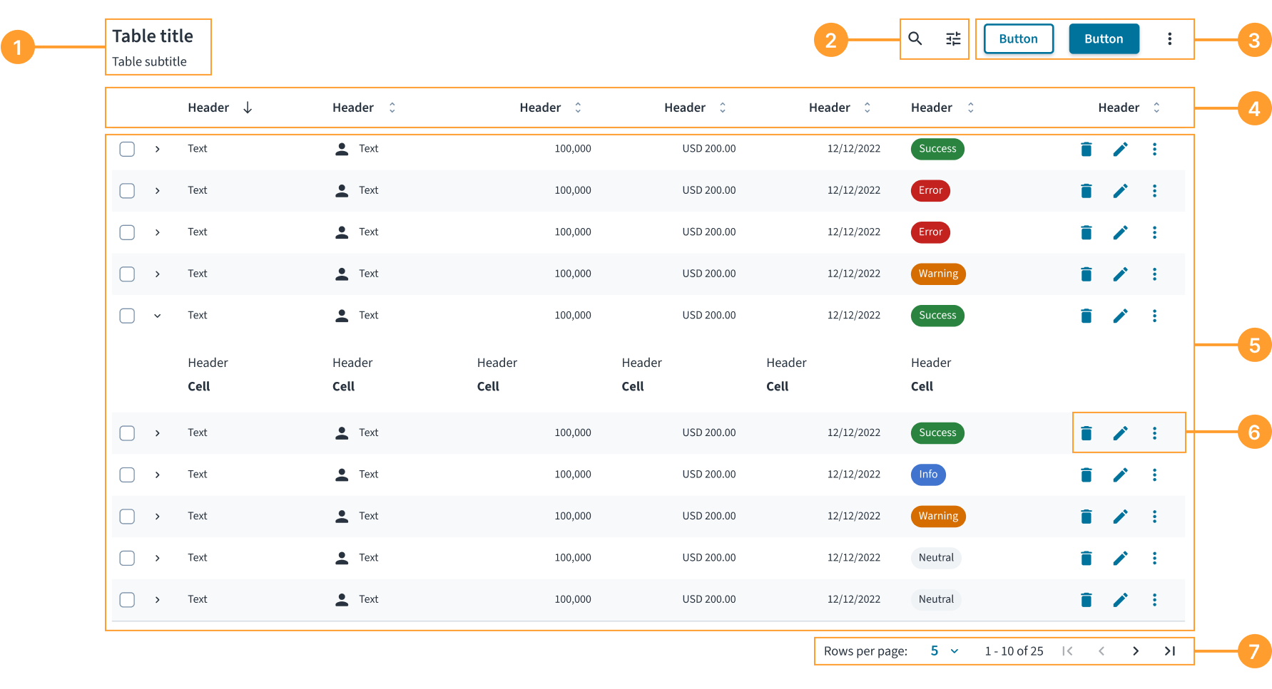
Le composant Table se compose des éléments suivants :
- Titre et sous-titre : en-tête décrivant le contenu de la table.
- Commandes de la table : un ensemble de commandes permettant de manipuler l’affichage des données, tels que la recherche et les filtres.
- Actions de la table : ensemble de boutons qui exécutent une opération sur l’ensemble de données de la table, comme l’ajout d’un nouvel enregistrement ou l’exportation de données.
- En-têtes de colonne : étiquettes pour chaque colonne qui identifient le type de données. Les en-têtes peuvent également inclure le tri et d’autres actions.
- Lignes de données : ensemble complet de cellules représentant un élément ou un enregistrement unique. Les lignes peuvent inclure des commandes de sélection (cases à cocher) et des icônes de développement.
- Actions relatives aux lignes : ensemble d’actions dans la dernière colonne qu’un utilisateur peut effectuer sur une ligne individuelle.
- Pagination : commandes qui permettent aux utilisateurs de naviguer entre les pages de données et d’ajuster le nombre de lignes affichées par page.
Alignement et placement
Par défaut, les colonnes se réduisent pour s’adapter à leur contenu, à l’exception de la dernière colonne, qui se développe pour remplir l’espace disponible restant. Cela préserve la capacité à parcourir les informations.
Si une table comporte des actions de ligne, elles doivent être placées dans cette dernière colonne.
Contenu
Directives générales relatives à la rédaction
- Mettez une majuscule en début de phrase pour tous les aspects relatifs à la conception des interfaces de produit Guidewire. Ne mettez pas la 1re lettre du 1er mot du titre en majuscule.
- Utilisez des verbes au présent et la forme active dans la plupart des cas.
- Utilisez des contractions courantes pour donner à votre texte un ton plus naturel et informel.
- Utilisez un langage simple. Évitez tout jargon inutile et les formulations complexes.
- Utilisez des termes et des phrases concis.
Veiller à la concision du contenu des cellules
Veillez à ce que le contenu d’une cellule de table ne contienne pas plus de 50 caractères afin d’en garantir la lisibilité. Pour un contenu plus long, le composant gère le dépassement avec les règles spécifiques suivantes :
- Le texte compris entre 81 et 159 caractères est renvoyé sur une ou plusieurs lignes.
- Le texte de 160 caractères ou plus est tronqué par des points de suspension (…), le texte complet s’affichant dans une infobulle lorsque l’utilisateur la survole.
- Les données numériques doivent toujours être entièrement visibles et ne doivent inclure aucun retour à la ligne ni être tronquées.
- Les autres formats de données s'ajustent automatiquement, si nécessaire.
Rédiger des en-têtes de colonne clairs
Les en-têtes doivent être courts, descriptifs et présentés avec une majuscule initiale.
- Limitez les en-têtes à un ou deux mots. Cela améliore la capacité de numérisation et garantit la lisibilité des données de la table.
- Commencez les en-têtes par un nom dans la mesure du possible. Les en-têtes sont des étiquettes pour les données de la colonne. L’utilisation d’un substantif (par exemple, Nom, Statut, Date de création) est la façon la plus claire de décrire ces données.
Formater les nombres de manière cohérente
Lorsque vous écrivez en anglais américain, utilisez une virgule comme séparateur des milliers dans les nombres d'au moins quatre chiffres. N’utilisez pas de virgules dans les années (sauf s’il s’agit de cinq chiffres ou plus), les numéros de page, les adresses ni en guise de séparateur décimal.
Pour les autres paramètres régionaux, suivez les directives de localisation établies pour le formatage des nombres.
Privilégier la clarté dans les états vides
Rédigez des messages directs et utiles qui expliquent pourquoi la table est vide et, si possible, ce que l’utilisateur peut faire ensuite.
Comportements
États
Une table peut comporter plusieurs états pour communiquer le statut des données.
- Chargement : lorsque des données sont extraites, le corps de la table affiche un indicateur de chargement avec le texte « Chargement des données… ».
- Vide : lorsqu’une table ne contient aucune donnée, elle affiche un état vide. Le message doit être utile et un bouton d’action est fortement recommandé pour guider l’utilisateur. Par exemple, lors de la conception d'un état « Aucun résultat de recherche », affichez un bouton Effacer les filtres si les filtres sont actifs. Le type de bouton (primaire, secondaire et tertiaire) peut être configuré en fonction du cas d’utilisation spécifique.
- Erreur : si les données ne se chargent pas en raison d’une erreur système (comme une perte de connexion Internet), l’état vide doit indiquer le problème et proposer une action de récupération, telle qu’un bouton Actualiser.
- États des lignes : les lignes peuvent présenter plusieurs états dont « par défaut », « sélectionné » (mis en évidence) ou « développé ».
Interactions
- Tri : les utilisateurs peuvent cliquer sur un en-tête de colonne pour trier les données de table sur la base de cette colonne. Une icône directionnelle dans l’en-tête indique l’ordre de tri actuel.
- Sélection : les utilisateurs peuvent sélectionner une ou plusieurs lignes à l’aide des cases à cocher de la première colonne. Une case à cocher dans l’en-tête permet aux utilisateurs de sélectionner ou de désélectionner toutes les lignes visibles. Lorsque des lignes sont sélectionnées, une barre de sélection contextuelle peut apparaître en haut de la table.
- Lignes en développement : si une ligne peut être développée, les utilisateurs peuvent cliquer sur l’icône en forme de chevron pour afficher des informations connexes supplémentaires directement sous la ligne.
- Actions relatives aux lignes : les utilisateurs effectuent des actions sur une seule ligne à l’aide des commandes de la dernière colonne. Affichez jusqu’à deux actions d’icône principale ; placez toutes les actions supplémentaires dans un menu présentant des points de suspension (…).
- Pagination : les utilisateurs peuvent naviguer entre les pages de données à l’aide des contrôles de pagination situés en bas de la table.
Réactivité et adaptabilité
Le composant Table est entièrement réactif. Toutefois, dans les cas d’utilisation orientés mobile, une vue Fiche offre souvent une meilleure expérience utilisateur qu’une table à plusieurs colonnes traditionnelle.
Accessibilité
Ce composant a été validé pour répondre aux directives d’accessibilité WCAG 2.2 AA dans sa configuration de base par défaut. Il s’agit notamment de s’assurer que :
- Le rapport de contraste des éléments textuels par rapport à leur arrière-plan est supérieur à 4.5:1.
- Le contenu non textuel qui doit transmettre le sens (comme les icônes et les indicateurs de focus) a un rapport de contraste d’au moins 3:1 avec ses couleurs adjacentes.
- Cet élément peut être utilisé à l’aide d’un clavier et d’une souris.
- Le contenu est accessible à l’aide de lecteurs d’écran, tels que JAWS et VoiceOver.
La conformité de l’accessibilité dépend en définitive de la façon dont ce composant est implémenté et personnalisé. Les modifications apportées par l’auteur du contenu peuvent affecter l’accessibilité. Pour en savoir plus sur notre modèle de responsabilité partagée, consultez notre Déclaration d’accessibilité Jutro complète.
Lorsque vous utilisez ce composant dans vos applications, assurez-vous des points suivants :
- Un titre descriptif est fourni. Un titre, utilisant idéalement l’élément
<caption>, aide les utilisateurs équipés de lecteurs d’écran à comprendre l’objectif de la table avant de commencer à parcourir les données. - Les en-têtes de colonne sont correctement définis. Les en-têtes doivent être correctement structurés (à l’aide de
<th>avec un attributscope="col") afin que les lecteurs d’écran puissent annoncer l’en-tête correct pour chaque cellule de données lorsqu'un utilisateur les parcourt. - Tous les éléments interactifs sont accessibles. Tous les contrôles de la table, tels que les boutons ou les liens, doivent avoir un nom clair et accessible. Pour les boutons avec icône uniquement, cela nécessite de fournir un élément
aria-labeldescriptif (par exemple,aria-label="Delete item"). - Le statut de tri en cours est annoncé. Lorsqu’une colonne est triée, son en-tête doit communiquer le sens (ascendant ou descendant) aux lecteurs d’écran, généralement à l’aide de l’attribut
aria-sort. - Le chargement en cours du contenu est indiqué. Définissez l’attribut
aria-busy="true"sur la table lorsque son contenu est en cours de chargement ou de mise à jour.
Navigation au clavier
La table permet une navigation entièrement au clavier sur la base du modèle de grille.
Touches de navigation
-
Touches fléchées : permettent de passer aux cellules adjacentes.
←(Flèche gauche) : passer à la cellule précédente de la ligne actuelle.→(Flèche droite) : passer à la cellule suivante de la ligne actuelle.↑(Flèche haut) : accéder à la cellule au-dessus dans la même colonne.↓(Flèche bas) : accéder à la cellule au-dessous dans la même colonne.
-
Navigation par onglet : navigation séquentielle dans la table.
Tab: passer à l’élément activable suivant.Shift + Tab: passer à l’élément activable précédent.
-
Navigation par page : navigation rapide pour les grandes tables.
Page Up: passer à la première ligne de la colonne actuelle.Page Down: passer à la dernière ligne de la colonne actuelle.
-
Navigation par limite : permet d’accéder aux limites des tables.
Home: passer à la première cellule de la ligne en cours.Ctrl + Home: passer à la première cellule de la table (en haut à gauche).End: passer à la dernière cellule de la ligne en cours.Ctrl + End: passer à la dernière cellule de la table (en bas à droite).
Prise en charge du contenu interactif
Le système de navigation au clavier gère intelligemment les cellules contenant des éléments interactifs :
- Boutons et liens : les éléments interactifs, tels que les boutons de tri ou les actions de ligne, restent accessibles dans les cellules à la fois par la navigation par onglet standard et par les flèches. Lors de l’utilisation de la navigation à l’aide des flèches, si une cellule contient un élément interactif, tel qu’un champ de saisie, un bouton ou un lien, dont la valeur
tabindexest supérieure à-1, le focus se déplace jusqu'à cet élément plutôt que de rester sur la cellule. Si la cellule contient plusieurs éléments interactifs, le focus se positionne sur le premier. - Contenu focalisable personnalisé : tout élément associé à un attribut
tabindexest correctement intégré dans le flux de navigation. - Entrées de formulaire : lorsqu’une cellule contient des champs de saisie, des éléments
textareaou d’autres élémentsformmodifiables, la navigation respecte leur mode d’édition, ce qui signifie que lorsque le focus est sur un élément de ce type, les touches fléchées fonctionnent comme prévu pour la navigation au sein de l'élément. Pour vous éloigner de l’élément , utilisezTabouShift + Tab.
Gestion du focus
La table utilise des techniques avancées de gestion du focus :
- Modèle de gestion dynamique du focus avec l'attribut tabindex : vous ne pouvez activer qu’une seule cellule à la fois dans la table, ce qui réduit le nombre de taquets de tabulation et améliore l’efficacité de la navigation.
- Reconnaissance des limites : les touches de navigation respectent les limites de la table et ne déplacent pas le focus en dehors de la grille de la table.
- Indicateurs de focus visuel : un retour visuel clair indique quelle cellule est actuellement mise en évidence.
Pour que la gestion du focus fonctionne correctement, assurez-vous que les propriétés rowIndex et columnIndex sont correctement définies pour le composant BodyCell et que la propriété columnIndex est correctement définie pour le composant HeaderCell. Consultez les cahiers des charge des composants pour obtenir en savoir plus.
Code
export default function BasicTableExample() {
  const data = [
    {
      id: '73065',
      product: 'Go Commercial Auto',
      insured: 'Marshall Rogahn',
      premium: 1236.39,
    },
    {
      id: '80077',
      product: 'Go Worker\'s Compensation',
      insured: 'April Kub',
      premium: 173.99,
    },
    {
      id: '64487',
      product: 'USA Personal Auto',
      insured: 'Abel Rippin',
      premium: 1228.69,
    },
    {
      id: '12345',
      product: 'Go Commercial Auto',
      insured: 'John Smith',
      premium: 892.45,
    },
  ];

  return (
    <Table aria-label="Policy list">
      <TableHeader>
        <HeaderRow>
          <HeaderCell columnIndex={0}>Product</HeaderCell>
          <HeaderCell columnIndex={1}>Insured</HeaderCell>
          <HeaderCell columnIndex={2}>Premium</HeaderCell>
        </HeaderRow>
      </TableHeader>
      <TableBody>
        {data.map((row, rowIndex) => (
          <BodyRow key={row.id}>
            <BodyCell rowIndex={rowIndex} columnIndex={0}>
              {row.product}
            </BodyCell>
            <BodyCell rowIndex={rowIndex} columnIndex={1}>
              {row.insured}
            </BodyCell>
            <BodyCell rowIndex={rowIndex} columnIndex={2}>
              ${row.premium.toLocaleString()}
            </BodyCell>
          </BodyRow>
        ))}
      </TableBody>
    </Table>
  );
}
Instruction d'importation
import {
  Table,
  TableHeader,
  TableBody,
  HeaderRow,
  HeaderCell,
  BodyRow,
  BodyCell,
} from '@jutro/components';
Cahier des charges du composant
Assurez-vous de comprendre la surface de l'API des composants du système de conception, ainsi que les implications et les compromis. Pour en savoir plus, reportez-vous à notre introduction à l'API des composants.
Table
Le composant Table définit la structure de la table.
Il accepte TableHeader et TableBody en tant qu'éléments enfants. Pour en savoir plus, reportez-vous à la section imbrication.
Propriétés
Parallèlement aux propriétés personnalisées du composant Table, vous pouvez lui transmettre des attributs HTML standard.
noStripedRows- Type
booleanDescriptionDetermines whether the table displays alternating striped rows for better visual distinction.
Valeur par défautfalse sortingIcons- Type
{ ascendingIcon: element, descendingIcon: element, unsortedIcon: element }DescriptionDefines custom icons for column sorting buttons, including ascending, descending, and unsorted states.
TableHeader
Le composant TableHeader définit la section d’en-tête de la table.
Il doit être utilisé comme élément enfant du composant Table et accepte uniquement HeaderRow en tant qu'élément enfant. Pour en savoir plus, reportez-vous à la section imbrication.
Propriétés
Le composant TableHeader n’a pas de propriétés personnalisées, mais vous pouvez lui transmettre des attributs HTML standard.
TableBody
Le composant TableBody définit la section du corps de la table.
Il doit être utilisé comme élément enfant du composant Table et accepte uniquement BodyRow en tant qu'élément enfant. Pour en savoir plus, reportez-vous à la section imbrication.
Propriétés
Le composant TableBody n’a pas de propriétés personnalisées, mais vous pouvez lui transmettre des attributs HTML standard.
HeaderRow
Le composant HeaderRow définit une ligne dans la section d’en-tête de la table.
Il doit être utilisé comme élément enfant du composant TableHeader et accepte uniquement HeaderCell en tant qu'élément enfant. Pour en savoir plus, reportez-vous à la section imbrication.
Propriétés
Le composant HeaderRow n’a pas de propriétés personnalisées, mais vous pouvez lui transmettre des attributs HTML standard.
BodyRow
Le composant BodyRow définit une ligne dans la section du corps de la table.
Il doit être utilisé comme élément enfant du composant TableBody et accepte uniquement BodyCell en tant qu'élément enfant. Pour en savoir plus, reportez-vous à la section imbrication.
Propriétés
Parallèlement aux propriétés personnalisées du composant BodyRow, vous pouvez lui transmettre des attributs HTML standard.
selected- Type
booleanDescriptionIndicates whether the row is selected. Used in the row selection feature implementation.
HeaderCell
Le composant HeaderCell définit une cellule dans la section d’en-tête de la table. Remplissez-le avec les en-têtes de colonnes.
Il doit être utilisé en tant qu'élément enfant du composant HeaderRow. Pour en savoir plus, reportez-vous à la section imbrication.
Propriétés
Parallèlement aux propriétés personnalisées du composant HeaderCell, vous pouvez lui transmettre des attributs HTML standard.
columnIndexobligatoire- Type
numberDescriptionSets the column index. Must be explicitly set to ensure accurate accessibility semantics when rendering multiple cells. The column index must start from 0.
align- Type
'left' | 'center' | 'right'DescriptionSets the alignment of the header cell content.
Valeur par défaut'left' isSortable- Type
booleanDescriptionIndicates whether the column is sortable or not. Used in the sorting feature implementation.
Valeur par défautfalse isSorted- Type
false | 'asc' | 'desc'DescriptionIndicates the sorting state of the column. Used in the sorting feature implementation.
onSort- Type
(event: unknown) => voidDescriptionCallback function triggered when a user clicks or activates the sortable column header. Use it to handle sorting logic, such as toggling between ascending, descending, and unsorted states, and updating the table data accordingly.
BodyCell
Le composant BodyCell définit une cellule dans la section du corps de la table. Remplissez-le avec les données de chaque cellule individuelle de chaque ligne.
Il doit être utilisé en tant qu'élément enfant du composant BodyRow. Pour en savoir plus, reportez-vous à la section imbrication.
Propriétés
Parallèlement aux propriétés personnalisées du composant BodyCell, vous pouvez lui transmettre des attributs HTML standard.
columnIndexobligatoire- Type
numberDescriptionSets the column index. Must be explicitly set to ensure accurate accessibility semantics when rendering multiple cells. The column index must start from 0.
rowIndexobligatoire- Type
numberDescriptionSets the row index. Must be explicitly set to ensure accurate accessibility semantics when rendering multiple cells. The row index must start from 0.
align- Type
'left' | 'center' | 'right'DescriptionSets the horizontal alignment of the body cell content.
Valeur par défaut'left'
Comportements personnalisés
Imbrication
Le composant Table définit la structure de la table à partir des propriétés children de type ReactNode. Vous devez utiliser les composants de la structure de table de la manière suivante :
- Le composant
TableaccepteTableHeaderetTableBodyen tant qu’éléments enfants. - Le composant
TableHeaderaccepteHeaderRowen tant qu'élément enfant et ne doit être utilisé que dans le contexte deTable. - Le composant
TableBodyaccepteBodyRowen tant qu'élément enfant et ne doit être utilisé que dans le contexte deTable. - Le composant
HeaderRowaccepteHeaderCellen tant qu'élément enfant et ne doit être utilisé que dans le contexte deTableHeader. - Le composant
BodyRowaccepteBodyCellen tant qu'élément enfant et ne doit être utilisé que dans le contexte deTableBody. - Le composant
HeaderCellne doit être utilisé que dans le contexte deHeaderRow. - Le composant
BodyCellne doit être utilisé que dans le contexte deBodyRow.
Bien que ces composants puissent afficher ou gérer d'autres types ou éléments HTML, cette fonction n'est pas prise en charge.
Lignes striées
Par défaut, la table affiche en alternance des couleurs d’arrière-plan pour les lignes (lignes striées) afin d'améliorer la lisibilité et faciliter le suivi des données entre les colonnes. Vous pouvez désactiver ce comportement en définissant la propriété noStripedRows sur true dans le composant Table. Pensez à le faire lorsque vous travaillez avec des tables qui ont très peu de lignes ou lorsque vous implémentez un style de ligne personnalisé qui entre en conflit avec la répartition par défaut.
Exemple avec la propriété noStripedRows définie sur true :
Crochets
Aucun crochet n'est disponible pour Table.
Clés de traduction
Il n'existe aucune traduction pour Table.
Pour en savoir plus sur la gestion des traductions, reportez-vous à notre section sur l'internationalisation.
Portes de sortie
Pour en savoir plus, reportez-vous à notre documentation sur les portes de sortie.
Transmission d’attributs HTML aux composants
Vous pouvez transmettre des attributs HTML standard, tels que id, className et style à partir d'éléments HTML correspondants à tous les composants d'une table. Ces attributs sont appliqués à l’élément racine du composant respectif.
Éléments racines des composants de table
| Composant de table | Élément HTML |
|---|---|
Table | <table> |
TableHeader | <thead> |
TableBody | <tbody> |
HeaderRow | <tr> |
BodyRow | <tr> |
HeaderCell | <th> |
BodyCell | <td> |
Exemple
Dans cet exemple, l’attribut aria-labelledby est transmis au composant Table. Il fait référence à l'élément id du composant Typography qui sert de titre de table et lit le contenu textuel de ce composant comme nom accessible de la table.
export function TableHTMLPropExample() {
  const data = [
    {
      id: '73065',
      product: 'Go Commercial Auto',
      insured: 'Marshall Rogahn',
      premium: 1236.39,
    },
    {
      id: '80077',
      product: 'Go Worker\'s Compensation',
      insured: 'April Kub',
      premium: 173.99,
    },
    {
      id: '64487',
      product: 'USA Personal Auto',
      insured: 'Abel Rippin',
      premium: 1228.69,
    },
    {
      id: '12345',
      product: 'Go Commercial Auto',
      insured: 'John Smith',
      premium: 892.45,
    },
  ];

  return (
    <div>
      <Typography variant="heading-3" id="policy-list-title">
        Policy list
      </Typography>
      <Table aria-labelledby="policy-list-title">
        <TableHeader>
          <HeaderRow>
            <HeaderCell columnIndex={0}>Product</HeaderCell>
            <HeaderCell columnIndex={1}>Insured</HeaderCell>
            <HeaderCell columnIndex={2}>Premium</HeaderCell>
          </HeaderRow>
        </TableHeader>
        <TableBody>
          {data.map((row, rowIndex) => (
            <BodyRow key={row.id}>
              <BodyCell rowIndex={rowIndex} columnIndex={0}>
                {row.product}
              </BodyCell>
              <BodyCell rowIndex={rowIndex} columnIndex={1}>
                {row.insured}
              </BodyCell>
              <BodyCell rowIndex={rowIndex} columnIndex={2}>
                ${row.premium.toLocaleString()}
              </BodyCell>
            </BodyRow>
          ))}
        </TableBody>
      </Table>
    </div>
  );
}