Examples
Check out the Usage section for details about how to design a time picker properly, and the different configuration options we provide.
Pick a time
You can allow the user to pick a time using the TimePicker component. Then use the handler to get the selected time.
import { TimePicker } from '@jutro/components/new';
export function DinnerTimeSelector() {
function handleTimeChange(event, value) {
console.log('The user selected the following time for dinner:', value);
}
return (
<TimePicker
label={{
id: 'time-picker-label',
defaultMessage: 'Enter dinner time',
}}
name="Dinner time picker"
onChange={handleTimeChange}
/>
);
}
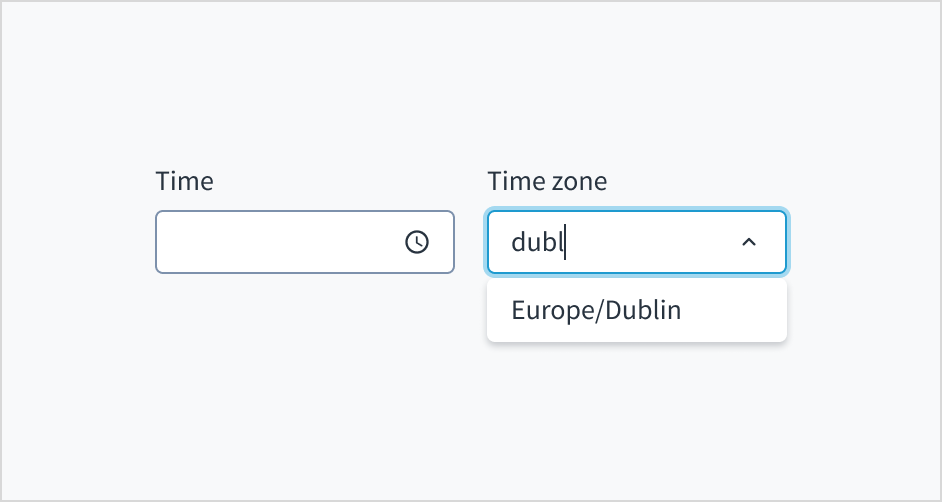
Pick a time and a timezone
You can allow the user to pick a time and a timezone using the TimePicker and TimezonePicker components. Then use the handlers to get the selected time and timezone.
import { TimePicker, TimezonePicker } from '@jutro/components/new';
export function DinnerTimeSelector() {
function handleTimeChange(event, value) {
console.log('The user selected the following time for dinner:', value);
}
function handleTimezoneChange(event, value) {
console.log('The user selected the following timezone for dinner:', value);
}
return (
<>
<TimePicker
label={{
id: 'time-picker-label',
defaultMessage: 'Enter dinner time',
}}
name="Dinner time picker"
onChange={handleTimeChange}
/>
<TimezonePicker
label={{
id: 'timezone-picker-label',
defaultMessage: 'Set timezone for dinner time',
}}
initialValue={{ timezone: 'Europe/Warsaw' }}
onChange={handleTimezoneChange}
/>
</>
);
}
Controlled time picker
You can control the time picker by passing the value prop. This is useful if you want to use the time picker as a controlled component.
import { TimePicker } from '@jutro/components/new';

function DinnerTimeSelector() {
  const [time, setTime] = React.useState({ hour: 19, minute: 30 });

  function handleTimeChange(event, value) {
    setTime(value);
  }

  return (
    <TimePicker
      label={{
        id: 'time-picker-label',
        defaultMessage: 'Enter dinner time',
      }}
      name="Dinner time picker"
      onChange={handleTimeChange}
      value={time}
    />
  );
}
Note that the value prop is an object with properties called hour and minute.
Tip: If you want to format the time picker value, you can get started with the following example:const dateObjectFromInput = new Date(0, 0, 0, time.hour, time.minute);
const formattedTime = Intl.DateTimeFormat('en-US', {
hour: '2-digit',
minute: '2-digit',
}).format(dateObjectFromInput);
It is best to use the Intl.DateTimeFormat API to format the time picker value because:
Every time toLocaleString is called, it has to perform a search in a big database of localization strings, which is potentially inefficient. When the method is called many times with the same arguments, it is better to create a Intl.DateTimeFormat object and use its format() method, because a DateTimeFormat object remembers the arguments passed to it and may decide to cache a slice of the database, so future format calls can search for localization strings within a more constrained context.
For more information, see the MDN documentation about DateTimeFormat.
Controlled timezone picker
You can control the timezone picker by passing the value prop. This is useful if you want to use the timezone picker as a controlled component.
import { TimezonePicker } from '@jutro/components/new';

function TimezonePickerControlled() {
  const [timezone, setTimezone] = React.useState({
    timezone: 'Europe/Warsaw',
  });

  function handleTimezoneChange(event, value) {
    setTimezone(value);
  }

  return (
    <TimezonePicker
      label={{
        id: 'timezone-picker-label',
        defaultMessage: 'Set timezone for dinner time',
      }}
      onChange={handleTimezoneChange}
      value={timezone}
    />
  );
}
Note that the value prop is an object with a property called timezone.
Specify time interval, time range, and timezones
For time picker, you can specify:
- The "min" and "max" time range, for example "9:00 AM" and "5:00 PM"
- The time interval, for example 15 minutes
For timezone picker, you can limit the list of timezones available. Simply pass an array of IANA timezones.
<>
  <TimePicker
    label="Pick a meeting time"
    interval={15}
    minTime={{
      hour: 9,
      minute: 0,
    }}
    maxTime={{
      hour: 17,
      minute: 30,
    }}
  />
  <TimezonePicker
    label="Set your timezone"
    availableTimezones={['Africa/Lagos', 'Africa/Maputo', 'Africa/Monrovia']}
  />
</>
Timezone picker in Typescript
Having trouble with Typescript? Check out the following example:
function TimezonePickerControlled() {
  const [timezone, setTimezone] =
    React.useState <
    JutroTimezone >
    {
      timezone: 'Europe/Warsaw',
    };

  function handleTimezoneChange(
    event: DropdownOnChangeEvent<JutroTimezone>,
    value: JutroTimezone
  ) {
    setTimezone(value);
  }

  return (
    <TimezonePicker
      label={{
        id: 'timezone-picker-label',
        defaultMessage: 'Set timezone for dinner time',
      }}
      onChange={handleTimezoneChange}
      value={timezone}
    />
  );
}
Usage
Overview
The time picker component enables users to select a time from a dropdown. This component is commonly used in insurance applications where users need to specify a time, such as scheduling an appointment or setting a reminder.
When to use
To select a time or add a custom time.
When not to use
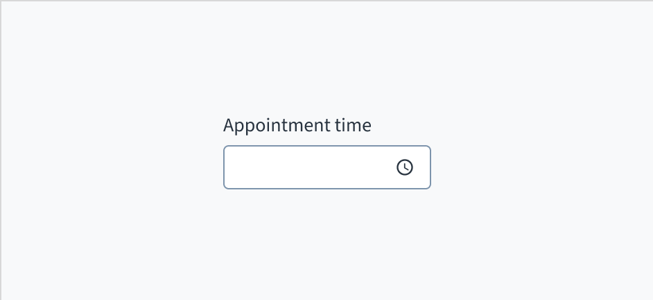
Anatomy
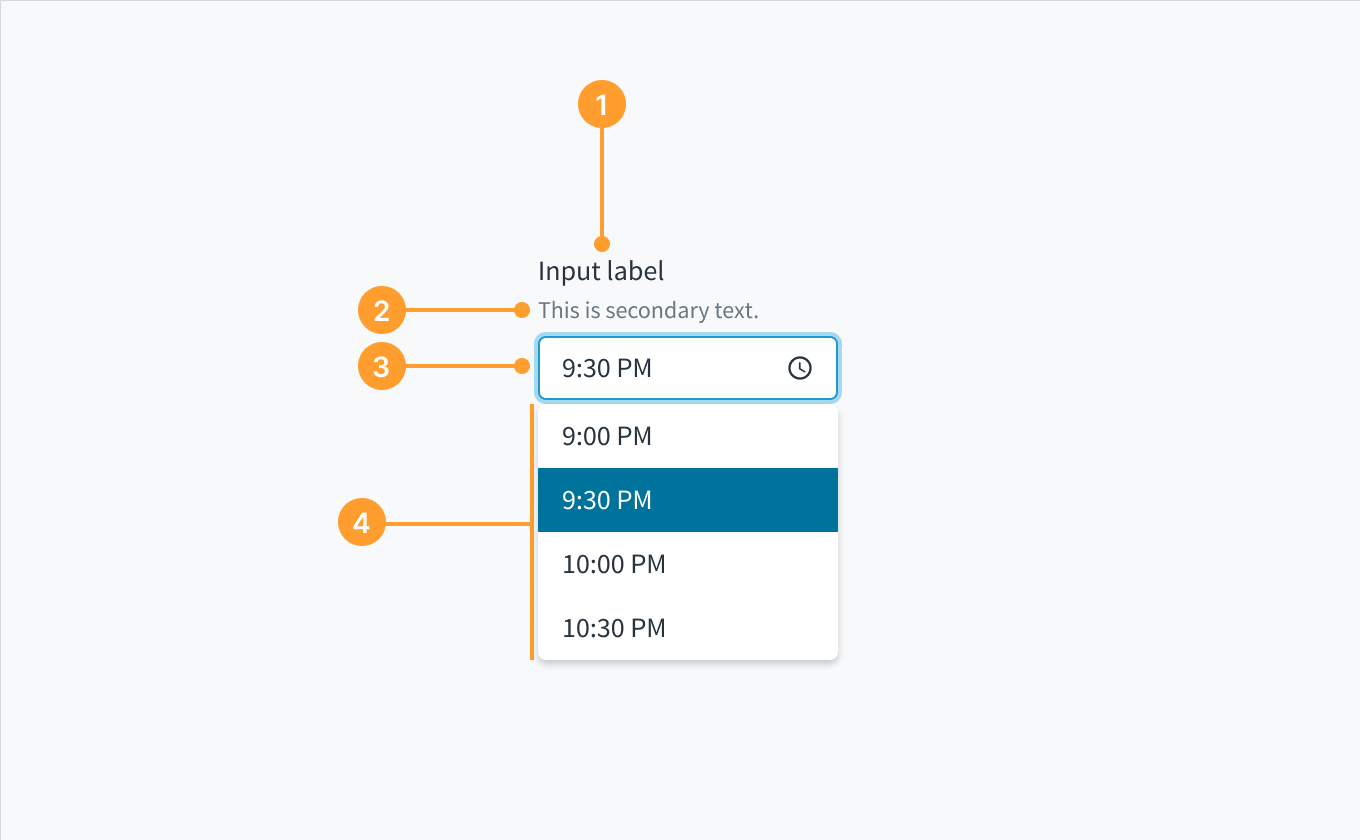 Anatomy of the time picker component.
- Label: Describes the purpose of the input field.
- Help text (optional): Gives extra context or helps the user choose the right selection.
- Dropdown input: Displays the user selected option. Users can type inside the input field to find an option that matches their query. They can also input a custom time.
- Dropdown menu: Displays a list of times to choose from.
Options
The time picker component can accommodate both a 12-hour clock and a 24-hour clock. Use the format that corresponds to the region in which your product is available. For example, the United States uses the 12-hour clock.
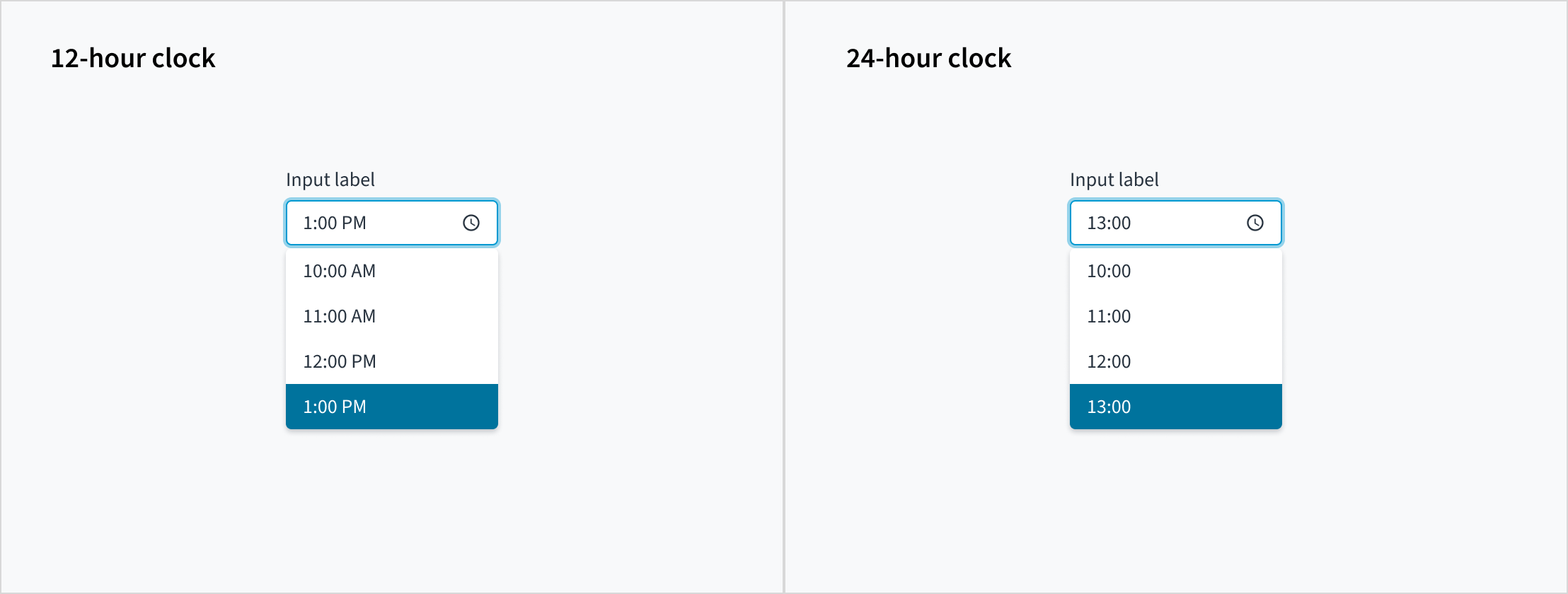
Day period marker
In a 12-hour clock system, the 24-hour day is divided into two periods, "AM" and "PM", and each period consists of 12 hours.
The format of the day period marker is determined by the user's locale. Developers have no control over it. For the en-US locale, the default way to write the day period marker is "AM" and "PM".
 The format of day period marker is determined by the user's locale. This example is using the en-US locale.
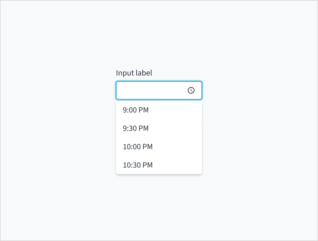
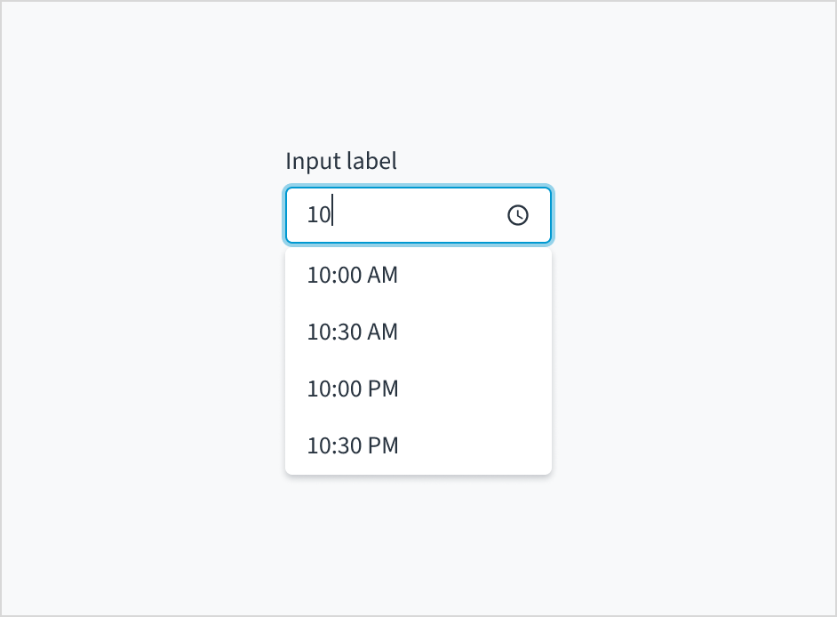
Typeahead
Jutro accommodates dropdown menus with typeahead input fields. Users can manually enter text to filter the dropdown items. This feature is useful for helping users select from a long list.
Dropdowns with typeahead enabled provide suggestions as users begin typing. Selections appear based on the characters that users have entered. The more characters that users input into the field, the more refined the list becomes.
Time zone
A time picker can include an input control for time zone. The time zone picker also supports typeahead functionality, enabling users to filter through the list of options.
Content
General writing guidelines
- Use sentence case for all aspects of designing Guidewire product interfaces. Don't use title case.
- Use present tense verbs and active voice in most situations.
- Use common contractions to lend your copy a more natural and informal tone.
- Use plain language. Avoid unnecessary jargon and complex language.
- Keep words and sentences short.
Include a label
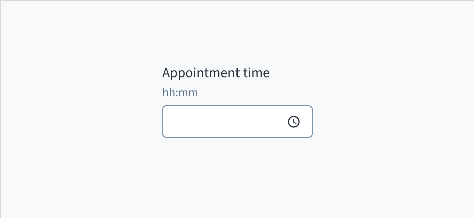
Place a clear, visible label outside the input field. An input field without a label is ambiguous and not accessible.
Do position a permanent label outside the field.
Don't use placeholder text as a replacement for the field label.
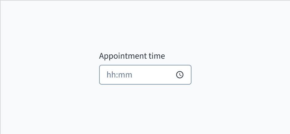
Don't use placeholder text
Don't put placeholder text in the input field. Placeholder text strains users' short-term memory because it disappears once a value is entered. It also poses additional burdens for users with visual and cognitive impairments.
Instead, place hints and instructions, including formatting examples and requirements, outside of the field.
The input field for time picker follows the content guidelines for text fields.
Source: Nielsen Norman Group
Do place hints and instructions, including formatting examples and requirements, outside of the field.
Don't add placeholder text to the input field.
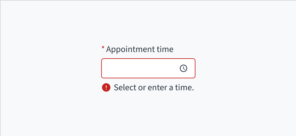
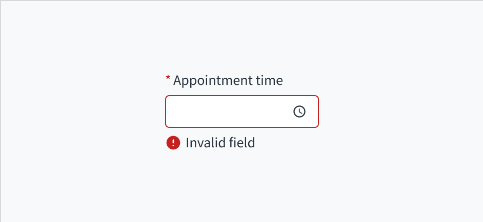
Use error text to guide users
Error message text tells a user how to fix the error. In the case of the time picker, errors are often related to something that must be fixed for in-line validation.
Invalid fields must be clearly marked. In pickers with more than one field, set the invalid state on the individual field that is triggering the error.
Use sentence case for error text. Write 1-2 short, complete sentences that end with a period.
Do use error text to guide the user and show them a solution.
Don't write ambiguous error messages or leave users guessing as to how to resolve a problem.
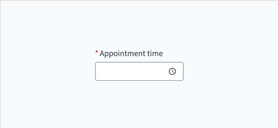
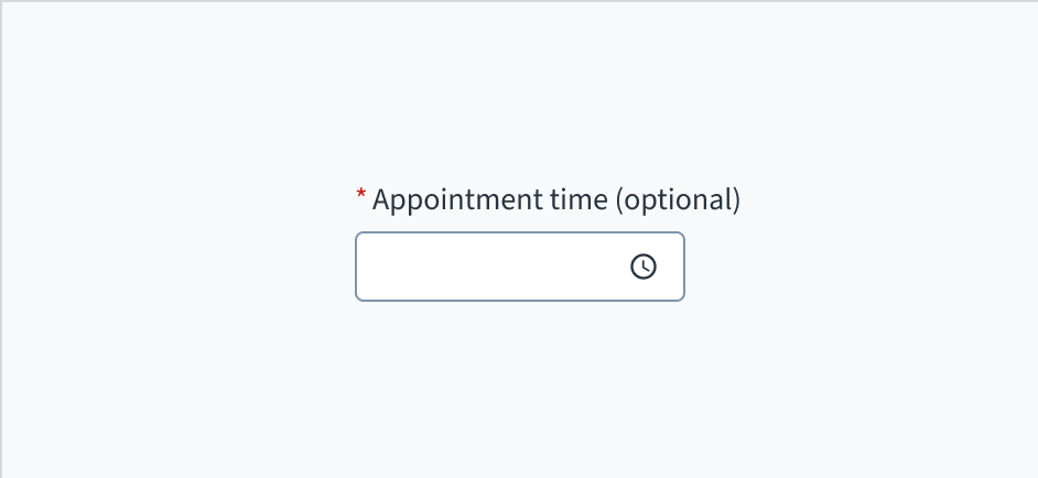
Mark required fields
Use an asterisk (*) to indicate required fields. The asterisk precedes the field label. This helps users to easily locate which fields are required by scanning just the left-most character of the label.
In addition to marking required fields with an asterisk, it is recommended to include clear instructions at the top of the form, such as "All fields marked with an asterisk are mandatory," to ensure users understand the meaning of the asterisk.
Do use an asterisk to indicate that a field is required.
Don't use an asterisk to denote anything that is optional.
Use sentence case
Field labels appear in sentence case.
Refer to the UI text style guide for more information on how to implement sentence case.
Behaviors
States
The time picker appears with no value (default), placeholder text, or a filled input.
| Visual | State | Description |
|---|
 | No value (default) | Indicates to the user that no value has been selected and there is no placeholder. |
 | Placeholder | Indicates to the user that no value has been selected. The placeholder is greyed out. |
 | Filled input | Indicates to the user that the input is filled with data. |
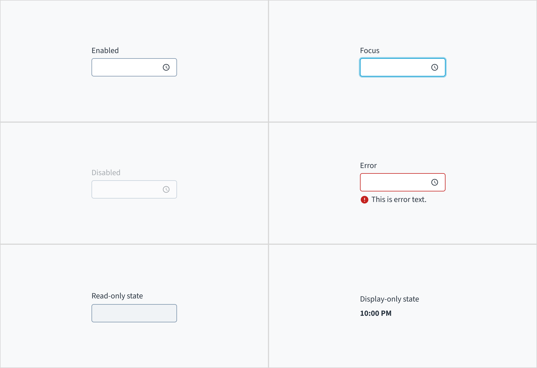
The time pickers also has interactive states for enabled, focus, disabled, error, read-only, and display-only.
| State | Description |
|---|
| Enabled | Indicates to the user that the element is enabled for interaction. |
| Focus | Indicates to the user which UI element in the system is focused. |
| Disabled | Indicates to the user that the input value can't be changed because of local factors. For example, a checkbox above the input field must be checked to access this input field. The user can take action to enable it by interacting with the page. |
| Error | Indicates that the user has made a validation error. Error text provides corrective feedback to users. |
| Read-only | Indicates to the user that the input value can't be changed because of outside factors. For example, lack of write access. The user can take action to enable it by, for example, contacting an administrator. |
| Display-only | The display-only state is used for two cases: - A UI element is used in display mode.
- A UI element is displayed in edit mode, but is never editable.
This state was called “read-only” before. |
The following image illustrates time picker interactive states.
Interactions
Mouse
Users can interact with this element by clicking in the area inside border.

Keyboard
The time picker is expanded and collapsed with SPACEBAR. Users navigate through the options using the arrow keys and select by means of the SPACEBAR or ENTER key.
Screen reader
The aria-labelledby establishes a programmatic association between the input field and its label. The WAI-ARIA attribute of aria-autocomplete='list' communicates that a list of choices will appear from which the user can choose, but the edit box retains focus. Selecting the 'required' option in Storybook adds both the 'required' and 'aria-required="true"' attributes to the input field.
Accessibility
The contrast ratio of textual elements against their background is above 4.5:1 as per WCAG 2.1 AA requirements. Non-textual content that needs to convey meaning (such as icons and keyboard focus visibility) has a contrast ratio of at least 3:1 with its adjacent colors. All content is visible and functional up to and including 400% without requiring scrolling in two dimensions.
This component has been validated to meet the WCAG 2.1 AA accessibility guidelines. However, changes made by the content author can affect accessibility conformance.
When using this component within your application:
- Clearly state formatting requirements.
- Avoid using placeholder text.
- Use meaningful copy for error text.
Code
<>
  <TimePicker
    label={{
      id: 'time-picker-label',
      defaultMessage: 'Enter dinner time',
    }}
    name="Dinner time picker"
    onChange={handleTimeChange}
  />
  <TimezonePicker
    label={{
      id: 'timezone-picker-label',
      defaultMessage: 'Set timezone for dinner time',
    }}
    initialValue={{ timezone: 'Europe/Warsaw' }}
    onChange={handleTimezoneChange}
  />
</>
Import statement
import { TimePicker, TimezonePicker } from '@jutro/components/new';
Component contract
Make sure to understand the Design System components API surface, and the implications and trade-offs. Learn more in our introduction to the component API.
Properties
TimePicker properties
labelrequired
DescriptionLabel associated with input field, also passed as a default value to aria-label
className
DescriptionCSS class passed to root element of the component
disabled
DescriptionIf true, component is rendered in disabled state
displayOnly
DescriptionIf true, displays the component value as a plain text
hideLabel
DescriptionIf true, the label is not visible
initialValue
Type{ hour: number, minute: number }
DescriptionInitial value of input. If value prop is specified along with this prop, this prop's value is discarded
interval
DescriptionInterval between time options in minutes
labelPosition
DescriptionAllows to select label position
maxTime
Type{ hour: number, minute: number }
DescriptionThe latest time that can be chosen, for example { hour: 12, minute: 30 } means 12:30 PM
minTime
Type{ hour: number, minute: number }
DescriptionThe earliest time that can be chosen, for example { hour: 6, minute: 15 } means 6:15 AM
name
DescriptionA string specifying a name for the input. It is used also to include it on the event parameter of the onChange function
onBlur
Typefunction (FocusEvent<HTMLInputElement>)
DescriptionA callback called after the component is focused.
onChange
Typefunction (React.ChangeEvent<HTMLInputElement>, { hour: number, minute: number })
DescriptionCallback invoked when component value is changed.
onFocus
Typefunction (FocusEvent<HTMLInputElement>)
DescriptionA callback called after the component is focused.
placeholder
DescriptionPlaceholder to display on an empty component
readOnly
DescriptionIf true, component is rendered in read-only state, for value as a plain text consider using displayOnly
required
DescriptionIf true, component is rendered as required and label has asterisk
secondaryLabel
DescriptionSecondary label text to display
stateMessages
DescriptionAn object with a list of error messages for the current state.
DescriptionForce 12-hour/24-hour clock (WARNING: This will override locale settings)
Type{ text: intlMessageShape, trigger: string } | intlMessageShapetext
DescriptionText to show tooltip content.
trigger
DescriptionThe trigger to show the tooltip
DescriptionText to be displayed in the tooltip or tooltip object that includes: text - to show tooltip content, trigger - to set tooltip trigger
value
Type{ hour: number, minute: number }
DescriptionValue of the component. Takes precedence over intialValue. If passed, the component works in controlled mode. The empty value is null.
TimezonePicker properties
labelrequired
DescriptionLabel associated with input field, also passed as a default value to aria-label
availableTimezones
DescriptionList of options in IANA format, by default all possible timezones are displayed.
className
DescriptionCSS class passed to root element of the component
disabled
DescriptionIf true, component is rendered in disabled state
displayOnly�
DescriptionIf true, displays the component value as a plain text
hideLabel
DescriptionIf true, the label is not visible
initialValue
Type{ timezone: JutroTimezone }
DescriptionInitial value of input. If value prop is specified along with this prop, this prop's value is discarded
labelPosition
DescriptionAllows to select label position
name
DescriptionA string specifying a name for the input. It is used also to include it on the event parameter of the onChange function
onBlur
Typefunction (FocusEvent<HTMLInputElement>)
DescriptionA callback called after the component is focused.
onChange
Typefunction (React.ChangeEvent<HTMLInputElement>, JutroTimezone)
DescriptionCallback invoked when component value is changed.
onFocus
Typefunction (FocusEvent<HTMLInputElement>)
DescriptionA callback called after the component is focused.
placeholder
DescriptionPlaceholder to display on an empty component
readOnly
DescriptionIf true, component is rendered in read-only state, for value as a plain text consider using displayOnly
required
DescriptionIf true, component is rendered as required and label has asterisk
secondaryLabel
DescriptionSecondary label text to display
stateMessages
DescriptionAn object with a list of error messages for the current state.
Type{ text: intlMessageShape, trigger: string } | intlMessageShapetext
DescriptionText to show tooltip content.
trigger
DescriptionThe trigger to show the tooltip
DescriptionText to be displayed in the tooltip or tooltip object that includes: text - to show tooltip content, trigger - to set tooltip trigger
value
Type{ timezone: JutroTimezone }
DescriptionValue of the component. Takes precedence over intialValue. If passed, the component works in controlled mode. The empty value is null.
The JutroTimezone type is a list of IANA timezones, for example:
const timeZones = [
'Africa/Lagos',
'Africa/Maputo',
'Africa/Monrovia',
];
To learn more about IANA timezones, check out the IANA timezone database.
Hooks
No hooks are available for TimePicker or TimezonePicker.
Translation keys
The TimePicker component defines one translation key:
| Key | Used for |
|---|
| jutro-components.fields.TimePicker.placeholder | The placeholder in the input field. |
The TimezonePicker component defines a translation key for each available timezone. The key always starts with jutro-components.fields.TimezonePicker, followed by the name of the timezone.
For example, for the Africa/Lagos timezone, the translation key ID is:
jutro-components.fields.TimezonePicker.Africa/Lagos
Time is formatted according to the selected locale. For example, if the locale is en-US, the time is formatted as "5:30 PM". If the locale is pl-PL, the time is formatted as "17:30".
Escape Hatches
For more information, see our documentation about escape hatches.
The following options are available:
- Design tokens
- A
className property
- The ability to pass the supported HTML attributes
- Ref with imperative handlers
- A native
event property
Ref with imperative handlers
Jutro inputs have implemented imperative handlers as a mechanism to provide access to some common native features that might be useful for you. The following features are available:
-
Set focus to allow you to set the user focus into a specific component
-
Blur to remove the focus from the component
-
Scroll to the component so that you can take the user to a specific area of the page.
These features are provided through the ref property, which exposes them as follows:
    const componentRef = useRef(null);

    const setFocus = () => {
        componentRef?.current.focus();
    }

    const removeFocus = () => {
        componentRef?.current.blur();
    }

    const scrollToComponent = () => {
        componentRef?.current.scrollIntoView();
    }

    <Component ref={componentRef}>
More options might be included in the future.
Precedence of disabled, displayOnly, and readOnly properties
If two or more of the properties disabled, displayOnly, and readOnly are set to true at the same time, the precedence is as follows:
displayOnly > readOnly > disabled
Although some Jutro components might provide complementary features or a helper function to facilitate the validation process, it is your responsibility as a developer to handle the validation of any user input (using or not using the complementary helpers) and to decide what error messages to show.
Jutro components behave based on the developer implementation.
When are error messages displayed?
Error messages are only displayed when you pass them to the component through the stateMessages property. This property receives an object with the following content:
{
  error: ['error message 1', 'error message 2', 'error message N'];
}
The component displays every error message provided in the same order as in the array.
When does validation occur?
This is your decision as a developer. As components do not determine when the validation is performed or when the error must be displayed, you need to implement the logic to handle it according to the project requirements, for example while the user is editing the content, when the component loses focus, and on form submission.
Additional validation for TimePicker
If the user enters an invalid time, or a time that is outside the min/max boundaries, they get a validation error as the third parameter in the onChange handler. The parameters looks like the following:
{
  errorCode: ERROR.<ERROR_CODE_GOES_HERE>,
}
The error code can be one of the following:
INVALID_TIME - when the user enters an invalid time, for example "25:67 AM".MIN_TIME_EXCEEDED - when the user enters a time that is before minTime.MAX_TIME_EXCEEDED - when the user enters a time that is after maxTime.