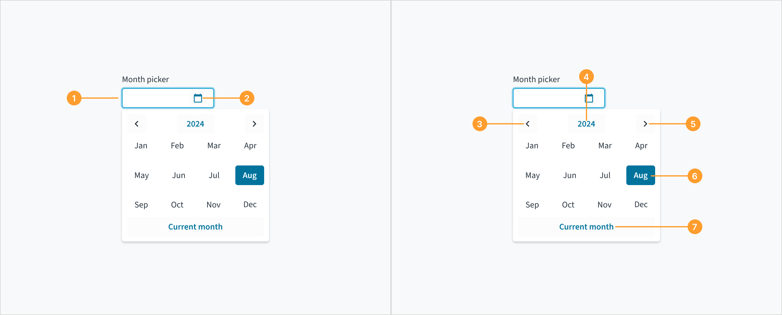
You can allow the user to pick a month using the MonthPicker component and then use the handler to get the selected month. Users will select a combined month and year.
It is best to use the Intl.DateTimeFormat API to format the month picker value because every time toLocaleString is called, it has to perform a search in a big database of localization strings, which is potentially inefficient. Creating an Intl.DateTimeFormat object and using its format() method can avoid this problem because a DateTimeFormat object remembers the arguments passed to it and may decide to cache a slice of the database.
You can specify the "min" and "max" date range to limit the amount of valid options, for example "January 2024" and "December 2024" would limit it to any month in 2024.
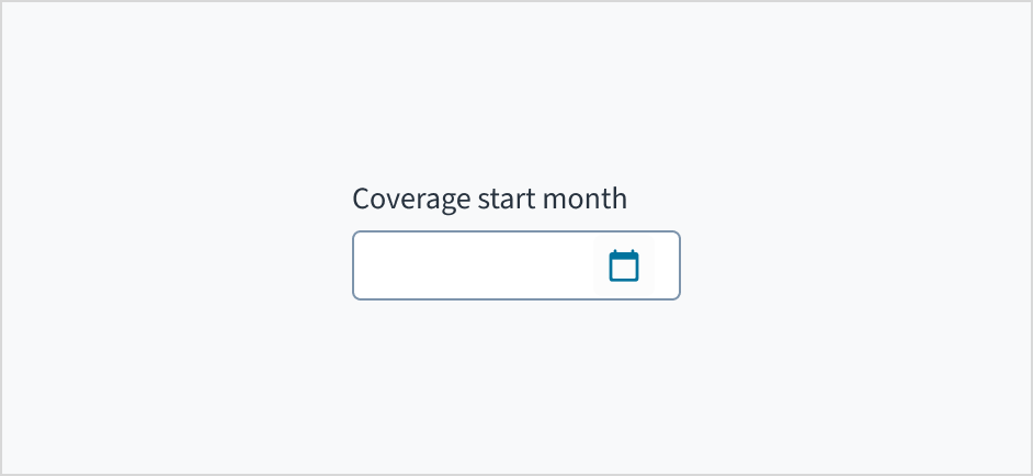
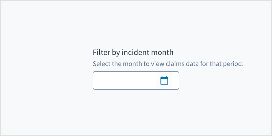
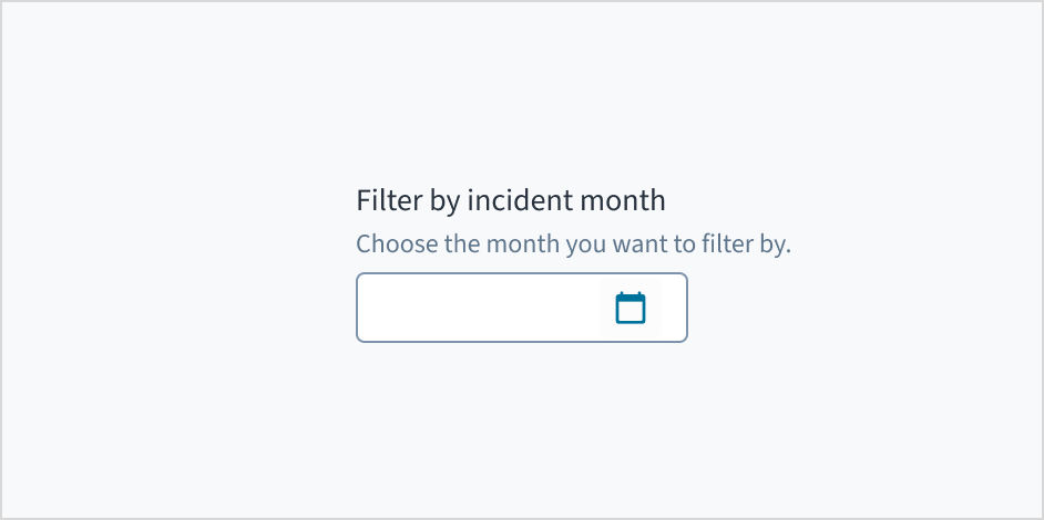
Month picker is a control element where the user selects a specific month from a calendar or enters it manually. This component is commonly used in insurance applications where users need to specify a month, such as selecting the start date for an insurance policy or filtering data by date.
Use help text to provide context and communicate what month to select. Here are some examples of what you might include:
Hints that assist the user in choosing the appropriate month
More context for why the user needs to select a specific month
Only use help text for pertinent information. Avoid restating the same details that appear in the label. Write help text in sentence case, using 1-2 short, complete sentences that end with a period.
Do use help text to show context.
Don't use help text to simply restate the same information that appears in the label.
The date picker is expanded and collapsed with Spacebar. Users navigate through the options using the arrow keys and select by means of the Spacebar or Enter key.
A calendar widget appears when the user tabs to the date picker input field. The current date is highlighted and keyboard-only users can enter the date manually here. Users can also place keyboard focus on the widget by pressing the down arrow key when it is expanded. Navigate through the calendar with the arrow keys. 'Previous', 'Month', 'Year', and 'Next' buttons are focusable using the Tab key when the widget is open.
Users are informed of the pre-populated date value when they tab to the date picker input field, and that this value is currently selected. The date can be entered manually from this input field. While focus remains on the pre-populated date, a calendar widget is also available. Users can also move focus into the widget by pressing the down arrow key. Navigation through the calendar portion of the widget is accomplished via the arrow keys, and the value currently in focus is voiced by screen readers via a WAI-ARIA aria-label attribute. The 'Previous', 'Month', 'Year', and 'Next' buttons are focusable using the Tab key when the widget is open. React date picker does not currently enable keyboard navigation to the 'Today' link.
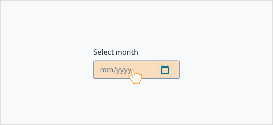
The month picker component allows users to move the caret (the blinking text cursor) between different sections of the date (MM/YYYY). However, users cannot delete individual digits within a section. Deleting any digit erases the entire section (MM or YYYY), requiring users to retype it. This behavior is consistent across date components, where the input mask formats the input as the user types.
The contrast ratio of textual elements against their background is above 4.5:1 as per WCAG 2.1 AA requirements. Non-textual content that needs to convey meaning (such as icons and keyboard focus visibility) has a contrast ratio of at least 3:1 with its adjacent colors. All content is visible and functional up to and including 400% without requiring scrolling in two dimensions.
This component has been validated to meet the WCAG 2.1 AA accessibility guidelines. However, changes made by the content author can affect accessibility conformance.
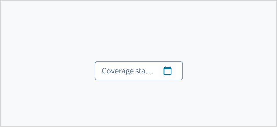
When using this component, ensure that the label clearly communicates which month the user needs to input or select.
Make sure to understand the Design System components API surface, and the implications and trade-offs. Learn more in our introduction to the component API.
If true, displays the component value as a plain text. Consider using readonly instead, if possible, because plain text has much worse accessibility than readonly inputs.
Initial value of input. Value must be in object format with month and year property where month is indexed from 1. If value prop is specified along with this prop, this prop's value is discarded.
Value of input. Takes precedence over initialValue. Value must be in object format with month and year property where month is indexed from 1. If this prop is passed, component works in controlled mode and its value will change only if this prop changes.
The date is formatted according to the selected locale. For example, if the locale is en-US, then the date January 20th, 2024 is formatted as "01/20/2024". If the locale is en-GB, it is formatted as "20/01/2024".
Jutro inputs have implemented imperative handlers as a mechanism to provide access to some common native features that might be useful for you. The following features are available:
Set focus to allow you to set the user focus into a specific component
Blur to remove the focus from the component
Scroll to the component so that you can take the user to a specific area of the page.
These features are provided through the ref property, which exposes them as follows:
Although some Jutro components might provide complementary features or a helper function to facilitate the validation process, it is your responsibility as a developer to handle the validation of any user input (using or not using the complementary helpers) and to decide what error messages to show.
Jutro components behave based on the developer implementation.
When are error messages displayed?
Error messages are only displayed when you pass them to the component through the stateMessages property. This property receives an object with the following content:
The component displays every error message provided in the same order as in the array.
When does validation occur?
This is your decision as a developer. As components do not determine when the validation is performed or when the error must be displayed, you need to implement the logic to handle it according to the project requirements, for example while the user is editing the content, when the component loses focus, and on form submission.
If the user enters an invalid date, or a date that is outside the min/max boundaries, they get a validation error as the third parameter in the onChange handler. The parameter looks like the following:
{ errorCode:ERROR.<ERROR_CODE_GOES_HERE>, }
The error code can be one of the following:
INVALID_DATE - when the user enters an invalid date, for example "January 32nd".
MIN_DATE_EXCEEDED - when the user enters a date that is before minDate.
MAX_DATE_EXCEEDED - when the user enters a date that is after maxDate.