Table states
Usage
Feedback states are an important part of the table component's user experience. They provide clear visual feedback when the table can't display rows of data, transforming a potentially confusing empty space into a helpful and informative message. These states communicate the current status of the data, such as loading, empty, or an error, and guide the user on how to proceed. This documentation covers the primary states of the table component.
Formatting
Anatomy
While the specific content varies, all states within the table share a common set of elements, presented in the table body in place of the data rows.
- Image or icon: A visual cue that helps users quickly understand the nature of the state.
- Title: A concise heading that communicates the primary message of the state.
- Description: Body text that provides additional context, explains why the state is being shown, and guides the user on next steps.
- Action: A button or link that provides a direct pathway for the user to take action.
Not all of these elements are required for every state; the specific combination depends on the context. See the section on State variations for detailed guidelines on each state.
Content
General writing guidelines
- Use sentence case for all aspects of designing Guidewire product interfaces. Don't use title case.
- Use present tense verbs and active voice in most situations.
- Use common contractions to lend your copy a more natural and informal tone.
- Use plain language. Avoid unnecessary jargon and complex language.
- Keep words and sentences short.
State variations
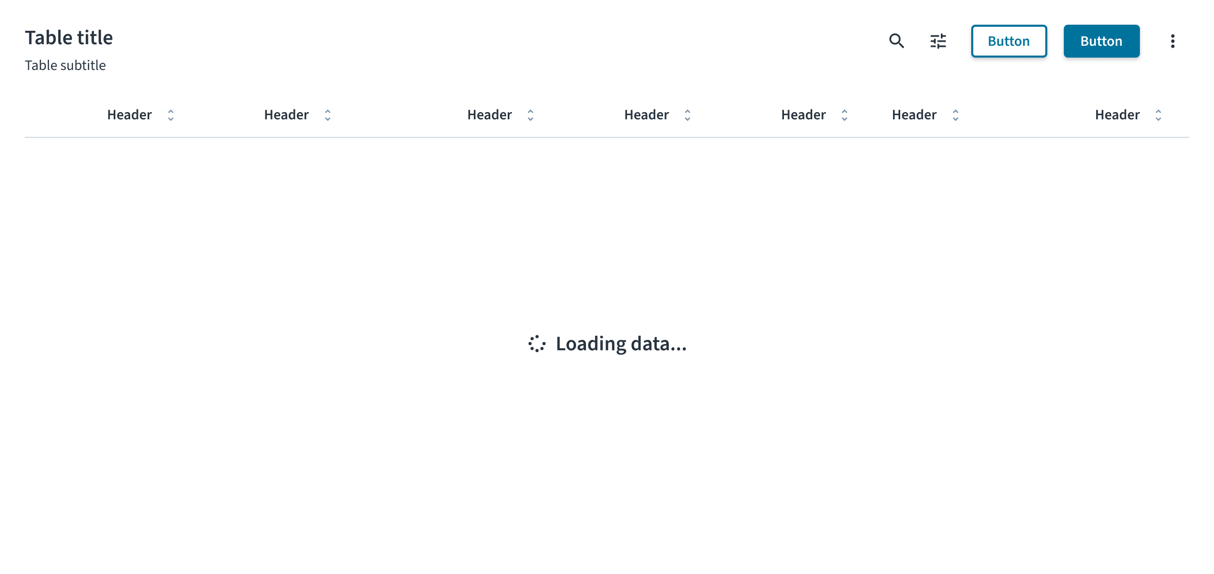
Loading state
The loading state informs the user that data is being fetched. It consists of a spinner icon and a text label. The message must be simple and direct. Use the standard "Loading data..." text to clearly inform the user that the system is working. This is a temporary state and does not include any user-interactive elements like buttons or links.
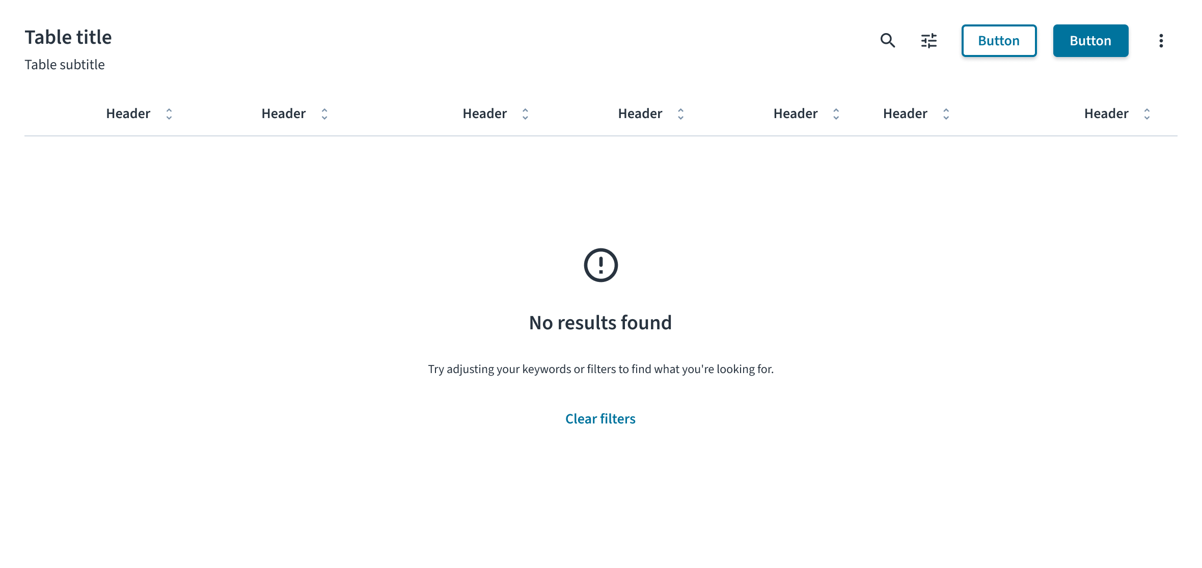
Empty state
The empty state informs the user why there is no data to display. The content and actions must be tailored to the specific scenario. For more comprehensive guidance, see the Empty state pattern.
- Initial use: This state appears when a user first encounters a feature and has not yet added any data. In the message, explain the value of the feature and use the primary action to guide the user toward adding their first item (for example, with an Add claim button).
- No search results: This state appears after a user's search or filtering returns no matching results. The message must inform the user that the search is complete but found nothing. An action button is strongly recommended to provide a clear path forward for the user. A good example of a logic-based action is to display a Clear filters button, but only when the empty state is a result of active filters.
- After deletion or completion: This state appears after a user successfully completes a task, such as clearing all notifications. It serves as a confirmation and often does not require an action button.
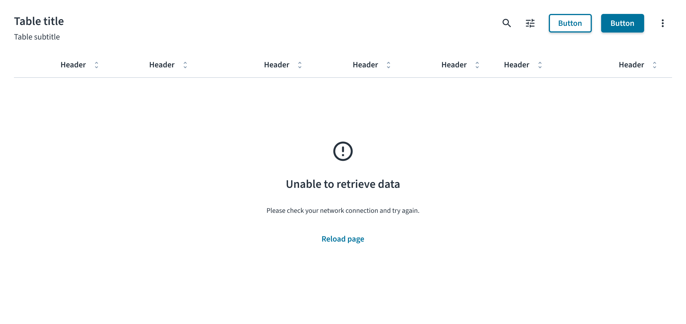
Error state
The error state informs the user that data could not be displayed due to a problem. The message must clearly explain the issue in plain language and provide a direct path to resolution. For example, for a system or network failure, the state includes a warning icon, the title “Unable to retrieve data,” a description explaining the issue, and a Reload page button as a recovery action.
Accessibility
This component has been validated to meet the WCAG 2.2 AA accessibility guidelines in its default, base configuration. This includes ensuring:
- The contrast ratio of textual elements against their background is above 4.5:1.
- Non-textual content that needs to convey meaning (like icons and focus indicators) has a contrast ratio of at least 3:1 with its adjacent colors.
- The item is operable using a keyboard, as well as using a mouse.
- Content is accessible using screen readers, such as JAWS and VoiceOver.
Accessibility conformance ultimately depends on how this component is implemented and customized. Changes made by the content author can affect accessibility. For details on our shared responsibility model, please review our full Jutro accessibility statement.
When using this component within your application, observe these best practices:
- Announce state changes. When a state appears, its content must be announced by screen readers. This typically requires the use of ARIA live regions to ensure users of assistive technologies are aware of the change.
- Define the role of illustrations. If a state includes supportive text that explains the situation, the illustration or icon must be treated as decorative and hidden from screen readers. If the illustration is the only means of conveying the state's meaning, it must have descriptive alt text.
Code
if (loading) {
  return <TableLoader />;
}

if (!hasData) {
  return (
    <TableEmptyState
      mainMessageVariant="heading-3"
      mainMessageTag="h3"
      mainMessageContent="Nothing to display"
      detailedMessageContent={
        <>
          Unable to load data.
          <br />
          Click below to try again.
        </>
      }
      actions={[
        {
          label: 'Reload',
          variant: 'tertiary',
          onClick: simulateAsyncFetch(addData, {
            setLoading,
          }),
        },
      ]}
    />
  );
}
Check out the Examples section for complete code samples demonstrating various table states implementations.
Import statement
import { TableEmptyState, TableLoader } from '@jutro/components';
Component contract
Make sure to understand the Design System components API surface, and the implications and trade-offs. Learn more in our introduction to the component API.
TableEmptyState
The TableEmptyState component defines the empty state of the table. It is used within the TableBody component when there is no data to be displayed. The component automatically centers the content within the table body and calculates its height based on the previously displayed table content to prevent abrupt visual shifts between states.
Properties
actions- Type
ButtonProps[]DescriptionA list of action buttons displayed below the messages, allowing users to perform specific tasks. You can add multiple action buttons and define them using the button component properties.
detailedMessageContent- Type
React.ReactNodeDescriptionAdditional message content displayed below the main message. Useful for providing context, instructions, or extra details.
icon- Type
React.ReactElementDescriptionThe icon displayed above the main message. Accepts any React element, for example an
Iconcomponent, or SVG file.Default valueErrorOutlineIcon mainMessageContent- Type
React.ReactNodeDescriptionThe content of the main message displayed when the table is empty.
mainMessageTag- Type
AllowedElementTypeDescriptionThe HTML element used by the
Typographycomponent to render the main message that you can use for semantic customization. See tag options to review possible values. mainMessageVariant- Type
VariantDescriptionThe style variant of the
Typographycomponent applied to the main message. See variant options to review possible values.Default valueheading-3
TableLoader
The TableLoader component defines the loading state of the table. It is used within the TableBody component during data fetch operations or any asynchronous processing that requires user feedback. The component automatically centers the content within the table body and calculates its height based on the previously displayed table content to prevent abrupt visual shifts between states.
Properties
icon- Type
React.ReactElementDescriptionThe icon displayed during data loading. Accepts any React element, for example an
Iconcomponent, or SVG file.Default valueSpinnerIcon label- Type
IntlMessageShapeDescriptionThe content of the label displayed during data loading. Accepts an internationalized message shape for localization purposes.
Default valueLoading data
Custom behaviors
Context-aware height scaling
The TableEmptyState and TableLoader components include context-aware height scaling to prevent distracting UI flickering and shifting. When these components are rendered, they calculate their height based on the previously displayed table content. This ensures that loaders and empty states occupy the same vertical space as the preceding data set, resulting in a smoother interface without sudden shifts in layout.
Example scenarios
- Data loading: A table displaying 50 rows with 1000px height maintains that 1000px height when the loader appears during an async operation, preventing content below the table from shifting.
- Search with no results: After filtering returns no matching results, the empty state uses the height previously occupied by the filtered data set, maintaining layout stability.
- Minimal data: A table displaying two rows with a height of 100px expands to a minimum of 400px when a state appears, ensuring sufficient space for the state’s content.
Customizing minimum height
The calculated height is determined automatically and cannot be customized. However, you can override the min-height (by default it's set to 400px) that applies when the previous table content is minimal, by setting the corresponding design tokens:
jds.table.content.emptyforTableEmptyStatejds.table.content.loadingforTableLoader
Hooks
No hooks are available for table states.
Translation keys
TableEmptyState
| Key | Default value | Used for |
|---|---|---|
| jutro-components.Table.TableEmptyState.mainMessage | Nothing to display | Main message displayed when the table is empty. Can be overridden by mainMessageContent property. |
| jutro-components.Table.TableEmptyState.detailedMessage | - | Additional message content displayed below the main message. Useful for providing context, instructions, or extra details. Can be overridden by detailedMessageContent property. |
TableLoader
| Key | Default value | Used for |
|---|---|---|
| jutro-components.Table.TableLoader.label | Loading data | Label displayed during data loading. Can be overridden by label property. |
Escape hatches
For more information, see our documentation about escape hatches.
Examples
The table component provides table states functionality using only Jutro components. For advanced use cases or existing integrations, you can optionally leverage external libraries such as TanStack Table to handle parts of data management logic.
You can review two types of code examples for table states that demonstrate using only Jutro components and using TanStack Table for part of data management logic. The examples have all files needed for you to review them in your environment, such as functions simulating asynchronous data fetching. Each example has a different set of files.
Check out the Usage section for details about how to design a table properly, and the different configuration options we provide.
Empty state implementation
To implement an empty state in your table, use the TableEmptyState component within the TableBody when your data array is empty or when a conditional check determines no content is to be displayed.
The TableEmptyState component provides a default ErrorOutlineIcon icon and a Nothing to display label. These can be modified using optional mainMessageContent and icon properties. It also accepts optional properties like detailedMessageContent for additional context and actions for interactive elements.
Use the mainMessageVariant and mainMessageTag properties to control the heading hierarchy and styling.
Configure action buttons through the actions array, where each action object requires a label property and accepts all optional button properties, such as onClick event handler.
import React, { useId, useState } from 'react';

import {
  BodyCell,
  BodyRow,
  Button,
  HeaderCell,
  HeaderRow,
  Table,
  TableBody,
  TableEmptyState,
  TableHeader,
  Typography,
} from '@jutro/components';
import type { TableProps } from '@jutro/components';

const mockRowData = {
  product: 'Go Commercial Auto',
  insured: 'Marshall Reagan',
  premium: 'USD 1,236.39',
};

export const TableTitleString = 'Policy list';

/** Component that renders a table title section with heading and subtitle. */
export const TableTitle: React.FC<{
  tableId: string;
  children?: React.ReactNode;
}> = ({ tableId, children }) => (
  <div>
    <div>
      <Typography
        variant="heading-2"
        id={tableId}
      >
        {TableTitleString}
      </Typography>
      <Typography role="doc-subtitle">
        Detailed record of individual policies
      </Typography>
    </div>
    {children}
  </div>
);

export function EmptyStateStory(args: TableProps): React.ReactElement {
  const tableId = useId();
  const [hasData, setHasData] = useState(false);

  return (
    <div>
      <TableTitle tableId={tableId}>
        {hasData && (
          <div>
            <Button
              label="Clear data"
              onClick={() => setHasData(false)}
            />
          </div>
        )}
      </TableTitle>
      <Table
        noStripedRows={args.noStripedRows}
        className={args.className}
        aria-labelledby={tableId}
      >
        <TableHeader>
          <HeaderRow>
            <HeaderCell columnIndex={0}>Product</HeaderCell>
            <HeaderCell columnIndex={1}>Insured</HeaderCell>
            <HeaderCell columnIndex={2}>Premium</HeaderCell>
          </HeaderRow>
        </TableHeader>
        <TableBody>
          {!hasData ? (
            <TableEmptyState
              mainMessageVariant="heading-3"
              mainMessageTag="h3"
              mainMessageContent="Nothing to display"
              detailedMessageContent={
                <>
                  No records found.
                  <br />
                  Click <strong>Add a new entry</strong> to create a new entry.
                </>
              }
              actions={[
                {
                  label: 'Add a new entry',
                  variant: 'tertiary',
                  onClick: () => {
                    setHasData(true);
                  },
                },
              ]}
            />
          ) : (
            <BodyRow>
              <BodyCell
                rowIndex={0}
                columnIndex={0}
              >
                {mockRowData.product}
              </BodyCell>
              <BodyCell
                rowIndex={0}
                columnIndex={1}
              >
                {mockRowData.insured}
              </BodyCell>
              <BodyCell
                rowIndex={0}
                columnIndex={2}
              >
                {mockRowData.premium}
              </BodyCell>
            </BodyRow>
          )}
        </TableBody>
      </Table>
    </div>
  );
}
import React, { useId, useState } from 'react';
import {
  flexRender,
  getCoreRowModel,
  Table as TableType,
  useReactTable,
} from '@tanstack/react-table';

import {
  BodyCell,
  BodyRow,
  Button,
  HeaderCell,
  HeaderRow,
  Table,
  TableBody,
  TableEmptyState,
  TableHeader,
  Typography,
} from '@jutro/components';
import type { TableEmptyStateProps, TableProps } from '@jutro/components';
import type { ColumnDef, RowData } from '@tanstack/react-table';

type TableMockData = {
  product: {
    name: string;
  };
  insured: string;
  premium: {
    currency: string;
    amount: number;
  };
};

const mockRowData: TableMockData = {
  product: {
    name: 'Go Commercial Auto',
  },
  insured: 'Marshall Reagan',
  premium: {
    currency: 'USD',
    amount: 1236.39,
  },
};

/** Tanstack Table module augmentation to extend ColumnMeta interface with alignment and aria-label properties. */
declare module '@tanstack/react-table' {
  interface ColumnMeta<TData extends RowData, TValue> {
    align?: 'left' | 'right' | 'center';
    ariaLabel?: string;
  }
}

/** Column configuration for the table with Product, Insured, and Premium columns. */
export const columns: ColumnDef<TableMockData, any>[] = [
  {
    id: 'product',
    header: () => (
      <Typography
        variant="heading-5"
        tag="span"
      >
        Product
      </Typography>
    ),
    cell: (props) => <Typography>{props.getValue()}</Typography>,
    accessorFn: (row) => row.product.name,
    meta: {
      ariaLabel: 'Product',
    },
  },
  {
    id: 'insured',
    header: () => (
      <Typography
        variant="heading-5"
        tag="span"
      >
        Insured
      </Typography>
    ),
    cell: (props) => <Typography>{props.getValue()}</Typography>,
    accessorKey: 'insured',
    meta: {
      ariaLabel: 'Insured',
    },
  },
  {
    id: 'premium',
    header: () => (
      <Typography
        variant="heading-5"
        tag="span"
      >
        Premium
      </Typography>
    ),
    cell: (props) => <Typography>{props.getValue()}</Typography>,
    accessorFn: (row) =>
      `${row.premium.currency} ${row.premium.amount?.toFixed(2)}`,
    meta: {
      align: 'right',
      ariaLabel: 'Premium',
    },
  },
];

export const TableTitleString = 'Policy list';

/** Component that renders a table title section with heading and subtitle. */
export const TableTitle: React.FC<{
  tableId: string;
  children?: React.ReactNode;
}> = ({ tableId, children }) => (
  <div>
    <div>
      <Typography
        variant="heading-2"
        id={tableId}
      >
        {TableTitleString}
      </Typography>
      <Typography role="doc-subtitle">
        Detailed record of individual policies
      </Typography>
    </div>
    {children}
  </div>
);

const mockData: TableMockData[] = [];

const TableBodyChildren: React.FC<{
  table: TableType<TableMockData>;
  data: TableMockData[];
  setTableData: React.Dispatch<React.SetStateAction<TableMockData[]>>;
  args: TableProps & TableEmptyStateProps;
}> = ({ table, data, setTableData, args }) => {
  if (!data.length) {
    return (
      <TableEmptyState
        mainMessageVariant={args.mainMessageVariant}
        mainMessageTag={args.mainMessageTag}
        mainMessageContent={args.mainMessageContent}
        detailedMessageContent={
          args?.detailedMessageContent || (
            <>
              No records found.
              <br />
              Click <strong>Add a new entry</strong> to create a new entry.
            </>
          )
        }
        actions={
          args?.actions || [
            {
              label: 'Add a new entry',
              variant: 'tertiary',
              onClick: () => {
                setTableData([mockRowData]);
              },
            },
          ]
        }
      />
    );
  }

  return (
    <React.Fragment>
      {table?.getRowModel()?.rows.map((row, rowIndex) => (
        <BodyRow key={row.id}>
          {row.getVisibleCells().map((cell, columnIndex) => (
            <BodyCell
              key={cell.id}
              rowIndex={rowIndex}
              columnIndex={columnIndex}
              align={cell.column.columnDef.meta?.align}
            >
              {flexRender(cell.column.columnDef.cell, cell.getContext())}
            </BodyCell>
          ))}
        </BodyRow>
      ))}
    </React.Fragment>
  );
};

export function EmptyStateTanstackStory(
  args: TableProps & TableEmptyStateProps
): React.ReactElement {
  const tableId = useId();

  const [tableData, setTableData] = useState(mockData);

  const table = useReactTable<TableMockData>({
    getCoreRowModel: getCoreRowModel(),
    data: tableData,
    columns,
  });

  return (
    <div>
      <TableTitle tableId={tableId}>
        {tableData.length > 0 && (
          <div>
            <Button
              label="Clear data"
              onClick={() => setTableData([])}
            />
          </div>
        )}
      </TableTitle>
      <Table
        aria-labelledby={tableId}
        className={args.className}
        noStripedRows={args.noStripedRows}
      >
        <TableHeader>
          {table.getHeaderGroups().map((headerGroup) => (
            <HeaderRow key={headerGroup.id}>
              {headerGroup.headers.map((header, columnIndex) => (
                <HeaderCell
                  key={header.id}
                  columnIndex={columnIndex}
                  align={header.column.columnDef.meta?.align}
                >
                  {flexRender(
                    header.column.columnDef.header,
                    header.getContext()
                  )}
                </HeaderCell>
              ))}
            </HeaderRow>
          ))}
        </TableHeader>
        <TableBody>
          <TableBodyChildren
            table={table}
            data={tableData}
            setTableData={setTableData}
            args={args}
          />
        </TableBody>
      </Table>
    </div>
  );
}
Loading state implementation
To implement a loading state in your table, use the TableLoader component within the TableBody during data fetch operations or any asynchronous processing that requires user feedback.
The TableLoader component provides a standardized loading experience with a spinner icon and the default "Loading data" label. You can modify both icon and label using available properties. The component automatically centers the content within the table body.
Implement loading states by conditionally rendering the TableLoader component based on your data fetching status. Use Boolean flags like loading or isLoading from your state management to control when the loading state appears. The loading state is to replace the normal table content during data operations and automatically transition to either the populated table, an empty state, or an appropriate error state once the operation completes.
Accessibility
Set aria-busy="true" on the Table component during loading operations to inform assistive technologies that content is being updated.
Use aria-live="polite" on the Table component to create a live region that automatically announces state changes to screen reader users, ensuring they receive timely feedback when content transitions between loading, empty, and populated states without interrupting their current focus or reading flow.
Component implementation
import React, { useId, useState } from 'react';

import {
  BodyCell,
  BodyRow,
  Button,
  HeaderCell,
  HeaderRow,
  Table,
  TableBody,
  TableEmptyState,
  TableHeader,
  Typography,
  TableLoader,
} from '@jutro/components';
import { simulateAsyncFetch } from './simulateAsyncFetch';
import type { TableProps, TableEmptyStateProps } from '@jutro/components';

const mockRowData = [
  {
    id: '11111',
    product: 'Go Commercial Auto',
    insured: 'Marshall Reagan',
    premium: 'USD 1,236.39',
  },
  {
    id: '80077',
    product: "Go Worker's Compensation",
    insured: 'April Kub',
    premium: 'USD 173.99',
  },
  {
    id: '64487',
    product: 'USA Personal Auto',
    insured: 'Abel Rippin',
    premium: 'USD 1,228.69',
  },
  {
    id: '12345',
    product: 'Go Commercial Auto',
    insured: 'John Smith',
    premium: 'USD 892.45',
  },
];

export const TableTitleString = 'Policy list';

/** Component that renders a table title section with heading and subtitle. */
export const TableTitle: React.FC<{
  tableId: string;
  children?: React.ReactNode;
}> = ({ tableId, children }) => (
  <div>
    <div>
      <Typography
        variant="heading-2"
        id={tableId}
      >
        {TableTitleString}
      </Typography>
      <Typography role="doc-subtitle">
        Detailed record of individual policies
      </Typography>
    </div>
    {children}
  </div>
);

const TableBodyChildren: React.FC<{
  hasData: boolean;
  setHasData: React.Dispatch<React.SetStateAction<boolean>>;
  loading: boolean;
  setLoading: React.Dispatch<React.SetStateAction<boolean>>;
  args: TableProps & TableEmptyStateProps;
}> = ({ hasData, setHasData, loading, setLoading, args }) => {
  const addData = () => {
    setHasData(true);
  };
  {
  }
  if (loading) {
    return <TableLoader />;
  }
  {
  }
  if (!hasData) {
    return (
      <TableEmptyState
        mainMessageVariant="heading-3"
        mainMessageTag="h3"
        mainMessageContent="Nothing to display"
        detailedMessageContent={
          <>
            Unable to load data.
            <br />
            Click <strong>Reload</strong> to reload the data.
          </>
        }
        actions={[
          {
            label: 'Reload',
            variant: 'tertiary',
            onClick: simulateAsyncFetch(addData, {
              setLoading,
            }),
          },
        ]}
      />
    );
  }

  return (
    <>
      {mockRowData.map((row, index) => (
        <BodyRow key={row.id}>
          <BodyCell
            rowIndex={index}
            columnIndex={0}
          >
            {row.product}
          </BodyCell>
          <BodyCell
            rowIndex={index}
            columnIndex={1}
          >
            {row.insured}
          </BodyCell>
          <BodyCell
            rowIndex={index}
            columnIndex={2}
          >
            {row.premium}
          </BodyCell>
        </BodyRow>
      ))}
    </>
  );
};

export function EmptyStateReloadStory(
  args: TableProps & TableEmptyStateProps
): React.ReactElement {
  const tableId = useId();
  const [hasData, setHasData] = useState(false);
  const [loading, setLoading] = useState(false);

  return (
    <div>
      <TableTitle tableId={tableId}>
        {hasData && (
          <div>
            <Button
              label="Clear data"
              onClick={() => setHasData(false)}
            />
          </div>
        )}
      </TableTitle>
      <Table
        noStripedRows={args.noStripedRows}
        className={args.className}
        aria-labelledby={tableId}
        aria-busy={loading ? 'true' : 'false'}
        aria-live="polite"
      >
        <TableHeader>
          <HeaderRow>
            <HeaderCell columnIndex={0}>Product</HeaderCell>
            <HeaderCell columnIndex={1}>Insured</HeaderCell>
            <HeaderCell columnIndex={2}>Premium</HeaderCell>
          </HeaderRow>
        </TableHeader>
        <TableBody>
          <TableBodyChildren
            hasData={hasData}
            setHasData={setHasData}
            loading={loading}
            setLoading={setLoading}
            args={args}
          />
        </TableBody>
      </Table>
    </div>
  );
}
Data management
const WAIT_TIME = 400;

type SimulateAsyncFetchOptions = {
    setLoading?: (value: boolean) => void;
    delay?: number;
};

export function simulateAsyncFetch<T extends unknown[], R>(
    callback: (...args: T) => R | Promise<R>,
    options?: SimulateAsyncFetchOptions
): (...args: T) => Promise<R> {
    let timer: number | null = null;

    return async (...args: T): Promise<R> => {
        options?.setLoading?.(true);

        try {
            return await callback(...args);
        } finally {
            if (timer) {
                clearTimeout(timer);
            }

            timer = window.setTimeout(
                () => options?.setLoading?.(false),
                options?.delay || WAIT_TIME
            );
        }
    };
}
Component implementation
import React, { useId, useState } from 'react';
import {
  flexRender,
  getCoreRowModel,
  Table as TableType,
  useReactTable,
} from '@tanstack/react-table';

import {
  BodyCell,
  BodyRow,
  Button,
  HeaderCell,
  HeaderRow,
  Table,
  TableBody,
  TableEmptyState,
  TableHeader,
  TableLoader,
  Typography,
} from '@jutro/components';
import type { TableEmptyStateProps, TableProps } from '@jutro/components';
import type { ColumnDef, RowData } from '@tanstack/react-table';
import { simulateAsyncFetch } from './simulateAsyncFetch';

type TableMockData = {
  product: {
    name: string;
  };
  insured: string;
  premium: {
    currency: string;
    amount: number;
  };
};

const mockRowData: TableMockData[] = [
  {
    product: {
      name: 'Go Commercial Auto',
    },
    insured: 'Marshall Reagan',
    premium: {
      currency: 'USD',
      amount: 1236.39,
    },
  },
  {
    product: {
      name: "Go Worker's Compensation",
    },
    insured: 'April Kub',
    premium: {
      currency: 'USD',
      amount: 173.99,
    },
  },
  {
    product: {
      name: 'USA Personal Auto',
    },
    insured: 'Abel Rippin',
    premium: {
      currency: 'USD',
      amount: 1228.69,
    },
  },
  {
    product: {
      name: 'Go Commercial Auto',
    },
    insured: 'John Smith',
    premium: {
      currency: 'USD',
      amount: 892.45,
    },
  },
];

/** Tanstack Table module augmentation to extend ColumnMeta interface with alignment and aria-label properties. */
declare module '@tanstack/react-table' {
  interface ColumnMeta<TData extends RowData, TValue> {
    align?: 'left' | 'right' | 'center';
    ariaLabel?: string;
  }
}

/** Column configuration for the table with Product, Insured, and Premium columns. */
export const columns: ColumnDef<TableMockData, any>[] = [
  {
    id: 'product',
    header: () => (
      <Typography
        variant="heading-5"
        tag="span"
      >
        Product
      </Typography>
    ),
    cell: (props) => <Typography>{props.getValue()}</Typography>,
    accessorFn: (row) => row.product.name,
    meta: {
      ariaLabel: 'Product',
    },
  },
  {
    id: 'insured',
    header: () => (
      <Typography
        variant="heading-5"
        tag="span"
      >
        Insured
      </Typography>
    ),
    cell: (props) => <Typography>{props.getValue()}</Typography>,
    accessorKey: 'insured',
    meta: {
      ariaLabel: 'Insured',
    },
  },
  {
    id: 'premium',
    header: () => (
      <Typography
        variant="heading-5"
        tag="span"
      >
        Premium
      </Typography>
    ),
    cell: (props) => <Typography>{props.getValue()}</Typography>,
    accessorFn: (row) =>
      `${row.premium.currency} ${row.premium.amount?.toFixed(2)}`,
    meta: {
      align: 'right',
      ariaLabel: 'Premium',
    },
  },
];

export const TableTitleString = 'Policy list';

/** Component that renders a table title section with heading and subtitle. */
export const TableTitle: React.FC<{
  tableId: string;
  children?: React.ReactNode;
}> = ({ tableId, children }) => (
  <div>
    <div>
      <Typography
        variant="heading-2"
        id={tableId}
      >
        {TableTitleString}
      </Typography>
      <Typography role="doc-subtitle">
        Detailed record of individual policies
      </Typography>
    </div>
    {children}
  </div>
);

const TableBodyChildren: React.FC<{
  table: TableType<TableMockData>;
  data: TableMockData[];
  setTableData: React.Dispatch<React.SetStateAction<TableMockData[]>>;
  args: TableEmptyStateProps;
  loading: boolean;
  setLoading: React.Dispatch<React.SetStateAction<boolean>>;
}> = ({ table, data, setTableData, args, loading, setLoading }) => {
  {
  }
  if (loading) {
    return <TableLoader />;
  }
  {
  }
  const reloadData = () => {
    setTableData(mockRowData);
  };

  if (!data.length) {
    return (
      <TableEmptyState
        mainMessageVariant="heading-3"
        mainMessageTag="h3"
        mainMessageContent="Nothing to display"
        detailedMessageContent={
          <>
            Unable to load data.
            <br />
            Click <strong>Reload</strong> to reload the data.
          </>
        }
        actions={[
          {
            label: 'Reload',
            variant: 'tertiary',
            onClick: simulateAsyncFetch(reloadData, {
              setLoading,
            }),
          },
        ]}
      />
    );
  }

  return (
    <React.Fragment>
      {table?.getRowModel()?.rows.map((row, rowIndex) => (
        <BodyRow key={row.id}>
          {row.getVisibleCells().map((cell, columnIndex) => (
            <BodyCell
              key={cell.id}
              rowIndex={rowIndex}
              columnIndex={columnIndex}
              align={cell.column.columnDef.meta?.align}
            >
              {flexRender(cell.column.columnDef.cell, cell.getContext())}
            </BodyCell>
          ))}
        </BodyRow>
      ))}
    </React.Fragment>
  );
};

export function LoadingStateTanstackStory(
  args: TableProps & TableEmptyStateProps
): React.ReactElement {
  const tableId = useId();

  const [tableData, setTableData] = useState<TableMockData[]>([]);
  const [loading, setLoading] = useState(false);

  const table = useReactTable<TableMockData>({
    getCoreRowModel: getCoreRowModel(),
    data: tableData,
    columns,
  });

  return (
    <div>
      <TableTitle tableId={tableId}>
        {tableData.length > 0 && (
          <div>
            <Button
              label="Clear data"
              onClick={() => setTableData([])}
            />
          </div>
        )}
      </TableTitle>
      <Table
        aria-labelledby={tableId}
        className={args.className}
        noStripedRows={args.noStripedRows}
        aria-busy={loading ? 'true' : 'false'}
        aria-live="polite"
      >
        <TableHeader>
          {table.getHeaderGroups().map((headerGroup) => (
            <HeaderRow key={headerGroup.id}>
              {headerGroup.headers.map((header, columnIndex) => (
                <HeaderCell
                  key={header.id}
                  columnIndex={columnIndex}
                  align={header.column.columnDef.meta?.align}
                >
                  {flexRender(
                    header.column.columnDef.header,
                    header.getContext()
                  )}
                </HeaderCell>
              ))}
            </HeaderRow>
          ))}
        </TableHeader>
        <TableBody>
          <TableBodyChildren
            table={table}
            data={tableData}
            setTableData={setTableData}
            args={args}
            loading={loading}
            setLoading={setLoading}
          />
        </TableBody>
      </Table>
    </div>
  );
}
Data management
const WAIT_TIME = 400;

type SimulateAsyncFetchOptions = {
    setLoading?: (value: boolean) => void;
    delay?: number;
};

export function simulateAsyncFetch<T extends unknown[], R>(
    callback: (...args: T) => R | Promise<R>,
    options?: SimulateAsyncFetchOptions
): (...args: T) => Promise<R> {
    let timer: number | null = null;

    return async (...args: T): Promise<R> => {
        options?.setLoading?.(true);

        try {
            return await callback(...args);
        } finally {
            if (timer) {
                clearTimeout(timer);
            }

            timer = window.setTimeout(
                () => options?.setLoading?.(false),
                options?.delay || WAIT_TIME
            );
        }
    };
}
Changelog
10.13.0
The TableEmptyState and TableLoader components that handle empty and loading states of the table have been updated with context-aware height scaling. This update prevents distracting UI flickering and shifting by ensuring that loaders and empty states occupy the same vertical space as the preceding data set, resulting in a smoother interface.
10.12.0
The following components were introduced:
@jutro/components/TableEmptyState@jutro/components/TableLoader