Currency input
Usage
Overview
A currency field is an enhanced input field that enables users to enter an amount of money in a specified currency.
When to use
When you need users to input money in a specific currency, such as euros and dollars.
When not to use
When you need to input a numeric value and incrementally increase or decrease the value, use the number input instead.
Formatting
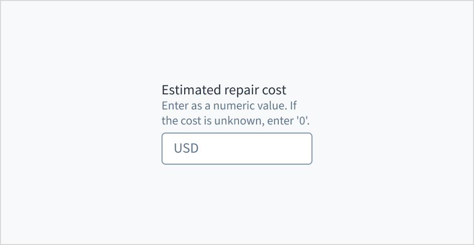
Anatomy
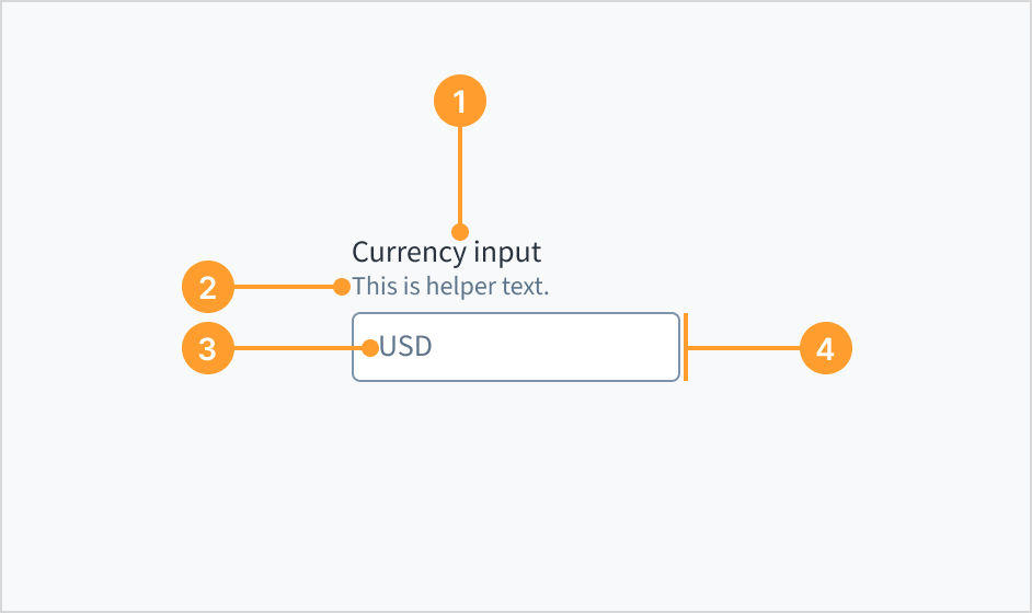
- Label: describes the purpose of an input field.
- Helper text (optional): Provides extra context, hints, or helpful information to aid the user. Often used to explain specific requirements for correctly filling out a field.
- Currency code or symbol: specifies and displays the currency type, helping users accurately enter and understand monetary values.
- Currency input field: the container, consisting of a fill and a stroke, in which the user enters data.
Label position
The label for the currency input field can appear at the top (default and recommended) or on the left of the input itself.

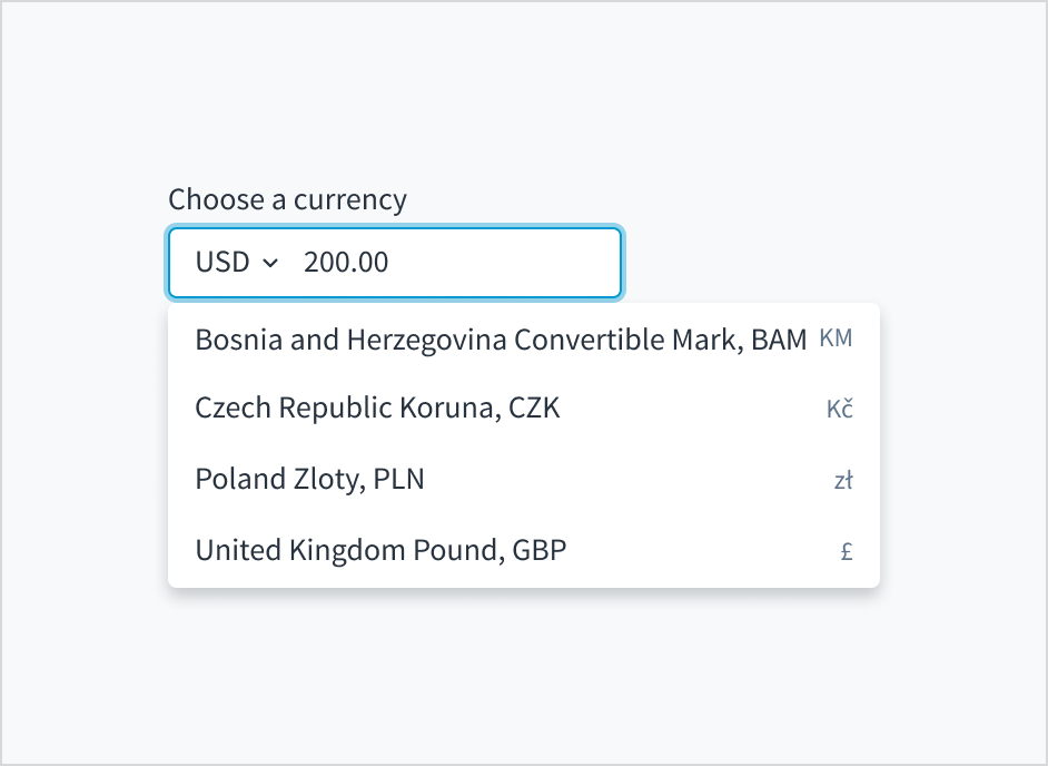
Currency codes and symbols
Currency codes follow the ISO 4217 standard. When setting up the component, you can change from currency code to symbol (for example, USD to $).
For multiple currencies, currency codes or symbols appear in a closed list and are ordered alphabetically.
Content
General writing guidelines
- Use sentence case for all aspects of designing Guidewire product interfaces. Don't use title case.
- Use present tense verbs and active voice in most situations.
- Use common contractions to lend your copy a more natural and informal tone.
- Use plain language. Avoid unnecessary jargon and complex language.
- Keep words and sentences short.
Include a label
Place a clear, visible label outside the currency input field. An input field without a label is ambiguous and not accessible.

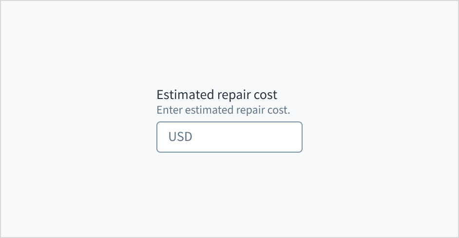
Use help text
Use help text to provide guidance about what to input and how. Here are some examples of what you might include in help text:
- Context to aid the user, such as how the information will be used
- Hints for what kind of information goes inside the input field
- Formatting examples or requirements
Only use help text for pertinent information. Avoid using help text that simply restates the same information that appears in the label.
Use sentence case for help text. Write the help text as 1-2 short, complete sentences that end with a period. When showing formatting examples, you don't need to end with a period.

Don't use placeholder text
Don't put placeholder text in the currency entry field. Placeholder text strains users' short-term memory because it disappears once a value is entered. It also poses additional burdens for users with visual and cognitive impairments.
Instead, place hints and instructions, including formatting examples and requirements, outside of the field.
Source: Nielsen Norman Group
Use error text to guide users
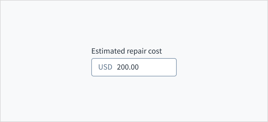
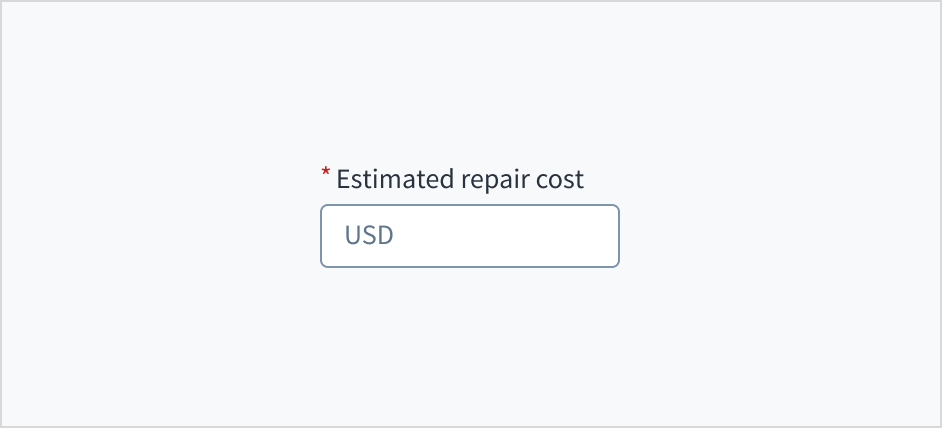
Error message text tells a user how to fix the error. For currency input fields, errors are often related to validation issues that must be fixed. For example, in a claims submission process where a user doesn't fill out a required field for estimated repair cost, you could use error text like "Enter the estimated cost of repairs."
Use sentence case for error text. Write 1-2 short, complete sentences that end with a period.
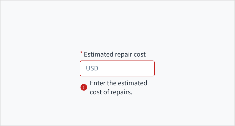
Mark required fields
Use an asterisk (*) to indicate required fields. The asterisk precedes the field label. This helps users to easily locate which fields are required by scanning just the left-most character of the label.
In addition to marking required fields with an asterisk, it is recommended to include clear instructions at the top of the form, such as "All fields marked with an asterisk are mandatory," to ensure users understand the meaning of the asterisk.
Use sentence case
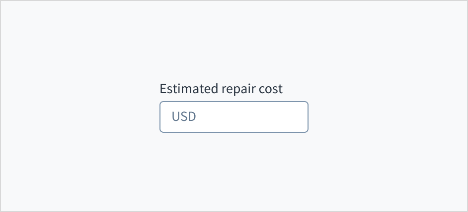
Field labels appear in sentence case.
Refer to the UI text style guide for more information on how to implement sentence case.
Behaviors
States
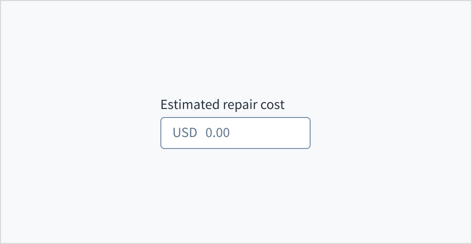
The currency input field appears with no value (default), placeholder text, or a filled input.
| Visual | State | Description |
|---|---|---|
 | No value (default) | Indicates to the user that no value has been entered and there is no placeholder. |
 | Placeholder | Indicates to the user that no value has been entered. The placeholder is grayed out. |
 | Filled input | Indicates to the user that the input is filled with data. |
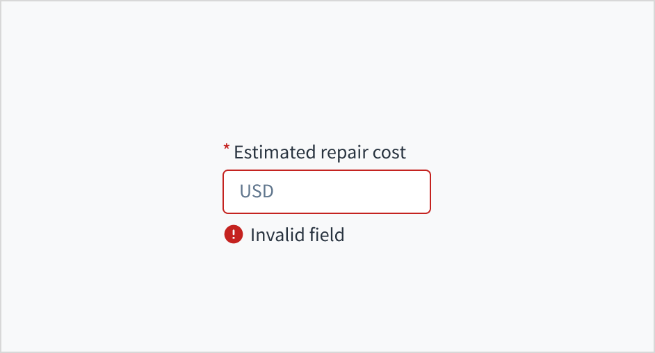
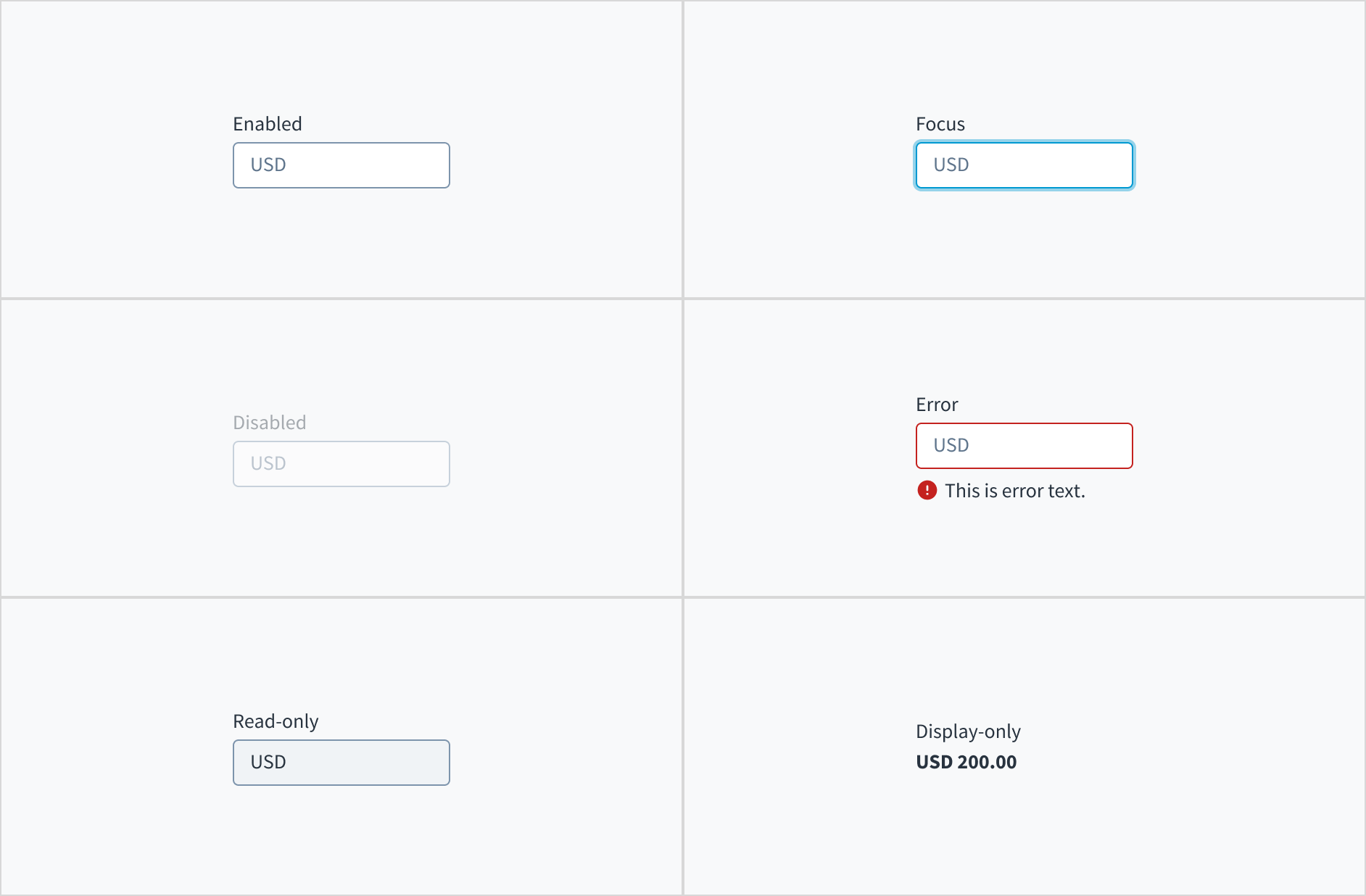
Currency input fields also have interactive states for enabled, focus, disabled, error, read-only, and display-only.
| State | Description |
|---|---|
| Enabled | Indicates to the user that the element is enabled for interaction. |
| Focus | Indicates to the user which UI element in the system is focused. |
| Disabled | Indicates to the user that the input value can't be changed because of local factors. For example, a checkbox above the input field must be checked to access this input field. The user can take action to enable it by interacting with the page. |
| Error | Indicates that the user has made a validation error. Error text provides corrective feedback to users. |
| Read-only | Indicates to the user that the input value can't be changed because of outside factors. For example, lack of write access. The user can take action to enable it by, for example, contacting an administrator. |
| Display-only | The display-only state is used for two cases:
|
Interactions
Mouse
Users can activate a currency input by clicking in the area inside the border.

Keyboard
The input element is keyboard accessible. Users can navigate into and out of the component using the TAB key.
Screenreader
The input field is associated with its label through a 'for/id' relationship. Checking the 'required' knob in Storybook toggles the aria-required value from 'true' to 'false'.
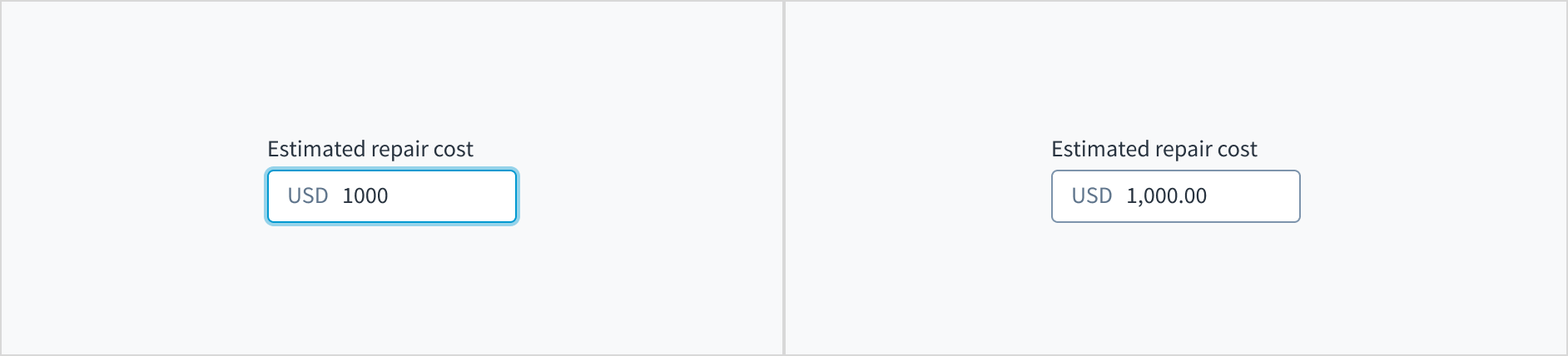
Thousands separator
The thousands separator doesn't display while the user is entering data. It appears after the input is complete and the user has clicked or tabbed away from the field.
Accessibility
This component has been validated to meet the WCAG 2.2 AA accessibility guidelines in its default, base configuration. This includes ensuring:
- The contrast ratio of textual elements against their background is above 4.5:1.
- Non-textual content that needs to convey meaning (like icons and focus indicators) has a contrast ratio of at least 3:1 with its adjacent colors.
- The item is operable using a keyboard, as well as using a mouse.
- Content is accessible using screen readers, such as JAWS and VoiceOver.
Accessibility conformance ultimately depends on how this component is implemented and customized. Changes made by the content author can affect accessibility. For details on our shared responsibility model, please review our full Jutro accessibility statement.
When using this component within your application, be sure to check the following:
- The labels and instructions are meaningful and concise. Provide supplemental instructions if necessary.
- The component displays the correct currency (the default is USD).
- If the input field is required, check the
aria-requiredcheckbox in Storybook.