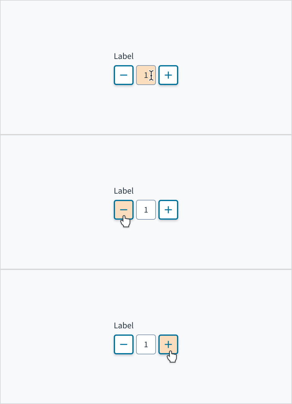
The stepper component enables users to incrementally increase or decrease a numeric value. Users can also type numeric values directly into the input field.
For numerical parameters with a clear default that most users are likely to select.
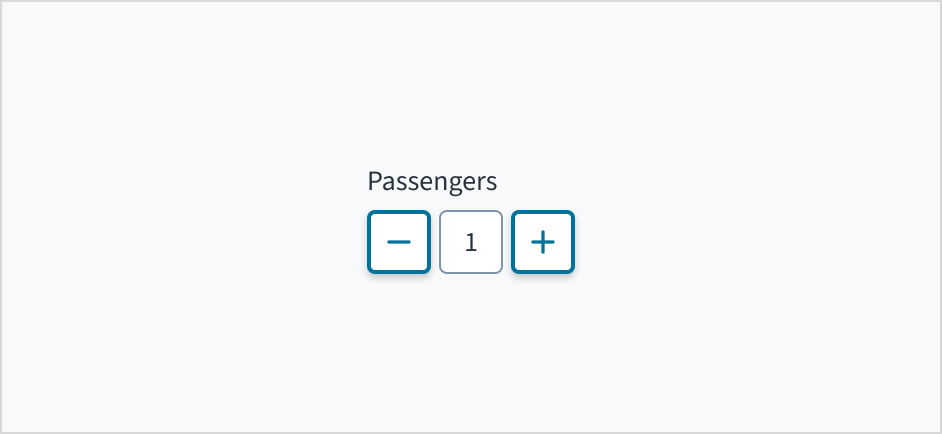
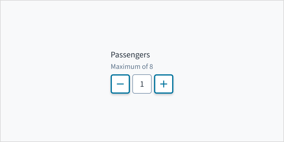
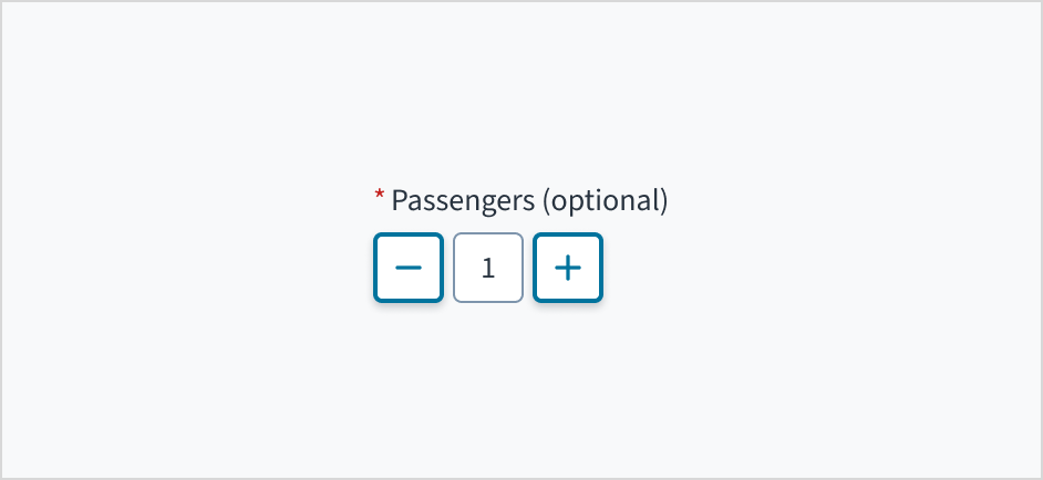
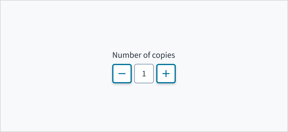
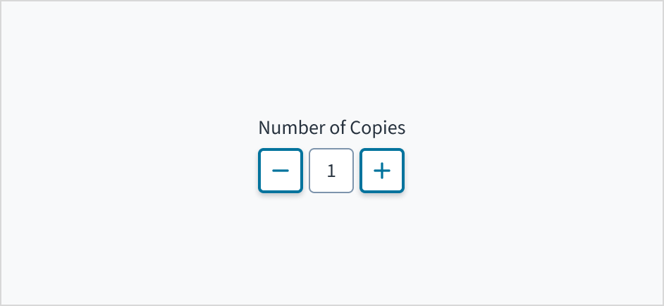
To adjust numeric fields by a small discrete amount, with no more than 10 increments or decrements. For example, you could use the stepper to change the number of passengers in a vehicle or the number of copies to be made.
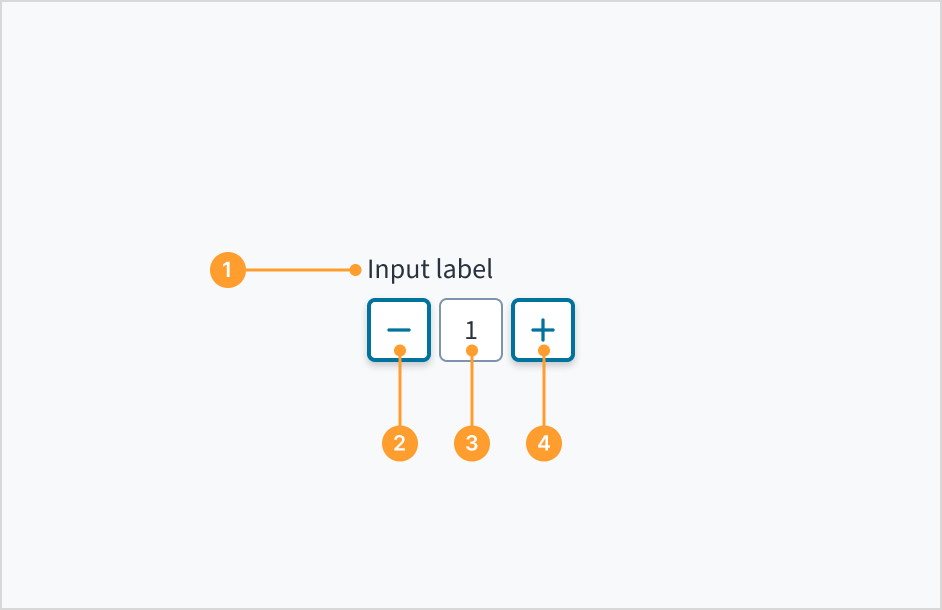
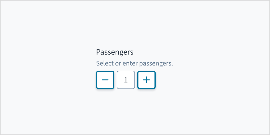
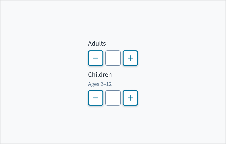
Label: Indicates what value the stepper changes, such as number of passengers.
Decrease button: The decrease button reduces the value. The value reduces by 1 when a user clicks the button.
Value: The current value that has been selected or predetermined. Users have the option to manually enter a numeric value by clicking in the text input field.
Increase button: The increase button increases the value. The value increases by 1 when a user clicks the button.
Place a clear, visible label outside the stepper input field. Label text explains the purpose of the stepper and provides context for the user. An input field without a label is ambiguous and not accessible.
Note: The label prop is mandatory for the Stepper component. If you do not want the label to be visible, you can pass hideLabel = true underneath the label prop.
Do position a permanent label outside the field.
Don't assume that the field is self-explanatory without a label.
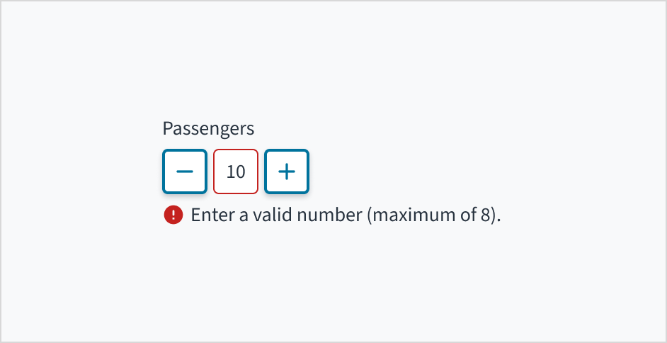
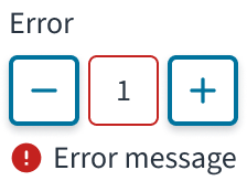
Error message text tells a user how to fix the error. In the case of the stepper, errors are often related to data that is invalid or a required field that is left empty.
Use sentence case for error text. Write 1-2 short, complete sentences that end with a period.
Do use error text to guide the user and show them a solution.
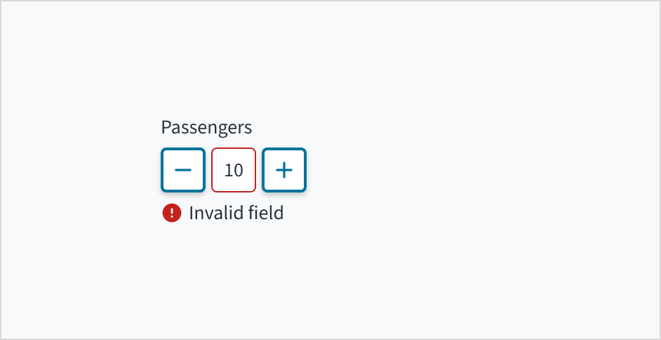
Don't write ambiguous error messages or leave users guessing as to how to resolve a problem.
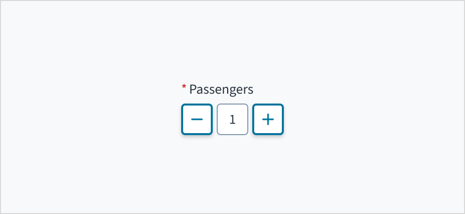
Use an asterisk (*) to indicate required fields. The asterisk precedes the field label. This helps users to easily locate which fields are required by scanning just the left-most character of the label.
In addition to marking required fields with an asterisk, it is recommended to include clear instructions at the top of the form, such as "All fields marked with an asterisk are mandatory," to ensure users understand the meaning of the asterisk.
Do use an asterisk to indicate that a field is required.
Don't use an asterisk to denote anything that is optional.
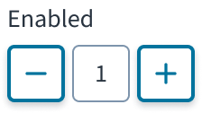
The stepper field has states for enabled, disabled, focus, error, read-only, and display-only.
Stepper control elements use icon buttons. For information about icon button states, refer to the documentation on button states.
State
Description
Enabled (default)
Communicates to the user that the element is enabled for interaction.
Disabled
Indicates to the user that the input value can't be changed because of local factors. For example, a checkbox above the input field must be checked to access this input field. The user can take action to enable it by interacting with the page.
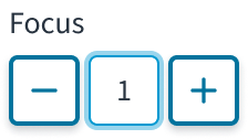
Focus
Provides feedback indicating the user has highlighted the element, typically using an input method such as a keyboard or voice.
Error
Indicates that the user has made a validation error. A validation label provides corrective feedback to users.
Read-only
Indicates to the user that the input value can't be changed because of outside factors. For example, lack of write access. The user can take action to enable it by, for example, contacting an administrator.
Display-only
The display-only state is used for two cases:
A UI element is used in display mode.
A UI element is displayed in edit mode, but is never editable.
Users can manually enter a numeric value by clicking in the text input field. They can also incrementally increase or decrease the value by clicking the add icon or subtract icon.
Each element in the Jutro stepper component is tab-indexed and, as such, can be accessed using the Tab key. Values can be increased or decreased with the Spacebar and Enter keys. The value within the input field can also be explicitly set with the cursor arrow keys or by entering the value manually.
The plus and minus value buttons include an aria-label attribute of "Increase Value" and "Decrease Value" respectively. These can be changed in Storybook in the messageProps fields. The input field utilizes aria-live="polite" in order to convey its value to people who are blind, and it is associated with the component label text through aria-labelledby.
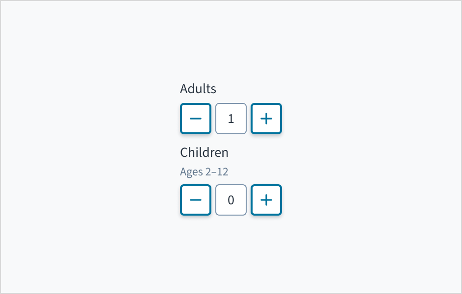
Set the most frequently selected value as a stepper default. For example, 1 is usually the default number of adults for booking a hotel room, whereas 0 may be the default number of children in a hotel reservation.
The contrast ratio of textual elements against their background is above 4.5:1.
Non-textual content that needs to convey meaning (like icons and focus indicators) has a contrast ratio of at least 3:1 with its adjacent colors.
The item is operable using a keyboard, as well as using a mouse.
Content is accessible using screen readers, such as JAWS and VoiceOver.
Accessibility conformance ultimately depends on how this component is implemented and customized. Changes made by the content author can affect accessibility. For details on our shared responsibility model, please review our full Jutro accessibility statement.
Make sure to understand the Design System components API surface, and the implications and trade-offs. Learn more in our introduction to the component API.
If set to true, displays the component value in plain text. Consider using readonly instead, if possible, because plain text is worse for accessibility than readonly inputs.
Value of input. Takes precedence over initialValue. If this prop is passed, component works in controlled mode and its value will change only if this prop changes.
Although min and max properties can be used to restrict the values that can be set in the component though the (+) and (-) buttons, there are 3 different ways in which the Stepper component can set a value out of these limits:
initialValue or value properties: these properties can accept any number and the one provided is out of the defined limits it will be anyway used.
User manual input: the user is allowed to type any number, even if it is out of the defined limits
In case of having an initialValue value or a manually entered value out of the limits, Stepper component will:
Disable (+) button if the value is above the max property value
Disable (-) button if the value is below the min property value
Set the value to the min or max values defined when the corresponding button is clicked
Although some Jutro components might provide complementary features or a helper function to facilitate the validation process, it is your responsibility as a developer to handle the validation of any user input (using or not using the complementary helpers) and to decide what error messages to show.
Jutro components behave based on the developer implementation.
When are error messages displayed?
Error messages are only displayed when you pass them to the component through the stateMessages property. This property receives an object with the following content:
The component displays every error message provided in the same order as in the array.
When does validation occur?
This is your decision as a developer. As components do not determine when the validation is performed or when the error must be displayed, you need to implement the logic to handle it according to the project requirements, for example while the user is editing the content, when the component loses focus, and on form submission.
Stepper does not provide a specific validation logic but it provides the way to include the developer validation and use the stateMessages property to display any required error message.
This is an example of handling validation when onChange event is triggered. Enter a value below 0 or above 10 without using the buttons to test it.
exportfunctionStepperValidation(){ const[validationMessages, setValidationMessages]=useState({}); const max =10; const min =0; const onChange =useCallback((e, newValue)=>{ setValidationMessages({}); if(newValue &&(newValue > max || newValue < min)){ setValidationMessages({ error:['Value must be between 0 and 10'], }); } },[]); return( <Stepper label="Enter Number" secondaryLabel="From 1 to 10 inclusive" onChange={onChange} stateMessages={validationMessages} min={min} max={max} /> ); }