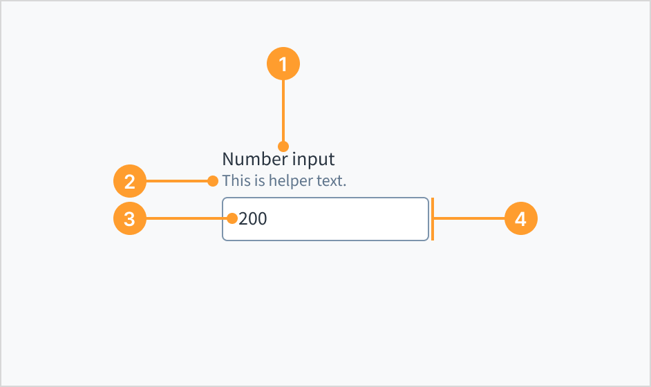
The number input enables users to enter or select numeric values within a predetermined range. It includes controls to incrementally increase or decrease the value. Users can also type numeric values directly into the input field.
Don't use this component when the precise value doesn't matter to the user, but rather only the approximate range. Consider using the slider component instead.
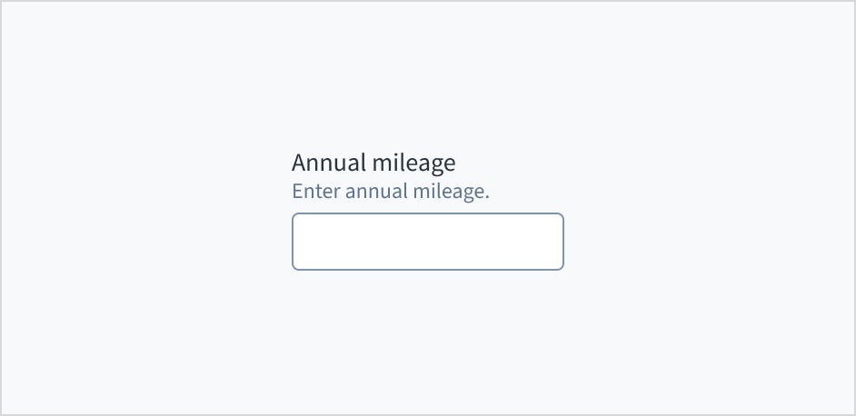
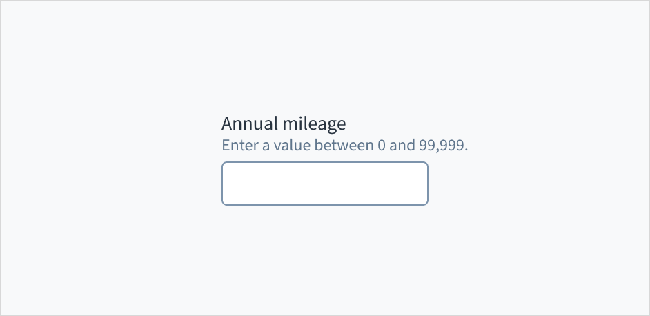
Helper text (optional): Provides extra context, hints, or helpful information to aid the user. Often used to explain specific requirements for correctly filling out a field.
Numeric value: changes when the user enters a value into the field or uses the two arrows at the end of the input to add and subtract values.
Number input field: the container, consisting of a fill and a stroke, in which the user enters data.
Use help text to provide guidance about what to input and how. Here are some examples of what you might include in help text:
Context to aid the user, such as how the information will be used
Hints for what kind of information goes inside the input field
Formatting examples or requirements
Only use help text for pertinent information. Avoid using help text that simply restates the same information that appears in the label.
Use sentence case for help text. Write the help text as 1-2 short, complete sentences that end with a period. When showing formatting examples, you don't need to end with a period.
Do use help text to provide additional aid or context to the user.
Don't use help text to simply restate the same information that appears in the label.
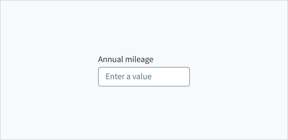
Don't put placeholder text in the number entry field. Placeholder text strains users' short-term memory because it disappears once a value is entered. It also poses additional burdens for users with visual and cognitive impairments.
Instead, place hints and instructions, including formatting examples and requirements, outside of the field.
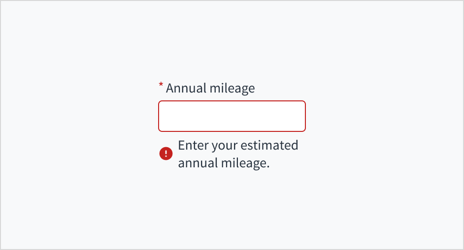
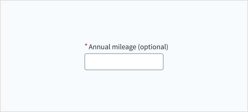
Error message text tells a user how to fix the error. In the case of the number input field, errors are often related to something that must be fixed for in-line validation. For example, if the user doesn't fill out a required field that asks for their estimated annual mileage, you can use error text to guide them to a solution: “Enter your estimated annual mileage.”
Use sentence case for error text. Write 1-2 short, complete sentences that end with a period.
Do use error text to guide the user and show them a solution.
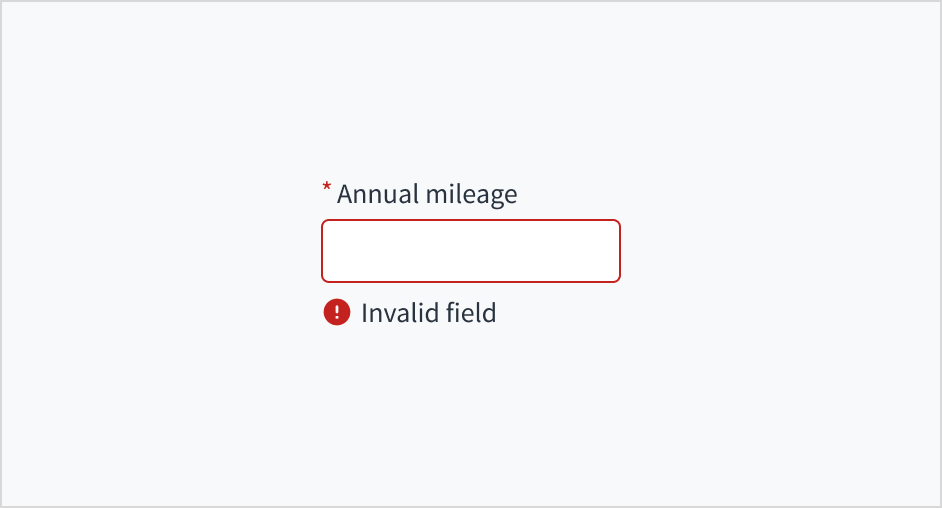
Don't write ambiguous error messages or leave users guessing as to how to resolve a problem.
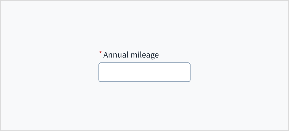
Use an asterisk (*) to indicate required fields. The asterisk precedes the field label. This helps users to easily locate which fields are required by scanning just the left-most character of the label.
In addition to marking required fields with an asterisk, it is recommended to include clear instructions at the top of the form, such as "All fields marked with an asterisk are mandatory," to ensure users understand the meaning of the asterisk.
Do use an asterisk to indicate that a field is required.
Don't use an asterisk to denote anything that is optional.
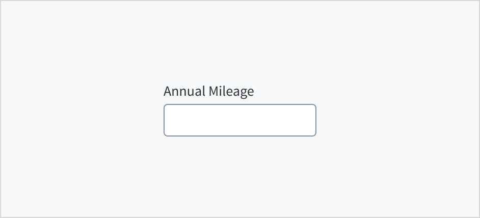
The number input field appears with no value (default), placeholder text, or a filled input.
Visual
State
Description
No value (default)
Indicates to the user that no value has been entered and there is no placeholder.
Placeholder
Indicates to the user that no value has been entered. The placeholder is grayed out.
Filled input
Indicates to the user that the input is filled with data.
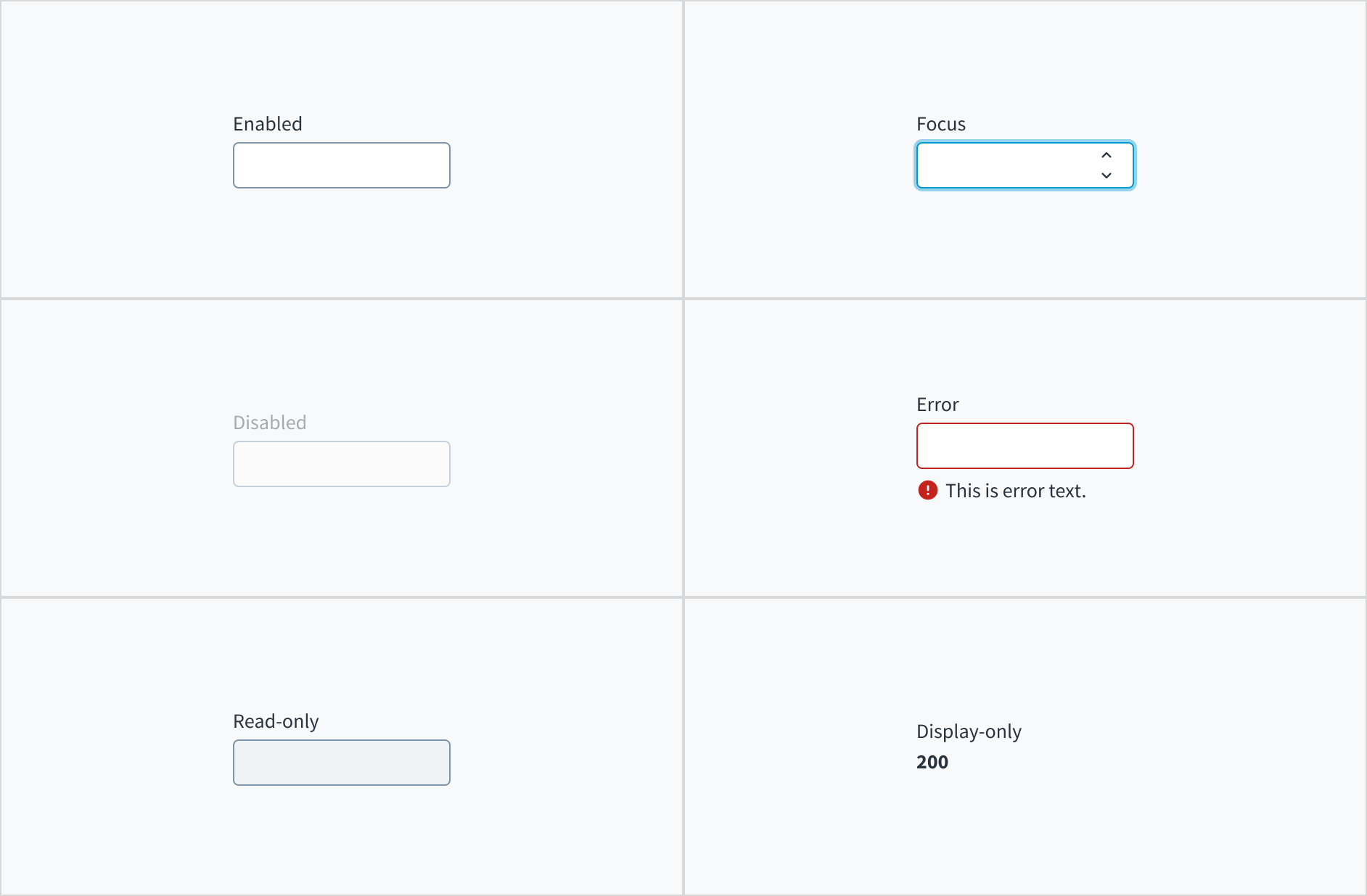
Number input fields also have interactive states for enabled, focus, disabled, error, read-only, and display-only.
State
Description
Enabled
Indicates to the user that the element is enabled for interaction.
Focus
Indicates to the user which UI element in the system is focused.
Disabled
Indicates to the user that the input value can't be changed because of local factors. For example, a checkbox above the input field must be checked to access this input field. The user can take action to enable it by interacting with the page.
Error
Indicates that the user has made a validation error. Error text provides corrective feedback to users.
Read-only
Indicates to the user that the input value can't be changed because of outside factors. For example, lack of write access. The user can take action to enable it by, for example, contacting an administrator.
Display-only
The display-only state is used for two cases:
A UI element is used in display mode.
A UI element is displayed in edit mode, but is never editable.
Users can activate a number input by clicking in the area inside border. When focused, two arrows appear at the end of the input. These controls enable users to incrementally increase or decrease the value.
The number input component derives its accessible name through an aria-label attribute. Changing the text value of the label element also changes the value of the accessible name. The default aria-required='true' attribute toggles to 'false' when the required checkbox is checked in Storybook.
The contrast ratio of textual elements against their background is above 4.5:1.
Non-textual content that needs to convey meaning (like icons and focus indicators) has a contrast ratio of at least 3:1 with its adjacent colors.
The item is operable using a keyboard, as well as using a mouse.
Content is accessible using screen readers, such as JAWS and VoiceOver.
Accessibility conformance ultimately depends on how this component is implemented and customized. Changes made by the content author can affect accessibility. For details on our shared responsibility model, please review our full Jutro accessibility statement.
When using this component within your application, ensure that labels and instructions are meaningful and concise. Provide supplemental instructions if necessary.
Note: There are deprecated versions of this component. Switch to a version of the docs older than 10.0.x to view their docs.
Make sure to understand the Design System components API surface, and the implications and trade-offs. Learn more in our introduction to the component API.
The number of decimal places to display in the value. If it is set, the user is prevented from entering too many digits after the decimal point. If the value or initialValue props have too many digits after the decimal point, the displayed figure is rounded to the closest valid value.
If set to true, displays the component value in plain text. Consider using readonly instead, if possible, because plain text is worse for accessibility than readonly inputs.
Initial value of the input. If the value prop is specified along with this prop, this prop's value is discarded. If the decimalPlaces prop is specified along with this prop, the displayed value is rounded to the closest valid value.
Maximum value of the input. If this prop is passed, the component does not allow entering values higher than the specified value when using the Up Arrow key.
Minimum value of the input. If this prop is passed, the component does not allow entering values lower than the specified value when using the Down Arrow key.
Step increment for value changes. If this prop is passed, the component will increase or decrease its value by the specified step when the Up Arrow or Down Arrow keys are pressed.
Value of the input. Takes precedence over initialValue. If this prop is passed, the component works in controlled mode and its value will change only if this prop changes. If the decimalPlaces prop is specified along with this prop, the displayed value is rounded to the closest valid value.
You can use HTML input attributes, except any of the ones which are overridden by Jutro. These attributes will be assigned to the HTML input element.
Please note that the most number input specific attributes (step, min and max) are included as part of the component API and might have some Jutro specific logic associated.
Jutro inputs have implemented imperative handlers as a mechanism to provide access to some common native features that might be useful for you. The following features are available:
Set focus to allow you to set the user focus into a specific component
Blur to remove the focus from the component
Scroll to the component so that you can take the user to a specific area of the page.
These features are provided through the ref property, which exposes them as follows:
Although some Jutro components might provide complementary features or a helper function to facilitate the validation process, it is your responsibility as a developer to handle the validation of any user input (using or not using the complementary helpers) and to decide what error messages to show.
Jutro components behave based on the developer implementation.
When are error messages displayed?
Error messages are only displayed when you pass them to the component through the stateMessages property. This property receives an object with the following content:
The component displays every error message provided in the same order as in the array.
When does validation occur?
This is your decision as a developer. As components do not determine when the validation is performed or when the error must be displayed, you need to implement the logic to handle it according to the project requirements, for example while the user is editing the content, when the component loses focus, and on form submission.
You can use React states to control the value of a NumberInput, but there are some limitations when doing so.
The onChange event is only triggered if the input is focused. If the value is updated as a controlled component, the onChange callback does not run.
If the NumberInput has a decimalPlaces property and receives a value from a React state update, the displayed value is rounded to the closest valid value.
For example, in the code below you can use the first input to change the value of the second input. You can observe the following two behaviors when doing so:
If a value bigger than 100 or less than 0 is entered in the first input, the validation messages do not show in the second input because its callback does not run.
If more than two decimal places are entered, the value displayed in the second input is rounded to the closest valid value.
exportfunctionNumberInputDecimalPlacesControlledExample(){ const[firstInputValue, setFirstInputValue]=useState(); const[secondInputValue, setSecondInputValue]=useState(); const[validationMessages, setValidationMessages]=useState({}); const max =100; const min =0; const handleFirstInputChange =useCallback((event, newValue)=>{ console.log(newValue) setFirstInputValue(newValue ||0); },[]); const handleSecondInputChange =useCallback((e, newValue)=>{ setValidationMessages({}); if(newValue &&(newValue > max || newValue < min)){ setValidationMessages({ error:['Value must be between 0 and 100'], }); } },[]); return( <NumberInput label="Number input" secondaryLabel="Change this value to see the second input update" onChange={handleFirstInputChange} /> <NumberInput label="Second number input" secondaryLabel="Value controlled by the first input" value={firstInputValue} decimalPlaces={2} onChange={handleSecondInputChange} stateMessages={validationMessages} min={min} max={max} readOnly /> ); }
A basic number input component only needs the label property to be displayed. Other props can be used to complement its behavior: placeholder, secondaryLabel, onChange, or the number specific ones.
<NumberInput
  label="Number input component"
  placeholder="Write what you want here"
  secondaryLabel="Free text input"
/>
The number input component allows setting up the max and min values. However, this is not related to a validation feature but to the component behavior. When setting any of these two properties, it will not be possible to use the component arrows to set a value that is lower than the min prop or a value that is higher than the max prop.
If specific validation is needed, it will need to be handled by the developer. For some details see the Number input validation on change example.
<NumberInput
  label="Number input component with min and max"
  placeholder="Enter a value"
  secondaryLabel="Test the limits with using the arrows"
  min={20}
  max={40}
/>
The number input component does not provide a specific validation logic, but it provides the way to include the developer validation and use the stateMessages property to display any required error message.
This is an example of handling validation when onChange event is triggered.
exportfunctionNumberInputValidation(){ const[validationMessages, setValidationMessages]=useState({}); const max =100; const min =0; const onChange =useCallback((e, newValue)=>{ setValidationMessages({}); if(newValue &&(newValue > max || newValue < min)){ setValidationMessages({ error:['Value must be between 0 and 100'], }); } },[]); return( <NumberInput label="Enter value" secondaryLabel="Min = 0. Max = 100" stateMessages={validationMessages} min={min} max={max} onChange={onChange} /> ); }
The decimalPlaces property specifies the number of decimal places to display. It limits users from entering too many digits after the decimal point, but if the initialValue or value properties are set, the number is rounded to the nearest valid value.
For example, if decimalPlaces is set to 2 the user cannot enter more than two decimal digits. However, the initialValue or value properties can have three or more decimal digits.
<NumberInput
  label="Number input component limited decimals"
  placeholder="Enter a value"
  secondaryLabel="Try to add an additional decimal"
  decimalPlaces={2}
/>
<NumberInput
  label="Number input with initial value"
  secondaryLabel="Rounded up from 5.666"
  initialValue={5.666}
  decimalPlaces={2}
  readOnly
/>
<NumberInput
  label="Number input with value"
  secondaryLabel="Rounded up from 5.666"
  value={5.666}
  decimalPlaces={2}
  readOnly
/>
The behavior of the decimalPlaces property has been changed. The user is now prevented from entering additional digits past the decimalPlaces limit. For example, if decimalPlaces is 2 then the user cannot enter a third digit after the decimal point.
The initialValue or value properties can have extra digits after the decimal point, but the value displayed is rounded to the nearest valid value.
New @jutro/components/NumberInput component introduced replacing InputNumberField.
The previous number-related component, InputNumberField was deprecated and moved to the @jutro/legacy package. To view its documentation switch to an older version.