Note: There are deprecated versions of this component. Switch to a version of the docs older than 10.3.x to view their docs.
Examples
import React from 'react';
import { MaskInput } from '@jutro/components/new';

export const BasicMaskinput = () => {
  return (
    <MaskInput
      label="Mask input component"
      mask="(999) 999-9999"
      secondaryLabel="This is a secondary label"
      initialValue="(123) 942-4237"
    />
  );
};
Note: If the initialValueis set and does not match the mask, this value is discarded
You can create a custom mapping of formatting characters and the corresponding regular expressions the input must satisfy. In this example, the mask DDD represents any letter from a to z in upper case and 0000 represents any number from 0 to 5.
import React, { useState } from 'react';
import { MaskInput } from '@jutro/components/new';
import { TextInput } from '@jutro/components';
export const FormatCharsMaskInput = () => {
const [value, setValue] = useState('');
const formatChars = {
D: '[A-Z]',
0: '[0-5]',
};
return (
<div>
<MaskInput
label="Enter 3 letters in upper case"
mask="DDD-0000"
formatChars={formatChars}
/>
</div>
);
};
You can use the value property for the controlled component scenario:
import React, { useState } from 'react';
import { MaskInput } from '@jutro/components/new';
import { TextInput } from '@jutro/components';

export const ControlledMaskInput = () => {
  const [enteredValue, setEnteredValue] = useState('');

  const onChangefunc = (event) => {
    const newValue = event.target.value;
    setEnteredValue(newValue);
    console.log('Entered value:', newValue);
  };

  return (
    <div>
      <MaskInput
        label="Enter a number to be assigned to the following field"
        mask="(999) 999-9999"
        onChange={onChangefunc}
        stateMessages={{}}
        required
      />
      <TextInput
        label="The value is updated when the first field is modified"
        value={enteredValue}
      />
    </div>
  );
};
Validation
You can validate the input when the field is modified or when it loses focus using the onChange and onBlur properties, respectively. Additionally, in this example, the required property sets the field as required.
import React, { useState } from 'react';
import { MaskInput } from '@jutro/components/new';
import { TextInput } from '@jutro/components';

export const ValidationMaskInput = () => {
  const [enteredValue, setEnteredValue] = useState('');

  const onBlurfunc = (event) => {
    const newValue = event.target.value;
    setEnteredValue(newValue);
  };

  return (
    <div>
      <MaskInput
        label="Validation onBlur example"
        mask="(999) 999-9999"
        onBlur={onBlurfunc}
        stateMessages={{}}
        required
      />
      <TextInput
        label="The value is updated when the first field loses its focus"
        value={enteredValue}
      />
    </div>
  );
};
Error message
Allows to set a custom error message.
import React from 'react';
import { MaskInput } from '@jutro/components/new';

export const ErrorMaskInput = () => {
  return (
    <MaskInput
      label="Error field"
      mask="(999) 999-9999"
      stateMessages={{
        error: ['This is a custom error message'],
      }}
    />
  );
};
Note: There are deprecated versions of this component. Switch to a version of the docs older than 10.3.x to view their docs.
Usage
Overview
An input mask guides users in entering data by constraining and shaping the information into a specific format as it is entered.
You can apply a mask to the text input field and the phone input field.
When to use
In fields with a specific expected format such as Social Security Number or ZIP code.
When not to use
- For input that requires a free-form field.
- When the input pattern is too complex for a mask. For example, an email address has many possible scenarios for input.
Anatomy
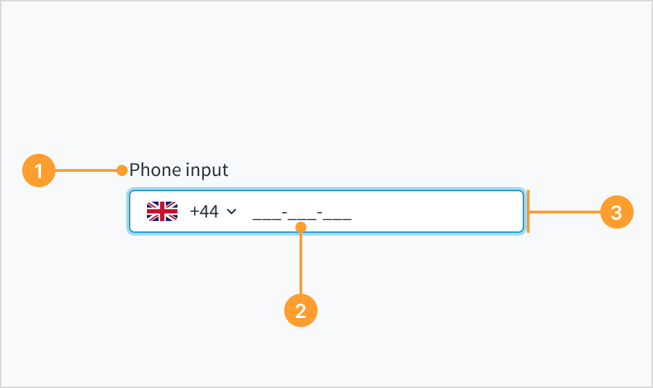 Example of the phone input field with an input mask.
- Label: Describes the purpose of an input field.
- Input mask: A string expression that constrains input to support valid input values. The input mask appears on focus.
- Phone input field: Enhanced field that enables users to enter their phone number. It only accepts numeric inputs and is automatically formatted.
Content
For content standards, refer to text input and phone input writing guidelines.
Behaviors
The input mask appears as soon as there is a focus on the field. Before focus, the input is empty or displays placeholder text.
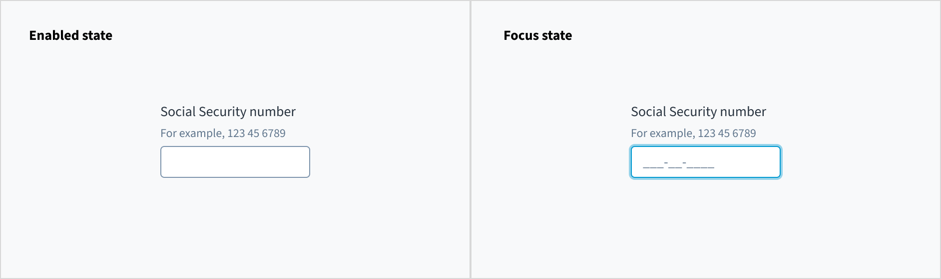 Example of an enabled text input field (on the left), and a focused text input field (on the right).
Accessibility
This component has been validated to meet the WCAG 2.0 AA accessibility guidelines. However, changes made by the content author can affect accessibility conformance. When using this component within your application, ensure that labels and instructions are meaningful and concise. Provide supplemental instructions if necessary.
Note: There are deprecated versions of this component. Switch to a version of the docs older than 10.3.x to view their docs.
Code
Import statement
import { MaskInput } from '@jutro/components/new';
Component contract
Make sure to understand the Design System components API surface, and the implications and trade-offs. Learn more in our introduction to the component API.
Properties
labelrequired
DescriptionLabel associated with input field, also passed as a default value to aria-label.
maskrequired
DescriptionString that formats the mask to display, for example 999-999-9999.
className
DescriptionCSS class passed to root element of the component.
disabled
DescriptionIf true, component is rendered in disabled state
displayOnly
DescriptionIf true, displays the component value as a plain text. Consider using readonly instead, if possible, since plain text has worse accessibility than readonly inputs.
DescriptionA map of special mask formatting characters and the corresponding regular expressions the input must satisfy
Default value{9: '[0-9]', a: '[A-Za-z]', A: '[A-Z]', '*': '[A-Za-z0-9]', '&': '[0-9A-Z]'}
hideLabel
DescriptionIf true, the label is not visible.
initialValue
DescriptionInitial value of input. If value prop is specified along with this prop, this prop's value is discarded.
labelPosition
DescriptionAllows to select label position.
onBlur
onChange
DescriptionCallback invoked when input value is changed. Gets event as first argument and parsed input value as a second argument func
onFocus
placeholder
DescriptionPlaceholder to display on an empty component
readOnly
DescriptionIf true, component is rendered in read-only state. For value as a plain text consider using displayOnly
required
DescriptionIf true, sets the field as required displaying an asterisk.
secondaryLabel
stateMessages
DescriptionObject with input state and messages that should be shown for current state.
DescriptionTooltip props object: text - to show tooltip content, trigger - to set tooltip trigger.
value
DescriptionValue of input. Takes precedence over initialValue. If this prop is passed, component works in controlled mode and its value will change only if this prop changes.
Hooks
No hooks are available for MaskInput.
Translation keys
There are no translation keys associated to the MaskInput component.
Escape hatches
For more information, see our documentation about escape hatches.
The following options are available:
- Design Tokens
className property- Passing native HTML attributes
- Ref with imperative handlers
- Native event property
Custom behaviors
Masked and unmasked value
When inputting a value into MaskInput, it is automatically formatted, and the formatted value is presented as a second argument within the onChange event. If you need access to the unformatted value, the MaskInput component extends the onChange event to include a third parameter. This parameter is an object that contains the unmasked property which holds the unformatted value.
An unfocused and empty MaskInput field displays either nothing or a defined placeholder if defined by default. When focusing on the field, the mask becomes visible. Users can input values matching the mask, which makes the mask invisible. If the provided value contains fewer characters than specified by the mask, the input is ignored. Partially filled masks retain the provided value, appending the remaining mask characters even when the field loses focus. In readOnly and displayOnly modes, the mask remains hidden regardless of the input state. In disabled mode, the mask remains visible as in the enabled mode
Copy paste
When a value is pasted into the field, it is formatted to align with the specified mask. If the MaskInput finds a character that does not match the mask requirements, for example, pasting letters when the mask is expecting numbers, the unmatching character and the rest of the value are ignored. Additionally, if the provided value exceeds the length specified by the mask, the value is truncated to match the mask length.
Disabled, displayOnly and readOnly precedence
If two or more of the properties disabled, displayOnly, and readOnly are set to true at the same time, the precedence is as follows:
displayOnly > readOnly > disabled
Although some Jutro components might provide complementary features or a helper function to facilitate the validation process, it is your responsibility as a developer to handle the validation of any user input (using or not using the complementary helpers) and to decide what error messages to show.
Jutro components behave based on the developer implementation.
When are error messages displayed?
Error messages are only displayed when you pass them to the component through the stateMessages property. This property receives an object with the following content:
{
  error: ['error message 1', 'error message 2', 'error message N'];
}
The component displays every error message provided in the same order as in the array.
When does validation occur?
This is your decision as a developer. As components do not determine when the validation is performed or when the error must be displayed, you need to implement the logic to handle it according to the project requirements, for example while the user is editing the content, when the component loses focus, and on form submission.
Are you using the legacy InputMaskFieldcomponent?
- To view docs for the old component, switch to a version of the documentation older than 10.3.
- This legacy component is also available in Storybook: