Chips
The chips pattern is coming soon. The code is not yet approved.
Overview
The UI chip displays small pieces of information or tags in a visually appealing and compact manner. It's commonly used to represent categories, filters, or selections in user interfaces.
When to use
Use the chip pattern when there's a need to visually represent discrete pieces of information, such as:
- Tagging systems
- Filtering options
- Selections in a multi-select interface
- Categorization of content
Anatomy
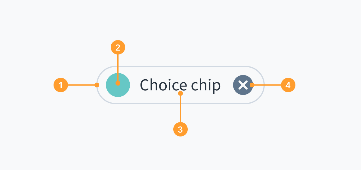
- Container that indicates at a glance different types of interactivity and functionality
- Optional thumbnail/avatar/icon/color swatch to distinguish between categories
- Label to identify the chip
- Optional remove or dropdown icon to remove a chip or trigger a selection menu
General guidelines
- There must be a clear relationship between chips and the content or task they represent.
- The purpose of UI chips is to make tasks easier to complete, or content easier to sort. Use chips sparingly and only when necessary to avoid cluttering the interface.
- Test the chip component across various devices and screen sizes to ensure consistent rendering and usability.
Interaction guidelines
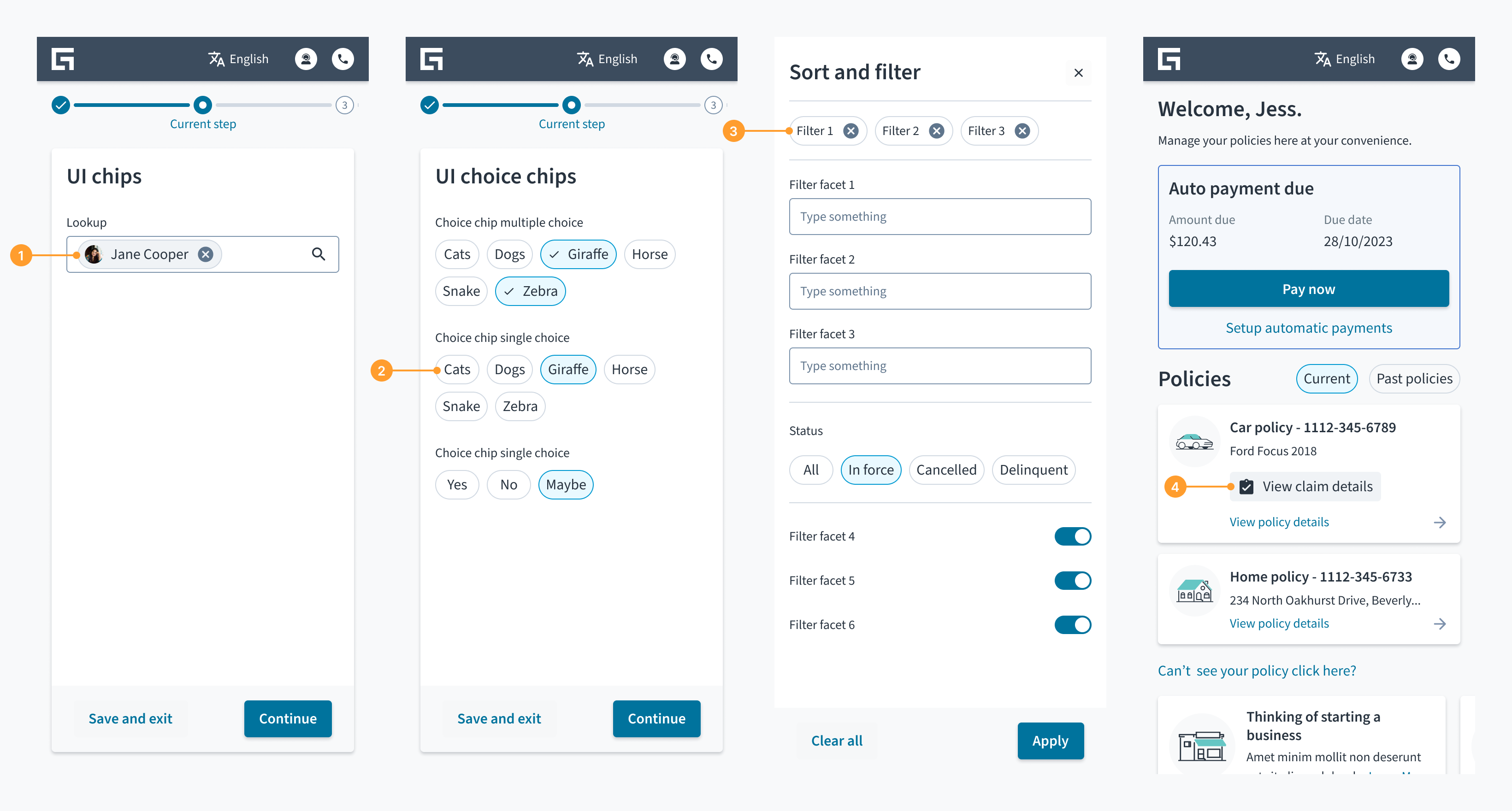
- Input chips: Input chips display information the user has entered. They enable user input and clarify that input by converting text into a chip. These chips include an X icon for users to remove their selections.
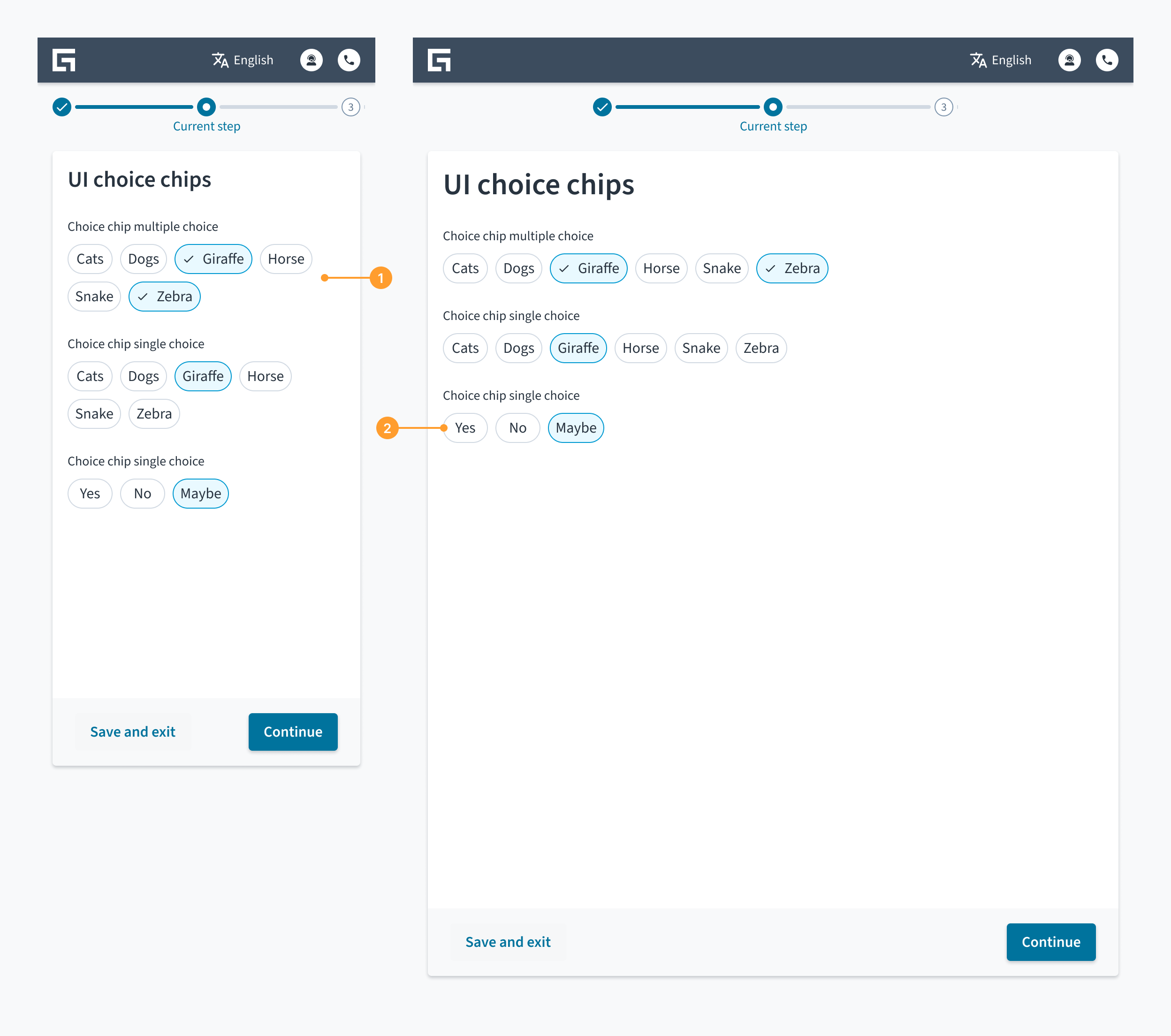
- Choice chips: Choice chips enable single or multiple selection from a set of input options in a form. There must be a minimum of 2 options from which users can select. Choice chips can serve as an alternative to toggle buttons, radio buttons, and single select menus.
- Filter chips: Filter chips use relevant words to filter certain types of content. Filter chips can serve as an alternative to toggle buttons or checkboxes.
- Action chips: Action chips trigger an action. You can use an optional leading icon to add a visual description of the copy on the label.
Content
General writing guidelines
- Use sentence case for all aspects of designing Guidewire product interfaces. Don't use title case.
- Use present tense verbs and active voice in most situations.
- Use common contractions to lend your copy a more natural and informal tone.
- Use plain language. Avoid unnecessary jargon and complex language.
- Keep words and sentences short.
Include a label
- All chip types must include a label to identify the chip.
- Keep chip labels concise and descriptive to convey meaning at a glance.
- Use a single line of text for chip labels. Avoid using long text labels that wrap to a second line.


Accessibility
- Ensure the flow is designed to be accessible to users with disabilities, including those who require screen reader compatibility and keyboard navigation.
- When using chips with color swatches and icons, name the color or icon in the text label. Don't rely on color alone to convey meaning.
Responsiveness
The UI chip pattern is designed in such a way that minimal changes are required when used on tablet or mobile. Wrapping of the chips in the pattern may occur as the screen width shrinks.
- Wrapping of chips on mobile. Chips that can no longer fit in the space go onto a second line.
- Chips with enough space to stay on one line.
Theming
By default, theming and branding match that of the application unless overridden.
Patterns may be themed to meet specific branding requirements and customer needs. This includes visual elements such as colors, typography, icons, buttons, and other components and graphical elements.
Learn about theming with design tokens
Related components and patterns
Components
Input chips have the following related components:
- Button
- Checkbox
- Dropdowns
- Inputs (for example, text)
- Lookup
- Radio group
- Tag
- Toggle button
Patterns
- Forms
- View (table view, card view, list view)
Resources
Access Figma to see how we create patterns and contribute to the next version of the drawer pattern. If you haven't used Figma before, you'll need to create a Figma account.
Was this page helpful?