Design tokens overview
What are design tokens?
Design tokens are simply design decisions expressed as paired names and values.
They are all the values needed to construct and maintain a design system — spacing, color, typography, animation, etc. — represented as data. They are used in place of hard-coded values in order to ensure flexibility and unity across all product experiences.
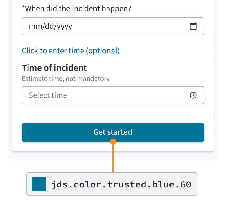
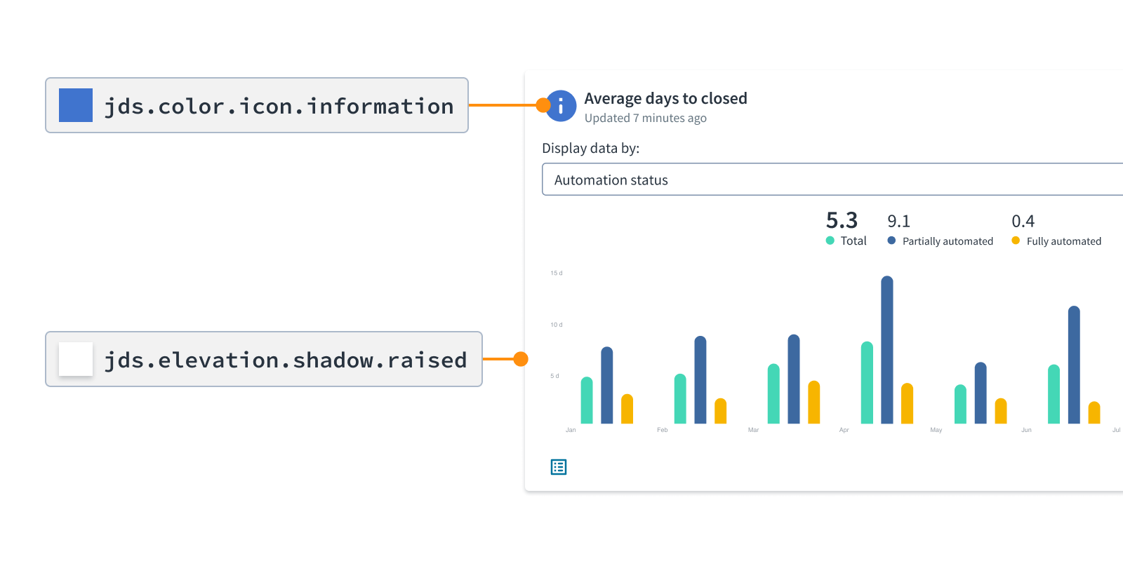
For instance, a button that uses the color token jds.color.background.brand will be consistent with all other elements that use it or a related token. If you change the theme to use a different brand color, all of those elements will automatically update.
Design tokens are a shared language and a single source of truth for theming within a design system for designers and developers.
What are themes?
Design tokens provide a flexible way to theme our design system. A theme is a set of tokens combined for a specific look or style, often for the purpose of branding.
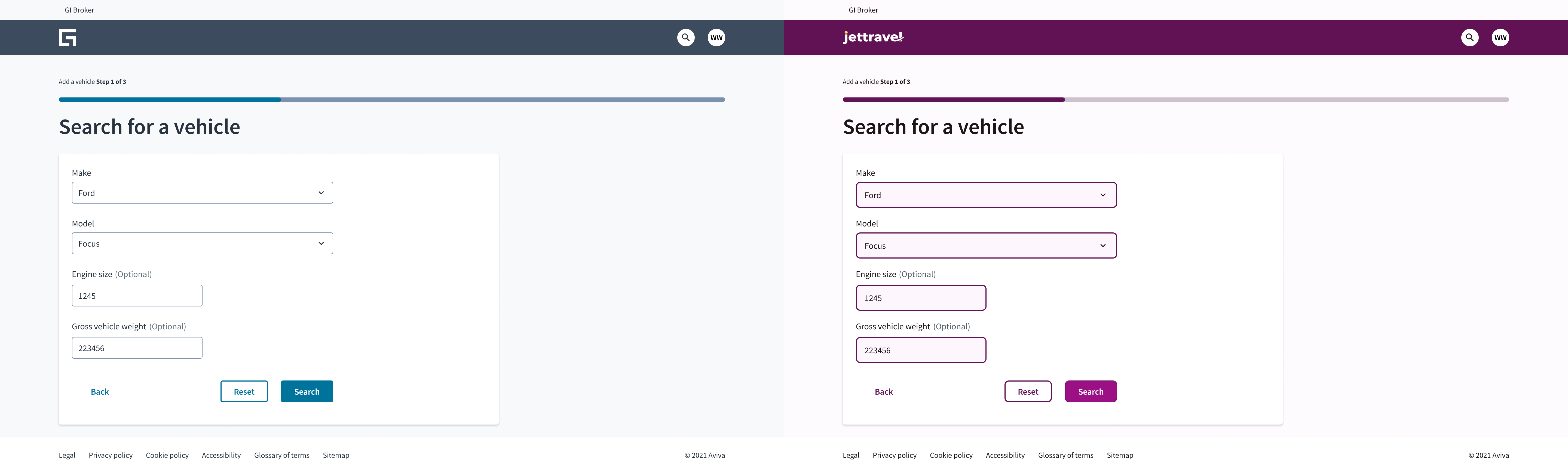 A new theme or new styles can be created by changing only the values for a handful (5-10) of tokens.
Why are design tokens valuable?
Collaboration. Design tokens empower designers, developers, and multidisciplinary teams to collaborate, speak the same language, and stay in sync across tools and languages.
Control. Design tokens make it easier to change specific UI elements, like buttons, without impacting the rest of your design work. With design tokens, you can change the value of one token, and the update will propagate to all instances in the system.
Consistency. Design tokens help to achieve parity between the design and development phases. Designers don't have to worry about designing twice. Developers don't have to worry about implementing twice.
How to read design token names
Token names consist of descriptors that together describe how to use the token.
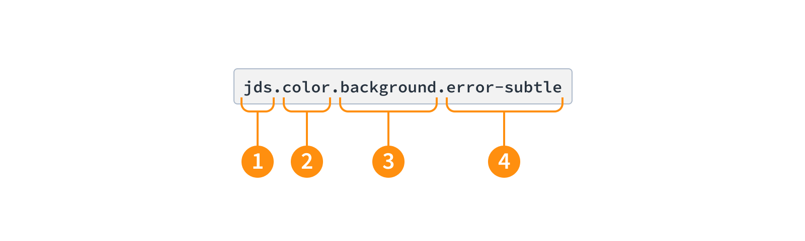
- System: The abbreviation for the Jutro Design System. Differentiates our tokens to avoid conflicts with customers' existing tokens.
- Category: The type of visual design attribute, such as color, size, or elevation.
- Property: The part of the UI to which the token will be applied, such as background, border, or text.
- Modifier: Further details about how the token will be used, such as its role, prominence, or interaction state. Some tokens don't require a modifier.
There may be variations in the format of token names depending on the tool and the environment. Token descriptors, however, always remain the same.
In most situations, the parts of a token name are separated by dot notation. Dot notation enables us to organize design token names for ease of use within a tree structure. This includes when using authoring tools such as Tokens Studio for Figma.
Hyphens are used for multi-word proper names, such as components, and on leaves of the trees when it doesn't make sense to add a new level of nesting. The transformation process replaces all dots with hyphens.
How to find and use design tokens
Find a subset of tokens and their usage descriptions in the tokens list.
Best practices
Choose tokens based on meaning, context, and intent, rather than specific values.