App switcher
Usage
Overview
The application switcher enables the user to quickly pivot between any application while in Guidewire Cloud Home. The user can access it from the application switcher icon, which is located on the Global Header. All the applications available to the user are displayed in a dropdown. Each application category can expand or collapse using an accordion. Users can locate a specific application by performing a search in the lookup field.
Anatomy
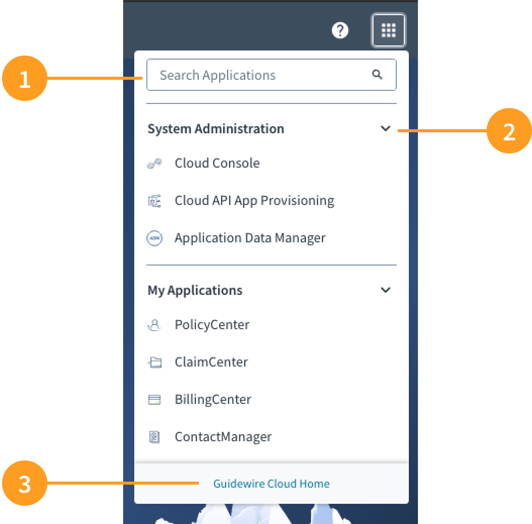
The application switcher component consists of the following elements:
- App switcher search: typeahead search feature that enables users to look up any application within Guidewire Cloud Home.
- Accordion: used to expand and collapse application categories.
- App switcher footer: enables users to navigate back to Guidewire Cloud Home.
Best Practices
- The application switcher enables users to pivot back and forth between applications. We recommend that you alert users that they will lose progress by switching applications through the Global Header.
- Use the typeahead search feature to help users quickly locate specific applications. This is particularly important for those users who have access to most of the applications on Guidewire Cloud Home.
- An accordion structure enables users to quickly scan a list of applications and access more information when it is needed. Reducing content in this way helps to prevent cognitive overload.
- Include a link as part of the footer that directs the user back to the Guidewire Cloud Home screen.
Responsiveness/Adaptiveness
The micro frontends within Guidewire Cloud Home are designed for desktop and tablet experiences.
Interactions
- Upon hover, the app switcher icon appears highlighted with a light gray square, communicating to the user that it can be clicked.
- Clicking on the app switcher icon produces a dropdown with a list of applications available to the user.
- Upon hover, each application is highlighted with a light blue background, communicating to the user that it can be clicked and launched from there.
- The chevron icon indicates the status of the accordion.
- The chevron icon is pointed to the right when it is in a collapsed state.
- The chevron icon is pointed downward when it is in an expanded state.
Navigation
The application switcher enables the user to navigate between applications. This feature is always available to the user regardless of the application they are using.
UX writing considerations
Accordion labels should be concise and should clearly describe nested content.