Phase progress bar
Usage
Overview
The phase progress bar displays the user's progress in completing a task, divided into distinct phases.
When to use
- To display steps and sub-steps for a specific task.
- When you need to use custom icons.
When not to use
If you are unsure of the number of steps required to complete the task. Instead, use a simple progress bar.
Formatting
Anatomy
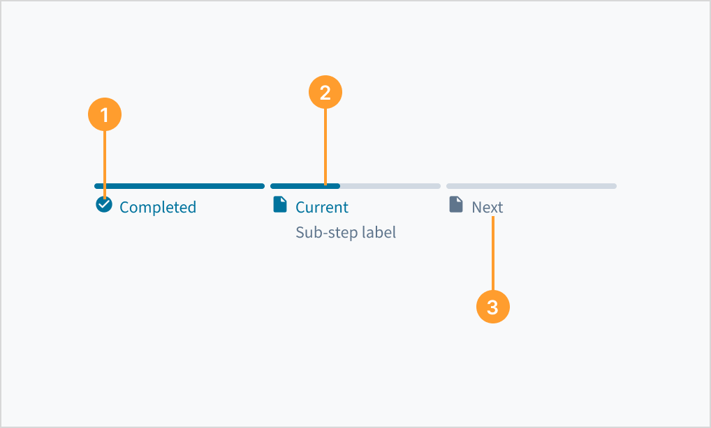
The phase layout consists of the following elements:
- Phase icon: Indicates if a phase is completed, in progress, or pending. You can use different icons with the phase progress bar to customize the experience.
- Bar: Connects the phases visually.
- Phase label: Provides context for each phase (for example, "Payment").
Best practices
- Ensure the steps are displayed in a logical order, from start to end (left to right).
- Users must be able to return to previous steps for review and to update details.
- Ensure the steps are logically grouped, simple, and clear to support understanding.
- Make sure all steps are visible.
- Keep the steps to a minimum of 3 and a maximum of 7.
Content
General writing guidelines
- Use sentence case for all aspects of designing Guidewire product interfaces. Don't use title case.
- Use present tense verbs and active voice in most situations.
- Use common contractions to lend your copy a more natural and informal tone.
- Use plain language. Avoid unnecessary jargon and complex language.
- Keep words and sentences short.
Phase label
- Keep labels short and clearly identify the step.
- Use sentence case for labels. Capitalize the first word of a phrase and any proper nouns. For additional guidance on how to implement sentence case, see Capitalization.
- When using tooltips in conjunction with a steps layout, tooltip content must only contain one or two words.
Interactions
Keyboard
Each active step can be focused on using the keyboard.
Screen reader
The phase progress bar represents an entire process. It contains a series of smaller independent progress bars that represent phases in that process. The component implements the HTML5 landmark <nav> tag and each individual phrase is identified by its name (through an aria-label value) and the WAI-ARIA role='link'.
Accessibility
The contrast ratio of textual elements against their background is above 4.5:1 as per WCAG 2.1 AA requirements. Non-textual content that needs to convey meaning (such as icons and keyboard focus visibility) has a contrast ratio of at least 3:1 with its adjacent colors. All content is visible and functional up to and including 400% without requiring scrolling in two dimensions.
This component has been validated to meet the WCAG 2.1 AA accessibility guidelines. However, changes made by the content author can affect accessibility conformance.