AI button
Usage
Overview
The AI button enables users to perform GenAI-related actions and make choices, with a single click. The general best practices for AI buttons are the same as for Jutro buttons. The main visual difference is the use of royal purple (#524AF6) as the primary color for AI buttons.
When to use
- Within AI-enabled components: Use inside AI cards, AI sections, or other AI-focused components to trigger a specific AI task. Examples: "Check coverage," "Analyze documents," "Request report."
- As an AI trigger: Use as the primary trigger to open a dedicated AI interface, such as an AI panel, AI menu, or a modal containing GenAI features.
- For user confirmation: Use within an AI chat or workflow to get explicit approval for an AI-generated response or action before it's finalized. Examples: "Approve and insert," "Accept suggestion," "Confirm and send."
When not to use
- For non-AI actions, such as standard “Save” or “Cancel,” use the button component instead.
- For suggested prompts within an AI chat experience, use the chips pattern instead.
- For general system functions or actions that don't involve Generative AI, such as accessing settings, closing a modal, or a standard file upload.
AI button types
Primary, secondary, and tertiary styling is determined based on action hierarchy for the page and workflow, as it is for standard Jutro actions.
Note: Neutral and inverse styling are available exclusively for the icon-only button.
| Type | Purpose |
|---|---|
| AI button with star icon | Use to initiate AI actions. |
| AI button without icon | Use for standard actions within AI workflows and follow-up actions such as human acceptance. |
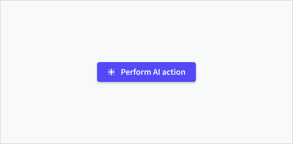
| Icon-only button | For limited use only. Use for Submit prompt and other very established concepts. Do not use to open the chat assistant. Use the AI logo floating action button instead. |
Formatting
Anatomy
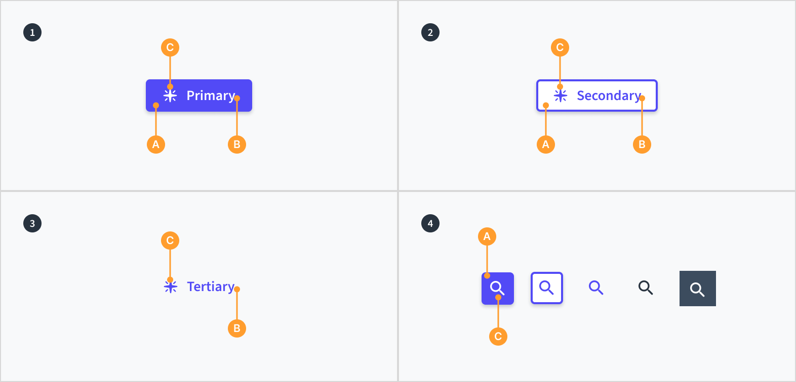
The AI button consists of the following elements:
- Primary buttons display containers (A) around a text label (B) with an optional icon (C). Primary buttons have a solid background color.
- Secondary buttons display containers (A) around a text label (B) with an optional icon (C). Secondary buttons have a visible stroke and no background color.
- Tertiary buttons display a text label (B) with an optional icon (C).
The icon-only button includes primary, secondary, tertiary, neutral, and inverse stylings. It consists of the following elements:
- Icon buttons display containers (A) around a mandatory icon (C).
Alignment and placement
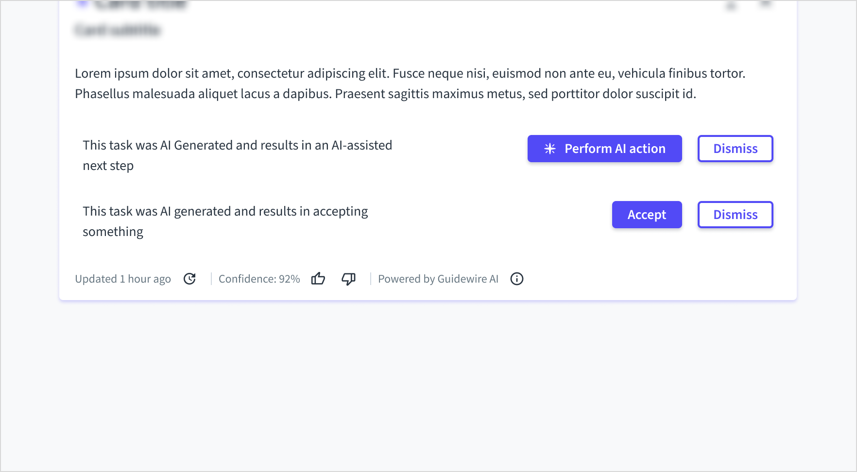
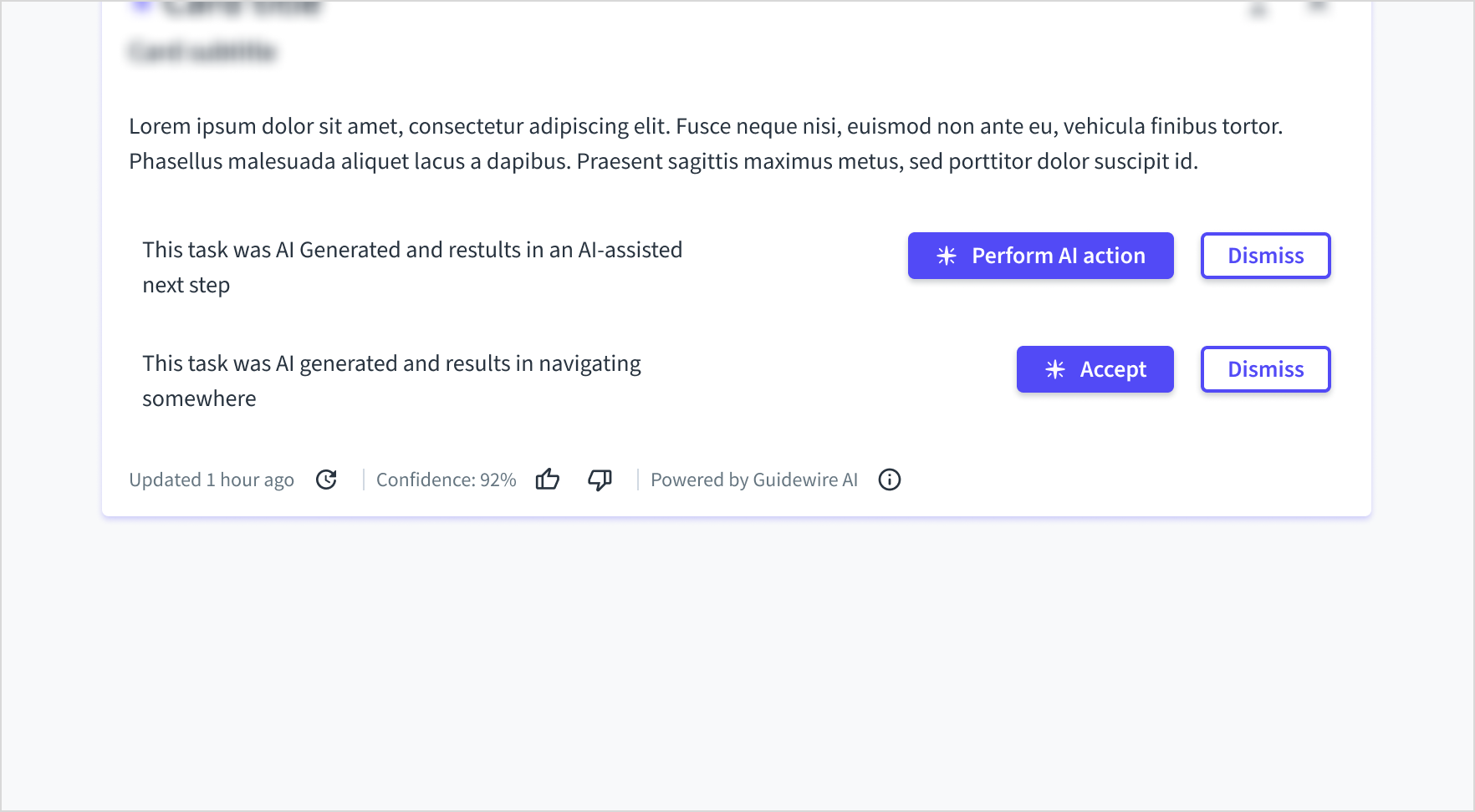
Usage of sparkle icon
The sparkle icon is a specific visual cue used to differentiate generative AI actions from standard workflow actions.
Use the icon to signify that a button will initiate a new, independent AI task, such as generating content, starting an analysis, or performing a complex action.
Don't use the sparkle icon for simple, responsive actions like Accept or Dismiss, even if they are part of an AI feature. Overusing the icon dilutes its meaning and creates visual clutter, making it harder for users to spot the primary generative actions.
Placement of icons
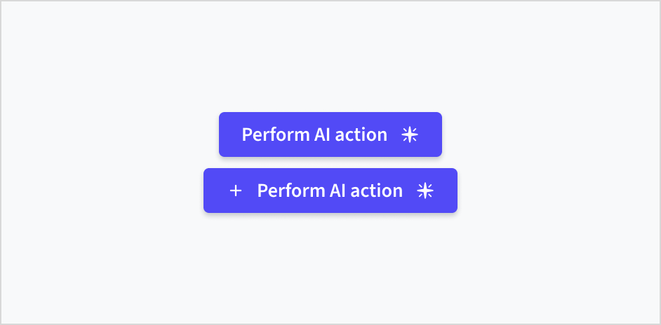
Content
General writing guidelines
- Mettez une majuscule en début de phrase pour tous les aspects relatifs à la conception des interfaces de produit Guidewire. Ne mettez pas la 1re lettre du 1er mot du titre en majuscule.
- Utilisez des verbes au présent et la forme active dans la plupart des cas.
- Utilisez des contractions courantes pour donner à votre texte un ton plus naturel et informel.
- Utilisez un langage simple. Évitez tout jargon inutile et les formulations complexes.
- Utilisez des termes et des phrases concis.
AI buttons follow the same content guidelines as standard buttons. For all rules on label writing, conciseness, tone, and formatting, see the button content guidelines.
Behaviors
States
| State | Description | |
|---|---|---|
 | Enabled | Communicates to the user that the element is enabled for interaction (default). |
 | Hover | Indicates that the user has placed a cursor over the element (desktop only). The Hover state can be used with the Enabled state. |
 | Focus | Indicates that the user has highlighted the element, typically using an input method such as keyboard or voice. The Focus state can be used with all other states (including Disabled). |
 | Active | Indicates that the user is clicking or tapping the element. The Active state can be used with the Enabled and Hover states. |
 | Disabled | Communicates to the user that the element is not interactive. Every button is Accessible Disabled by default. That means the disabled button can be focused. |
Accessibility
The AI button element represents an HTML button that is used to perform GenAI-related actions and make choices. Text between the opening and closing tags appears as the text of the button.
This component is designed to meet WCAG 2.1 AA accessibility guidelines. The contrast ratio of textual elements against their background is above 4.5:1. Non-textual content that needs to convey meaning (such as icons) and the keyboard focus indicator have a contrast ratio of at least 3:1 with their adjacent colors.
However, changes made by the content author can affect accessibility conformance.
Follow the guidance below and refer to the WAI-ARIA Authoring Practices for Buttons when using this component in your applications:
- The button text must clearly describe the action of the button.
- If applying custom color themes, check that the contrast ratio of text against its background meets the required threshold.