Overflow menu
Usage
Overview
The overflow menu indicates there is more available content in a UI object than can be displayed at once. Additional lists, options and functionality can be hidden in an expandable menu so as not to clutter the main interface.
Anatomy
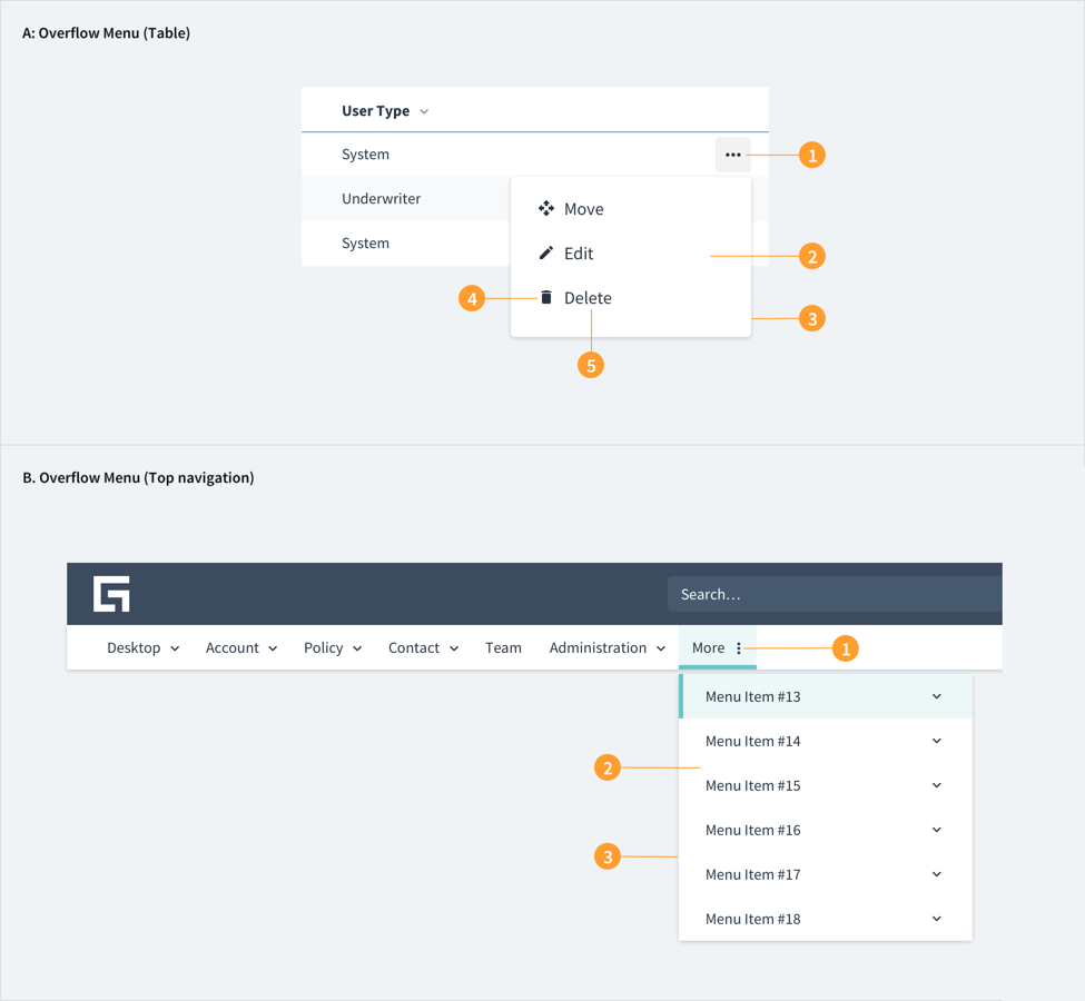
- A. Overflow menu in a table.
- B. Overflow menu in a top nav.
The overflow menu is indicated with an ellipsis icon. It appears at the (right-hand) end of a row of navigation titles or on a content row.
A. Overflow menu (Table):
- Ellipsis icon: The table overflow menu is indicated with an ellipsis icon which always appears on the right-hand side of a table row.
- Dropdown menu: The overflow menu consists of a list of additional interactions, e.g., tools/actions, e.g., delete, edit, duplicate (duplicate row).
- Dropdown menu shadow: A shadow is used as part of the overflow menu to clearly distinguish it from the background it's set against.
- Tools/actions icons: Iconography can be added to the overflow menu list items, providing a quick and clear indication of the associated functionality.
- Tools labels: Overflow menu list items are labeled according to the Jutro dropdown menu guidelines.
B. Overflow menu (Top nav):
- Ellipsis icon: The top navigation overflow menu is indicated with an ellipsis icon which always appears on the right-hand side of a top nav strip.
- Dropdown menu: The overflow menu consists of a list of additional top navigation links.
- Dropdown menu shadow: A shadow is used as part of the overflow menu to clearly distinguish it from the background it's set against.
Best practices
- Always position the overflow menu (ellipsis) icon to the end of an object, (when start / end is left / right it will be on the right-hand side), to indicate additional content/functionality.
- Use overflow menus to maintain clean user interfaces by hiding the secondary options in an expandable menu, or alternatively, to show the important actions in terms of engagement.
- Make sure you include only those actions that are necessary to complete priority tasks and are contextually relevant and list them in order of frequency of use.
- Use overflow menus to contain additional menu items or actions as they are incrementally/progressively added to the UI.
- Do not use cascading menus.
- Disable options that are not relevant in a given context.
Interactions
Mouse
- An overflow menu ellipsis symbol is highlighted when hovered, indicating interactivity.
- An overflow menu (ellipsis) symbol may be invisible until an associated object is hovered or clicked, for example, a table row, which helps draw attention to the inclusion of the overflow menu object and functionality.
- Clicking on the overflow menu ellipsis symbol will produce a dropdown menu of content, by clicking off the menu anywhere the menu will disappear
- Overflow menu items will appear highlighted with a blue background when hovered over; a single mouse click will trigger the action or link from the menu.
Keyboard
The component is actionable through the Spacebar and Enter keys.
Screen reader
The overflow menu component is part of the navigation menu and as such includes the role of "menuitem'. The WAI-ARIA role of aria-expanded="false' indicate that its default state is collapsed with extra content contained within it. This value toggles to true when the overflow menu is expanded.
UX writing considerations
- Text within an overflow menu should be direct and concise so that users can quickly decide on an action.
- For actions that could cause a significant change to users' data, consider using a horizontal rule to separate that action and list it below the primary set of actions.
Accessibility
The contrast ratio of textual elements against their background is above 4.5:1 as per WCAG 2.1 AA requirements. Non-textual content that needs to convey meaning (such as icons and keyboard focus visibility) has a contrast ratio of at least 3:1 with its adjacent colors. All content is visible and functional up to and including 400% without requiring scrolling in two dimensions.
This component has been validated to meet the WCAG 2.1 AA accessibility guidelines. However, changes made by the content author can affect accessibility conformance.