Note: Es gibt veraltete Versionen dieser Komponente. Wechseln Sie zu einer Version, die älter als 10.0.x ist, um die entsprechende Dokumentation anzuzeigen.
Im Abschnitt Verwendung finden Sie Informationen darüber, wie und wann Sie Combobox verwenden können. Auf den speziellen Registerkarten finden Sie Einzelheiten zu den von der Komponente bereitgestellten Funktionen.
Der Hook useFilteredOptions wird verwendet, um den Filtermechanismus basierend auf Benutzereingaben zu implementieren. Aus Gründen der Übersichtlichkeit und Einfachheit ist er jedoch in einigen Beispielen nicht enthalten. Genauere Informationen zu dem Hook finden Sie hier.
Note: Die meisten Funktionen und Eigenschaften der vier verfügbaren Dropdown-Komponenten unterscheiden sich bei der Verwendung nicht. Einige Beispiele aus anderen Komponenten können auch für Combobox relevant sein.
Sie können jede der Dropdown-Komponenten vollständig deaktivieren, indem Sie die Eigenschaft disabled auf true setzen. Mit der Eigenschaft disabled der Komponenten SelectOption und ComboboxOption können Sie auch nur die speziellen Optionen deaktivieren. Wenn die gesamte Komponente deaktiviert ist, hat die Eigenschaft disabled der Optionen keine Auswirkungen.
Dieses Verhalten ist bei allen Dropdown-Komponenten gleich: Wenn die value-Eigenschaft festgelegt ist, kann der Benutzer die Komponente nicht direkt ändern. Stattdessen wird sie vollständig über die Implementierung durch Entwickler verwaltet.
Dieses Beispiel gilt für alle Dropdown-Komponenten:
exportfunctionComboControlled(){ const[updatedValue, setNewValue]=useState(null); constonChange=(e, newValue)=>{ setNewValue(newValue); }; const options =[ <ComboboxOption value={{ id:'1', label:'Option 1', }} />, <ComboboxOption value={{ id:'2', label:'Option 2', }} />, <ComboboxOption value={{ id:'3', label:'Option 3', }} />, <ComboboxOption value={{ id:'4', label:'Option 4', }} />, <ComboboxOption value={{ id:'5', label:'Option 5', }} />, ]; return( <div> <Combobox label="Choose values" secondaryLabel="This value will be passed to the list of options below" onChange={onChange}> {options} </Combobox> <br/> <Combobox label="Changes with the above" value={updatedValue}> {options} </Combobox> </div> ); }
Mit der Eigenschaft ref und den imperativen Handlern („focus“, „blur“ und „scrollIntoView“) ist es möglich, verschiedene native Aktionen auszuführen. Ein Beispiel ist, die Komponente zu fokussieren.
Dies ist ein Beispiel unter Verwendung der Komponente Combobox:
In den Dropdown-Komponenten lässt sich der Validierungsprozess nicht durchführen, aber Sie können den Fehlerstatus und die anzuzeigenden Meldungen über die Eigenschaft stateMessages bearbeiten.
Die Logik der Statusmeldungen gilt für alle Dropdown-Komponenten. Nachfolgend ein Beispiel für MultipleSelect:
Der Hook useFilteredOptions bietet eine grundlegende Datenverarbeitung für die Filterung.
importReact,{ useState }from'react'; import{IntlMessageShape}from'@jutro/prop-types'; import{ useTranslator }from'@jutro/locale'; type SelectValue={ id: string; label:IntlMessageShape; [index:PropertyKey]: unknown; }; /** * @typedef {Object} FilterHookReturnObject * @property {TValue[]} filteredOptions - array of filtered options * @property {function} onSearch - function that takes the onSearch input event * and filters the options based on it * @property {function} resetFilter - used to reset the filtering for options, * after using filteredOptions array resets to initial one * @property {function} onAddNew - function that adds new value to the internal * options array inside the hook and calls appendToSelection that is responsible * for selecting this new value inside the dropdown */ /** * Helper hook for filtering options based on user input. * * @param {TValue[]} initialOptions - initial list of options in component * @param {function} createNewValue - function for constructing value object * from string * @param {function} appendToSelection - callback that is responsible for * appending value to the controlled list of selected values * * @returns {FilterHookReturnObject} - helpers for filtering purposes: * filtered options array, onAddNew and onSearch function to be supplied * to component and resetFilter function */ exportconst useFilteredOptions =<TValueextendsSelectValue=SelectValue>( initialOptions:TValue[], createNewValue?:(value: string)=>TValue, appendToSelection?:(value:TValue)=>void ):{ filteredOptions:TValue[]; onSearch:(event:React.ChangeEvent<HTMLInputElement>) => void; resetFilter: () => void; onAddNew: (newValue: string) => void; } => { const translator =useTranslator(); const[query, setQuery]=useState(''); const[options, setOptions]=useState(initialOptions); // Basic filtering. This part should be changed to cover your needs. const filteredOptions = options.filter(val=> translator(val.label) .trim() .toLowerCase() .includes(query.trim().toLowerCase()) ); // Function that should be passed to the Combobox onSearch prop. // It gets the value of the search term inside Combobox. const onSearch =(event:React.ChangeEvent<HTMLInputElement>) => { setQuery(event.target.value); }; // Function that is responsible for clearing the query // only when the Combobox is on active browser tab. // Typically connected to Combobox onBlur. const resetFilter = () => { if(document.visibilityState==='visible'&&document.hasFocus()){ setQuery(''); } }; // Function responsible on adding new values to both // internal state of filtered items and external // controlled state value const onAddNew = (newValue: string) => { const valueTransformed = createNewValue?.(newValue); setQuery(''); if(valueTransformed){ // adds the value to the internal state setOptions(prevOptions=>[...prevOptions, valueTransformed]); // adds the value to the controlled state appendToSelection?.(valueTransformed); } }; return { filteredOptions, onSearch, resetFilter, onAddNew }; };
Beispiel-Implementierung mit asynchronen API-Aufrufen
Asynchrone API-Aufrufe werden nicht innerhalb des Basis-Hooks useFilteredOptions verarbeitet. Zu diesem Zweck müssen Sie möglicherweise eine eigene Implementierung erstellen, die auf Ihre speziellen Anforderungen zugeschnitten ist. Dies ist ein Beispiel für einen benutzerdefinierten Hook für die Komponente Combobox:
importReact,{ useEffect, useState }from'react'; import{Combobox,ComboboxOption}from'@jutro/components'; import{ useTranslator }from'@jutro/locale'; import{IntlMessageShape}from'@jutro/prop-types'; type SelectValue={ id: string; label:IntlMessageShape; [index:PropertyKey]: unknown; }; constsomeAPICallback=asyncquery=>{ console.log('calling the API'); constCHARACTERS=[ {id:'1',label:'Anakin Skywalker'}, {id:'2',label:'Luke Skywalker'}, {id:'3',label:'Master Yoda'}, {id:'4',label:'Han Solo'}, ]; const result =newPromise(resolve=>{ setTimeout( ()=> resolve( CHARACTERS.filter(val=> val.label .trim() .toLowerCase() .includes(query.trim().toLowerCase()) ) ), 3000 ); }); return result; }; const useFilteredOptions =<TValueextendsSelectValue=SelectValue>():{ filteredOptions:TValue[]; onSearch:(event:React.ChangeEvent<HTMLInputElement>) => void; resetFilter: () => void; loading: boolean; } => { const[query, setQuery]=useState(''); const[filteredOptions, setFilteredOptions]=useState([]); const[loading, setLoading]=useState(true); useEffect(()=>{ setLoading(true); // This is a simple example only, API callback should be debounced // to ensure the async operation does not overlap with the query change. someAPICallback(query).then((opts:TValue[])=>{ setFilteredOptions(opts); setLoading(false); }); },[query]); // Function that should be passed to the Combobox onSearch prop. // It gets the value of the search term inside Combobox. const onSearch =(event:React.ChangeEvent<HTMLInputElement>) => { setQuery(event.target.value); }; // Function that is responsible for clearing the query // only when the Combobox is on active browser tab. // Typically connected to Combobox onBlur. const resetFilter = () => { if(document.visibilityState==='visible'&&document.hasFocus()){ setQuery(''); } }; return { filteredOptions, onSearch, resetFilter, loading }; }; export const Welcome: React.FC = () => { const translator =useTranslator(); const{ filteredOptions, onSearch, resetFilter, loading }= useFilteredOptions(); return( <Combobox label="Select 1 option" secondaryLabel="Options filtered by user input" onSearch={onSearch} onBlur={resetFilter} > {loading ?( <span>{translator('Loading...')}</span> ):( filteredOptions.map(({ id, label })=>( <ComboboxOptionkey={id}value={{ id, label }}/> )) )} </Combobox> ); };
By default, the Combobox component does not allow the user to clear a selected option. You can enable this feature and the ability to delete typed text using one of two available solutions.
To enable clearing the input with a single click on the icon button, set the clearable property to true. The button appears when the option is selected, or any text is typed. It allows the user to unselect the selected option or delete the typed text.
This is the recommended solution for clearing the selected option in the Combobox component.
To enable clearing the selected option, use the placeholder and showPlaceholderAsOption properties. In this solution, the provided placeholder is available as the first dropdown option, allowing users to unselect the selected option or delete the typed text by choosing it.
You need to set these two properties as follows:
placeholder cannot be empty
showPlaceholderAsOption set to true
This solution avoids putting interactive elements within the dropdown. However, using placeholder text in the Combobox component is not recommended. Therefore, it is not the recommended solution for clearing the selected option in this component.
Note: Es gibt veraltete Versionen dieser Komponente. Wechseln Sie zu einer Version, die älter als 10.0.x ist, um die entsprechende Dokumentation anzuzeigen.
The dropdown component presents users with a set of options from which they select. Dropdowns progressively disclose options, preventing users from seeing too much information at one time. They can also be used to group information. Dropdowns are always supported by a field label or title that is positioned before the control.
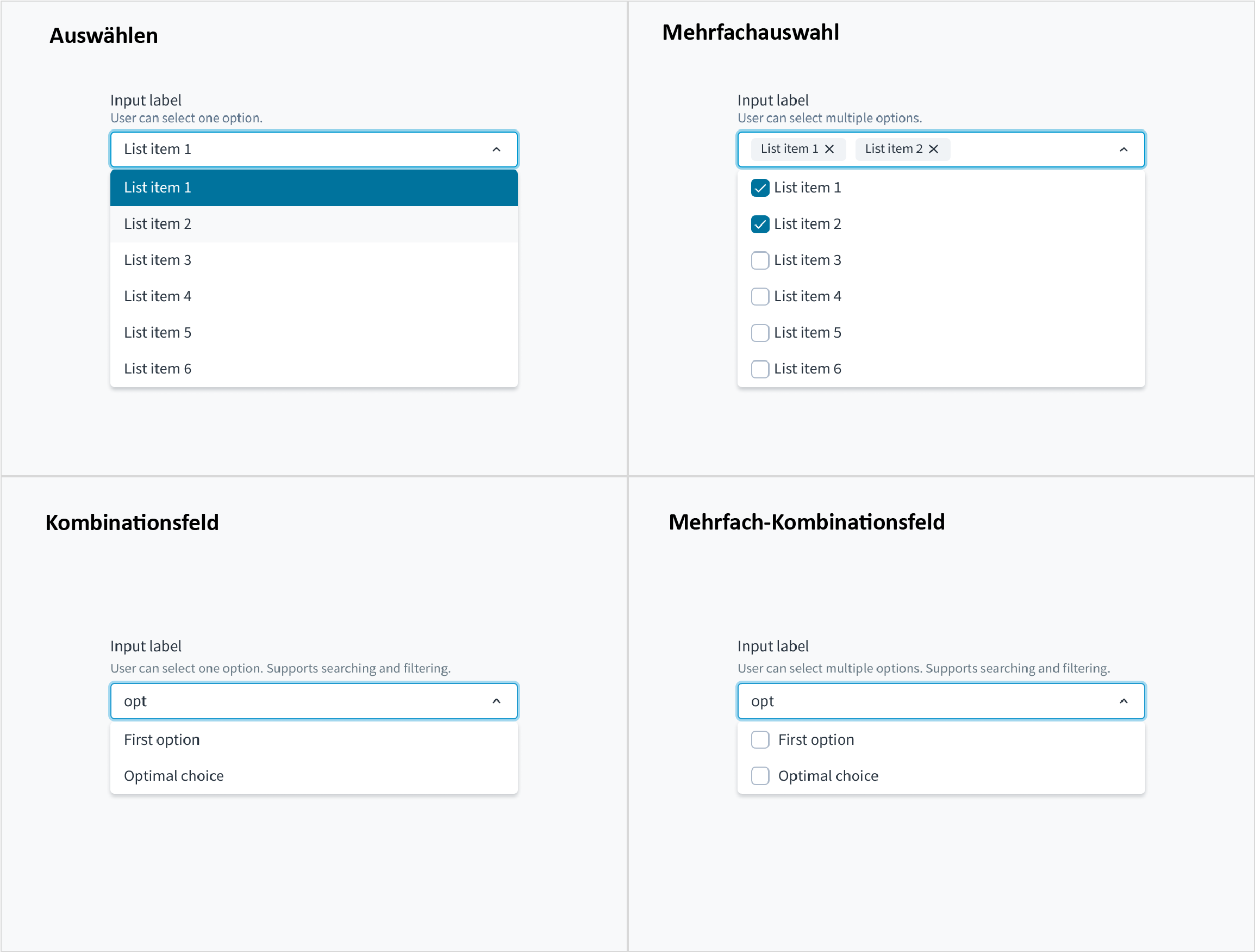
This component comes in four variants: select, multiple select, combobox, and multiple combobox.
The combobox variant of the dropdown enables users to filter longer lists to only the selections matching a query. The user can select one option from the list.
Jutro accommodates dropdown menus with typeahead input fields. Users can manually enter text to filter the dropdown items. This feature is useful for helping users select from a long list.
Dropdowns with typeahead enabled provide suggestions as users begin typing. Selections appear based on the characters that users have entered. The more characters that users input into the field, the more refined the list becomes.
When using the dropdown for sorting purposes, consider arranging options in order. For example:
From most common to least common option
From simplest to most complex operation
From least to most risky option
The first option would appear at the top of the list.
Avoid arranging the list of options alphabetically unless it makes sense for your use case. Lists of countries and other known-item problems are often fine to alphabetize. However, you do need to ensure that users will know unambiguously the name of their selection.
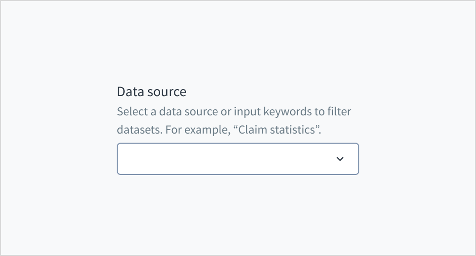
Use help text to show context and communicate what to select or how to select an option. Here are some examples of what you might include in help text:
An overall description of the dropdown options
Hints that assist the user in choosing the right selection
More context for why a user needs to make a selection
Only use help text for pertinent information. Avoid using help text that simply restates the same information that appears in the label.
Use sentence case for help text. Write 1-2 short, complete sentences that end with a period.
Do use help text to show context.
Don't use help text to simply restate the same information that appears in the label.
Don't put placeholder text in the text entry field. Placeholder text strains users' short-term memory because it disappears once a value is entered. It also poses additional burdens for users with visual and cognitive impairments.
Instead, place hints and instructions outside of the field.
The input field for combobox follows the content guidelines for text fields.
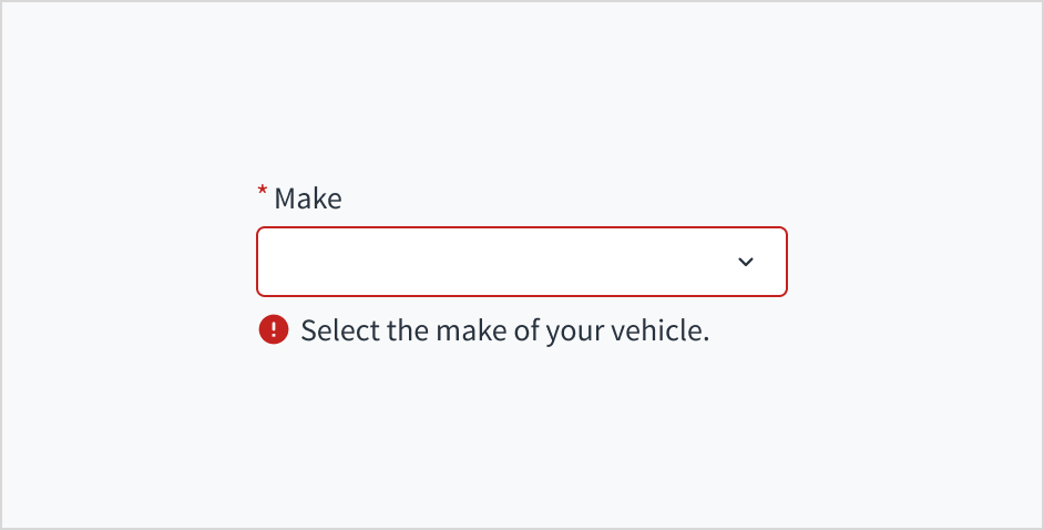
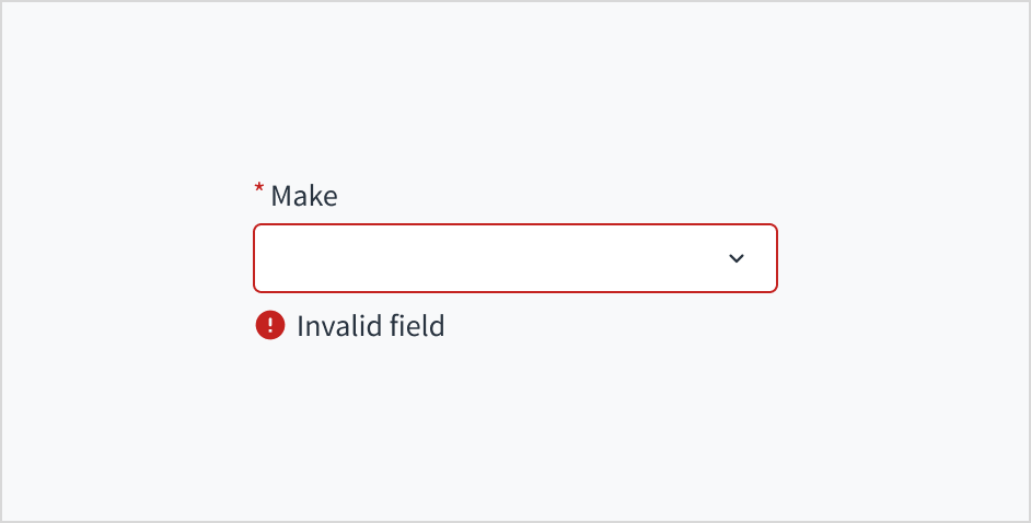
Error message text tells a user how to fix the error. In the case of the dropdown, errors are often related to something that must be fixed for in-line validation. For example, if someone doesn't input the make of their vehicle and this is a required field, you can use error text to guide the user to a solution: “Select the make of your vehicle.”
Use sentence case for error text. Write 1-2 short, complete sentences that end with a period.
Do use error text to guide the user and show them a solution.
Don't write ambiguous error messages or leave users guessing as to how to resolve a problem.
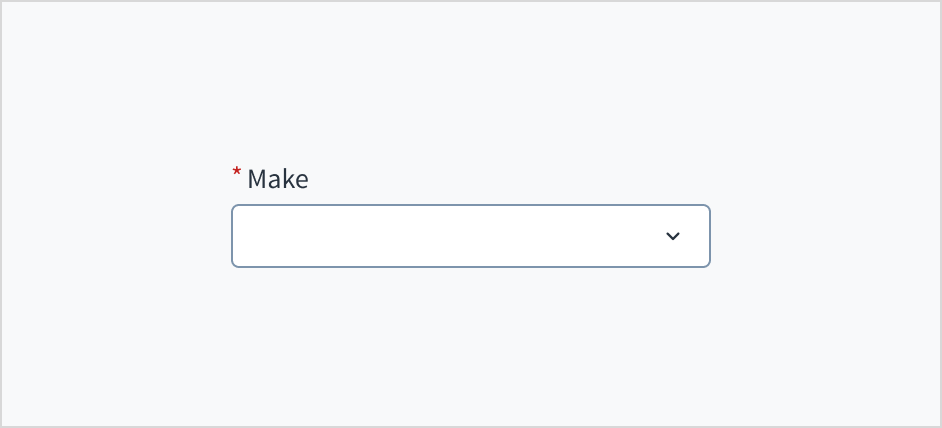
Markieren Sie erforderliche Felder mit einem Sternchen (*). Das Sternchen steht vor der Feldbeschriftung. Benutzer können so leicht herausfinden, welche Felder erforderlich sind, indem sie nur das Zeichen ganz links in der Beschriftung scannen.
Zusätzlich zur Markierung erforderlicher Felder mit einem Sternchen wird empfohlen, klare Anweisungen am oberen Rand des Formulars einzufügen, z. B. „Alle mit einem Sternchen gekennzeichneten Felder sind Pflichtfelder“, um sicherzustellen, dass die Benutzer die Bedeutung des Sternchens verstehen.
Do use an asterisk to indicate that a field is required.
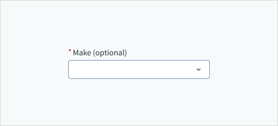
Don't use an asterisk to denote anything that is optional.
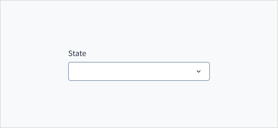
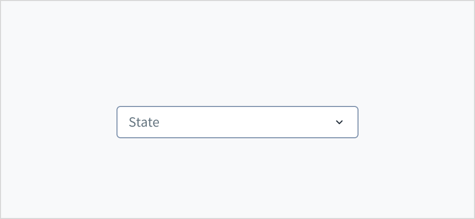
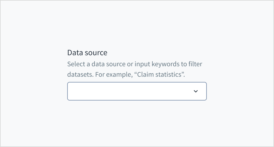
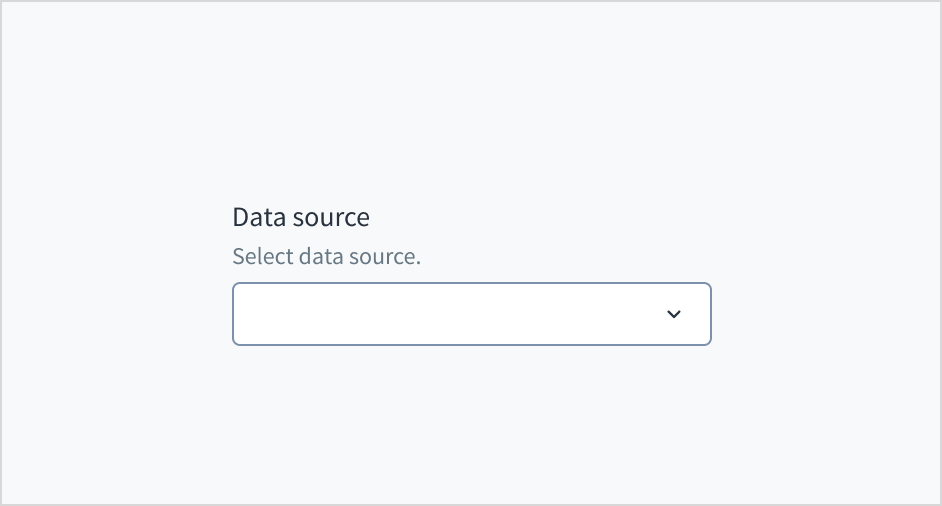
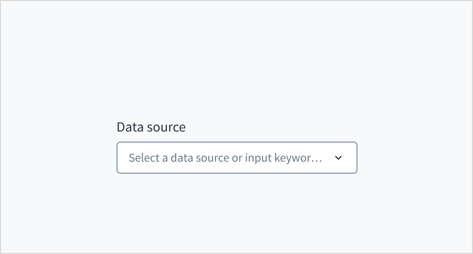
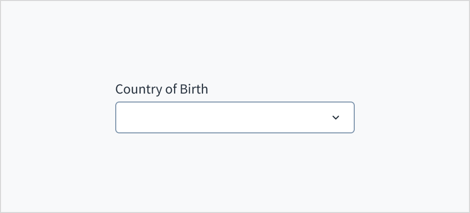
The combobox variant appears with no value (default), placeholder text, or a filled input.
Visual
State
Description
No value (default)
Indicates to the user that no value has been selected and there is no placeholder.
Placeholder
Indicates to the user that no value has been selected. The placeholder is grayed out.
Filled input
Indicates to the user that the input is filled with data.
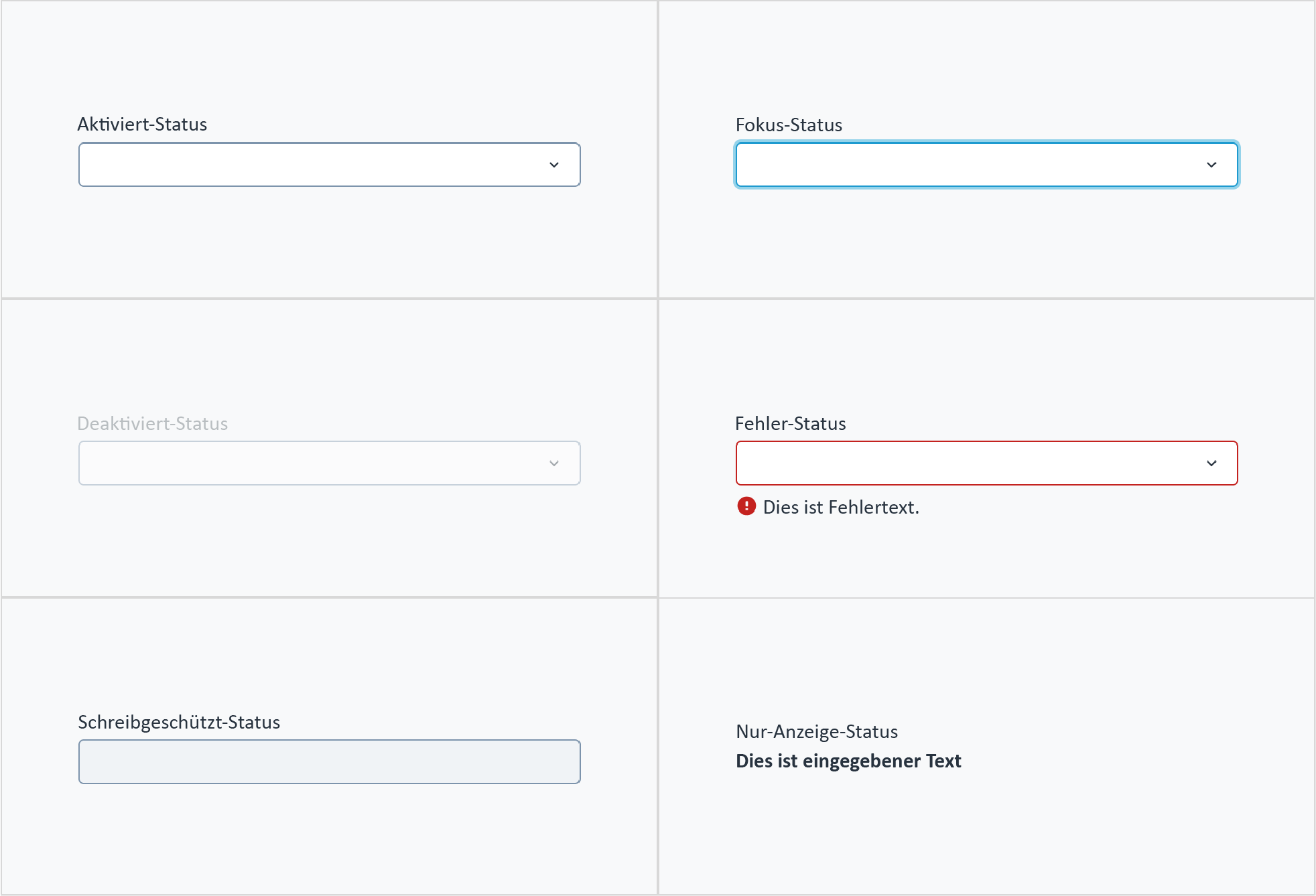
Combobox also has interactive states for enabled, focus, disabled, error, read-only, and display-only.
Zustand
Beschreibung
Aktiviert
Zeigt dem Benutzer an, dass das Element für die Interaktion aktiviert ist.
Fokussiert
Zeigt dem Benutzer an, auf welchem UI-Element im System der Fokus liegt.
Deaktiviert
Zeigt dem Benutzer an, dass der Eingabewert aufgrund lokaler Faktoren nicht geändert werden kann. Zum Beispiel muss ein Kontrollkästchen über dem Eingabefeld aktiviert sein, um auf dieses Eingabefeld zuzugreifen. Der Benutzer kann durch Interaktion mit der Seite eine Aktion zur Aktivierung durchführen.
Fehler
Zeigt an, dass der Benutzer einen Fehler bei der Validierung gemacht hat. Der Fehlertext gibt dem Benutzer eine korrigierende Rückmeldung.
Schreibgeschützt
Zeigt dem Benutzer an, dass der Eingabewert aufgrund externer Faktoren nicht geändert werden kann. Zum Beispiel fehlender Schreibzugriff. Der Benutzer kann Maßnahmen zur Aktivierung ergreifen, indem er sich z. B. an einen Administrator wendet.
Nur Anzeige
Der Zustand „Nur Anzeige“ wird in zwei Fällen verwendet:
Ein UI-Element wird im Anzeigemodus verwendet.
Ein UI-Element wird im Bearbeitungsmodus angezeigt, ist aber nie bearbeitbar.
Dieser Zustand wurde zuvor als „Schreibgeschützt“ bezeichnet.
The following image illustrates combobox interactive states.
The dropdown is expanded and collapsed with the Spacebar key. Users navigate through the options using the arrow keys and select by means of the Spacebar or Enter key.
Das Attribut aria-labelledby stellt eine programmatische Verbindung zwischen dem Eingabefeld und seinem Label her. Das WAI-ARIA-Attribut aria-autocomplete='list' gibt an, dass eine Liste von Optionen angezeigt wird, aus der der Benutzer auswählen kann, während das Eingabefeld weiterhin fokussiert bleibt. Wenn in Storybook die Option „required“ ausgewählt wird, werden die Attribute „required“ und „aria-required="true"“ zum Eingabefeld hinzugefügt.
Das Kontrastverhältnis von Textelementen zu ihrem Hintergrund liegt über 4,5:1 gemäß den Anforderungen der WCAG 2.1 AA. Nicht-textuelle Inhalte, die eine Bedeutung vermitteln müssen (z. B. Symbole und Sichtbarkeit des Tastaturfokus), weisen ein Kontrastverhältnis von mindestens 3:1 zu den angrenzenden Farben auf. Alle Inhalte sind bis einschließlich 400 % sichtbar und funktionsfähig, ohne dass ein Scrollen in zwei Dimensionen erforderlich ist.
Diese Komponente wurde validiert, um die Zugänglichkeitsrichtlinien WCAG 2.1 AA zu erfüllen. Vom Autor des Inhalts vorgenommene Änderungen können sich jedoch auf die Konformität mit der Barrierefreiheit auswirken.
Bei Verwendung dieser Komponente in Ihren Anwendungen:
Erleichtern Sie den Benutzern das Verständnis der Inhalte und verwenden Sie keine zu langen Bezeichnungen für Optionen.
Verwenden Sie in Ihren Dropdown-Komponenten keine implizit fokussierbaren Elemente wie Schaltflächen, Kontrollkästchen und Links und keine implizit semantischen Inhalte wie Überschriften.
Note: Es gibt veraltete Versionen dieser Komponente. Wechseln Sie zu einer Version, die älter als 10.0.x ist, um die entsprechende Dokumentation anzuzeigen.
Vergewissern Sie sich, dass Sie die API-Oberfläche der Design System-Komponenten und die damit verbundenen Auswirkungen und Kompromisse verstehen. Erfahren Sie mehr in unserer Einführung zur Komponenten-API.
Warning: An die Komponente Combobox können keine anderen untergeordneten Optionen als ComboboxOption übergeben werden. Auch wenn dies funktionieren kann, kann es zu unerwartetem Verhalten führen oder durch in künftigen Versionen eingeführte Änderungen beeinträchtigt werden.
If set to true, adds an icon button that appears when the option is selected, or any text is typed. It allows the user to unselect the selected option or delete the typed text at once. It is one of the two solutions to allow the user to unselect the option.
The value of the component. Takes precedence over the initialValue prop. If this prop is passed, the component works in controlled mode and its value changes only if this prop changes.
Der Hook useFilteredOptions enthält die Mechanismen zur Verarbeitung der Optionen, die basierend auf Benutzereingaben angezeigt werden.
Übergebene Parameter:
initialOptions: TValue[]. Initialliste der Optionen in der Komponente ohne angewendete Filter
Ausgabe:
Ein Objekt mit Folgendem:
filteredOptions: TValue[]. Array mit den Optionen, die sich aus der Anwendung eines Filters ergeben.
onSearch: function. Funktion, die das Eingabeereignis onSearch verwendet und die Optionen entsprechend filtert. Kann dem Ereignis onSearch der Komponente zugewiesen werden.
resetFilter: function. Wird verwendet, um die Filterung der Optionen zurückzusetzen. Dabei wird das filteredOptions-Array auf seinen Initialwert gesetzt.
Standardmäßig ist es in der Combobox-Komponente nicht möglich, dass der Benutzer eine ausgewählte Option löscht. Sie können diese Funktion und die Möglichkeit zum Löschen von eingegebenem Text mit einer der zwei verfügbaren Lösungen aktivieren.
Alle Dropdown-bezogenen Komponenten definieren die Liste der verfügbaren Optionen über die Eigenschaft children des Typs ReactNode. Sie können nur die folgenden Unterkomponenten als untergeordnete Komponenten verwenden:
SelectOption in Select und MultipleSelect
ComboboxOption in Combobox und MultipleCombobox
Warning:
SelectOption und ComboboxOption dürfen nur im Kontext ihrer jeweiligen „übergeordneten“ Komponente verwendet werden. Auch wenn sie für sich allein funktionieren, wird diese Funktion nicht unterstützt.
Bei den Komponenten Select und MultipleSelect ist nur vorgesehen, dass SelectOption-Komponenten als untergeordnete Komponenten unterstützt werden. Auch wenn sie möglicherweise andere Typen oder HTML-Elemente anzeigen oder verarbeiten können, wird dies nicht unterstützt.
Bei den Komponenten Combobox und MultipleCombobox ist nur vorgesehen, dass ComboboxOption-Komponenten als untergeordnete Komponenten unterstützt werden. Auch wenn sie möglicherweise andere Typen oder HTML-Elemente anzeigen oder verarbeiten können, wird dies nicht unterstützt.
Jegliche Verwendung dieser Komponenten außerhalb des unterstützten Geltungsbereichs fällt nicht unter die Verpflichtung der Non-Breaking Changes, da eine solche Verwendung nicht als Bestandteil des Komponentenvertrags gilt. Diese Verwendungen können zu unerwartetem Verhalten führen oder durch in künftigen Versionen eingeführte Änderungen beeinträchtigt werden.
Die Jutro-Eingaben haben imperative Handler als Mechanismus implementiert, um Zugang zu einigen gängigen nativen Funktionen zu bieten, die für Sie nützlich sein könnten. Die folgenden Funktionen sind verfügbar:
Fokus setzen ermöglicht es, den Fokus des Benutzers auf eine bestimmte Komponente zu setzen.
Weichzeichnen ermöglicht es, den Fokus von der Komponente zu entfernen.
Zur Komponente scrollen ermöglicht es, den Benutzer zu einem bestimmten Bereich der Seite zu führen.
Diese Funktionen werden über die ref-Eigenschaft bereitgestellt, die sie wie folgt verfügbar macht:
Obwohl einige Jutro-Komponenten ergänzende Funktionen oder eine Hilfsfunktion zur Erleichterung des Validierungsprozesses bereitstellen, liegt es in Ihrer Verantwortung als Entwickler, die Validierung von Benutzereingaben (mit oder ohne Verwendung der ergänzenden Hilfsfunktionen) durchzuführen und zu entscheiden, welche Fehlermeldungen angezeigt werden sollen.
Jutro-Komponenten verhalten sich in Abhängigkeit von der Implementierung des Entwicklers.
Wann werden Fehlermeldungen angezeigt?
Fehlermeldungen werden nur angezeigt, wenn Sie sie über die Eigenschaft stateMessages an die Komponente übergeben. Diese Eigenschaft empfängt ein Objekt mit dem folgenden Inhalt:
Die Komponente zeigt alle bereitgestellten Fehlermeldungen in der gleichen Reihenfolge wie im Array an.
Wann erfolgt die Validierung?
Dies ist Ihre Entscheidung als Entwickler. Da die Komponenten nicht festlegen, wann die Validierung durchgeführt wird oder wann der Fehler angezeigt werden muss, müssen Sie die Logik für die Behandlung entsprechend den Projektanforderungen implementieren, z. B. während der Benutzer den Inhalt bearbeitet, wenn die Komponente den Fokus verliert und bei der Formularübermittlung.
Added the clearable property, which, when set to true, allows the user to clear the selected option or delete the typed text with a single click on the icon button.
Neue Komponente @jutro/components/Combobox eingeführt.
Die frühere Komponente TypeaheadMultiSelectField wurde verworfen und in das @jutro/legacy-Paket verschoben. Um die entsprechende Dokumentation anzuzeigen, wechseln Sie zu einer Version der Dokumentation, die älter als 10.0 ist.
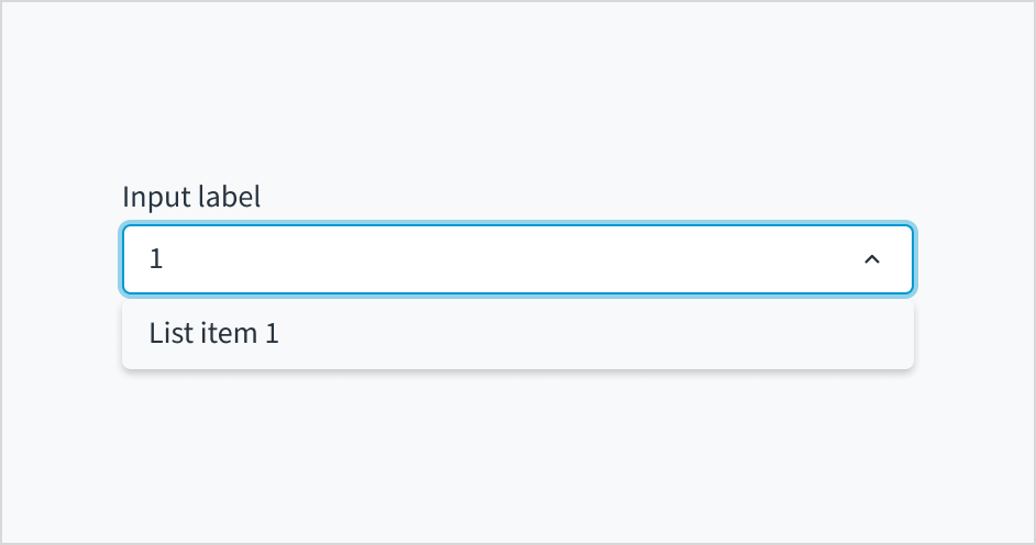
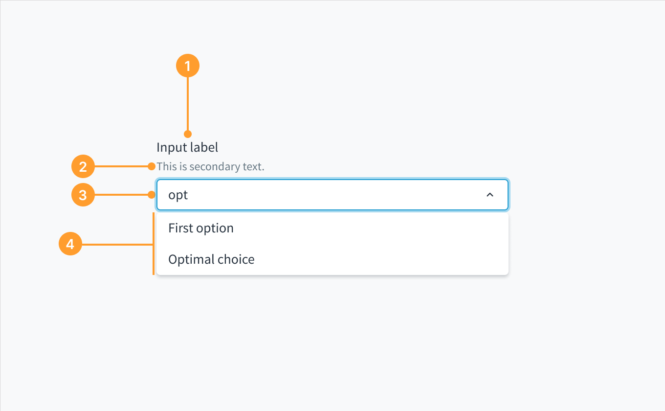 Anatomy of the dropdown component, combobox variant.