Pie chart
Introduction
A pie chart illustrates numerical proportion with pie-shaped "sectors" that represent categorical values of the total amount. Pie charts are best for when you want to visualize a whole amount that is divided into a number of distinct parts, such as the consumption of hard disk space.
When to use
Showing percentages
A pie chart can be used to show percentages of a whole for a specific point in time.
Comparing a few categories
Pie charts are best used when there are five categories or less.
Dominant category
If there is a single dominant category, a pie chart is good for emphasizing its contrast with the smaller categories. If there are several categories of similar size, then a bar chart is better.
Combining categories
When using a larger data set with many categories (sectors), you can combine smaller categories into one slice and label it as "others", to keep the category count low.
When not to use
Don't use a pie chart if there are more than five data points. A bar chart is easier to read and scan when there are many categories to visually process.
Pie chart examples
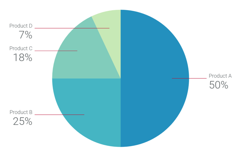
Pie chart showing sales by product for a particular time period
For section labels, annotations are used instead of a legend.
Recharts code
To explore how to create pie charts using Recharts, see the following:
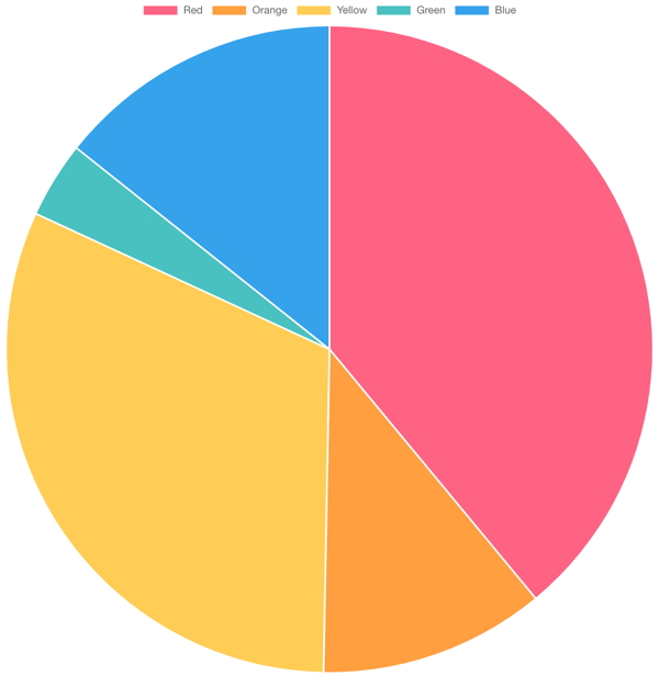
Pie chart that uses a legend to label its categories
Charts.js code
To explore how to create pie charts using Chart.js, see the following:
Pie chart example in Charts.js
Resources
Para acceder a los componentes de visualización de datos para diagramas reticulares y guiones gráficos, consulte los patrones de visualización de datos en Figma.