AppFloorPlan
El componente AppFloorPlan establece la composición y disposición general de toda la aplicación, incluido el contenido de cada sección. Para ser más específicos, controla lo siguiente:
- El encabezado
- El pie de página
- Dónde se muestra la navegación: izquierda (panel lateral) o arriba (subtítulo)
- El panel derecho
La composición y disposición general de la aplicación se administra mediante un AppFloorPlan. Sin embargo, para áreas específicas de la aplicación, puede utilizar componentes de contenido de composición y disposición de Jutro como Grid, Flex u otros componentes personalizados.
Explicado de un modo muy general:
- El
AppFloorPlanestablece la composición y disposición y el enrutamiento para su aplicación. Ajusta cada página individual. - Cada página gestiona su propia composición y disposición dentro del espacio que crea el
AppFloorPlan. Aquí es donde puede insertar uno de los componentes de contenido de composición y disposición disponibles.
AppFloorPlan, es posible crear diferentes estructuras de composición y disposición de página, utilizando el contenido predefinido o proporcionando componentes personalizados.Código
La dependencia @jutro/auth ahora es opcional para los paquetes
@jutro/router y @jutro/components .
Sin embargo, el componente AppFloorPlan component requiere que se agregue
@jutro/auth a las dependencias de la aplicación que se van a utilizar.
Instrucción de importación
import { AppFloorPlan } from '@jutro/floorplan';
Contrato de componentes
Propiedades
className- Tipo
stringDescripciónCSS class name for this component.
contentAsSectionElement- Tipo
booleanDescripciónIf set to
true, content is rendered within<section>HTML tags, otherwise<main>is used. This is used when the page contains nested floorplans as only one element withmainrole is recommended. contentClassName- Tipo
stringDescripciónAdditional class name for the main component.
contentLayout- Tipo
'canvas' | 'default' | 'center'DescripciónLayout type of the main content.
excludeScrollToTopRoutes- TipoDescripción
Routes to be excluded from automatic scroll to the top on a location change.
header- Descripción
Properties for the application's Header component.
leftSide- Tipo
objectclassName- Tipo
stringDescripciónCSS class name for this component.
collapsed- Tipo
booleanDescripciónIf set to
true, component is currently collapsed. collapsible- Tipo
booleanDescripciónIf set to
true, component can be collapsed. contextSwitcher- Descripción
Context switcher object.
renderContextSwitcher- Tipo
RenderContextSwitcherDescripciónCallback to render custom ContextSwitcher instead of default one.
DescripciónProps passed to SideNavigation component.
noContentPadding- Tipo
booleanDescripciónIf set to
true, padding of the page content will be removed. renderFooter- Tipo
({ className }: { className: string }) => ReactNodeDescripciónFunction to render a custom footer.
rightSide- Tipo
objectcollapsible- Tipo
booleanDescripciónIf set to
true, component can be collapsed. This prop isfalseby default for desktop andtruefor smaller devices. isInitiallyCollapsed- Tipo
booleanDescripciónIf set to
true, component will be collapsed on initial render. This prop isfalseby default for desktop andtruefor smaller devices. shouldFocusAfterRender- Tipo
booleanDescripciónIf set to
true, component will be in focus after render. This is useful for proper accessibility support because the content will be automatically read by a screen reader. sides- Tipo
SideContentShape[]componentobligatorio- Tipo
ReactComponentDescripciónComponent to render as content.
labelobligatorio- TipoDescripción
The aria-label describing the content. This text is not rendered and is only used for accessibility.
componentProps- Tipo
objectDescripciónProps to pass to the component passed to the
componentproperty. The type depends on the value of thecomponentproperty. icon- Tipo
string | IconDescripciónAn Icon component to render on the component. The value must be an
Iconcomponent or the icon's name. For example,CheckIconor'gw-check'. id- Tipo
stringDescripciónUnique identifier for the component.
DescripciónList of pages to render in the panel.
DescripciónRight panel config.
routes- TipoDescripción
App routes to be shown in the subheader or, if the screen is mall, the burger menu.
scrollContent- Tipo
booleanDescripciónIf set to
true, the height of the content is set to the height of the screen and the footer will be displayed at the bottom of the screen. showFooter- Tipo
booleanDescripciónIf set to
false, the footer will not be shown. showHeader- Tipo
booleanDescripciónIf set to
false, the header will not be shown. showLeftSide- Tipo
booleanDescripciónIf set to
trueand if a value has been passed tosideRoutes, then the left side panel will be shown. showRightSide- Tipo
booleanDescripciónIf set to
false, the right side panel will not be shown. showSubHeader- Tipo
booleanDescripciónIf set to
false, the subheader will not be shown. sideRoutes- TipoDescripción
App routes to be shown in leftSide.
subHeader- Tipo
objectclassName- Tipo
stringDescripciónCSS class name for this component.
contextSwitcher- Descripción
Context switcher component that will be rendered in the left side of the header.
renderContextSwitcher- Tipo
RenderContextSwitcherDescripciónCallback to render custom ContextSwitcher instead of default one.
renderCustomComponent- Tipo
JSXElementConstructor<Record<string, never>>DescripciónCustom component placed on the right side of subheader or in burger menu.
DescripciónSub header config.
Propiedades del encabezado
La propiedad header en el componente AppFloorPlan admite un objeto con las siguientes propiedades:
appSwitcherCollapsibleGroupsThreshold- Tipo
numberDescripciónNumber of items from which the groups in AppSwitcher are collapsible and the search field is displayed.
appSwitcherFooterText- Tipo
IntlMessageShape | LinkPropTypesDescripciónText displayed on the footer link in AppSwitcher. See IntlMessageShape and Link for more detailed information on the accepted types.
appSwitcherFooterUrl- Tipo
Record<string, (...args: any[]) => void>DescripciónURL to which the footer link in the AppSwitcher leads.
appSwitcherHideFooter- Tipo
booleanDescripciónIf set to
true, the footer in the AppSwitcher is hidden. appSwitcherItems- TipoDescripción
Array of items to be displayed in the App Switcher menu.
appSwitcherSearchEnabled- Tipo
booleanDescripciónIf set to
true, enables the search field in AppSwitcher if the number of items are equal to or above theappSwitcherCollapsibleGroupsThresholdvalue. avatarChildren- Tipo
React.ReactNodeDescripciónAvatar content to be rendered before routes links.
avatarProps- Tipo
AvatarPropTypesDescripciónAvatar props to be passed down if not using auth info (username, imageSource, title, subtitle).
burgerMenuRoutes- TipoDescripción
Routes to be rendered in the burger menu, for breakpoints smaller than
desktop. callbackMap- Tipo
Record<string, (...args: any[]) => void>DescripciónMap to resolve callbacks on avatar links.
className- Tipo
stringDescripciónCSS class name for this component.
commonAvatarRoutes- Tipo
Array<DropdownMenuLinkShape>DescripciónArray of items to be displayed as common Avatar content.
contextSwitcher- Descripción
Context switcher object.
helpPopoverItems- Tipo
React.ReactNode[]DescripciónHelp popover items.
helpUrl- Descripción
The link path for the help page.
languageSelectorProps- Descripción
Props passed to Language Selector.
logoAlt- TipoDescripción
Logo image's
altprop. logoSrc- Tipo
stringDescripciónDisplay a logo from source.
logoTitle- TipoDescripción
The title for the logo.
logoUrl- Tipo
stringDescripciónLink path to a logo.
notificationChildren- Tipo
React.ReactNodeDescripciónNotification content to be rendered.
onAppSwitcherFooterClick- Tipo
(event: React.SyntheticEvent) => voidDescripciónCallback which will be triggered when the footer link in the AppSwitcher is clicked.
onLoadValues- Tipo
functionDescripciónFunction for asynchronous data loading in the search field.
onSearchValueChange- Tipo
functionDescripciónDisplay a search field. Callback for the search field value change.
renderBurgerMenuCustomItem- Tipo
JSXElementConstructor<Record<string, never>>DescripciónComponent to be rendered inside burger menu after navigation.
renderContextSwitcher- Tipo
RenderContextSwitcherDescripciónCallback to render custom ContextSwitcher instead of default one.
renderCustomComponent- Tipo
JSXElementConstructor<Record<string, never>>DescripciónCustom component to be rendered in the application header. It will be rendered on the left of actions menu.
renderHeader- Tipo
(props: RenderHeaderProps) => ReactNodeDescripciónFunction to render a custom header.
renderHelpPopoverItems- Tipo
() => ReactElementDescripciónRender custom help popover items.
searchAvailableValues- Tipo
LookupOptionShape[]DescripciónAn array of choice objects to display, works only if
onLoadValuesis not supplied. searchFieldPlaceholder- TipoDescripción
Search field placeholder text.
searchOptionTypes- Tipo
LookupOptionType[]DescripciónArray of option types variants in the search lookup field.
showAppSwitcher- Tipo
booleanDescripciónIf set to
true, will show App Switcher. showAvatar- Tipo
booleanDescripciónDisplay the avatar.
showHelp- Tipo
booleanDescripciónIf set to
true, shows the Help dropdown. showLanguageSelector- Tipo
booleanDescripciónIf set to
true, shows the Language Selector. showNotifications- Tipo
booleanDescripciónDisplay the notification icon.
useAuthInfo- Tipo
booleanDescripciónIf set to
true,uses Okta auth information.
Habilitar o deshabilitar diferentes partes de AppFloorPlan
Puede deshabilitar o habilitar cada parte del AppFloorPlan configurando la propiedad correspondiente en false/true. Todas estas son true de manera predeterminada.
showHeader: mostrar/ocultar encabezado; esto tiene prioridad sobre la propiedadheadershowSubHeader: mostrar/ocultar la navegación superior; para poder verla, es necesario tener al menos una ruta enroutesconshowOnNavBar=trueshowFooter: mostrar/ocultar pie de páginashowRightSide: mostrar/ocultar el lado derecho, si se establece enfalse, el panel derecho no se muestra, incluso si configurarightSideshowLeftSide: mostrar/ocultar navegación izquierda; para poder verla debe tener al menos una ruta ensideRoutesconshowOnNavBar=true
Rutas, navegación y páginas
Puede controlar las rutas mediante la propiedad routes o sideRoutes de AppFloorPlan. Si necesita agregar nuevas páginas a su aplicación, agréguelas a una de estas propiedades.
La configuración sideRoutes hace que la navegación aparezca en el lado izquierdo. La configuración routes hace que la navegación aparezca en la parte superior del SubHeader. Si desea la navegación superior y la izquierda a la vez, puede configurar tanto sideRoutes como routes.
Estas rutas tienen la siguiente forma:
export type Route = {
  // react-router-dom Route and Redirect props
  //URL path of the route
  path?: string,
  // If true, will only match if the path matches
  // the location.pathname exactly
  exact?: boolean,
  //If true, a path that has a trailing slash will
  // only match a location.pathname with a trailing slash
  strict?: boolean,
  // Match is case sensitive
  sensitive?: boolean,
  //Path to which redirect when entering the current page
  redirect?: string,
  //When true, redirecting will push a new entry onto
  // the history instead of replacing the current one
  push?: boolean,
  //The location to redirect to
  to?: IntlToShape,
  //A pathname to redirect from
  from?: string,
  // end of react-router-dom

  //Identifier for the route
  id?: string,
  // Component to be rendered as the destination page
  // for this route
  component?: ReactComponent,
  //Properties for the component to be rendered
  componentProps?: Record<string, unknown>,
  //Title to be displayed for the route
  title?: IntlMessageShape,
  //Defines whether the route should be shown in the navigation
  showOnNavBar?: boolean,
  //Nav link properties
  navLink?: NavLinkPropTypes,
  //Array of sub-routes
  routes?: Route[],
  //An external path
  href?: string,
};
For more details see the page about routing.
Floorplan overrides
You can use a different definition for individual pages of the application. Create a configuration (FloorplanOverride) with a matches prop with paths to pages.
 {
  ...
  matches: ["/welcome", "/contact"];
  ...
 }
If there are several override configs for the same path, the first one takes precedence.
If you have more than one configuration without the matches prop, the first one is considered default. If you do not provide an override for a page, it uses the default configuration.
The override configuration only needs to specify the differences with the default configuration, as it will be merged with it.
  export const example2PageDefinition = (): FloorPlanOverride {
    return {
        // Configuration override for the /example2 path only
        showRightSide: false,
        matches: '/example2'
    }
  }
  export const floorPlanDefinition = (): FloorPlan {
    return {
      // Default `AppFloorPlan` configuration definition
      contentLayout: 'canvas'
      showRightSide: true,
      rightSide: {
        ...
      }
    }
  }

  export function Jutro(): JSX.Element {
    return <AppFloorPlan
              floorPlans={[floorPlanDefinition(), example2PageDefinition()]} />;
}
Composición y disposición de contenido
En AppFloorPlan, al aplicar la composición y disposición del espaciado entre borde y texto para un contenedor de contenido principal, puede usar la propiedad contentLayout con una de sus variantes:
center, que proporciona el ancho máximo y centrado horizontalcanvassin espaciado entre borde y textodefaultcon espaciado entre borde y texto estándar de Guidewire (valor predeterminado)
contentLayout establece la composición y disposición predeterminada para todas las páginas de la aplicación. Si desea cambiar la composición y disposición de cualquier subpágina para que sea diferente de la predeterminada, tendrá que definir la configuración deseada mediante un FloorplanOverrides:
  export const example2PageDefinition = (): FloorPlanOverride {
    return {
        contentLayout: 'center',
        matches: '/example2'
    }
  }
  export const floorPlanDefinition = (): FloorPlan {
    return {
      // Default configuration
      contentLayout: 'canvas'
    }
  }

  export function Jutro(): JSX.Element {
    return <AppFloorPlan
              floorPlans={[floorPlanDefinition(), example2PageDefinition()]} />;
}
Propiedad contentClassName
También puede usar una propiedad contentClassName para permitir que se coloque CSS personalizado en el contenedor de contenido principal para modificar los fondos y otros estilos.
Ejemplos
Consulte las secciones Uso y Código para obtener más detalles, opciones de configuración y ejemplos.
Configuración básica
En el ejemplo siguiente se muestra cómo utilizar las distintas propiedades de AppFloorPlan. Se muestra una página con encabezado y paneles izquierdo y derecho, cada uno de ellos con un par de elementos secundarios.
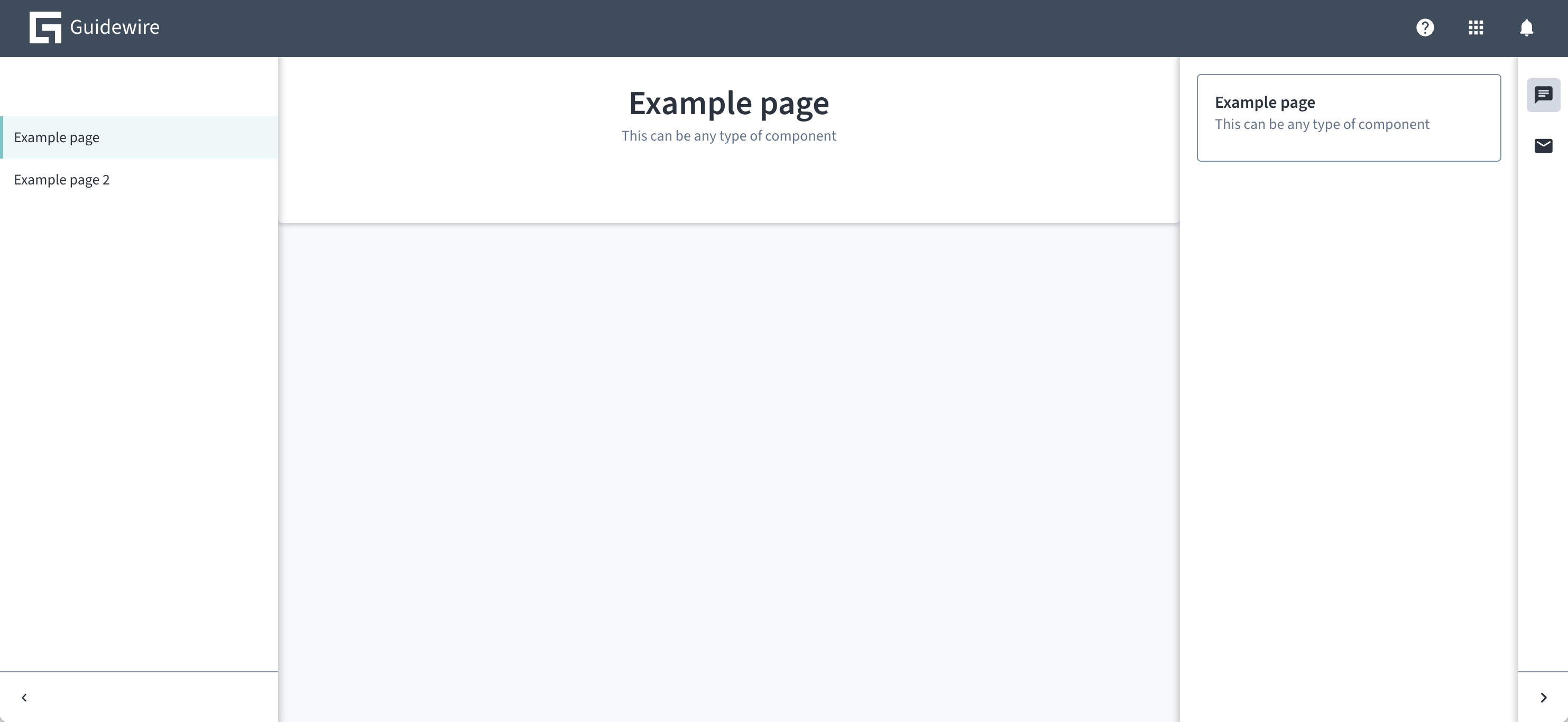
import React from 'react';
import { AppFloorPlan } from '@jutro/floorplan';
import { FloorPlan } from '@jutro/floorplan';
import { ChatIcon, MailIcon } from '@jutro/icons';
import { Card } from '@jutro/components';

export const floorPlanDefinition = (): FloorPlan {
    return {
        showHeader: true,
        header: {
            showNotifications: true,
            logoSrc: './images/guidewire-logo-dark.svg',
            logoTitle: 'Guidewire',
            showHelp: true,
            showAppSwitcher: true,
            showLanguageSelector: false,
        },
        showSubHeader: false,
        showLeftSide: true,
        leftSide: {
            collapsible: true,

        },
        sideRoutes: [
            {
                path: '/',
                exact: true,
                showOnNavBar: false,
                redirect: '/example',
            },
            {
                title: 'Example page',
                path: '/example',
                exact: true,
                component: PageExample,
            },
            {
                title: 'Example page 2',
                path: '/example2',
                exact: true,
                component: PageExample,
            },
        ],
        showRightSide: true,
        rightSide: {
            collapsible: true,
            isInitiallyCollapsed: true,
            sides: [
                {
                    label: "Open chat",
                    icon: ChatIcon,
                    component: RightSideExample,
                },
                {
                    label: "Email",
                    icon: MailIcon,
                    component: RightSideExample,
                }
            ],
        },
        showFooter: false,
    };
};

export function Jutro(): JSX.Element {
    return <AppFloorPlan floorPlans={[floorPlanDefinition()]} />;
}


const PageExample = (): JSX.Element {
    return <Card title="Example page"
              subTitle="This can be any type of component" isPanel></Card>
}

const RightSideExample = (): JSX.Element {
    return <Card title="Example page"
              subTitle="This can be any type of component"></Card>
}
Encabezado personalizado
Si el diseño de su encabezado es significativamente diferente al encabezado de configuración base y las opciones de personalización disponibles no son suficientes, puede proporcionar una función de renderizador de encabezado personalizado con el atributo renderHeader:
const floorplans = {
    'floorplan.default': {
        ...
        renderHeader() {
            // myCustomHeaderRenderer implementation
        }
    }
}

<AppFloorPlan floorPlans={floorplans} />;
La función renderHeader tiene los siguientes argumentos:
navigationRoutes: rutas visibles (rutas conshowOnNavBarno establecido enfalse).header: propiedades del encabezado deAppFloorPlan.subHeader: propiedades del subtítulo deAppFloorPlan.
Con showSubHeader configurado en false, también puede implementar su propio subtítulo como parte del encabezado personalizado y la altura del encabezado personalizado no está limitada de ninguna manera.
Lateral derecho
La propiedad rightSide toma un objeto de configuración que determina el contenido del panel derecho. Supongamos este ejemplo de lateral derecho:
{
  "showRightSide": true,
  "rightSide": {
    "collapsible": true,
    "sides": [
      {
        "label": {
          "id": "example1",
          "defaultMessage": "Example right side 1"
        },
        "icon": "gw-home",
        "component": "RightSideContent",
        "componentProps": {
          "foodItem": "banana"
        }
      },
      {
        "label": {
          "id": "example2",
          "defaultMessage": "Example right side 2"
        },
        "icon": "gw-star",
        "component": "RightSideContent",
        "componentProps": {
          "foodItem": "cup of coffee"
        }
      }
    ],
    "shouldFocusAfterRender": true,
    "isInitiallyCollapsed": false
  }
}
Para que este ejemplo funcione, cree un RightSideContent:
function RightSideContent({ foodItem }) {
  return <div>Enjoy this {foodItem}!</div>;
}
La configuración crea un panel derecho con dos botones. Al hacer clic en los botones, se alterna entre dos paneles. Uno de ellos dice “¡Disfruta de esta banana!”, y otro dice “¡Disfruta de esta taza de café!”.
Las propiedades que rightSide puede tomar se encuentran en la tabla de propiedades en la pestaña Código.