Markdown editor
Usage
Overview
The markdown editor is an editor that enables users to author content using markdown syntax. It provides a live-formatted preview of the text as it is typed, eliminating the need for a separate split-screen view. The editor includes a toolbar for common text styling, including headings, emphasis, lists, and links.
When to use
- For structured, long-form content that requires hierarchical organization, such as reports, detailed notes, or multi-section descriptions.
- When users need to create a mix of text styles, including multiple heading levels (H1-H6), bold and italic emphasis, and complex lists.
- To provide an intuitive editing interface where users can either use standard keyboard shortcuts or the toolbar to format their content.
When not to use
- For short, single-line data that doesn't require formatting. Use a standard text input component instead.
- When the workflow requires advanced table creation or embedding complex media like videos or interactive widgets.
- For writing code that requires multi-language syntax highlighting or line numbering.
Formatting
Anatomy
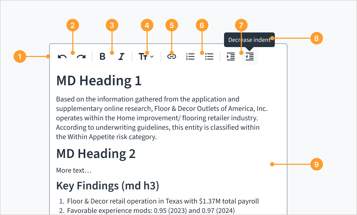
The markdown editor component consists of the following elements:
- Toolbar: A container for formatting actions that remains visible while the user is in edit mode.
- Undo and redo: Buttons that enable users to reverse or re-apply recent changes.
- Bold and italic: Buttons used to apply emphasis (italic) or strong emphasis (bold) to text.
- Text style menu: A dropdown menu to switch between normal text and six levels of headings.
- Link: A tool used to insert and manage hyperlinks within the content.
- List toggles: Buttons to create bulleted (unordered) or numbered (ordered) lists.
- Indentation tools: Buttons to increase or decrease the indent level of text.
- Tooltips: Brief text labels that appear on hover to identify the function of each toolbar button.
- Editing area: The interactive area where text is entered and rendered with live formatting.
Behaviors
Live formatting
The markdown editor allows users to format text using either the toolbar or markdown syntax directly. When a user types markdown syntax, such as ** to bold a word, the component automatically converts it into visual formatting. This enables users to focus on the content's appearance without managing raw code.
Read-only mode
When the readOnly prop is set to true, the component functions as a content viewer. In this state:
- The toolbar is hidden.
- The text cannot be edited.
- The content remains formatted according to the markdown provided in the
valueprop.
AI-generated summaries
The markdown editor is designed to support workflows where content is generated outside the UI, such as underwriting summaries returned by AI services (for example, Merlin).
- Automatic formatting: When the editor receives markdown-formatted content, it renders headings, lists, and emphasis with the correct visual hierarchy.
- Content review and refinement: Underwriters can review the pre-formatted summary and use the toolbar or keyboard shortcuts to add notes, adjust emphasis, or correct structure.
- Editable vs. read-only: Depending on the workflow, teams can present these summaries as editable for refinement or read-only for final review.
History and operations

The editor tracks changes made during the current session, allowing users to manage their editing history:
- Undo and redo: Users can reverse recent formatting or text changes using the toolbar buttons or standard keyboard shortcuts (
Ctrl+ZandCtrl+Y). - Copy and paste: The editor supports standard clipboard operations, maintaining basic formatting when content is moved into or out of the editing area.
- Toolbar tooltips: To assist with icon identification, tooltips appear on hover for all toolbar buttons.
Nested list indentation
The editor supports a deep hierarchy for organized content, allowing for up to six levels of indentation.
- Ordered list patterns: When nesting numbered lists, the markers follow a repeating cycle of numbers, lowercase letters, and lowercase Roman numerals to help users distinguish between levels.
- Unordered list consistency: Bulleted lists use different markers at different levels, following a repeating cycle of discs, circles, and squares.
Content
General writing guidelines
- En todos los aspectos del diseño de las interfaces de productos de Guidewire, utilice mayúsculas como se usan en las oraciones. No use mayúsculas en todas las palabras.
- Use verbos en tiempo presente y voz activa en la mayoría de las situaciones.
- Use contracciones comunes para darle al texto un tono más natural e informal (pauta correspondiente al inglés).
- Use un lenguaje sencillo. Evite la jerga innecesaria y el lenguaje complejo.
- Las palabras y las oraciones deben ser breves.
The markdown editor follows the same typographic principles as other Jutro components. For rules on maintaining a purposeful hierarchy and using approved font variations, see the foundational typography guidelines.
Markdown editor writing guidelines
- Use descriptive placeholders: Provide a hint that describes the expected content, such as "Enter a detailed description of the risk".
- Structure for readability: Use headings and lists to break up long blocks of text and create a clear hierarchy.
Accessibility
The markdown editor is designed to meet WCAG 2.1 AA accessibility guidelines.
- Keyboard navigation: All formatting actions are accessible using the toolbar or through standard keyboard shortcuts, such as
Ctrl+Bfor bold andCtrl+Ifor italics. - Screen reader support: The component uses specific translation keys (for example,
textStyleHeading1,linkTextLabel) to provide accessible ARIA labels for toolbar buttons and menus. - Visual focus indicators: Interactive elements within the toolbar, such as buttons and dropdown menus, display a high-contrast blue outline when receiving keyboard focus.
- Visual labeling: Toolbar tooltips provide a persistent visual text label on hover, ensuring the function of each icon is clear to users who might not recognize the symbol alone.
- Semantic HTML: The editor automatically generates semantically correct HTML tags (such as
<h1>through<h6>,<ul>, and<ol>), allowing assistive technology to accurately parse the document structure.