Getting started with AI
This guide provides the essential visual, behavioral, and content guidelines for teams building AI-powered features in Jutro.
Core principles
Before designing any AI feature, teams must review our AI design principles. These 7 principles define what must be true for our system to be responsible, intuitive, and effective.
Accessibility
While AI technology is new, the principles of accessible design remain the same. An AI-enabled interface is still a user interface. Its elements must follow established usability patterns, be clearly labeled, and adhere to accessibility standards.
For example, a prompt input field must be as intuitive and accessible as any other type of form input. The fundamentals of human-centric design do not change simply because the technology powering the experience does.
Visual identity
Our AI experiences are distinct from the standard UI. They use a specific color palette and iconography to signal to the user that they are interacting with an intelligent system.
Color
The AI color system defines how identity, motion, and state changes are communicated consistently across AI experiences. For complete design specifications and to see how these colors are applied in context, refer to the AI Visual Theme Figma file.
Primary and secondary AI colors
These colors are the only ones permitted for use in static UI elements, such as buttons, cards, and navigation.
| Color | Name | HEX color | Usage |
|---|---|---|---|
| Royal purple | #524AF6 | Primary. Represents the core AI identity. Use for chat, agent actions, and AI-generated content indicators. | |
| Grape | #8048FF | Secondary. Supports royal purple during motion or transitions. It must never be used alone. |
Support colors
These colors are strictly reserved for motion states and must never appear in static UI.
| Color | Name | HEX color | Usage |
|---|---|---|---|
| Peach | #FEA492 | Use for micro animations, pulses, loading, and state transitions. | |
| Salmon | #FED8D1 | Use for micro animations, pulses, loading, and state transitions. | |
| Cream | #FDF7DD | Use for micro animations, pulses, loading, and state transitions. | |
| Lavender | #A39DFA | Use for micro animations, pulses, loading, and state transitions. |
Iconography
The AI sparkle icon is the primary visual identifier for AI-powered features. For visual examples and to access design assets, refer to the Jutro Component Library in Figma.

Usage rules
- Do use the sparkle icon to mark AI-powered actions (like a "Generate summary" button) or areas where AI assists the user.
- Do place the sparkle icon on the left side of button labels.
- Don't use the icon decoratively. If the button doesn't trigger an AI action, do not use the sparkle.
- Don't use the sparkle for simple actions like "Accept" or "Dismiss," even if they are part of an AI workflow.
Visual specifications
To ensure the AI icon is rendered consistently across different product surfaces, follow these technical specifications:
| Attribute | Guideline |
|---|---|
| File format | SVG or PNG. |
| Default size | 14x14 px for inline use (buttons, labels). |
| Floating action button size | 24 px icon inside a 50 px button. |
| Minimum size | 14x14 px. |
| Padding | 2 px clear space around the icon. |
| Alignment | Center within its container; align to the grid where applicable. |
| Color | Use the designated AI icon color token. |
Other AI-related icons
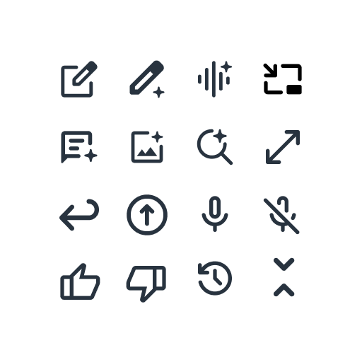
Some AI features in the product, such as image generation or content summarization, might include additional icons. These icons are specifically designed for their intended function and are used only in their designated context. All in-app AI icons must adhere to the Jutro icon style guide to ensure visual consistency across the product.
Typography
To create a clear distinction between system-produced output and product-authored UI, use system default fonts (such as Arial) for insertable code output, temporary AI previews, or surfaces where custom fonts might not load consistently. For standard UI elements, follow Jutro typography standards.
Components
We have dedicated components for common AI patterns. These components are currently intended for internal use and are considered experimental.
| Component | Visual | Use for... |
|---|---|---|
| AI chat | 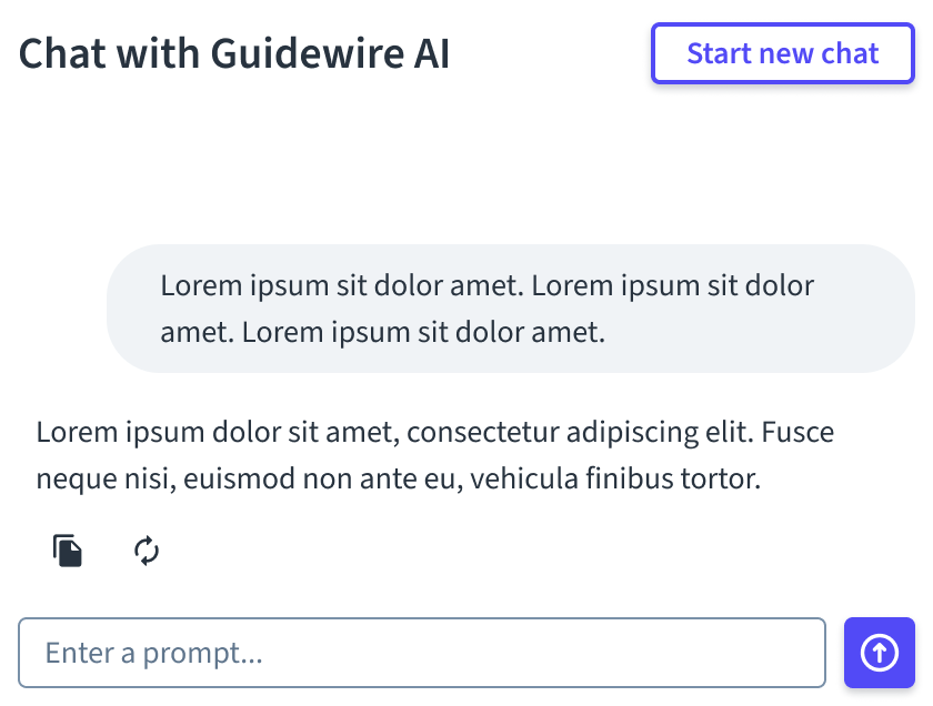 | Multi-turn conversations, complex inquiries, or "agentic" workflows. Best for: Deep-dive research and side-by-side assistance. Avoid for: Single-turn interactions. |
| AI button | 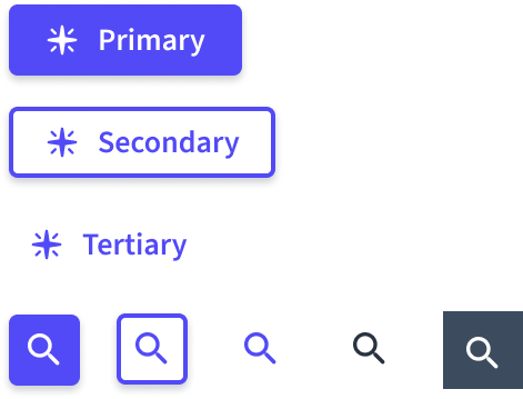 | Triggering AI actions. With sparkle: Independent AI tasks (for example, "Analyze document"). Without sparkle: Follow-up actions (for example, "Confirm" or "Stop"). |
| AI floating button |  | A persistent, always-available entry point to toggle the visibility of the AI chat interface. Best for: Accessing an assistant from the bottom-right of the screen. Avoid for: Task-level actions. |
| Action card | 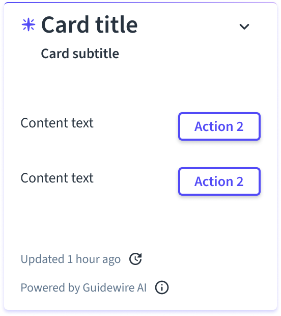 | Grouping and structuring related information within a collapsible container. AI variant: Use when data or text is produced by an AI model. Avoid for: Chat (use AI chat instead). |
| Markdown editor |  | Authoring content using markdown syntax with a live-formatted preview. Best for: Reviewing and refining long-form AI-generated summaries (for example, Merlin underwriting summaries). Avoid for: Short, single-line data without formatting. |
Motion and behavior
Micro-animations provide lightweight motion cues that support AI behavior without becoming a focal point of attention. For motion specs and assets, refer to the Jutro Pattern Library in Figma.
Motion in AI interfaces is functional, not decorative. It signals state changes and system thinking through the following behaviors:
- Streaming content: When the AI generates long-form text, stream the content to the screen as it arrives rather than loading it all at once. This reduces perceived latency and builds trust.
- Loading states: Differentiate between system and AI processing.
- Standard UI: Use the standard Guidewire “G” loader when loading UI elements or performing standard processing.
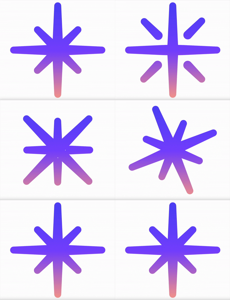
- AI processing: Use the AI loader (spinning star) to indicate agentic steps or AI analysis.
- AI content: Use the "rainbow bars" skeleton when AI content is loading.
- Transitions: Animations must begin when the AI becomes active and stop immediately once the action completes.
Visualizing loading states
Refer to these visual examples to distinguish between AI-specific processing and content loading.
AI loader (spinning star)
"Rainbow bars" skeleton

Motion usage guidelines
- Do use micro-animations to signal active AI states like generating, loading, or updating.
- Do keep motion minimal, subtle, and low-emphasis.
- Don't add decorative or ambient looping effects.
- Don't apply motion to static UI elements like buttons, cards, or navigation.
- Don't introduce movement that distracts from primary content or actions.
Writing for AI agents
When configuring the "persona" or system prompt for an AI agent, use the following guidelines to ensure the agent sounds like Guidewire.
Persona and voice
The AI's voice must be simple, helpful, trustworthy, and friendly.
- Natural but professional: Write as you would speak in a helpful professional conversation.
- Positive: Focus on what the user can do, not what they can't.
- Global: Avoid slang, idioms, or culture-specific references.
Structure
- Inverted pyramid: Always lead with the most important information or the direct answer. Follow up with details or explanations if needed.
- Conciseness: Use short words and sentences. Eliminate filler language.
Formatting outputs
- Scannability: Avoid large walls of text.
- Emphasis: Use bolding for key terms and phrases.
- Lists: Use bulleted lists for unordered items and numbered lists for sequential steps.
- Clarity: If a user prompt is ambiguous, the agent must ask for clarification rather than guessing.