Data visualization patterns for dashboards and embedded analytics
Introduction
The data visualization patterns are intended for internal UI designers and developers who wish to incorporate chart and graph components into their dashboard and embedded analytics initiatives.
Best practices for data visualizations and dashboard design were previously defined by the Analytics & Data Services UX team. These guidelines have been shared with internal teams through workshops and a downloadable PDF, as part of our Dashboard Cookbook project. There are also plans to produce a self-learning module for the Guidewire Education portal. The chart components that can be used in dashboard floorplans and embedded analytics patterns will be made available to development teams via the following online resources: (1) Guidewire Documentation, and (2) Figma Jutro pattern library.
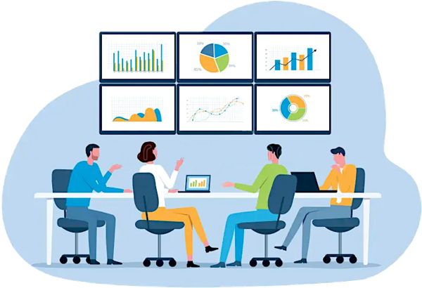
Goals and outcomes
- Developers are able to quickly grab Chart.js or Recharts code samples from external resources (referenced here and in the Figma Jutro pattern library), and browse examples and use cases for specific data viz patterns.
- Designers of dashboards and embedded analytics solutions are able to learn best practices and use cases for data viz patterns -- this includes utilizing the JavaScript library resources to generate charts and graphs for wireframe inclusion.
Resources
Para acceder a los componentes de visualización de datos para diagramas reticulares y guiones gráficos, consulte los patrones de visualización de datos en Figma.