Color and accessibility for data visualizations
Overview
The goal of this section is to provide best practices for color usage in data visualizations, and the primary audience is a designer or developer who is tasked with adding charts and graphs to their Guidewire application. When used effectively, color can draw attention to the most important data values, or help distinguish various charts from one another in a dashboard. Color can also be used to reinforce corporate branding, although marketing considerations should be secondary to data comprehension and accessibility standards.
Color basics
After you've selected the appropriate components to visualize data in your application, there are some basic guidelines to follow when using color to represent the data values and regions of a chart or graph. When considering these guidelines, it's important to resist decorating a graph in a way that undermines its ability to present data clearly.
In general, the following rules will help you determine when and how much color to use in your data visualizations:
- Start with gray: If the goal of your data visualization is to highlight one data point against all others, start with a grayscale palette and use a single color to call out the most important information. In the example below, blue is used to highlight the data point of interest. Coloring the other bars would distract the user.

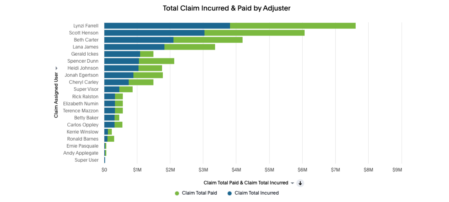
- Using multiple colors: Within a chart or graph, use different colors only when they correspond to differences of meaning in the data. When users look at data and see visual differences (such as color), they try to interpret the meaning of those differences -- even if none exists. In the horizontal bar chart below, there are two separate values indicated on each bar, so it's ok to use different colors for each value.
- Sequential coding: When using color to encode a sequential range of data values, use a single hue of various intensities -- starting with a pale shade for low data values to increasingly darker and brighter shades for high data values. There are additional strategies for sequential color coding scales in the diagram below.

- Colorblind considerations: To ensure that most colorblind users can distinguish groups of data that are color coded, avoid using combinations of red and green in the same chart, graph, or table. For more information on colorblind-safe palettes and WCAG compliance, see Accessibility.
Guidewire color palette
Corporate color palettes are an effective way to help showcase a company's branding message across marketing collateral and product interfaces. While not mandatory in data visualization scenarios, branding palettes can serve as a starting point for generating familiar colors to be used with the charts and graphs in our applications.
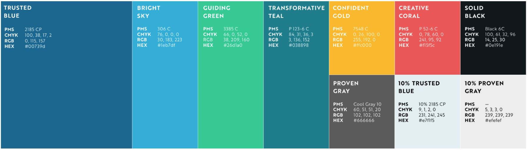
A palette generator tool can be used to create a series of colors that are visually equidistant, which is useful for data visualizations. Designers can specify two endpoint colors, with at least one being a brand color, and the tool will fill in the rest of the series in between.
Accessibility
Data visualizations need to meet certain criteria in order to be compliant with the Web Content Accessibility Guidelines (WCAG) initiative. This is to ensure that colorblind and other visually impaired users are not excluded from the information being presented in your charts and graphs.
Here are the most important accessibility guidelines to follow when using color in your data visualizations:
- Contrast: Use a high contrast ratio (at least 3:1) between the background and the data elements on top -- such as bars, lines, and pie wedges. Text labels should have a contrast ratio of 4.5:1 against background colors.
- Text labels: Use clear text that labels all significant parts of your data visualization, such as the chart or graph title and both the X and Y axis. When necessary, use labels and legends that clearly mark and distinguish the data points.
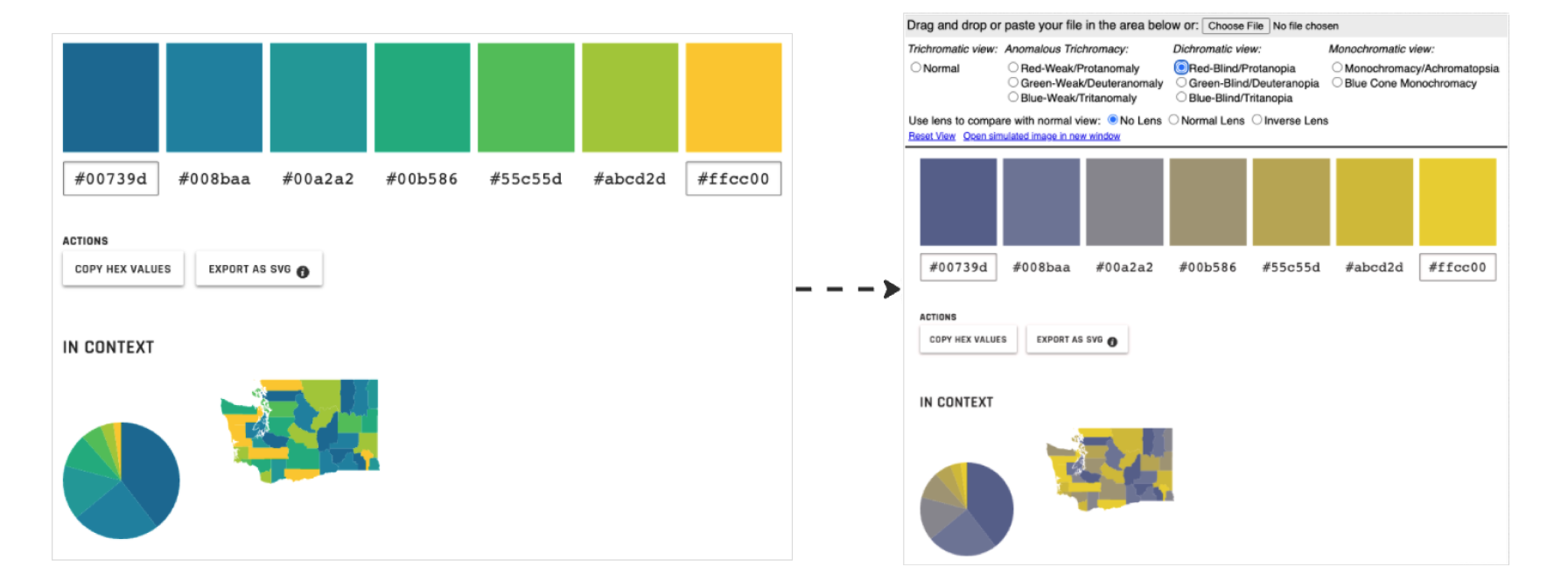
A colorblind simulator is helpful for checking your data visualization palettes for proper contrast ratios and comprehension.