Don't use the AI floating button to perform a specific AI action in context. Instead, use an AI button for those task-level actions (inside cards, chat, or panels).
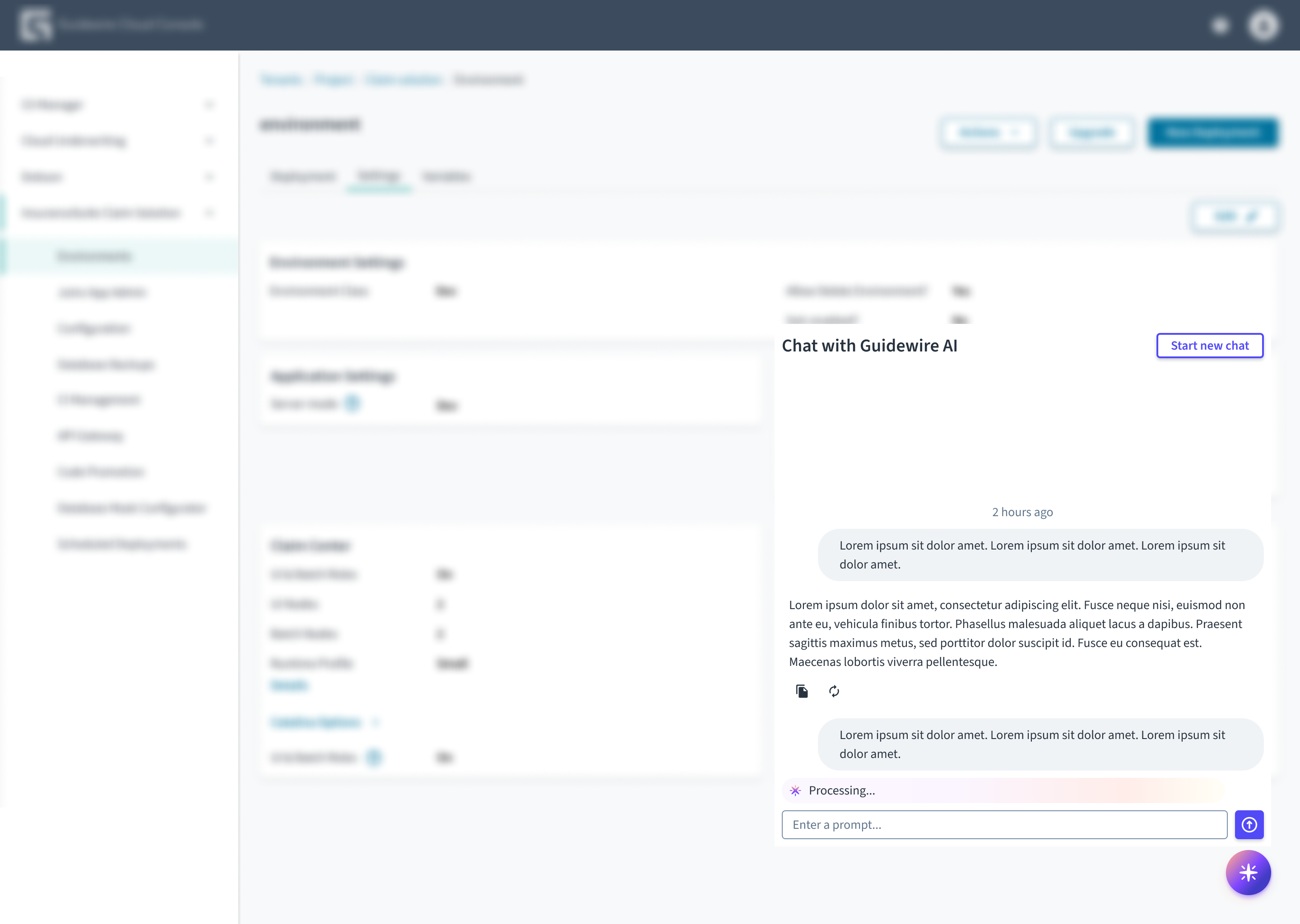
Place the button in the bottom-right corner of the screen so users can find it quickly. Use a high z-index so the button floats above all other content and isn't clipped.
Do place the AI floating button in the bottom-right corner of the screen.
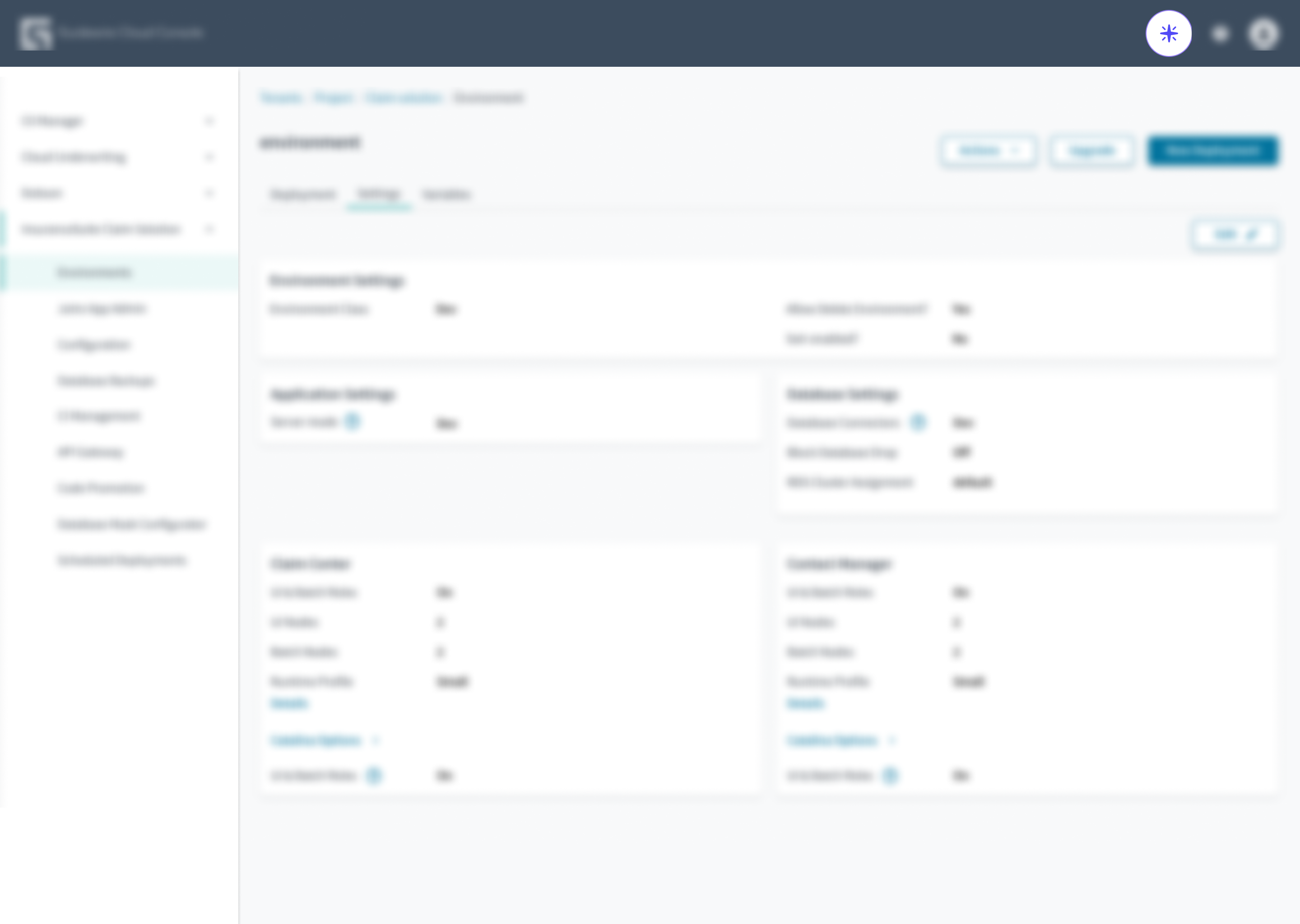
Don't place the AI floating button inline in the header. It's a floating control that sits in a fixed bottom-right position on the screen.
The AI floating button component is an icon-only button used to toggle the visibility of the AI chat interface.
This component is designed to meet WCAG 2.1 AA accessibility guidelines. Non-textual content that needs to convey meaning (the icon) and the keyboard focus indicator have a contrast ratio of at least 3:1 with their adjacent colors.
However, changes made by the content author or the specific implementation context can affect accessibility conformance.
Labels: Provide a descriptive label using the label prop (for example, label="Toggle AI chat"), which the component renders as an aria-label. This ensures screen readers identify the button correctly immediately upon focus.
State indication: Because this button controls a collapsible window, use the aria-expanded attribute to indicate state. Set aria-expanded="true" when the chat is open, and aria-expanded="false" when it is closed.
Focus management: When the user selects this button to open the chat, focus must move to the chat window. When the user closes the chat, focus must return to this button.
Zoom and layout: Ensure the floating button does not obscure essential content, interactive elements, or scrollbars, especially when the page is zoomed to 400%.
Asegúrese de comprender la superficie de la API de componentes del sistema de diseño, así como sus implicaciones, ventajas y desventajas. Obtenga más información en nuestra introducción a la API de componentes.
If set to true, the button is disabled. IMPORTANT: this prop overrides the native HTML disabled attribute. In this case, the button is still tabbable, even when it's disabled.
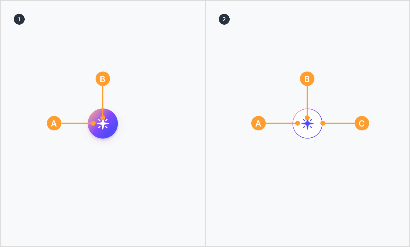
The AIFloatingButton component is a circular button with an icon that indicates the action it triggers is powered by GenAI. It comes in two styles: 'default' and 'inverse'.