Action card
Usage
Overview
The action card is a flexible container used to display related information. It comes in two variants: a standard card for general content, and an AI action card designed to indicate content generated or assisted by artificial intelligence.
When to use
Use the action card to group and structure related information within a collapsible container.
- Standard variant: Use for general content that is not produced by an AI model.
- AI variant: Use when the data or text within the card is produced by an AI model. This variant applies distinct styling and icons to signal the source of the information.
When not to use
Don't use an AI action card as a container for chat. Instead, use the AI chat component.
Formatting
Anatomy
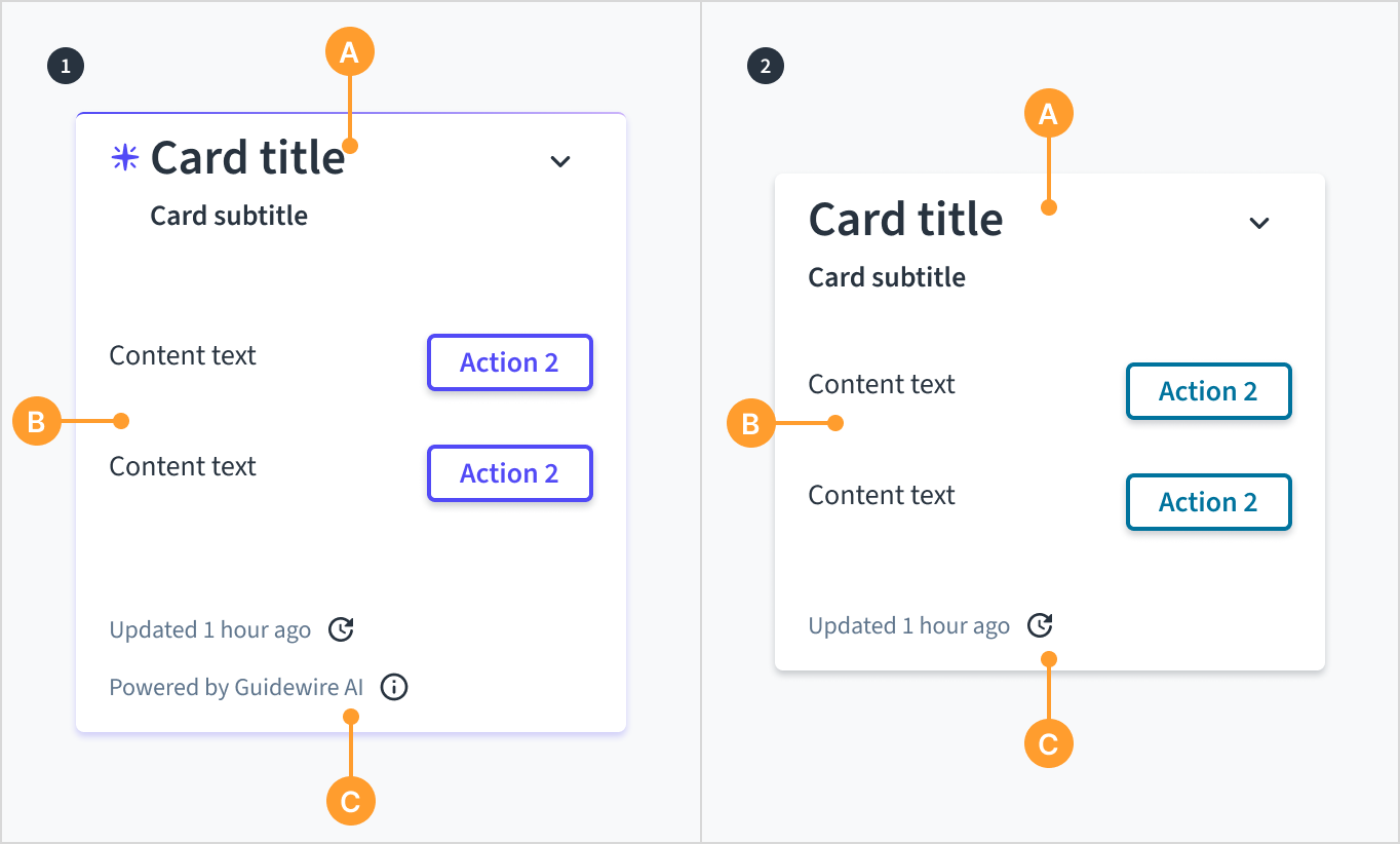
Action cards consist of the following elements:
- AI action card: header (A), content (B), and footer (C).
- Standard action card: header (A), content (B), and footer (C).
Placement
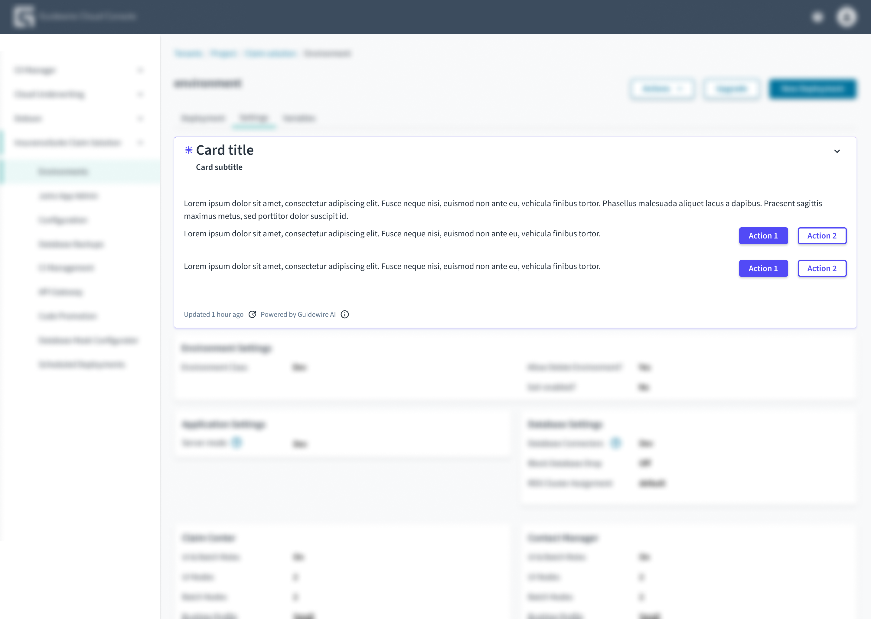
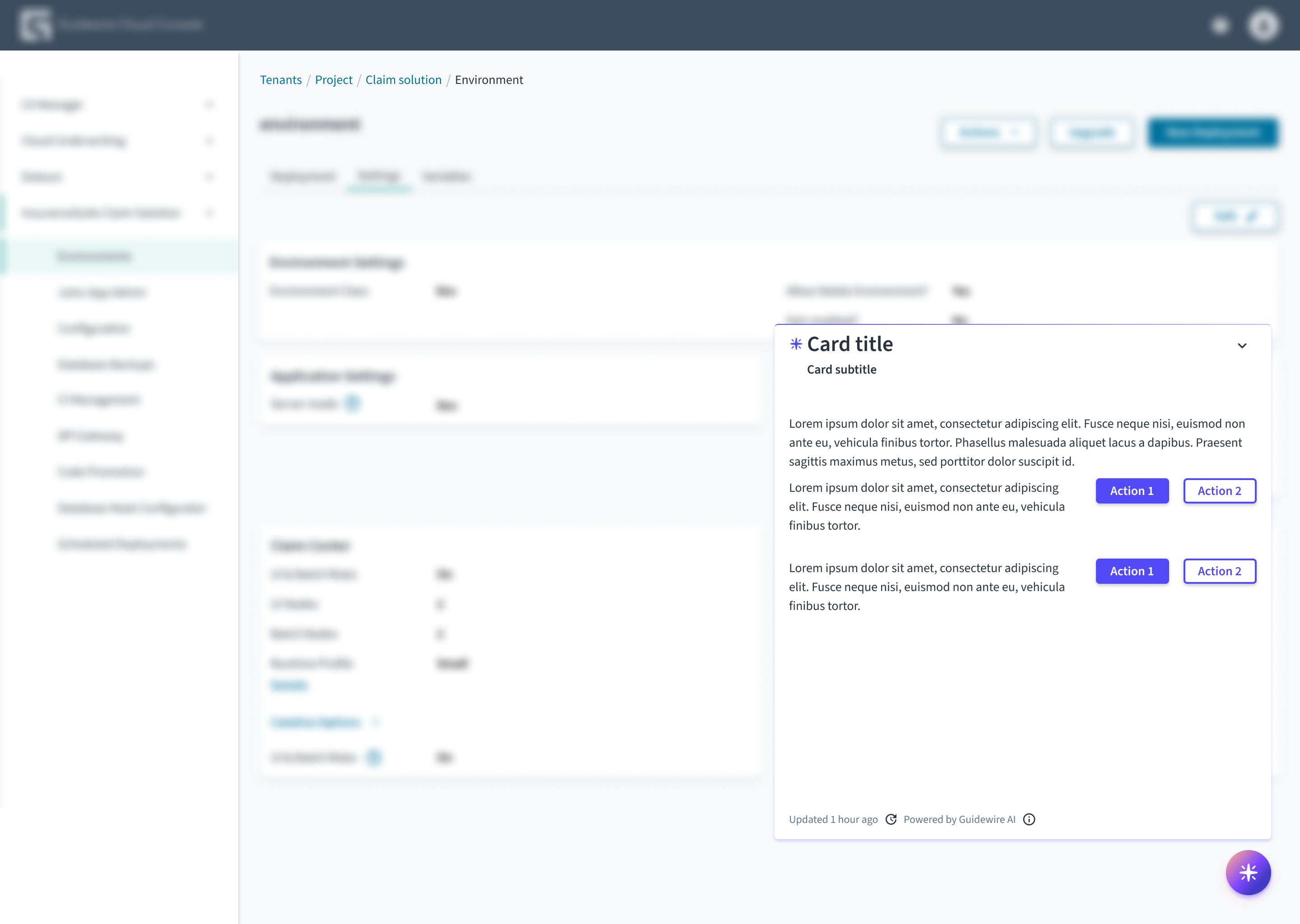
Content
General writing guidelines
- En todos los aspectos del diseño de las interfaces de productos de Guidewire, utilice mayúsculas como se usan en las oraciones. No use mayúsculas en todas las palabras.
- Use verbos en tiempo presente y voz activa en la mayoría de las situaciones.
- Use contracciones comunes para darle al texto un tono más natural e informal (pauta correspondiente al inglés).
- Use un lenguaje sencillo. Evite la jerga innecesaria y el lenguaje complejo.
- Las palabras y las oraciones deben ser breves.
Action cards follow the same content guidelines as the Jutro card component. For all rules on card-specific writing (hierarchy, emphasis, actions), see the card content guidelines.
Accessibility
The action card is a container component that structures content into a collapsible region. It includes a header for summary information and a content area that can be expanded or collapsed by the user.
This component is designed to meet WCAG 2.1 AA accessibility guidelines. The contrast ratio of textual elements against their background is above 4.5:1. Non-textual content that conveys meaning and keyboard focus indicators have a contrast ratio of at least 3:1 with their adjacent colors.
However, changes made by the content author or the specific implementation context can affect accessibility conformance.
Follow the guidance below and refer to the WAI-ARIA Authoring Practices Guide when using this component in your applications:
- Expand/Collapse labels: The component relies on specific translation keys to populate the
aria-labelattributes for the toggle buttons. The keyjutro-experimental-cards.ActionCardHeader.expandButtonprovides the label for the expand action, andjutro-experimental-cards.ActionCardHeader.collapseButtonprovides the label for the collapse action. - Structure and headings: The
ActionCardHeaderaccepts a title and subtitle. Ensure the title text clearly summarizes the content within the card so users can decide whether to expand it. - Keyboard navigation: Users must be able to navigate to the card header and toggle the expanded state using the keyboard (typically
EnterorSpace). - Truncation: The component automatically truncates long titles and displays the full text in a tooltip. Ensure that this tooltip content remains accessible using keyboard focus or hover for users who cannot see the full text immediately.