Scatter plot
Introduction
A scatter plot uses dots to display values of two or more variables for a set of data. For each dot, the value of one variable determines its position on the horizontal axis, and the value of the other variable determines its position on the vertical axis. Scatter plots are ideal for observing relationships between variables, such as clusters.
When to use
General visual analysis
In general, a scatter plot's greatest strength is its ability to show relationships between two variables, and helps users determine if one variable is a good predictor of another.
Scientific analysis
Scatter plots are effective for presenting measurements of related variables, especially when the y-axis values have dependencies on the x-axis values.
Business intelligence
Scatter plots are a good way to evaluate trends and relationships in large sets of data, such as product satisfaction scores across a customer base.
Market research
Marketing teams can use scatter plots to show the relationship between demographics such as gender, age, and occupation title in relation to consumer buying habits.
Cluster analysis
Data points can be divided into groups based on how closely sets of points cluster together. Conversely, scatter plots also show if there are any unexpected gaps in the data, or if there are any outlier points. This can be useful for segmenting data into different parts.
When not to use
Don't use scatter plots to analyze more than two variables at a time or when data points are too numerous to display clearly.
Scatter plot examples
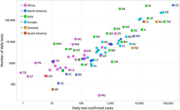
Scatter plot using a legend to identify the various data points
Recharts code
To explore how to create scatter plots using Recharts, see the following:
Scatter plot example in Recharts
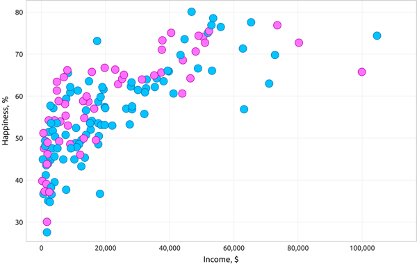
Scatter plot showing the relationship between happiness and income
Charts.js code
To explore how to create scatter plots using Chart.js, see the following:
Scatter plot example in Charts.js
Resources
Informationen zum Zugriff auf Datenvisualisierungskomponenten für Wireframing und Storyboarding finden Sie in den Datenvisualisierungsmustern auf Figma.