Line chart
Introduction
A line chart displays information as a series of data points, or markers, which are connected by straight line segments. The line chart typically uses the horizontal axis to display a continuous progression (e.g. intervals of time), and the vertical axis to display values for a metric of interest across that progression. An example would be depicting interest rates over a specific period of time.
When to use
Buying and selling decisions
A line chart's strength in displaying time series data makes it an ideal choice for analyzing and predicting future markets and opportunities.
Inventory management
Line charts can be used to plot days of supply to gain insight into inventory management performance.
Comparing historical revenue
Line charts can be used to compare historical revenue between products and/or services.
Customer satisfaction
Line charts can be used to identify customer satisfaction scores over time.
When not to use
Don't use a line chart to compare multiple categories at one point in time for a single variable. Line charts are designed to show a trend in a variable over time for one or more categories.
Line chart examples
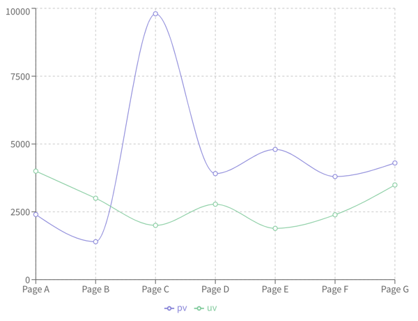
Line chart showing two different counts across a progression of pages
Recharts code
To explore how to create line charts using Recharts, see the following:
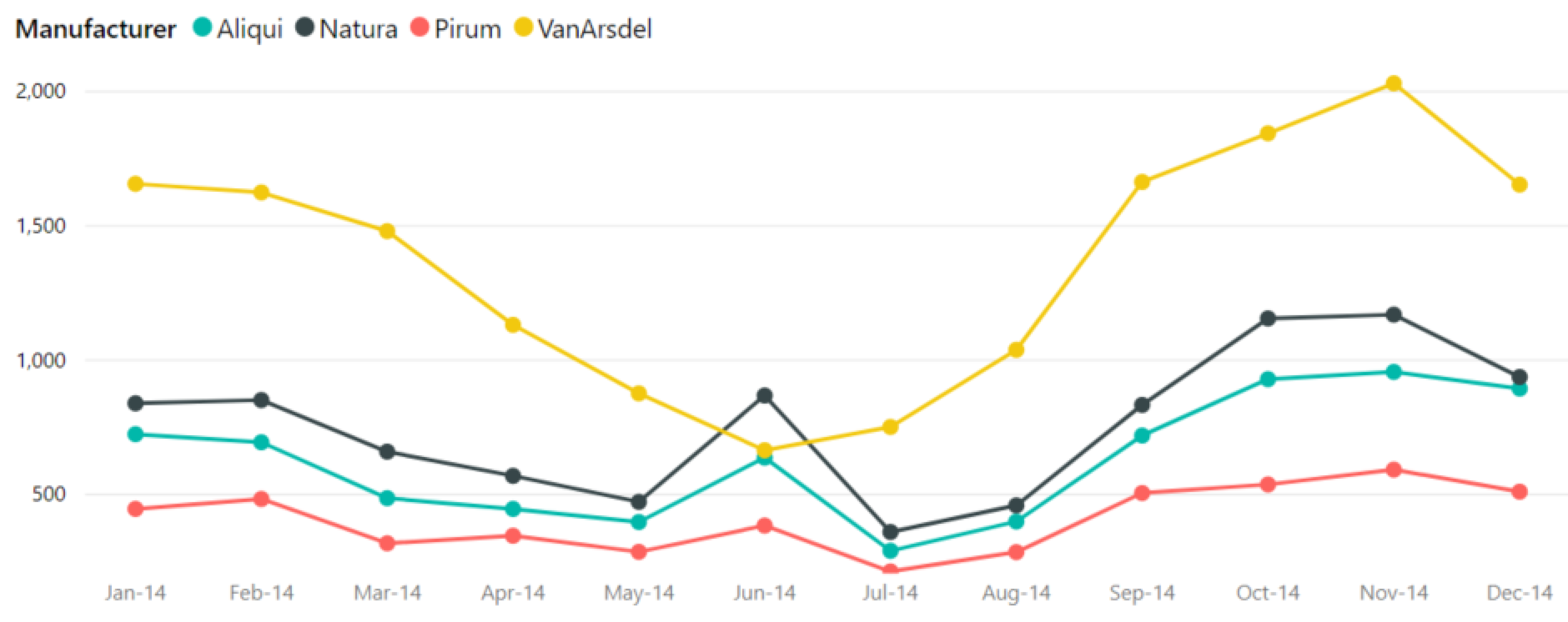
Line chart displaying total units by month by manufacturer
Charts.js code
To explore how to create line charts using Chart.js, see the following:
Line chart example in Charts.js
Resources
Informationen zum Zugriff auf Datenvisualisierungskomponenten für Wireframing und Storyboarding finden Sie in den Datenvisualisierungsmustern auf Figma.