How to design with Jutro
Whether you're new or experienced, this guide will equip you with everything you need to design with Jutro. It will walk you through each step of the Jutro UX process, ensuring you have the knowledge and guidance to leverage Jutro effectively for your design endeavors, while offering tailored recommendations at every turn.
To learn more about what Jutro is and how it works, check out this Jutro Digital Platform video overview.
Jutro UX design process
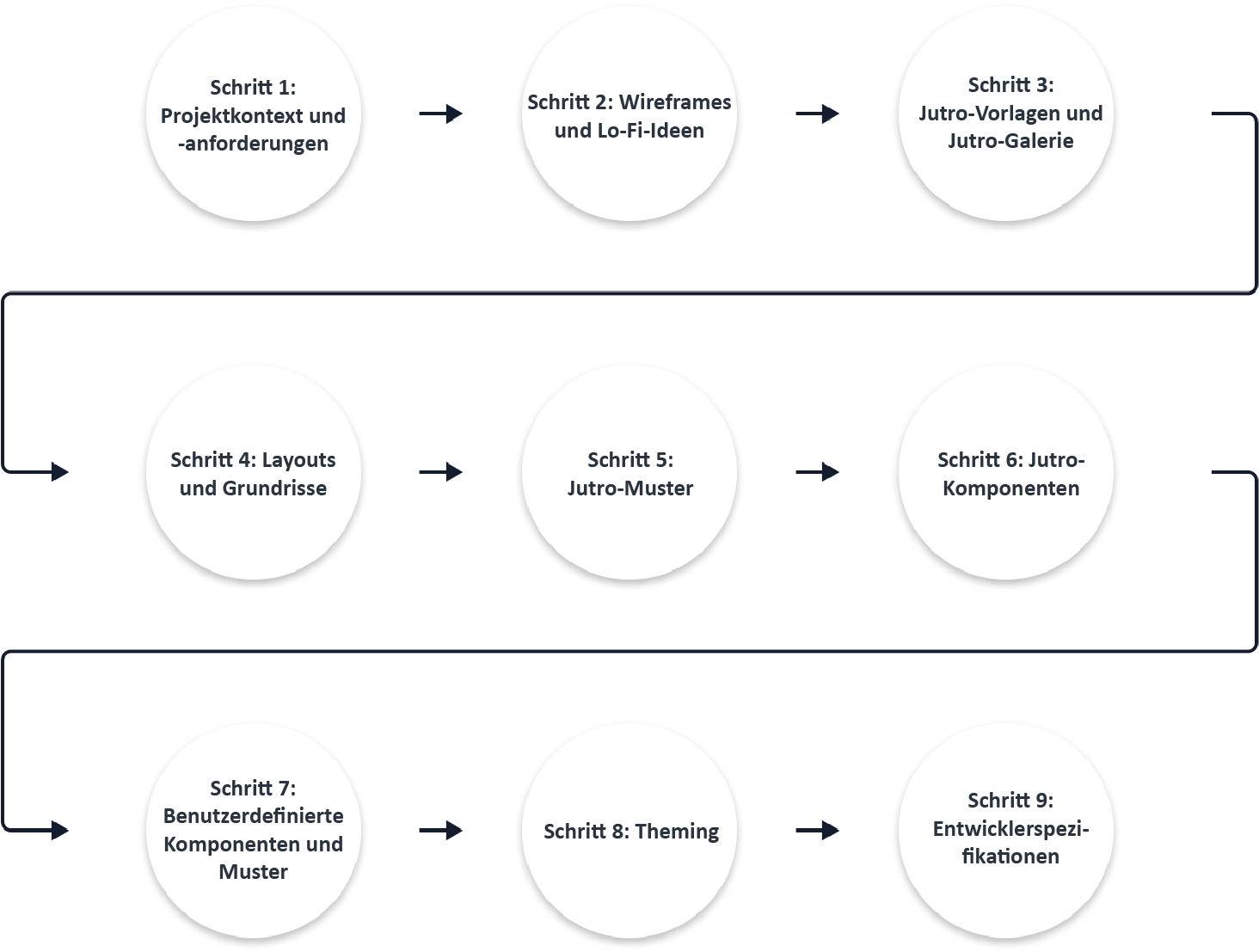
The Jutro UX design process applies to anyone who is using Jutro to design digital products. It consists of the following steps:
Step 1: Context and requirements
Before diving into the design process using Jutro, it's crucial to lay a strong foundation by understanding the project's context and requirements. This ensures alignment with business goals and user needs throughout the design process.
Identify persona

What are personas?
Personas are fictional characters that represent the different user types who might use your product, service, or site. Creating personas helps you understand your users' needs, experiences, behaviors, and goals.
How to identify personas
Ready-to-use materials, featuring user descriptions and stories showcasing how they use Guidewire products and other tools to achieve their goals, are readily available for your convenience. Leveraging these resources can expedite your work by offering valuable insights into user behavior and preferences.
What if I can't find the persona I'm looking for?
If you don't see the persona you need, please contact us at userresearch@guidewire.com.
Define use cases
What are use cases?
Use cases describe the interactions between a user (or persona) and a product to achieve a goal. They help in understanding the user's journey and the different ways your product will be used.
How to define use cases
Engaging stakeholders in the process of defining use cases and user stories ensures that the resulting scenarios accurately reflect user needs and align with the goals of the project, ultimately leading to more successful outcomes. You can leverage resources like the #ux-general-internal Slack channel to seek assistance in defining use cases.
For more information about user stories, see this article from the Interaction design foundation.
Market research
Why is market research important?
Market research helps you understand the competitive landscape, identify market needs, and uncover opportunities to distinguish your product.
How to conduct market research
- Analyze your competitors, identifying their strengths and weaknesses.
- Stay updated on industry trends that could influence user expectations and product relevance.
- Use insights gained to refine your product concept, ensuring it meets unaddressed needs or offers superior solutions.
- To ensure that insights are preserved and can effectively inform decision-making, document your findings by writing down the results. Use this Google Drive link to create a subfolder within the product folder. Title it with the name of your project, and place your research findings and artifacts in that subfolder.
Information architecture sitemap
What is information architecture (IA)?
IA involves organizing, structuring, and labeling content in an effective and sustainable way. The goal is to help users find information and complete tasks.
How to develop IA and a sitemap
- Outline all content elements and functionalities of your product.
- Organize these elements into a coherent structure, considering user flow and ease of navigation.
- Create a visual sitemap reflecting this structure, which serves as a blueprint for the development process.
Resources mentioned in step 1:
Step 2: Wireframes and lo-fi ideas
In step 2, you translate your foundational UX research into tangible, visual formats via wireframes and low-fidelity (lo-fi) prototypes. This is crucial for swiftly exploring design concepts and refining UIs with minimal initial investment. You can use these tools to gather early feedback on your design ideas, ensuring you're on the right track before delving into more detailed development.
What are wireframes?
Wireframes are simple, schematic drawings used to outline the structure of web pages, apps, or software interfaces. They serve as the backbone of your design, focusing on layout and interaction rather than on detailed aesthetics.

When to consider lo-fi designs
- Early exploration: Use lo-fi designs during the initial stages of the design process to explore a wide range of ideas quickly and efficiently.
- User feedback: Employ lo-fi prototypes to gather early feedback from stakeholders and end-users. These rough designs facilitate discussions and insights early in the design process, allowing for rapid iteration based on input.
- Usability testing: Use lo-fi prototypes for usability testing to identify usability issues and validate design assumptions. Lo-fi designs enable testers to focus on functionality and user experience without being distracted by visual details.
Benefits of creating wireframes and lo-fi ideas
- Innovation: Through the exploration of innovative ideas in wireframes and lo-fi prototypes, users are more likely to encounter novel solutions that address their needs in unexpected ways.
- Early engagement: Lo-fi designs give users the opportunity to engage with the product at an early stage, providing valuable feedback and insights that can shape the direction of the design process.
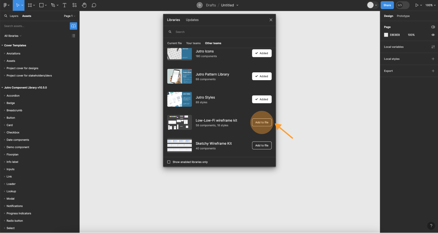
Lo-fi wireframe kit
Within the Jutro Design System libraries, you'll find the lo-fi wireframe kit, a ready-to-use kit designed specifically for creating lo-fi designs. This resource can streamline your design process, providing a convenient starting point for your projects. However, while these wireframe sets are intended to facilitate your work, it's important to remember that creativity plays a crucial role in design. Don't limit yourself to what you find in this kit; feel free to explore and innovate beyond its boundaries. Remember, you can use tools other than Figma for wireframes and lo-fi designs, such as Miro.
To access the lo-fi wireframe kit:
- Select the Assets panel in Figma's left sidebar.
- Select the Team Library icon to open the Libraries dialog.
- Select Lo-fi wireframe kit
- Click Add to file.
Resources mentioned in step 2:
Lo-fi wireframe kit
Step 3: Templates and gallery
In step 3, you begin to incorporate resources from the Jutro Design System. Whether you're initiating a project from the ground up (likely with lo-fi sketches) or refining existing features (accompanied by polished designs), this phase aims to enhance your grasp on effectively using the assets available within the Jutro Design System.
What are Jutro templates?
Templates are end-to-end customer journeys that our clients use to accelerate digital implementation. Templates take into account a variety of scenarios and interactions. For example:
- Different personas (agents and policyholders)
- Lines of business (personal auto, commercial auto, homeowners, commercial property)
- Transactions (quote and buy, renewal, policy change)
This means that there is a large spectrum of templates to start from depending on the desired experience. For examples of Jutro templates, see the Jutro templates documentation.
What is the Jutro gallery?
The Jutro gallery is a place to find design inspiration. It also showcases how you can use tokens to theme designs and meet specific branding requirements.
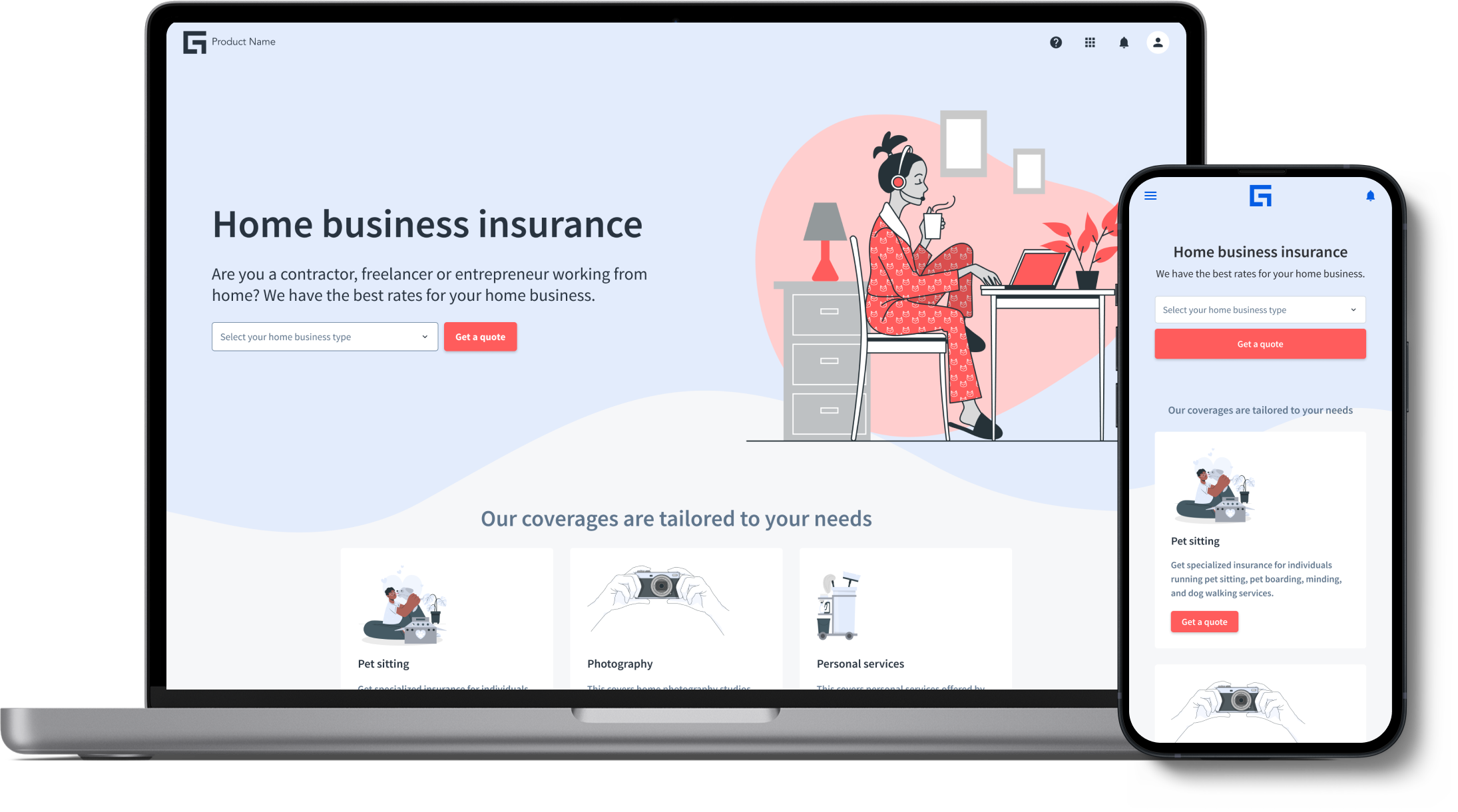
To explore examples of Jutro design work and see tokens in action, check out the the Jutro gallery.
What's the difference between templates and the gallery?
The Jutro gallery includes "samples" of applied themes. This is different from our out-of-the-box templates, which consist of end-to-end user flows.
Resources mentioned in step 3:
Step 4: Floorplans
In step 4, we introduce floorplans and how to use them.
What are floorplans?
Floorplans serve as the core structure for all pages, comprising a header, left panel, right panel, and footer. You have the option to choose from four distinct types of floorplans:
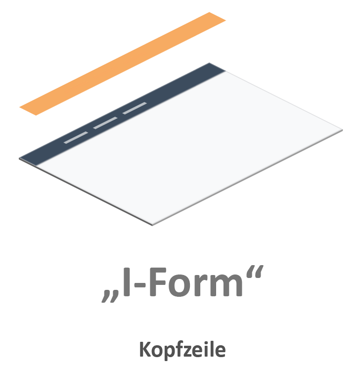
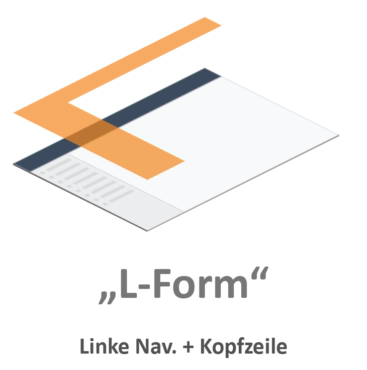
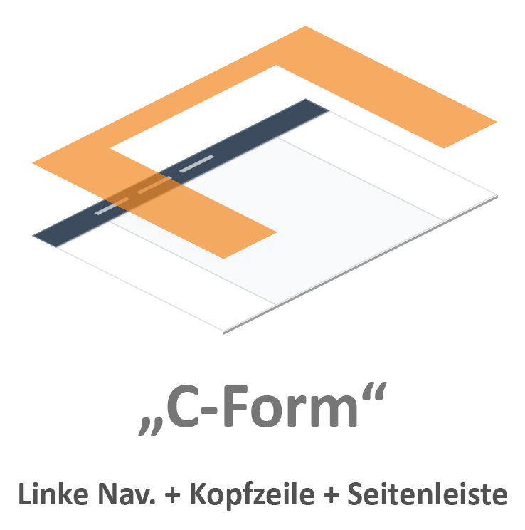
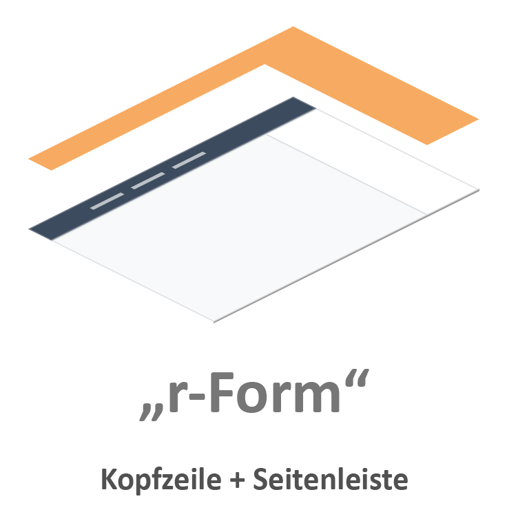
For more information about floorplans and layouts, see the floorplans and layouts overview page.
Resources mentioned in step 4:
Step 5: Patterns
In step 5, we explain what Jutro patterns are and how you can use them to save time and effort in creating effective designs.
What are Jutro patterns?
Jutro patterns are best practice solutions to recurring design problems (flows, behaviors, or interactions) within the same product, product families, or distinct products. The following examples illustrate both P&C-focused and agnostic patterns.
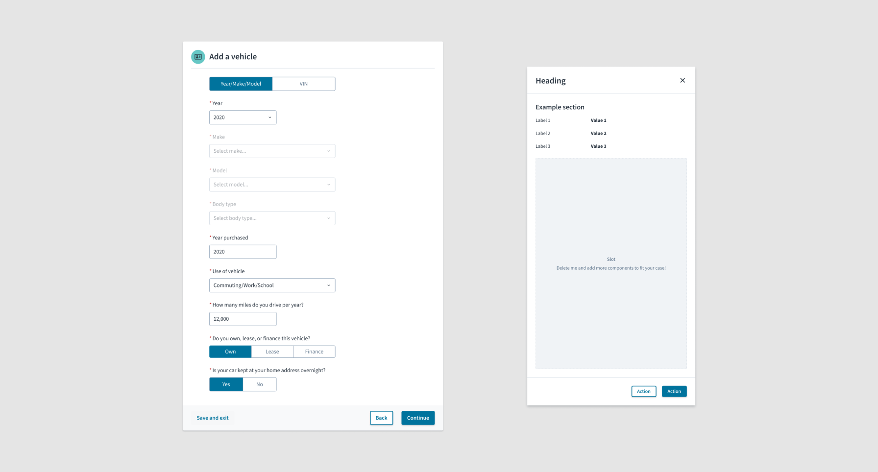
For more information on Jutro patterns, see the patterns overview page.
How to use Jutro patterns
To use Jutro patterns, begin by exploring lo-fi ideas and determine which patterns might work for your use case. You can find all the available patterns at the following resources:
- Jutro pattern library in Figma (designs of Jutro patterns)
- Jutro pattern documentation (descriptions, visual examples, and guidelines)
- Jutro playground (implementations of Jutro patterns)
What if no pattern suits my use case?
After familiarizing yourself with Jutro patterns, if you notice that there isn't a pattern for your specific need, you can either make your own custom design (we'll talk about this more in step 6), or you can help contribute to Jutro patterns by adding your designs in our library.
What if a pattern doesn't have everything that I need?
It's all right if a pattern doesn't have every single thing you need. Jutro patterns are designed to tackle the most common situations for each pattern. Because Jutro patterns are open, both in Figma and in code, they serve as a good starting point. They show you how to build things according to Jutro recommendations and save you time by not having to start from scratch. Additionally, Jutro patterns are designed with accessibility and responsiveness in mind, ensuring you're covered on those fronts.
How to request a feature or file a bug for Jutro patterns
If you want to request a feature but don't have time to contribute to Jutro patterns, you can go to the new product & enhancements ideas AHA page and use the "Jutro/UX pattern" category.
To file a bug, use the request help from Jutro page.
Resources mentioned in step 5:
- Jutro pattern library in Figma
- Jutro pattern documentation
- Jutro playground
- Pattern contribution for designers
- New product & enhancements ideas AHA page
- Request help from Jutro page
Step 6: Components
Have you identified all the Jutro patterns that might work for your basic design but still need more detailed elements?
In step 6, we show you how to use Jutro components for creating a user interface.
What are Jutro components?
Components are the basic building blocks of the Jutro Design System. Each component is designed and implemented to address a specific interaction or UI need. All components follow the guidelines and requirements of the Jutro Design System, which promotes a consistent look and feel across Guidewire apps and ensures that product teams adhere to best practices.
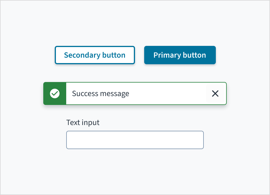
For more information about Jutro components, see the components overview page.
How to use Jutro components
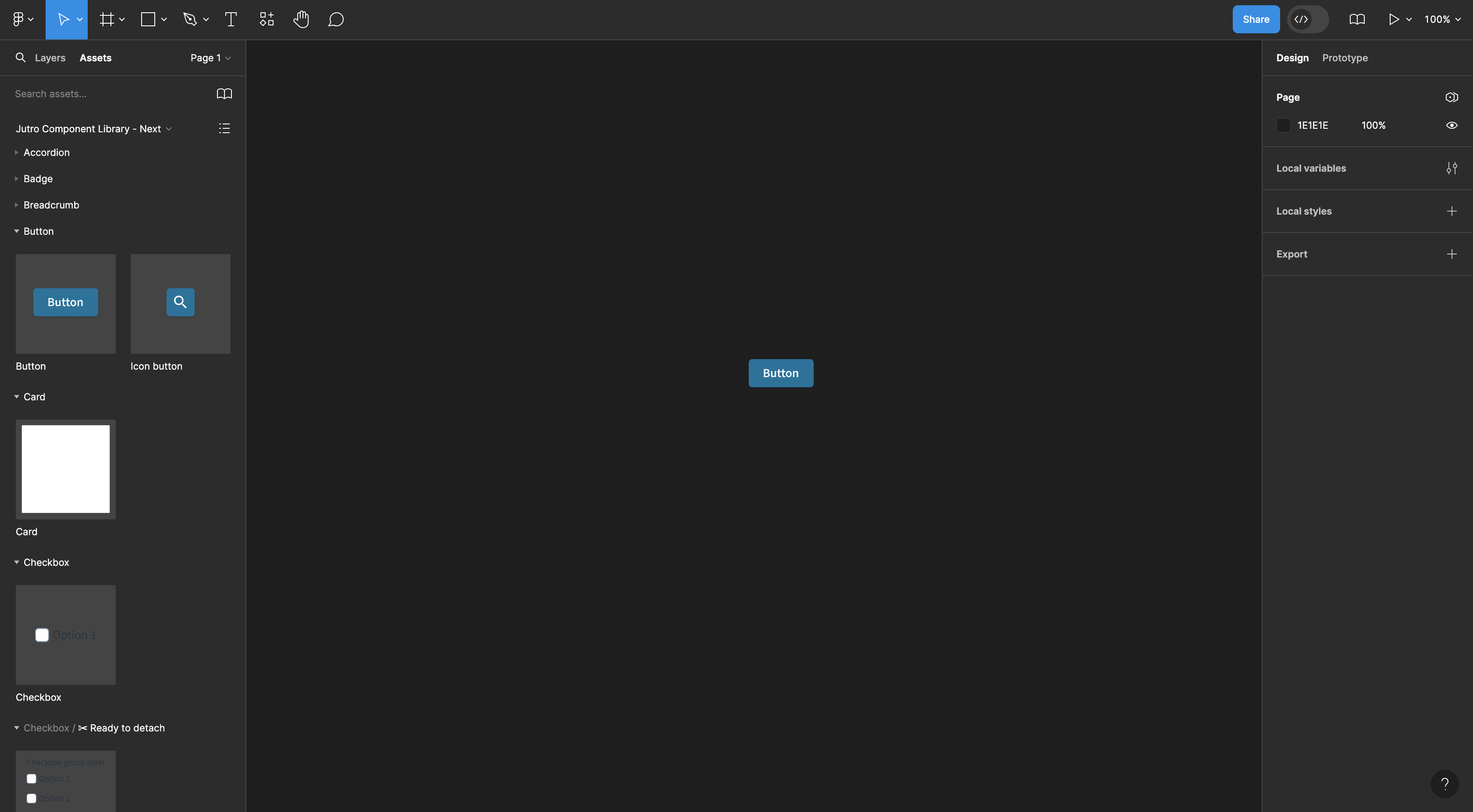
To use Jutro components, enable the Jutro component library in Figma:
- Select the Assets panel in Figma's left sidebar.
- Select the Team Library icon to open the Libraries dialog.
- Select Jutro Component Library - Next.
- Click Add to file.
You can now use the assets panel to drag and drop components.
Jutro component docs and Storybook
For guidance on when to use and when not to use particular components, as well as guidelines on usage, behavior, styling, accessibility, and variations of UI elements, refer to Jutro component documentation.
Additionally, if you want to understand how components function in code, check out Jutro Storybook.
Guidelines for using components from the new library in your designs
When integrating new components into your designs, consider the following guidelines:
- Existing designs don't require updates to the new library.
- If reusing old designs, ensure that any copied elements are updated with components from the new library.
- If you're working on a new feature for an existing product designed with components from the old library, use components from the new library to design the new feature.
- For new projects, use components from the new library to maintain consistency and maximize benefits.
What if no component suits my use case?
If there isn't a Jutro component that suits your specific interaction or UI need, you have two choices. You can either create your own custom design (we'll discuss this further in step 7), or you can request a feature to be added in future versions of the Jutro Design System.
To request a feature, go to the new product & enhancements ideas AHA page and use the "Jutro/DS Component" category.
Component updates and feedback
If you encounter a notification indicating that a new component is available, remember to update your library. This ensures that you have access to the latest features, improvements, and bug fixes, enhancing the quality and functionality of your designs.
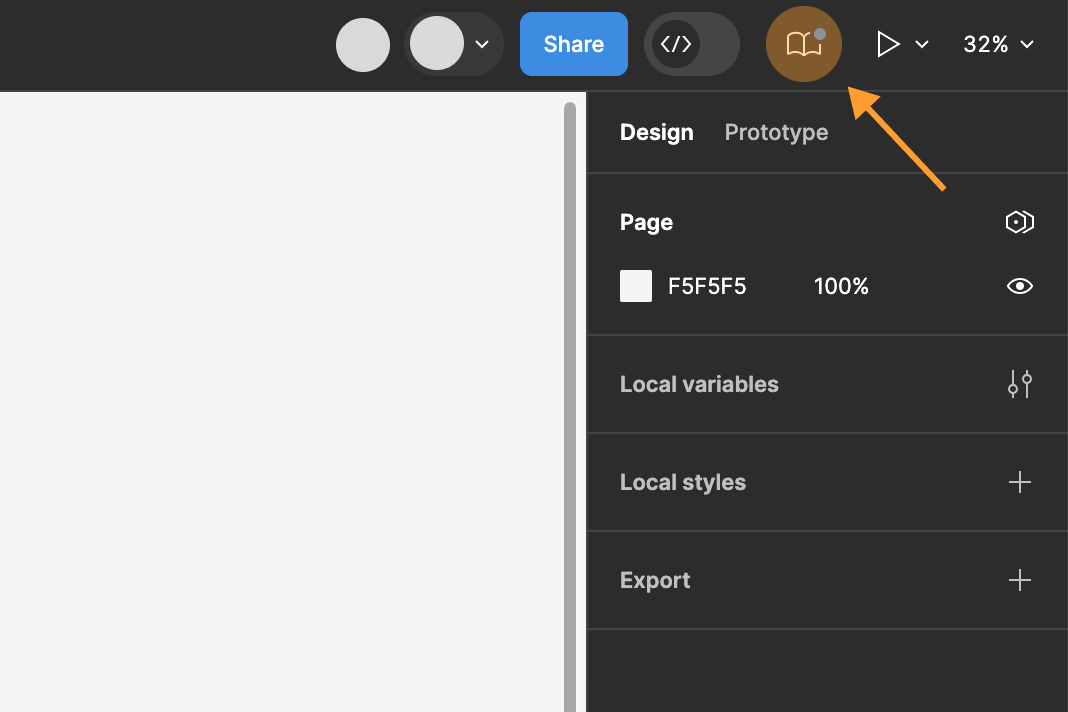
Additionally, if you encounter any bugs or issues with components, please notify the Jutro team. While we continuously work on refining and expanding our component library, your feedback is invaluable in identifying and addressing any potential issues. Your input helps us ensure that our components meet the highest standards of quality and usability.
You can file a bug using the request help from Jutro page.
Resources mentioned in step 6:
- Jutro component documentation
- Jutro Component Library in Figma
- Jutro Storybook
- New product & enhancements ideas AHA page
- Request help from Jutro
Step 7: Custom designs
By now, you should have identified which patterns and components suit your use case.
In step 7, we show you how to create a custom solution when Jutro is missing features or functionality that you need.
What do we mean by custom?
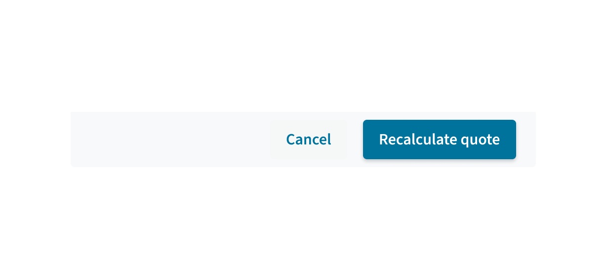
Every project or product we develop at Guidewire has its own special qualities and features. We don't want to restrict teams by insisting that they only use Jutro components and patterns. Custom designs are made specifically for your product. You should create them whenever the Jutro Design System doesn't meet all your needs.
The following image illustrates an example of a custom design. It's constructed using Jutro components, but different teams might have varying numbers of buttons within it.
Considerations for creating custom designs
When making something custom, keep in mind that you need to address accessibility, interactions (like focus and disabled states for components), internationalization, and responsiveness. Additionally, you and your team will need to maintain and update the custom components or patterns in the future.
Step 8: Theming (optional)
Jutro components are themed by default with the Guidewire Enterprise theme used for internal apps. However, designers working with Digital or Professional Services will need to create new themes to match the branding requirements of customers or create themes for the Jutro gallery.
In step 8, we cover those use cases when creating a theme is essential and how to theme using design tokens.
What are design tokens
Design tokens consist of a name and a value that reflect a single design decision in a format that can be used in a design tool and in code. The value of design tokens is that when a value is changed in the design tool and synchronized, the visual change is reflected in the web app without additional development effort. You can find more details on the design tokens overview page.
How do designers work with design tokens?
Theme authors (designers who create or edit themes) need to install the Tokens Studio for Figma plugin and connect to a shared Git repository created for their project. This is where the starting sets of design tokens are added. Using the plugin along with tokenized components, layouts, and other assets, a theme author is able to clone an existing theme and systematically change token values as needed to match a customer design or a new design. Changes are pushed to the shared repository so they can be transformed into CSS variables used to reflect the theme in code. More details on this process will soon be added to the Jutro documentation site.
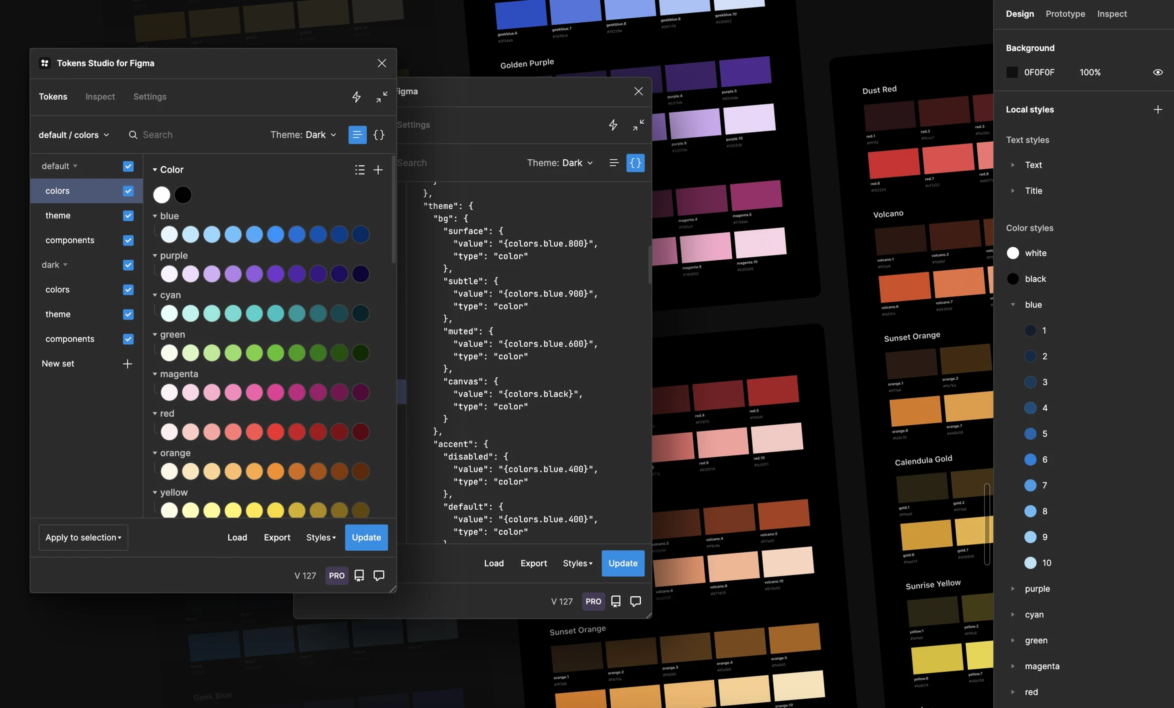 Tokens Studio for Figma is the tool we use to leverage design tokens in Jutro.
Design tokens have been assigned to components in Figma and in code, so they are already in place for theming. Be aware that if you are assigning tokens in Figma, with a few narrow exceptions, you are creating a custom component that will require a coordinated development effort to create in code.
How do I create design tokens?
Unless you are an experienced theme author or design token architect, you don't. Jutro Design System tokens have already been created and assigned to components in both Figma and in code. They are the source of truth for design decisions regarding styles and layout for the Jutro Design System and themes based on the system. Only experienced theme authors or design token architects should create, rename, delete, or modify design tokens and their values, and only within the guidelines established by the Jutro design and development teams.
What if I need to switch to an existing theme?
To switch to an existing theme, install the Tokens Studio for Figma plugin and connect to an existing shared Git repository containing the desired theme. The plugin enables switching between existing themes for a selection, a page, or the entire document. More details will soon be added to the Jutro documentation site.
How do developers use design tokens?
Developers do not use design tokens directly. Instead, they use the CSS variables transformed from design tokens—using the transformation command leveraging the Styles Dictionary instance in the Jutro project—which are mapped to the CSS variables assigned in the React components. For developer details, see Design tokens to CSS variables transformation.
Resources mentioned in step 8:
Step 9: Developer specifications
While this is the final step, we hope that you've collaborated with engineers throughout the design process.
In step 9, we talk about what to remember when making dev specifications.
Don't design every single page
Look for pages that are representative of others and design those first. Often, a representative page will provide sufficient guidance for other pages, especially if only the content differs. Have a discussion with your development team about what is needed and what may be unnecessary repetition.
Use Auto Layout
Even if you initially didn't use Auto Layout, implement it for the developer handoff. For many years, developers had to layout using hacks because there was no alternative. Modern CSS has robust layout methods that prior developers only dreamed of, including Flexbox, which in Figma is called Auto Layout.
Name your layers with purpose
"Frame 7133" doesn't convey intent. "Card content container" does. Rename your layers for clarity and purpose. Your teammates will thank you, especially your development team.
Help your developers find what's ready
Establish a process with your developers whether you use the "ready for dev" feature in Figma or not. Just as a designer can easily become lost in a page of unfamiliar code, so can a developer looking for development-ready designs in a Figma document. Remove clutter and make it clear.
Connect with us
Every week we have Jutro UX team meetings. You can add a topic to the agenda using the design system service hours Confluence page.
Have questions that weren't answered here? Contact the Jutro UX Design team in the #ask-jutro-design Slack channel.
If you need feedback on your work, you can add a topic on the EMEA UX Clinic or AMERICAs UX Clinic Confluence page.