Histogram
Introduction
A histogram is similar to a bar chart, but whereas a bar chart's primary variable is categorical, a histogram's primary variable is continuous and numeric. The bars in a histogram are displayed right next to each other to emphasize continuity, while a bar chart includes space in between its bars to emphasize categorical groupings.
The visual nature of histograms facilitates the identification of patterns and trends in data. Analysts can identify high points, low points, or imbalances, which helps recognize patterns and differences in the distribution of the data.
When to use
Analyzing data distribution
Histograms are a common tool for analyzing the distribution of data to determine whether it's skewed or normal. They can also help identify outliers, or gaps in the data.
Comparing datasets
Histograms can be used to compare the frequency distribution of two data sets, such as the number of sales to different age groups.
When not to use
Don't use a histogram to visualize discrete data. Histograms represent the distribution of continuous data. Discrete data consists of distinct, separate values (item counts), while histograms imply continuity. Use bar charts instead for comparing categories and discrete values.
Historgram examples
Histogram comparing values over a specific time period
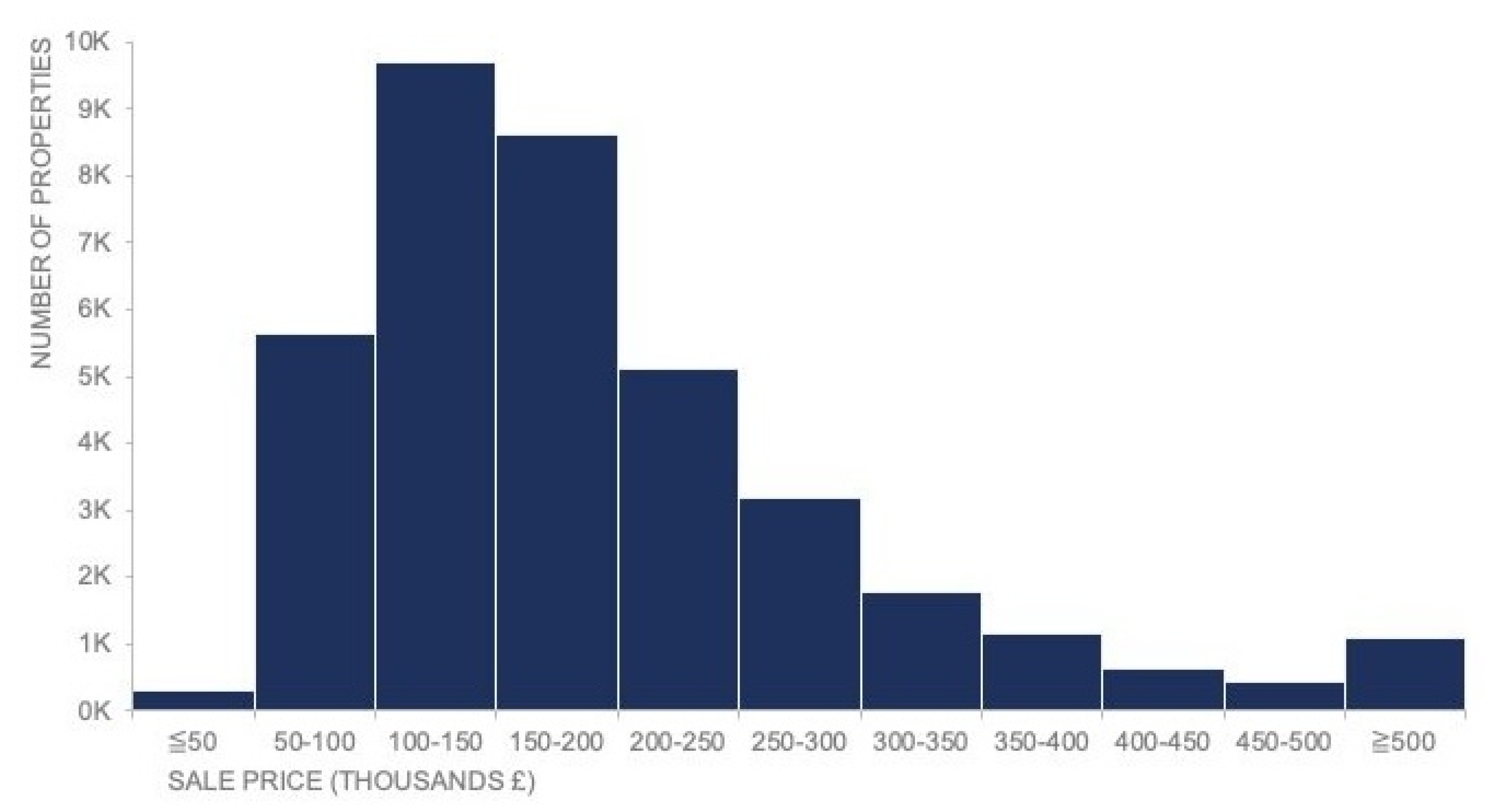
Recharts code
To explore how to create histograms using Recharts, see the following:
Histogram example in React Google Charts
Histogram showing frequency across a range of ages
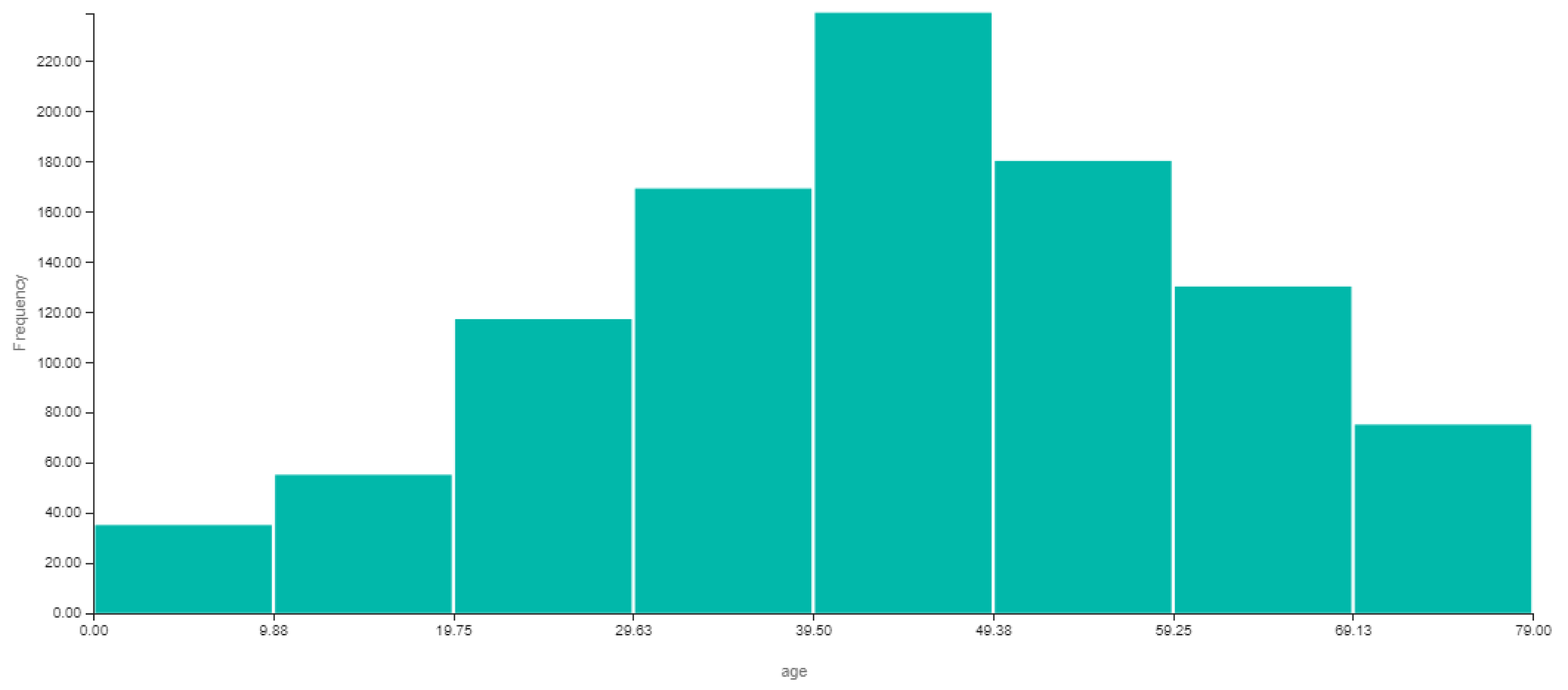
Charts.js code
To explore how to create bar charts using Chart.js, see the following:
Resources
Informationen zum Zugriff auf Datenvisualisierungskomponenten für Wireframing und Storyboarding finden Sie in den Datenvisualisierungsmustern auf Figma.