Heat map
Introduction
A heat map is a graphical representation of data that utilizes color-coded systems. Heat maps depict values for a main variable of interest (across two axis variables) as a grid of colored squares. The x- and y-axis variables are divided into ranges, and each cell's color indicates the value of the main variable in the corresponding cell range. Heat maps are useful for visualizing variance across multiple variables to display patterns in correlations.
When to use
Patterns and trends
Heat maps are useful when you want to quickly spot correlations, patterns, or anomalies in your data.
Comparing data across categories
Heat maps are ideal for comparing categories, such as sales figures across different regions and time periods.
Performance highs and lows
Heat maps facilitate quick identification of peaks and valleys in data, such as high customer engagement areas on a website, or business regions with high sales performance.
Visualizing large datasets
When working with large amounts of data, a heat map can condense the information into more digestible formats, allowing for faster insights at a glance.
Real-time data monitoring
In environments where performance monitoring is critical, such as network operations and financial trading, heat maps provide real-time visual feedback on the status of key metrics.
Geospatial analysis
Heat maps are useful for visualizing geographical data such as mapping customer locations, sales regions, or environmental data. Heat maps help identify regional patterns so users can make informed decisions based on geographic trends.
When not to use
Don't use heat maps to separate and show multiple variables, such as likelihood and impact. Heat maps can't effectively show separate dimensions like a high-impact, low-probability event versus a low-impact, high-probability event.
Heat map examples
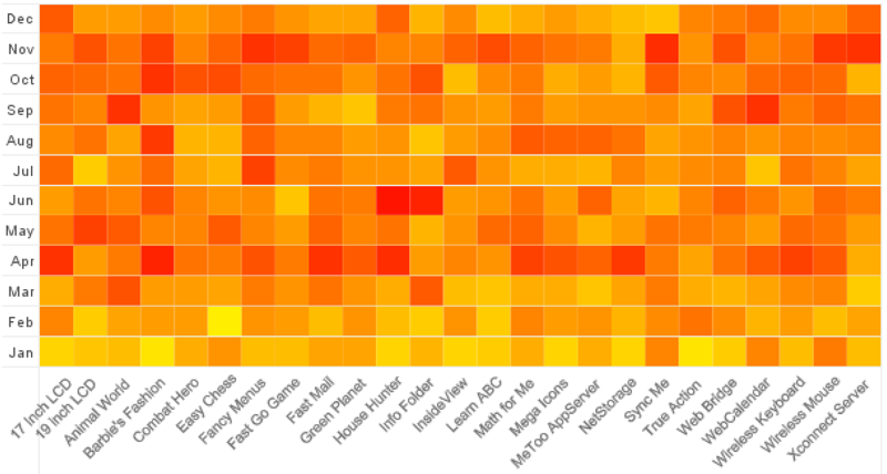
Heat map showing product adoption across a 12-month period
Recharts code
To explore how to create heat maps using Recharts, see the following:
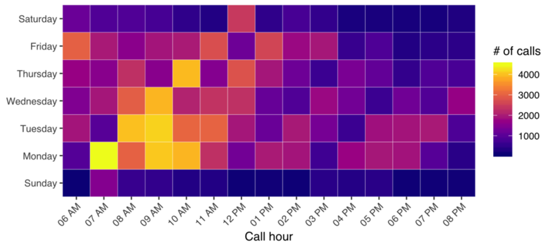
Heat map displaying call volume intensity across a 14-hour period for each day of the week
Charts.js code
To explore how to create heat maps using Chart.js, see the following:
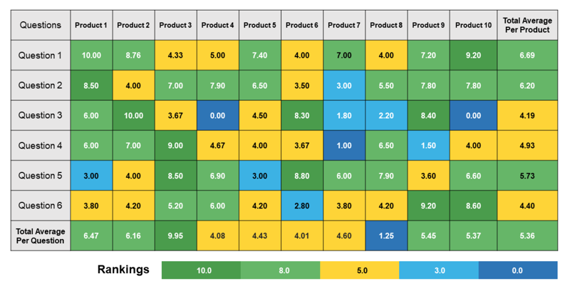
Heat map with cell labels for visualizing product question volume
Resources
Informationen zum Zugriff auf Datenvisualisierungskomponenten für Wireframing und Storyboarding finden Sie in den Datenvisualisierungsmustern auf Figma.