Note: Es gibt veraltete Versionen dieser Komponente. Wechseln Sie zu einer Version, die älter als 10.0.x ist, um die entsprechende Dokumentation anzuzeigen.
Im Abschnitt Verwendung finden Sie Informationen darüber, wie und wann Sie MultipleCombobox verwenden können. Auf den speziellen Registerkarten finden Sie Einzelheiten zu den von der Komponente bereitgestellten Funktionen.
Der Hook useFilteredOptions wird verwendet, um den Filtermechanismus basierend auf Benutzereingaben zu implementieren. Aus Gründen der Übersichtlichkeit und Einfachheit ist er jedoch in einigen Beispielen nicht enthalten. Genauere Informationen zu dem Hook finden Sie hier.
Note: Die meisten Funktionen und Eigenschaften der vier verfügbaren Dropdown-Komponenten unterscheiden sich bei der Verwendung nicht. Einige Beispiele aus anderen Komponenten können auch für MultipleCombobox relevant sein.
Sie können jede der Dropdown-Komponenten vollständig deaktivieren, indem Sie die Eigenschaft disabled auf true setzen. Mit der Eigenschaft disabled der Komponenten SelectOption und ComboboxOption können Sie auch nur die speziellen Optionen deaktivieren. Wenn die gesamte Komponente deaktiviert ist, hat die Eigenschaft disabled der Optionen keine Auswirkungen.
Dieses Verhalten ist bei allen Dropdown-Komponenten gleich: Wenn die value-Eigenschaft festgelegt ist, kann der Benutzer die Komponente nicht direkt ändern. Stattdessen wird sie vollständig über die Implementierung durch Entwickler verwaltet.
Dieses Beispiel gilt für alle Dropdown-Komponenten:
exportfunctionMultiComboControlled(){ const[updatedValue, setNewValue]=useState([]); constonChange=(e, newValue)=>{ setNewValue(newValue); }; const options =[ <ComboboxOption value={{ id:'1', label:'Option 1', }} />, <ComboboxOption value={{ id:'2', label:'Option 2', }} />, <ComboboxOption value={{ id:'3', label:'Option 3', }} />, <ComboboxOption value={{ id:'4', label:'Option 4', }} />, <ComboboxOption value={{ id:'5', label:'Option 5', }} />, ]; return( <div> <MultipleCombobox label="Choose values" secondaryLabel="This value will be passed to the list of options below" onChange={onChange}> {options} </MultipleCombobox> <br/> <MultipleCombobox label="Changes with the above" value={updatedValue}> {options} </MultipleCombobox> </div> ); }
Mit der Eigenschaft ref und den imperativen Handlern („focus“, „blur“ und „scrollIntoView“) ist es möglich, verschiedene native Aktionen auszuführen. Ein Beispiel ist, die Komponente zu fokussieren.
Dies ist ein Beispiel unter Verwendung der Komponente MultipleCombobox:
In den Dropdown-Komponenten lässt sich der Validierungsprozess nicht durchführen, aber Sie können den Fehlerstatus und die anzuzeigenden Meldungen über die Eigenschaft stateMessages bearbeiten.
Die Logik der Statusmeldungen gilt für alle Dropdown-Komponenten. Nachfolgend ein Beispiel für MultipleSelect:
Der Hook useFilteredOptions bietet eine grundlegende Datenverarbeitung für die Filterung.
importReact,{ useState }from'react'; import{IntlMessageShape}from'@jutro/prop-types'; import{ useTranslator }from'@jutro/locale'; type SelectValue={ id: string; label:IntlMessageShape; [index:PropertyKey]: unknown; }; /** * @typedef {Object} FilterHookReturnObject * @property {TValue[]} filteredOptions - array of filtered options * @property {function} onSearch - function that takes the onSearch input event * and filters the options based on it * @property {function} resetFilter - used to reset the filtering for options, * after using filteredOptions array resets to initial one * @property {function} onAddNew - function that adds new value to the internal * options array inside the hook and calls appendToSelection that is responsible * for selecting this new value inside the dropdown */ /** * Helper hook for filtering options based on user input. * * @param {TValue[]} initialOptions - initial list of options in component * @param {function} createNewValue - function for constructing value object * from string * @param {function} appendToSelection - callback that is responsible for * appending value to the controlled list of selected values * * @returns {FilterHookReturnObject} - helpers for filtering purposes: * filtered options array, onAddNew and onSearch function to be supplied * to component and resetFilter function */ exportconst useFilteredOptions =<TValueextendsSelectValue=SelectValue>( initialOptions:TValue[], createNewValue?:(value: string)=>TValue, appendToSelection?:(value:TValue)=>void ):{ filteredOptions:TValue[]; onSearch:(event:React.ChangeEvent<HTMLInputElement>) => void; resetFilter: () => void; onAddNew: (newValue: string) => void; } => { const translator =useTranslator(); const[query, setQuery]=useState(''); const[options, setOptions]=useState(initialOptions); // Basic filtering. This part should be changed to cover your needs. const filteredOptions = options.filter(val=> translator(val.label) .trim() .toLowerCase() .includes(query.trim().toLowerCase()) ); // Function that should be passed to the Combobox onSearch prop. // It gets the value of the search term inside Combobox. const onSearch =(event:React.ChangeEvent<HTMLInputElement>) => { setQuery(event.target.value); }; // Function that is responsible for clearing the query // only when the Combobox is on active browser tab. // Typically connected to Combobox onBlur. const resetFilter = () => { if(document.visibilityState==='visible'&&document.hasFocus()){ setQuery(''); } }; // Function responsible on adding new values to both // internal state of filtered items and external // controlled state value const onAddNew = (newValue: string) => { const valueTransformed = createNewValue?.(newValue); setQuery(''); if(valueTransformed){ // adds the value to the internal state setOptions(prevOptions=>[...prevOptions, valueTransformed]); // adds the value to the controlled state appendToSelection?.(valueTransformed); } }; return { filteredOptions, onSearch, resetFilter, onAddNew }; };
Beispiel-Implementierung mit asynchronen API-Aufrufen
Asynchrone API-Aufrufe werden nicht innerhalb des Basis-Hooks useFilteredOptions verarbeitet. Zu diesem Zweck müssen Sie möglicherweise eine eigene Implementierung erstellen, die auf Ihre speziellen Anforderungen zugeschnitten ist. Dies ist ein Beispiel für einen benutzerdefinierten Hook für die Komponente MultipleCombobox:
importReact,{ useEffect, useState }from'react'; import{ComboboxOption,MultipleCombobox}from'@jutro/components'; import{ useTranslator }from'@jutro/locale'; import{IntlMessageShape}from'@jutro/prop-types'; type SelectValue={ id: string; label:IntlMessageShape; [index:PropertyKey]: unknown; }; constsomeAPICallback=asyncquery=>{ console.log('calling the API'); constCHARACTERS=[ {id:'1',label:'Anakin Skywalker'}, {id:'2',label:'Luke Skywalker'}, {id:'3',label:'Master Yoda'}, {id:'4',label:'Han Solo'}, ]; const result =newPromise(resolve=>{ setTimeout( ()=> resolve( CHARACTERS.filter(val=> val.label .trim() .toLowerCase() .includes(query.trim().toLowerCase()) ) ), 3000 ); }); return result; }; const useFilteredOptions =<TValueextendsSelectValue=SelectValue>():{ filteredOptions:TValue[]; onSearch:(event:React.ChangeEvent<HTMLInputElement>) => void; resetFilter: () => void; loading: boolean; } => { const[query, setQuery]=useState(''); const[filteredOptions, setFilteredOptions]=useState([]); const[loading, setLoading]=useState(true); useEffect(()=>{ setLoading(true); // This is a simple example only, the API callback should be debounced // to ensure the async operation does not overlap with the query change. someAPICallback(query).then((opts:TValue[])=>{ setFilteredOptions(opts); setLoading(false); }); },[query]); // Function that should be passed to the Combobox onSearch prop. // It gets the value of the search term inside Combobox. const onSearch =(event:React.ChangeEvent<HTMLInputElement>) => { setQuery(event.target.value); }; // Function that is responsible for clearing the query // only when the Combobox is on active browser tab. // Typically connected to Combobox onBlur. const resetFilter = () => { if(document.visibilityState==='visible'&&document.hasFocus()){ setQuery(''); } }; return { filteredOptions, onSearch, resetFilter, loading }; }; export const Welcome: React.FC = () => { const translator =useTranslator(); const{ filteredOptions, onSearch, resetFilter, loading }= useFilteredOptions(); return( <MultipleCombobox label="Select options" secondaryLabel="Options filtered by user input" onSearch={onSearch} onBlur={resetFilter} > {loading ?( <span>{translator('Loading...')}</span> ):( filteredOptions.map(({ id, label })=>( <ComboboxOptionkey={id}value={{ id, label }}/> )) )} </MultipleCombobox> ); };
The MultipleCombobox component's default behavior is to collapse option tags when they cannot fit in a single line. The component expands to a multiline view when you click on the tag containing aggregated options. This behavior is controlled by the tagsAlwaysExpanded property, and by default it's set to false.
To enable clearing the input with a single click on the icon button, set the clearable property to true. The button appears when at least one option is selected, or any text is typed. It allows the user to unselect the selected options and delete the typed text at once.
Note: Es gibt veraltete Versionen dieser Komponente. Wechseln Sie zu einer Version, die älter als 10.0.x ist, um die entsprechende Dokumentation anzuzeigen.
Mit der Dropdown-Komponente wird Benutzern eine Reihe von Optionen angezeigt, aus denen sie auswählen können. Dropdown-Menüs zeigen die Optionen nach und nach an und verhindern, dass Benutzer zu viele Informationen auf einmal sehen. Sie können auch zum Gruppieren von Informationen verwendet werden. Dropdown-Menüs werden immer durch eine Feldbeschriftung oder einen Titel unterstützt, der/die sich vor dem Steuerelement befindet.
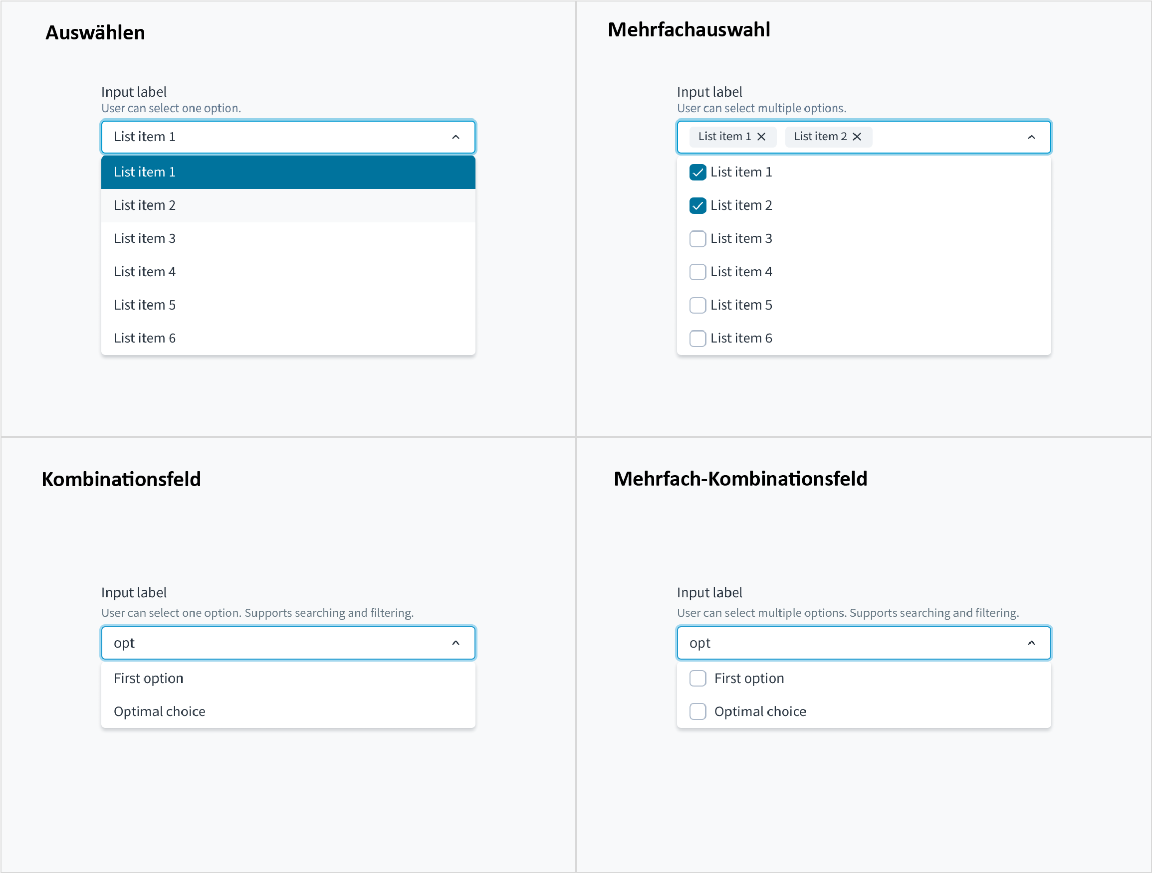
Diese Komponente gibt es in vier Varianten: Auswahl, Mehrfachauswahl, Kombinationsfeld und Mehrfach-Kombinationsfeld.
Mit der Variante Mehrfach-Kombinationsfeld der Dropdown-Komponente können Benutzer längere Listen so filtern, dass nur die Auswahlmöglichkeiten angezeigt werden, die einer Suchanfrage entsprechen. Der Benutzer kann mehrere Optionen in der Liste auswählen.
Wenn die Auswahlliste für ein Kombinationsfeld nicht komplex genug ist, können Sie die Dropdown-Variante Mehrfachauswahl verwenden.
Es gibt eine kleine Anzahl von Optionen (5 oder weniger), aus denen Benutzer wählen können. Verwenden Sie Kontrollkästchen für Mehrfachauswahlelemente.
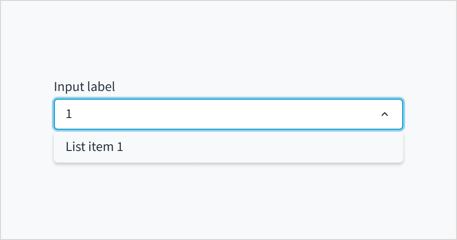
Aufbau der Dropdown-Komponente, Variante Mehrfach-Kombinationsfeld.
Beschriftung: Beschreibt den Zweck des Eingabefeldes.
Hilfetext (optional): Liefert zusätzlichen Kontext oder hilft dem Benutzer bei der richtigen Auswahl.
Dropdown-Eingabe: Zeigt die vom Benutzer ausgewählten Optionen an. Benutzer können in das Eingabefeld schreiben, um eine Option zu finden, die ihrer Abfrage entspricht.
Dropdown-Menü: Zeigt eine Liste mit Optionen zur Auswahl an.
Jutro unterstützt Dropdown-Menüs mit Eingabefeldern mit Autovervollständigung. Benutzer können manuell Text eingeben, um die Dropdown-Elemente zu filtern. Diese Funktion ist hilfreich, um Benutzern die Auswahl aus einer langen Liste zu erleichtern.
Dropdown-Menüs mit aktivierter Autovervollständigung machen Vorschläge, wenn Benutzer mit der Eingabe beginnen. Die Auswahl wird basierend auf den Zeichen angezeigt, die der Benutzer eingegeben hat. Je mehr Zeichen der Benutzer in das Feld eingibt, desto detaillierter wird die Liste.
Wenn Sie das Dropdown-Menü zum Sortieren verwenden, sollten Sie die Optionen in der richtigen Reihenfolge anordnen. Zum Beispiel:
Von der häufigsten zu der am wenigsten häufigen Option
Von der einfachsten zur komplexesten Option
Von der am wenigsten riskanten zur riskantesten Option
Die erste Option wird oben in der Liste angezeigt.
Ordnen Sie die Liste der Optionen nicht alphabetisch an, es sei denn, dies ist für Ihren Anwendungsfall sinnvoll. Bei Listen von Ländern und anderen Problemen mit bekannten Elementen ist es oft in Ordnung, sie alphabetisch zu ordnen. Sie müssen jedoch sicher sein, dass die Benutzer den Namen ihrer Auswahl eindeutig kennen.
Positionieren Sie die Dropdown-Beschriftung außerhalb des Feldes, sodass sie immer sichtbar ist. Auf ein Dropdown-Menü ohne Beschriftung kann nicht zugegriffen werden.
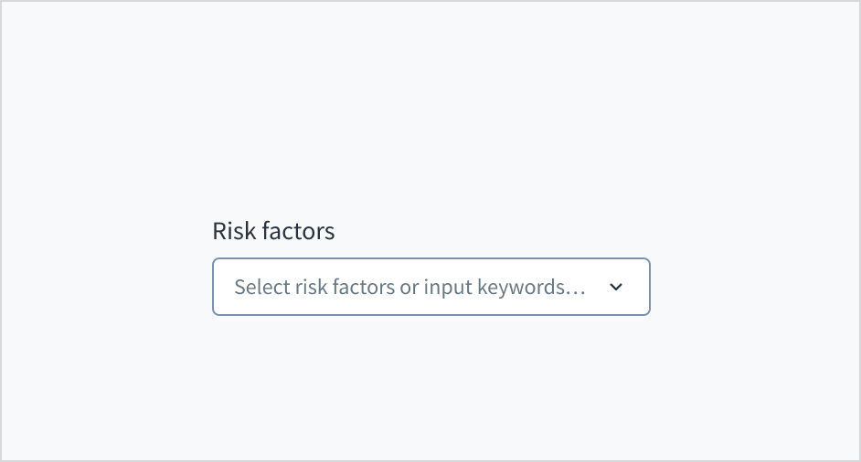
Ersetzen Sie Feldbeschriftungen nicht durch Platzhaltertext im Feld. Das schadet der Gebrauchstauglichkeit und hat viele negative Folgen.
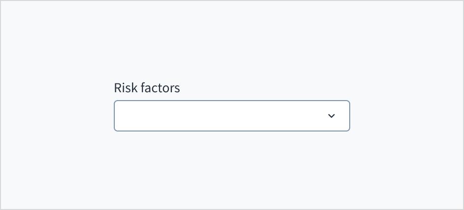
Positionieren Sie eine dauerhafte Beschriftung außerhalb des Feldes.
Verwenden Sie keinen Platzhaltertext als Ersatz für die Beschriftung.
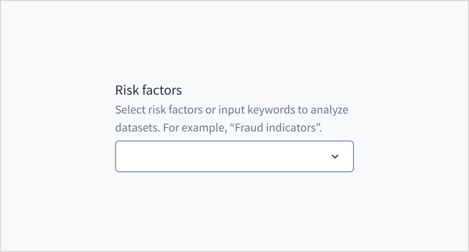
Fügen Sie Hilfetext hinzu, wenn er aussagekräftig ist
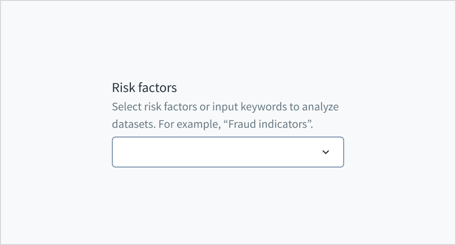
Verwenden Sie Hilfetext, um Kontext bereitzustellen und zu vermitteln, was ausgewählt oder wie eine Option ausgewählt werden soll. Hier sind einige Beispiele dafür, was Sie in den Hilfetext aufnehmen könnten:
Eine allgemeine Beschreibung der Dropdown-Optionen
Hinweise, die dem Benutzer bei der richtigen Auswahl helfen
Mehr Kontext dazu, warum ein Benutzer eine Auswahl treffen muss
Verwenden Sie Hilfetext nur für relevante Informationen. Vermeiden Sie die Verwendung von Hilfetext, der einfach nur die gleichen Informationen wiedergibt, die in der Beschriftung erscheinen.
Verwenden Sie für Hilfetext die übliche Groß- und Kleinschreibung. Schreiben Sie 1 bis 2 kurze, vollständige Sätze, die mit einem Punkt enden.
Verwenden Sie Hilfetext, um Informationen zum Kontext zu geben.
Verwenden Sie den Hilfetext nicht, um einfach dieselben Informationen wiederzugeben, die auch in der Beschriftung erscheinen.
Fügen Sie keinen Platzhaltertext in das Texteingabefeld ein. Platzhaltertext belastet das Kurzzeitgedächtnis der Benutzer, da es nach der Eingabe eines Wertes verschwindet. Auch für Benutzer mit vermindertem Sehvermögen und kognitiven Beeinträchtigungen stellt er eine zusätzliche Belastung dar.
Platzieren Sie Hinweise und Anweisungen stattdessen außerhalb des Felds.
Für das Eingabefeld des Mehrfach-Kombinationsfelds gelten die Inhaltsrichtlinien für Textfelder.
Platzieren Sie Hinweise und Anweisungen außerhalb des Felds.
Fügen Sie keine Platzhalter in Texteingabefelder ein.
Verwenden von Fehlertext zur Anleitung der Benutzer
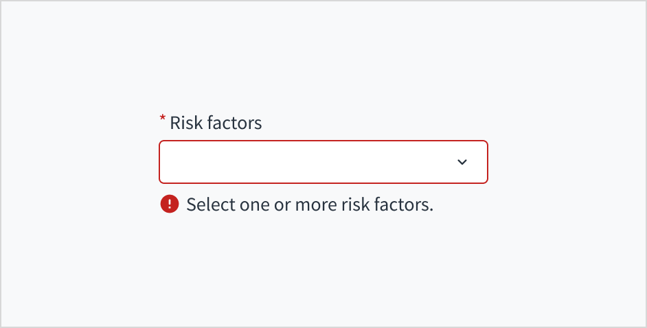
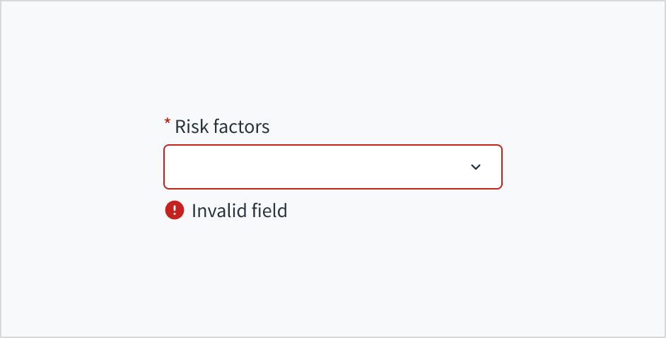
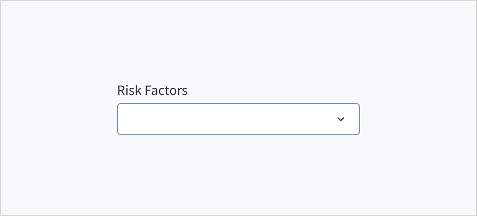
Der Text der Fehlermeldung erklärt dem Benutzer, wie er den Fehler beheben kann. Im Falle des Dropdown-Menüs hängen Fehler oft mit etwas zusammen, das für die Inline-Validierung korrigiert werden muss. Wenn beispielsweise kein Risikofaktor ausgewählt ist und dieses Feld ein Pflichtfeld ist, können Sie den Benutzer mithilfe von Fehlertext zu einer Lösung führen: „Wählen Sie einen oder mehrere Risikofaktoren aus.“
Verwenden Sie für Fehlertext die übliche Groß- und Kleinschreibung. Schreiben Sie 1 bis 2 kurze, vollständige Sätze, die mit einem Punkt enden.
Verwenden Sie Fehlermeldungstexte, um den Benutzer zu führen und ihm eine Lösung zu zeigen.
Schreiben Sie keine zweideutigen Fehlermeldungen und lassen Sie die Benutzer nicht im Unklaren darüber, wie ein Problem zu lösen ist.
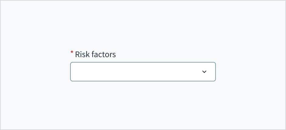
Markieren Sie erforderliche Felder mit einem Sternchen (*). Das Sternchen steht vor der Feldbeschriftung. Benutzer können so leicht herausfinden, welche Felder erforderlich sind, indem sie nur das Zeichen ganz links in der Beschriftung scannen.
Zusätzlich zur Markierung erforderlicher Felder mit einem Sternchen wird empfohlen, klare Anweisungen am oberen Rand des Formulars einzufügen, z. B. „Alle mit einem Sternchen gekennzeichneten Felder sind Pflichtfelder“, um sicherzustellen, dass die Benutzer die Bedeutung des Sternchens verstehen.
Verwenden Sie ein Sternchen, um anzuzeigen, dass ein Feld ein Pflichtfeld ist.
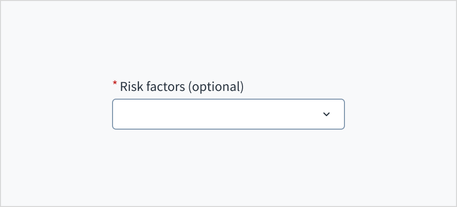
Verwenden Sie kein Sternchen, um etwas zu kennzeichnen, das optional ist.
Schreiben Sie das erste Wort und Substantive groß.
Für Feldbeschriftungen und Menüoptionen wird die übliche Groß- und Kleinschreibung verwendet.
Weitere Informationen zum Implementieren der Groß- und Kleinschreibung finden Sie im UI-Textstyleguide.
Verwenden Sie die übliche Groß- und Kleinschreibung.
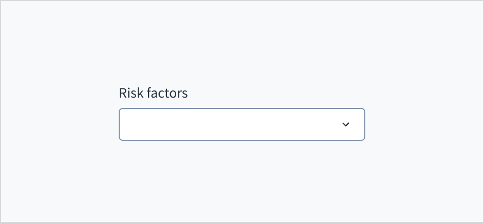
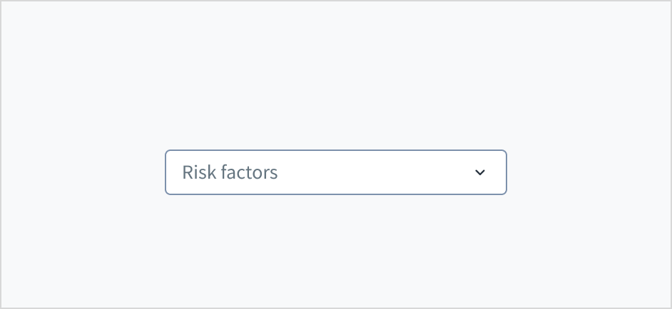
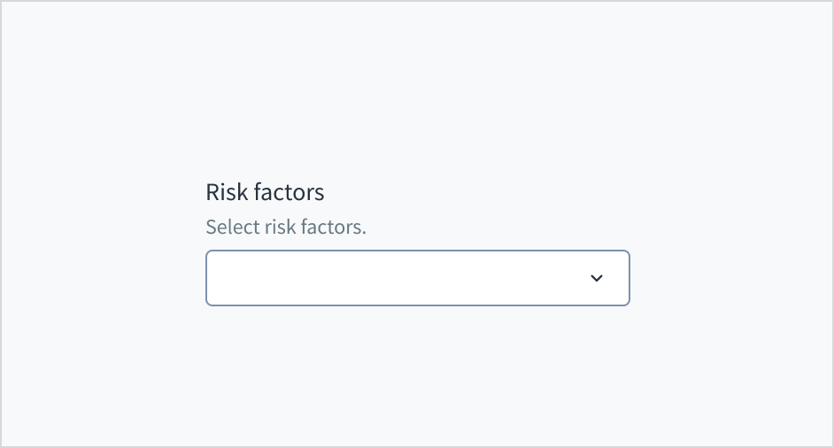
Die Variante Mehrfach-Kombinationsfeld wird ohne Wert (Standard), Platzhaltertext und vorausgefüllte Eingabe angezeigt.
Visualisiert
Zustand
Beschreibung
Kein Wert (Standard)
Zeigt dem Benutzer an, dass kein Wert ausgewählt wurde und kein Platzhalter vorhanden ist.
Platzhalter
Zeigt dem Benutzer an, dass kein Wert ausgewählt wurde. Der Platzhalter ist ausgegraut.
Vorausgefüllte Eingabe
Zeigt dem Benutzer an, dass die Eingabe mit Daten vorausgefüllt ist.
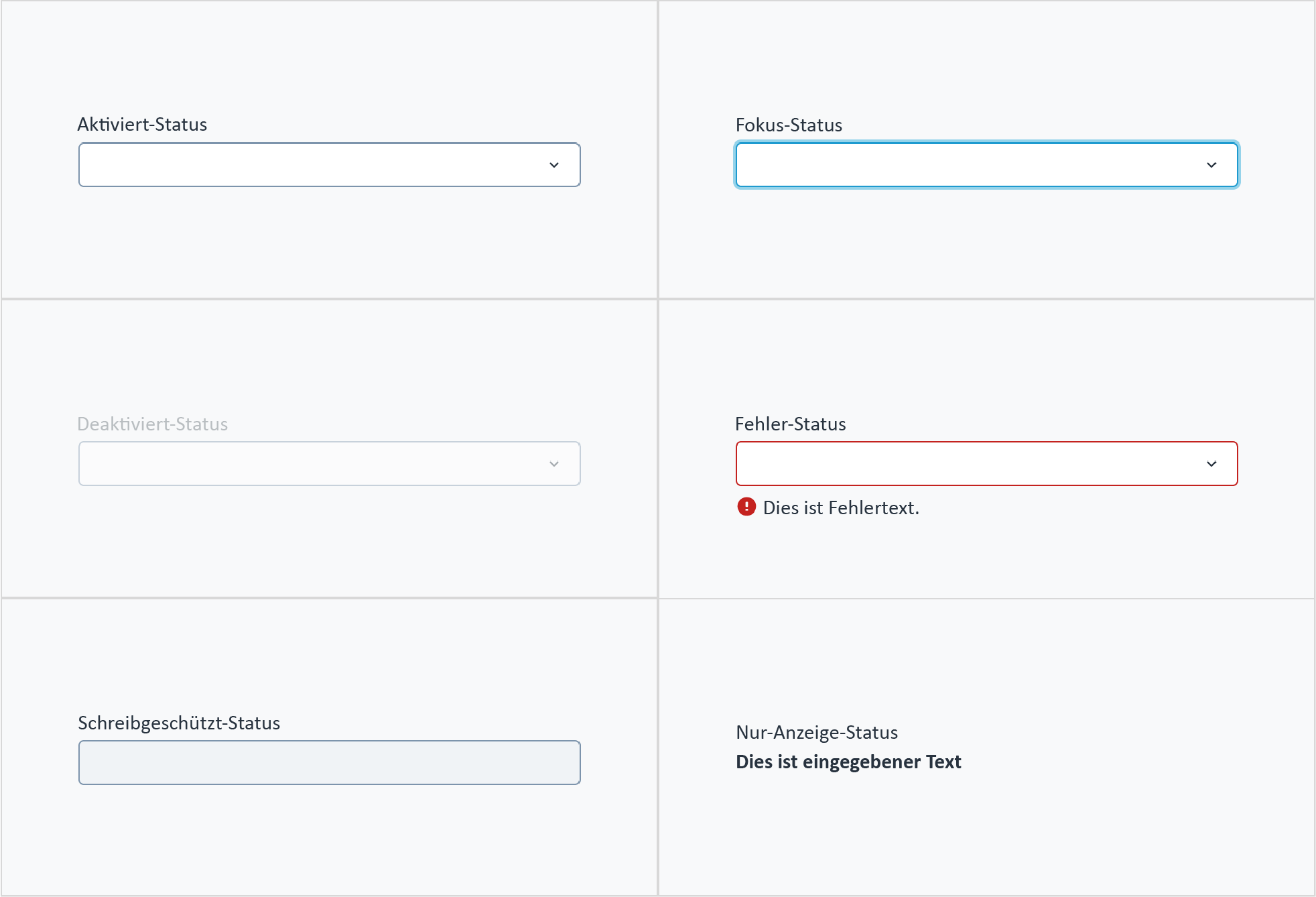
Das Mehrfach-Kombinationsfeld verfügt auch über interaktive Zustände für Aktiviert, Fokussiert, Deaktiviert, Fehler, Schreibgeschützt und Nur Anzeige.
Zustand
Beschreibung
Aktiviert
Zeigt dem Benutzer an, dass das Element für die Interaktion aktiviert ist.
Fokussiert
Zeigt dem Benutzer an, auf welchem UI-Element im System der Fokus liegt.
Deaktiviert
Zeigt dem Benutzer an, dass der Eingabewert aufgrund lokaler Faktoren nicht geändert werden kann. Zum Beispiel muss ein Kontrollkästchen über dem Eingabefeld aktiviert sein, um auf dieses Eingabefeld zuzugreifen. Der Benutzer kann durch Interaktion mit der Seite eine Aktion zur Aktivierung durchführen.
Fehler
Zeigt an, dass der Benutzer einen Fehler bei der Validierung gemacht hat. Der Fehlertext gibt dem Benutzer eine korrigierende Rückmeldung.
Schreibgeschützt
Zeigt dem Benutzer an, dass der Eingabewert aufgrund externer Faktoren nicht geändert werden kann. Zum Beispiel fehlender Schreibzugriff. Der Benutzer kann Maßnahmen zur Aktivierung ergreifen, indem er sich z. B. an einen Administrator wendet.
Nur Anzeige
Der Zustand „Nur Anzeige“ wird in zwei Fällen verwendet:
Ein UI-Element wird im Anzeigemodus verwendet.
Ein UI-Element wird im Bearbeitungsmodus angezeigt, ist aber nie bearbeitbar.
Dieser Zustand wurde zuvor als „Schreibgeschützt“ bezeichnet.
Die folgende Abbildung veranschaulicht die interaktiven Zustände des Mehrfach-Kombinationsfelds.
Das Dropdown-Menü wird mit der Leertaste aus- und eingeklappt. Die Benutzer navigieren mithilfe die Pfeiltasten durch die Optionen und wählen mit der Leertaste oder der Eingabetaste eine Option aus.
Die aria-labelledby stellt eine programmgesteuerte Verknüpfung zwischen dem Eingabefeld und dessen Beschriftung her. Das WAI-ARIA-Attribut aria-autocomplete='list' gibt an, dass eine Liste von Optionen angezeigt wird, aus der der Benutzer auswählen kann, das Bearbeitungsfeld jedoch fokussiert bleibt. Wenn in Storybook die Option „required“ ausgewählt wird, werden die Attribute „required“ und „aria-required="true"“ zum Eingabefeld hinzugefügt.
Das Kontrastverhältnis von Textelementen zu ihrem Hintergrund liegt über 4,5:1 gemäß den Anforderungen der WCAG 2.1 AA. Nicht-textuelle Inhalte, die eine Bedeutung vermitteln müssen (z. B. Symbole und Sichtbarkeit des Tastaturfokus), weisen ein Kontrastverhältnis von mindestens 3:1 zu den angrenzenden Farben auf. Alle Inhalte sind bis einschließlich 400 % sichtbar und funktionsfähig, ohne dass ein Scrollen in zwei Dimensionen erforderlich ist.
Diese Komponente wurde validiert, um die Zugänglichkeitsrichtlinien WCAG 2.1 AA zu erfüllen. Vom Autor des Inhalts vorgenommene Änderungen können sich jedoch auf die Konformität mit der Barrierefreiheit auswirken.
Bei Verwendung dieser Komponente in Ihren Anwendungen:
Erleichtern Sie den Benutzern das Verständnis der Inhalte und verwenden Sie keine zu langen Bezeichnungen für Optionen.
Verwenden Sie in Ihren Dropdown-Komponenten keine implizit fokussierbaren Elemente wie Schaltflächen, Kontrollkästchen und Links und keine implizit semantischen Inhalte wie Überschriften.
Note: Es gibt veraltete Versionen dieser Komponente. Wechseln Sie zu einer Version, die älter als 10.0.x ist, um die entsprechende Dokumentation anzuzeigen.
Vergewissern Sie sich, dass Sie die API-Oberfläche der Design System-Komponenten und die damit verbundenen Auswirkungen und Kompromisse verstehen. Erfahren Sie mehr in unserer Einführung zur Komponenten-API.
Warning: An die Komponente MultipleSelect können keine anderen untergeordneten Optionen als SelectOption übergeben werden. Auch wenn dies funktionieren kann, kann es zu unerwartetem Verhalten führen oder durch in künftigen Versionen eingeführte Änderungen beeinträchtigt werden.
If set to true, adds an icon button that appears when at least one option is selected, or any text is typed. It allows the user to unselect all selected options and delete the typed text at once.
If set to true, the tags are displayed permanently in expanded view. This overrides the default behavior where excess tags collapse into a tag containing aggregated options.
Value of the component, in the form of an array of currently selected options. Takes precedence over initialValue. If this prop is passed, component works in controlled mode and its value will change only if this prop changes.
Der Hook useFilteredOptions enthält die Mechanismen zur Verarbeitung der Optionen, die basierend auf Benutzereingaben angezeigt werden.
Übergebene Parameter:
initialOptions: TValue[]. Initialliste der Optionen in der Komponente ohne angewendete Filter
Ausgabe:
Ein Objekt mit Folgendem:
filteredOptions: TValue[]. Array mit den Optionen, die sich aus der Anwendung eines Filters ergeben
onSearch: function. Funktion, die das Eingabeereignis onSearch verwendet und die Optionen entsprechend filtert. Kann dem Ereignis onSearch der Komponente zugewiesen werden.
resetFilter: function. Wird verwendet, um die Filterung der Optionen zurückzusetzen. Dabei wird das filteredOptions-Array auf seinen Initialwert gesetzt.
Wenn die Tags der ausgewählten Optionen den Komponentenbereich überschreiten, werden einige in einem einzelnen Tag zusammengeführt, das die Anzahl der nicht angezeigten ausgewählten Optionen angibt. Durch Klicken auf dieses Tag wird die Komponente vertikal erweitert, sodass alle Tags der ausgewählten Optionen angezeigt werden. Nachdem die Options-Tags erweitert wurden, können sie nicht mehr reduziert werden.
Um dieses Verhalten zu überschreiben und alle Options-Tags dauerhaft in einer erweiterten Ansicht anzuzeigen, legen Sie die Eigenschaft tagsAlwaysExpanded auf true fest. Zum Vergleich der beiden Verhalten siehe diese Beispiele.
Alle Dropdown-bezogenen Komponenten definieren die Liste der verfügbaren Optionen über die Eigenschaft children des Typs ReactNode. Sie können nur die folgenden Unterkomponenten als untergeordnete Komponenten verwenden:
SelectOption verwendet bei Select und MultipleSelect
ComboboxOption verwendet bei Combobox und MultipleCombobox
Warning:
SelectOption und ComboboxOption dürfen nur im Kontext ihrer jeweiligen „übergeordneten“ Komponente verwendet werden. Auch wenn sie für sich allein funktionieren, wird diese Funktion nicht unterstützt.
Bei den Komponenten Select und MultipleSelect ist nur vorgesehen, dass SelectOption-Komponenten als untergeordnete Komponenten unterstützt werden. Auch wenn sie möglicherweise andere Typen oder HTML-Elemente anzeigen oder verarbeiten können, wird dies nicht unterstützt.
Bei den Komponenten Combobox und MultipleCombobox ist nur vorgesehen, dass ComboboxOption-Komponenten als untergeordnete Komponenten unterstützt werden. Auch wenn sie möglicherweise andere Typen oder HTML-Elemente anzeigen oder verarbeiten können, wird dies nicht unterstützt.
Jegliche Verwendung dieser Komponenten außerhalb des unterstützten Geltungsbereichs fällt nicht unter die Verpflichtung der Non-Breaking Changes, da eine solche Verwendung nicht als Bestandteil des Komponentenvertrags gilt. Diese Verwendungen können zu unerwartetem Verhalten führen oder durch in künftigen Versionen eingeführte Änderungen beeinträchtigt werden.
Die Jutro-Eingaben haben imperative Handler als Mechanismus implementiert, um Zugang zu einigen gängigen nativen Funktionen zu bieten, die für Sie nützlich sein könnten. Die folgenden Funktionen sind verfügbar:
Fokus setzen ermöglicht es, den Fokus des Benutzers auf eine bestimmte Komponente zu setzen.
Weichzeichnen ermöglicht es, den Fokus von der Komponente zu entfernen.
Zur Komponente scrollen ermöglicht es, den Benutzer zu einem bestimmten Bereich der Seite zu führen.
Diese Funktionen werden über die ref-Eigenschaft bereitgestellt, die sie wie folgt verfügbar macht:
Obwohl einige Jutro-Komponenten ergänzende Funktionen oder eine Hilfsfunktion zur Erleichterung des Validierungsprozesses bereitstellen, liegt es in Ihrer Verantwortung als Entwickler, die Validierung von Benutzereingaben (mit oder ohne Verwendung der ergänzenden Hilfsfunktionen) durchzuführen und zu entscheiden, welche Fehlermeldungen angezeigt werden sollen.
Jutro-Komponenten verhalten sich in Abhängigkeit von der Implementierung des Entwicklers.
Wann werden Fehlermeldungen angezeigt?
Fehlermeldungen werden nur angezeigt, wenn Sie sie über die Eigenschaft stateMessages an die Komponente übergeben. Diese Eigenschaft empfängt ein Objekt mit dem folgenden Inhalt:
Die Komponente zeigt alle bereitgestellten Fehlermeldungen in der gleichen Reihenfolge wie im Array an.
Wann erfolgt die Validierung?
Dies ist Ihre Entscheidung als Entwickler. Da die Komponenten nicht festlegen, wann die Validierung durchgeführt wird oder wann der Fehler angezeigt werden muss, müssen Sie die Logik für die Behandlung entsprechend den Projektanforderungen implementieren, z. B. während der Benutzer den Inhalt bearbeitet, wenn die Komponente den Fokus verliert und bei der Formularübermittlung.
Die Eigenschaft tagsAlwaysExpanded wurde hinzugefügt, die, wenn sie auf true festgelegt ist, das Standardverhalten für reduzierte Options-Tags überschreibt.
Added the clearable property, which, when set to true, allows the user to clear the selected options or delete the typed text with a single click on the icon button.
Neue Komponente @jutro/components/MultipleCombobox eingeführt.
Die frühere Komponente TypeaheadMultiSelectField wurde verworfen und in das @jutro/legacy-Paket verschoben. Um die entsprechende Dokumentation anzuzeigen, wechseln Sie zu einer Version der Dokumentation, die älter als 10.0 ist.
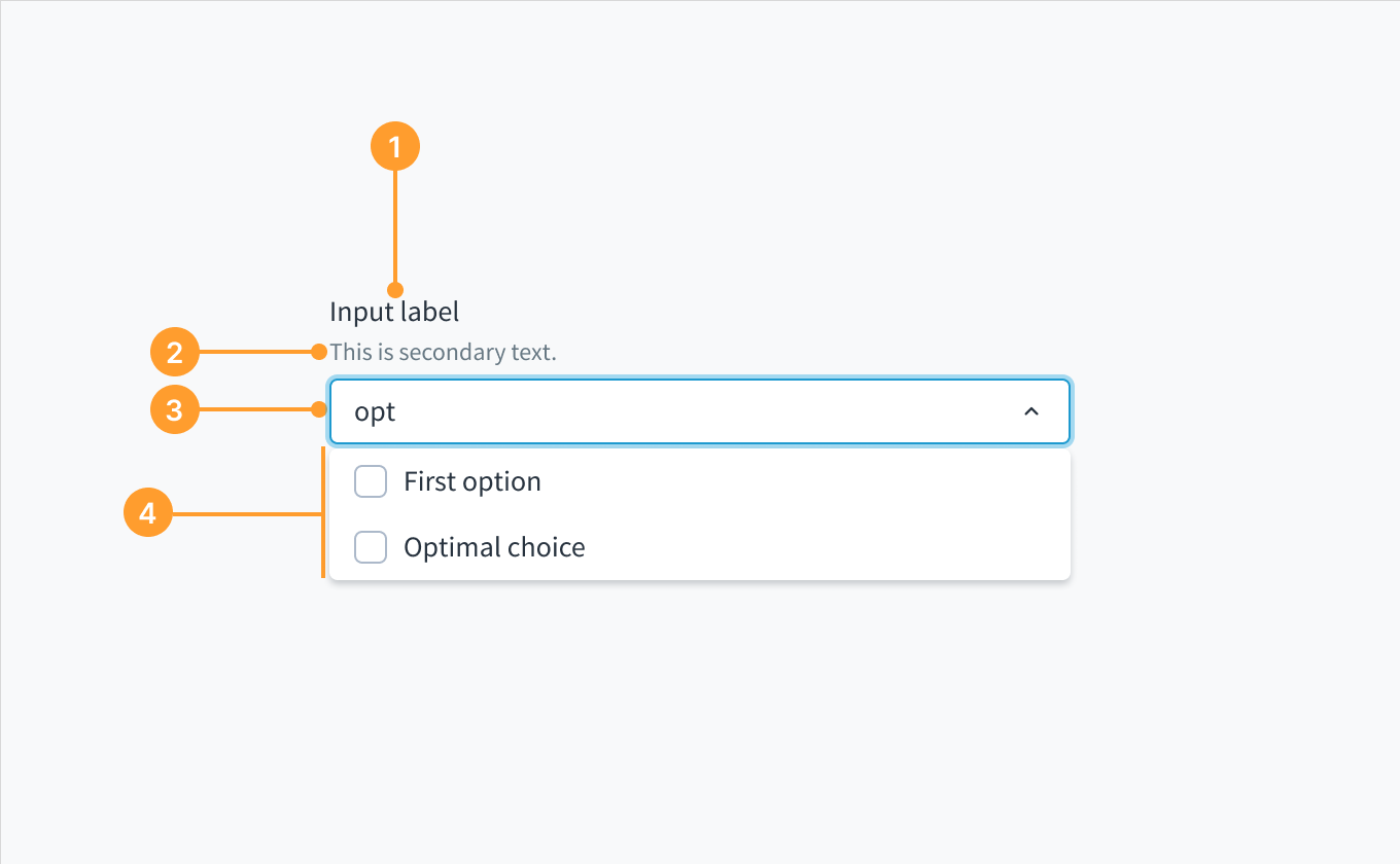 Aufbau der Dropdown-Komponente, Variante Mehrfach-Kombinationsfeld.