Donut chart
Introduction
A donut chart is similar to a pie chart, but it contains a blank center and allows the ability to support multiple statistics at once. The central area can be used to show additional information, a summary KPI, or to report statistics.
When to use
Categorical comparison
A donut chart is a good choice for showing quantitative comparisons between two primary categories, such as school enrollment by gender.
Downtime causes
Manufacturers and IT administrators can visualize causes of lost production or system downtime.
Payment statuses
Donut charts can be used to show financial-related activities such as paid, pending, and overdue to assess an organization's financial position.
Demographics
Workforce composition can be represented using donut chart segments that display the proportional representation of age groups.
When not to use
Don't use a donut chart if there are more than five data points. A bar chart is easier to read and scan when there are many categories to visually process.
Donut chart examples
Donut chart using a legend and direct labeling
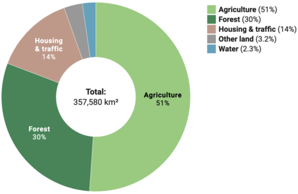
Recharts code
To explore how to create donut charts using Recharts, see the following:
Donut chart example in Recharts
Donut chart displaying secondary segment labels inside the hole
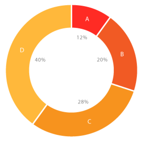
Charts.js code
To explore how to create donut charts using Chart.js, see the following:
Donut chart example in Charts.js
Resources
Informationen zum Zugriff auf Datenvisualisierungskomponenten für Wireframing und Storyboarding finden Sie in den Datenvisualisierungsmustern auf Figma.