Bar chart
Introduction
A bar chart provides visual representation of categorical data, or discrete groups. The bars are rectangular, and their lengths are proportional to the values they represent. Bars can be aligned horizontally or vertically, but one axis should always show the categories being compared, while the other axis should represent a discrete value. Examples of categorical groups include months of the year, sizes, and age groups.
When to use
Comparing values
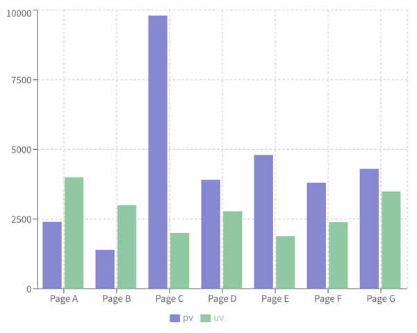
Bar charts can show how different values compare across subgroups, such as comparing revenue between businesses, or how much money a small business spends by expense type.
Showing trends
Bar charts can show data over a specific period of time, such as comparing quarterly sales revenue over several years.
Highlighting difference
Bar charts can show positive and negative values, such as highlighting budget variances, or comparing variances across departments.
Identifying top performers
Bar charts can show which groups are highest or most common, such as sorting categories from highest to lowest to see which team members are top performers.
Categorizing survey responses
Bar charts can show the values of different responses to visualize the most important issues customers are highlighting.
General business visualizations
Bar charts can be used to visualize data for sales, investments, forecasts, and company budgets.
When not to use
Don't use a bar chart for comparing summary statistics of continuous data (for example, mean, median, standard deviation, mode). Different data distributions can produce identical bar graphs, hiding important underlying details.
Bar chart examples
Bar chart comparing values across subgroups
Recharts code
To explore how to create bar charts using Recharts, see the following:
Bar chart showing trends over time
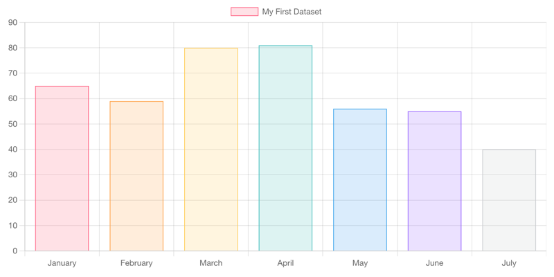
Chart.js code
To explore how to create bar charts using Chart.js, see the following:
Resources
Informationen zum Zugriff auf Datenvisualisierungskomponenten für Wireframing und Storyboarding finden Sie in den Datenvisualisierungsmustern auf Figma.